Gothic Font Tattoo: 24 Old English and Fraktur Fonts for Blackletter Ink
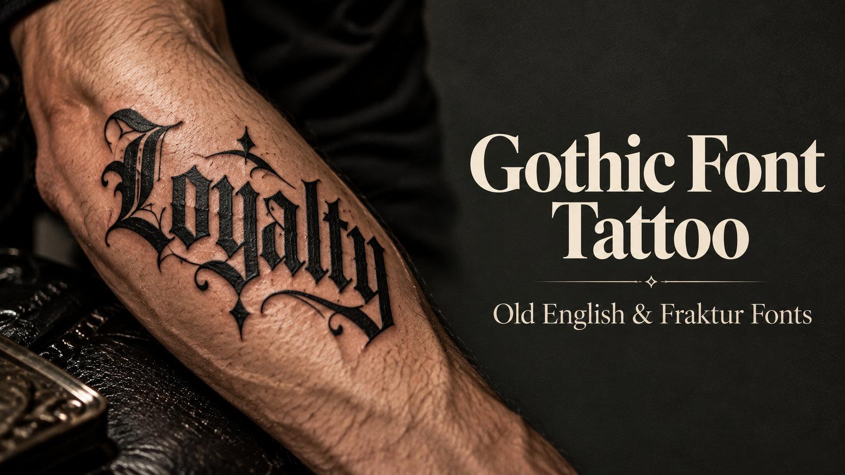
A gothic font tattoo is the one lettering style people recognize from across the room: dense black strokes, sharp diamond-shaped feet and capitals that look carved rather than written. Tattoo shops call it Old English, type designers call it blackletter, and German printers called their rounder version Fraktur, but they all come from the same broken-pen tradition. This collection splits 24 fonts into four groups, from shop-classic Old English to crowned initials, Fraktur and sharp modern gothic, so you can match the lettering to the placement before you take it to your artist.
This post contains affiliate links. If you buy through them, I may earn a small commission at no extra cost to you.
All fonts in this list are on Creative Fabrica, and a single All Access subscription unlocks every one of them, so you can try several styles before committing to one.
More tattoo font collections:
Tattoo Lettering Fonts: 16 Bold Picks for Blackletter, Script and Fine-Line Designs
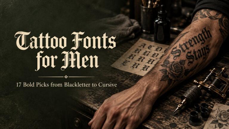
Tattoo Fonts for Men: 17 Bold Picks from Blackletter to Cursive for Name Tattoos
Tattoo Fonts Cursive: 20 Flowing Script Picks for Names, Quotes and Fine-Line Work
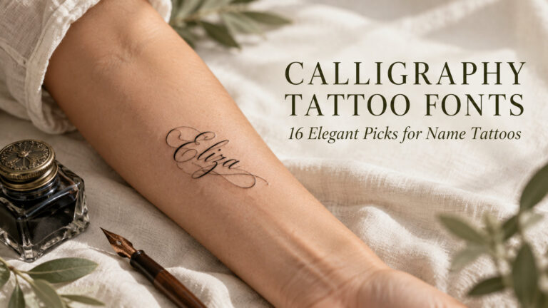
Calligraphy Tattoo Fonts: 16 Elegant Picks for Name Tattoos and Fine-Line Designs
Table of Contents
- Classic Old English Tattoo Fonts
- Ornate & Crowned Old English Tattoo Fonts
- Fraktur Tattoo Fonts
- Modern & Sharp Gothic Tattoo Fonts
- How to Choose a Gothic Tattoo Font
- FAQ
- Pick the Group First, Then the Font
Classic Old English Tattoo Fonts
This is the lettering most people picture when they say Old English: upright, heavy and built from straight strokes that end in pointed feet. These six fonts cover names, dates, single words and short phrases, and they range from very dense to fairly open, which matters once the ink settles into skin.
1. Ragnar Gothic Font
by Eko Kurniawan
Best For: classic name tattoos, collarbone lines, single words across the forearm
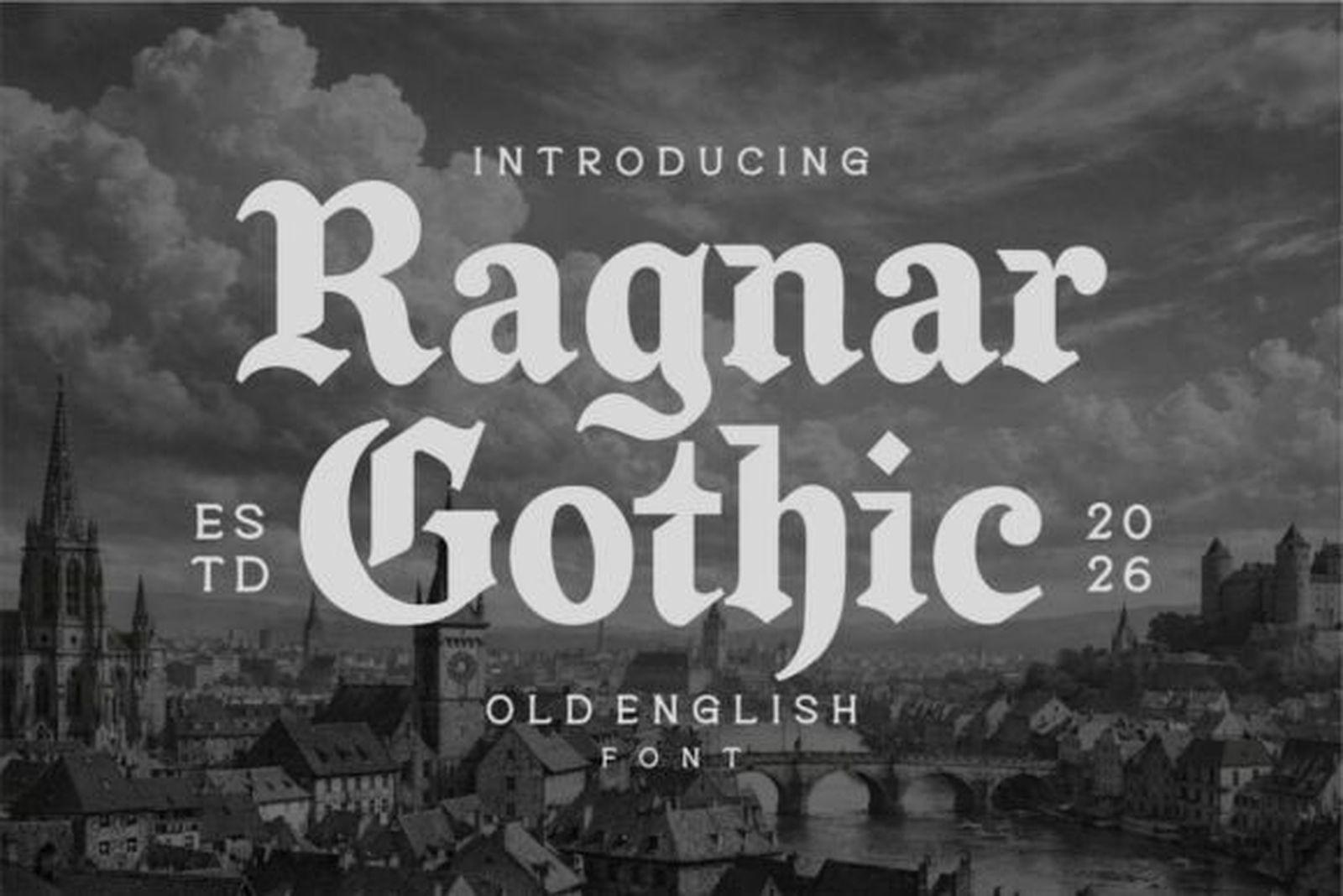
Ragnar Gothic Font is textura in its traditional form: a tight rhythm of vertical strokes, diamond feet and capitals with enough weight to anchor a word. It reads as the shop-standard Old English, the version people point to when they ask for “that gothic lettering.”
Whole words stay legible, but lowercase letters like m, n and u are built from the same repeated strokes, so at small sizes they can blur into a picket fence. Give it room and let the capital do the work at the start of a name.
2. Gothic Old English Font
by Bundle
Best For: large back pieces, forearm words, lettering with lots of room
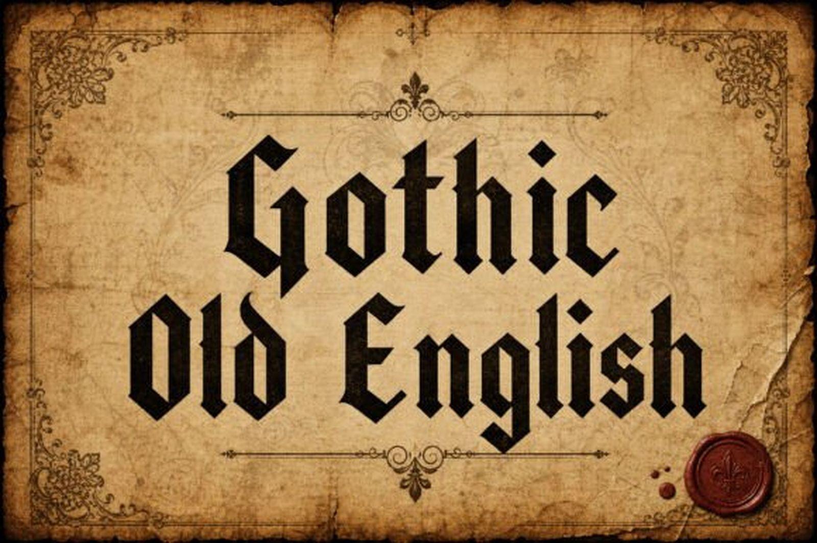
Gothic Old English Font goes for mass. The strokes are wide, the capitals are large and ornamented, and the whole word sits like a heavy block on the line. It is the kind of lettering that still reads from a distance.
That weight is also its limit. The counters inside the letters are narrow, and at a small size those gaps fill with ink over the years. Use it where the placement is generous, like the upper back or the outer forearm, and keep the phrase short.
View Gothic Old English Font →
3. Demon Old English Font
by Chonada
Best For: one bold word, stomach and chest lettering, darker pieces without horror clichés
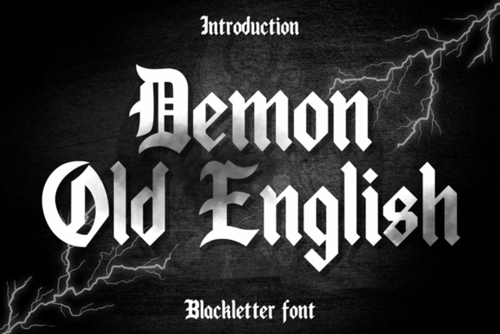
Despite the name, Demon Old English Font is a clean, hard-edged blackletter rather than a dripping horror display. The contrast between thick and thin strokes is strong, and the stroke ends are cut to sharp points that give every letter a slightly aggressive edge.
It works best as a single statement word set large across the stomach or chest. The thin connecting strokes are the part to watch: ask your artist to thicken them a touch if the piece is going on the small side.
4. Baghen Font
by Shakira Studio
Best For: names and dates that must stay readable, first gothic tattoo, smaller placements
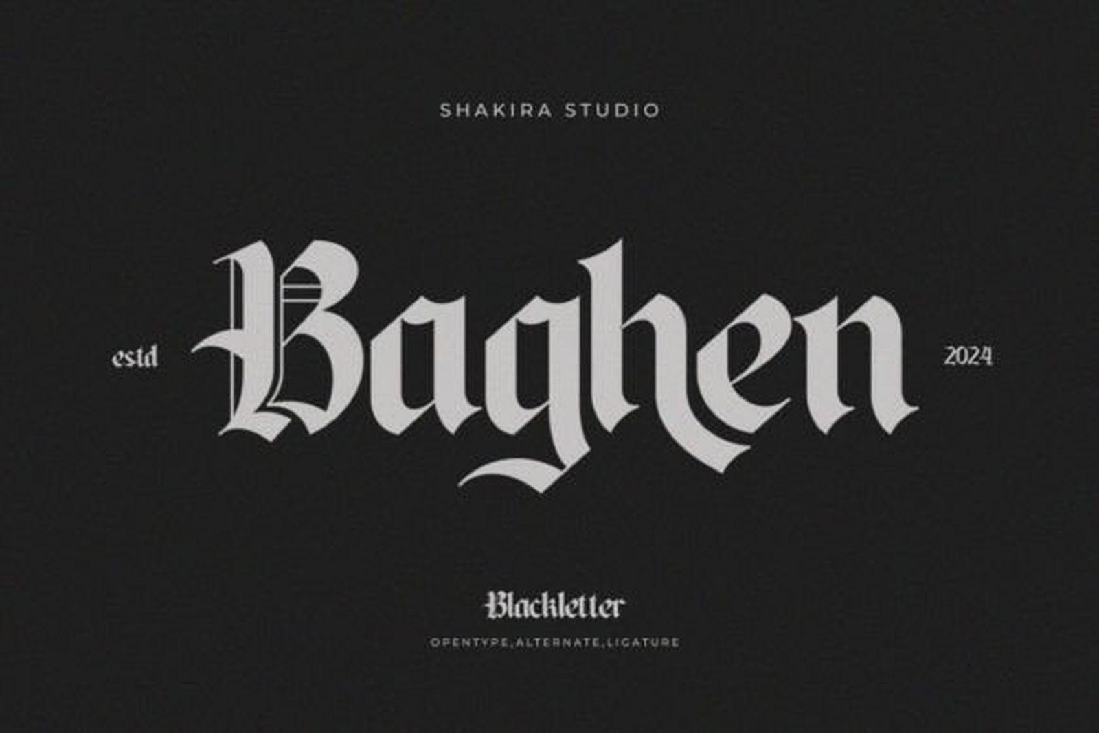
Baghen Font strips blackletter back to its structure. There are no extra hairlines or decorative spurs, just even strokes and clear, well-separated letters. Next to the heavier fonts in this group it looks calm, almost restrained.
That restraint is exactly why it suits names, birth dates and anything where the text has to be read correctly years from now. If you are unsure whether gothic lettering is right for you, this is the safest place to start.
5. Black Crown Font
by Wow Magic
Best For: one-line phrases along the ribs, collarbone or inner arm
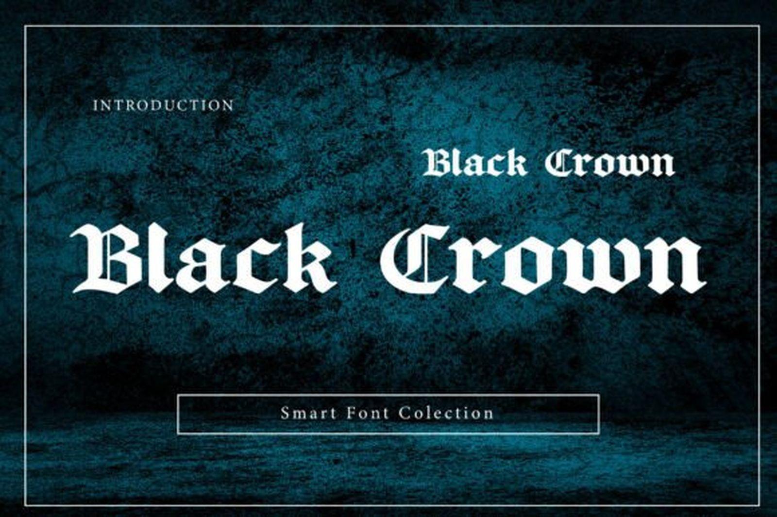
Black Crown Font is a lighter, more elongated Old English. The letters are taller than they are wide, and the capitals carry small, controlled flourishes instead of heavy ornament. The result feels refined rather than heavy.
Because it runs narrow, it fits longer text into a single line, which is useful for a quote along the ribs or a line under the collarbone. Keep the size sensible so the thinner strokes have room to hold.
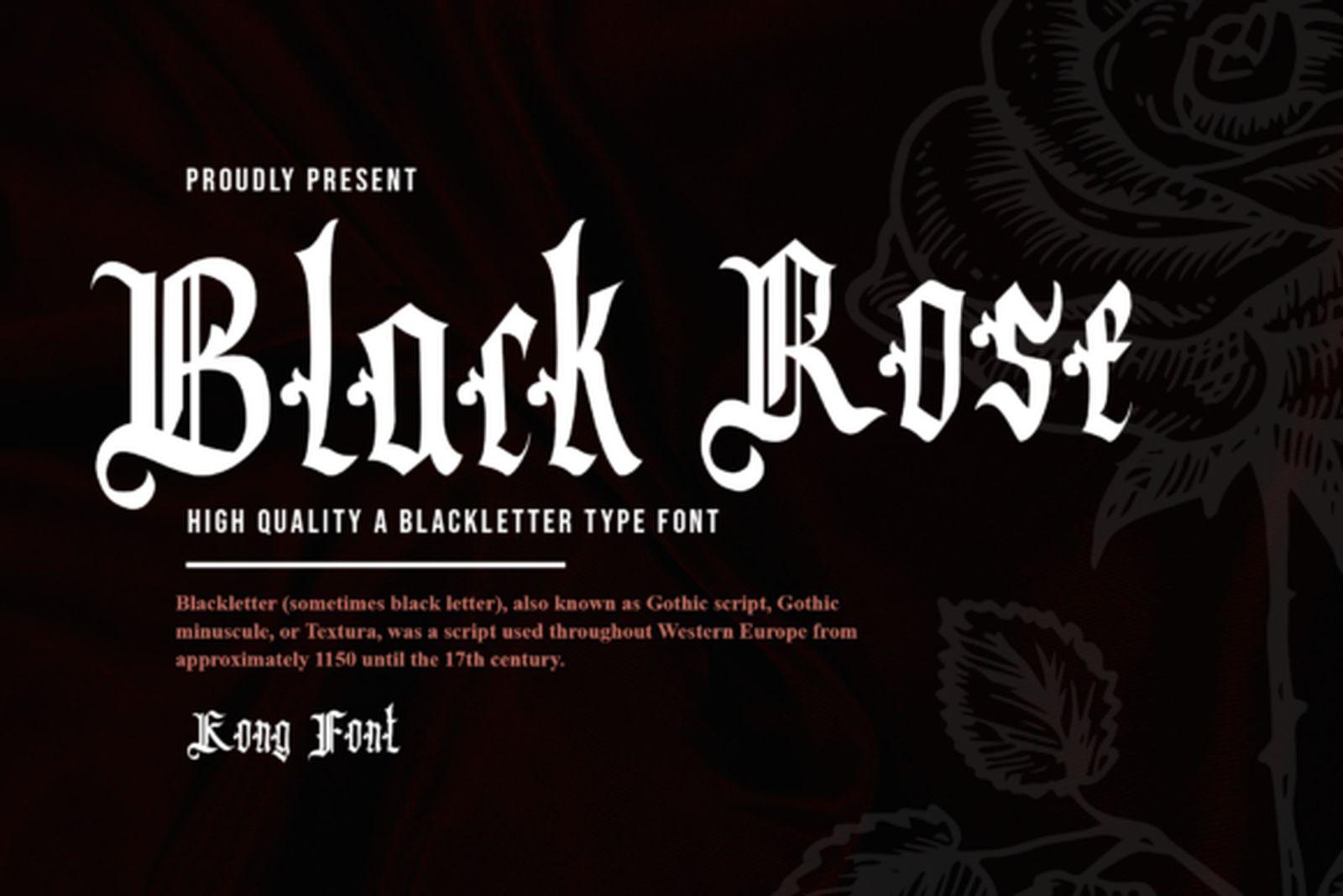
6. Black Rose Font
by Freebies
Best For: short quotes, two-line lettering, phrases that need both gothic mood and readability
Black Rose Font pairs narrow, orderly lowercase with expressive capitals. The lowercase keeps a steady rhythm, while the uppercase letters open up with curves and hooks that make the first letter of each word stand out.
This balance makes it one of the better choices in the group for a full phrase. A short quote set in two lines keeps its gothic character without turning into a solid black bar.
Ornate & Crowned Old English Tattoo Fonts
These fonts trade some readability for decoration: swashes, split strokes, crowns and flourishes that spill past the letter edges. They shine as initials, single names and centerpiece words on the chest or back, and they are less suited to long sentences.
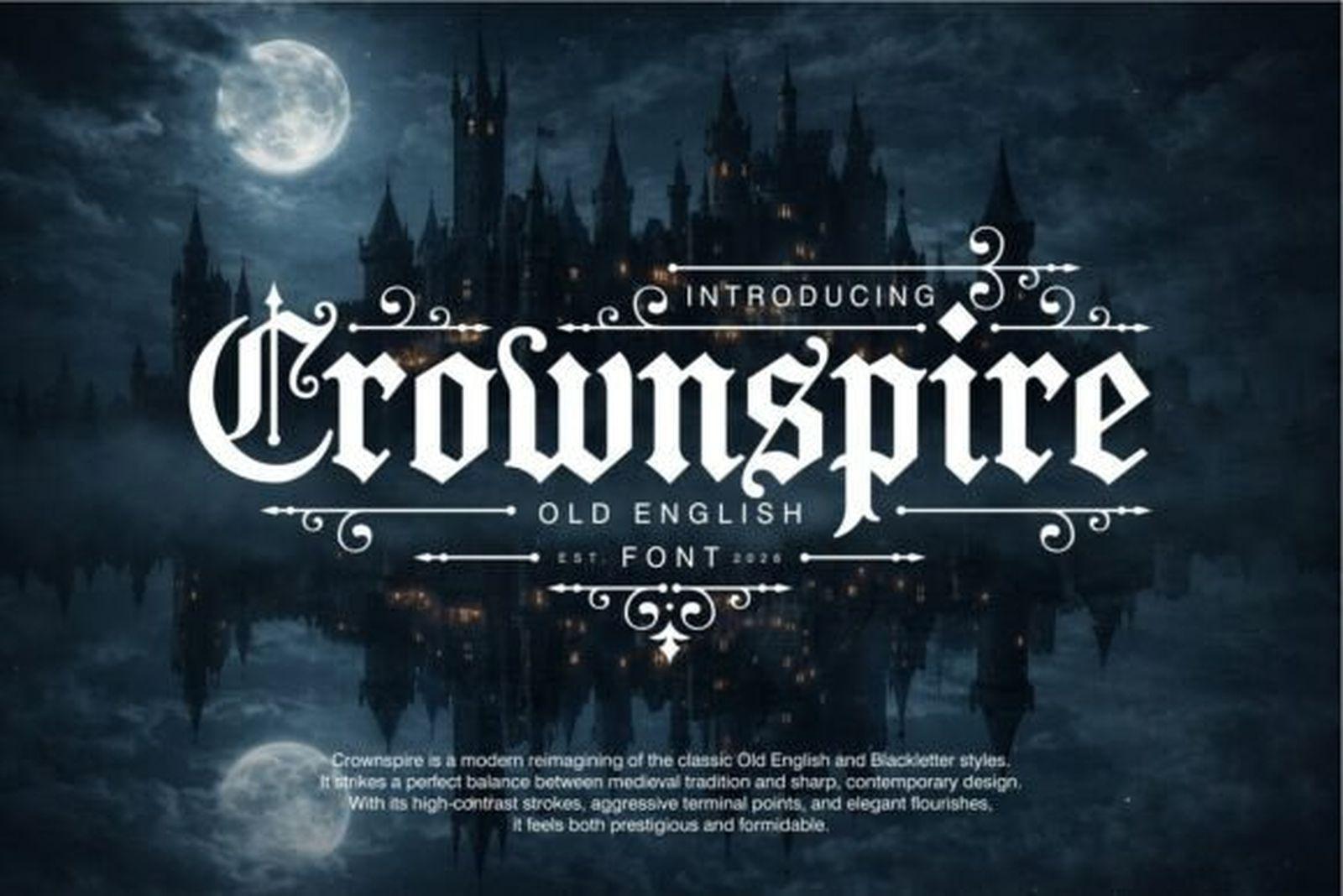
7. Crownspire Font
by Eko Kurniawan
Best For: single initials, short names, chest pieces with space for flourishes
Crownspire Font keeps the Old English skeleton and adds decorative extensions to the capitals: curling swashes and small ornamental offshoots that make each uppercase letter feel like a small emblem.
Those flourishes need space to breathe, so it works best for an initial or a short word. In a long phrase the decoration starts competing with itself, and the eye loses track of where one word ends.
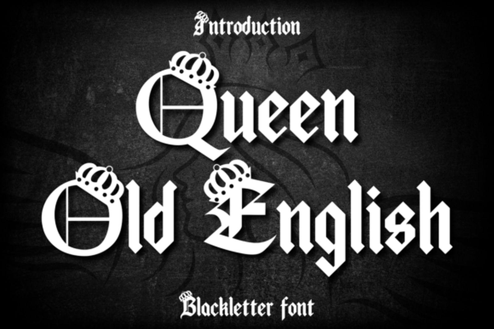
8. Queen Old English Font
by Chonada
Best For: crowned initials, a partner’s or child’s name, royalty-themed pieces
Queen Old English Font places small crowns on its capitals, which makes it almost a ready-made design for an initial or a name. The lowercase stays in a fairly standard blackletter, so the crown on the first letter carries the whole idea.
At a small size the crown detail will be simplified by the artist, so if the crown is the point, go bigger or use just the capital on its own as a symbol.
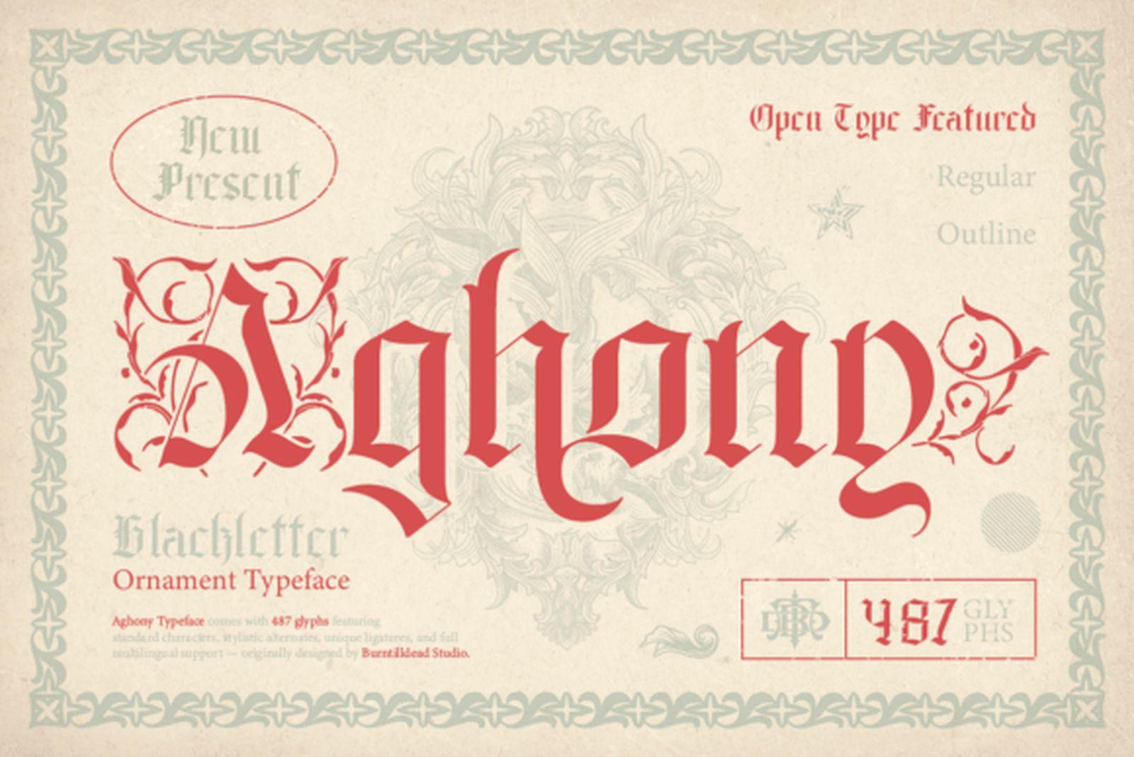
9. Aghony Font
by Burntilldead
Best For: a single decorative letter, centerpiece words, chest and sternum pieces
Aghony Font is presented as an ornament blackletter, and the capitals look like illuminated letters from an old manuscript: layered curves, extra strokes and decorative tails around a gothic core.
Treat it as a design element rather than a text font. One letter, a short name or a single word in the middle of the chest will show off the ornament; a sentence will not.
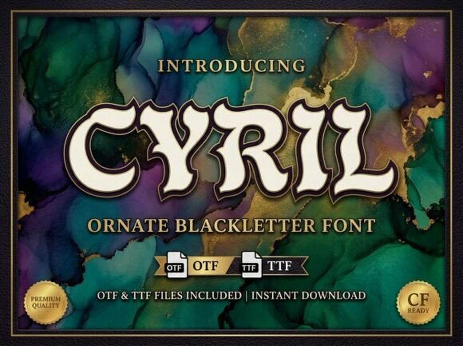
10. Cyril Font
by LINEART3
Best For: large lettering on the back or chest, names framed by other imagery
Cyril Font is an ornate blackletter with split strokes and curling details that make each letter look hand-cut. It carries a rich, almost ceremonial feel that suits lettering meant to be the focus of the piece.
All that detail pays off at a large size and gets lost at a small one. If the design is compact, pick a cleaner font from the first group and save Cyril Font for the back or chest.
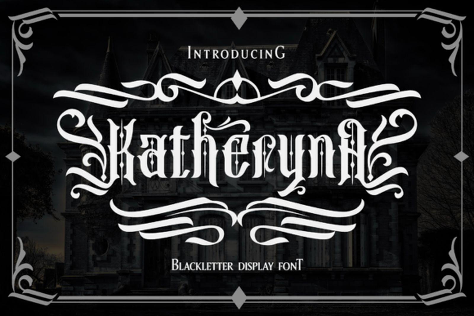
11. Katheryna Font
by Arterfak Project
Best For: one name as a standalone design, decorative back or shoulder pieces
Katheryna Font is a blackletter display with swirling flourishes that reach far beyond the letters themselves. The word becomes an ornamental shape, closer to a drawing than to typed text.
Go in knowing that readability is traded for effect. It suits one name treated as the whole tattoo, and it pays to show the full word to a few people before booking to make sure it still reads.
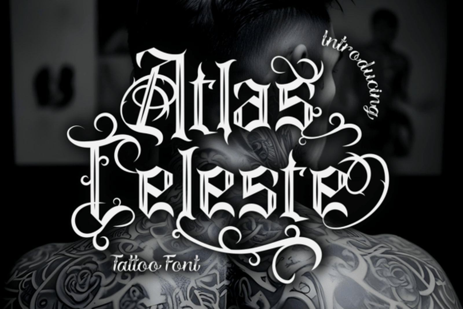
12. Atlas Celeste Font
by putracetol
Best For: lettering across the upper back or shoulder blades, names with flowing loops
Atlas Celeste Font is presented as a tattoo font, and it sits between blackletter and tattoo script: gothic capitals and structure, but with loops and curved connections that make it move more than a strict Old English.
That movement suits curved placements. Across the shoulder blades or along the top of the back, the loops follow the body instead of fighting it.
Fraktur Tattoo Fonts
Fraktur is the German branch of blackletter. Instead of straight strokes with diamond feet, it uses broken curves, so the letters look rounder and a little less severe. Many people find it easier to read than classic Old English, which makes it a good middle ground for phrases and quotes.
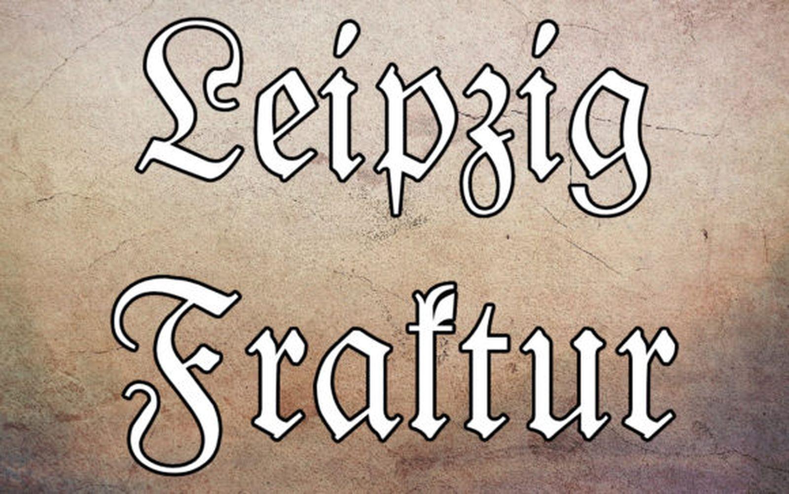
13. Leipzig Fraktur Font
by Freebies
Best For: quotes and phrases, lettering with a decorative first letter
Leipzig Fraktur Font is classic Fraktur: large, elaborate capitals with sweeping curves, followed by lighter lowercase letters that stay clear and even. The contrast between the two gives a phrase an elegant, bookish feel.
It reads more easily than most textura-style fonts, so it handles a full quote well. Let the capital open the phrase and keep the rest of the line simple.
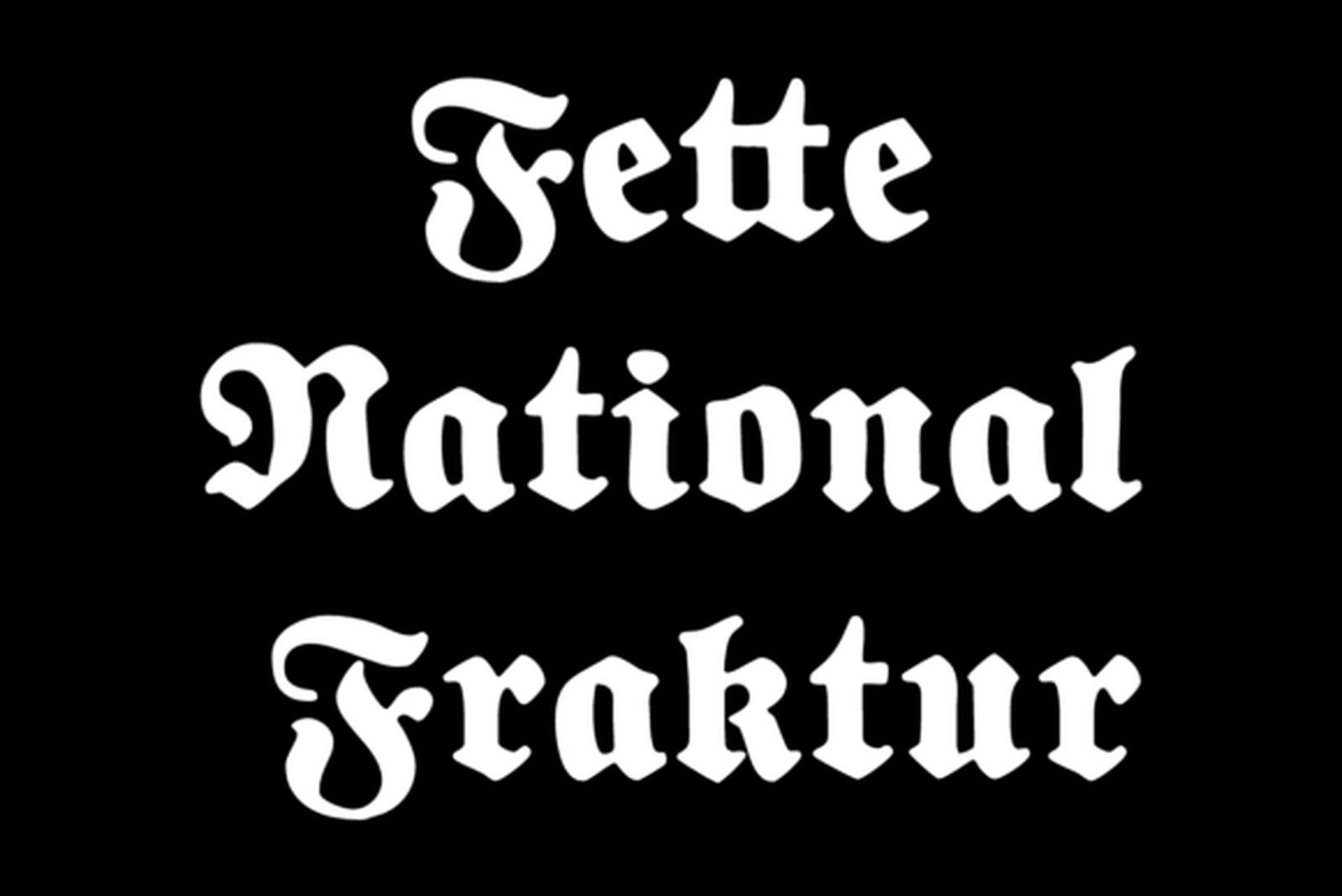
14. Fette National Fraktur Font
by Freebies
Best For: one or two words set large, stomach and chest lettering
Fette National Fraktur Font is a bold, compact Fraktur with a lot of black on the page. The curves are still there, but the weight gives it the presence of a heavy Old English.
Use it where a word needs mass: one or two words across the stomach or chest. At a small size the tight interior spaces will close up, so avoid it for fine details or long lines.
View Fette National Fraktur Font →
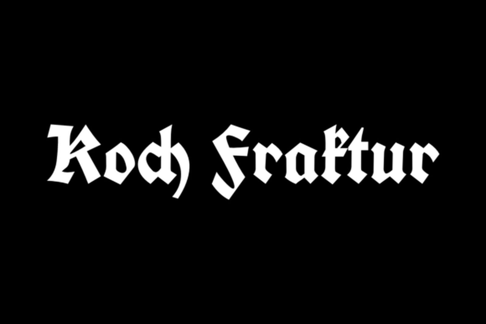
15. Koch Fraktur Font
by Freebies
Best For: gothic lettering that has to stay readable, names, short phrases on the forearm
Koch Fraktur Font is dense but keeps its letter shapes open, so individual lowercase letters stay easy to tell apart. It has a strong, slightly rugged character without leaning into ornament.
If you want gothic lettering but readability is a priority, this is one of the most practical options in the list. It works for names and short phrases where every letter needs to be recognized.
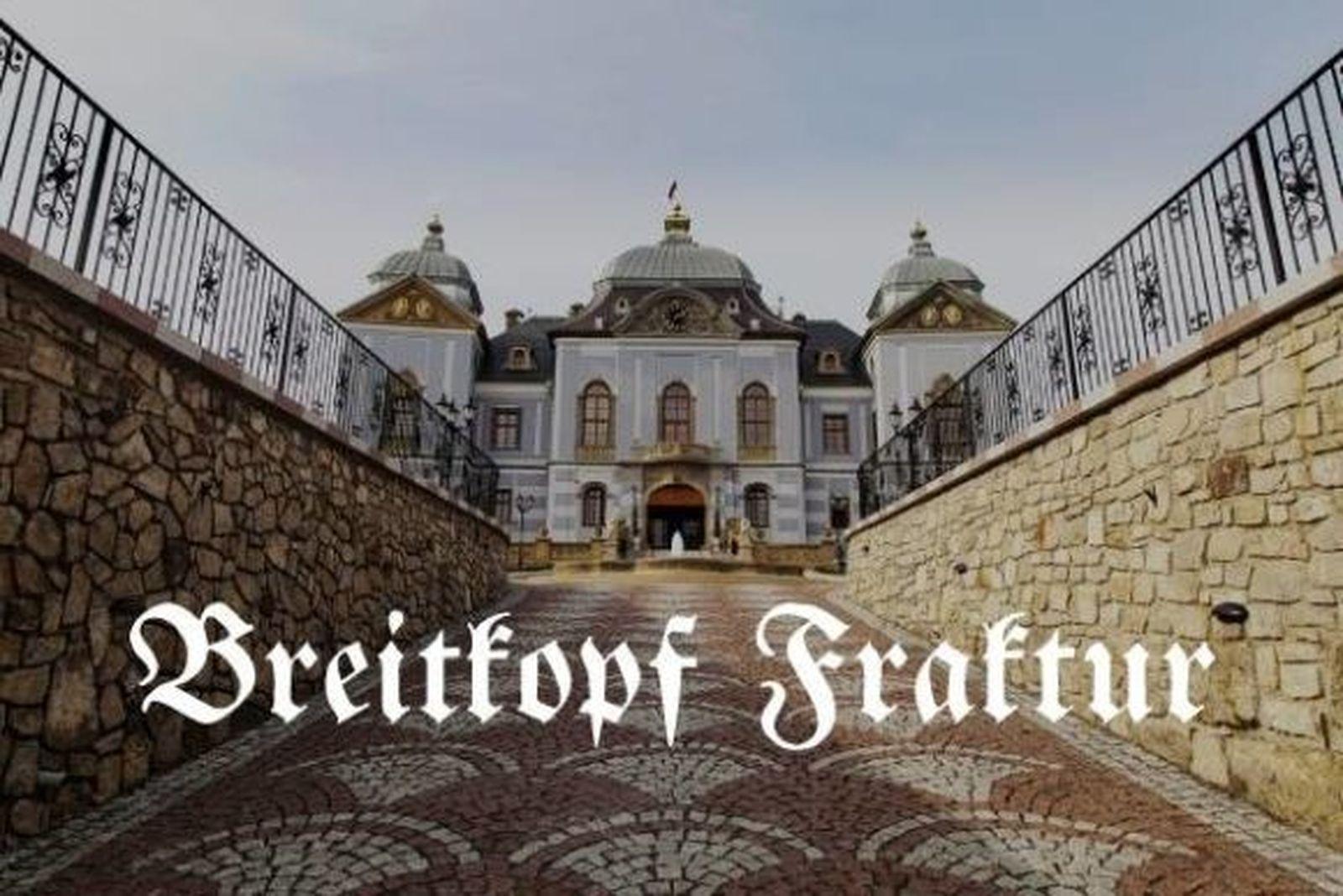
16. Breitkopf Fraktur Font
by Freebies
Best For: literary quotes, one-line phrases, lighter gothic lettering
Breitkopf Fraktur Font is a light, calm, book-style Fraktur. The strokes are thinner than in most fonts here, which gives lettering a quieter, more literary tone.
Choose it for a quote in one line when the heavier fonts feel too loud. Because the strokes are lighter, keep the lettering at a comfortable size so it does not fade into the skin over time.
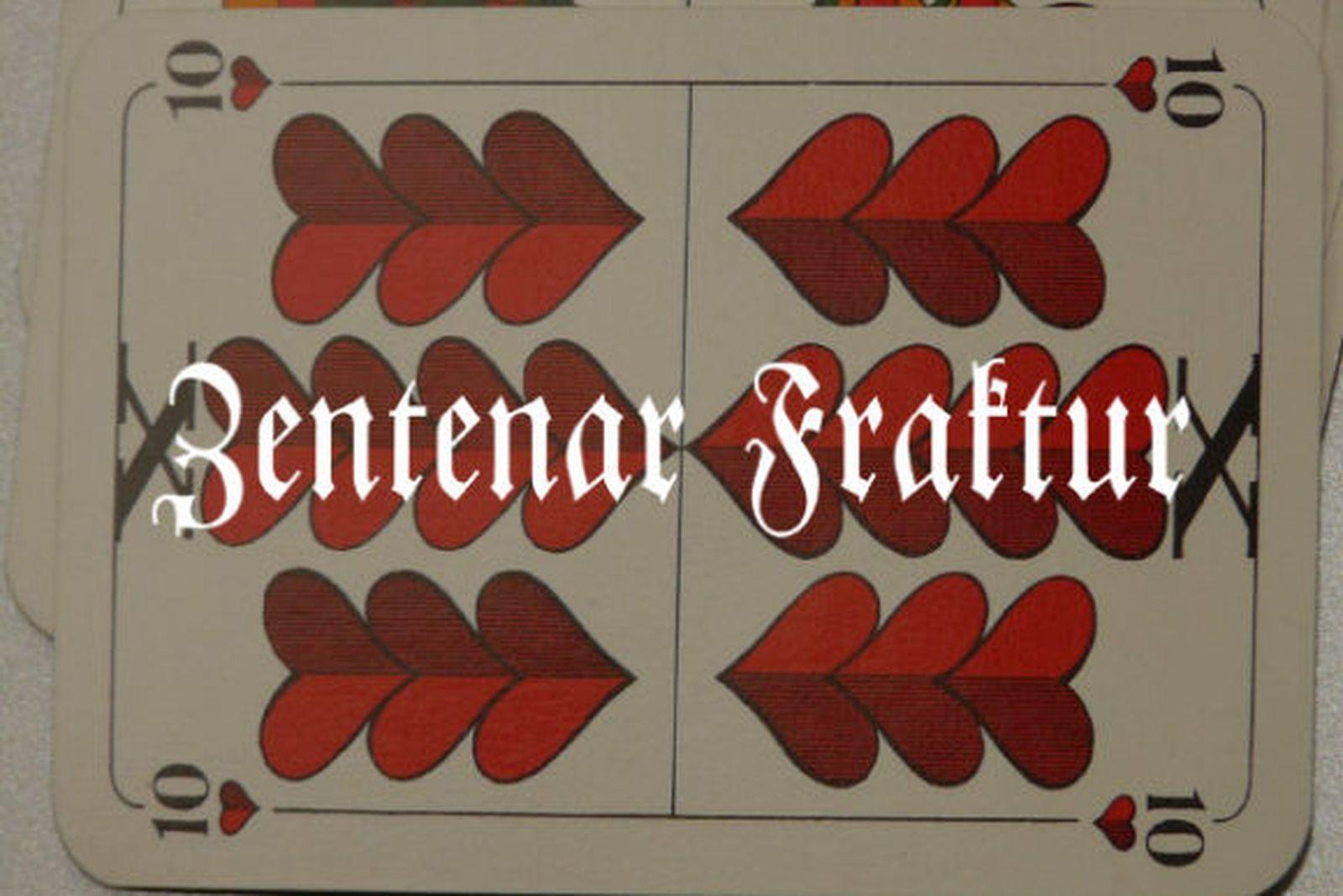
17. Zentenar Fraktur Font
by Freebies
Best For: long single-line lettering along the arm or spine
Zentenar Fraktur Font is narrow and neat, with crisp strokes and a steady rhythm. It fits more letters into a line than most fonts in this list without looking cramped.
That narrow build makes it a natural choice for lettering that runs in one line down the spine or along the inner arm, where width is limited and length is not.
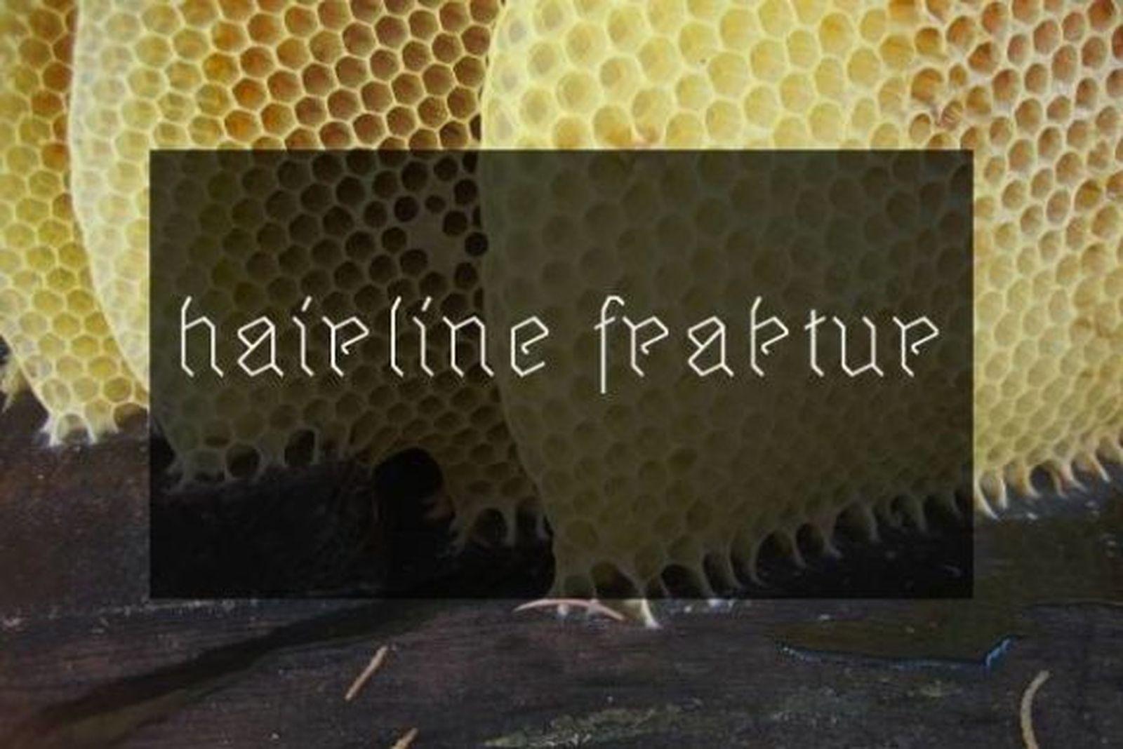
18. Hairline Fraktur Font
by Freebies
Best For: fine-line gothic tattoos, delicate lettering on the wrist or collarbone
Hairline Fraktur Font draws Fraktur with a single thin line. It keeps the recognizable broken shapes of gothic lettering but drops all the weight, which makes it the only true fine-line option in this collection.
Thin lines spread more over the years than bold ones, so do not shrink it too far. Set a little larger than you would a heavy font, it keeps the delicate look without losing the letters.
Modern & Sharp Gothic Tattoo Fonts
These are contemporary takes on blackletter: sharper angles, stretched proportions, rough edges and even dotwork texture. They suit people who want gothic lettering that looks current rather than historical.
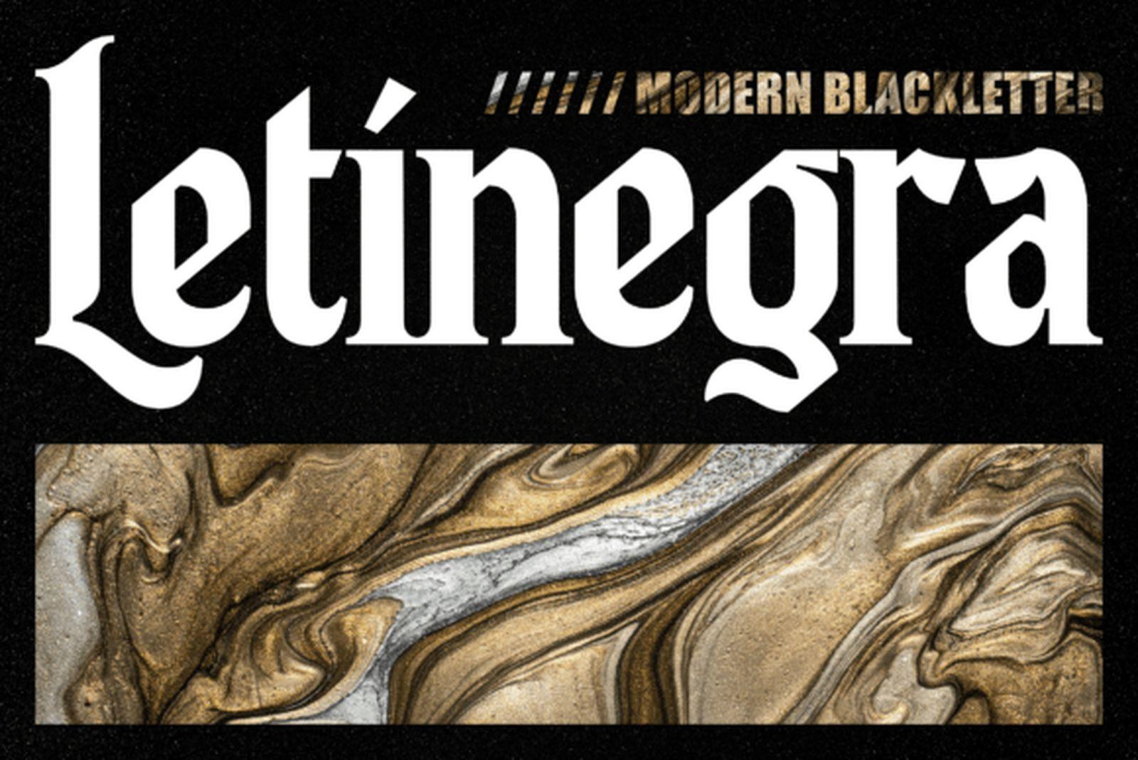
19. Letinegra Font
by Fontdation
Best For: modern name tattoos, single words on the forearm, gothic lettering with a fresh look
Letinegra Font is labeled as a modern blackletter, and it looks the part: high contrast, tall proportions and clean curves that soften the traditional gothic structure.
It keeps the gothic feel without the museum weight, which suits a name or a single word on the forearm. The thin strokes are part of its charm, so keep the size generous enough for them to hold.
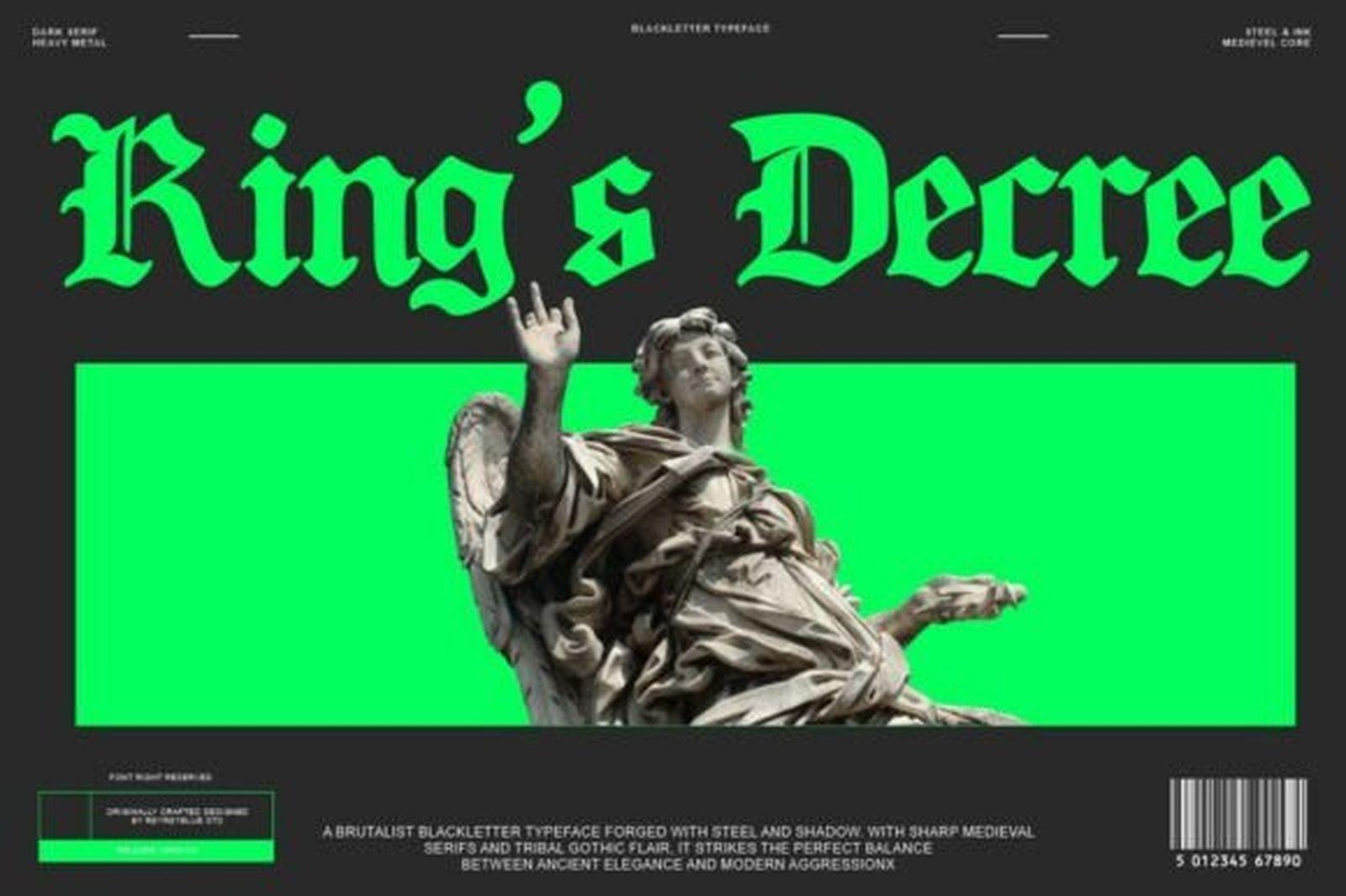
20. King’s Decree Font
by Reyrey Blue
Best For: large chest or stomach words, statement lettering with impact
King’s Decree Font is heavy and angular, with sharp cuts at the ends of each stroke. It has the confidence of a headline, and a single word set in it fills a large area with very little effort.
Use it where the lettering needs to hit: a big word across the chest or stomach. It is less suited to small or long lettering, where all that weight turns into a dark mass.
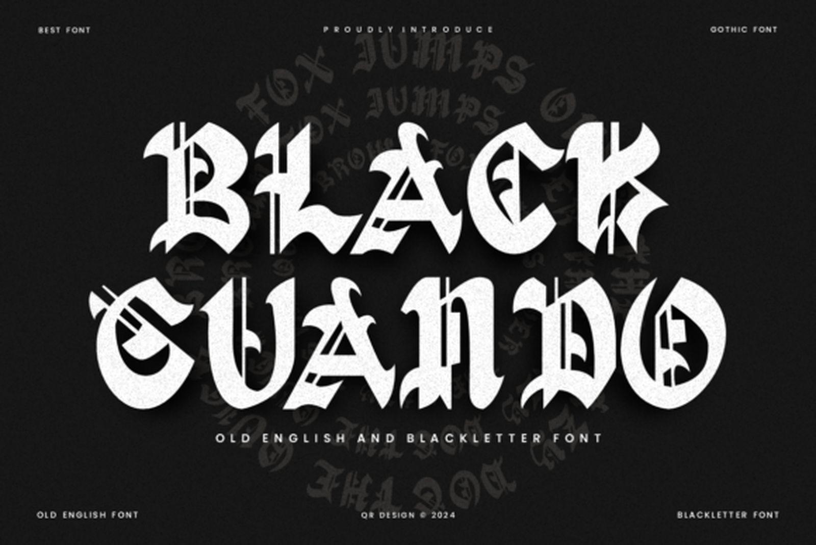
21. Black Guando Font
by qrdesignstd
Best For: one aggressive word, metal-inspired pieces, lettering paired with dark imagery
Black Guando Font is spiky and broken, with thorn-like points and jagged turns throughout. It sits close to the look of metal band lettering while keeping a readable Old English base.
It is at its best as a single word, especially next to skulls, thorns or other dark imagery. In a longer phrase the constant spikes tire the eye, so keep it short.
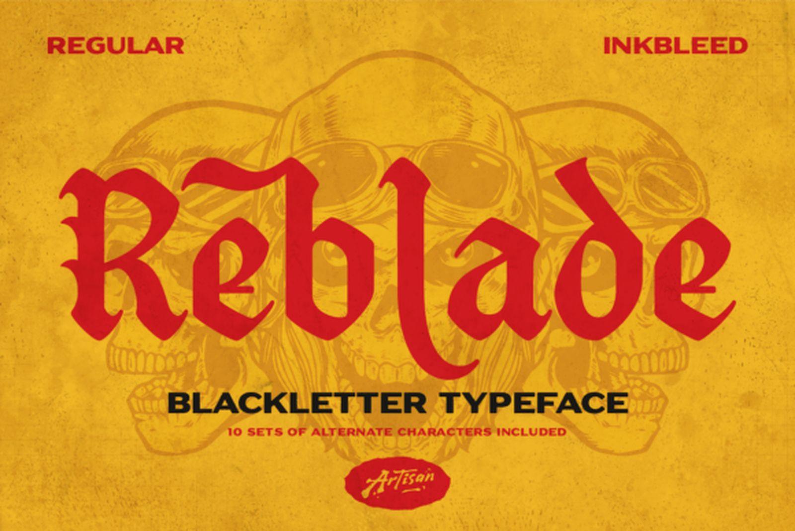
22. Reblade Font
by Artisan Themes
Best For: flash-style lettering, bold words with a hand-drawn edge
Reblade Font is a bold blackletter with a lively, slightly rough edge, as if the letters were cut quickly with a wide blade. It looks less like printed type and more like lettering drawn for a flash sheet.
That hand-made quality makes it a good fit for traditional-style pieces where the lettering sits inside a banner or next to bold imagery. The rough edge itself is a detail your artist may clean up, so treat the overall shape as the main reason to choose it.
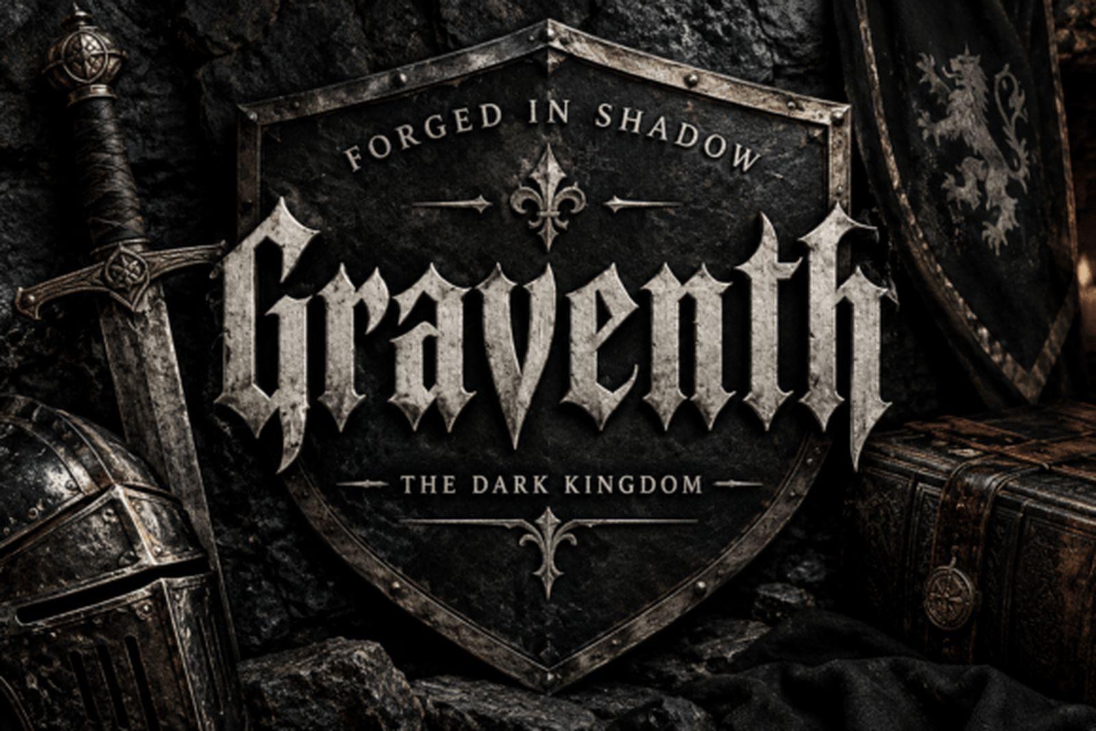
23. Graventh Font
by Colourful
Best For: vertical lettering along the spine or arm, dark but readable words
Graventh Font is narrow and sharp, with long vertical strokes and pointed terminals. It carries a dark, medieval mood but keeps its letter shapes clear enough to read at a glance.
The tall, narrow build suits placements where the lettering runs vertically, such as down the spine or along the side of the arm. It also works well as a single dark word next to a larger design.
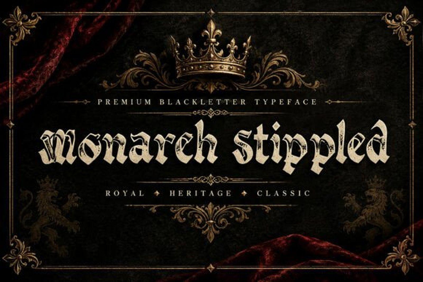
24. Monarch Stippled Font
by BILLI
Best For: dotwork tattoos, larger lettering with texture, pieces by stippling artists
Monarch Stippled Font builds blackletter shapes from a stippled, dotted texture, which echoes dotwork tattooing directly. The letters keep a classic gothic outline while the fill looks shaded by hand.
The texture only survives at a large size, so plan it for a bigger piece and bring it to an artist who works in dotwork. At a small size the dots will merge, and you end up with a plain blackletter.
How to Choose a Gothic Tattoo Font
Start with the length of the text. One word or an initial can carry heavy or ornate lettering such as Gothic Old English Font or Aghony Font. A full phrase needs something more open, like Black Rose Font, Leipzig Fraktur Font or Koch Fraktur Font.
Match the width to the placement. Narrow fonts such as Zentenar Fraktur Font, Black Crown Font and Graventh Font fit long lines on the spine, ribs or inner arm. Wide, heavy fonts need the space of the chest, stomach or upper back.
Check the thin strokes. Blackletter mixes very thick and very thin lines. The thin ones are what fade and blur first, so the smaller the tattoo, the more you should favor even, sturdy strokes like those in Baghen Font or Koch Fraktur Font.
Look at the numbers before you commit. Dates, years and angel numbers are some of the most common gothic tattoos. Numerals in blackletter fonts vary a lot in quality, so open the font page and check how the digits look before choosing a font for a date.
Print a stencil-size test. Type your exact text, print it at the real size and hold it against the placement. It is the quickest way to see whether the letters stay readable or merge into a dark block.
FAQ
Is Old English the same as a gothic font?
In tattoo shops the two names are used for the same thing: blackletter lettering with heavy vertical strokes and pointed feet. Fraktur is a related German style with rounder, broken curves. All three belong to the blackletter family.
Which gothic font is best for a name tattoo?
For a name that must stay readable, choose a clean blackletter like Baghen Font or an open Fraktur like Koch Fraktur Font. For a name treated as a decorative piece, Queen Old English Font or Crownspire Font give the first letter more presence.
Can gothic lettering work as a small tattoo?
It can, but it is harder than with script or sans-serif lettering. Choose a font with even strokes and open letters, keep the text short, and ask your artist whether the size is realistic for the letters you picked. For a delicate look, Hairline Fraktur Font is the lightest option in this list.
Is there a fine-line gothic font?
Hairline Fraktur Font draws gothic letters with a single thin line, which makes it the fine-line choice in this collection. Set it slightly larger than a bold font so the lines have room to hold.
Can a tattoo artist use these fonts for client work?
License terms are set on each font’s Creative Fabrica page, so check the license there before using a font for commercial work.
Pick the Group First, Then the Font
The fastest way through this list is to decide which group fits your idea before comparing individual fonts. Classic Old English covers names and dates, the ornate group handles initials and centerpiece words, Fraktur gives phrases a softer and more readable gothic, and the modern group brings sharper, current shapes. Choose the group by the length of your text and the placement, then pick the font inside it that looks right at the real size on your skin.