Tattoo Fonts Cursive: 20 Flowing Script Picks for Names, Quotes and Fine-Line Work
Cursive is the most requested register in tattoo lettering and the least forgiving one. A script has to do two things at once: flow like handwriting and survive being read at arm’s length, on skin, years after the ink settled. Plenty of beautiful scripts manage the first and fail the second.
The twenty fonts below are sorted by how much weight and ornament they carry, because that is what decides where a script can go. Classic cursive for long phrases. Ornate swash and Chicano for one word with room around it. Fine-line for small, delicate placements. Bold and handwritten for pieces that have to land immediately.
For blackletter, bold display and everything outside script, see our roundup of 16 Tattoo Lettering Fonts for Blackletter, Script and Fine-Line Designs.
Every font here is on Creative Fabrica, so an All Access subscription covers the whole list.
Table of Contents
- Classic Tattoo Cursive Fonts
- Ornate Swash & Chicano Cursive Fonts
- Fine-Line & Delicate Cursive Fonts
- Bold & Handwritten Cursive Fonts
- How to Choose a Cursive Tattoo Font
- FAQ
What Makes a Cursive Font Work on Skin
The connections matter more than the letters. In a script, legibility lives in the joins. If the connecting strokes are thinner than the letter bodies by too much, they are the first thing to blur, and the word turns into a continuous ribbon. Look at how a script handles a double letter — two of the same shape side by side is where weak connections show.
Slant has to be consistent. Hand-drawn scripts often vary their angle from letter to letter, which looks lively in a specimen word and looks unsteady in a full sentence. For a quote, the more mechanical the slant, the better it holds.
Swashes need to be optional. The best tattoo scripts ship alternates so the flourishes can be switched on for the first and last letter only. A font where every capital carries a permanent tail is a one-word font, whatever its product page says.
Classic Tattoo Cursive Fonts
Even slant, controlled flourishes, letters that stay recognisable in a long line. This is the group to start from when the piece is a phrase rather than a single name.
1. Bionley Font
by Denustudios
Best For: name pieces, quotes, studio branding
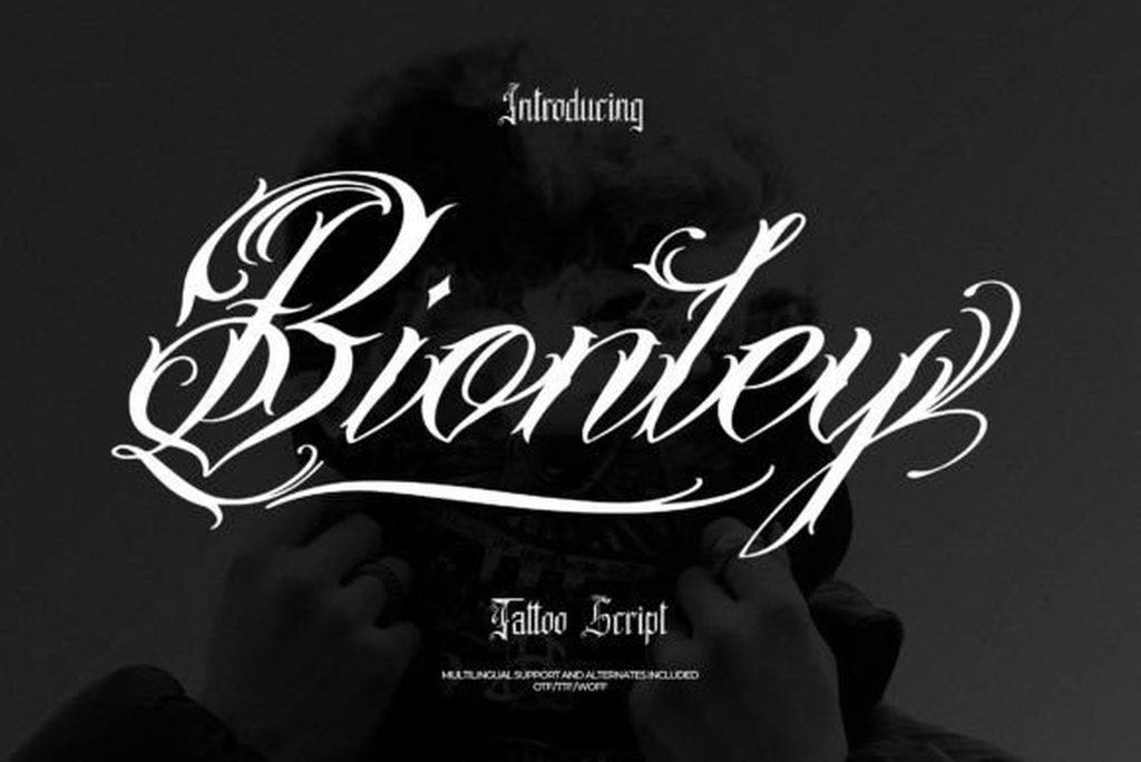
Bionley is the most even-tempered script in this collection, and that is its whole argument. The slant holds steady across the word, the loops on the ascenders are regular in size, and the flourishes stay close to the letters instead of launching off the baseline. Nothing fights for attention.
That makes it the safe default when the words themselves carry the meaning. The specimen sets it white on a dark ground, which is close to how it will read as ink on skin, and it holds together at that contrast. Multilingual support, ligatures and alternates are included, so a name with accented characters is not a problem.
2. Ruthlock Font
by Essentials Studio
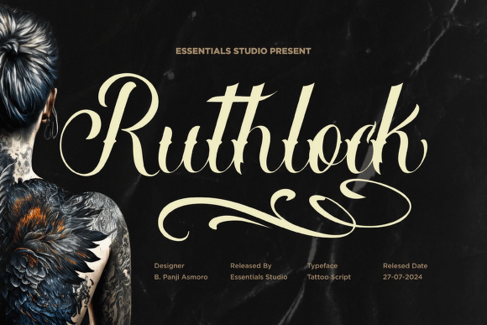
Best For: vertical placements, forearm lettering, long single words
Ruthlock is taller and narrower than most tattoo scripts. The ascenders stretch well above the x-height and the letter bodies stay compact, which gives the word an upright, elongated rhythm rather than a sprawling one. The terminals end in fine points that lift away from the baseline.
The proportions are the practical reason to pick it. A long word that would run out of room in a wide script fits in a much tighter horizontal span here, so it suits forearm and spine placements where width is the constraint and height is not.
3. Historic Font
by brightonexart
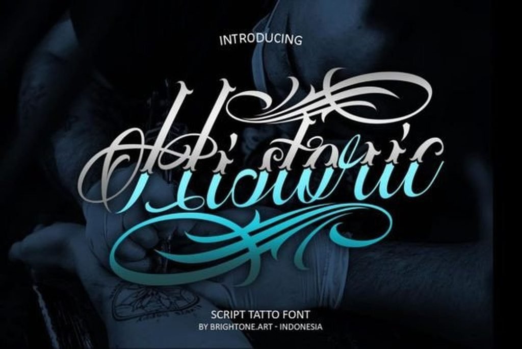
Best For: single words, chest lettering, album and poster work
Historic sits between classic script and calligraphy. The contrast between thick and thin is stronger than in Bionley, the downstrokes swell noticeably, and the capitals carry a curl that rises above the rest of the word. It reads as written with a broad nib rather than drawn.
The strong contrast is both the appeal and the thing to watch. High-contrast scripts look refined at size and lose their hairlines when set small, so this one belongs on placements where the lettering can be generous. One word, given room, is where it is at its best.
4. Kinksane Font
by madeDeduk
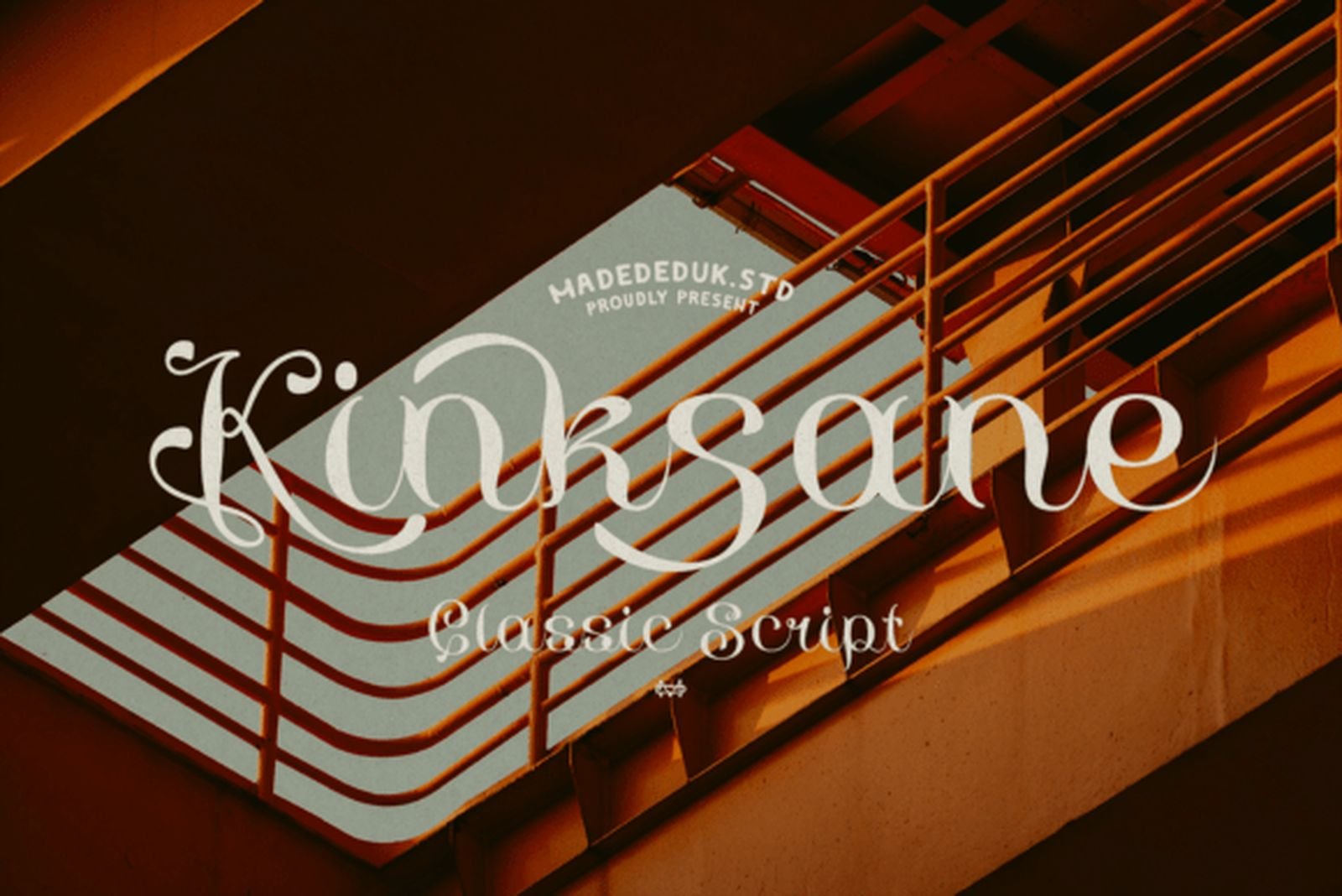
Best For: quotes, full sentences, clean minimal lettering
Kinksane is the plainest script on this list and the one most likely to be underestimated. The letterforms are close to copperplate handwriting: modest loops, a gentle slant, no decorative flicks anywhere. The specimen is set light on a warm background, which shows how little the font relies on contrast to work.
Use it for anything with a lot of words. Ornamental scripts collapse under a full sentence because the flourishes start colliding with the line below; this one just keeps going. It is also the easiest font here to pair with a small block-letter date or initial.
5. Quillstone Font
by thomasaradea
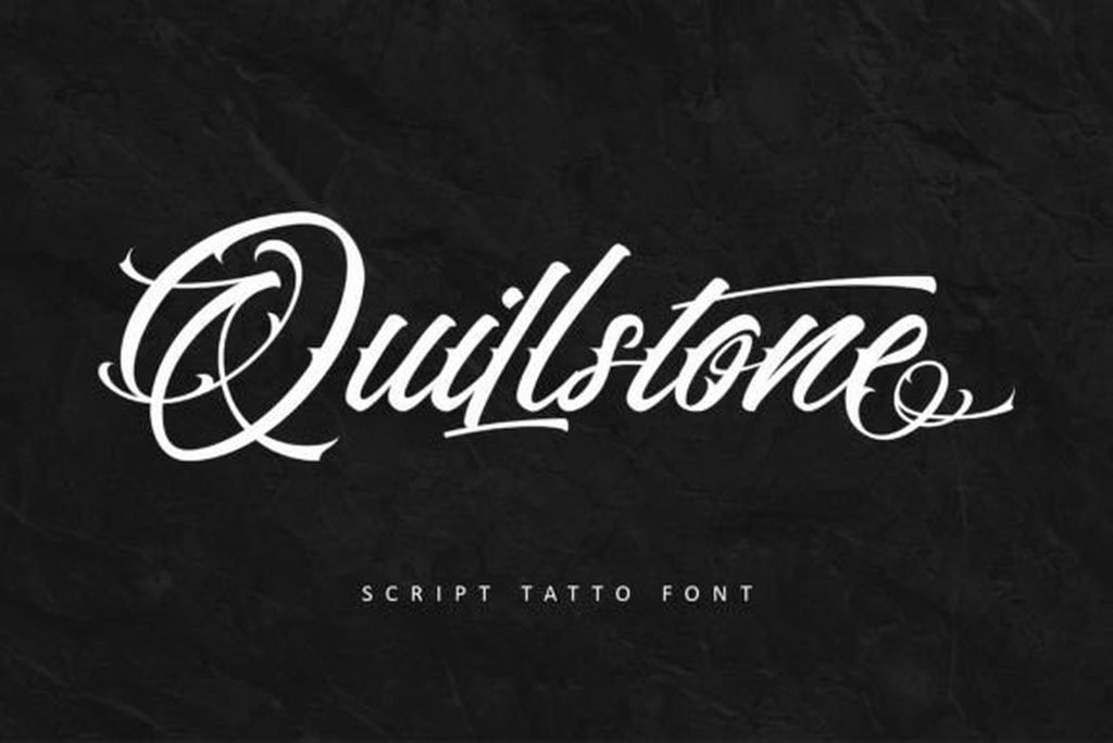
Best For: names, signature-style lettering, small studio logos
Quillstone keeps the body of the word restrained and puts all its personality into the exit stroke, which sweeps out from the final letter and curves back underneath. The rest of the letterforms are rounded and full, with even weight through the curves and only mild thinning on the upstrokes.
That structure is useful. Because the ornament lives at the end rather than on every letter, the word stays readable and still gets a finishing gesture. Set a name in it and the tail does the work a flourish is supposed to do: close the shape without crowding it.
Ornate Swash & Chicano Cursive Fonts
Heavy ornament, long flourishes, West Coast tattoo lettering and its descendants. Every font in this group needs horizontal room — decide the placement before you fall in love with the specimen.
6. Diablo Font
by Whymore
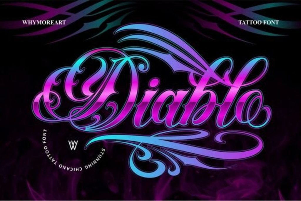
Best For: single statement words, chest and back pieces, streetwear graphics
Diablo is the extreme case on this list. The flourishes extend further than the word itself, fanning out on both sides in long tapering strokes that sweep above and below the letters. The letterforms underneath are pure Chicano script — sharp entry strokes, dramatic contrast, pointed terminals.
Treat the swashes as part of the composition, not as decoration you can trim. This is a font for one word placed in open space, where the tails have somewhere to travel. Crowd it and the whole effect collapses.
7. Loyalty Chicano Font
by Blankids Studio
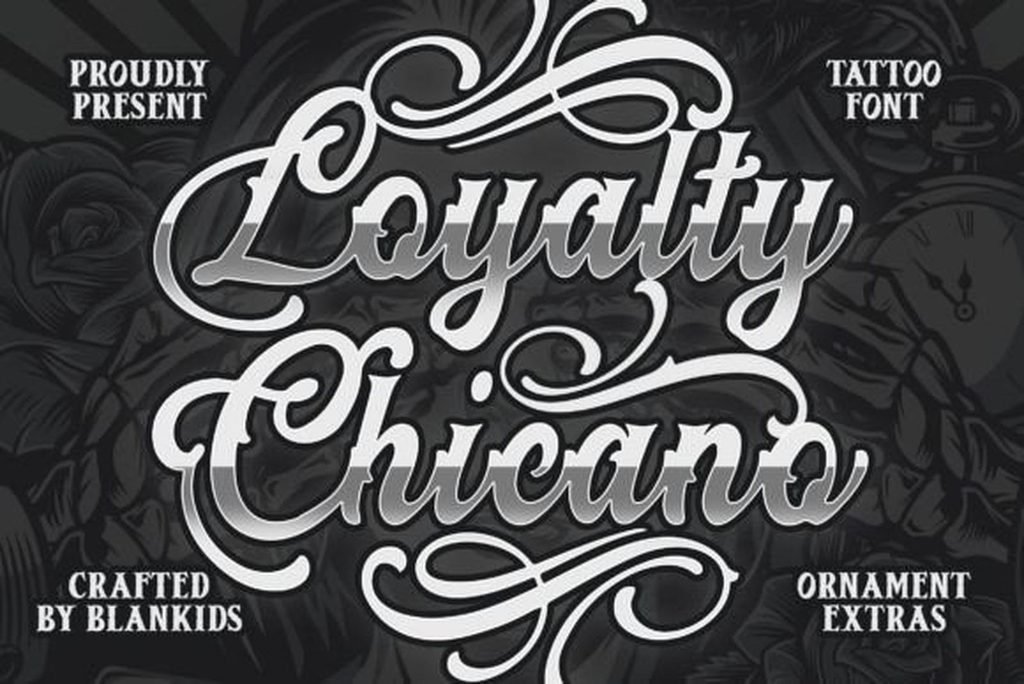
Best For: Chicano-style lettering, apparel graphics, barbershop and studio branding
Loyalty Chicano is the textbook version of the style. The letters are broad and confidently weighted, the capitals carry curled spurs, and the whole word sits with a slight backward lean that is characteristic of West Coast lettering rather than European script. The specimen shows it with a dimensional treatment on the strokes.
Ornament extras are bundled with it, which is the difference between a font and a kit. For flash sheets or apparel, having matching filigree drawn in the same hand saves the usual job of hunting for ornaments that do not clash with the type.
8. Marty Font
by mail.skygroup
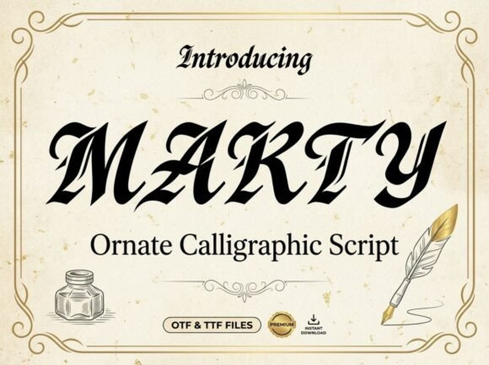
Best For: vintage-themed lettering, labels, single-word headlines
Marty leans older than the rest of this group. The specimen presents it as an ornate calligraphic script in a period frame, and the letterforms follow that brief: heavy, upright, with the kind of decorative spurs you see on nineteenth-century labels rather than on modern tattoo flash.
That makes it the pick when the reference is vintage signwriting rather than Chicano. It carries weight without the long tails the other fonts here rely on, so it needs less horizontal space than Diablo or Shatoryu. Available in OTF and TTF.
9. Bethinae Font
by Burntilldead
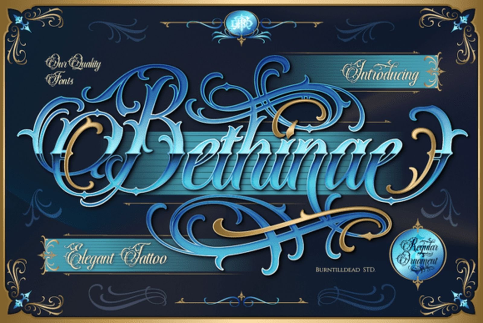
Best For: decorative name pieces, ornamental compositions, cover artwork
Bethinae is built for display. The capitals are elaborate constructions with interlocking loops, the lowercase carries fine hairline detail inside the strokes, and the specimen frames the word in matching ornaments. It is the most decorative interpretation of elegant tattoo lettering in this selection.
The detail is what you are buying and what you have to protect. Fine internal linework needs scale to survive, so this is a large-placement font or a design font rather than something for small script work. Set big, it does what nothing plainer can.
10. Shatoryu Font
by Denustudios
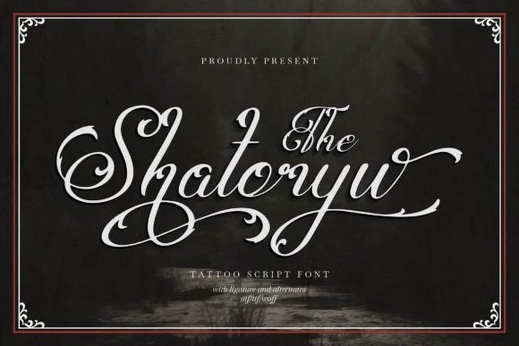
Best For: elaborate single words, ornamental lettering, poster and cover design
Shatoryu takes the opposite approach to Bionley from the same studio. Multiple loops spiral off each capital, the connecting strokes curl rather than run straight, and the word ends up half letterform and half ornament. The specimen sets it white on near-black with a decorative border, and it needs that much air.
Alternates and stylistic sets are included, which is what makes it usable rather than overwhelming. Set the word in the plain forms first, then bring in the elaborate capitals one at a time until the composition is balanced. Turning everything on at once is how this kind of font goes wrong.
Fine-Line & Delicate Cursive Fonts
Thin strokes, light weight, restrained ornament. This is where the current demand in cursive tattooing is running, and where the heavy scripts above have nothing to offer.
11. Royal Veins Font
by Denustudios
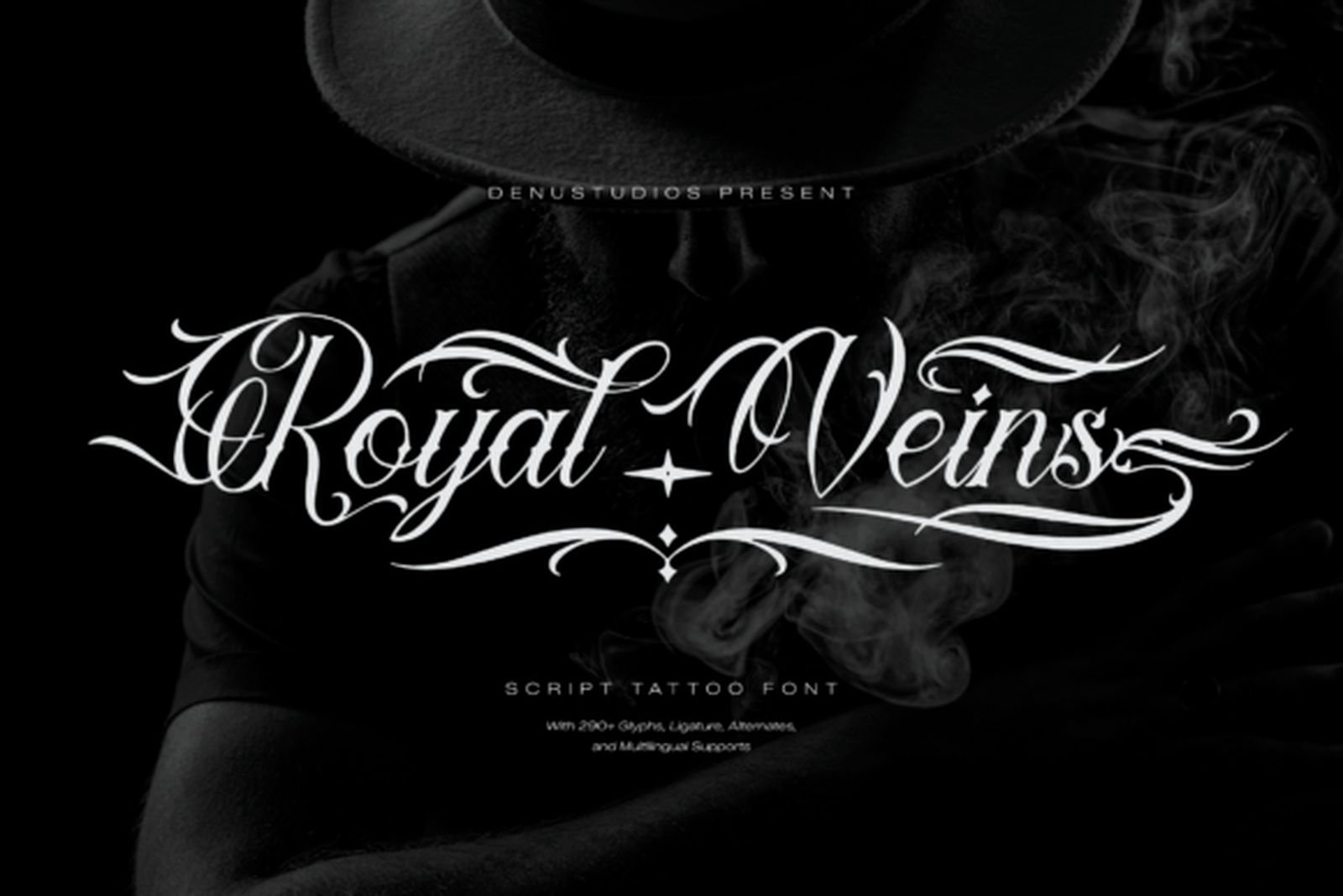
Best For: delicate name lettering, collarbone and rib placements, minimal branding
Royal Veins is thin throughout, with only slight swelling on the downstrokes and a long horizontal stroke that runs the full width of the word and finishes in a small ornament. The letterforms themselves are classical; the extended flourish is what gives the setting its shape.
That horizontal gesture suits placements that are wide and shallow — under a collarbone, along a rib, across a forearm. It is also the reason the font needs clean space above and below: the stroke has to read as a deliberate line, not as a stray mark.
12. Blacklover Font
by bilal.kadimi00
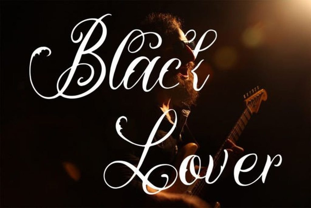
Best For: small script tattoos, single words, understated lettering
Blacklover is the lightest font in the collection. The stroke stays close to a single weight from start to finish, with almost no thick-to-thin modulation, and the loops are large and unhurried. Next to the Chicano scripts it looks like a different medium entirely.
Near-monoline construction is the honest trade-off of fine-line work. It gives the airy look clients ask for, and it is the construction most affected as ink settles, since there are no heavy strokes to carry the shape if the thin ones spread. Worth discussing with the artist before committing to a small size.
13. Under Your Skin Font
by Miss Tiina
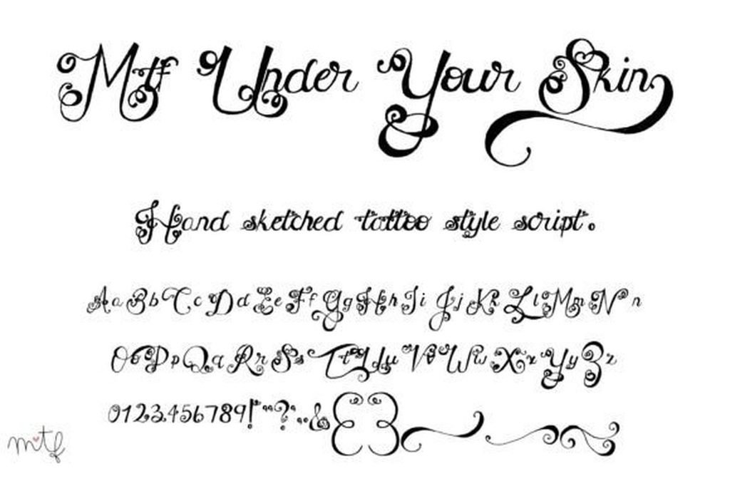
Best For: dates and numerals, small ornamental pieces, script with decorative extras
Under Your Skin pairs a fine, softly slanted script with a set of decorative swirls and flourishes shown alongside the alphabet. The letterforms are delicate without being fragile — the strokes thicken just enough through the curves to hold a shape.
The specimen also shows a full set of numerals, which is more useful than it sounds. Dates are one of the most common cursive tattoo requests, and plenty of script fonts treat their figures as an afterthought. Here they are drawn in the same hand as the letters.
14. Ningrat Font
by Whymore
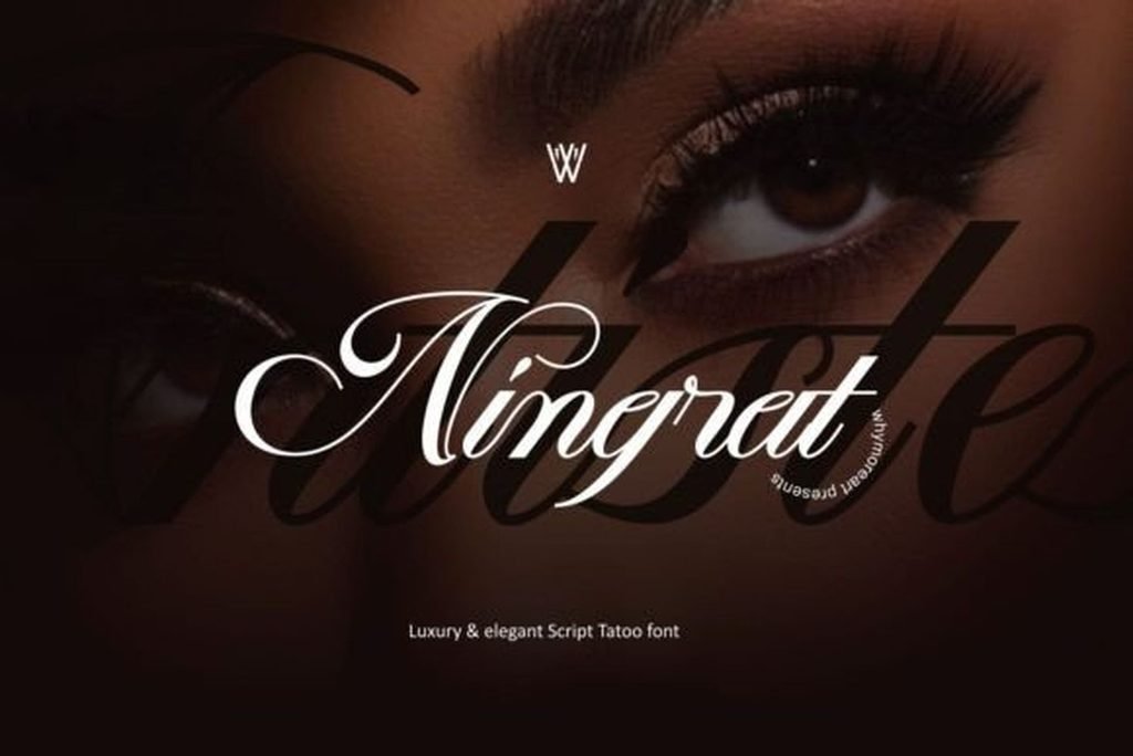
Best For: refined name pieces, luxury branding, fashion and editorial work
Ningrat is fine-line with a formal accent. The strokes are thin but clearly modulated, the slant is steep, and the capitals finish in tapering curls that stay tight to the letter rather than sweeping outward. The overall impression is closer to an engraved signature than to handwriting.
That restraint gives it a double life. On skin it reads as delicate script; on a logo or a label it reads as premium branding, with no tattoo signalling at all. Useful if the same lettering has to work for a studio identity and for the work it produces.
15. Makulcey Font
by madeDeduk
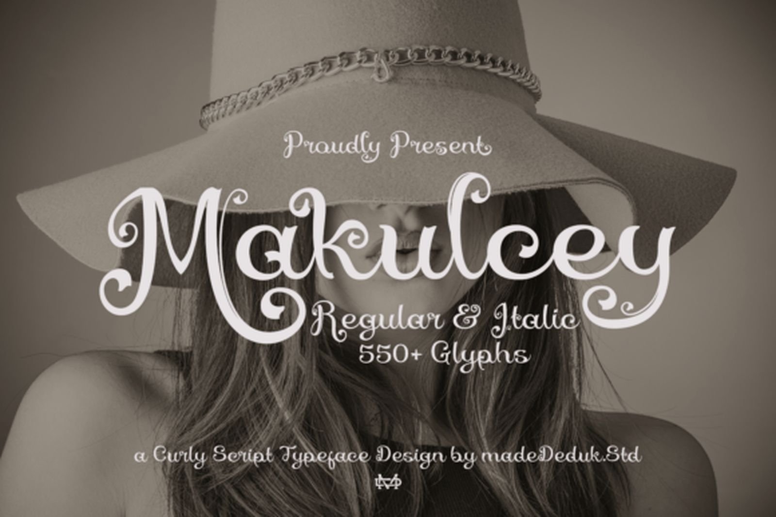
Best For: playful name lettering, quotes with movement, mixed-case designs
Makulcey is a curly script: the loops are rounder and more open than in the other fine-line options, and the ascenders and descenders curl back on themselves instead of running straight. It has more bounce along the baseline, which gives a phrase a hand-drawn irregularity.
Two things make it practical. It ships in Regular and Italic, so there is a second weight for emphasis without introducing a different typeface, and the character set runs to 550+ glyphs, which means alternates for most letters. For a name with repeated characters, that variety is what stops the repetition from showing.
Bold & Handwritten Cursive Fonts
Thick strokes and plain handwriting, from opposite directions. What these five share is that they do not depend on fine detail to work, which makes them the most forgiving group on the list.
16. Nostrad Font
by brightonexart
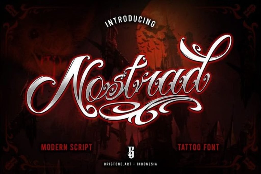
Best For: bold single words, apparel graphics, poster headlines
Nostrad is a modern script with real mass. The downstrokes are thick and squared at the ends, the contrast is sharp rather than gradual, and one long flourish extends from the final letter across the base of the word. It is loud without being ornamental.
The weight is the point: this holds its shape at sizes where the fine-line fonts above would disappear, and it stays legible against a busy background. If a design has other elements competing for attention, this is the script that will not get lost among them.
17. Fadli Script Font
by Mikrojihad Typefounder
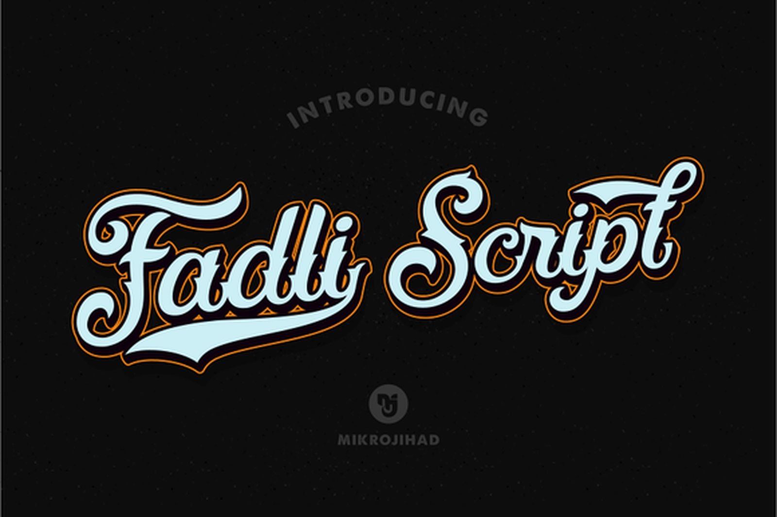
Best For: old-school flash, signage-style lettering, merchandise
Fadli Script comes from sign painting rather than tattoo flash, and the outline treatment in the specimen makes that lineage obvious. The letters are heavy and rounded, the slant is shallow, and the contour around each stroke adds a second layer of weight.
Outlined scripts are a specific tool. On a shirt or a poster the outline gives the word a clean edge against colour; as ink it translates into a bold script with a natural border. Either way it is a one-word face — the extra contour makes long settings heavy fast.
18. Heartbeat Font
by cans studio
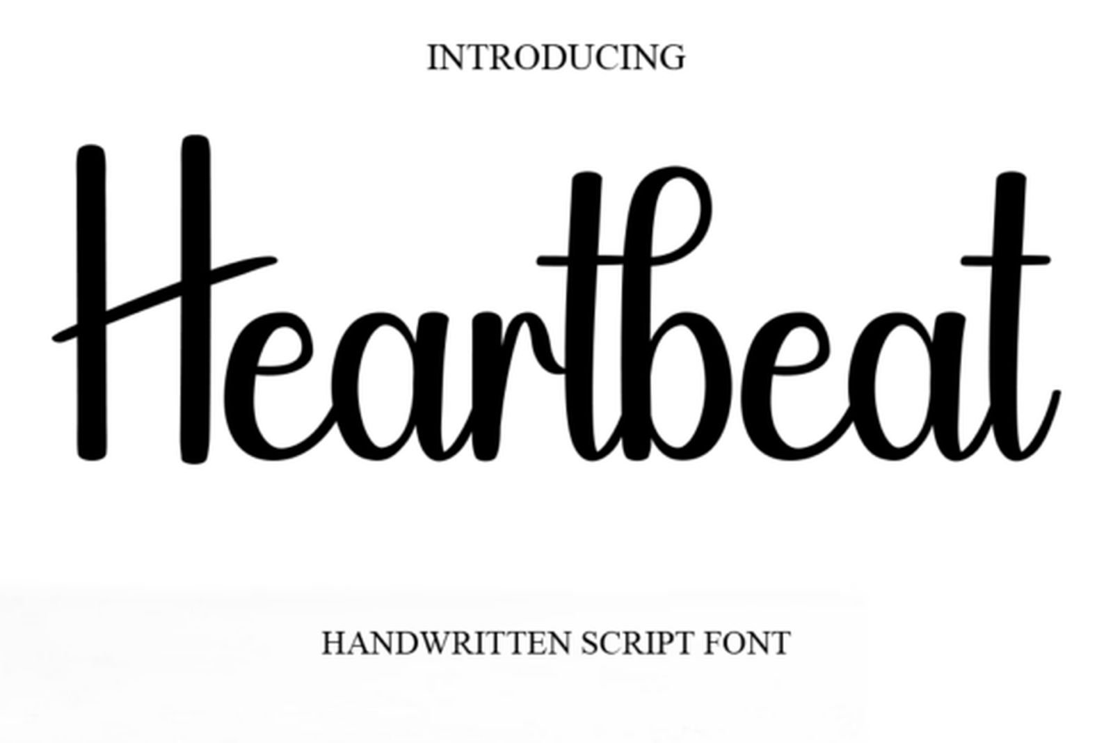
Best For: handwriting-style tattoos, personal quotes, minimal lettering
Heartbeat is the plainest font here and the deliberate opposite of the ornate group. No flourishes, no swashes, no decorative capitals — just an upright handwritten script with slightly uneven letter widths, the way real handwriting is uneven.
It fills a request the elaborate scripts cannot: lettering that looks written by a person rather than designed. For a quote that should read as if it came out of a notebook, the absence of styling is exactly the feature.
19. Floating Script Font
by Whymore
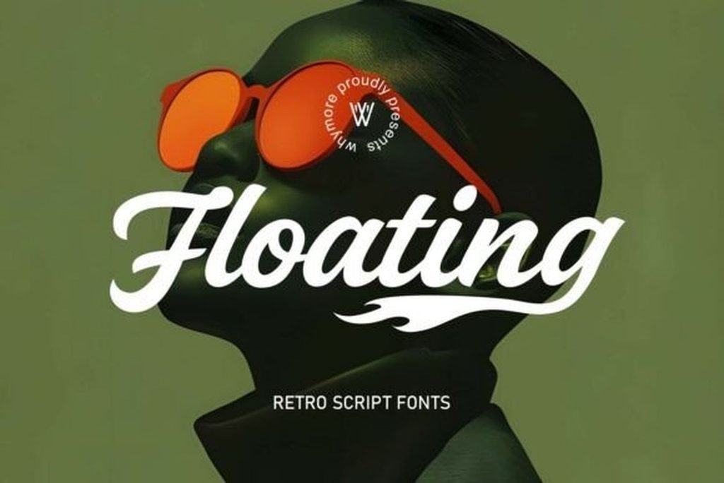
Best For: retro lettering, band and brand marks, vintage-styled designs
Floating Script is a retro script built on thick, smoothly curving strokes with rounded terminals. The connections are generous and the letters lean forward as a group, giving the word a continuous rolling motion rather than a series of separate shapes.
It reads mid-century rather than traditional tattoo, which is precisely why it is worth having on the shortlist. When a client wants script but the usual Chicano and blackletter references feel wrong for them, this is a different answer that still carries weight.
20. Lentamy Ebigail Font
by Denustudios
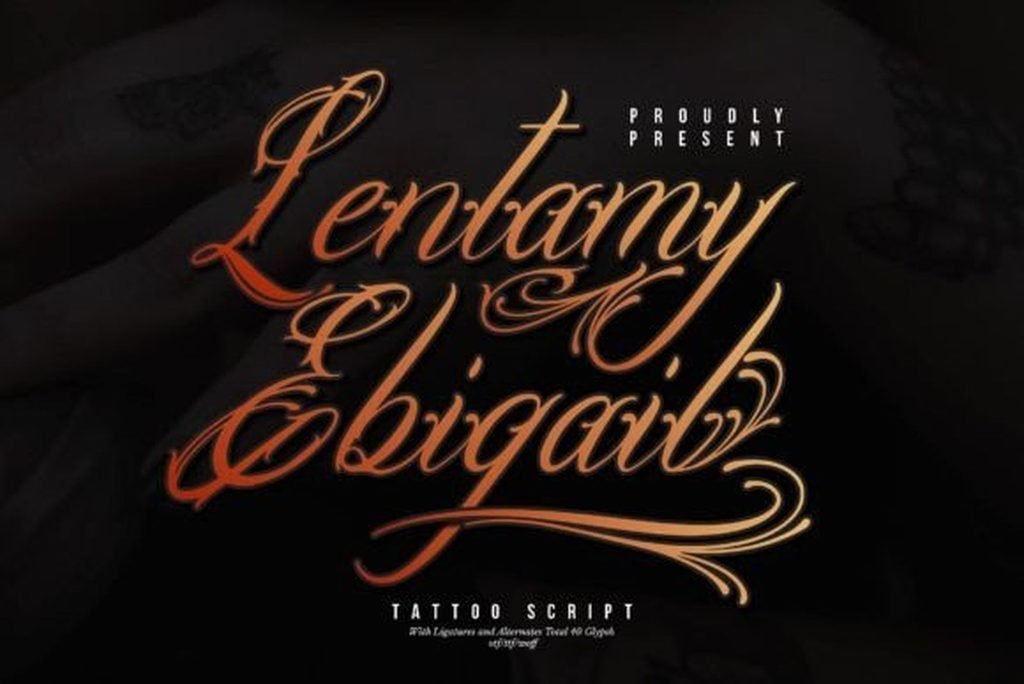
Best For: statement names, studio lettering, designs that need weight and flow
Lentamy Ebigail closes the list by bringing the two halves of it together. The stroke weight is closer to Nostrad than to anything in the fine-line group, but the tails and entry strokes are drawn with the sweep of the ornate scripts. Heavy body, flowing exits.
Ligatures and alternates are included, which matters more in a heavy script than a light one: thick letters collide at the joins far more readily, and having a second version of a problem character is often the difference between a clean setting and a compromise.
How to Choose a Cursive Tattoo Font
Count the words before anything else. One word can carry Diablo, Shatoryu or Bethinae. A full quote cannot — the flourishes start colliding with the line beneath. For anything longer than three words, start in the classic group and work outward.
Match the flourish to the space, not to your taste. Long horizontal swashes need width; tall ascenders need height. Measure the actual placement first, then shortlist the fonts whose ornament runs in the same direction as the available room.
Type the real text, not the specimen word. Product previews are set in words chosen to flatter the font. If the piece is a name, set that name. Capitals vary wildly in quality across ornamental scripts, and the one letter you need may be the weakest in the set.
Check the letters that repeat. Double letters are where a script exposes itself. If the font has no alternates, two identical shapes side by side will look mechanical in exactly the place a script is supposed to look handwritten.
Read the licence before client work. Personal ink is one thing; selling flash, merchandise or studio branding is commercial use. The terms are listed on each product page and they vary by designer.
FAQ
Which cursive fonts stay legible in a long quote?
The plain ones: Kinksane Font, Bionley Font and Heartbeat Font are built on even slants and short flourishes, so they keep working line after line. Ornate scripts are for single words.
How thin is too thin for a tattoo?
It depends on the placement and the artist, not on the font file. What you can judge from a specimen is construction: fonts with some contrast between thick and thin, like Ningrat Font, keep their shape better than near-monoline designs if the strokes spread. Ask the artist about the specific size.
Can I combine two of these in one piece?
Yes, if they come from different groups. A fine-line script for a date under a bold script name works. Two ornate scripts together compete, because both are trying to own the same space.
What are alternates and why do they matter here?
Alternates are extra versions of the same character. In cursive they let you vary repeated letters and swap a swash capital for a plain one, which is how a script setting avoids looking mechanical. Makulcey Font, Shatoryu Font and Lentamy Ebigail Font all include them.
Are these fonts free?
All twenty are on Creative Fabrica and covered by an All Access subscription. Individual licensing terms are on each product page.
Start With the Word Count
If the piece is a full quote, begin with Kinksane Font or Bionley Font and do not look further until they have failed. If it is one word with room around it, Diablo Font and Shatoryu Font are the most dramatic options here. For small and delicate, Royal Veins Font or Blacklover Font. For weight that has to hold on a busy design, Nostrad Font.
The common mistake with cursive is choosing from the specimen image, where every font is set in one flattering word with perfect spacing. Set your own text, at your own size, and most of the list will eliminate itself in a couple of minutes.