106 Serif Fonts for Logos, Branding and Print: Every Style in One Place
Serif fonts come in more moods than any other type style. The same small strokes at the ends of the letters can look romantic on…
Get free and premium fonts for tattoos, cards, weddings and branding — 260,000+ on Creative Fabrica. Get free fonts →
278,000+ fonts on Creative Fabrica. Explore fonts
Serif fonts for logos, branding, packaging, wedding stationery and editorial design: modern, elegant, bold, classic and slab styles, with notes on where each one works.
Read the full guide ↓
Serif fonts come in more moods than any other type style. The same small strokes at the ends of the letters can look romantic on…
Bold serif fonts combine the character of classic serifs with the weight of a headline font. They make logos look confident, posters impossible to miss…
Elegant serif fonts are the quiet luxury of typography. Fine hairlines, careful contrast and graceful curves can make a wedding invitation feel special, a skincare…
Serif fonts are the oldest family in typography and still the most versatile. The small strokes at the ends of the letters can make a…
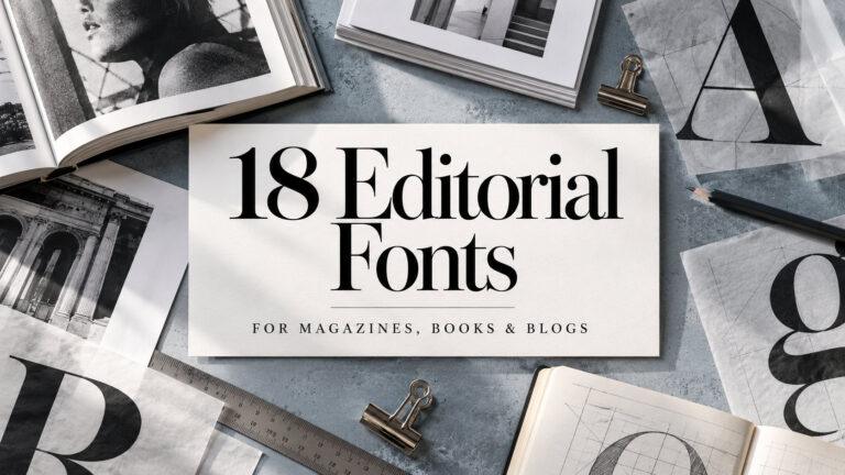
Editorial fonts do the quiet work of publishing. They set the tone of a magazine spread, carry a novel for three hundred pages and make…
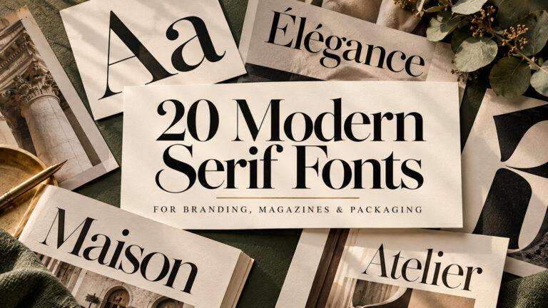
Modern serif fonts sit where classic book typography meets fashion-magazine polish: sharp contrast between thick and thin strokes, fine serifs, and letters that look confident…
Serif fonts have small strokes at the ends of their letters, and those little details change the whole mood of a design. A high-contrast modern serif looks like a fashion magazine. A soft elegant serif feels like a wedding invitation or a skincare label. A heavy bold serif shouts from a poster or a coffee bag, and a calm book serif makes long text easy to read for pages on end.
The collections in this category are sorted by those moods and jobs: a big all-style collection, the best serifs for small brands, modern serifs for brand identity, elegant serifs for weddings and beauty brands, bold serifs for logos and vintage packaging, and editorial serifs for magazines and books.
Quick check: type your brand name or title in the font preview, then a full sentence underneath. A good serif for your project looks right in the big line and still reads comfortably in the small one, or clearly tells you it’s meant only for headlines.
| Style | Best For | What To Check |
|---|---|---|
| Modern high-contrast serif | Brand identity, fashion and beauty logos, premium packaging | Hairline strokes survive at small sizes and in print |
| Elegant serif | Wedding invitations, beauty brands, luxury labels | Delicate details don’t disappear on textured paper |
| Bold serif | Logos, posters, vintage packaging | Heavy letters keep their inner spaces open |
| Classic and book serif | Body text, books, long-form print | Comfortable reading in a full paragraph |
| Slab serif | Signs, labels, sturdy and friendly brands | Block serifs don’t crowd neighbouring letters |
| Editorial serif | Magazines, blogs, content-rich brands | The family has weights for both headlines and text |
To see every serif style in one place, start with the big collection for logos, branding and print.
106 Serif Fonts for Logos, Branding & Print
For a short list of strong picks for small brands and creators, look at the best serifs sorted into premium elegant, classic, bold and slab styles.
29 Best Serif Fonts for Brands: Premium Elegant to Slab
For brand identity, logos and premium packaging, pick modern serifs with sharp contrast.
20 Modern Serif Fonts for Branding, Logos & Packaging
For wedding invitations, beauty brands and luxury labels, go for elegant serifs with fine hairlines.
14 Elegant Serif Fonts for Weddings & Beauty Brands
For logos, posters and vintage packaging that need weight, choose bold serifs.
25 Bold Serif Fonts for Logos, Posters & Packaging
For magazine layouts, books and blogs, look at editorial serifs made for headlines and long text.
18 Editorial Fonts for Magazine & Book Design
Logos and brand identity need a serif that stays clear on a business card, a website header and a shop sign alike.
Packaging and labels are printed small and on many materials, so check thin strokes on kraft paper, glass and foil.
Wedding and event stationery often pairs an elegant serif for details with a script for names.
Books, magazines and blogs need a serif built for reading, with enough weights for headings, quotes and body text.
| Term | What It Means | Where It Shows Up |
|---|---|---|
| Serif | A small stroke at the end of a letter’s main lines | Every serif font |
| Contrast | The difference between the thick and thin strokes | Modern and elegant serifs |
| Hairline | The thinnest stroke in a letter | Fashion, beauty and wedding designs |
| Slab serif | A serif with thick, block-shaped serifs | Signs, labels, posters |
| Font family | A set of weights and styles of the same design | Branding, editorial layouts |
Using a high-contrast display serif for body text. Fine hairlines that look stunning in a headline become tiring and faint in a paragraph.
Printing delicate serifs too small. On labels and tags, thin strokes can break up or disappear entirely.
Pairing two similar serifs. Two serifs that look almost alike read as a mistake. Pair a serif with a sans or a script instead.
Choosing a font with only one weight for a brand. A brand usually needs at least a regular and a bold, and often an italic.
Tip: choose the serif by mood first, modern, elegant, bold or classic, and only then compare individual fonts within that mood.
A serif font has small strokes, called serifs, at the ends of the main lines of its letters. They give the text a more traditional, refined or bookish look compared with sans serif fonts.
Yes. Modern and elegant serifs suit beauty, fashion and premium brands, while bold and slab serifs work well for food, coffee and vintage-style brands. Test the logo at small sizes too.
Modern serifs have strong contrast between thick and thin strokes and a sharp, polished look. Classic serifs are calmer and more even, which makes them easier to read in longer text.
Elegant serifs with fine hairlines work well for dates, venue and details, often paired with a script for the couple’s names.
Yes. Editorial serifs made for reading work well for headlines and articles. Very high-contrast display serifs are better kept for headings only.