29 Best Serif Fonts for Small Brands and Creators: Premium Elegant, Classic, Bold and Slab Styles
Serif fonts are the oldest family in typography and still the most versatile. The small strokes at the ends of the letters can make a design look elegant, bookish, bold or rugged, depending on how they are drawn. That is why the same category covers a wedding invitation, a novel, a retro poster and a coffee bag.
This post contains affiliate links. If you buy through them, I may earn a small commission at no extra cost to you.
This collection brings together 29 premium serif fonts from Fontspring for small brands and creators, grouped into four styles: elegant serif fonts, classic serif fonts, bold serif fonts and slab serif fonts. Each entry describes how the letters look, where they work best and how to use them.
All fonts in this list are premium fonts on Fontspring. Each family page shows every style, its price and the licence options, so you can check what your project needs before you buy. Museo Slab Font also includes free styles to test first.
More serif font collections:
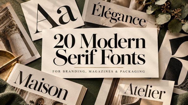
20 Modern Serif Fonts for Brand Identity, Magazine Layouts and Premium Packaging
18 Editorial Fonts for Magazine Layouts, Book Design and Content-Rich Brands
In This Collection
Elegant Serif Fonts for Weddings, Beauty and Luxury Brands
- 1. Lust Font
- 2. Joane Font
- 3. Vincente Font
- 4. Fiorina Grande Font
- 5. Dear Ivy Font
- 6. Walbaum Original Pro Font
- 7. Kitsch Font
- 8. Mirador Font
Classic Serif Fonts for Books, Menus and Timeless Branding
- 9. Arno Pro Font
- 10. Adobe Jenson Pro Font
- 11. Goudy Oldstyle FS Font
- 12. Century Schoolbook Pro Font
- 13. Clearface FS Font
- 14. Cheltenham FS Font
- 15. Roos Font
- 16. Juana Font
Bold Serif Fonts for Headlines, Posters and Retro Packaging
- 17. Moranga Font
- 18. Bogart Font
- 19. Perfectly Nineties Font
- 20. Palmore Font
- 21. Encorpada Pro Font
- 22. Spirits Font
- 23. Mixta Font
Slab Serif Fonts for Labels, Cafés and Craft Brands
- 24. Museo Slab Font
- 25. Sagona Font
- 26. Chaparral Pro Font
- 27. Super Clarendon Font
- 28. Sanchez Font
- 29. Brix Slab Font
Elegant Serif Fonts for Weddings, Beauty and Luxury Brands
Elegant serif fonts rely on contrast, fine hairlines and careful spacing. These premium fonts suit wedding stationery, beauty packaging and fashion headlines, where the letters themselves should look expensive and considered.
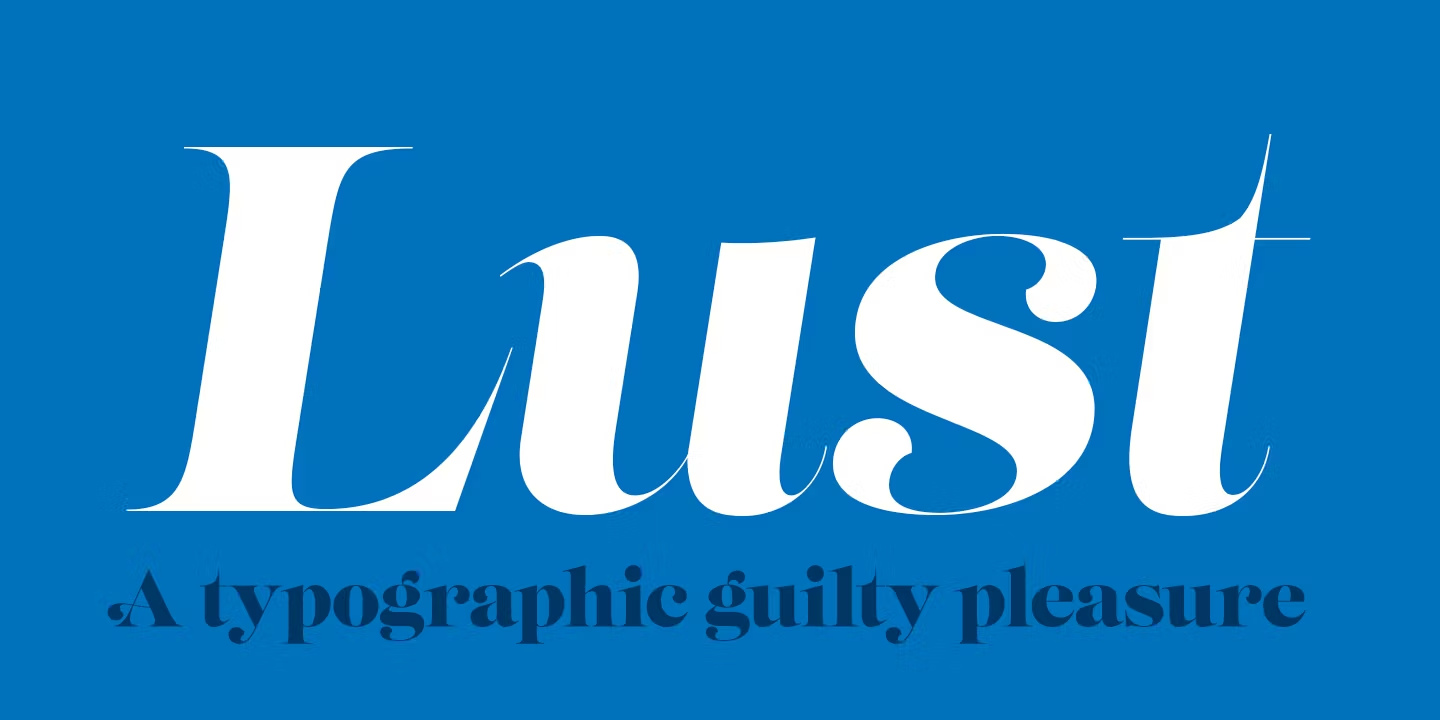
1. Lust Font by Neil Summerour
Best For: fashion headlines, beauty packaging, magazine covers, boutique logos
Lust Font pushes contrast to the edge: heavy, curving main strokes against hairline serifs, with sharp terminals that give every letter a little drama. In the preview the word sets tight and confident, like a cover line.
The family has six styles, so it is a display face first. Give it size and space at the top of a layout, and let a quiet sans serif carry prices, ingredients or body text underneath.
2. Joane Font by Ale Navarro
Best For: art deco invitations, cocktail menus, gold foil stationery, luxury event branding
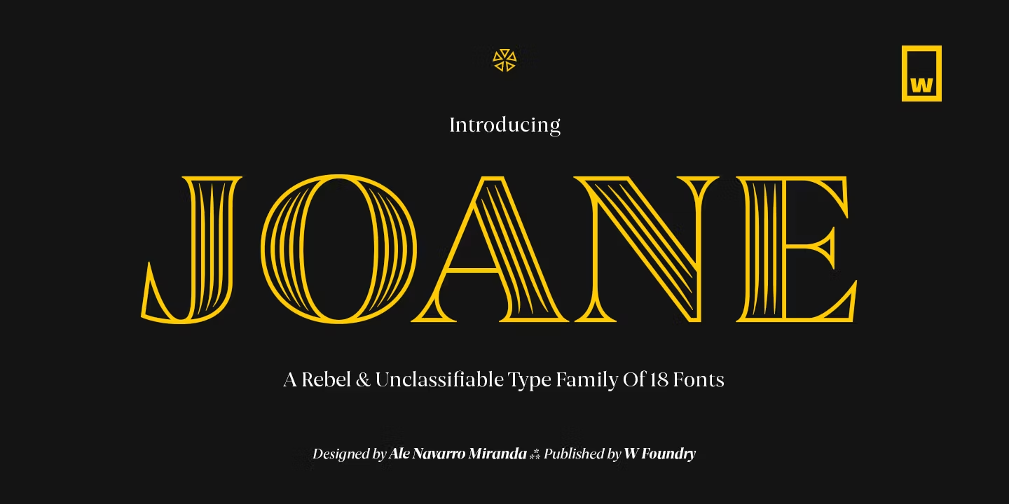
Joane Font is the most ornamental design in this group. The preview shows tall capitals with parallel inline strokes running through them, a clear nod to art deco lettering and engraved signage.
It is a family of 18 styles, which lets you move from the decorated inline cuts to plainer ones inside the same design. Use the inline capitals for short words, names and titles, and print them in gold or on dark paper, where the fine lines really show.
3. Vincente Font by Ryoichi Tsunekawa
Best For: perfume and wine labels, narrow posters, book covers, tall packaging
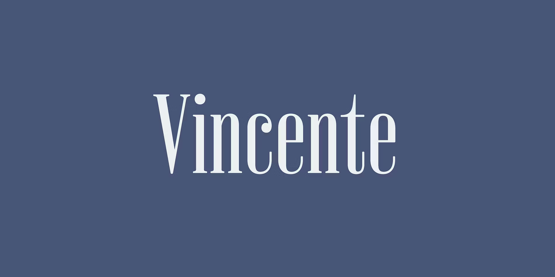
Vincente Font is tall, narrow and high in contrast, with thin hairlines and vertical stress. Long words fit into a slim column without losing their polish.
With six styles, it works best for headings and short lines. It is a smart choice when a label or a spine gives you height but very little width.
4. Fiorina Grande Font by Andriy Konstantynov
Best For: wedding stationery, beauty brands, editorial headings, packaging titles
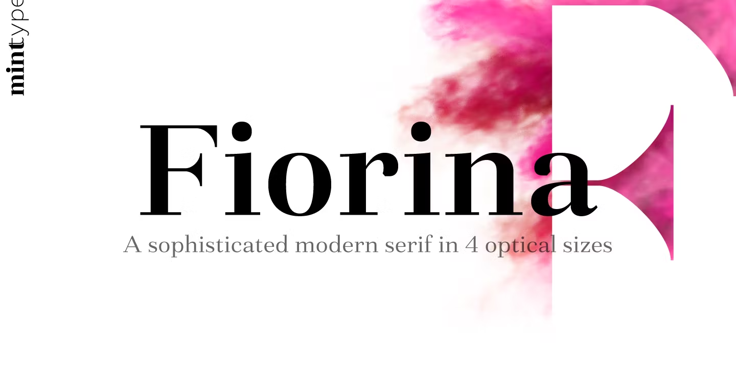
Fiorina Grande Font is a sophisticated modern serif with crisp contrast and generous, rounded bowls. The preview calls it part of a family built in four optical sizes, and Grande is the cut made for large display settings.
This page has 18 styles. Use Grande for names, headlines and packaging titles; for smaller text, the other Fiorina sizes on Fontspring keep the same look at reading size.
5. Dear Ivy Font by Max Duy T.
Best For: minimalist invitations, boutique logos, fashion and lifestyle social graphics
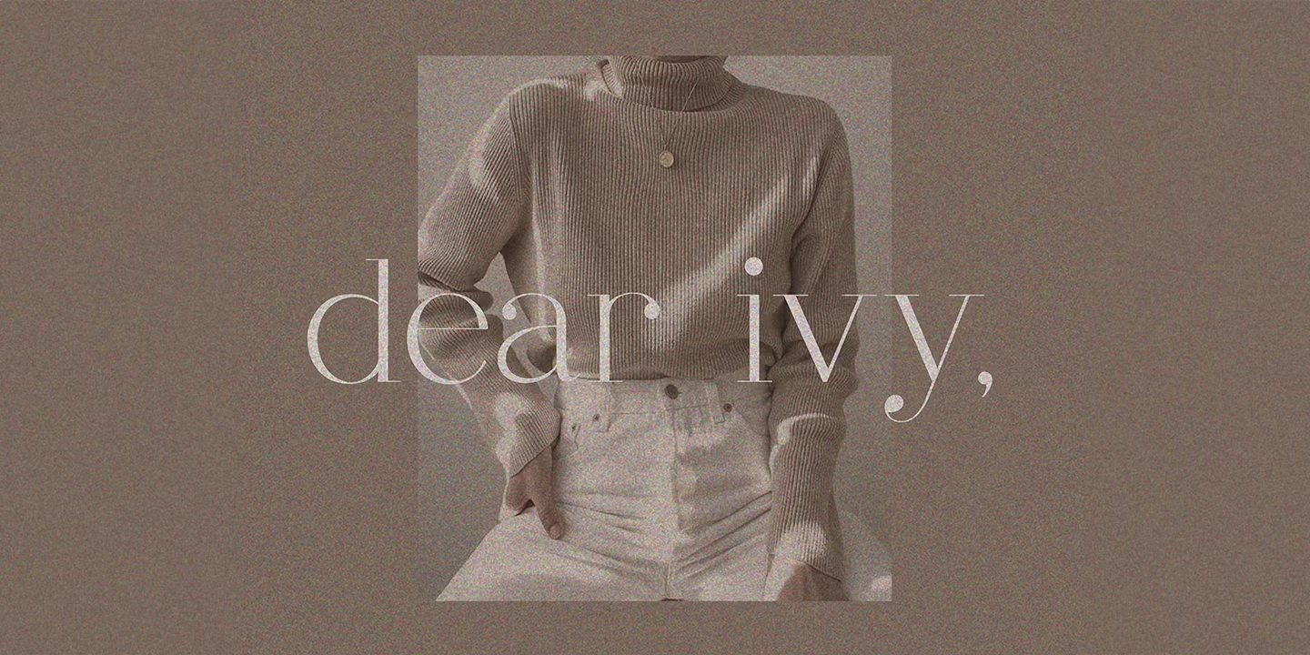
Dear Ivy Font is light and airy, with thin strokes, delicate serifs and wide spacing. In the preview the lowercase sits softly over a photograph, calm rather than loud.
It is a single-style font, so treat it as a finishing touch: a brand name, a monogram line or a headline on a quiet background. Set it large, because the hairlines disappear at small sizes.
6. Walbaum Original Pro Font by SoftMaker
Best For: formal invitations, certificates, classic labels, heritage branding
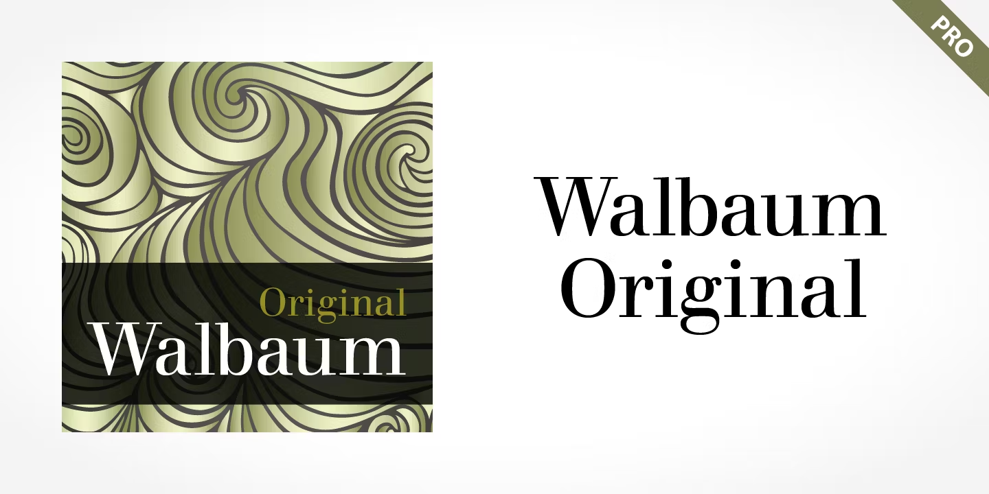
Walbaum Original Pro Font has the crisp vertical stress and strong thick-thin contrast of a classical didone, with a slightly gentler, more readable rhythm than the sharpest fashion serifs.
The family has six styles, enough for a title, a subtitle and an italic. It suits paper goods and branding that should feel formal and established rather than trendy.
7. Kitsch Font by Zetafonts
Best For: fashion editorials, gallery posters, boutique branding, book covers
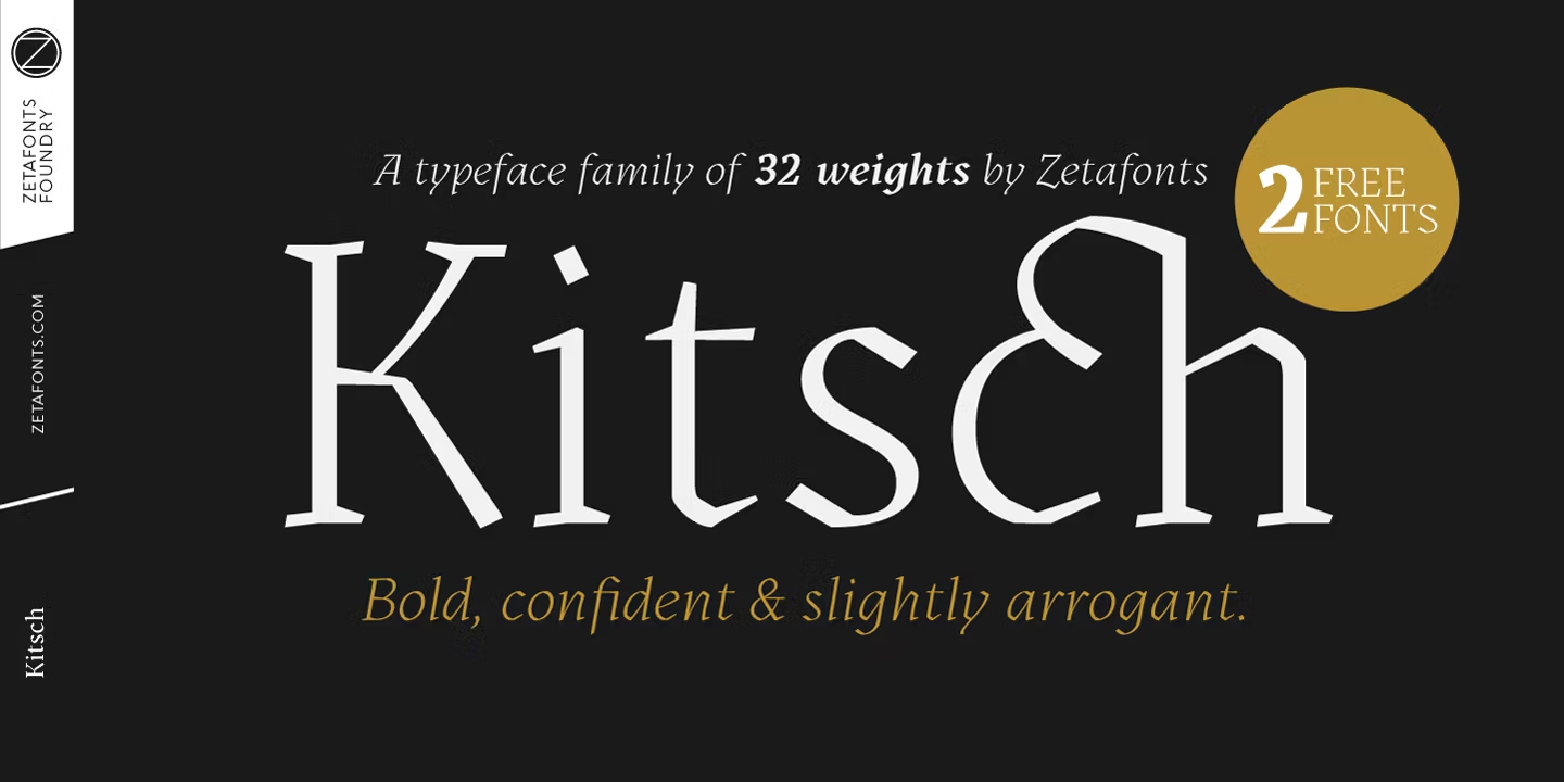
Kitsch Font is shown in a light, sharp weight with pointed serifs and an unusual joined ch, the kind of detail that makes a short title memorable. The preview describes it as bold, confident and slightly arrogant, and that is a fair summary of its attitude.
The preview mentions 32 weights, so the same design runs from delicate headlines to heavy display. Pick one weight for the headline and one for the subheading and let the quirky letters do the rest.
8. Mirador Font by René Bieder
Best For: wedding stationery, hotel and restaurant branding, elegant packaging
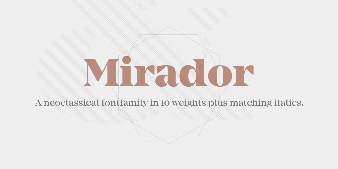
Mirador Font is a neoclassical serif with balanced contrast and calm, wide proportions. In the preview it looks refined without being fragile, which makes it easier to use than most high-contrast serifs.
The preview lists 10 weights with matching italics. That range lets one family cover a wedding suite from the couple’s names to the small print on the RSVP card.
Classic Serif Fonts for Books, Menus and Timeless Branding
Classic serif fonts come from centuries of book and newspaper printing. They are readable, warm and trustworthy, and they rarely go out of style, which makes them a solid base for a long-lasting brand.
9. Arno Pro Font by Robert Slimbach
Best For: books, wine lists, museum and gallery print, long-form reading
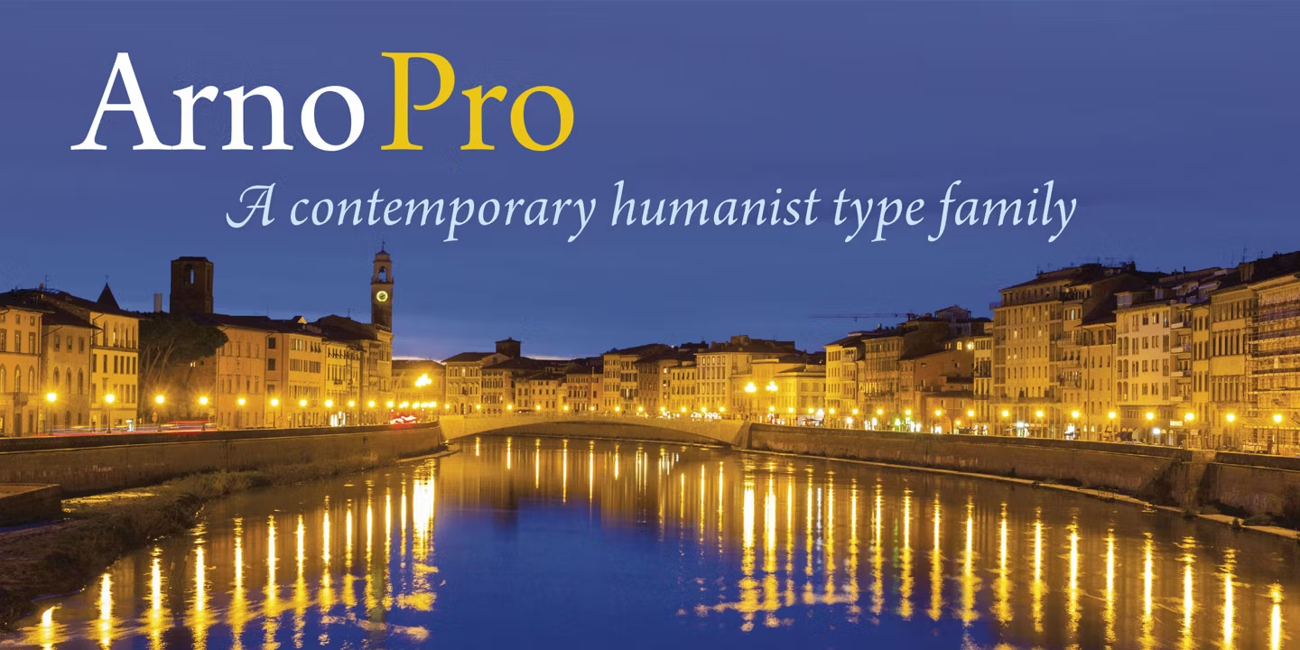
Arno Pro Font is a humanist serif with warm, calligraphic roots. The capitals are dignified, and the italic in the preview is lively and clearly written by a pen rather than drawn with a ruler.
With 32 styles, it covers everything from long paragraphs to small captions. It is a safe, classic choice for any printed piece that people will actually read from start to finish.
10. Adobe Jenson Pro Font by Robert Slimbach
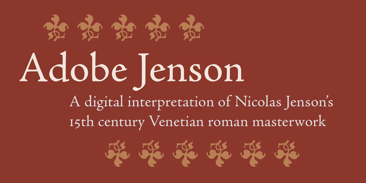
Best For: literary books, historical projects, classic invitations, museum labels
Adobe Jenson Pro Font is, as the preview says, a digital interpretation of Nicolas Jenson’s 15th-century Venetian roman. The letters have low contrast, sturdy serifs and a warm, handmade feel.
The family has 32 styles. It brings an old-world, bookish tone to a page, so pair it with plenty of margin and avoid mixing it with sharp modern display fonts.
11. Goudy Oldstyle FS Font by FontSite Inc.
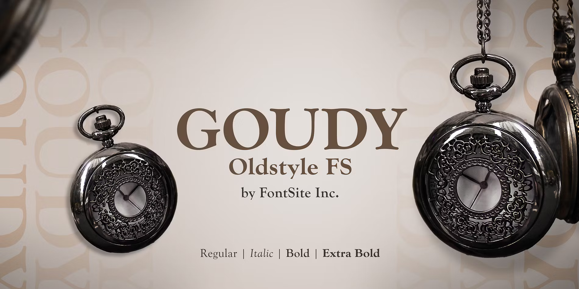
Best For: vintage labels, antique shop signs, heritage menus, classic book covers
Goudy Oldstyle FS Font has warm, slightly quirky old-style capitals with small, bracketed serifs. It looks traditional in a friendly way rather than a stiff one.
The preview lists four styles: Regular, Italic, Bold and Extra Bold. The Extra Bold is useful for signs and labels, where the design needs to be read from a distance.
12. Century Schoolbook Pro Font by Morris Fuller Benton
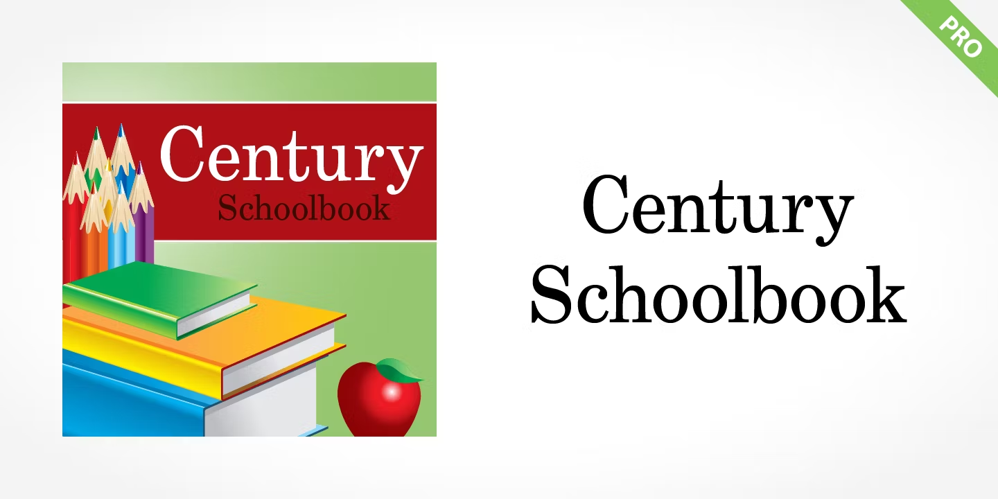
Best For: children’s books, worksheets, teacher printables, clear signage
Century Schoolbook Pro Font is open, sturdy and very clear, with generous letter shapes and firm serifs. It is the classic schoolbook look, and the preview leans into that with books, pencils and an apple.
The family has four styles. Choose it when legibility matters more than style: learning materials, instructions, printed forms and anything a young reader has to follow.
13. Clearface FS Font by FontSite Inc.
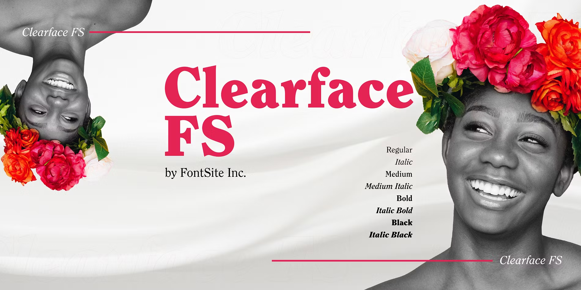
Best For: magazine headlines, vintage-inspired branding, café and bakery signage
Clearface FS Font has soft, rounded serifs and short, weighty strokes that feel friendly even in the boldest cuts. The preview shows the bold weight in bright pink, and it looks warm rather than heavy.
The preview lists eight styles, from Regular to Black Italic. The heavier weights are made for headlines; pair them with a simple sans serif for menus and descriptions.
14. Cheltenham FS Font by FontSite Inc.
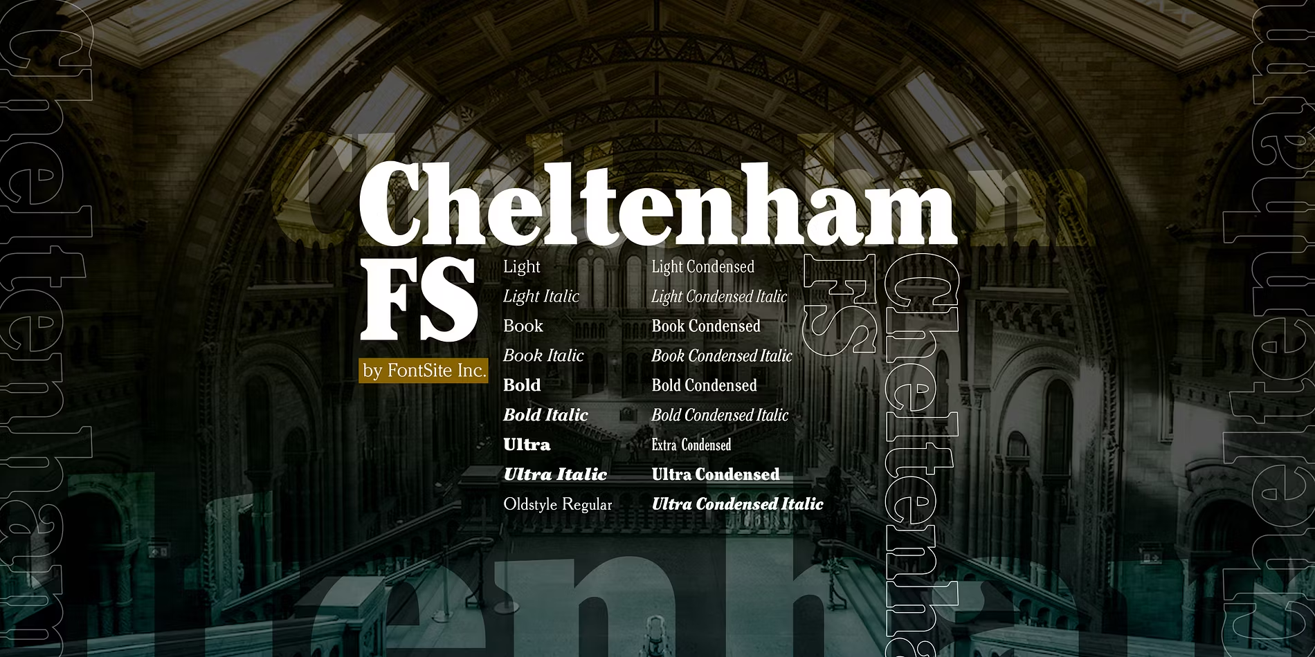
Best For: newspaper-style headlines, event posters, bookish brands
Cheltenham FS Font has tall ascenders, small serifs and a sturdy, slightly condensed build. It reads as classic newspaper and book typography with a practical, no-nonsense feel.
The family has 18 styles, and the preview includes condensed and extra-condensed cuts. Those narrow versions help when a long headline needs to fit a tight space.
15. Roos Font by Canada Type
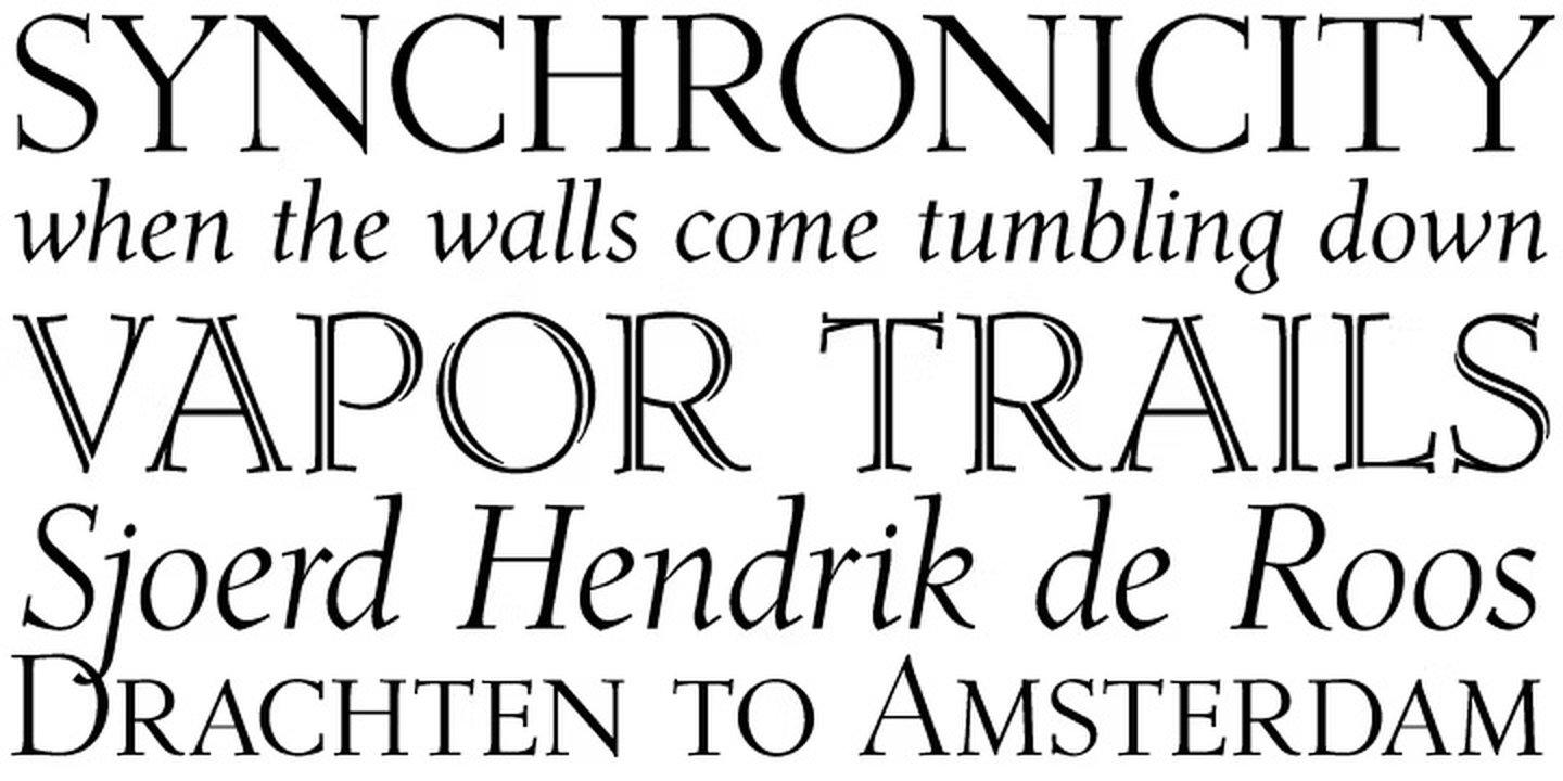
Best For: literary covers, formal invitations, heritage branding, bookplates
Roos Font is light and graceful, with elegant capitals and a flowing italic. The preview also shows small caps, which give headings and names a refined, bookish touch.
The family has ten styles. It works well when you want a classic serif with a little more grace than a standard text face, for example on a book cover or a formal card.
16. Juana Font by Eli Hernández
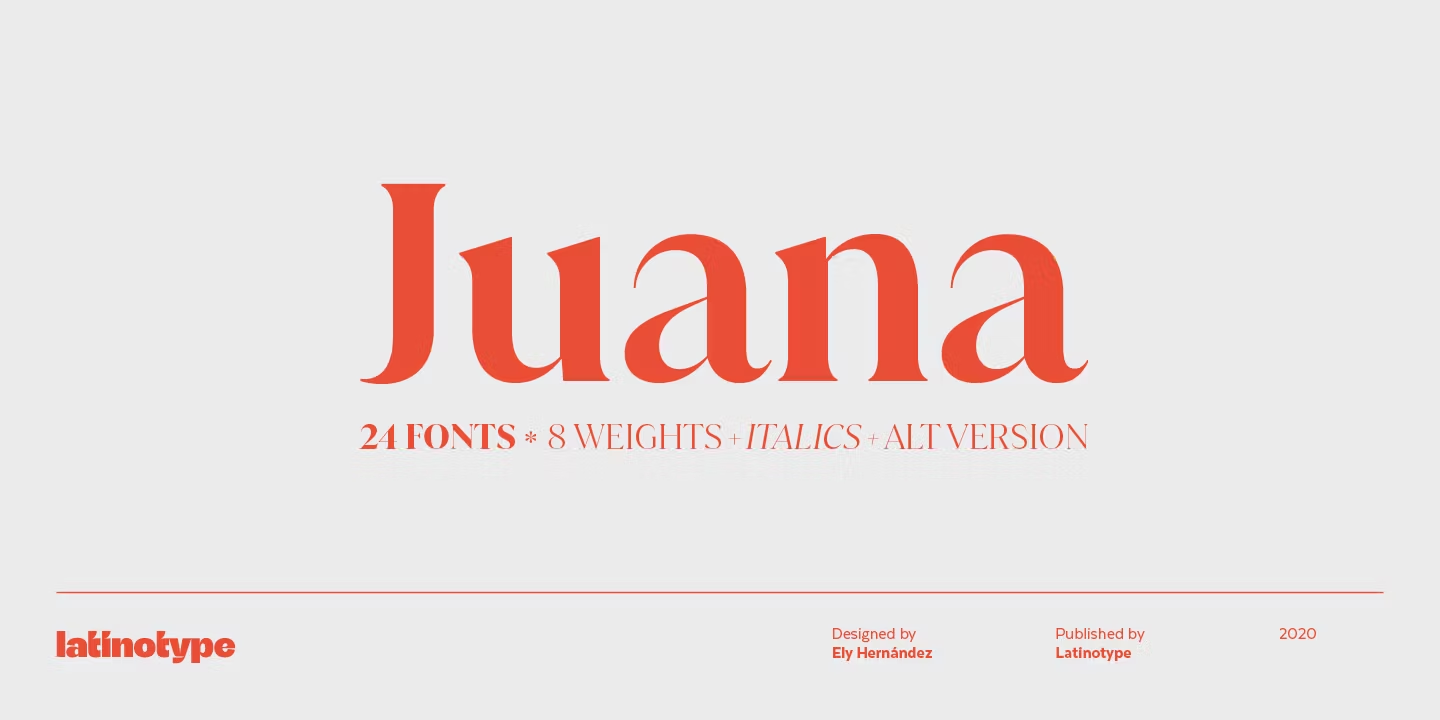
Best For: bakery and florist branding, cookbook covers, lifestyle blogs, product labels
Juana Font has softly bracketed serifs and round, generous curves that make it look warm and approachable. It feels classic but not old-fashioned.
The preview lists 24 fonts in eight weights with italics and an alternate version. That range makes it flexible enough for a whole small-brand identity, from the logo to the price tags.
Bold Serif Fonts for Headlines, Posters and Retro Packaging
Bold serif fonts carry a design on their own. Heavy weights, soft or flared serifs and a touch of retro character make them ideal for posters, packaging and social media headlines.
17. Moranga Font by Sofia Mohr
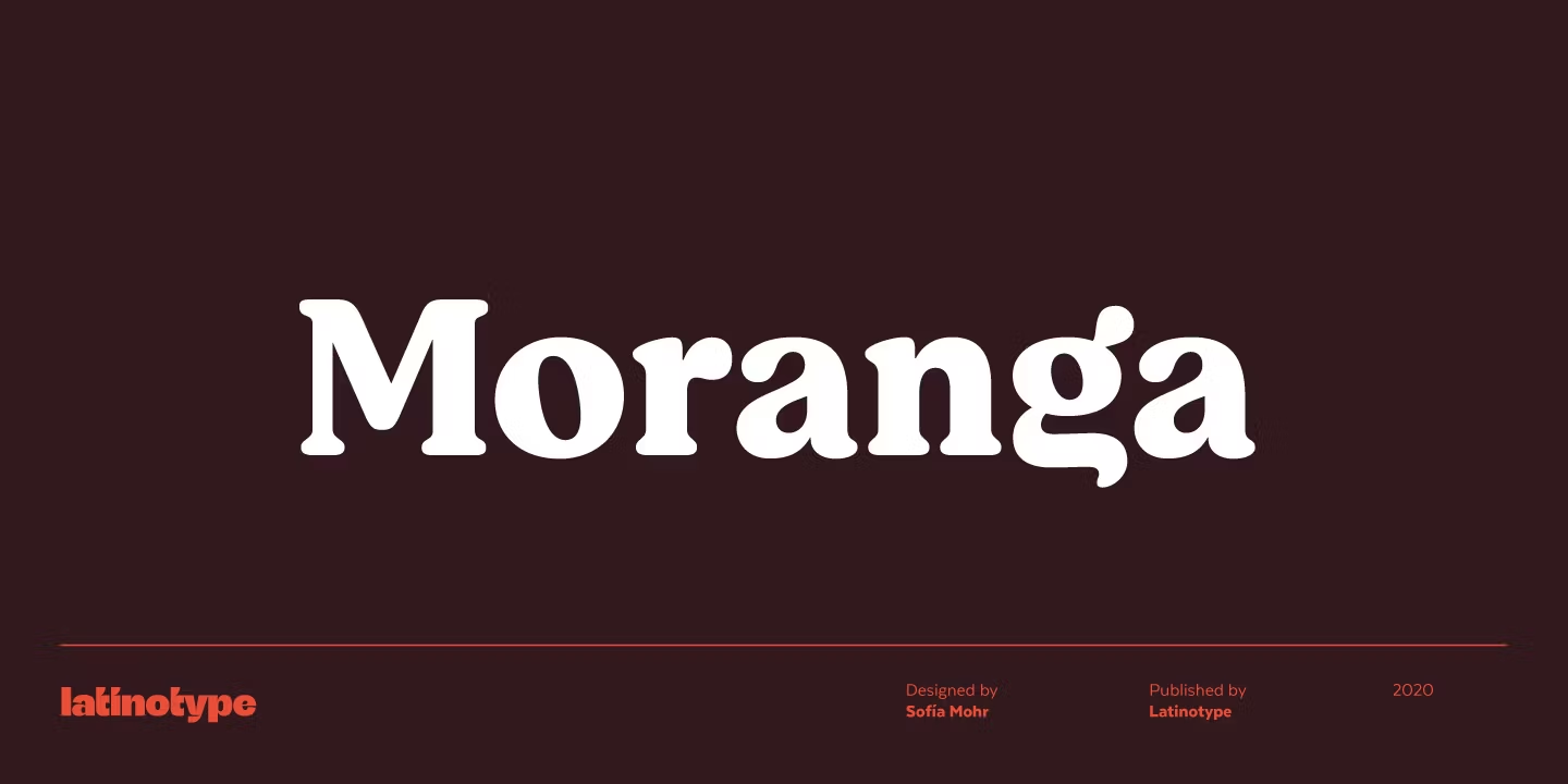
Best For: café and food packaging, bold social media graphics, retro-inspired branding
Moranga Font is heavy, compact and soft, with rounded serifs that give it a warm 1970s flavour. Even in the boldest weight it looks friendly rather than aggressive.
Use it large on packaging, menus and headline graphics, and pair it with a clean sans serif for the smaller text. It pulls a lot of warmth into a design with just one or two words.
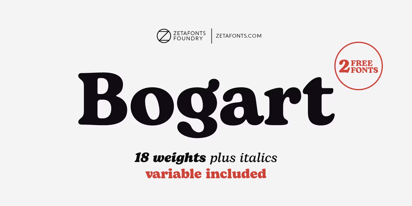
18. Bogart Font by Zetafonts
Best For: retro packaging, candle and soap labels, headline posters
Bogart Font has heavy, ball-like curves and rounded serifs that make every word look plump and confident. The preview shows it in black, and the shapes are strong enough to hold a poster by themselves.
The preview lists 18 weights plus italics and a variable version, so the design also works in lighter cuts for subheadings. It suits brands with a retro, playful personality.
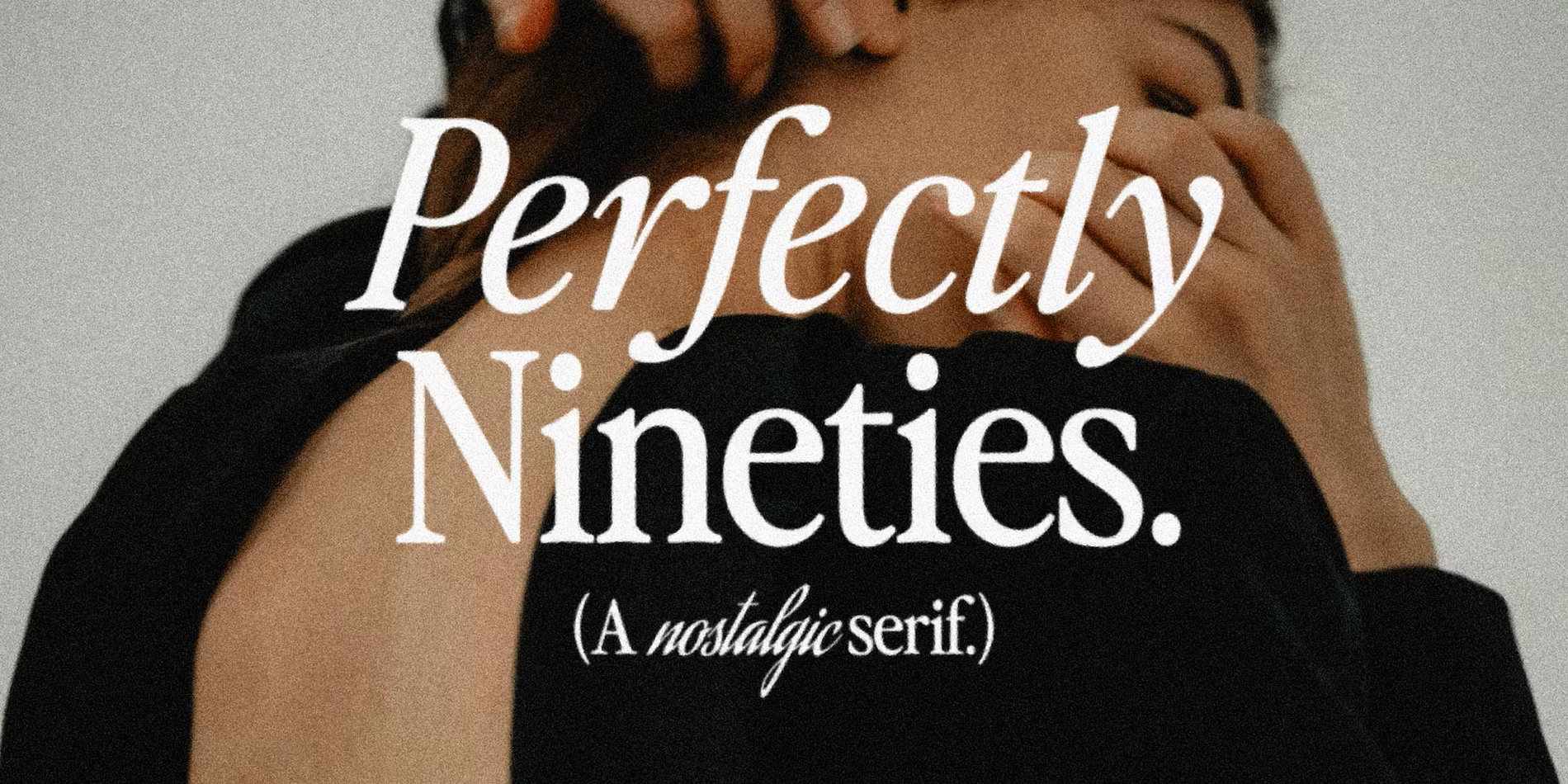
19. Perfectly Nineties Font by Jen Wagner Co
Best For: fashion posters, album covers, quote graphics, lifestyle branding
Perfectly Nineties Font is a nostalgic serif with a characterful italic. In the preview the italic line has a calligraphic swing, while the upright line stays clean and slightly condensed.
The family has two styles, an upright and an italic, and that pairing is the point: mix them in one headline for an instant editorial look.
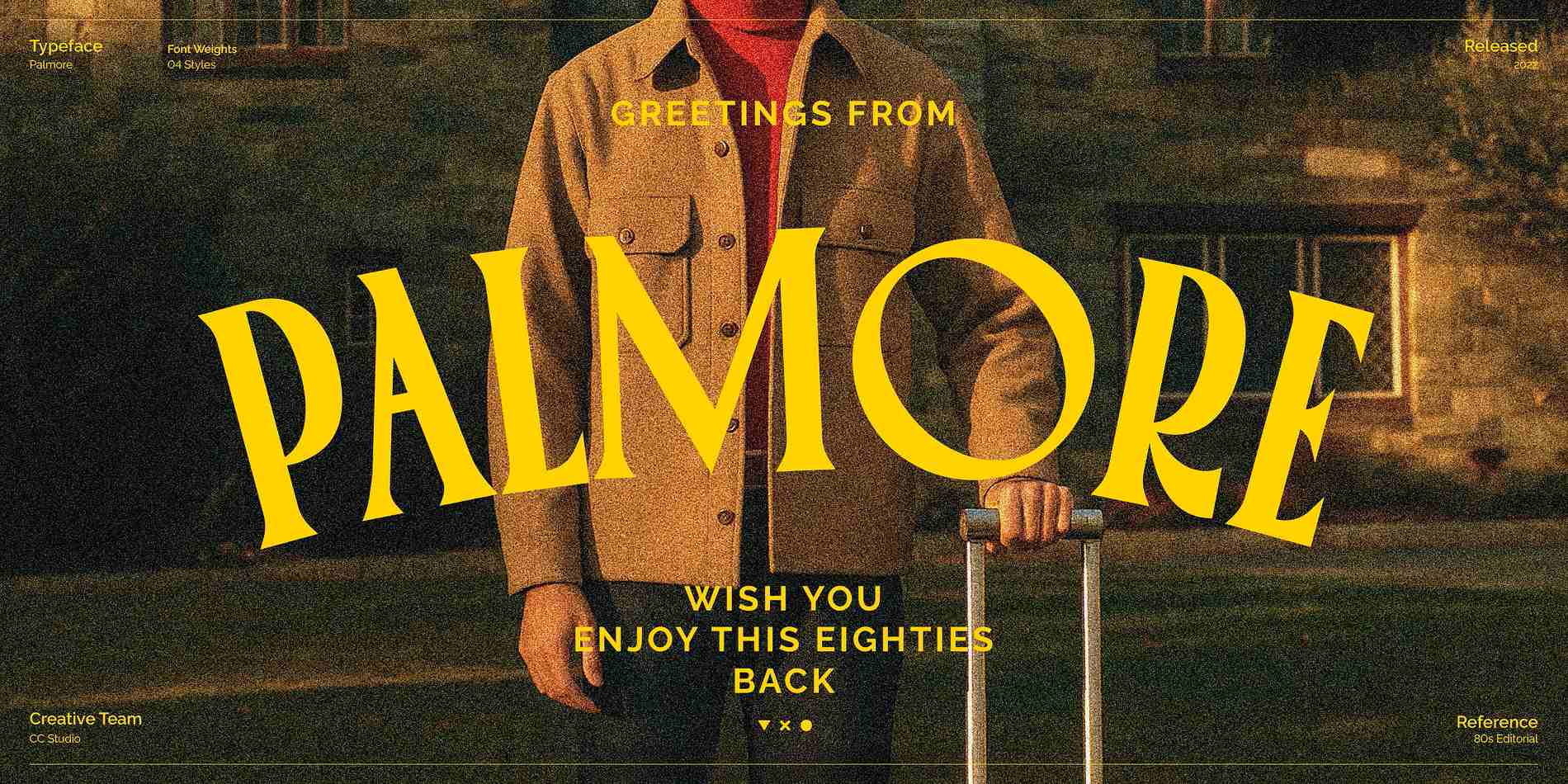
20. Palmore Font by CCS Type
Best For: retro travel posters, streetwear graphics, event flyers, postcards
Palmore Font is bouncy and flared, with letters that lean and swell like hand-cut signage. The preview frames it as an eighties postcard, and that is exactly the mood it creates.
The family has four styles. It works best in short, loud words: a poster title, a T-shirt graphic or a shop name. Keep the rest of the layout simple so the lettering stays the star.
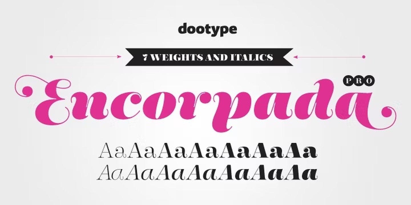
21. Encorpada Pro Font by dooType
Best For: bakery and sweets packaging, bold feminine branding, chocolate and candy labels
Encorpada Pro Font combines a bold serif with a swashy, calligraphic italic. The preview shows the italic in magenta, with flowing strokes that feel almost like script.
The preview lists seven weights and italics. Use the italic for a name or a flavour and the upright for supporting words, and the label gets contrast from one family.
22. Spirits Font by Alfonso García
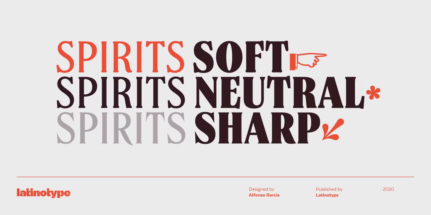
Best For: liquor and craft beer labels, bar menus, bold posters
Spirits Font is a heavy display serif, and the preview shows it in three versions: Soft, Neutral and Sharp. The same letters change character depending on how rounded or pointed the details are.
That built-in choice is useful for branding: Soft for a friendly product, Sharp for something with more edge. Pick one version and stay with it across the whole label.
23. Mixta Font by Rodrigo Fuenzalida
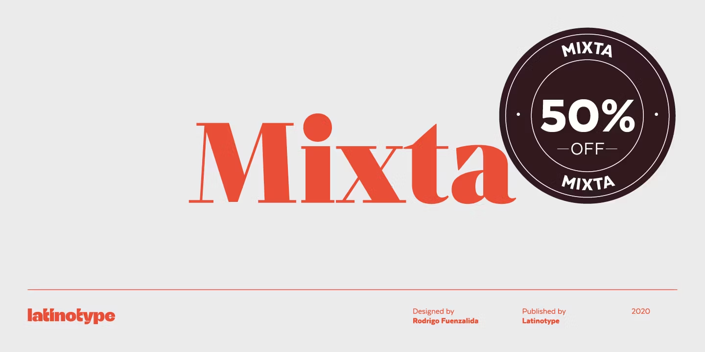
Best For: editorial headlines, packaging titles, playful brand identities
Mixta Font appears in the preview in a heavy red weight with sturdy, confident serifs, set big like a magazine masthead.
The family has 54 styles, the largest range in this list. That makes it one of the few display serifs that can also handle subheads and short texts inside the same identity.
Slab Serif Fonts for Labels, Cafés and Craft Brands
Slab serif fonts have thick, block-like serifs that look sturdy and honest. They work on labels, signs and packaging, and the softer ones stay friendly enough for children’s products and craft brands.
24. Museo Slab Font by exljbris Font Foundry
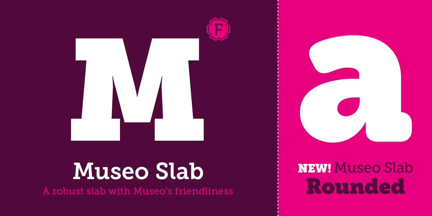
Best For: craft brands, children’s products, website headings, friendly packaging
Museo Slab Font is, in the preview’s own words, a robust slab with Museo’s friendliness. The slabs are solid, the curves are soft, and a rounded version is shown alongside it.
The family has 12 styles, and two of them are free on Fontspring, so you can test it on real headings before buying. It reads well on screen as well as in print.
25. Sagona Font by René Bieder
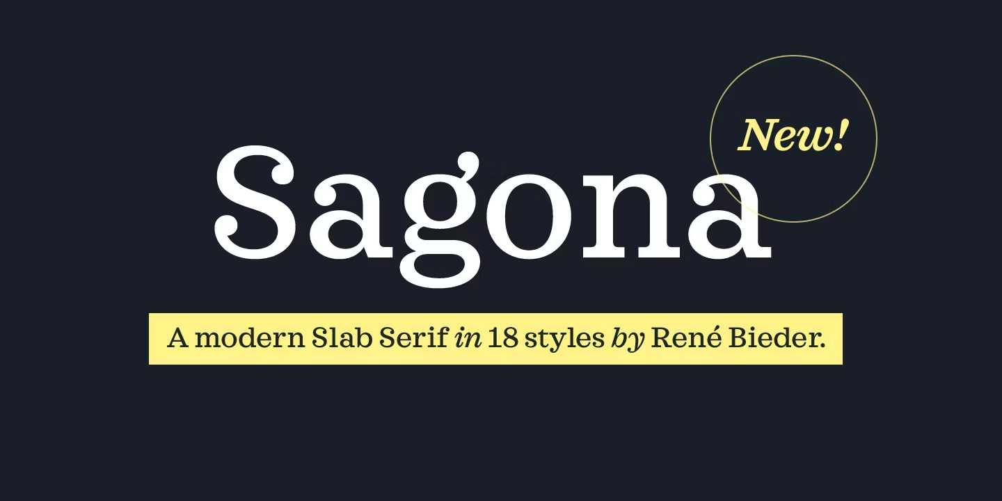
Best For: book covers, coffee shop branding, editorial headings, stationery
Sagona Font is a modern slab serif with lighter, more refined slabs than the chunky classics. In the preview it looks calm and elegant, closer to a book face than to a poster font.
The preview lists 18 styles. It is a good slab for brands that want structure without looking heavy, and it works for both headings and short paragraphs.
26. Chaparral Pro Font by Adobe
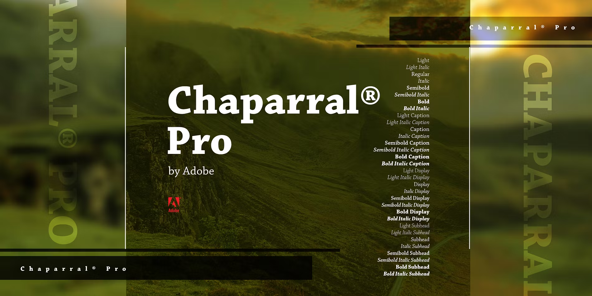
Best For: outdoor and travel brands, product guides, packaging text, reports
Chaparral Pro Font is a slab serif with soft, bracketed slabs that keep it readable at text size. It looks sturdy and practical without the mechanical feel of a typewriter slab.
The family has 32 styles, visible in the long style list on the preview. That depth makes it one of the few slab serifs you can use for a full document, not only for titles.
27. Super Clarendon Font by Typodermic Fonts
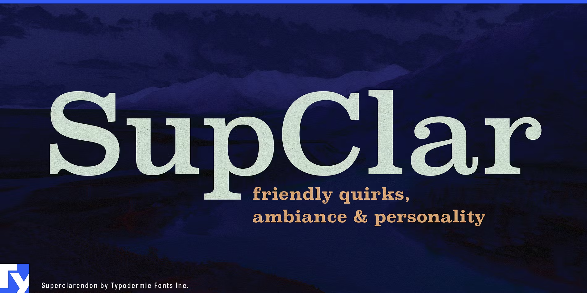
Best For: vintage labels, Western-style posters, shop signs, heritage packaging
Super Clarendon Font follows the Clarendon tradition: bracketed slabs, heavy curves and ball-shaped terminals. The preview promises friendly quirks and personality, and the letters do feel warm rather than stiff.
The family has eight styles. It is the classic choice for old-fashioned labels, general-store signs and anything that should feel printed on a wooden-type press.
28. Sanchez Font by Daniel Hernández
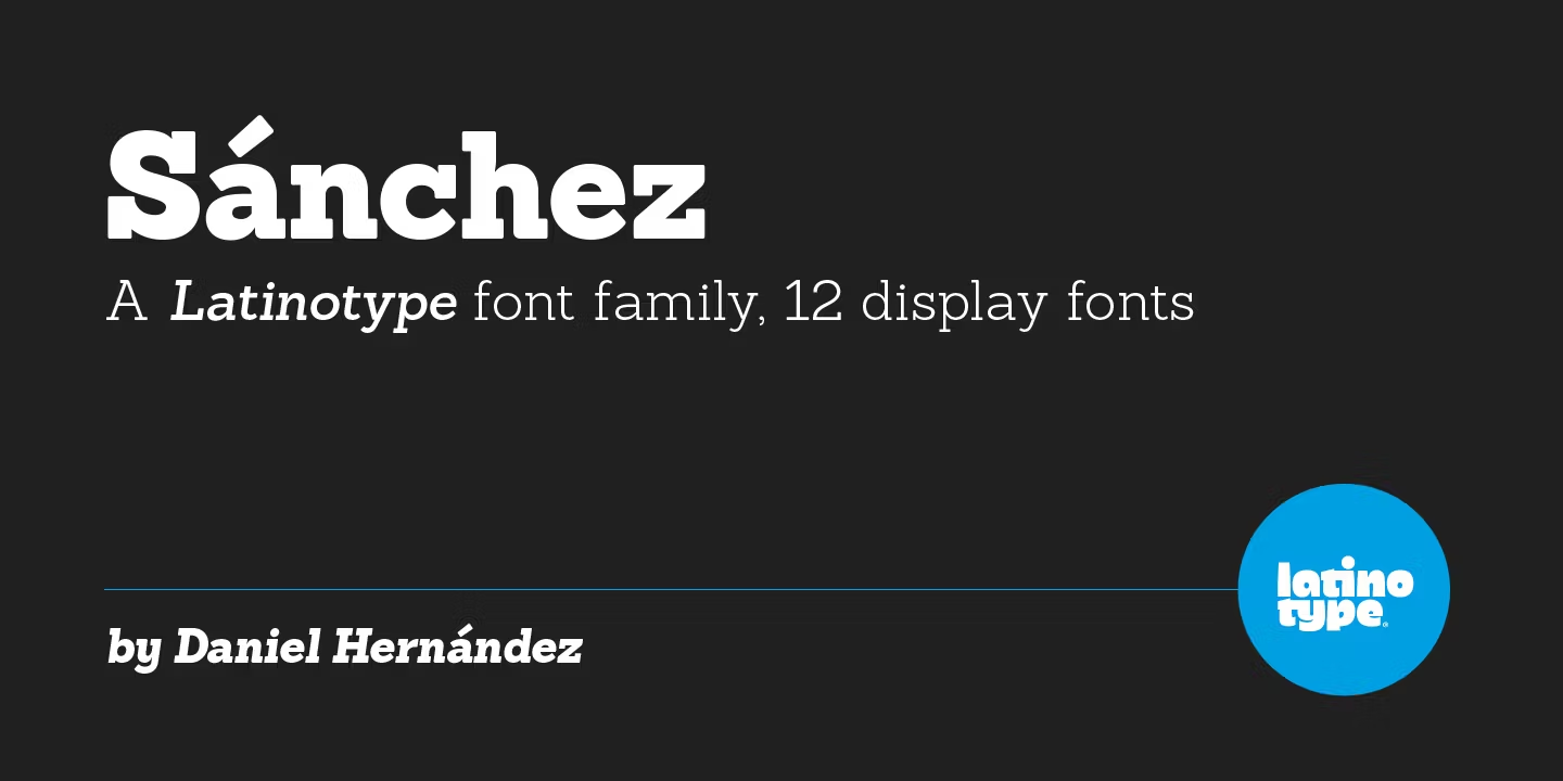
Best For: website headlines, café menus, modern craft packaging
Sanchez Font is a clean, contemporary slab with round, open letters and simple square serifs. The preview describes it as a family of 12 display fonts.
It looks modern and tidy, so it suits brands that want a slab serif without the vintage mood. Try it for menu headings, product names and blog titles.
29. Brix Slab Font by Hannes von Döhren and Livius Dietzel
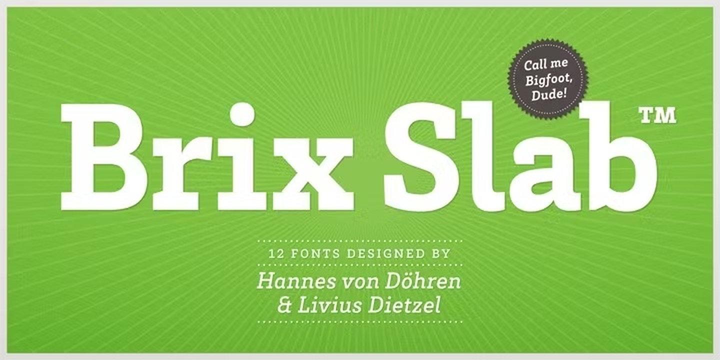
Best For: sports and outdoor brands, signage, children’s products, bold headlines
Brix Slab Font is sturdy and friendly, with solid slabs and slightly rounded details. The preview shows it big and bright on green, and it holds its shape even at poster size.
The preview lists 12 fonts. It is a dependable slab for signage and packaging, where the text has to be clear from a distance and still look approachable.
How to Choose Serif Fonts
Start with the feeling, then the style. Decide whether the project should feel luxurious, trustworthy, loud or handmade. Elegant serifs give luxury, classic serifs give trust, bold serifs give energy and slab serifs give a sturdy, honest look.
Check the size you will use most. Hairline serifs such as Dear Ivy Font or Vincente Font need large sizes. For text, labels and small print, choose a sturdier design such as Arno Pro Font, Century Schoolbook Pro Font or Chaparral Pro Font.
Pair a serif with a simple sans serif. One characterful serif for headlines and a clean sans serif for everything else is the easiest system for a small brand. Two different display serifs side by side usually compete for attention.
Test with real words and check the licence. Type your brand name, product names and prices into the tester on each Fontspring family page. Then open the licensing section and confirm the licence covers every place the font will appear: print, website, social media or products for sale.
Serif Fonts FAQ
What is a serif font?
A serif font has small strokes, called serifs, at the ends of the main strokes of its letters. Sans serif fonts do not have them. Serifs range from hairline-thin in elegant fonts to thick blocks in slab serif fonts.
What is the difference between elegant, classic, bold and slab serif fonts?
Elegant serifs have high contrast and fine hairlines. Classic serifs come from book and newspaper printing and are built for reading. Bold serifs are heavy display designs for headlines and packaging. Slab serifs have thick, block-like serifs with little contrast.
Are premium fonts worth it compared to free fonts?
Premium fonts usually come with more styles, better spacing, wider language support and a clear licence for commercial use. For a brand that will use the same font for years, on products and in marketing, that reliability is often worth the price.
Which serif fonts in this list work for logos?
For an elegant logo, try Lust Font, Joane Font or Dear Ivy Font. For a warm, friendly logo, try Juana Font, Moranga Font or Bogart Font. For a sturdy craft or outdoor logo, Brix Slab Font and Super Clarendon Font are good starting points.
Where to Start
For weddings and beauty brands, start with Mirador Font or Fiorina Grande Font. For books, menus and a timeless identity, Arno Pro Font and Juana Font cover almost everything. For posters and retro packaging, Moranga Font and Bogart Font bring instant warmth, and for labels and craft products, Museo Slab Font is an easy first test because it includes free styles on Fontspring.