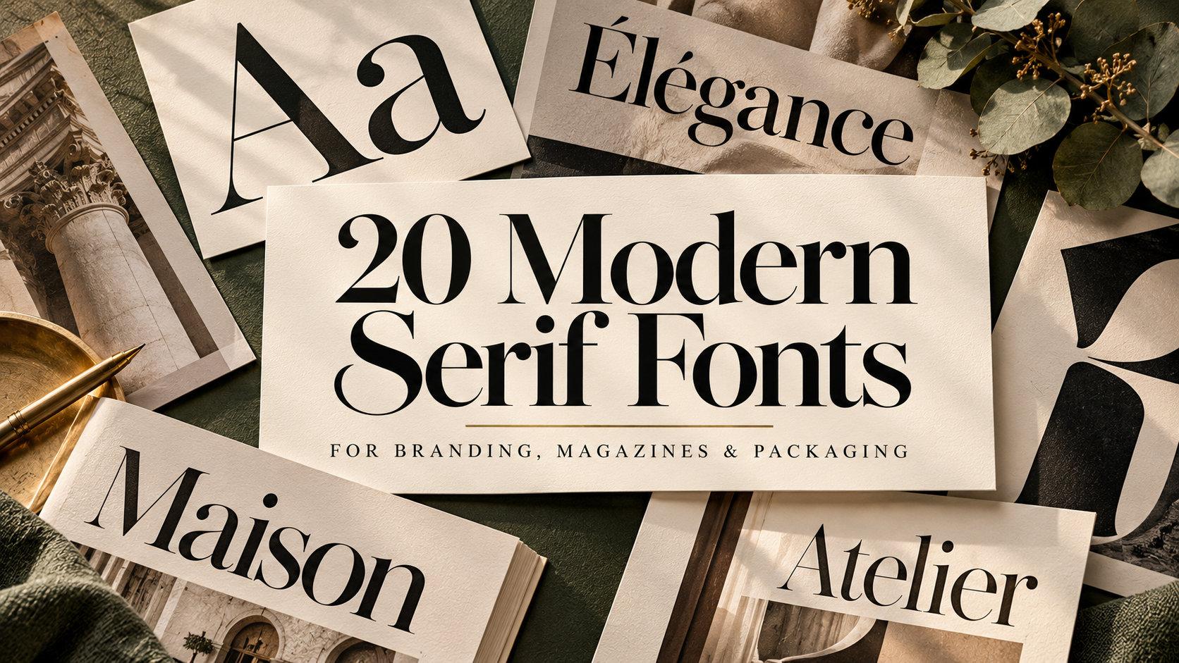
20 Modern Serif Fonts for Brand Identity, Magazine Layouts and Premium Packaging
Modern serif fonts sit where classic book typography meets fashion-magazine polish: sharp contrast between thick and thin strokes, fine serifs, and letters that look confident at large sizes. That is why they keep appearing on beauty packaging, boutique logos, wedding stationery and editorial covers.
This collection brings together 20 modern serif font families from Fontspring, grouped by the job they do best: high-contrast classics, contemporary display serifs for branding, softer editorial serifs for longer text, and italics for accents. Each entry describes how the letters look, where they work and what to watch for.
All fonts in this list are on Fontspring. Each family page shows every style, its price and the licence options, so you can check what your project needs before you buy, and several of these families include a free style to test first.
More font collections:
20 Logo Fonts for Small Business Branding, Shop Signs and Product Labels
14 Elegant Cursive & Script Fonts for Wedding & Branding Design
18 Editorial Fonts for Magazine Layouts, Book Design and Content-Rich Brands
In This Collection
High-Contrast Classic Serif Fonts for Fashion, Beauty and Luxury Labels
- 1. URW Bodoni Font
- 2. Didot Headline Font
- 3. Operetta Font
- 4. Questa Grande Font
- 5. Anglecia Pro Display Font
- 6. Dawnora Font
Contemporary Display Serif Fonts for Brand Identity and Packaging
- 7. The New Elegance Font
- 8. Monarque Font
- 9. VSOP Font
- 10. Talesha Font
- 11. Idealist Serif Font
- 12. Jazmín Font
- 13. Milanesa Serif Font
Soft Editorial Serif Fonts for Magazines, Books and Websites
Italic Serif Fonts for Headlines and Accents
High-Contrast Classic Serif Fonts for Fashion, Beauty and Luxury Labels
These fonts follow the Didone tradition: strong vertical contrast, hairline serifs and a polished, upright stance.
1. URW Bodoni Font by Giambattista Bodoni
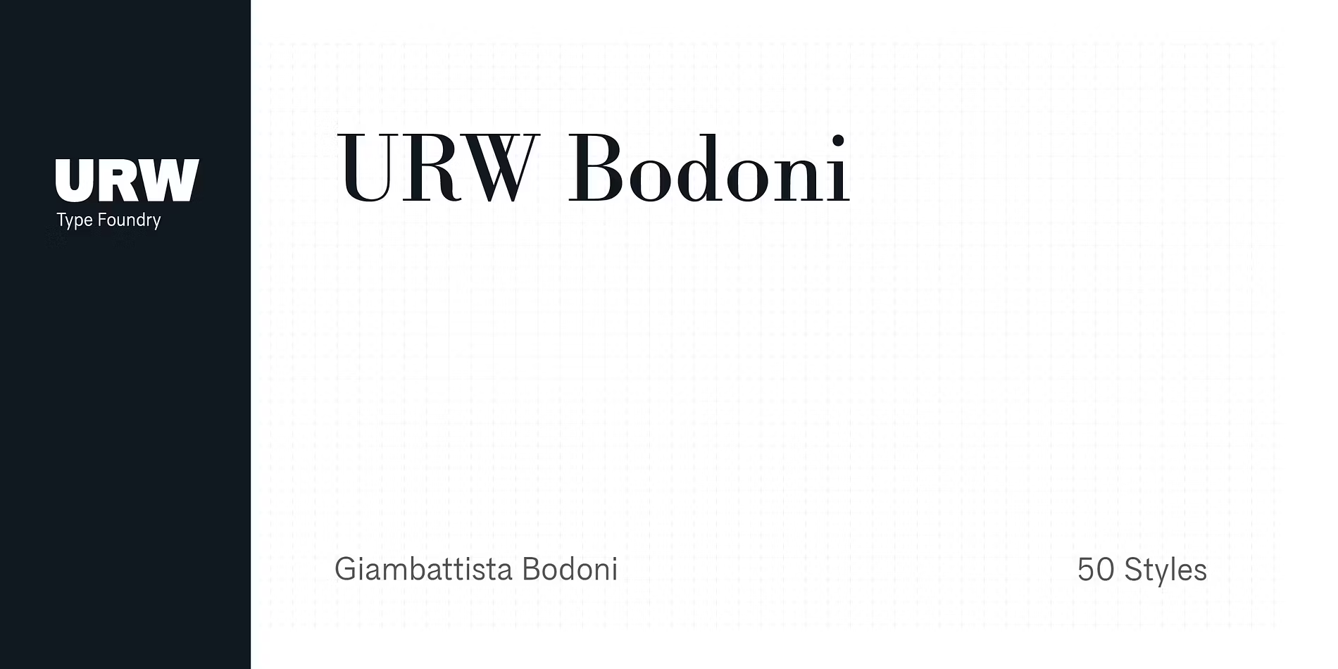
Best For: fashion logos, beauty packaging, invitations, magazine headlines
URW Bodoni Font is the classic Bodoni shape: a strict vertical axis, heavy stems standing next to hairline strokes, and flat, unbracketed serifs. The family has 50 styles, including light weights and obliques, so it can go from a delicate wordmark to a bold headline without changing voice.
Use the lighter weights large and move to the regular or bold as the size drops, because the hairlines are the first thing to disappear. For product details and body copy, a plain sans serif keeps the page calm and lets Bodoni stay the focal point.
2. Didot Headline Font by Canada Type
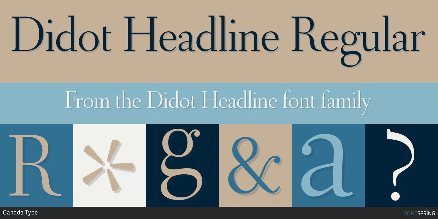
Best For: magazine covers, perfume and cosmetics labels, large display lettering
Didot Headline Font pushes contrast further than most fonts in this list. The thin strokes are close to threads, and the preview shows a light, open texture with upright, finely cut capitals. The name tells you what it was drawn for: headlines.
Keep it at cover and poster sizes, where those fine lines have room to hold. The family is small, with three styles, so plan a second typeface for subheads and running text.
3. Operetta Font by Jan Tonellato
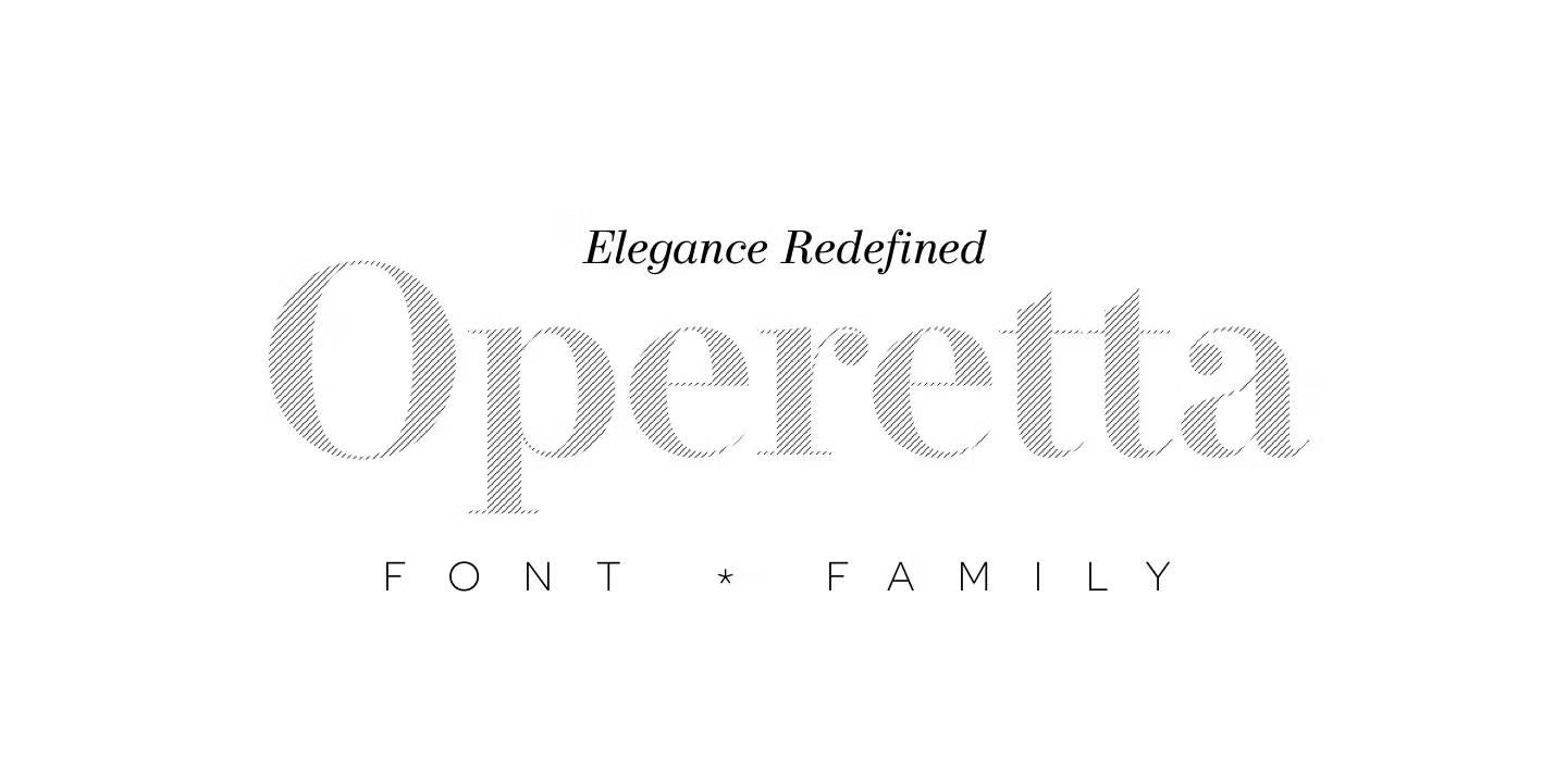
Best For: editorial headlines, luxury branding, invitations, display text with swashes
Operetta Font is a neo-Didone that draws on Bodoni, Didot and Walbaum but is tuned for current layouts. In the preview the letters are tall and slightly narrow, with crisp contrast and a long descender on the J that adds a touch of drama.
Its range is what sets it apart: five optical sizes, eight weights from Extralight to Extrabold, italics, and extras such as swashes and arrows that Didone fonts rarely include. The number in each optical size name is the recommended minimum print size in points, so choose the cut that matches how large the text will really appear.
4. Questa Grande Font by Jos Buivenga and Martin Majoor
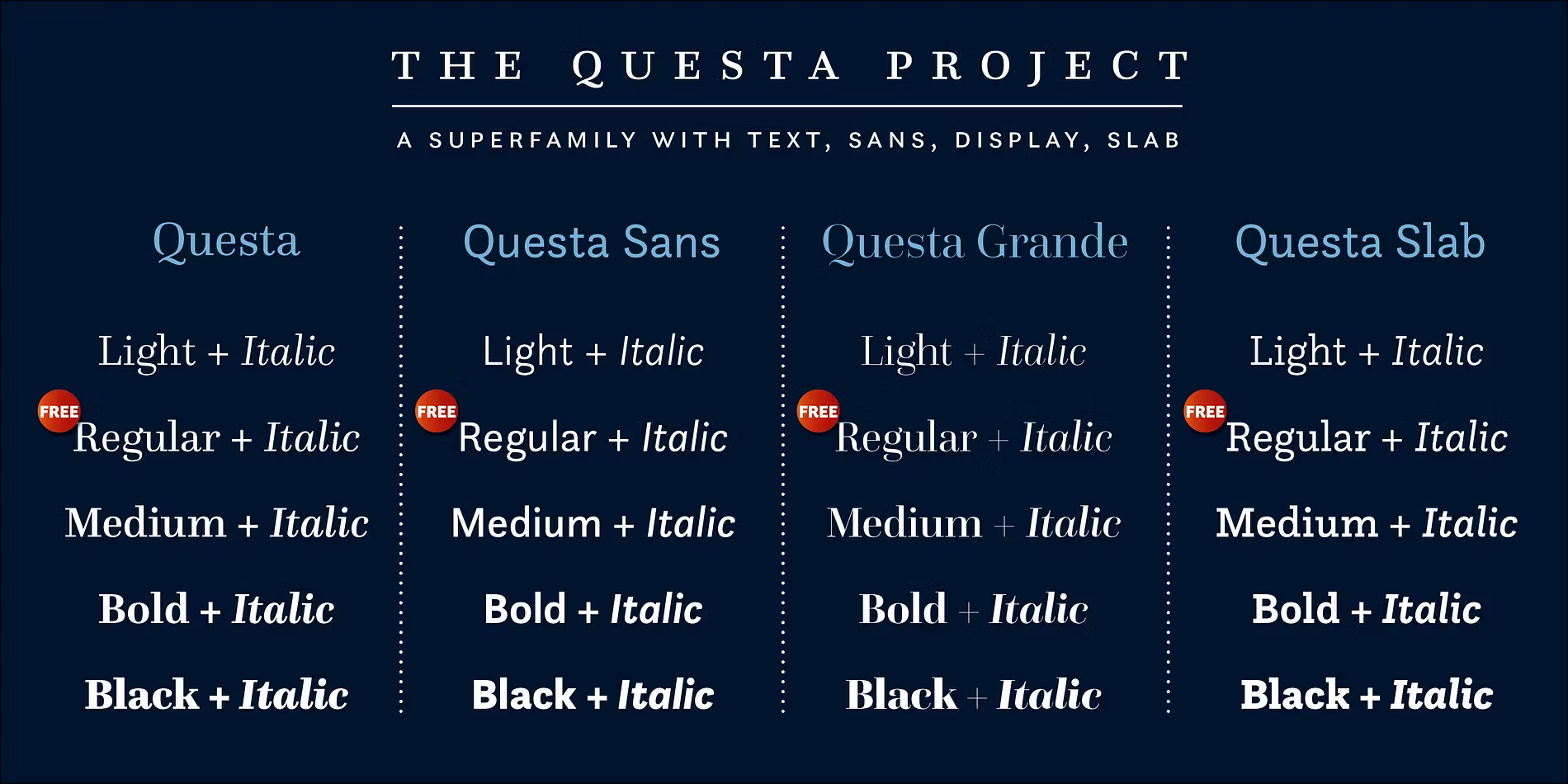
Best For: brand headlines, book covers, packaging titles, elegant editorial display
Questa Grande Font is the display version of the Questa family. Its proportions are calm and balanced, and the contrast is sharper than in the text version, so large words look refined without turning fragile.
One style is free on Fontspring, which makes it easy to test in a real mockup before you buy. Set it large for titles and use the regular Questa for smaller text if you want a matched pair from the same designers.
5. Anglecia Pro Display Font by Mint Type
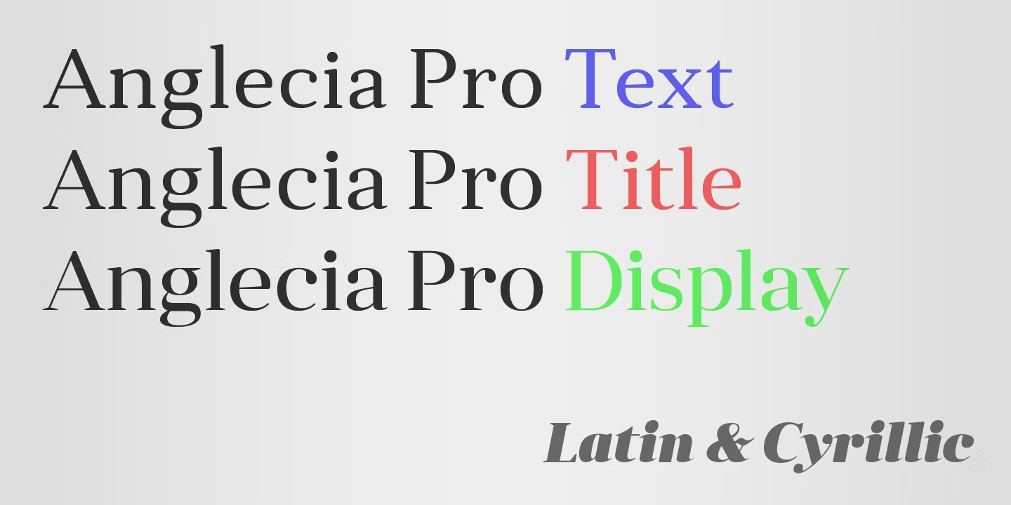
Best For: beauty and skincare brands, boutique logos, wedding stationery
Anglecia Pro Display Font has wide, round bowls and soft ball-shaped endings on letters like a and c. That softness makes the high contrast feel friendly rather than severe.
Two styles are free on Fontspring. It works well in lowercase wordmarks and short product names; on light backgrounds, open the letter spacing slightly so the round shapes do not crowd each other.
6. Dawnora Font by Typomancer
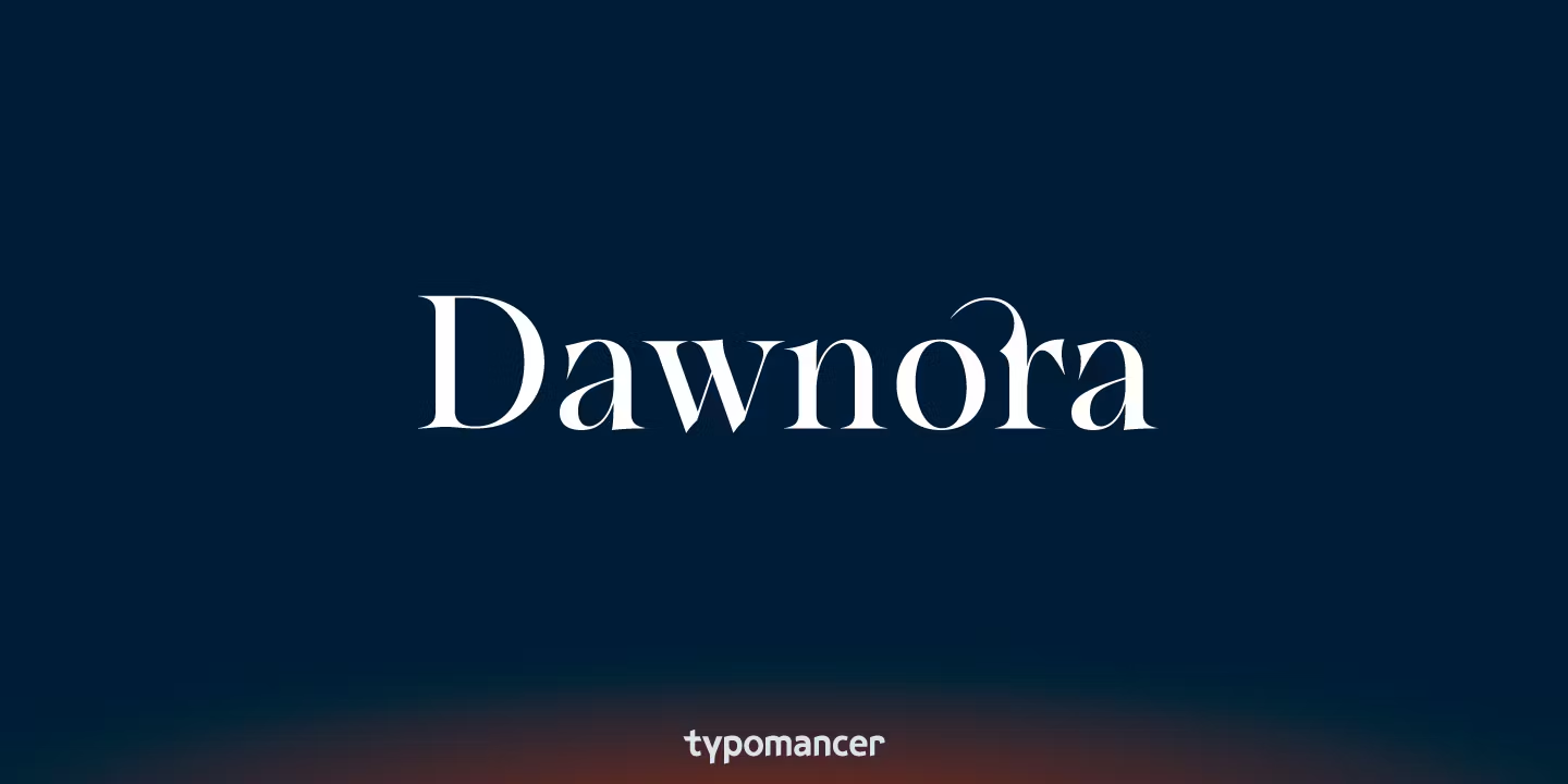
Best For: business cards, stationery, clean brand wordmarks, menus
Dawnora Font keeps things tidy: normal width, crisp contrast and no decorative extras. In the preview it reads as a clean, well-behaved Didone.
That restraint pays off when one serif has to look polished on everything from a letterhead to a price card. With 11 styles, you can build a small hierarchy of headings and details without adding a second serif.
Contemporary Display Serif Fonts for Brand Identity and Packaging
Newer display serifs made for logos, labels and social graphics, with bolder shapes, tighter spacing and more personality.
7. The New Elegance Font by Great Studio
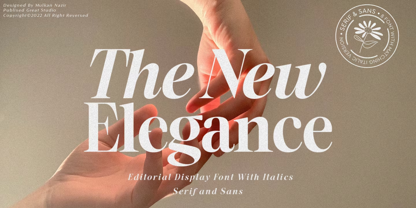
Best For: magazine-style headlines, fashion social posts, bold wordmarks
The New Elegance Font combines heavy strokes, tight spacing and sharp contrast. The preview sets it in a dense, dark weight that has the presence of a cover headline.
It is strongest on short words: a brand name, a collection title, a one-line quote. Longer sentences get heavy quickly, so hand those over to a lighter serif or a simple sans.
8. Monarque Font by Jessika Granell
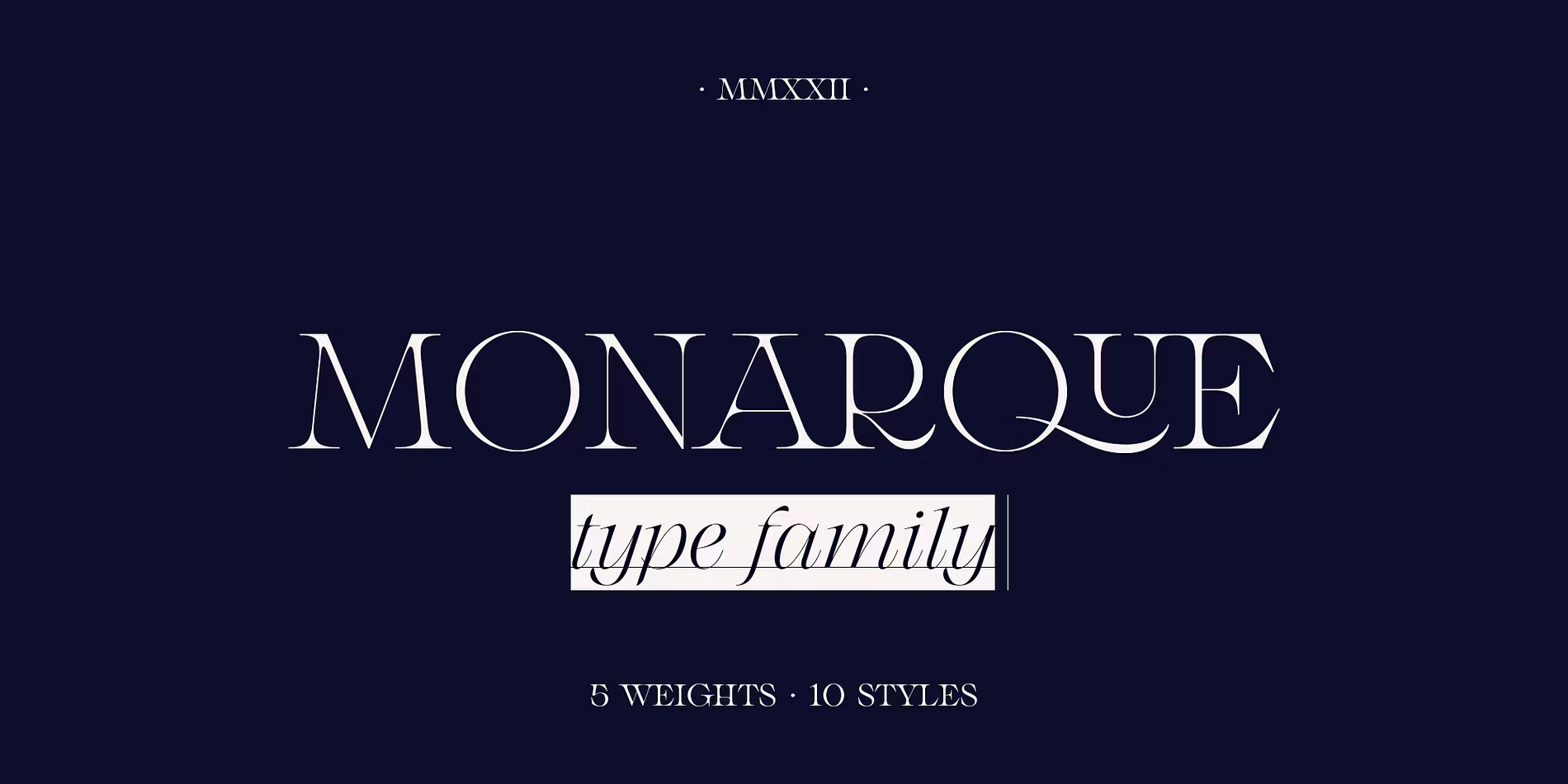
Best For: luxury brand logos, jewellery and fashion labels, premium packaging
Monarque Font has wide, generous capitals, a very round C and sharp, wedge-like serifs. Together they give it a formal, grand character.
Set it in all caps with extra tracking for a monogram-style logo, or in title case for product names. Wide letters need horizontal room, so it suits landscape layouts, wide labels and shop signs.
9. VSOP Font by VPcreativeshop
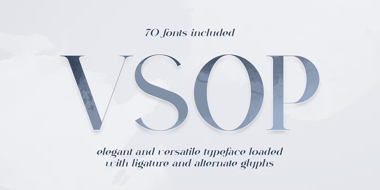
Best For: complete brand identities, packaging systems, editorial layouts
VSOP Font is the largest family in this collection, with 70 styles. The preview shows high contrast and a few distinctive lowercase shapes; the e in particular has a character of its own.
A family this size can carry a whole brand, from the logo and headlines to labels and web text. One style is free on Fontspring, so you can check how those lowercase details behave at your working size before committing.
10. Talesha Font by Seniors Studio
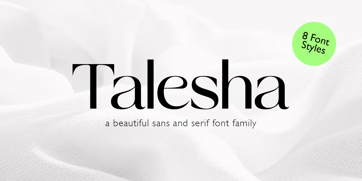
Best For: tall packaging, posters, narrow labels, book spines
Talesha Font is narrow and tightly spaced, with tall letters that fit a long word into a small width.
That makes it practical for bottle labels, candle jars, vertical posters and book spines. Keep the spacing as designed or open it a little; squeezing it further makes the letters run together. One style is free on Fontspring.
11. Idealist Serif Font by Nicky Laatz
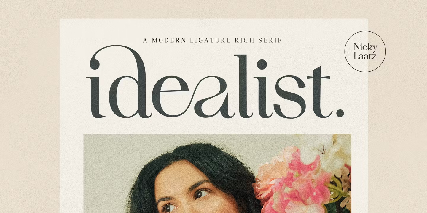
Best For: logos, product names, invitations, one-word accents
Idealist Serif Font has personality built into the letters. The preview shows a joined ea and a K with a curled stroke, set in a light, high-contrast style.
It comes as a single style, so treat it as an accent: a brand name, a headline word, a name on an invitation. Pair it with a quieter serif or a sans for everything around it.
12. Jazmín Font by Eli Hernández
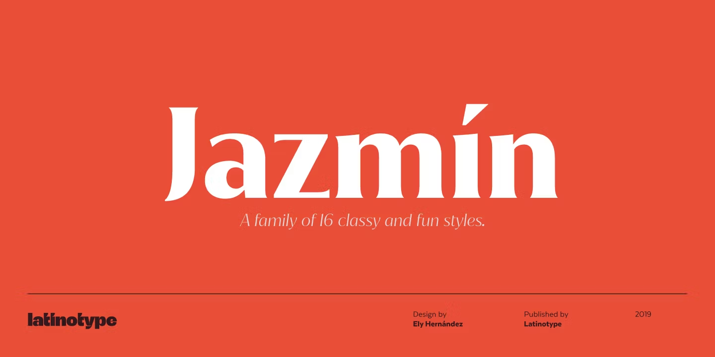
Best For: fashion headlines, bold brand names, editorial covers
Jazmín Font appears in the preview in a heavy, sharp-edged weight with strong contrast and confident capitals.
With 32 styles in the family, you can set headlines in the bold and supporting lines in lighter cuts while keeping the same voice across the layout.
13. Milanesa Serif Font by Andrés Ramírez
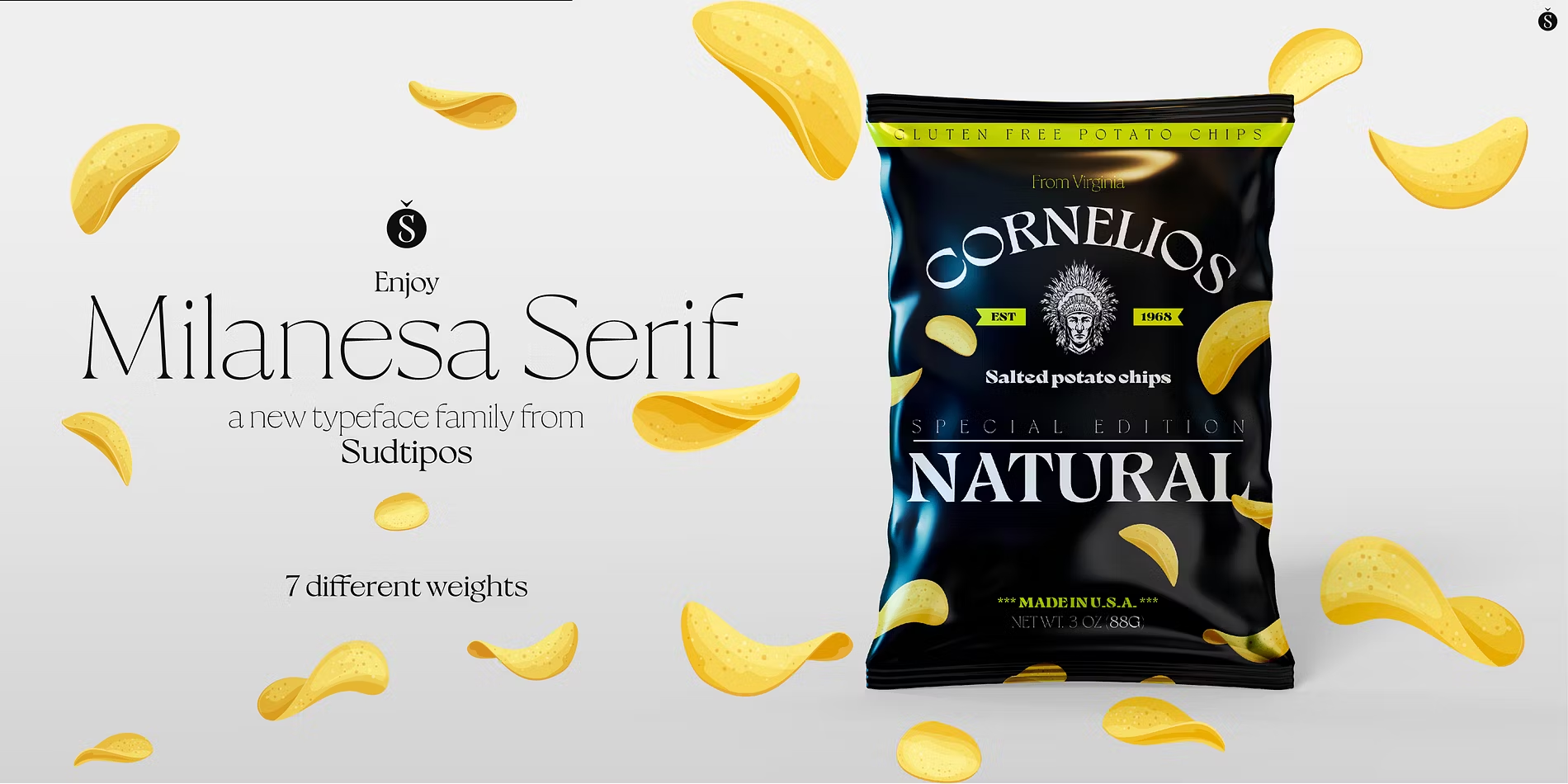
Best For: food and drink packaging, café branding, retro-inspired labels
Milanesa Serif Font is very heavy, with softened wedge-shaped serifs and tight spacing. The result feels warm, with a slight 1970s flavour.
It suits labels and signage that need to be read from a distance. Pair it with a lighter sans so the page does not feel crowded.
Soft Editorial Serif Fonts for Magazines, Books and Websites
Lower contrast and more open shapes make these serifs comfortable in longer text as well as in headlines.
14. Lovelace Font by Cosimo Lorenzo Pancini
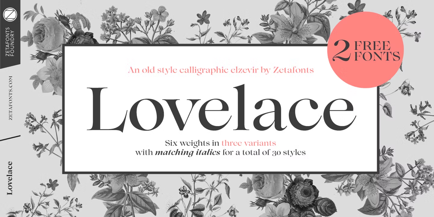
Best For: magazine layouts, blog headings, book covers, brand text
Lovelace Font has moderate contrast and sturdy serifs, so it keeps its shape in headings and paragraphs alike.
The family has 30 styles, enough for a full editorial hierarchy. It is a dependable choice when one serif needs to cover titles, pull quotes and body text.
15. Montaigne Font by Teo Tuominen, Erik Bertell and Emil Bertell
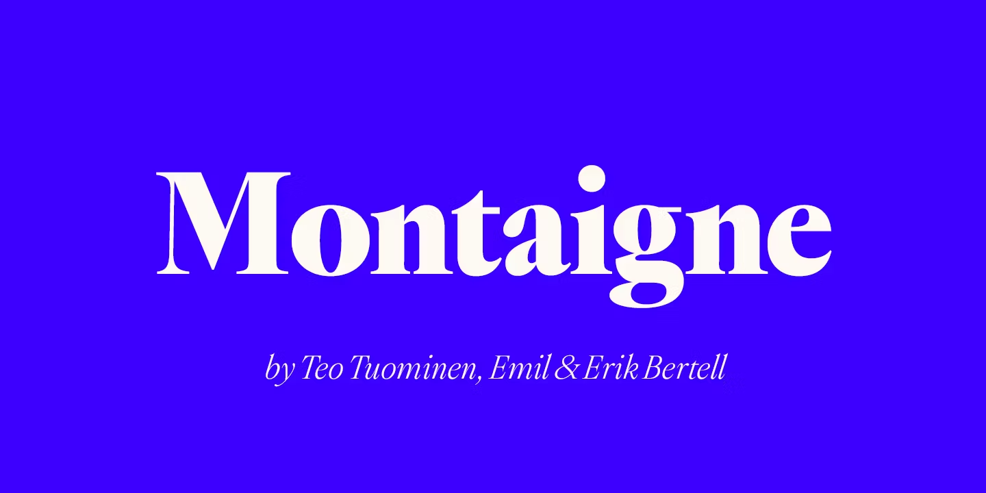
Best For: book design, editorial layouts, understated brand identities
Montaigne Font is calm and classical. The preview shows a bookish rhythm and gentle contrast rather than fashion-magazine sharpness.
It fits projects that should feel literate rather than loud: book covers, essays, gallery or bookshop branding. Generous line spacing lets its texture breathe.
16. Callas Font by Dieter Hofrichter
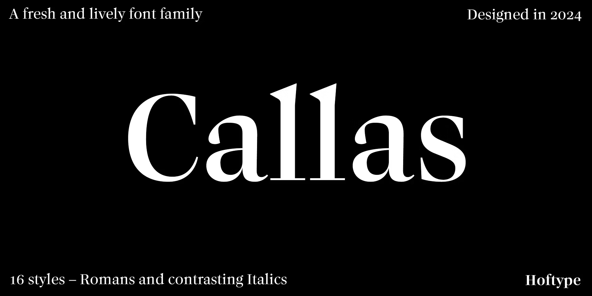
Best For: websites, magazines, reports, readable brand text
Callas Font has open shapes and moderate contrast, which keeps it readable at the smaller sizes where Didone-style fonts struggle.
Use it for body text and subheads next to a high-contrast display serif from the first group. The pair gives an editorial layout both drama and readability.
17. Ethereal Font by Kereatype
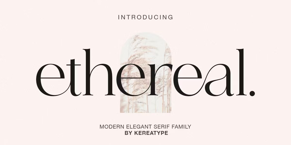
Best For: minimalist branding, wellness and beauty labels, light headlines
Ethereal Font is light and airy, with crisp contrast and clean proportions. On Fontspring it sits under both the modern serif and modern display tags.
It looks its best on pale backgrounds with plenty of white space. For small print, choose a heavier weight from its nine styles so the thin strokes stay visible.
18. Monesta Font by Aulia Rahman
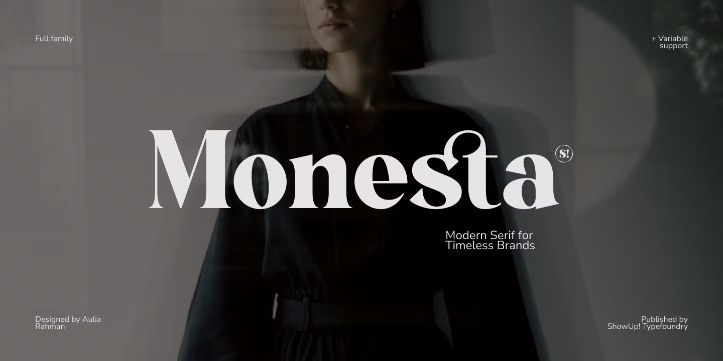
Best For: everyday branding, social graphics, menus, packaging text
Monesta Font is balanced and slightly narrow, elegant without extra flourishes.
That neutrality makes it easy to carry across a whole set of materials, from menus to social posts. One style is free on Fontspring for testing.
Italic Serif Fonts for Headlines and Accents
A good italic serif adds movement to a headline or picks out one word next to an upright font.
19. Costaline Font by Mega Type
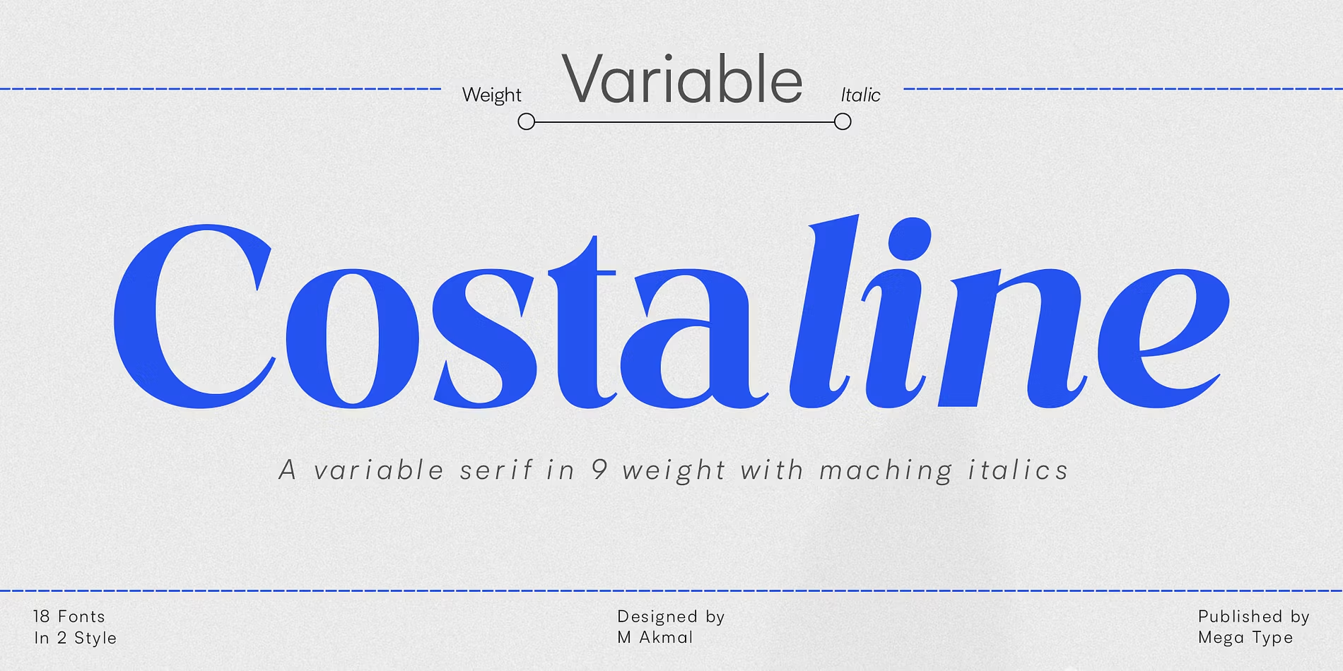
Best For: bold headlines, lifestyle brands, campaign graphics
Costaline Font is a heavy italic with a strong slant, so the words look as if they are moving forward.
Use it for short, punchy headlines and campaign lines. Two styles are free on Fontspring.
20. The Erupha Font by Pista Mova
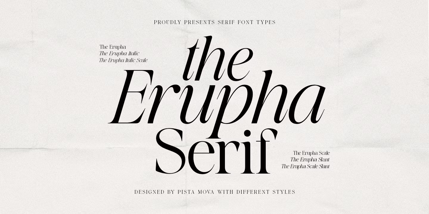
Best For: accent words, invitations, editorial pull quotes
The Erupha Font is a high-contrast italic with a flowing, calligraphic rhythm.
Set one word in The Erupha next to an upright serif, such as a name on an invitation or a key word in a headline. The contrast between the two styles does the work.
How to Choose a Modern Serif Font
Start with the size. High-contrast serifs such as Didot Headline Font or URW Bodoni Font look their best large, because the hairline strokes need room. If the font also has to work in small print or on screen, look at the editorial group, or pick a family with heavier weights or optical sizes, like Operetta Font.
Count the styles you need. A logo can live with a single style, as Idealist Serif Font shows. A brand that needs headlines, labels, a website and printed materials is easier to build on a large family such as VSOP Font, Lovelace Font or Jazmín Font.
Test with your real words. Type the actual brand name, product line or headline into the tester on the Fontspring family page. Letters with strong personality, like a curled K or a distinctive e, can look great in a sample and awkward in your specific name.
Check the licence before you design. Each Fontspring family page has a licensing section. Make sure the licence covers how you will use the font, whether that is print, a website, an app or products for sale.
Modern Serif Fonts FAQ
What is a modern serif font?
In type classification, a modern serif is a Didone: vertical stress, strong contrast between thick and thin strokes, and thin, flat serifs, in the tradition of Bodoni and Didot. On Pinterest and in design blogs, the phrase is also used more loosely for contemporary display serifs with a clean, fashionable look. This collection covers both.
Are modern serif fonts good for logos?
Yes, especially for fashion, beauty, jewellery and lifestyle brands. Check the logo at the smallest size it will appear, such as a social media avatar or a small label, because very thin strokes can fade.
Can I use a modern serif font for body text?
High-contrast Didones are usually better for headlines. For paragraphs, a serif with moderate contrast and open shapes, such as Callas Font or Lovelace Font, is easier to read.
Which fonts in this list have a free style?
On Fontspring, Questa Grande Font, VSOP Font, Talesha Font and Monesta Font each show one free style, and Anglecia Pro Display Font and Costaline Font show two. A free style is a handy way to test the design in a real layout before buying the full family.
Where to Start
If you need one dependable serif for a brand, start with the first group: URW Bodoni Font for the classic look, or Dawnora Font for something quieter. For bold packaging and social graphics, try The New Elegance Font or Monarque Font. For a blog, a magazine or a book, Lovelace Font and Callas Font will carry longer text comfortably, and The Erupha Font can add a single elegant accent where a headline needs one.