Font Combinations: How to Pair Fonts That Work Together
Most designs use two fonts, not one. One font does the talking: the name, the title, the logo word. The other carries the details: dates, prices, addresses, captions. When the two are chosen well, the eye goes where it should first, and everything else stays easy to read.
Every collection in this category is built around real pairs for real jobs: script and serif duos for weddings, clean and vintage pairs for small business logos and signs, and Canva-ready combinations for templates and social posts.
Quick check: put both fonts on one line with your real text: the headline in one font, a short detail line in the other. If they look different at a glance but feel like they belong to the same design, the pair works.
Font Pair Types at a Glance
| Pair Type |
Best For |
What To Check |
| Script + serif |
Wedding invitations, menus, elegant cards |
The script stays readable next to the serif at small sizes |
| Script + sans serif |
Small brand logos, social posts, product labels |
The sans is plain enough not to compete with the script |
| Serif + sans serif |
Shop signs, business cards, websites |
The two fonts have clearly different shapes, not near-twins |
| Vintage display + clean sans |
Logos, labels, shirt designs |
The display font holds up in short words and initials |
| Statement font + built-in Canva font |
Canva templates, stories, printables |
The body font stays clear in longer lines on a phone screen |
Font Combinations by Task
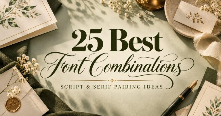
For wedding stationery, pair a flowing script for names with a serif for dates, venue and RSVP details.
25 Best Font Combinations & Font Pairing Ideas for Weddings
For logos and small business signs, pick one font that carries the brand name and one that stays clean for the tagline and contact line.
19 Font Pairings for Logos: Clean, Script & Vintage Duos
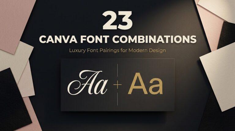
For Canva templates, combine one uploaded statement font with a built-in Canva font for body text.
Canva Font Combinations: 23 Pairs for Logos, Weddings and Posters
Font Combinations by Project
Invitations and cards need contrast between the names and the details, so guests read the important lines without squinting.
Logos, labels and shop signs need a pair that still reads at a distance and on a small product label.
Social posts, planners and printables need a body font that stays clear on a phone screen and in print, with the decorative font kept for headlines.
Checklist Before You Choose a Font Pair
- Decide which font is the headline and which is the body before you pick either one.
- Test both fonts with your real text, not with the alphabet sheet.
- Make sure the two fonts differ clearly in shape, not just in size.
- Check the body font at the smallest size it will appear.
- Check numbers in the body font if you need dates, prices or phone numbers.
- Read the license on each font page if the design is for a client or products you sell.
Font Pairing Terms Compared
| Term |
What It Means |
Where It Shows Up |
| Font pair |
Two fonts chosen to work together in one design |
Invitations, logos, templates |
| Font duo |
A pair sold or presented together, often by one designer |
Branding kits, wedding sets |
| Headline font |
The font for the first thing people should read |
Names, titles, logo words |
| Body font |
The font for details and longer text |
Dates, prices, captions |
| Contrast |
How clearly the two fonts differ in style and weight |
Every pair |
Common Mistakes with Font Combinations
Pairing two similar fonts. Two serifs or two sans fonts that look almost alike read as a mistake, not a choice.
Pairing two decorative fonts. A script next to a bold display font makes both fight for attention.
Using the script for details. Dates, times and addresses in a flowing script are hard to read, especially on small cards.
Adding a third font “just for one line”. It usually breaks the look. A different weight of the body font does the same job.
Tip: let the headline font be the only one with personality. The quieter the partner, the better the headline looks.
Font Combinations FAQ
How many fonts should one design use?
Two is enough for most designs: one for headlines and one for body text. A third font rarely adds anything that a different weight or size of the body font can’t do.
What is the easiest font pair for beginners?
A script for the headline and a simple sans serif or serif for everything else. The difference is obvious, so the two fonts don’t compete.
Which font combination works best for wedding invitations?
A script for the couple’s names paired with a serif for the date, venue and RSVP line is the most common choice, because it keeps names elegant and details easy to read.
How do I pair fonts for a logo?
Use the expressive font for the brand name and a clean font for the tagline or business type. Check that both stay readable when the logo is small.
Can I pair a Creative Fabrica font with a built-in Canva font?
Yes, this is a common way to build a template: the uploaded font gives the design its look, and a plain built-in Canva font handles longer text.