Wedding Fonts: How to Pick Fonts for Every Piece of Your Wedding
A wedding needs more fonts than most people expect. The couple’s names on the invitation call for a romantic script. The date, venue and RSVP details need something calm and readable. A welcome sign has to be clear from across the room, and place cards have to work at the size of a business card. One font rarely does all of these jobs well.
The collections in this category cover the whole set: script, serif and sign fonts for DIY couples and stationery makers, elegant serifs for invitations, and ready-made script and serif combinations that work together on the same card.
Quick check: type both names with the ampersand, like “Anna & James”, in the font preview. The capitals and the ampersand are where wedding scripts look their best, or show their problems.
Wedding Font Styles at a Glance
| Style |
Best For |
What To Check |
| Romantic calligraphy |
Couple’s names, invitation headings |
Capitals and the ampersand look elegant together |
| Readable script |
Welcome signs, seating charts, menus |
Words read clearly from a distance |
| Elegant serif |
Dates, venue, RSVP and details |
Thin strokes print well on textured paper |
| Script and serif pair |
Complete invitation suites |
The two fonts look clearly different but match in mood |
| Craft-friendly script |
Cricut signs, favours, decals |
Letters join cleanly so each word cuts in one piece |
Wedding Fonts by Task
For a full set of fonts for invitations, signs and Cricut projects, start with the main collection of script, serif and sign fonts.
27 Wedding Fonts for DIY Couples and Stationery Makers: Script, Serif and Sign Fonts for Invitations and Cricut Projects
For dates, venue and details that look refined, pick elegant serifs with fine hairlines.
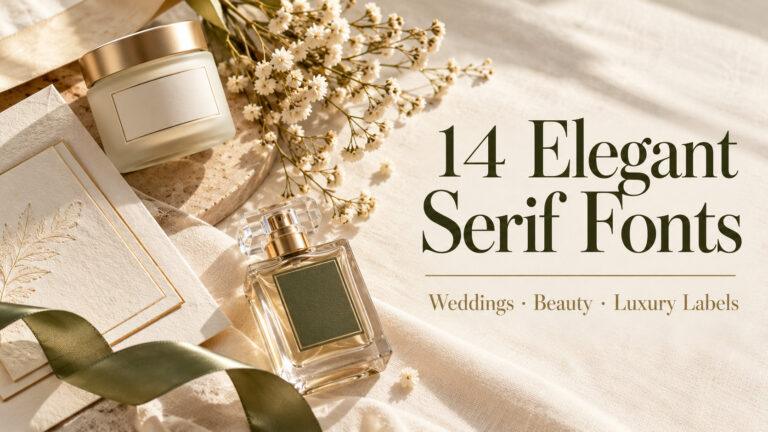
14 Elegant Serif Fonts for Wedding Invitations, Beauty Brands and Luxury Labels
For a script and a serif that already work together, choose from ready-made wedding font pairings.
25 Best Font Combinations: Script and Serif Font Pairing Ideas for Weddings
Wedding Fonts by Piece
Invitations and save the dates use a script for names and a serif or sans for everything guests need to read.
Welcome signs and seating charts are read from several steps away, so choose a script with simple shapes and enough weight.
Place cards and escort cards are small, so test guest names at their real size before printing.
Menus, programs and thank-you cards carry more text, so keep the script for the heading and set the rest in a serif.
Checklist Before You Choose Wedding Fonts
- Type the real names and the ampersand, not the alphabet.
- Pick the script for names and the font for details together, as a pair.
- Check the date and times in the details font, including numbers.
- Test sign text from a distance, and place card names at their real size.
- For Cricut projects, check that script letters connect and strokes aren’t too thin.
- Read the license on the font page if you make stationery to sell or for clients.
Wedding Font Terms Compared
| Term |
What It Means |
Where It Shows Up |
| Script |
A handwriting-style font, often with joined letters |
Names, headings, signs |
| Calligraphy |
Script with thick and thin strokes like a pen nib |
Invitations, place cards |
| Serif |
A font with small strokes at the ends of its letters |
Dates, venue, RSVP |
| Font pairing |
Two fonts chosen to work together |
Whole stationery suites |
| Swash |
An extra decorative stroke on a letter |
First letters of names |
Common Mistakes with Wedding Fonts
Setting details in a script. Guests need to read the date, time and address easily. Keep the script for names.
Typing names in all caps with a script. Script capitals in a row look tangled and are hard to read.
Using a hairline script on a big sign. Very thin strokes disappear from a distance and on wood or mirrors.
Mixing too many fonts across the suite. Using the same pair on every piece makes the whole wedding look planned.
Tip: choose your pair once and use it everywhere: invitation, signs, place cards and thank-you notes.
Wedding Fonts FAQ
What fonts are best for wedding invitations?
Most invitations combine a romantic script or calligraphy font for the couple’s names with an elegant serif or simple sans serif for the date, venue and RSVP details.
How many fonts should a wedding invitation use?
Two is usually enough: one script for names and one readable font for details. A third font often makes the design look busy.
Which wedding fonts work best for signs?
Choose scripts with simple, bold-enough strokes that read from a distance. Very thin or heavily decorated scripts are better kept for small printed pieces.
Can I cut wedding fonts on a Cricut?
Yes, if the script letters join so each word cuts as one piece. Check the preview for gaps and very thin strokes before cutting signs or decals.
Should all wedding stationery use the same fonts?
It’s a good idea. Using one font pair across the invitation, signs, place cards and menus makes the whole wedding look consistent.