Halloween Fonts: How to Pick the Right Kind of Spooky
Halloween fonts cover a wide range of moods. A “Happy Halloween” card in a treat bag should feel friendly. A haunted house sign should look scary from the sidewalk. A witchy label on a potion jar sits somewhere in between, closer to old spell books than to slasher films. Choosing a Halloween font starts with deciding how spooky the design should be.
The collections in this category follow that scale: handwritten and classy greetings, spooky fonts for parties and crafts, creepy dripping horror styles, and mystic witchy fonts for Halloween crafters and spiritual brands.
Quick check: type your real words in the font preview: “Happy Halloween”, “Boo”, “Trick or Treat”, your party name. Then look at it as a guest would. If it feels right for the audience, kids or adults, cute or creepy, the font fits.
Halloween Font Styles at a Glance
| Style |
Best For |
What To Check |
| Handwritten and classy script |
Greeting cards, banners, porch signs |
“Happy Halloween” reads easily in one glance |
| Spooky display |
Party invitations, signs, Cricut shirts |
The effect doesn’t hide the letters at small sizes |
| Dripping and bloody |
Haunted house signs, horror movie posters |
Drips don’t merge between neighbouring letters |
| Slasher and scratchy |
Movie night posters, horror merch |
Rough edges still read on a dark background |
| Witchy and mystic |
Potion labels, tarot and spiritual brands, witch parties |
Decorative serifs and swashes stay readable in short words |
| Cute Halloween |
Kids’ parties, treat bag tags, classroom printables |
The style feels playful, not scary, for younger guests |
Halloween Fonts by Task
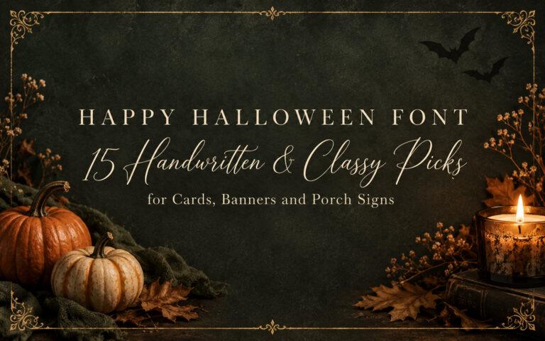
For friendly greetings on cards, banners and porch signs, look at handwritten and classy scripts where “Happy Halloween” is the whole message.
Happy Halloween Font: 15 Handwritten & Classy Styles
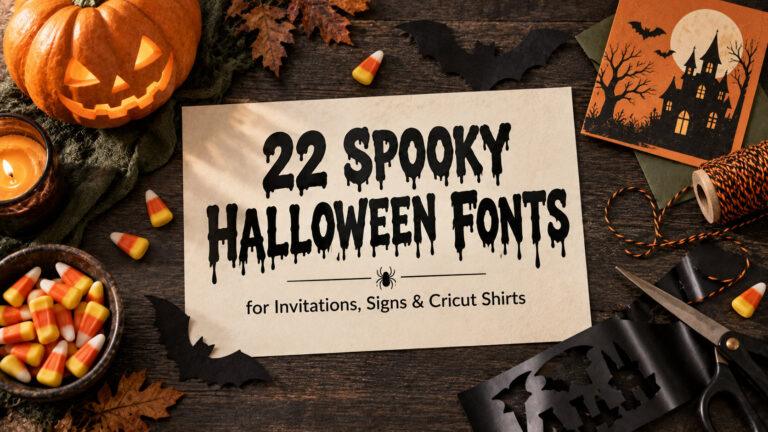
For party invitations, signs and Cricut shirts, start with spooky display fonts made for hosts and crafters.
22 Spooky Halloween Fonts for Invites, Signs & Cricut Shirts
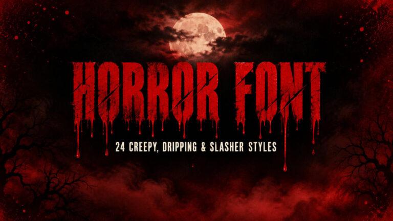
For haunted house signs and horror movie nights, go for creepy, dripping and slasher styles.
Horror Font: 24 Creepy and Dripping Styles for Halloween Signs
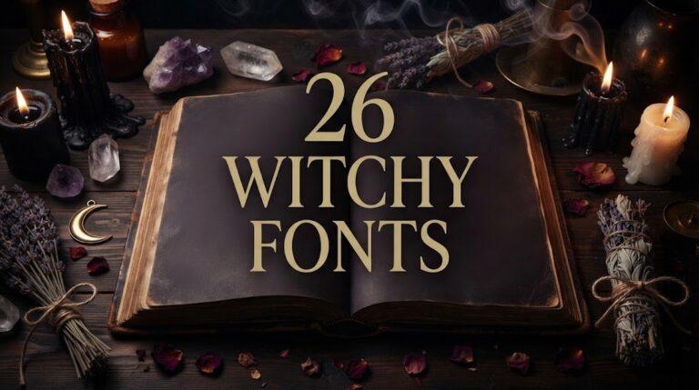
For witch parties, potion labels and spiritual brands, pick mystic serifs, handwritten spells and cute witch styles.
Witchy Fonts: 26 Mystic, Spooky and Cute Witch Font Styles
Halloween Fonts by Project
Party invitations need a spooky headline and a plain font for the date, time and address, so guests actually show up on the right night.
Porch and yard signs are read from a distance, so bold letters with simple effects work better than fine, scratchy ones.
Shirts and treat bags made on a Cricut need letters thick enough to cut, without tiny drips or splatters that are hard to weed.
Movie night posters and haunted house flyers can go fully creepy in the title, as long as the event details stay readable.
Checklist Before You Choose a Halloween Font
- Decide the mood first: friendly, spooky, creepy or witchy.
- Think about the audience: a kids’ party and an adult horror night need different fonts.
- Type your real words, not the alphabet.
- Check the font on black, deep purple and orange, the usual Halloween backgrounds.
- For Cricut projects, look closely at drips, cracks and splatter details before cutting.
- Read the license on the font page if you plan to sell shirts, printables or decor.
Halloween Font Terms Compared
| Term |
What It Means |
Where It Shows Up |
| Spooky font |
A Halloween font with a mild scary mood |
Invitations, signs, decor |
| Horror font |
A display font made to look frightening |
Haunted houses, movie posters |
| Dripping font |
Letters with drips of paint, slime or blood |
Titles, signs, shirts |
| Witchy font |
Mystic letters inspired by spell books and old labels |
Potion jars, tarot, witch parties |
| Display font |
A font made for big text, not long paragraphs |
Headlines, banners, posters |
Common Mistakes with Halloween Fonts
Making everything scary. A dripping font on a kids’ party invitation can feel wrong. Match the mood to the guests.
Using a horror font for details. Dates and addresses in dripping letters are hard to read. Keep the effect for the title.
Choosing fine scratchy letters for a sign. Thin, rough strokes vanish from a distance. Signs need bolder shapes.
Cutting tiny drips on vinyl. Small splatters and thin drips are hard to weed and peel off shirts.
Tip: one spooky font is enough. Pair it with a plain partner, and the scary part will look scarier.
Halloween Fonts FAQ
What font style works best for a Halloween party invitation?
A spooky or witchy display font for the party name, paired with a simple font for the date, time and address. It sets the mood and keeps the details clear.
What is the difference between spooky and horror fonts?
Spooky fonts give a light, fun Halloween feel. Horror fonts go further, with drips, cracks and slasher scratches that look truly creepy, which suits haunted houses and horror movie nights.
Which Halloween fonts work for kids’ designs?
Handwritten, rounded and cute witch styles feel playful without being frightening. They work well for treat bag tags, classroom printables and kids’ party invitations.
Can I cut Halloween fonts on a Cricut?
Many work well, especially bold display and handwritten styles. Fonts with tiny drips or splatters are harder to cut and weed, so check the preview closely first.
Are witchy fonts only for Halloween?
No. Witchy fonts also suit spiritual brands, tarot designs, candle labels and moon calendars, so they can be used all year round.