18 Editorial Fonts for Magazine Layouts, Book Design and Content-Rich Brands
Editorial fonts do the quiet work of publishing. They set the tone of a magazine spread, carry a novel for three hundred pages and make a long blog post easy to finish. Most of them are serifs, because serifs guide the eye along a line of text and give headlines a sense of authority.
This collection brings together 18 editorial font families from Fontspring, grouped by the job they do best: classic text serifs for books and long reads, headline serifs for covers and features, and contemporary serifs that stay comfortable on screen. Each entry describes how the letters look, where they work and what to pair them with.
All fonts in this list are on Fontspring. Each family page shows every style, its price and the licence options, so you can check what your project needs before you buy, and several of these families include a free style to test first.
More serif font collections:
20 Modern Serif Fonts for Brand Identity, Magazine Layouts and Premium Packaging
20 Logo Fonts for Small Business Branding, Shop Signs and Product Labels
In This Collection
Classic Text Serif Fonts for Books, Magazines and Long Reads
- 1. Minion Pro Font
- 2. Garamond Premier Pro Font
- 3. Adobe Caslon Pro Font
- 4. Baskerville Nova Pro Font
- 5. Calluna Font
Headline and Cover Serif Fonts for Magazines and Posters
- 6. Mrs Eaves Font
- 7. Recoleta Font
- 8. Blacker Pro Font
- 9. Engrace Font
- 10. Spitzkant Font
- 11. HV Fitzgerald Font
- 12. Bogue Font
Contemporary Serif Fonts for Blogs, Newsletters and Websites
- 13. Cala Font
- 14. Carat Font
- 15. Quador Font
- 16. Veritas AE Font
- 17. Geographica Font
- 18. Monarcha Font
Classic Text Serif Fonts for Books, Magazines and Long Reads
These are the workhorses of editorial design: quiet, readable serifs built for page after page of text.
1. Minion Pro Font by Adobe
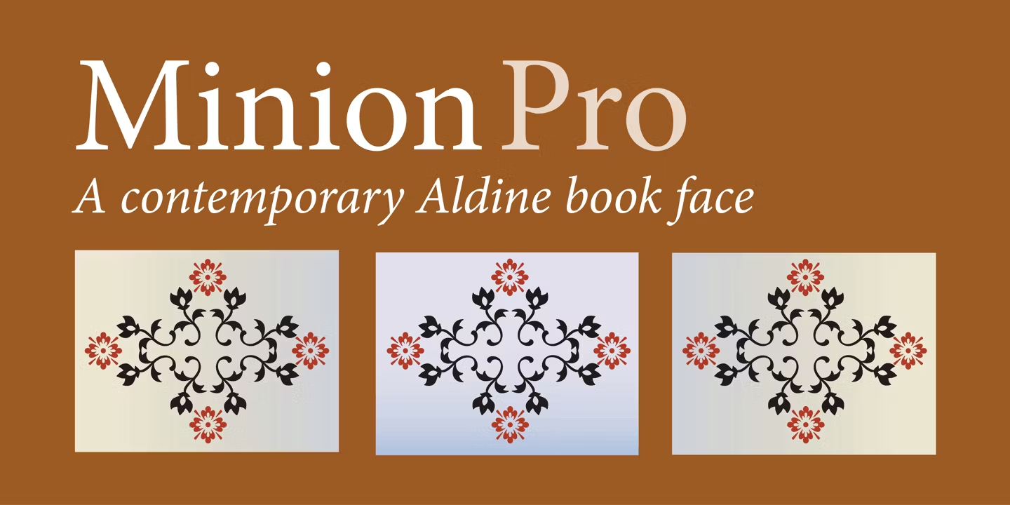
Best For: books, magazine body text, annual reports, long articles
Minion Pro Font is calm and even: moderate contrast, balanced proportions and nothing that pulls the eye away from the words. It is the kind of text face that disappears into the reading, which is exactly what body text should do.
The family has 65 styles, so captions, subheads, body copy and display lines can all come from one source. For navigation, labels or photo credits, add a clean sans serif and let Minion carry the reading.
2. Garamond Premier Pro Font by Adobe
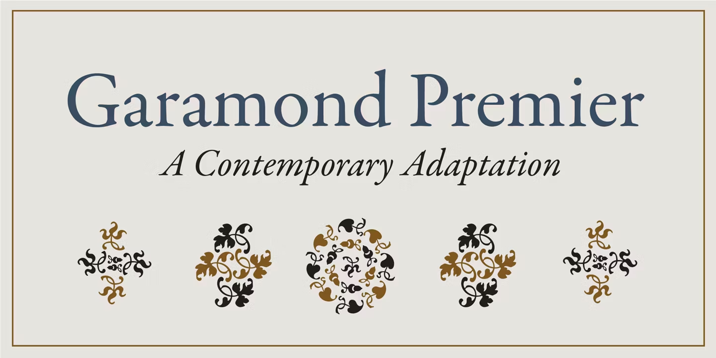
Best For: literary books, essays, cultural magazines, museum and gallery print
Garamond Premier Pro Font follows the Garamond tradition: open, graceful letters with a gentle, even rhythm. The capitals look refined and the lowercase stays airy on the page.
With 34 styles, it covers long reading and elegant titling alike. Give the text generous line spacing; Garamond is at its best when the page has room to breathe.
3. Adobe Caslon Pro Font by Adobe
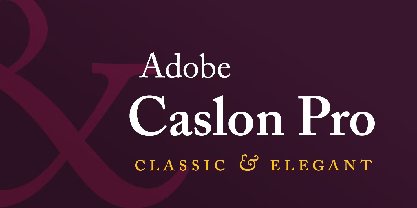
Best For: book interiors, classic editorial layouts, literary invitations
Adobe Caslon Pro Font has a sturdy, slightly irregular rhythm that feels printed on paper. The serifs are solid and the texture on the page is warm and bookish.
The family is compact, with six styles, so it works best as a text face. For large cover titles, pair it with a display serif from the next group.
4. Baskerville Nova Pro Font by John Baskerville and Linotype Design Studio
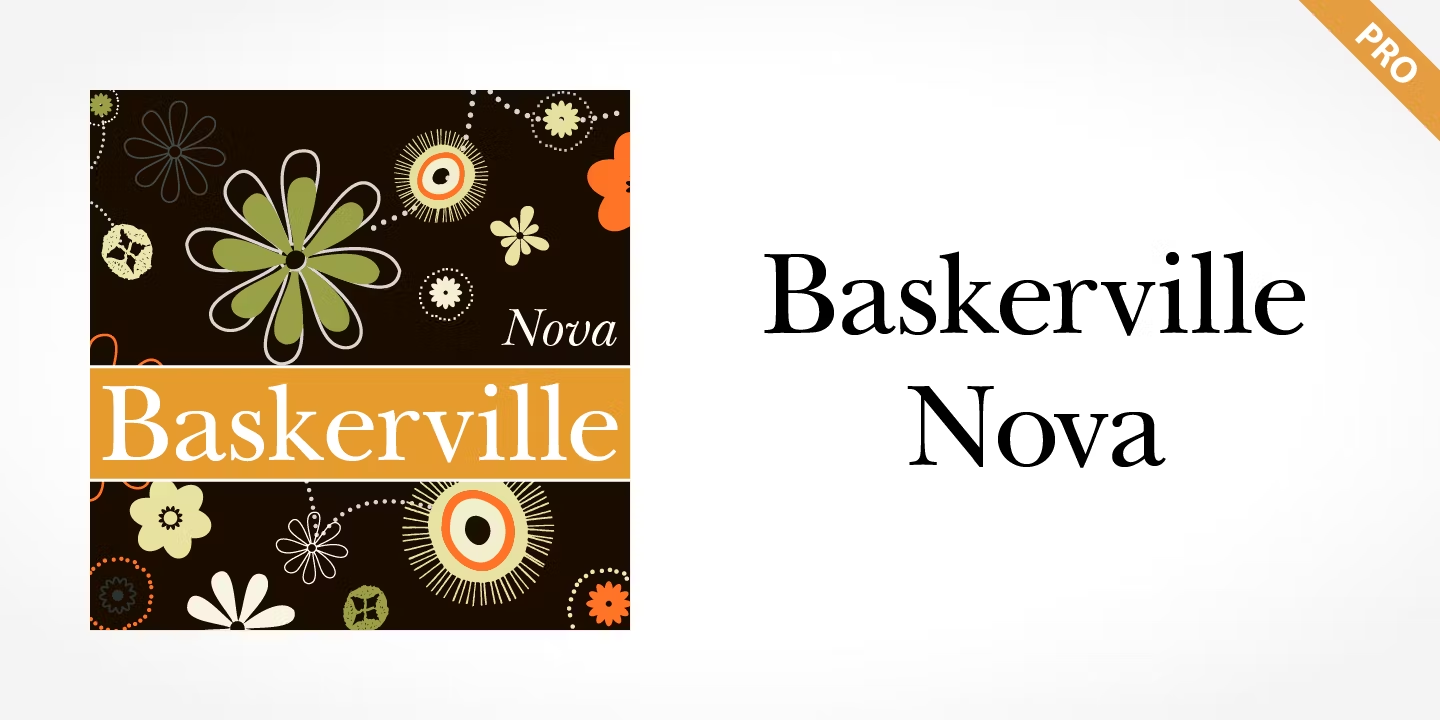
Best For: magazine features, academic publishing, formal reports
Baskerville Nova Pro Font shows the classic Baskerville traits: round bowls, clear contrast between thick and thin strokes, and crisp serifs. The result is polished and orderly.
It sits between the old-style and modern families: sharper than Garamond, softer than Bodoni. That middle position makes it comfortable in both headlines and paragraphs, and it pairs naturally with the high-contrast serifs from our modern serif collection.
5. Calluna Font by exljbris Font Foundry
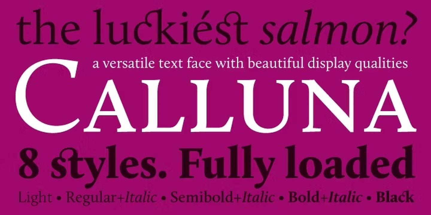
Best For: long-form blogs, novels, newsletters
Calluna Font has serifs with a clear direction to them, so the line seems to move forward as you read. It is a text face with personality that never gets in the way.
One style is free on Fontspring, which is a practical way to test it on real paragraphs before buying the family.
Headline and Cover Serif Fonts for Magazines and Posters
Display-minded serifs for titles, cover lines and pull quotes, where the typeface sets the tone of the whole page.
6. Mrs Eaves Font by Zuzana Licko
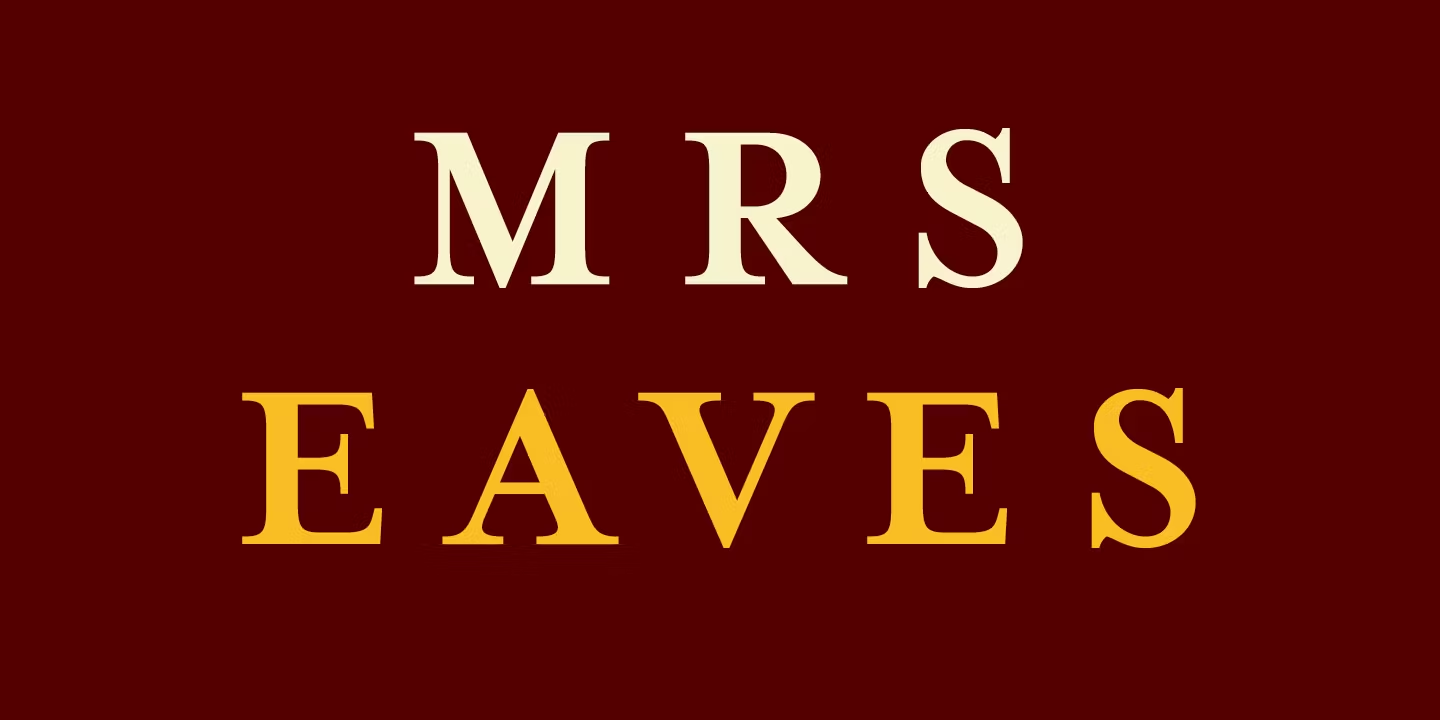
Best For: magazine headlines, book covers, elegant short texts
Mrs Eaves Font is instantly recognisable: wide proportions, open spacing and a refined, slightly literary look. In the preview the letters sit comfortably apart, which gives titles a calm, luxurious pace.
It shines in headings, pull quotes, cover lines and short passages. For long body text, pair it with a narrower text serif from the first group.
7. Recoleta Font by Jorge Cisterna
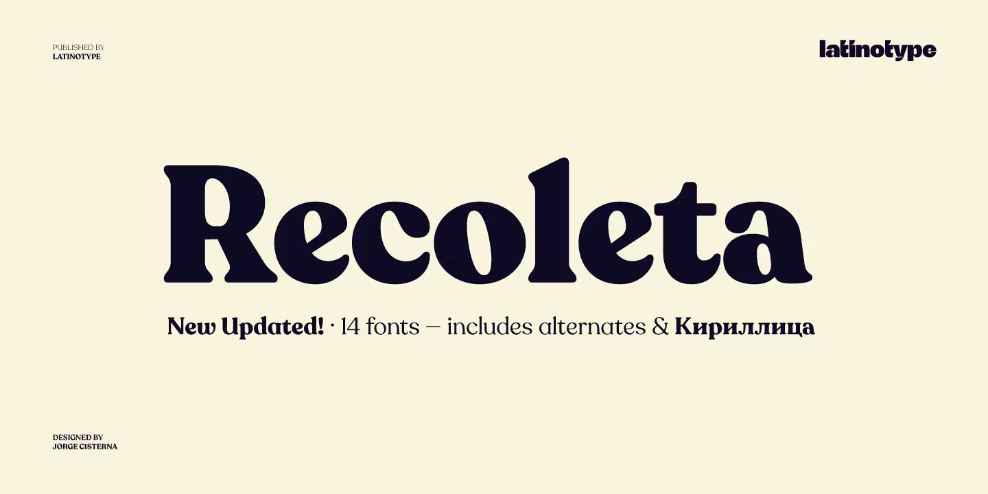
Best For: food and lifestyle magazines, cookbook covers, café menus, blog headers
Recoleta Font has soft, rounded serifs and a warm feel with a hint of the 1970s. It looks friendly and inviting rather than formal.
Use it for headlines and section titles, then switch to a neutral text serif for paragraphs. The contrast between the two keeps a layout warm without making it busy.
8. Blacker Pro Font by Cosimo Lorenzo Pancini and Andrea Tartarelli
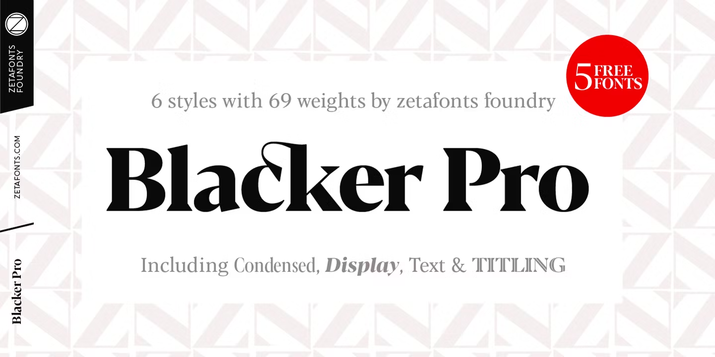
Best For: bold magazine headlines, covers, posters
Blacker Pro Font appears in the preview in a heavy weight with strong contrast and sharp, wedge-like serifs. It is built to hold attention on a cover.
The family has 69 styles, so lighter cuts can handle subheads and standfirsts while the bold carries the main headline.
9. Engrace Font by Angèle Kamp
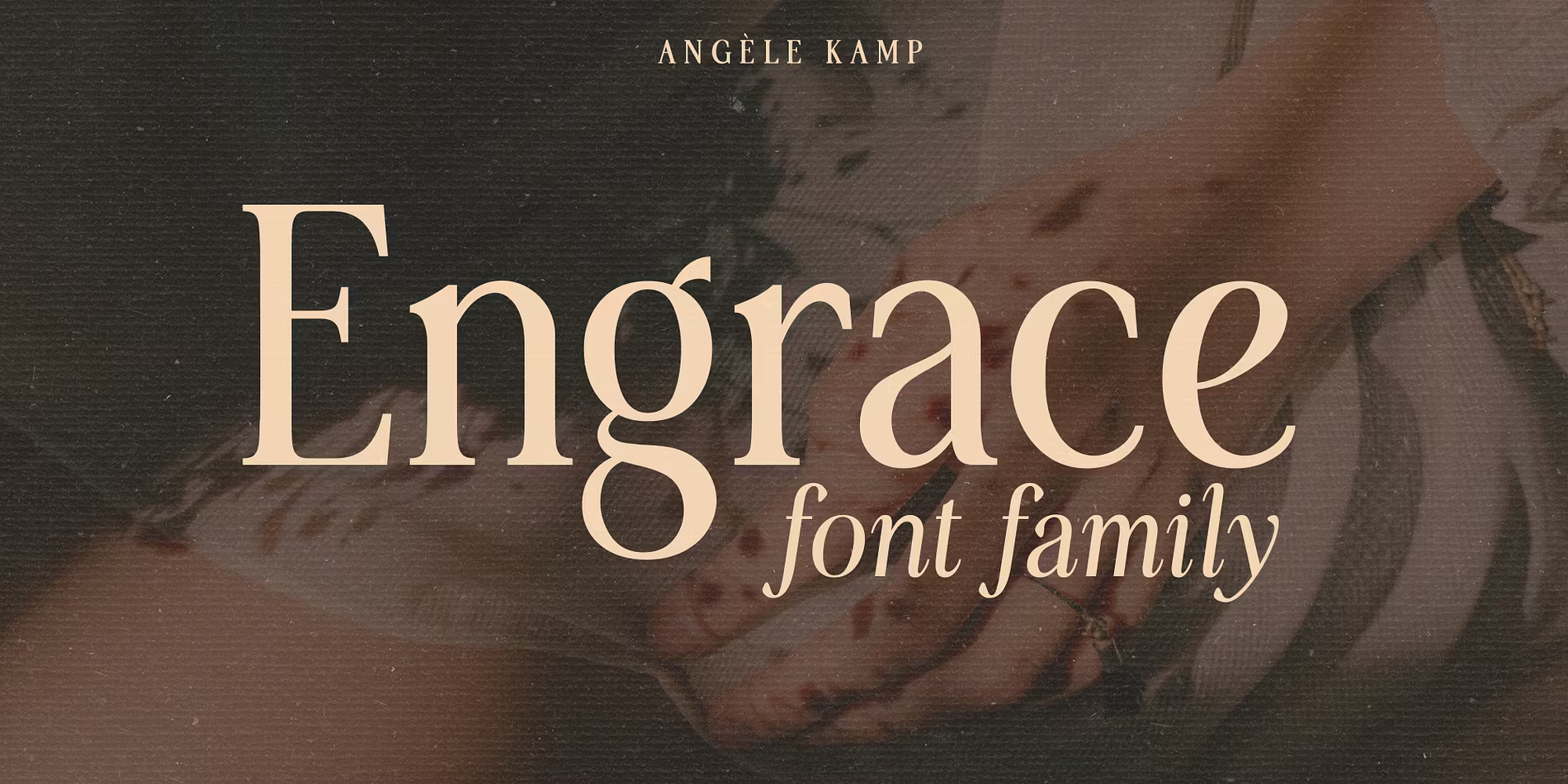
Best For: narrow columns, cover lines, posters
Engrace Font is narrow, tall and tightly set. The preview shows long words fitting into a small width without losing their elegance.
That makes it useful when a long headline has to fit a narrow column or the spine of a design. At smaller sizes, open the letter spacing slightly so the letters do not crowd.
10. Spitzkant Font by Julien Fincker
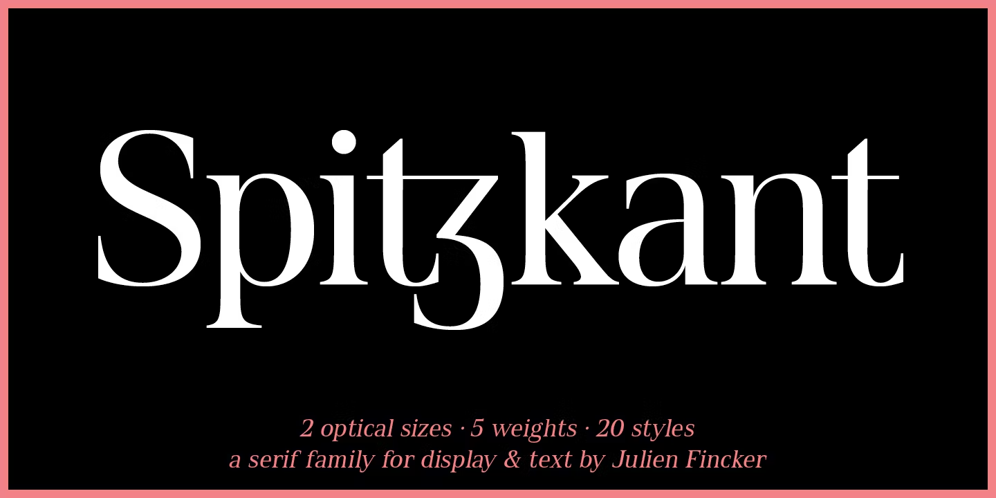
Best For: contemporary magazine headlines, editorial branding, exhibition graphics
Spitzkant Font has sharply cut, pointed serifs that give it a crisp, contemporary edge while keeping a classic structure.
There are 20 styles, one of them free on Fontspring. It suits publications that want to look current without dropping serifs altogether.
11. HV Fitzgerald Font by Max Duy T
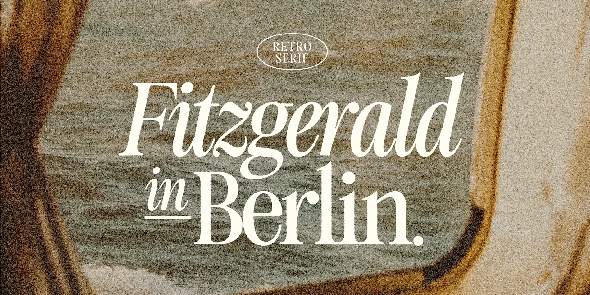
Best For: elegant headlines, fashion editorials, invitations
HV Fitzgerald Font is light, slender and tall, with fine strokes that give headlines a delicate, polished look.
The family is small, with four styles, and the thin strokes need size. Use it large for titles and leave the text to a sturdier serif.
12. Bogue Font by Mika Melvas
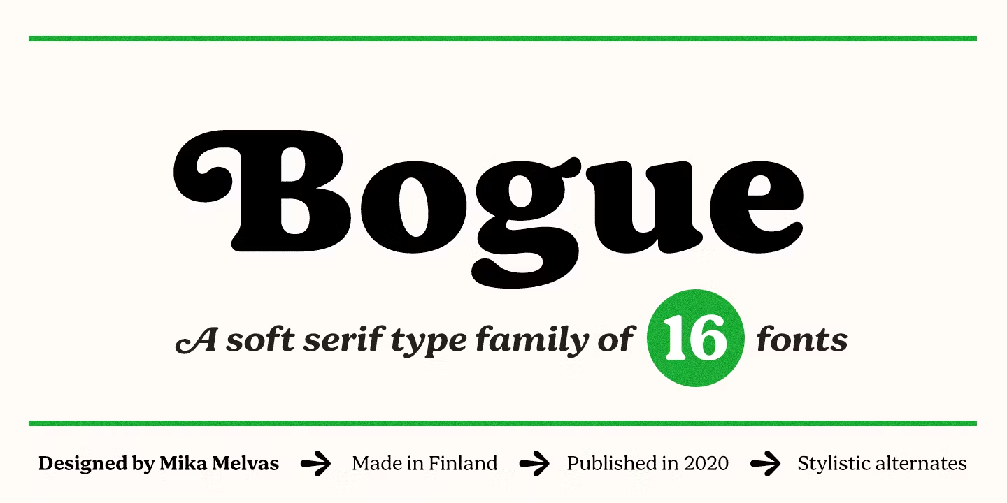
Best For: confident headlines, brand editorial, newsletters
Bogue Font is sturdy and slightly wide, with low contrast and a warm, approachable character.
Its 16 styles read well from headline size down to short paragraphs, so it can give a newsletter or brand blog a consistent voice without shouting.
Contemporary Serif Fonts for Blogs, Newsletters and Websites
Newer text serifs with open shapes and clear details that stay comfortable on screen as well as in print.
13. Cala Font by Hoftype
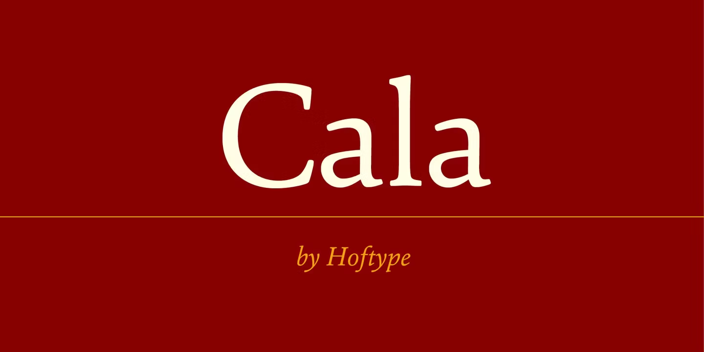
Best For: blogs, websites, newsletters
Cala Font is clear and open, with moderate contrast that keeps it readable on screen and in print.
One style is free on Fontspring. It is a sensible choice when a site needs a serif that looks considered but never gets tiring over a long article.
14. Carat Font by Hoftype
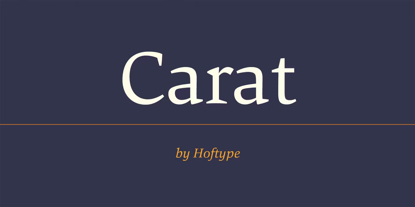
Best For: essays, cultural blogs, book-like websites
Carat Font has open shapes with light calligraphic touches, which gives the text a more literary tone than Cala.
One style is free on Fontspring. The two Hoftype designs work well side by side: Carat for titles and quotes, Cala for the running text.
15. Quador Font by Arne Freytag
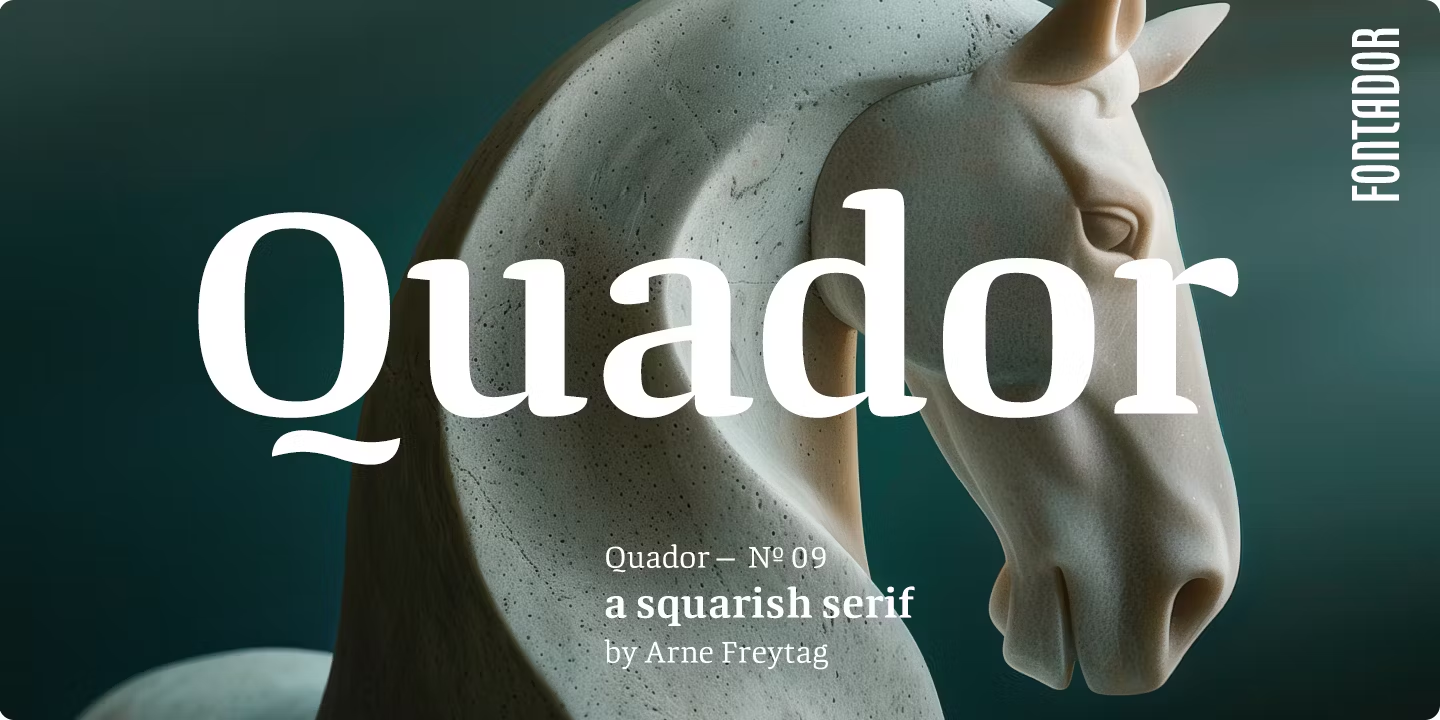
Best For: design and tech blogs, modern reports, product pages
Quador Font has slightly squared bowls that give a classic serif a contemporary, engineered feel.
It fits publications that sit between tradition and technology. One style is free on Fontspring for testing.
16. Veritas AE Font by Brian Sooy
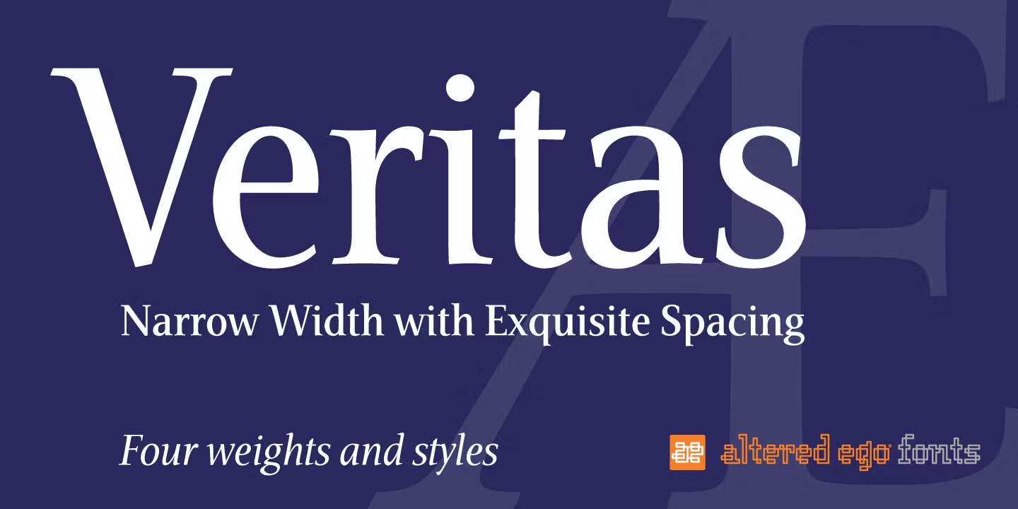
Best For: news-style layouts, dense websites, sidebars
Veritas AE Font is compact and crisp, fitting more words per line without looking squeezed.
That economy helps on pages with a lot of content: news sites, directories, sidebars and multi-column layouts.
17. Geographica Font by Brian Willson

Best For: travel and history writing, book-style blogs
Geographica Font is sturdy, dense and bookish, with a solid texture on the page.
With four styles, it works best as a text or subhead face. It suits content with a sense of place and history, such as travel essays or heritage features.
18. Monarcha Font by IsacoType
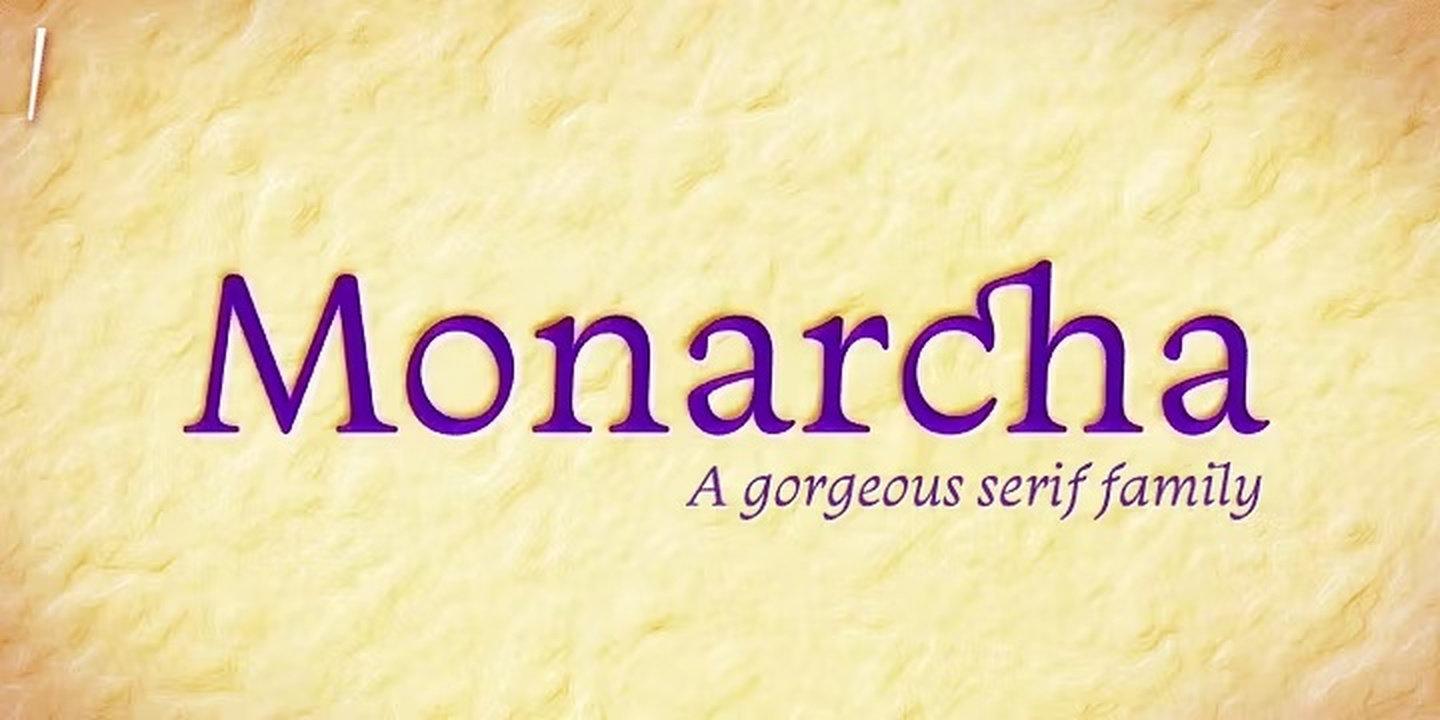
Best For: long reads, lifestyle blogs, magazines
Monarcha Font is wide, open and slightly soft, which makes long paragraphs comfortable to follow.
It has eight styles and a friendly tone that suits lifestyle and culture writing, where the page should feel relaxed rather than formal.
How to Choose Editorial Fonts
Pick the text font first. Readers spend most of their time in paragraphs, not headlines. Choose a serif from the first or third group that feels comfortable over several pages, then find a headline font that suits it.
Pair contrast, not copies. A good headline and text pair differs clearly in weight or width. Blacker Pro Font over Minion Pro Font, or Recoleta Font over Cala Font, reads as a deliberate system; two similar serifs side by side look like a mistake.
Test with real content. Use the tester on each Fontspring family page with an actual headline and a full paragraph from your project. Check italics, numbers and punctuation, since editorial layouts use all three.
Check the licence for every format. A magazine may appear in print, as a PDF, on a website and in an app. Each Fontspring family page has a licensing section, so confirm the licence covers every place the text will appear.
Editorial Fonts FAQ
What are editorial fonts?
Editorial fonts are typefaces chosen for publishing: magazines, newspapers, books, blogs and reports. They include text fonts designed for long reading and display fonts designed for headlines and covers. Most of the classic choices are serifs.
Should editorial fonts be serif or sans serif?
Both are used, but serifs remain the traditional choice for long printed text and for headlines with a literary or authoritative tone. Many publications combine a serif for headlines or body text with a sans serif for captions, labels and navigation.
How many fonts should a magazine or blog use?
Two families are usually enough: one for text and one for headlines. A large family, such as Minion Pro Font or Blacker Pro Font, can even cover both roles through its range of weights.
Which fonts in this list have a free style?
On Fontspring, Calluna Font, Spitzkant Font, Cala Font, Carat Font and Quador Font each show one free style. It is a simple way to test the design on real text before buying the full family.
Where to Start
For a book or a long-form magazine, start with Minion Pro Font or Garamond Premier Pro Font as the text face. For covers and features, add Mrs Eaves Font for elegance or Blacker Pro Font for impact. For a blog or newsletter, Cala Font and Monarcha Font keep long posts easy to read, and Recoleta Font gives headlines a warm, welcoming voice.