Tattoo Lettering Fonts: 16 Bold Picks for Blackletter, Script and Fine-Line Designs
Tattoo lettering fonts have to survive something no other typography does. A poster gets reprinted, a logo gets redrawn, but ink sits in skin and stays there. That changes what makes a letterform good: not how impressive it looks blown up on a product page, but whether its thin joints still read after the lines spread, and whether a stranger can tell a b from an h at arm’s length.
The sixteen fonts below are grouped by the four jobs that actually come up. Blackletter and Old English for weight and tradition. Chicano and ornamental script for the flowing, swash-heavy look. Bold display for short statement words. Fine-line for delicate work, which is where the current demand is running and where most roundups have nothing to offer.
For softer script work outside the tattoo register, see our roundup of 14 Elegant Cursive & Script Fonts for Wedding & Branding Design.
Every font here is on Creative Fabrica, so an All Access subscription covers the whole list.
Table of Contents
- Blackletter & Old English Tattoo Fonts
- Chicano & Ornamental Script Tattoo Fonts
- Bold Statement & Display Tattoo Fonts
- Fine-Line & Delicate Tattoo Fonts
- How to Choose a Tattoo Lettering Font
- FAQ
What Makes Lettering Work as a Tattoo
Three things separate a typeface that works on skin from one that only works on screen.
Stroke weight has to be uneven on purpose. Fonts built on a single hairline weight lose their rhythm once the ink settles. The ones that age well have a clear contrast between thick and thin, so even when the fine strokes thicken slightly, the shape of the letter is still carried by the heavy ones.
Counters need room. The enclosed white space inside an a, e or o is the first thing to close up. Dense blackletter looks spectacular in a specimen and turns into a solid block on a forearm if the size is wrong. Bigger placement, or a font with open counters.
Swashes are a layout decision, not decoration. A script with extravagant tails needs space around the word. Squeeze the same word into a wrist and the tails either get cut or crowd the letters they were meant to frame.
Blackletter & Old English Tattoo Fonts
The oldest register in tattoo lettering and still the most requested. These four cover the range from strict historical Old English to sharper modern interpretations.
1. Vorged Font
by dawaii
Best For: old-school flash, merch, retro labels
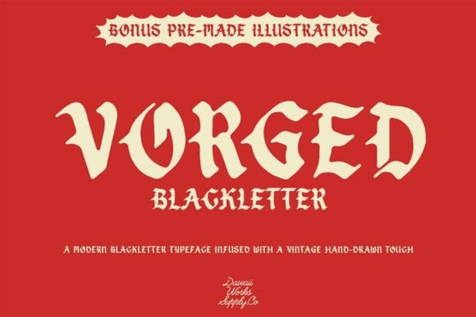
Vorged is a hand-drawn blackletter rather than a geometric revival, and the difference shows in the diagonals. The breaks in the strokes are softened just enough that the letters keep their medieval structure without the brittle, machine-cut edges that make some blackletter hard to read. Contrast is strong but the counters stay open.
The package includes a set of old-school tattoo illustrations built in the same drawing style, which makes this one unusually practical if you are designing a full piece rather than picking type. Set the word large, let the illustrations sit around it, and the two read as one drawing.
2. Tattoo Old English Font
by Chonada
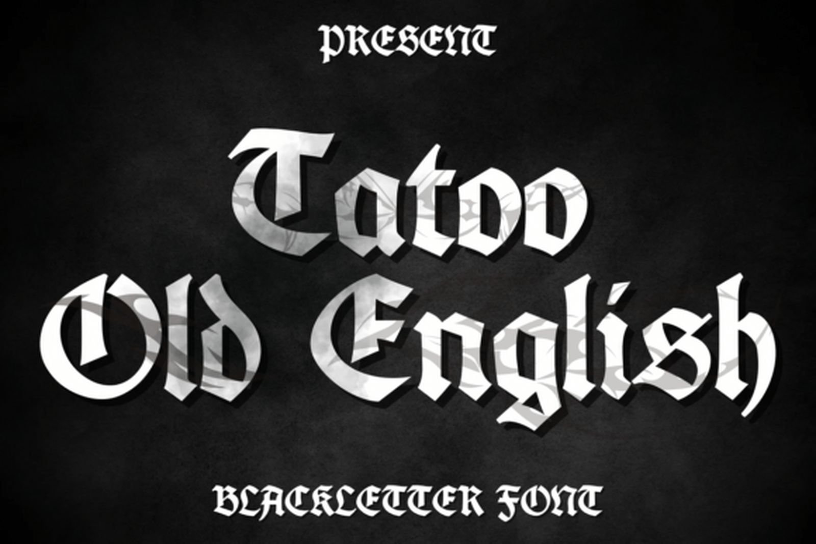
Best For: chest and back lettering, name pieces, classic script work
This is the shape most people picture when they say Old English: heavy vertical stems, hairline connectors, spurs coming off the capitals at sharp angles. Nothing has been modernised. If a client brings in a reference photo of traditional lettering, this is usually closer to it than any reinterpretation.
It is also the least forgiving font in this group. The dense capitals need real size to stay legible, and the lowercase packs tightly, so tracking has to be opened up for anything longer than one word. Used big, it does exactly what it promises.
3. Aortascarta Font
by typealiens
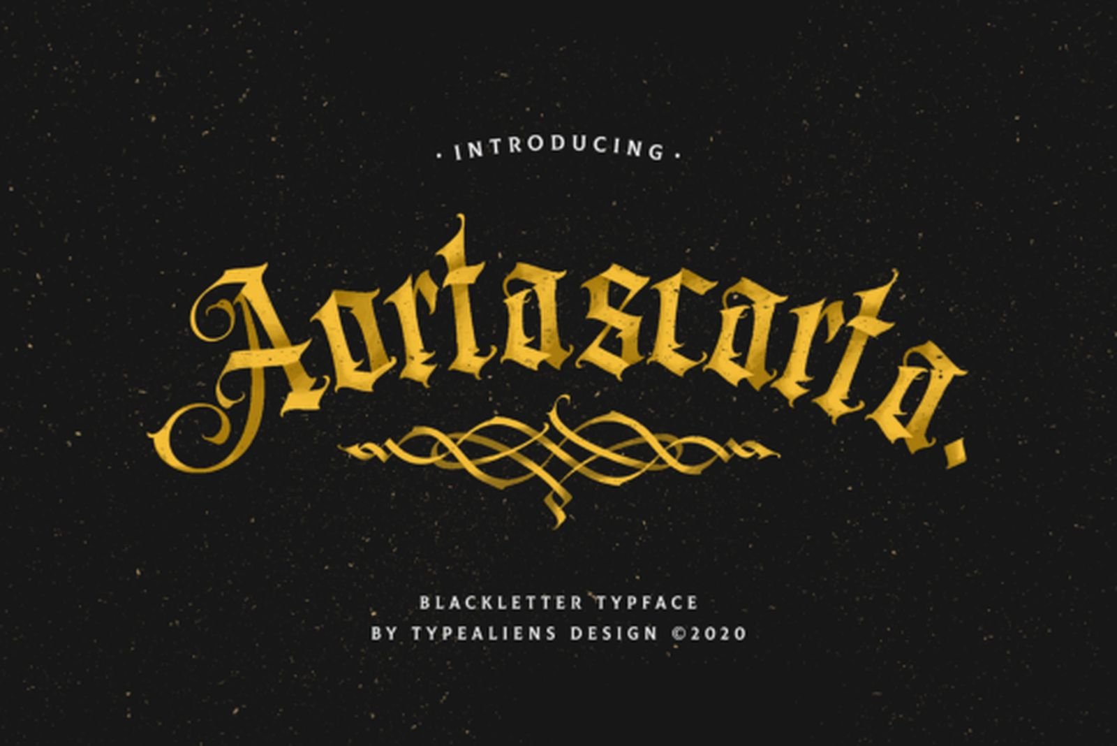
Best For: logos, packaging, tattoo lettering, certificates
Aortascarta pushes the fractures further than traditional blackletter does. The breaks in each stroke are more pronounced, the terminals extend into points, and several letters carry extra flicks that a historical face would not have. The result is recognisably gothic but noticeably more aggressive.
Because the decoration lives at the ends of strokes rather than inside the letter bodies, it survives scaling better than it looks like it should. Good choice when the client wants gothic but the existing references all feel too churchy.
4. Sorento Font
by Hendrik studio
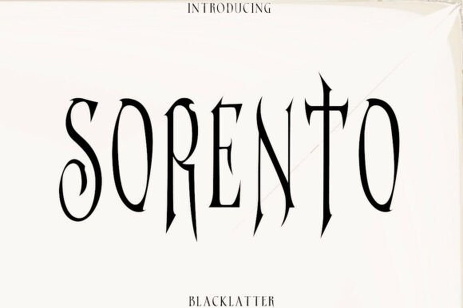
Best For: apparel, album covers, beverage labels, street-culture branding
Sorento is the outlier of the four and the reason it earned a place. The letters are tall, narrow and cut with straight sharp lines rather than the curved fractures of traditional blackletter. It reads as European gothic filtered through modern display type, which means it sits next to contemporary design without looking like a costume.
The condensed proportions make it the most space-efficient option here. A long word that would sprawl in Old English fits in a much tighter column, which matters for vertical placements like spine or forearm lettering.
Chicano & Ornamental Script Tattoo Fonts
Flowing, swash-heavy lettering with roots in West Coast tattoo tradition. All four need horizontal room, so plan the placement before the font. For flowing cursive script specifically, see our roundup of 20 Cursive Tattoo Fonts for Names, Quotes and Fine-Line Work.
5. Chicago Font
by Whymore
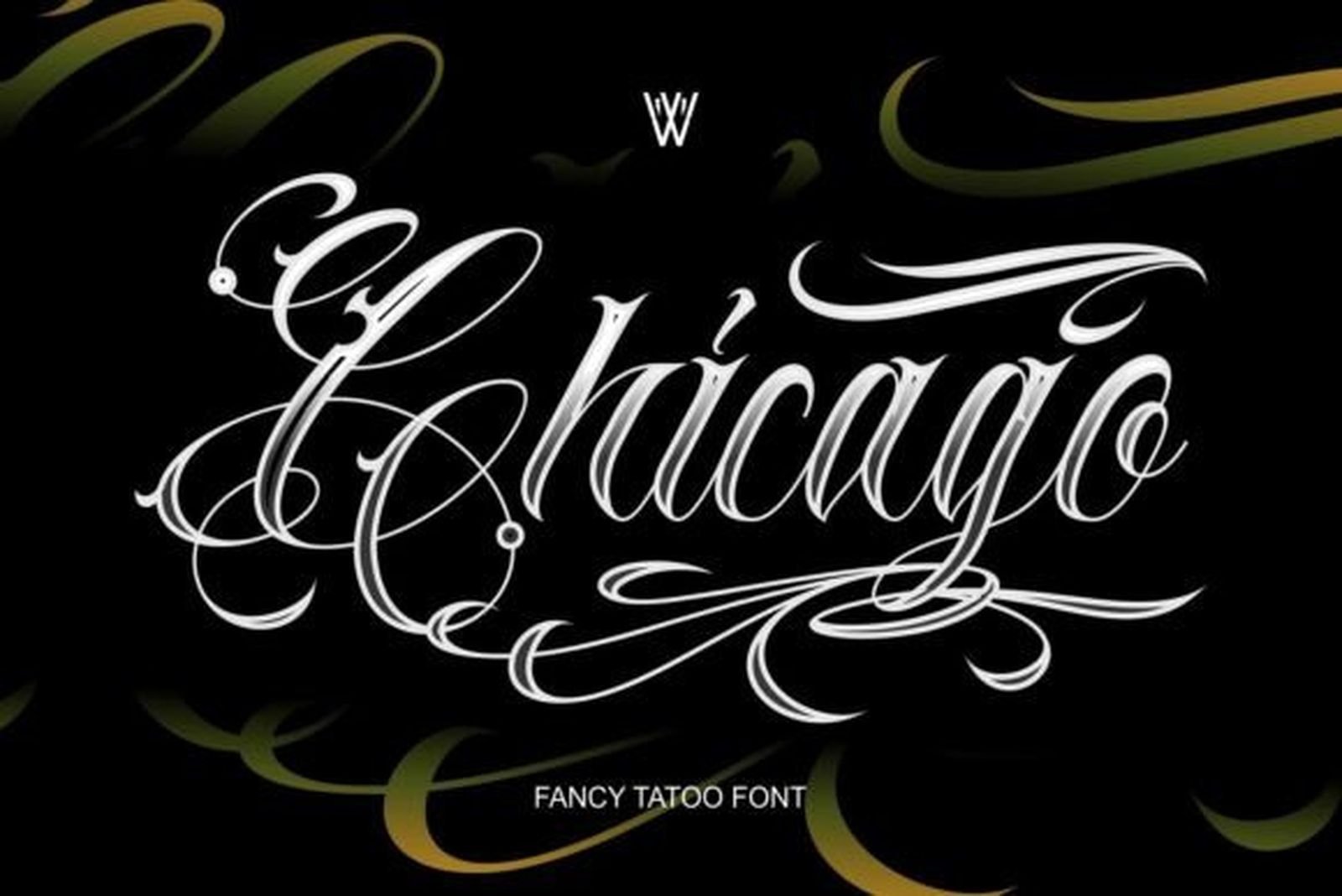
Best For: custom tattoo lettering, streetwear branding, vintage artwork
Worth knowing before you click: Chicago is a collection rather than a single face. It bundles bold blackletter, elegant script and Chicano calligraphy, which makes it the best value on this list if you work across several lettering styles. The specimen shows the script member, with long connected flourishes running above and below the word.
Having the blackletter and the script drawn by the same hand solves a problem that comes up constantly in tattoo design: mixing two registers in one piece without them fighting. A name in the script with a date underneath in the blackletter will look deliberate rather than assembled.
6. Ulgiora Font
by Whymore
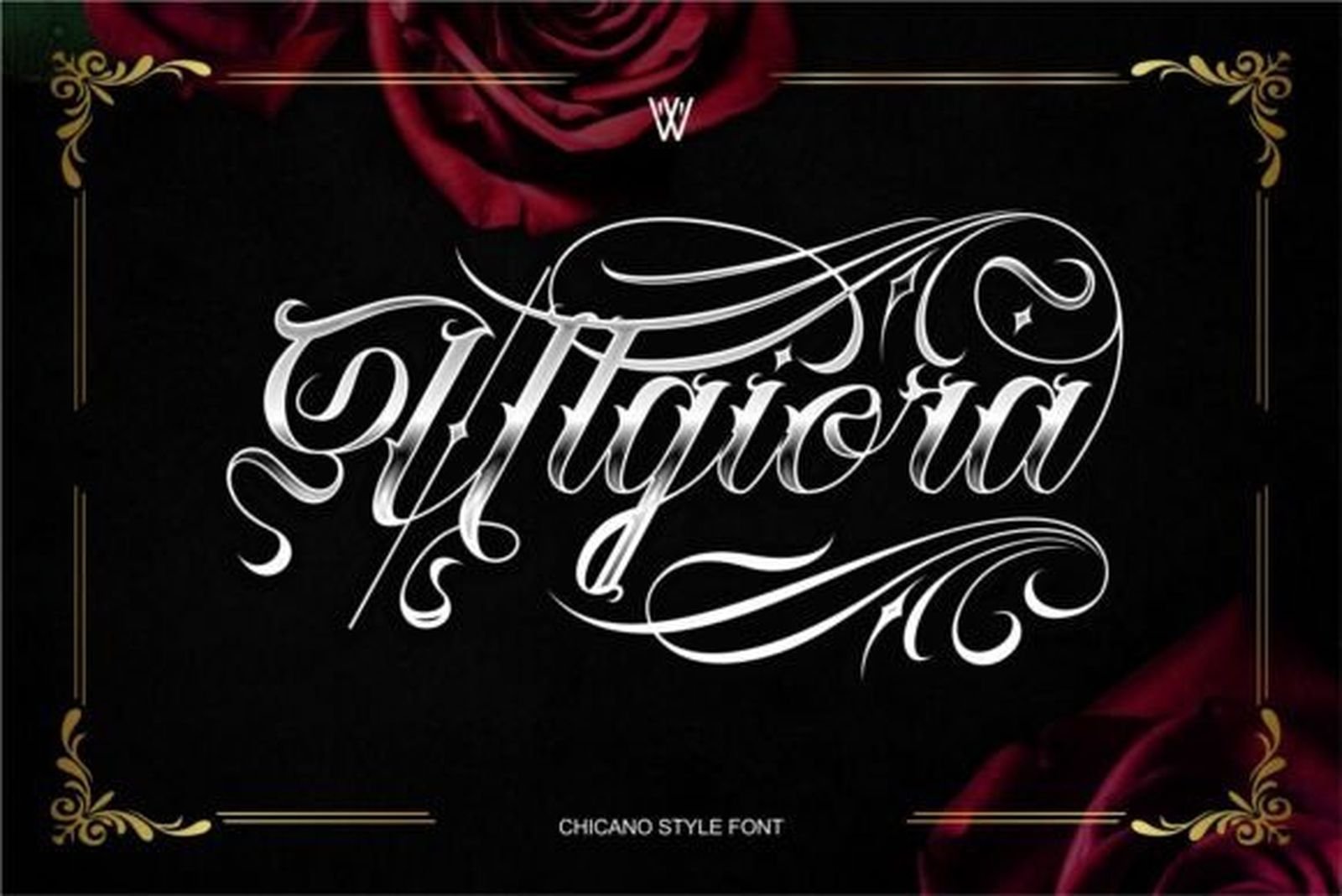
Best For: custom lettering, barbershop branding, streetwear, fashion
Ulgiora sits between Chicano script and blackletter. The lowercase flows like a script, but the capitals carry the angular construction of gothic type, and the swashes are tighter and more controlled than in a pure Chicano face. Letters are narrower too, so words hold together instead of spreading.
That combination makes it more versatile than its category suggests. It reads as tattoo lettering on skin and as premium branding on a logo, which is rare. Use the plain forms for the body of a design and bring in the swash versions only on the first and last letter.
7. InuTattoo Script Font
by inumocca_type
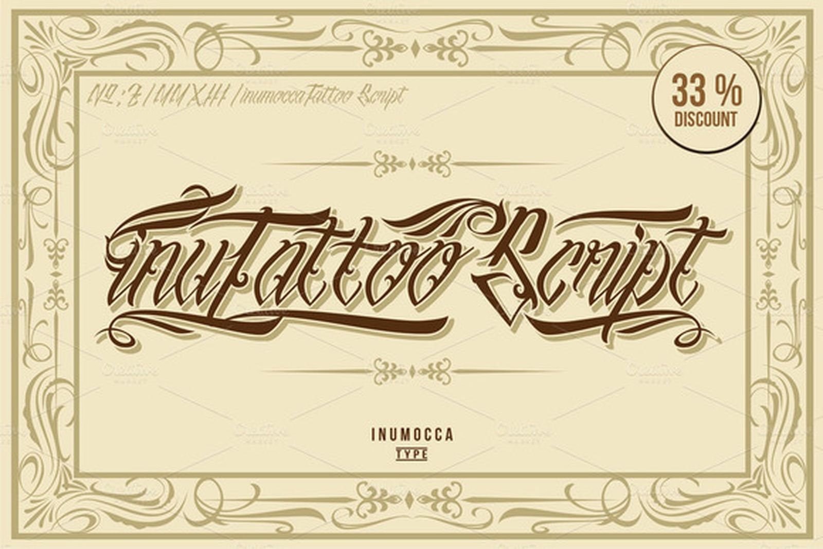
Best For: headings, logos, t-shirt designs, labels, book covers
Drawn from tattoo lettering and swirl work, InuTattoo Script is the most even-tempered script in this group. The slant is consistent, the loops are regular in size, and the flourishes stay close to the letters instead of launching away from them. Nothing about it is showy.
That restraint is the point. When the word matters more than the lettering, a script that calls less attention to itself is the correct answer, and this one still reads unmistakably as tattoo type. It also handles longer phrases better than the heavily ornamented options.
8. Ristogea Font
by Keristyper
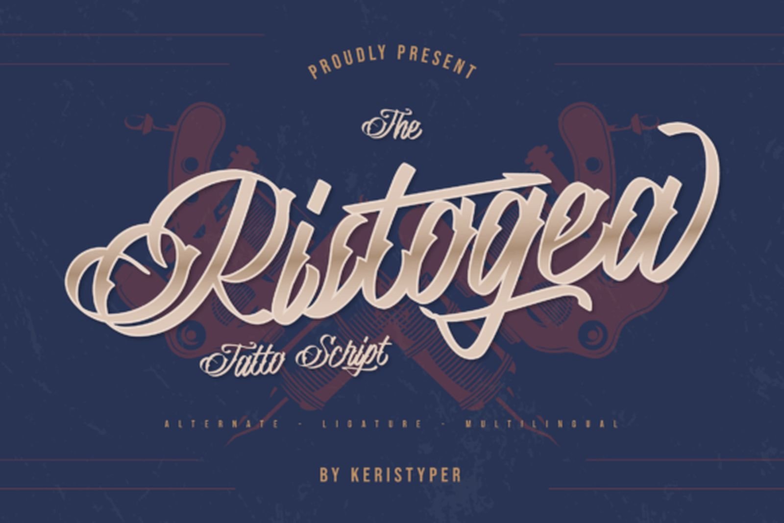
Best For: branding, tattoo studio logos, flyers, posters, t-shirt printing
Ristogea rounds everything off. Where InuTattoo keeps its curves tight, this one lets them open out, giving the word a softer, almost hand-painted rhythm. The strokes are thicker through the middles, so it holds its weight better at smaller sizes than most ornamental scripts.
The specimen shows alternates and ligatures in the set, which is what you want for studio branding: the same word can be set two or three ways until the connections land properly. Best on wide horizontal placements where the tails have somewhere to go.
Bold Statement & Display Tattoo Fonts
Heavy, high-impact lettering for short words. These are built for a single line that has to land immediately.
9. Tattoo Master Font
by Vozzy Vintage Fonts And Graphics
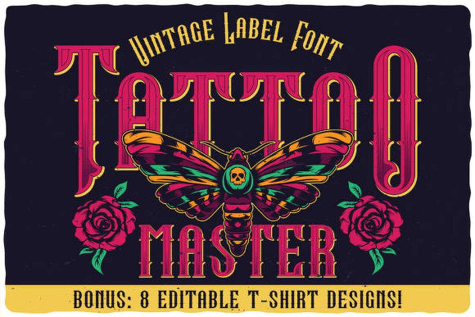
Best For: merch, t-shirt graphics, poster headlines
Tattoo Master is heavy, upright and outlined, closer to vintage sign painting than to gothic lettering. The strokes are thick with almost no modulation, the shapes are simple, and legibility is never in question. Three or four letters in this face fill a space completely.
It also ships with eight editable t-shirt designs, which changes the calculation if you are producing merchandise rather than designing ink. The font on its own is a strong headline face; with the apparel artwork included, it covers a whole product line.
10. Forlan Tattoo Font
by Creative Fabrica Fonts
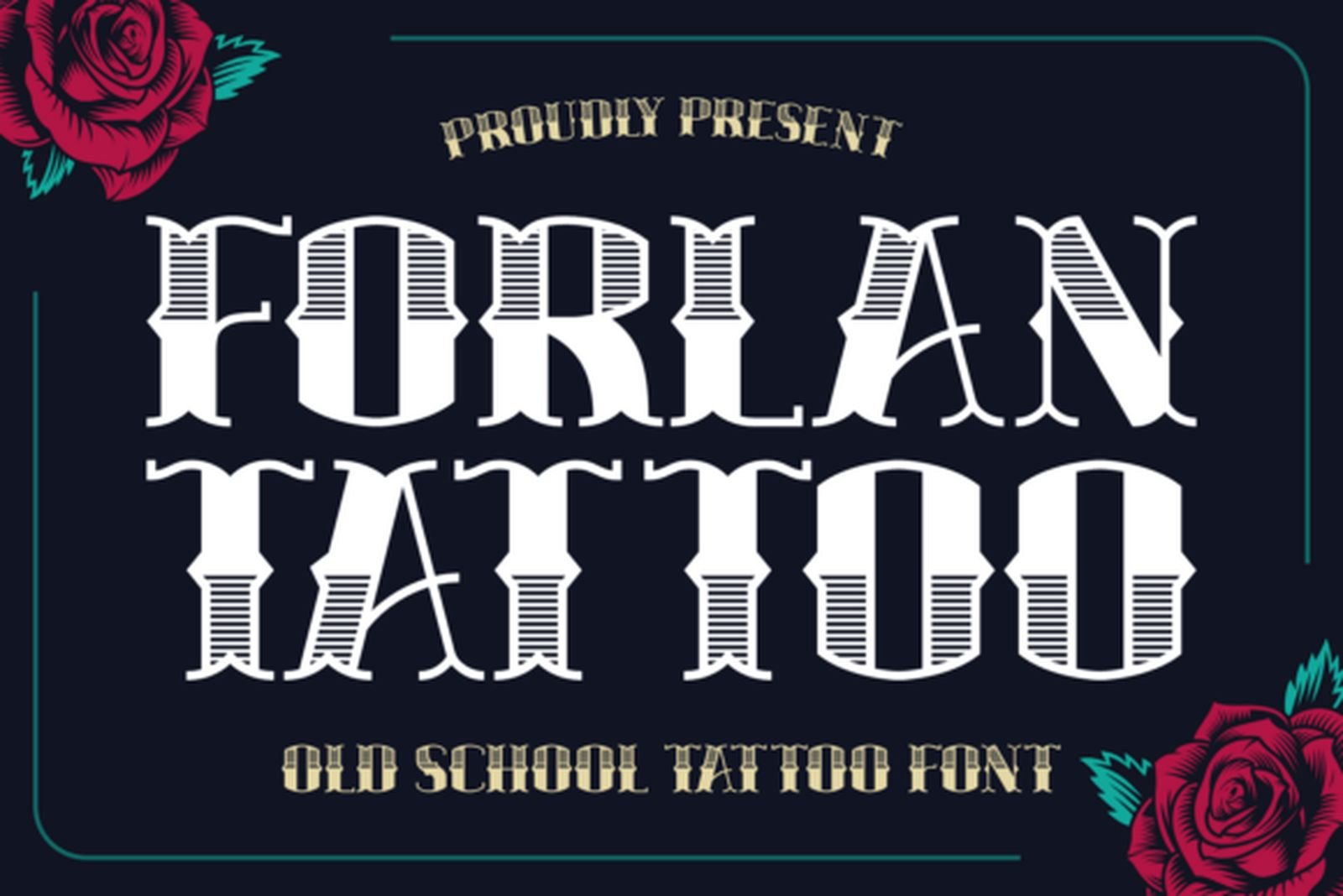
Best For: traditional tattoo art, flash sheets, bold single words
Forlan Tattoo is old-school blackletter compressed into a condensed width. Sharp angles at the joints, decorative detail worked into the stems, and very little air between the letters. It carries the traditional look while taking up considerably less room than a classical Old English face.
The tight fit is the main reason to reach for it. On a narrow placement where the word has to run in one line, this holds its character where a wider gothic face would force a break. Keep the tracking as drawn; opening it up dilutes the effect.
11. Classic Tattoo Font
by Blankids Studio
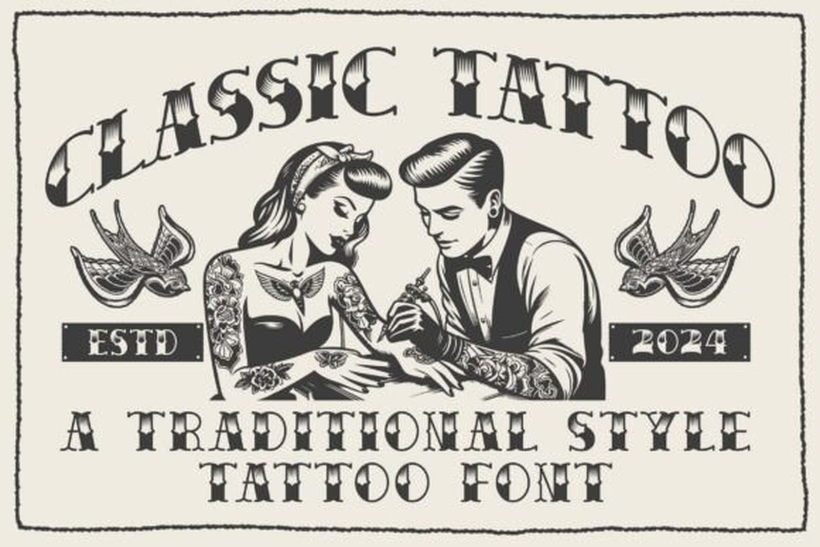
Best For: logotypes, watermarks, product packaging, promotions
Every letter in Classic Tattoo is drawn in traditional flash style, which gives the set an internal consistency that mixed-inspiration fonts rarely have. The forms are narrow, the terminals are cut cleanly, and there is no ornament beyond what the letter shapes themselves carry.
It is the most neutral font in this group, in the useful sense: it signals traditional tattoo without committing to gothic, Chicano or biker styling. That makes it a safe base when the rest of a design is already doing the talking.
12. Golyath Font
by Whymore
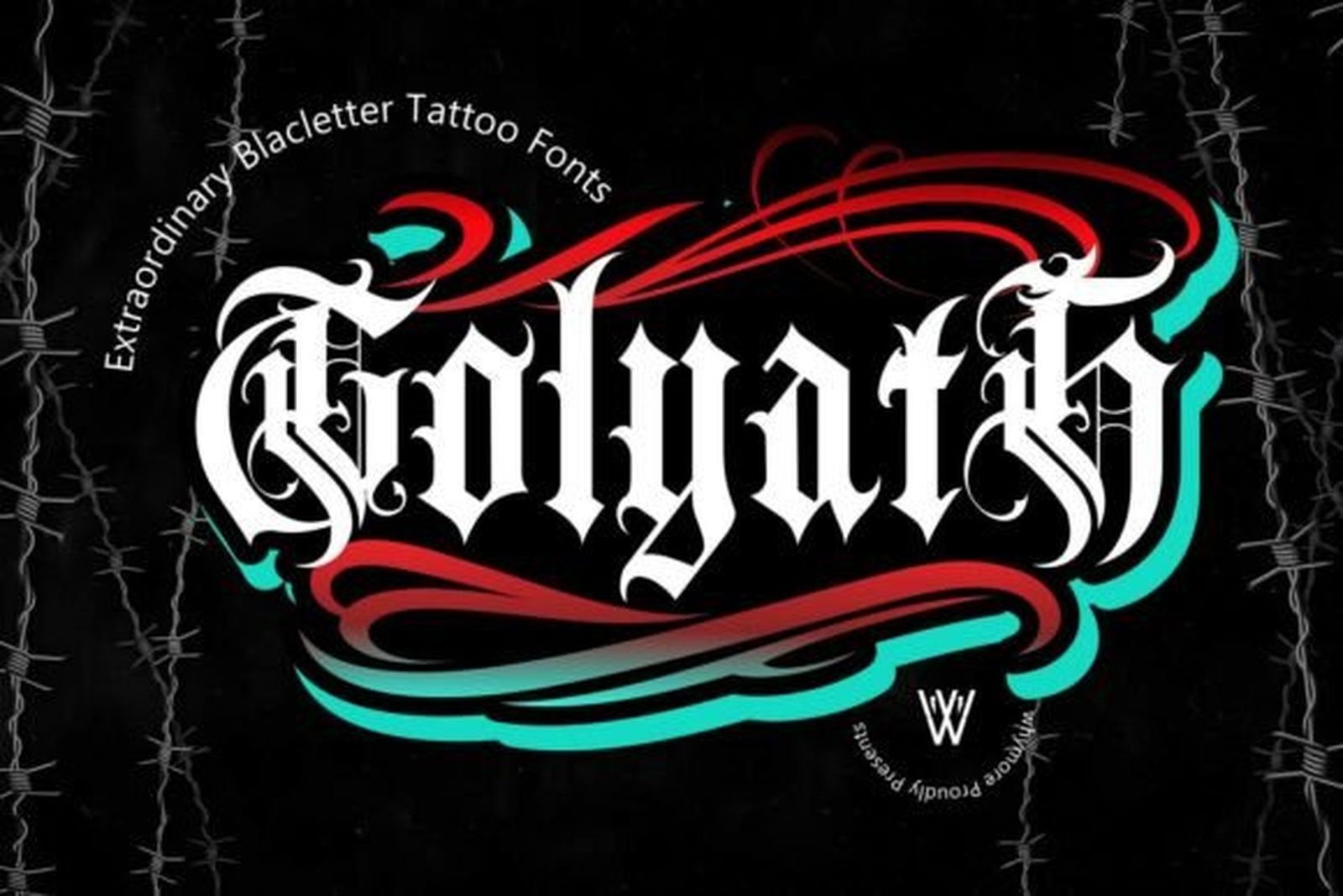
Best For: tattoo designs, clothing, merchandise, assertive branding
Golyath pulls from traditional tattoo lettering, gothic type, biker culture and retro sign painting, and it wears all four influences openly. The strokes are thick and confident, the blackletter forms are edgy rather than historical, and generous swashes hang off the capitals.
This is the loudest font on the list. It does not share space well, so give it the whole design or leave it out. Available in both OTF and TTF, so it drops into most workflows without conversion.
Fine-Line & Delicate Tattoo Fonts
The register that has grown fastest and that most tattoo font roundups skip entirely. Thin strokes, light weight, restrained decoration.
13. Boneliness Line Font
by setiawanarief111
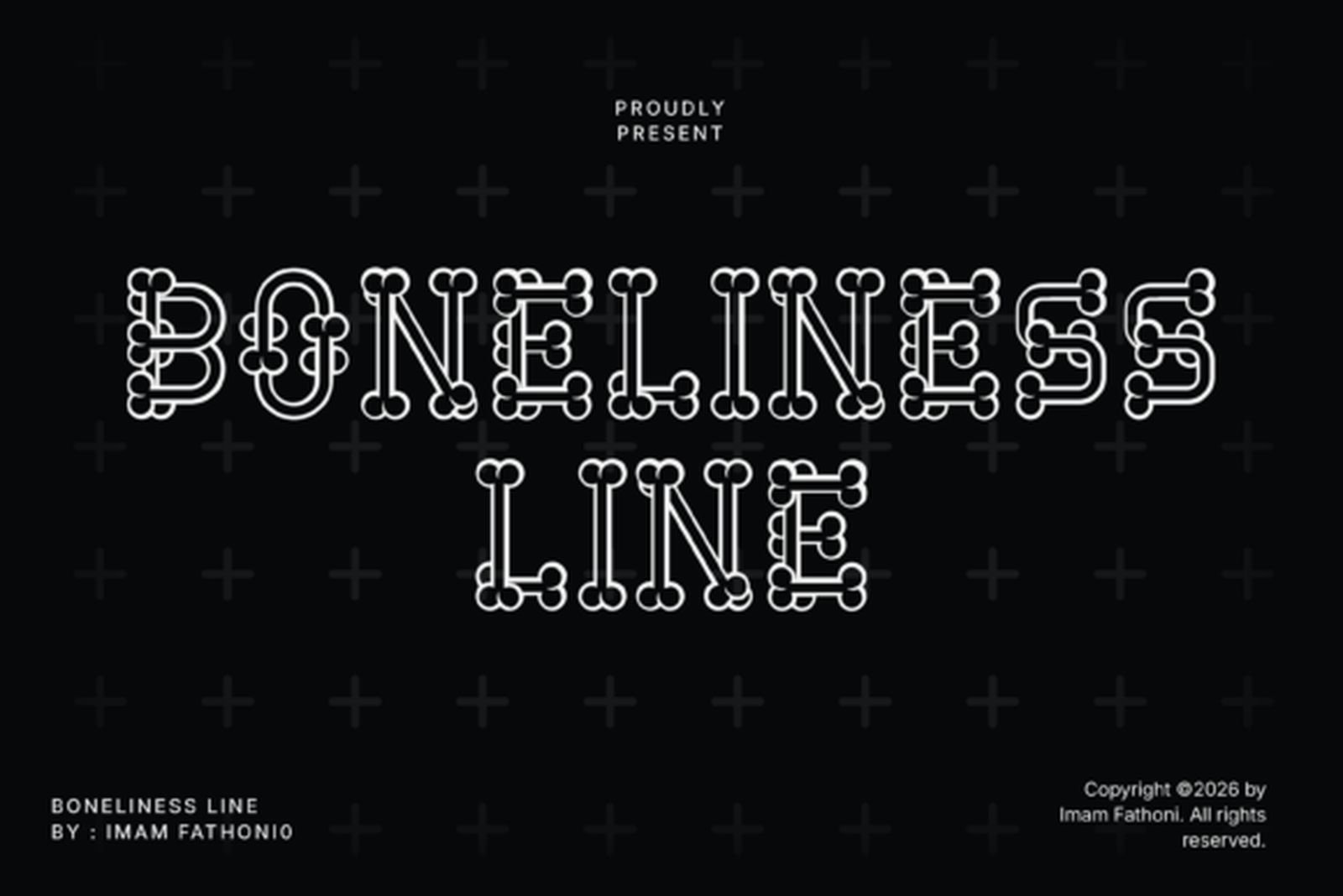
Best For: tattoo studio logos, gothic apparel, minimal dark branding
Boneliness Line is built from thin bone-shaped strokes in a clean outline style. The joints are delicate and the ends taper, which gives the letters a skeletal rhythm without any of the dripping horror styling that usually comes with the theme. It is the only genuinely linear face on this list.
The author frames it around Halloween and skeleton design, and that is where the decorative details point, but the light construction makes it equally at home on dark minimal branding. It works at display and mid sizes; below that the outline strokes start to merge. Installs as TTF or OTF and runs in Photoshop, Illustrator, Canva, Procreate and Cricut Design Space.
14. Yellow Molly Font
by Koplexs Studio
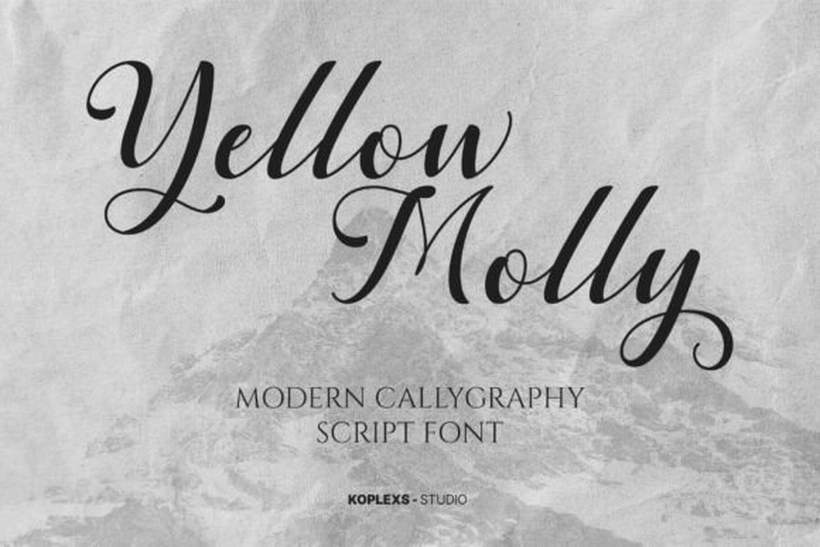
Best For: small script pieces, delicate name lettering, luxury design
Yellow Molly is the lightest script in the collection. The strokes stay thin throughout with only mild swelling on the downstrokes, the slant is gentle, and the loops are large and unhurried. Next to the Chicano scripts above it looks almost weightless.
That makes it the natural pick for the small, understated script work that fine-line clients ask for. The trade-off is placement: strokes this thin need clean skin and a careful hand, and they are not the right call for a piece that has to hold up at a distance.
15. Torkias Jole Font
by Maulana Creative
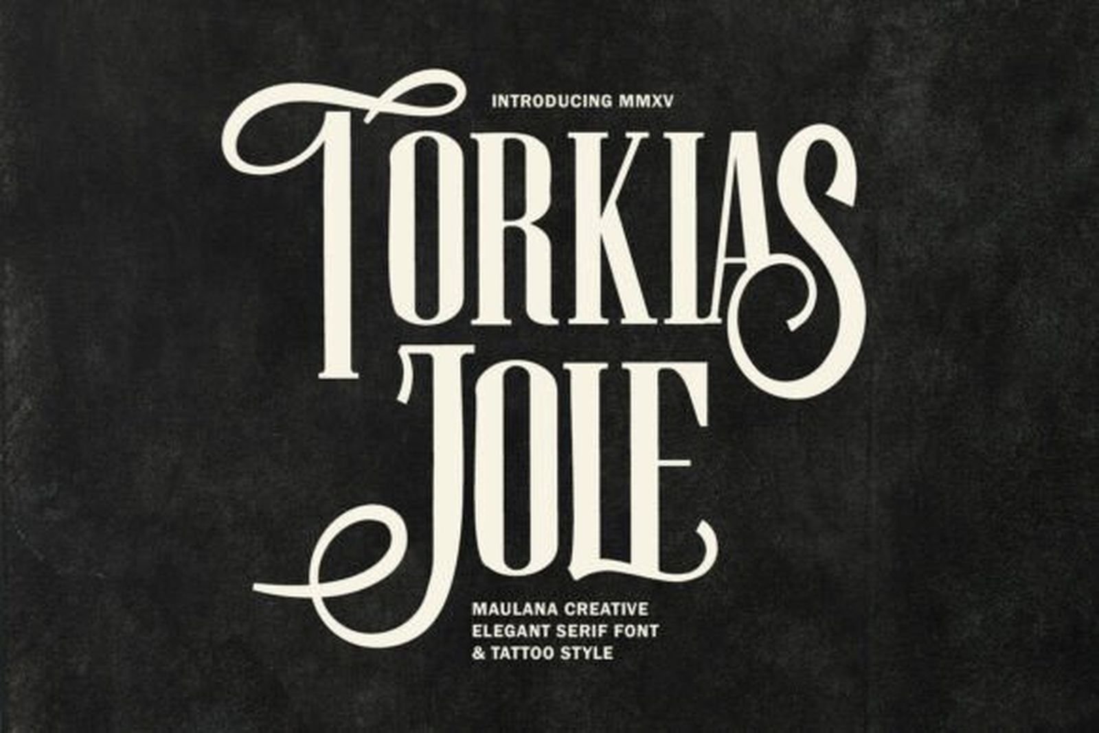
Best For: high-end branding, fashion, editorial headlines, tattoo-style logos
Torkias Jole is a serif display face rather than a tattoo font in the usual sense, and that is exactly why it belongs here. Tall slender stems, sharp contrast between thick and thin, and long flowing swash alternates that curl away from the capitals. The effect is vintage luxury with a lettering artist’s hand behind it.
Two ways to use it. The plain uppercase gives a clean, fashion-forward line with no tattoo signalling at all. Switch in the swash alternates and the same word turns ornate and clearly hand-lettered. Few fonts in this space give you both registers from one file.
16. Avestrava Tattoo Font
by ilhamtaro
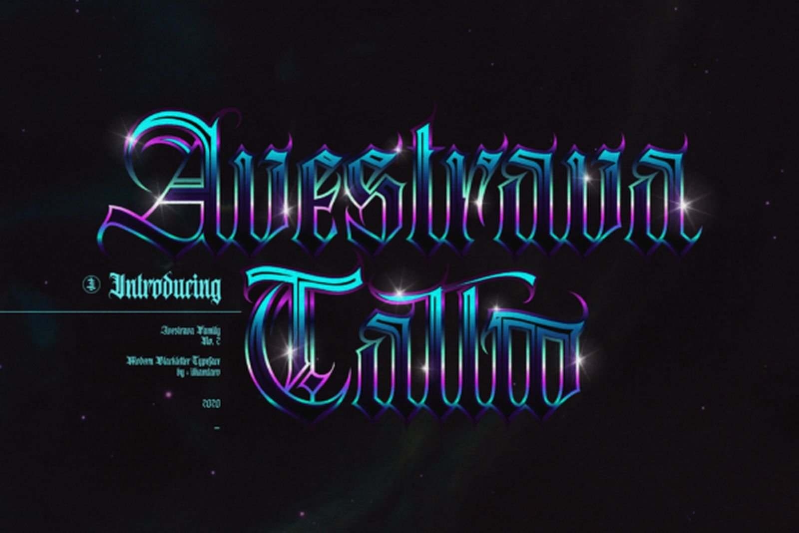
Best For: gothic lettering at lighter weight, poster and cover design
Avestrava Tattoo takes gothic letterforms and draws them at a noticeably lighter weight than the blackletter faces at the top of this list. The structure is the same, with fractured strokes and pointed terminals, but the stems are thinner and more air sits between the letters.
That solves a specific problem: clients who want the gothic look without the heavy black mass it usually brings. It closes the gap between the two ends of this collection, and it sets a full phrase in a way that dense blackletter cannot.
How to Choose a Tattoo Lettering Font
Start from the placement, not the font. A wrist and a back piece are different typographic problems. Narrow vertical space rules out wide swashes before you look at a single specimen; a large flat area makes the ornamental scripts viable. Decide the space, then shortlist.
Count the words. One word can carry a loud display face. A sentence cannot. Golyath or Tattoo Master on a full quote becomes a wall; InuTattoo Script or Classic Tattoo will still read.
Test at final size, on screen, at arm’s length. Set the actual word, scale it to the actual dimensions, then step back from the monitor. Most legibility failures are visible in ten seconds this way and invisible at 300%.
Check the letters you actually need. Specimens are set in words chosen to flatter the font. If the piece is a name, type that name. Capitals in ornamental faces vary wildly in quality, and the one letter you need may be the weakest in the set.
Mind the licence for client work. Personal ink is one thing; selling flash, merch or studio branding is commercial use. Read the terms on the product page before the design goes to a client.
FAQ
Which style is most legible as a tattoo?
Bold display faces like Tattoo Master and Classic Tattoo, because the strokes are thick and the shapes are simple. Ornamental script is the least legible, and dense Old English is the most size-dependent.
Do thin fine-line fonts hold up over time?
Thin strokes spread more visibly than thick ones as ink settles, which is a known trade-off with fine-line work. Fonts with some contrast between thick and thin, like Torkias Jole, keep their shape better than ones drawn at a single hairline weight.
Can I mix two fonts in one piece?
Yes, if they come from different registers. A script for the main word with a display face for a date or small line underneath works. Two scripts, or two blackletters, compete.
Are these fonts free?
All sixteen are on Creative Fabrica and are covered by an All Access subscription. Individual licensing terms are listed on each product page.
What formats do they come in?
Most ship as OTF and TTF. Golyath and Boneliness Line state both formats explicitly; check the product page for the rest, since the details vary by designer.
Pick the Register First
If the brief is traditional and the placement is generous, start with Tattoo Old English Font or Forlan Tattoo Font. If it is a name in flowing script, InuTattoo Script Font is the safe pick and Ulgiora Font the more distinctive one. For merch and short statement words, Tattoo Master Font. For anything delicate, Yellow Molly Font or Torkias Jole Font depending on whether you want a script or a serif.
The mistake is picking the font you like most in the specimen. Pick the one that fits the space, the word count and the weight the design needs, then decide between the two or three that survive that filter.