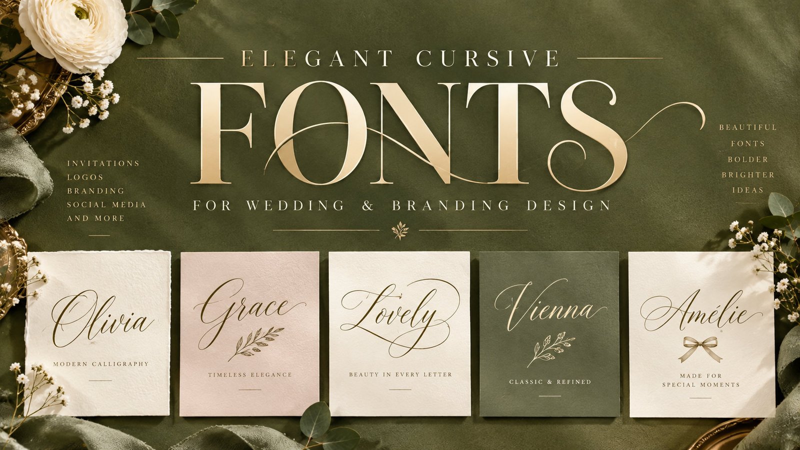
14 Elegant Cursive & Script Fonts for Wedding & Branding Design
Elegant cursive fonts sit in a strange middle ground. They need to feel personal and hand-drawn, yet still hold up on a wedding invitation printed at scale, a boutique logo shrunk to a favicon, or a signature mark stamped onto packaging. Get the balance right and the letters carry warmth and authority at once; get it wrong and the script either turns illegible or loses the very softness that made it worth choosing.
This collection gathers 14 elegant cursive and script fonts from Creative Fabrica, grouped by the job they do best rather than dropped into one long list. Some are built for romantic wedding stationery, some for polished luxury branding, and some are quiet all-rounders you can reach for on almost any project. Each entry includes what it suits, how the letterforms behave, and a note on getting the most out of it, so you can shortlist by purpose instead of scrolling through specimens.
Inside This Guide
- Wedding & Romantic Scripts
- Luxury Signature & Calligraphy Scripts
- Versatile Everyday Scripts
- How to Choose an Elegant Cursive Font
- Frequently Asked Questions
Wedding & Romantic Scripts
These are the soft, flowing scripts built for invitations, save-the-dates, and anything that should feel warm and personal. They lean into connected strokes and gentle movement, so they read as handwriting rather than typesetting.
1. Background Signature Font — by Creativewhitee
Best For: wedding invitations, greeting cards, romantic branding, social media
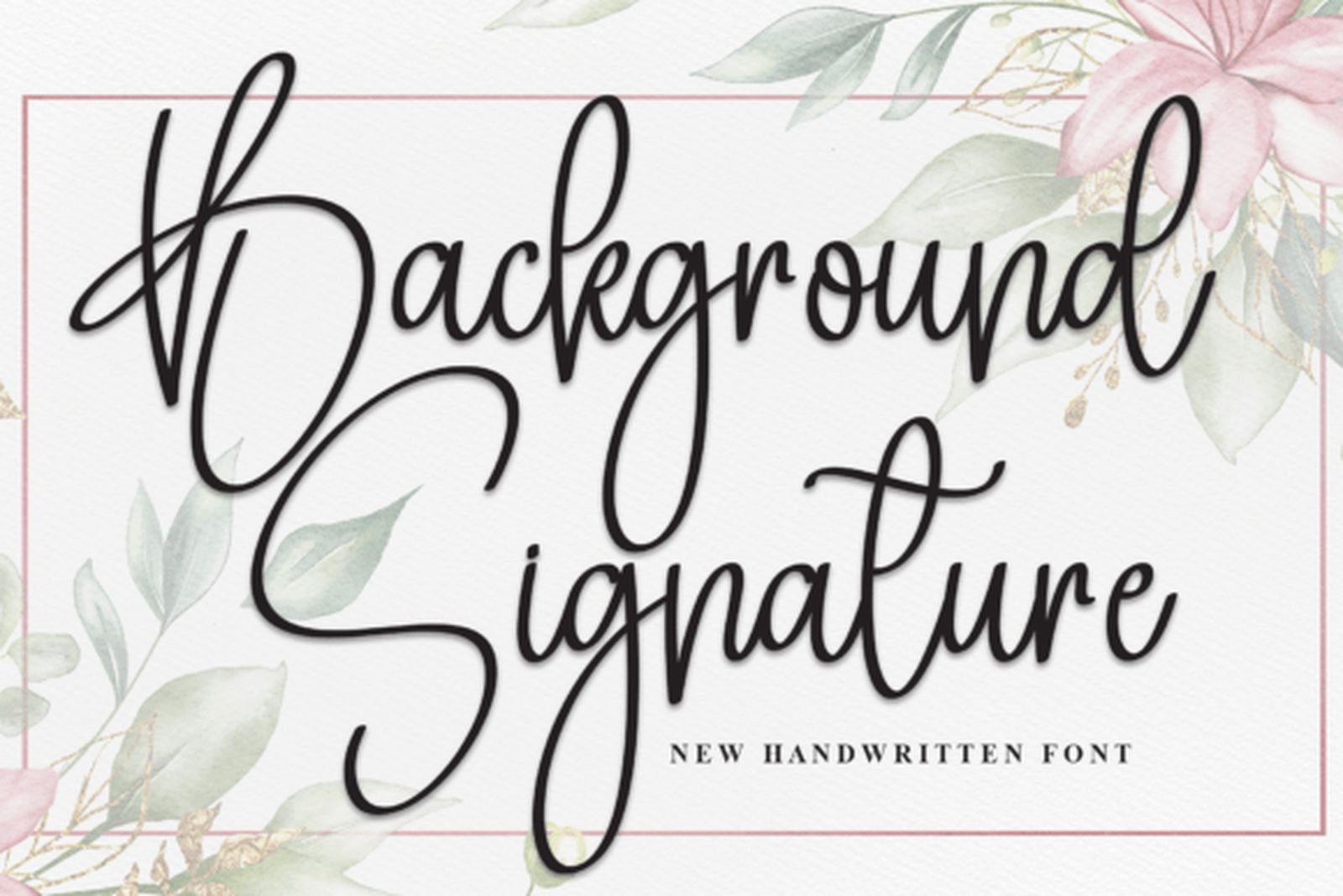
Background Signature moves with a natural, unhurried flow, the kind of connected script that reads like a real note written by hand. Its strokes keep an even weight rather than swinging to dramatic thick-and-thin contrast, which is exactly what makes it forgiving: it holds its shape at smaller sizes where flashier scripts start to break.
Set it as the headline on an invitation and let a simple serif or a clean sans carry the details underneath. Give the letters a little breathing room, since tightly tracked signature scripts can tangle where the tails overlap. Used that way, it stays legible while keeping the personal, romantic feel it was built for.
View Background Signature Font →2. Beautiful Pirates Font — by TM Type
Best For: boutique branding, product packaging, wedding stationery, logos
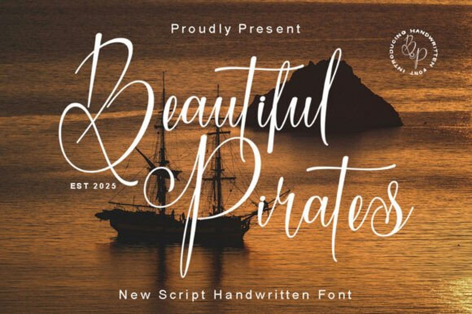
Beautiful Pirates carries the same soft handwritten rhythm but ships PUA encoded, meaning its swashes and alternate glyphs are easy to reach in design software rather than locked away. That matters most when you want a name to feel bespoke: swapping in an alternate capital or an extended tail can turn a generic wordmark into something that looks custom-drawn.
It suits small-batch branding and packaging as much as stationery, especially where the mark needs a hand-crafted, boutique tone. Because the alternates are the whole point, test your actual words first and audition the swashes on the letters your name really uses, not just the ones in the specimen.
View Beautiful Pirates Font →3. Olivia Font — by Black line
Best For: wedding invitations, seasonal designs, greeting cards, feminine branding
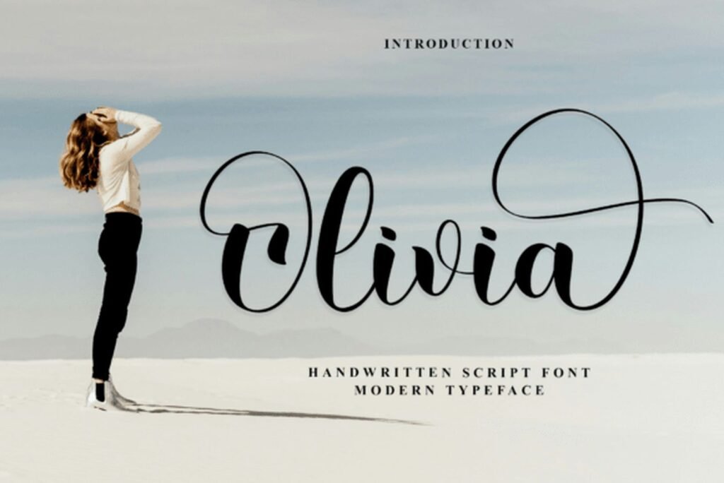
Olivia is a soft, rounded cursive with a friendly, informal lean. Its bowls are open and its slant is gentle, which gives it an approachable feel rather than a formal one, so it works well when the tone should be sweet rather than grand. It also carries a summer-leaning character, useful if a seasonal sub-line needs to share a family look with your main branding.
Pair it with an understated all-caps sans to ground its softness and stop the design tipping into pure whimsy. Keep it at generous display sizes for headlines and titles; the loose, casual rhythm reads best when the letters have space to breathe.
View Olivia Font →4. The Rustic Font — by Black line
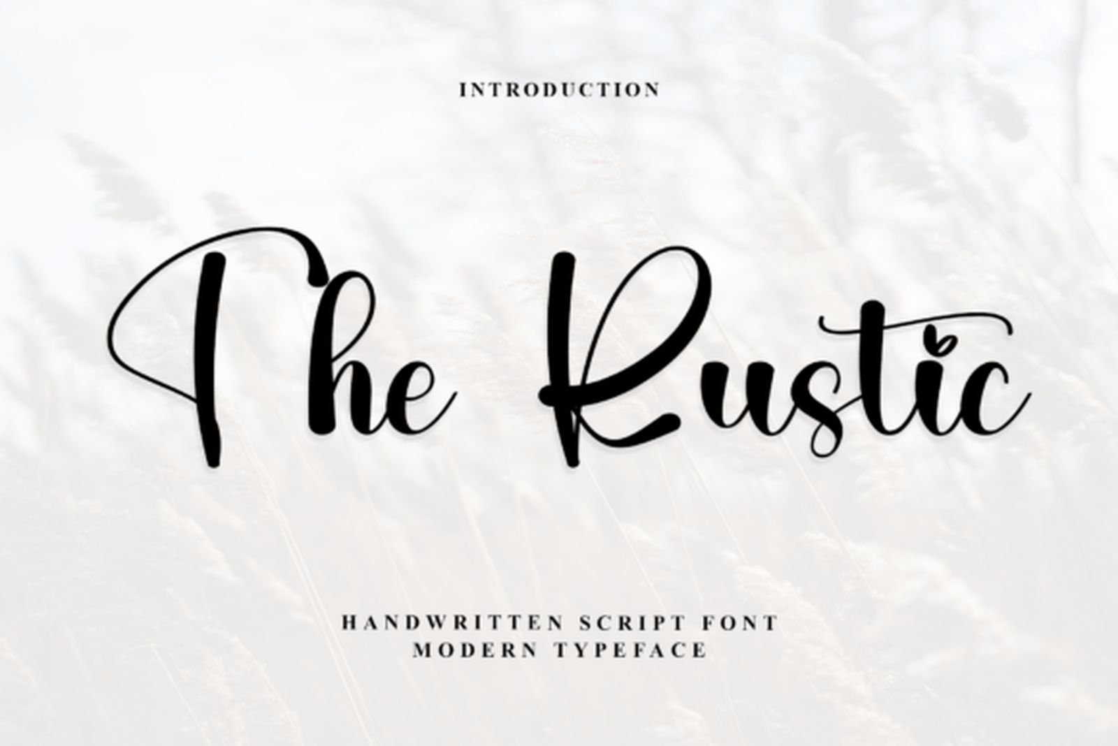
Best For: invitations, earthy branding, greeting cards, craft projects
From the same designer as Olivia, The Rustic shares the flowing base structure but sits on a slightly heavier, more textured stroke. That extra weight gives it presence, so where Olivia whispers, this one speaks up a little. The two make a natural pair if you want two related scripts across one brand system without licensing two unrelated typefaces.
Its slightly rougher character suits earthy, organic, or craft-led designs more than sleek luxury work. Reserve it for the hero line and keep supporting type minimal, letting the textured strokes do the expressive work on their own.
View The Rustic Font →5. Sweet Home Font — by AA studio
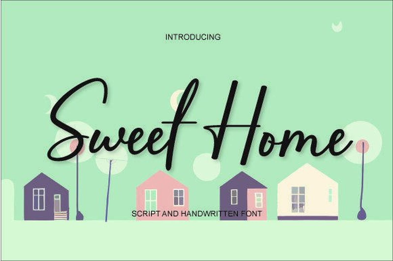
Best For: invitations, logos, social media posts, everyday stationery
Sweet Home is the dependable, unfussy option in this group: a natural handwritten cursive without heavy ornament or dramatic flourishes. That plainness is a feature, not a shortcoming. When a design already carries a lot of visual weight elsewhere, a calm script like this adds a personal touch without competing for attention.
It slots comfortably into invitations, simple logos, and social graphics where you want warmth but not spectacle. Treat it as a reliable default: when a more decorative script would overpower the layout, this one keeps the handwritten feel while staying quietly out of the way.
View Sweet Home Font →Luxury Signature & Calligraphy Scripts
These scripts trade softness for polish. They carry higher contrast, more deliberate strokes, and a premium tone that suits branding, signature logos, and high-end stationery where the mark needs to feel expensive.
6. Vienna Romance Font — by its designer
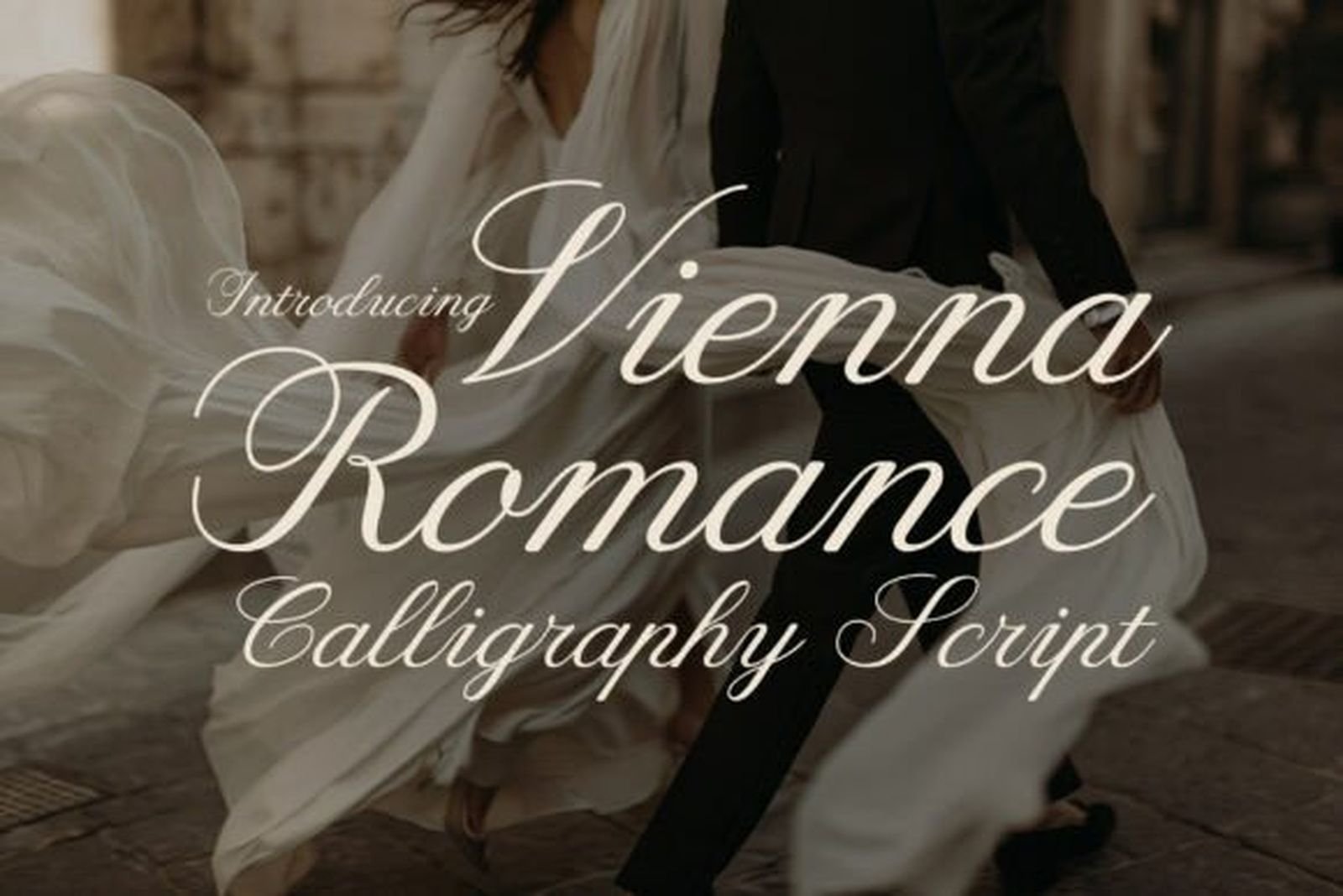
Best For: wedding invitations, luxury packaging, bridal branding, quote art prints
Vienna Romance is the most overtly calligraphic font in this collection, built around flowing slants, dramatic loops, and beautifully connected strokes that recall classic penmanship. There’s a European, old-world elegance to it, the kind of high-contrast script that looks handwritten by a practiced hand rather than assembled from a typeface.
Those dramatic loops need room, so give it generous line spacing and avoid cramming it into tight columns where ascenders and descenders collide. It shines on wedding invitations, luxury product packaging, and bridal branding — anywhere a poetic, high-end feel justifies letting the script take center stage.
View Vienna Romance Font →7. Saint Grasello Font — by krismagraph
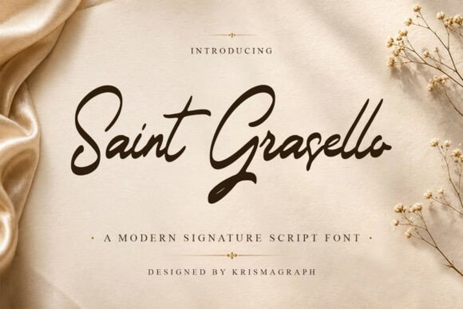
Best For: luxury branding, signature logos, editorial designs, premium packaging
Saint Grasello is described by its designer as a modern luxury signature script, and the restraint shows. Its strokes are tighter and more controlled than a romantic wedding cursive, trading flourish for a poised, upscale confidence. That control is what makes it read as premium rather than pretty.
It’s a strong fit for brand marks and signature logos where the tone needs to feel expensive but not fussy. Keep the surrounding typography minimal and let the script be the single expressive element; against a clean, quiet layout, its measured strokes look deliberate and high-end.
View Saint Grasello Font →8. Angelina Signature Font — by andikastudio
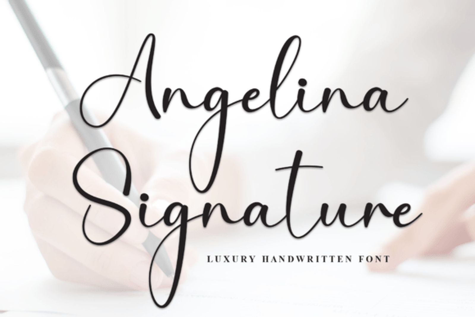
Best For: personal branding, signature logos, business cards, luxury stationery
Angelina Signature sits closer to a genuine handwritten signature than most scripts here — think of a name signed with a confident pen rather than lettered slowly. That authenticity is its strength for personal branding, where the goal is to feel like a real individual’s mark rather than a manufactured logo.
Use it small and sharp on business cards and signature marks, where its quick, connected rhythm reads as effortless. It pairs cleanly with a restrained serif for the supporting details, letting the signature carry the personality while the rest of the type stays understated.
View Angelina Signature Font →9. Mystical Firefighter Font — by Creativewhitee
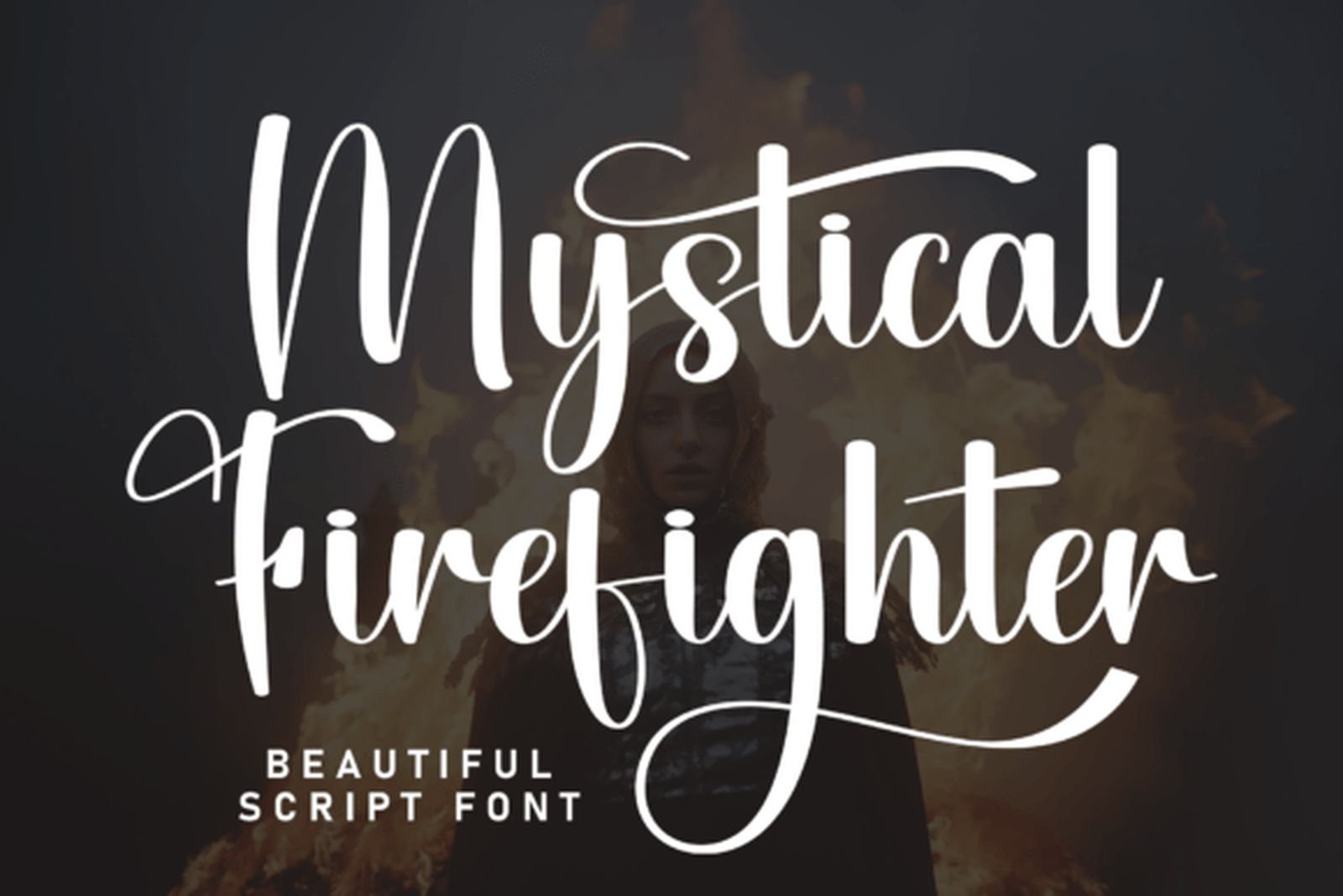
Best For: boutique beauty logos, chic event stationery, editorial branding, fashion
Mystical Firefighter brings tall, high-contrast letterforms with dramatic looping descenders — a script with real editorial presence. The height and the swing of its tails give it a fashion-forward character that suits boutique beauty logos and chic event stationery, exactly the settings its designer had in mind.
That vertical drama is its signature, so it wants space above and below to let the ascenders and descenders extend fully. Keep it to short words and headlines rather than long lines; at display size against plenty of whitespace, the tall contrast reads as elegant rather than crowded.
View Mystical Firefighter Font →10. Lovely Font — by Artkenza
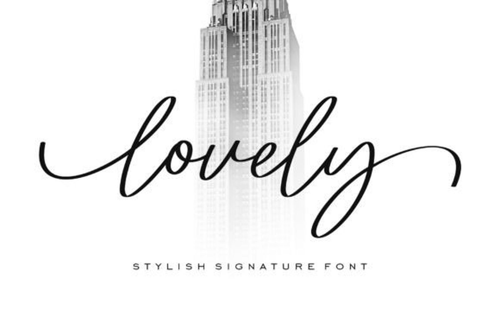
Best For: wedding invitations, greeting cards, feminine branding, luxury designs
Lovely earns its place partly on merit and partly on proof: it’s one of the most bookmarked scripts in this collection, with a strong favorite count and a top rating behind it. The letters are thin and gracefully curved, built around a delicate, romantic feel that leans elegant rather than casual.
When a font has that much real-world traction, it’s usually because it performs across projects, not just in a specimen. Use it where refinement matters — invitations, feminine branding, luxury stationery — and give the slim strokes enough size to stay crisp, since very fine scripts can thin out too far when set small.
View Lovely Font →Versatile Everyday Scripts
These are the flexible choices that don’t lock you into one mood. They stretch across weddings, branding, and general design work, which makes them useful starting points when a brief is still taking shape.
11. Maryland X Raelynn Duo Font — by Pixova Creative
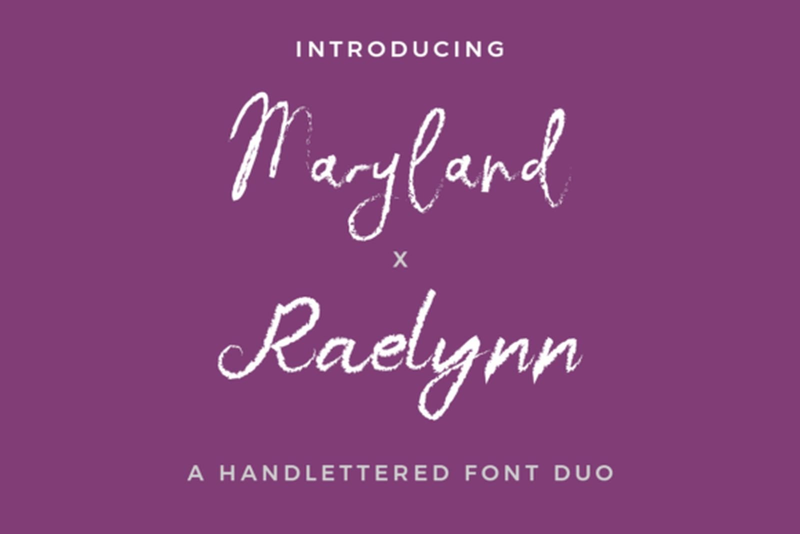
Best For: branding, invitations, logo pairings, editorial layouts
Maryland X Raelynn is a duo: an elegant script paired with a companion serif, designed together so the two already share proportions and personality. That’s a real time-saver, because the hardest part of typography is often finding a second face that complements the first — here the pairing is done for you.
Use the script for the expressive line and the serif for everything supporting it, and you have a complete, coherent system out of the box. It balances sophistication with a lighter, more playful touch, so it works where a purely formal script would feel too stiff, from branding to invitations to editorial layouts.
View Maryland X Raelynn Duo Font →12. Finytaels Font — by Gracetypestudio
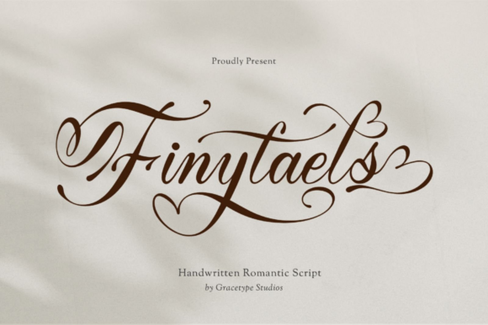
Best For: branding, invitations, editorial headlines, packaging
Finytaels combines sweeping, elegant strokes with a genuinely useful extra: it ships with both a Regular and an Italic weight, which is rare among scripts at this level. That built-in contrast means you can pair a headline with a subheading, or a name with a tagline, without hunting for a second font family.
It’s also PUA encoded, so its swashes and alternates are easy to reach for fine-tuning a wordmark. The two weights make it a smart pick when a project needs typographic hierarchy from a single script; set the Regular for the main line and lean on the Italic where you want a lighter, secondary voice.
View Finytaels Font →13. Lettering Font — by pinkmeca
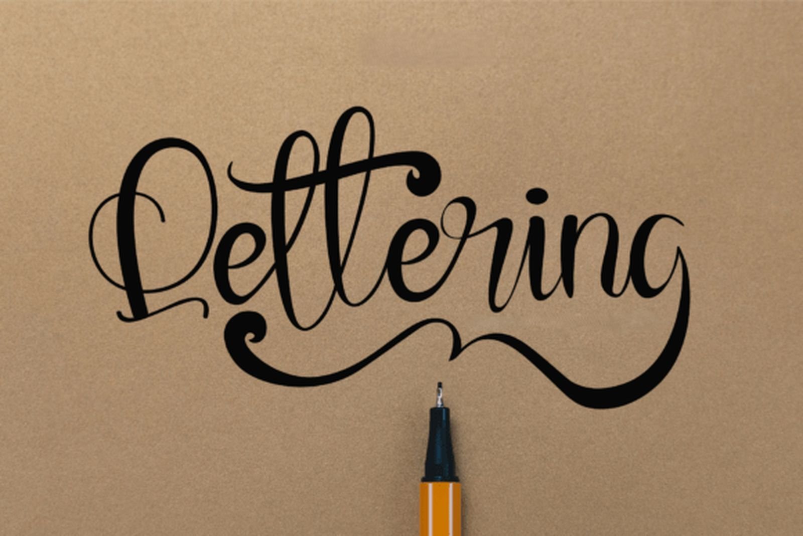
Best For: invitations, product packaging, branding, general design work
Lettering is the generalist of the group: a classy, PUA-encoded script that doesn’t push toward any single mood, which is exactly what makes it flexible. When a brief simply calls for “something elegant and cursive” without a narrower stylistic requirement, this is a safe place to start.
Its broad set of use cases — from invitations to packaging to general branding — reflects that adaptability. Because it doesn’t commit to a strong personality of its own, it takes direction well from the design around it; lean on your layout, color, and supporting type to steer the tone rather than expecting the script to set it.
View Lettering Font →14. Whisky Font — by 21Design
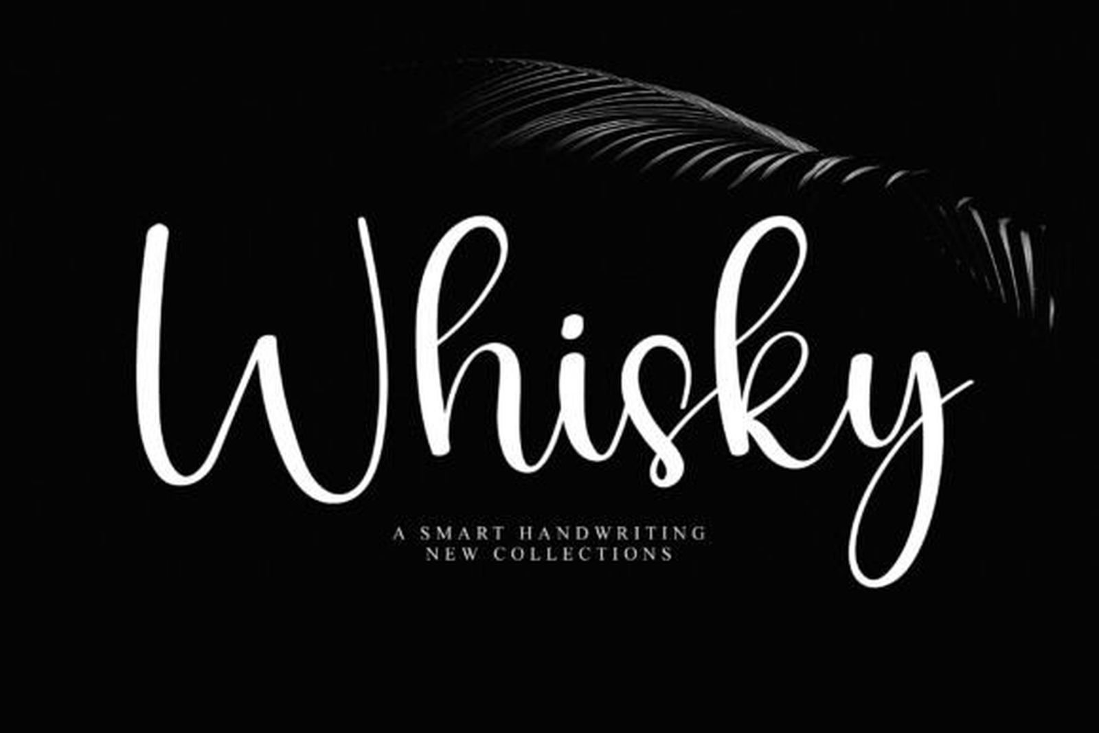
Best For: business branding, logos, wedding designs, versatile everyday use
Whisky closes the list as the most commercially minded script here. Its tags span wedding, luxury, and business use, and that range is telling: it reads as more of a working brand script than a purely romantic one, which makes it handy when a design needs a personal touch without tipping fully into sentiment.
That balance suits business branding and logos as readily as celebration stationery. It’s the script to reach for when you want handwritten warmth on something that still has to look professional — set it as the wordmark and let a neutral sans handle the corporate details underneath.
View Whisky Font →How to Choose an Elegant Cursive Font
Start with the job, not the specimen. A script that looks stunning enlarged in a preview can behave very differently on a real invitation or a small logo. Decide first whether you need romance, luxury, or flexibility, then shortlist from that group rather than falling for the prettiest specimen image.
Test your actual words. Specimen designers pick words that flatter the font. Your couple’s names, brand name, or event title may contain awkward letter pairs, repeated characters, or capitals the specimen never showed. Type the real wording before committing, and pay attention to how the connecting strokes handle it.
Check it at final size. Fine, high-contrast scripts can thin out or clog when reduced to a favicon, a small label, or a printed detail. If a font only works enlarged on screen, it isn’t ready for production. Reduce it early and confirm the delicate strokes survive.
Pair it with something quiet. An elegant script is strongest as the single expressive voice. Support it with a restrained serif or a clean sans for body text, dates, and details, and let the script lead the hierarchy without competition.
Frequently Asked Questions
Can I use these fonts commercially?
Most fonts on Creative Fabrica include a commercial license, but the exact terms control what’s permitted — client logos, merchandise, print-on-demand, and templates can carry extra conditions. Always check the current license on the product page before using a font in paid work.
What’s the difference between cursive and script fonts?
In everyday use the terms overlap heavily, and most people searching for “cursive” and “script” mean the same thing: connected, flowing, handwritten-style letters. Type designers sometimes draw finer distinctions — signature, calligraphy, handwritten — but for choosing a font for an invitation or logo, the practical question is the mood and legibility, not the label.
How many fonts should one design use?
Usually two: one expressive script for the main message and one restrained family for supporting text. A third can work if it has a clearly separate role, but adding more tends to weaken the hierarchy rather than strengthen it.
Which of these works best for wedding invitations?
The Wedding & Romantic Scripts group is built for exactly that, with soft, flowing options that stay legible at invitation size. For a more dramatic, high-end look, Vienna Romance from the luxury group brings a classic calligraphic feel that suits formal stationery.
Do these fonts work in Canva?
Availability in Canva varies by font and can change over time, so it’s best to confirm directly rather than assume. If you’re working outside Canva, each font downloads for installation on Windows, Mac, and Linux, and many convert easily to webfonts for online use.