Writing Styles Fonts Explained: Script vs Cursive vs Calligraphy for Crafters, Name Signs and Tattoos
Script, cursive and calligraphy get used as if they meant the same thing, and shop listings mix them freely. They overlap, but they are not the same, and the difference decides whether a name reads clearly on a sign, whether a word cuts as one piece on a Cricut, and whether an invitation looks formal or relaxed.
This post contains affiliate links. If you buy through them, I may earn a small commission at no extra cost to you.
This guide explains each style in plain terms, shows how to recognise it from the letters alone, and walks through nine example fonts, three for each style, with notes on where each one works.
All fonts in this list are on Creative Fabrica, and a single All Access subscription unlocks every one of them, so you can try several styles before committing to one.
More script and cursive collections:
Types of Fonts Explained
Elegant Cursive & Script Fonts
Cursive Handwriting Fonts
Calligraphy Tattoo Fonts
Fancy Font Styles
Beautiful Fonts
Contents
- Script, Cursive and Calligraphy at a Glance
- Script Fonts: The Big Family
- Cursive Fonts: Every Letter Joined
- Calligraphy Fonts: The Pen Stroke Is the Point
- How to Tell Them Apart in 10 Seconds
- Where Each Style Works
- Cricut Tip: Script and Cursive Need Welding
- FAQ
Script, Cursive and Calligraphy at a Glance
The simplest way to hold the three apart is to see them as nested. Script is the big umbrella: any typeface built to look like handwriting, brush lettering or pen work. Cursive is one branch of it, defined by letters that join into each other. Calligraphy fonts are another branch, drawn to copy the strokes of a real pen or brush.
That is why every cursive font is a script font, but plenty of script fonts are not cursive at all. The word cursive itself goes back to a Latin word for running, which fits letters that run into one another without a pen lift.
| Style | What it is | Letters joined? | What to look for |
|---|---|---|---|
| Script | The broad family of handwriting-inspired type, from formal to casual | Sometimes yes, sometimes no | A hand-made feel, with or without connections |
| Cursive | Script where the letters link up, like joined handwriting | Yes, that is the defining trait | Strokes that carry from one letter into the next |
| Calligraphy | Script that imitates pen or brush calligraphy | Usually, but not always | Thick and thin strokes, swashes, a deliberate, drawn look |
One more distinction is worth knowing. Calligraphy as a craft is slow, careful lettering where the look of each letter matters more than writing speed. A calligraphy font imitates that look, but typing with it is not calligraphy, and every repeated letter will be identical unless the font ships alternate letters and ligatures.
Script Fonts: The Big Family
Script fonts are usually split into formal scripts, with traditional letterforms and fine strokes, and casual scripts, with heavier strokes and playful shapes. Many vintage scripts come from brush and sign-painting rather than from a pen. The three examples below are scripts that are not handwriting in the school sense: one with separate letters, one built like a painted sign, one that bounces.
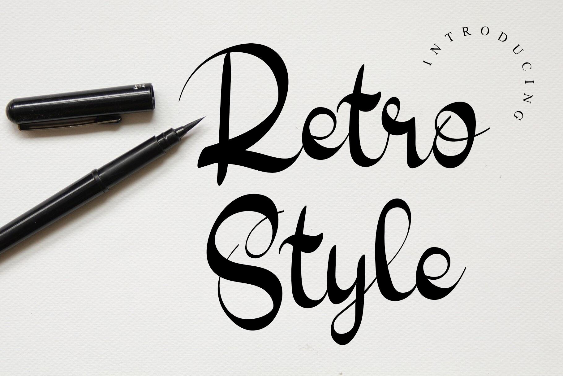
1. Retro Style Font by GiaLetter
Best For: café menus, retro posters, sticker titles
Black brush-pen letters on white paper, with the pen lying beside them. Look at “Retro” and “Style” in the preview: the letters stand apart instead of joining, yet the font still reads as handwriting because each stroke swells and then tapers into a sharp flick. That is the clearest proof in this guide that script and cursive are not the same thing.
Separate letters make it easy to space and edit word by word, which helps on menus and posters with short lines. Keep it for titles and labels; the flicked ends need some size to show.
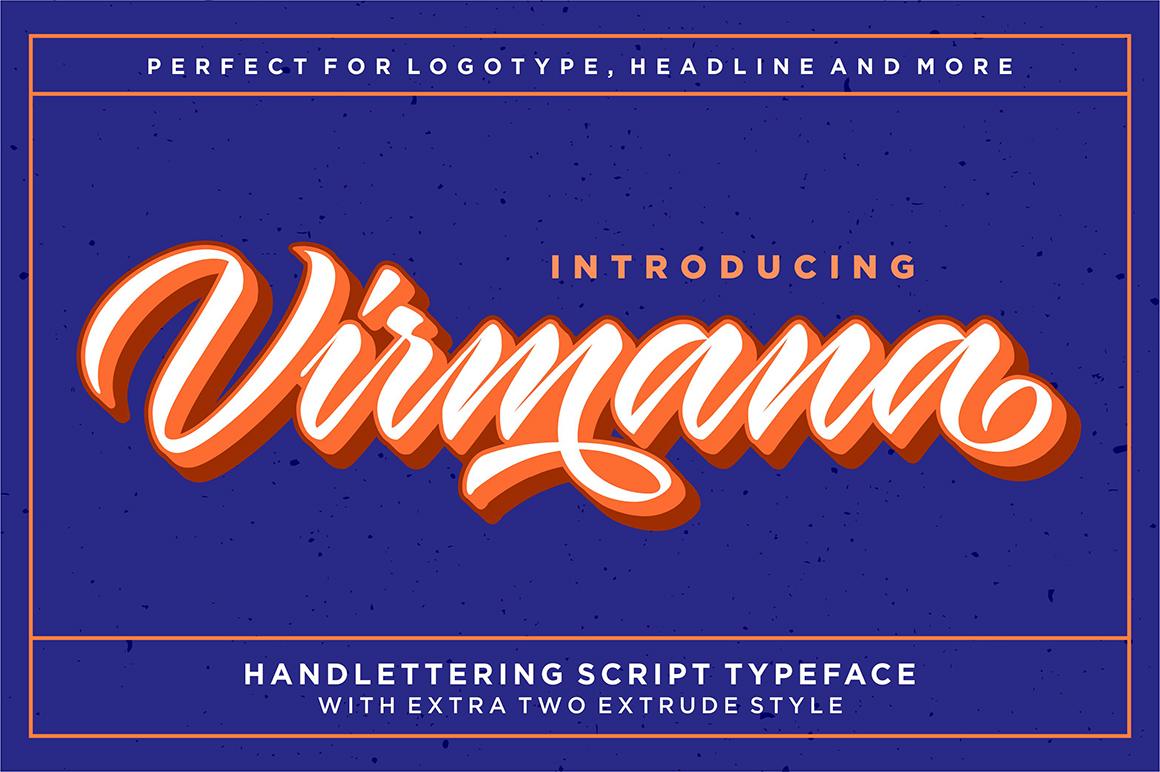
2. Virmana Font by Solidtype
Best For: shop logos, T-shirt prints, signboards
A heavy, slanted script in white with stacked orange and brown shadows, on a speckled navy background. The preview calls it a hand-lettering script typeface with two extra extrude styles, and says it suits logotypes and headlines. The letters do join, but the shapes are built like painted sign lettering, with fat strokes and a long swash under the word, not like a pen note.
This is the kind of script that carries a brand name or a shirt slogan. The shadow layers come from the extrude styles, so try the plain style on its own first and add the depth only if the design needs it.
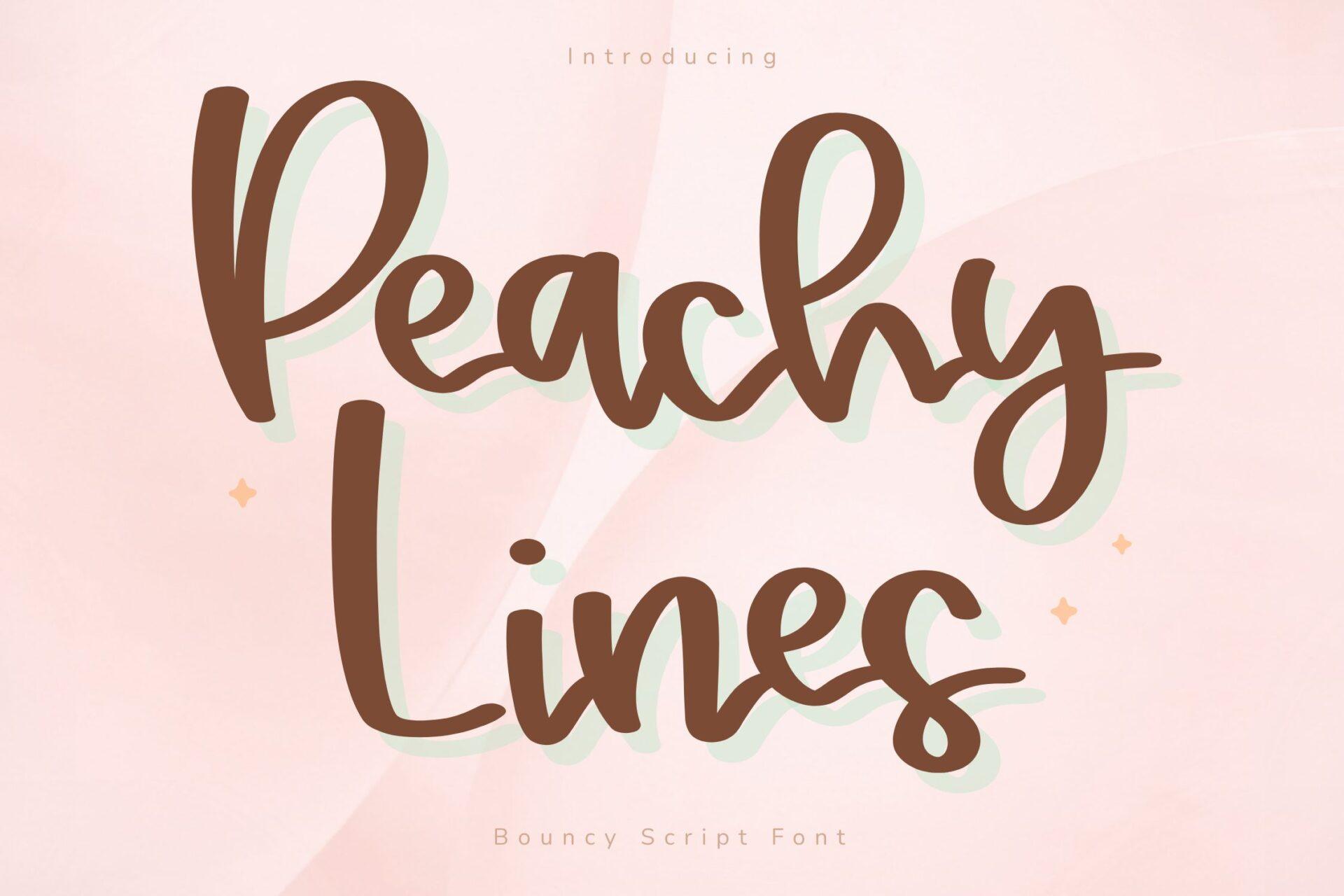
3. Peachy Lines Font by FVBFontArt
Best For: planner stickers, kids’ party signs, social media graphics
Thick, rounded brown letters with a pale mint shadow, on a soft pink background, labelled in the preview as a bouncy script font. The letters hop above and below the baseline, so “Peachy Lines” looks written in a cheerful hurry rather than lined up on a ruler.
This is the casual end of the script family: easy to read, friendly, and sturdy enough for small printed stickers. The mint shadow is part of the preview styling, so judge the plain letters when you type your own text.
More casual and playful styles:
Fancy Font Styles
Cursive Fonts: Every Letter Joined
Cursive fonts copy joined handwriting: each letter leads into the next, so a word looks as if it was written in one movement. That makes them feel personal, and the neater ones stay readable even for longer names. The three below go from school handwriting to a fast signature to a bold, craft-friendly cursive.
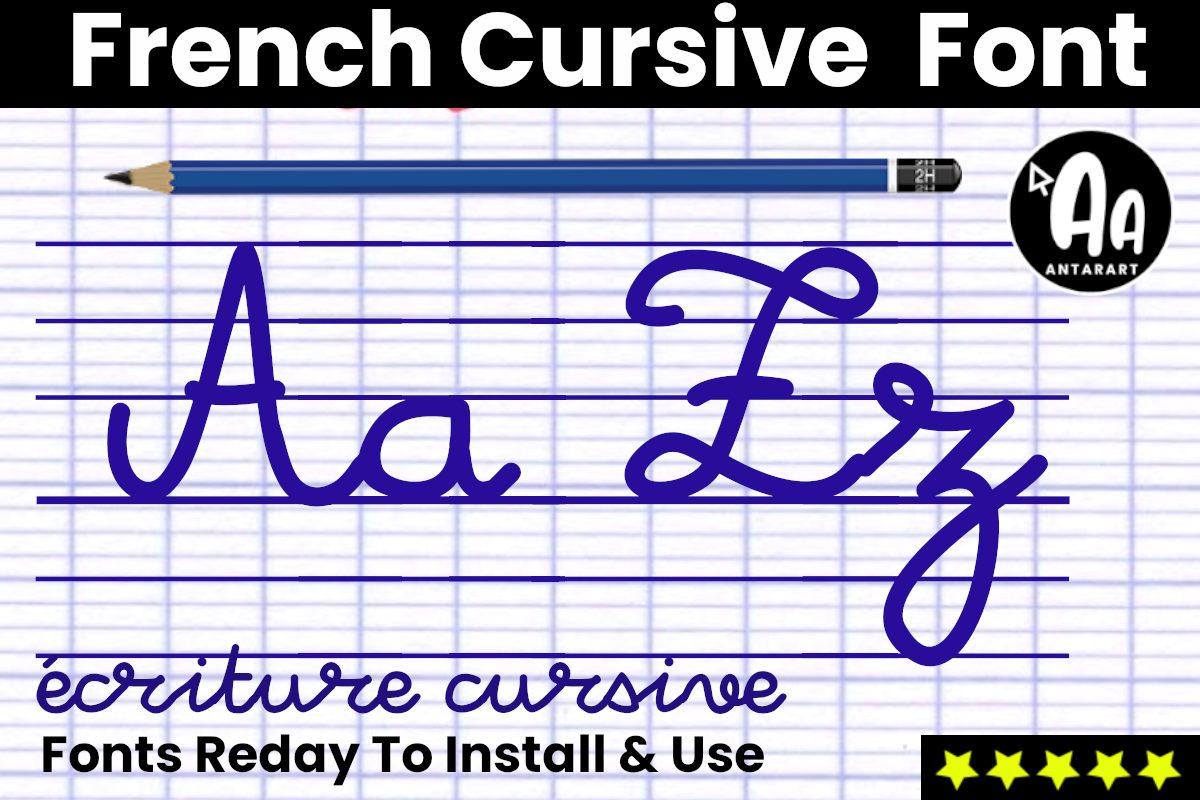
4. French Cursive Lined Font by AntarArt
Best For: teacher printables, handwriting practice sheets, school-themed designs
Blue school cursive on French ruled exercise paper, with a pencil above and the words “écriture cursive” written underneath. The strokes are even and rounded, the capital A and Z carry classroom-style loops, and every letter in “écriture cursive” joins the next. This is cursive in its textbook form.
It reads like a teacher’s handwriting, which makes it a natural fit for worksheets and nostalgic back-to-school designs. The preview shows the letters on ruled lines and “Lined” is in the name, so check the listing for how the lines are included if you need clean letters only.
View French Cursive Lined Font →
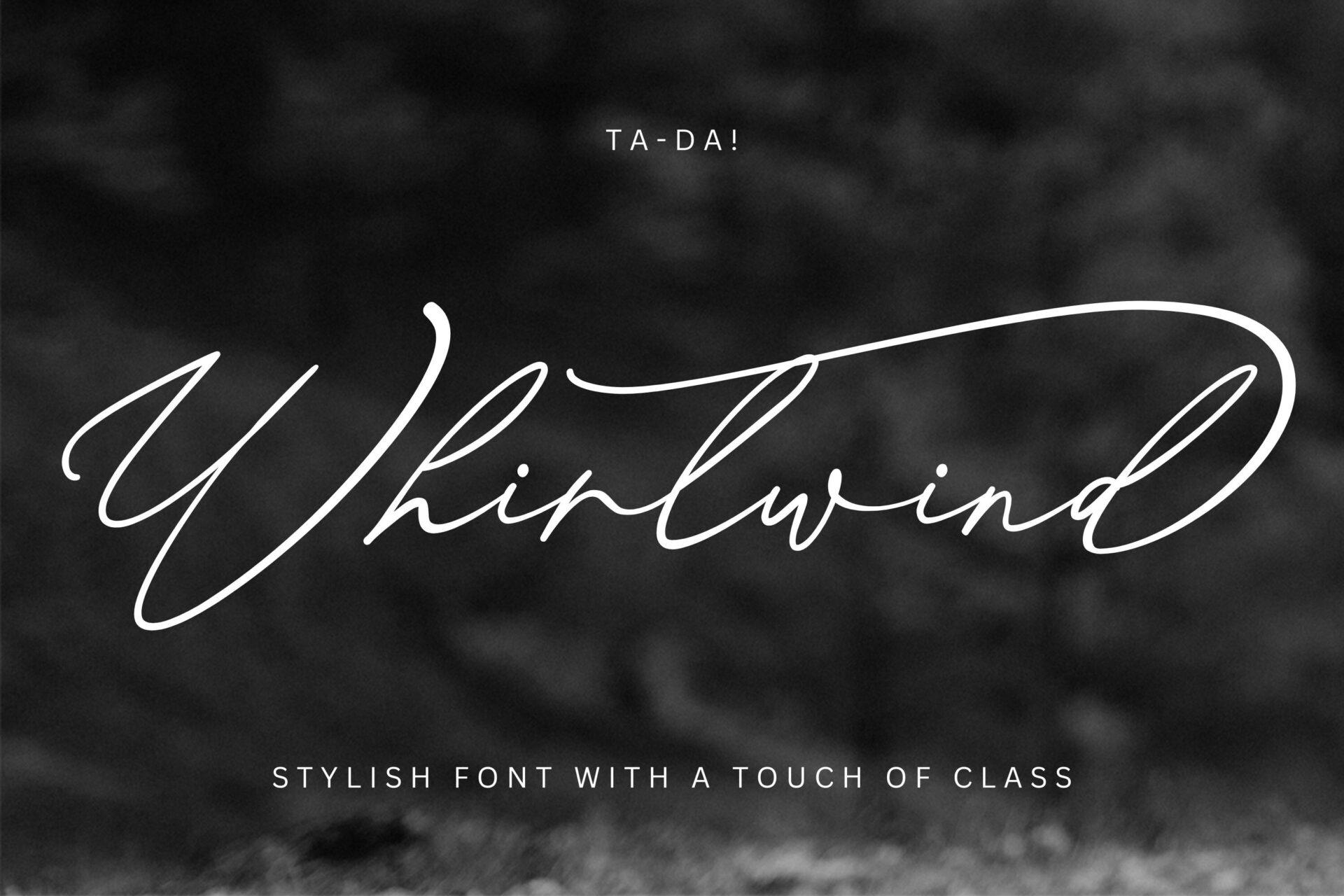
5. Whirlwind Font by gatype
Best For: signature logos, photography watermarks, couple names
A thin white line on a dark, blurred photo, like a name signed quickly with a fine pen. The W opens with a long entry stroke, the letters lean hard to the right, and the tail of the final d sweeps back over the whole word. There is no thick and thin here; the line stays the same weight all the way through.
That single-weight line is what separates a signature cursive from calligraphy. It works for a watermark or a one-word logo, but the fine line needs space, so give it a large size and a plain background.
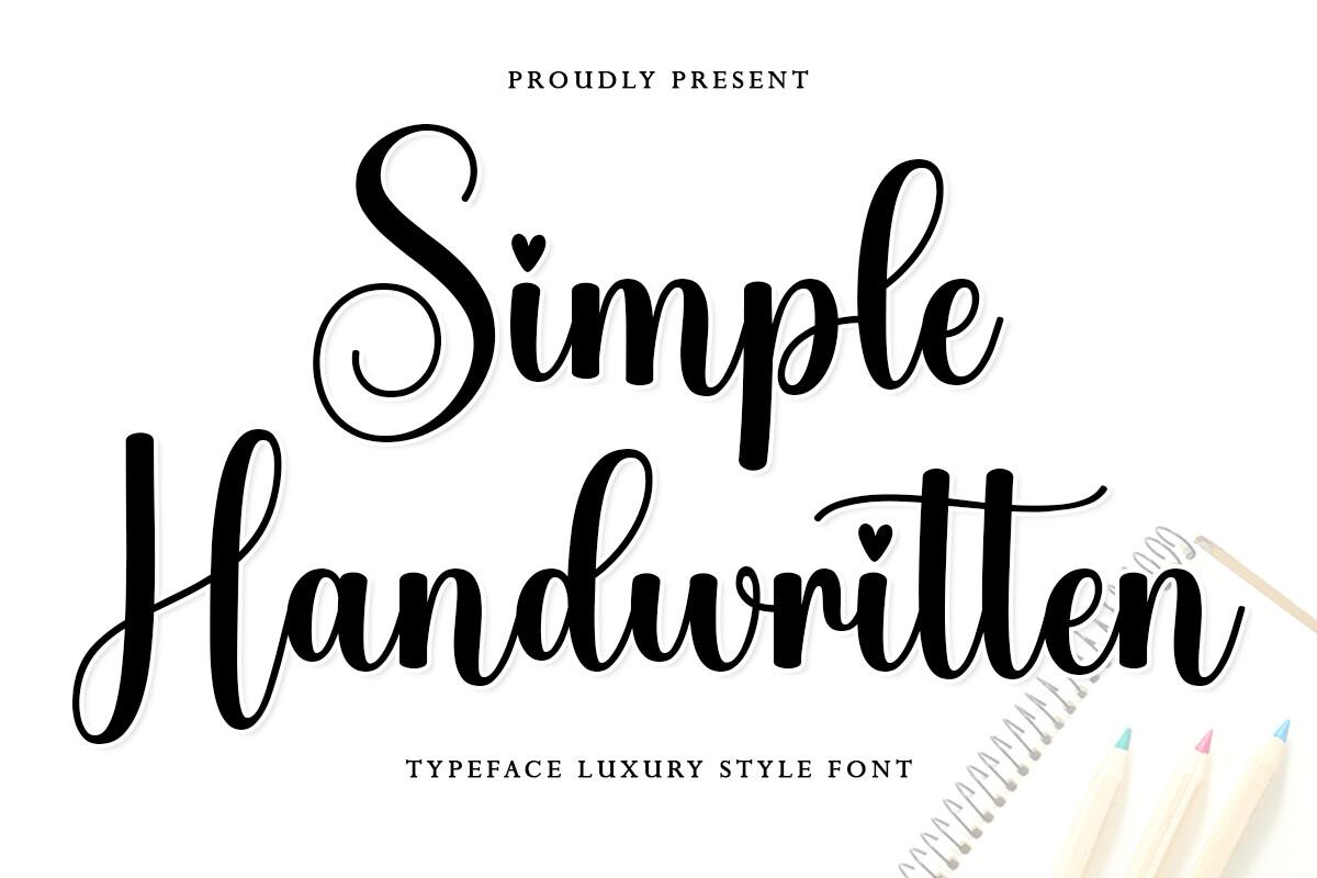
6. Simple Handwritten Font by Letter Muray
Best For: Cricut decals, mug and tumbler names, gift tags
Bold black cursive on white, with heavy downstrokes that thin out where the letters join. Small hearts sit in place of the dots over the i in both words, and the S and H open with round loops. The preview subtitle presents it as a luxury style typeface.
Joined letters with solid strokes are the easiest kind of cursive to cut, because the word can be welded into one piece. Use it for a single name on a mug or a tag, and decide whether the heart dots suit the project before you commit.
View Simple Handwritten Font →
More joined handwriting styles:
Cursive Handwriting Fonts
Calligraphy Fonts: The Pen Stroke Is the Point
Calligraphy fonts are the part of the script family that copies traditional pen or brush work. Formal ones follow disciplined strokes made with pointed or broad-nib pens, and they often carry swashes that go well beyond ordinary cursive. The three examples cover a classic copperplate, a looser modern calligraphy and a brush version.
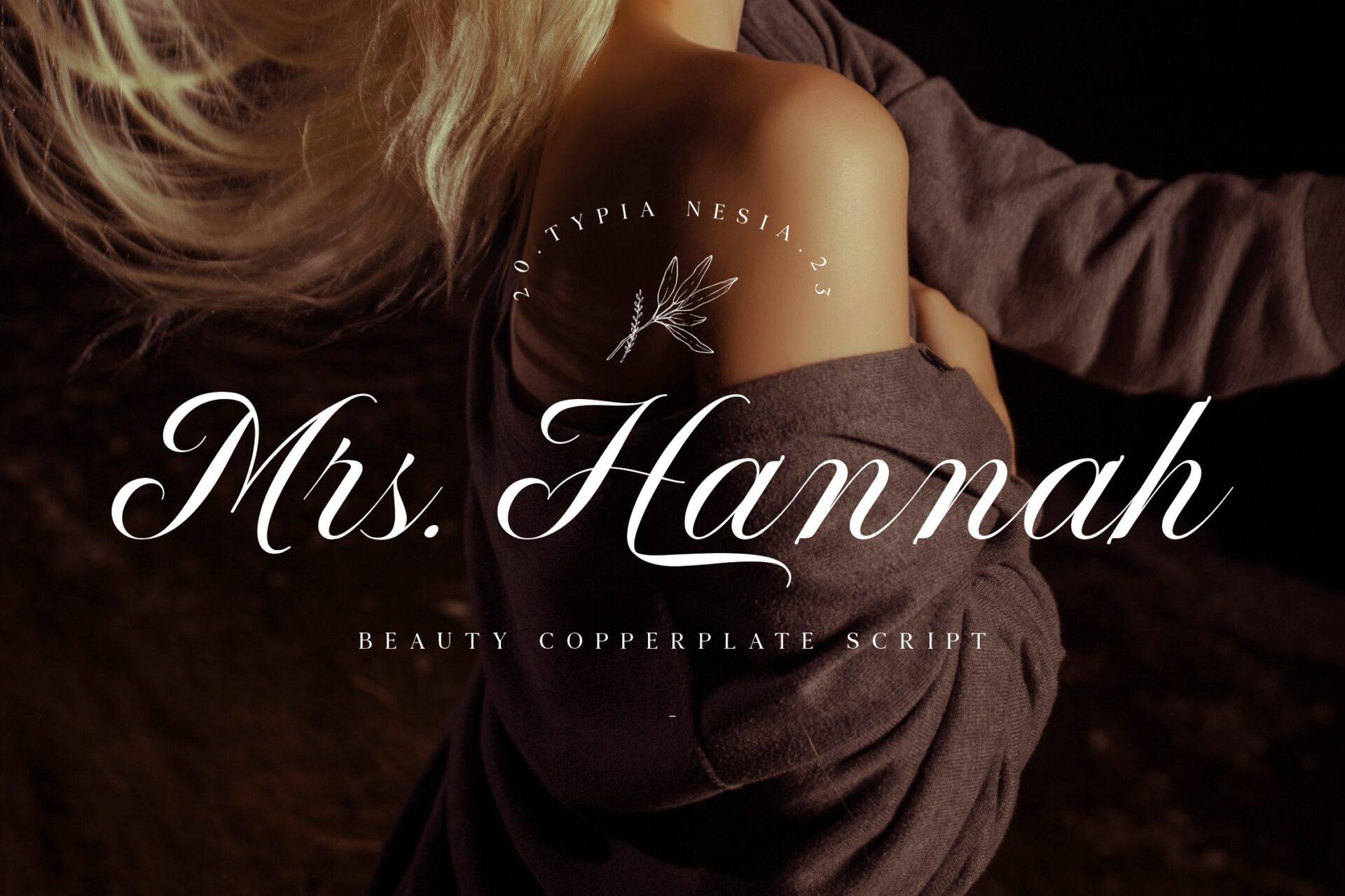
7. Mrs Hannah Font by Typia Nesia
Best For: wedding invitations, beauty brand names, perfume labels
White lettering over a moody photo, labelled in the preview as a beauty copperplate script. The upstrokes are hairline thin and the downstrokes are thick and shaded, which is the pointed-pen pattern that copperplate is known for. The H has a looped crossbar, and “Mrs.” keeps its full stop, which gives the line a stationery feel.
The contrast looks refined at a good size and on smooth paper or a dark photo. On a busy background the hairlines can disappear, so give it room and a calm base.
8. Moline Font by aminmario
Best For: greeting cards, boutique logos, quote graphics
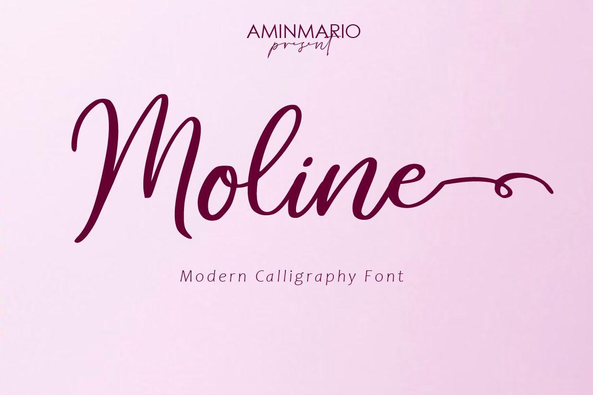
Plum letters on a pink gradient, labelled as a modern calligraphy font. The M stands tall and narrow, the baseline rises and dips from letter to letter, and the final e runs out into a long horizontal swash that ends in a small loop. The thick and thin are still there, but softer than in copperplate.
Modern calligraphy keeps the pen feel and drops the strict slant, which makes it friendlier for cards and small brands. Save the swash ending for the last word of a line so it has space to run.
9. Arlenda Botteyk Font by Letterena Studios
Best For: coffee packaging, handmade product labels, T-shirt quotes
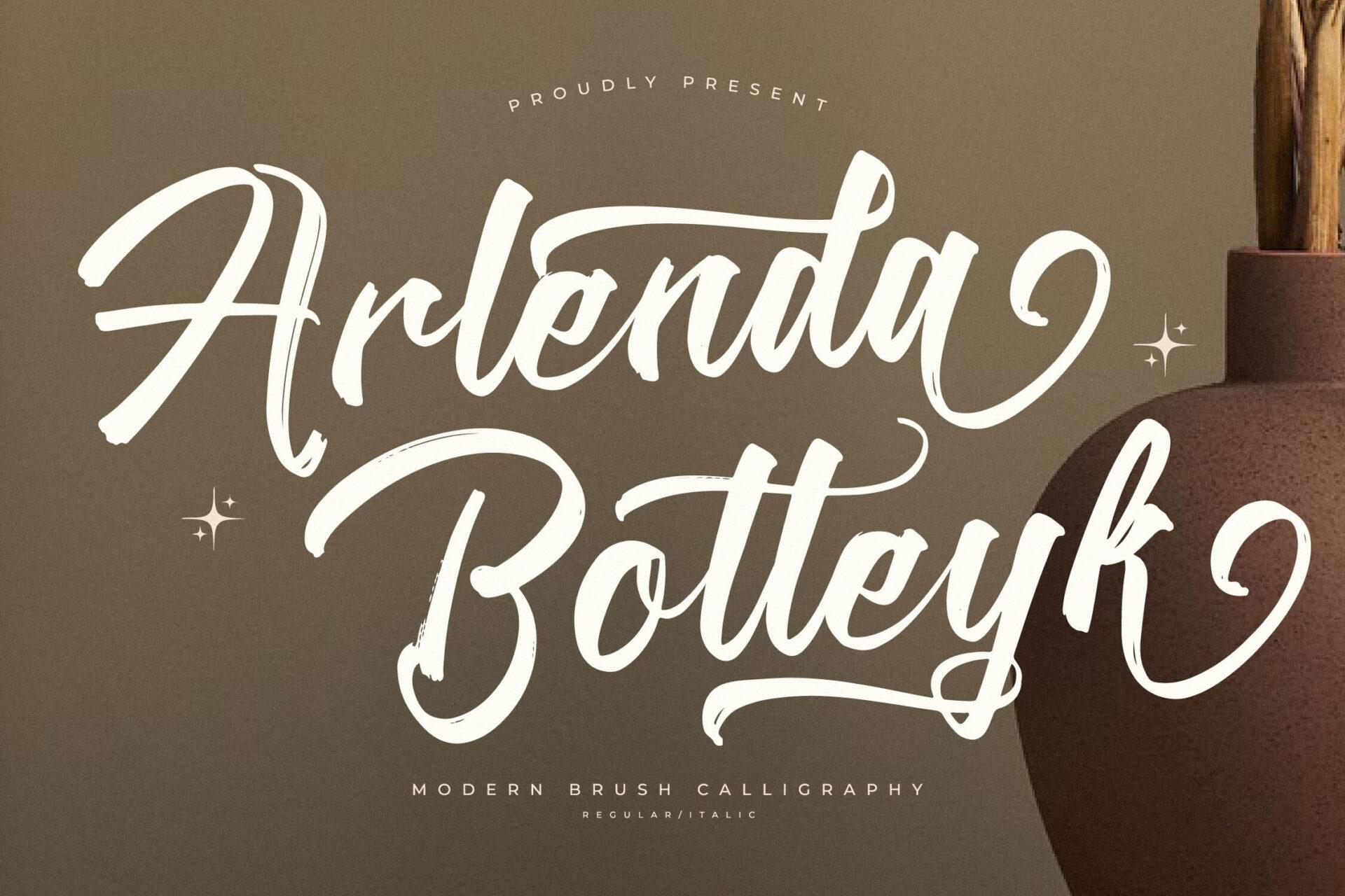
Cream lettering on an olive background beside a clay vase, labelled as a modern brush calligraphy font. You can see dry-brush streaks inside the thick strokes and rough edges where the brush ran out of ink, and the k ends in a curled tail. The letters join, and the weight comes from brush pressure rather than a pen nib.
Brush calligraphy has more energy than pen styles and holds up better at a distance. The streaky texture is part of the letters, so it suits print and packaging more than a clean cut on a Cricut, where the texture would be lost.
More calligraphy styles for ink:
Calligraphy Tattoo Fonts
How to Tell Them Apart in 10 Seconds
Type one lowercase word, such as “minimum” or “hello”, and ask three questions in this order.
- Do the letters join? If every letter flows into the next, the font is cursive. If they stand apart, it is a script that is not cursive, like Retro Style Font.
- Does the line change weight? Hairline upstrokes and heavy downstrokes point to calligraphy, as in Mrs Hannah Font. An even line, as in Whirlwind Font, points to plain handwriting or signature cursive.
- Does it look drawn or written? Big swashes, entry strokes and decorative tails suggest calligraphy or lettering. A quick, natural rhythm suggests handwriting.
A font can answer yes to more than one question. Mrs Hannah Font is a calligraphy font and also joins its letters, so it is cursive too. The labels describe features, not boxes, and shop listings often use them loosely.
Where Each Style Works
| Project | Good choice | Why |
|---|---|---|
| Names (cups, tags, place cards) | Cursive with solid strokes | Joined letters read as one name and cut as one piece |
| Shop signs and logos | Lettering-style script | Heavy strokes stay legible from across a room |
| Cards and invitations | Copperplate or modern calligraphy | Thick and thin strokes look formal and printed on paper they show well |
| Tattoos | Calligraphy or signature cursive | Personal and flowing; talk through size and line weight with your artist |
| Cricut projects | Cursive or script without texture | Clean outlines cut cleanly; brush texture does not survive the blade |
Whatever the style, avoid typing script fonts in all capitals. They are drawn to be read in lowercase with a capital at the start, and a row of swashy capitals quickly becomes hard to read.
Cricut Tip: Script and Cursive Need Welding
In Cricut Design Space every letter is a separate shape, so a cursive word that looks joined on screen will still cut as loose letters unless you weld it. Recent versions of Design Space connect script fonts more automatically, but the spacing is still not always right.
- Type the word and choose the font.
- Lower the Letter Spacing until the letters touch and slightly overlap.
- If one letter still sits apart, use Ungroup to Letters and nudge it into place.
- Select the whole word and click Weld, so it cuts as one piece.
Two things to watch. If letters overlap too much, Weld can fill in the holes of letters like e and o, so loosen the spacing and weld again. And once welded, the text becomes a single shape that can no longer be edited, so check spelling first. Separate-letter scripts like Retro Style Font do not need welding at all; use Attach to keep their spacing.
FAQ
Is cursive the same as script?
No. Script is the wider group of handwriting-inspired fonts, and cursive is the part of it where letters join. Every cursive font is a script font, but not every script font is cursive.
Are calligraphy fonts a type of script font?
Yes. Calligraphy fonts are scripts that copy traditional pen or brush calligraphy, which is why they show thick and thin strokes and decorative swashes.
Is typing in a calligraphy font real calligraphy?
No. Calligraphy is the craft of drawing letters by hand, and every hand-made word is a little different. A font imitates the look, and repeated letters match exactly unless the font includes alternates and ligatures.
Why don’t my script letters connect in Cricut Design Space?
The default spacing leaves small gaps between letters. Reduce the Letter Spacing until they overlap, adjust single letters if needed, then weld the word into one shape.
Choose Your Style
Start from the project, not the label. If the word has to be cut or read fast, choose a cursive or script with solid strokes. If it has to look formal on paper, choose calligraphy. If it has to stand out on a sign or a shirt, choose a heavy lettering script. Then type your real words in two or three candidates and keep the one that still reads at the size you need.
Browse more styles by mood:
Beautiful Fonts
Elegant Cursive & Script Fonts