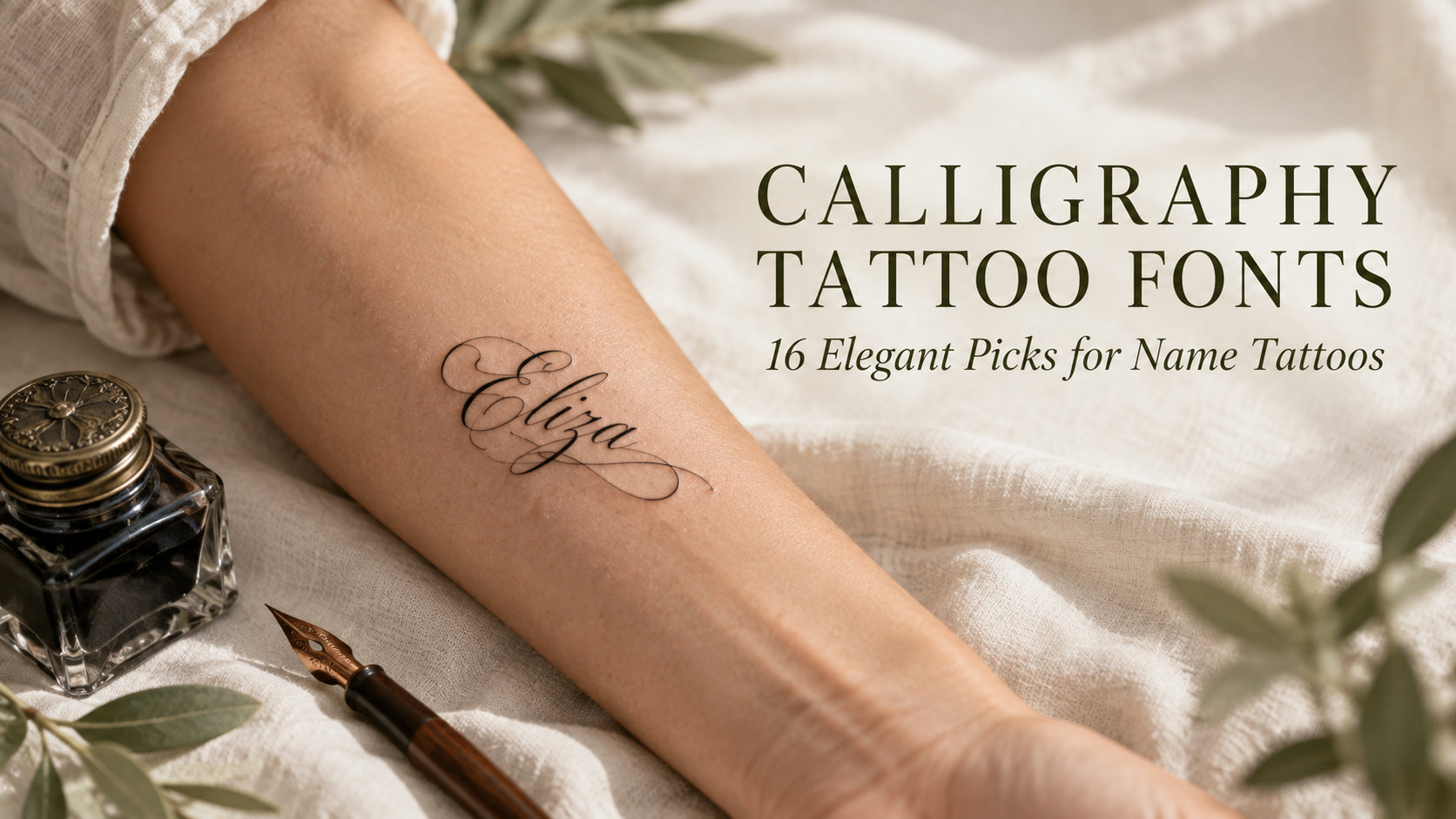
Calligraphy Tattoo Fonts: 16 Elegant Picks for Name Tattoos and Fine-Line Designs
Calligraphy tattoo fonts carry the trace of a tool. A pointed pen swells on the downstroke and thins to a hairline on the way up, a brush leaves a dry edge where it runs out of ink, and a monoline pen draws every stroke at the same weight. On skin, those differences decide whether a name still reads years later or softens into a ribbon of loops.
This collection is for anyone planning a name, date or short quote tattoo who wants to bring a clear lettering reference to the studio. The sixteen fonts below are grouped by the tool behind them. Pointed-pen and copperplate scripts for classic, high-contrast lettering. Brush calligraphy for texture and weight. Flourished capitals for one word with room to breathe. Monoline calligraphy for fine-line work, where an even stroke matters more than contrast.
More tattoo font collections:
Tattoo Fonts Cursive: 20 Flowing Script Picks for Names, Quotes and Fine-Line Work
Tattoo Lettering Fonts: 16 Bold Picks for Blackletter, Script and Fine-Line Designs
All fonts in this list are on Creative Fabrica, and a single All Access subscription unlocks every one of them, so you can try several styles before committing to one.
Table of Contents
- Pointed-Pen & Copperplate Calligraphy Tattoo Fonts
- Brush Calligraphy Tattoo Fonts
- Flourished Capitals Calligraphy Tattoo Fonts
- Monoline Calligraphy Tattoo Fonts
- How to Choose a Calligraphy Tattoo Font
- FAQ
What Makes Calligraphy Work as a Tattoo
Contrast is a size decision. The hairlines in pointed-pen calligraphy are the first part of a letter to blur as ink settles. High contrast looks refined when the word is set large and turns fragile when it is squeezed onto a wrist. The smaller the placement, the less contrast a font can afford.
Capitals carry the risk. Calligraphy fonts put most of their decoration into the first letter. A beautiful capital can dominate a short name and make the rest of the word look like an afterthought, or it can crowd the second letter until neither reads. Always check the capital you actually need.
The tool should match the mood. Pointed pen reads formal and classic, brush reads personal and energetic, flourished calligraphy reads ornamental, and monoline reads quiet and modern. Picking the tool first narrows sixteen options to four before you look at a single specimen.
Pointed-Pen & Copperplate Calligraphy Tattoo Fonts
Classic contrast between thick downstrokes and thin upstrokes, a steady slant and restrained loops. This is the group closest to traditional handwritten calligraphy.
1. Adorn Copperplate Font
by OliviaFontCo
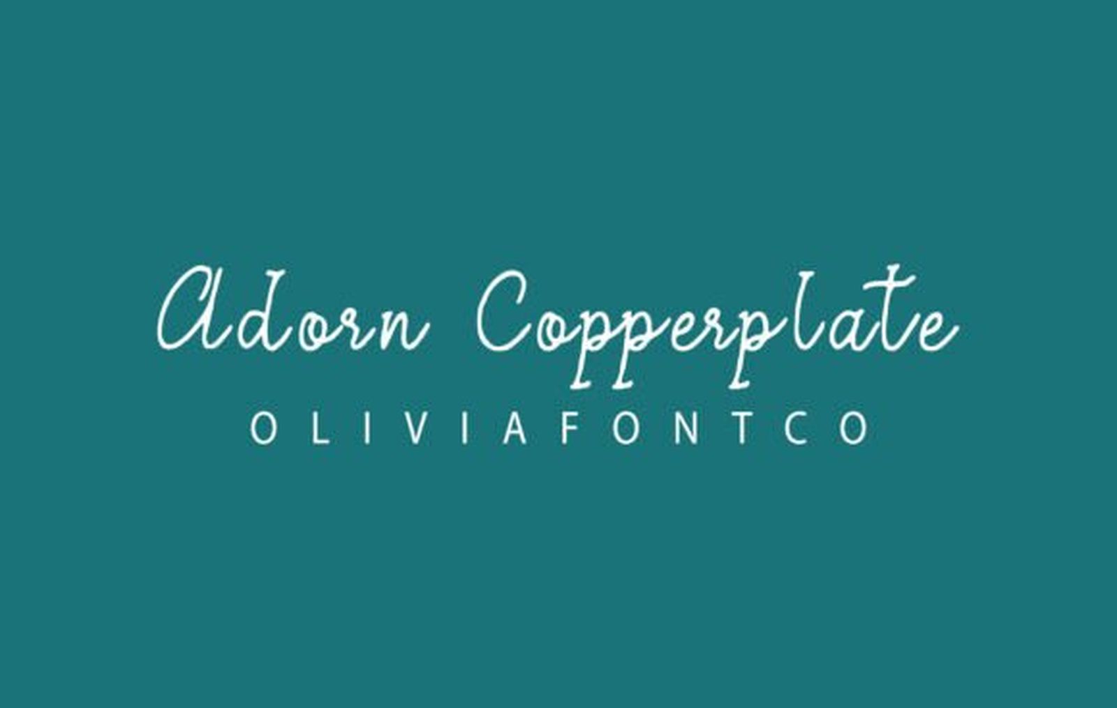
Best For: small name tattoos, wrist and ankle lettering, delicate quotes
Adorn Copperplate is the most restrained font in this collection. The slant is steady, the contrast between thick and thin is present but gentle, and the capitals open with a small loop instead of a sweeping flourish. The specimen sets it light on a flat teal ground with no ornament around the name, which shows how little it relies on decoration.
That restraint is what makes it the safe pick for small placements. With fewer hairlines to lose and no long tails to fit, a short name keeps its shape where a more ornamental copperplate would start to blur.
2. Noela Nestani Font
by TypeFactory
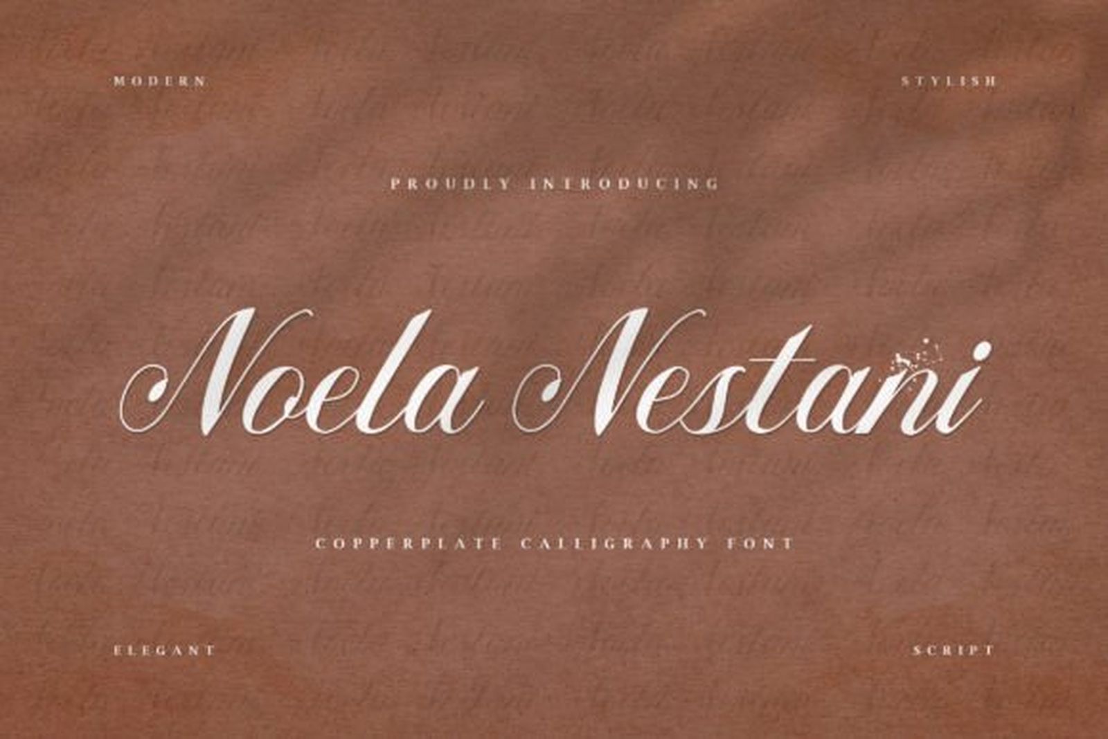
Best For: first names, forearm lettering, classic script pieces
Noela Nestani has the proportions most people picture when they hear the word copperplate. The downstrokes swell clearly, the connecting strokes stay fine, and the capitals are built from open, rounded loops that sit slightly above the lowercase. The specimen shows it in cream on a warm brown background, close to how light ink reads on skin.
The contrast is stronger than in Adorn Copperplate, so give it more size. At forearm scale the swelling strokes are its best feature; set too small, the thin joins are where a word starts to lose definition.
3. Mrs. Hannah Font
by Typia Nesia
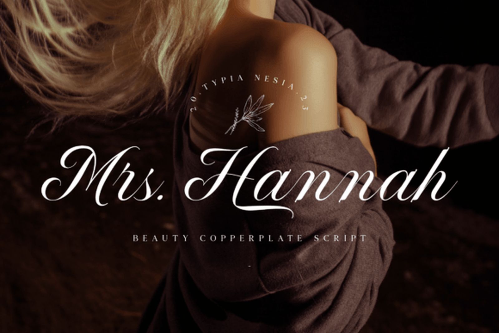
Best For: collarbone and forearm placements, longer names, elegant single words
Mrs. Hannah is narrow and strongly slanted. The letters lean well forward, the lowercase stays compact, and the capitals stretch tall with long entry strokes. Set on a dark photographic background in the specimen, the word reads as one continuous forward motion rather than a row of separate shapes.
The narrow build is the practical advantage. A long name that would spread too wide in a rounder copperplate fits along a collarbone or down the inside of a forearm without being squeezed.
4. Svarajka Font
by typealiens
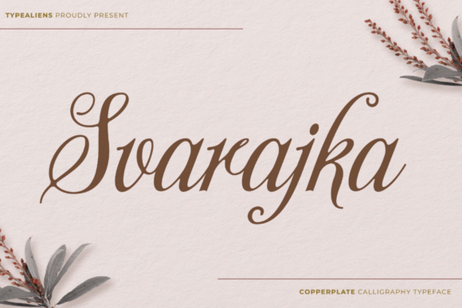
Best For: names with several capitals, softer script pieces, memorial lettering
Svarajka is the softest copperplate of the four. The curves are fuller, the loops are rounder, and the strokes end without sharp points, which gives the whole word a gentle, unhurried rhythm. The capital in the specimen is generous without turning into a flourish.
Because the forms are rounded rather than pointed, it holds together well when a phrase needs more than one capital, such as two names or initials. Nothing in the letterforms fights for attention.
Brush Calligraphy Tattoo Fonts
Heavier strokes, visible texture and more movement. Brush calligraphy looks personal and energetic, and most of these need size to show what makes them different.
5. Frintake Font
by Blankids Studio
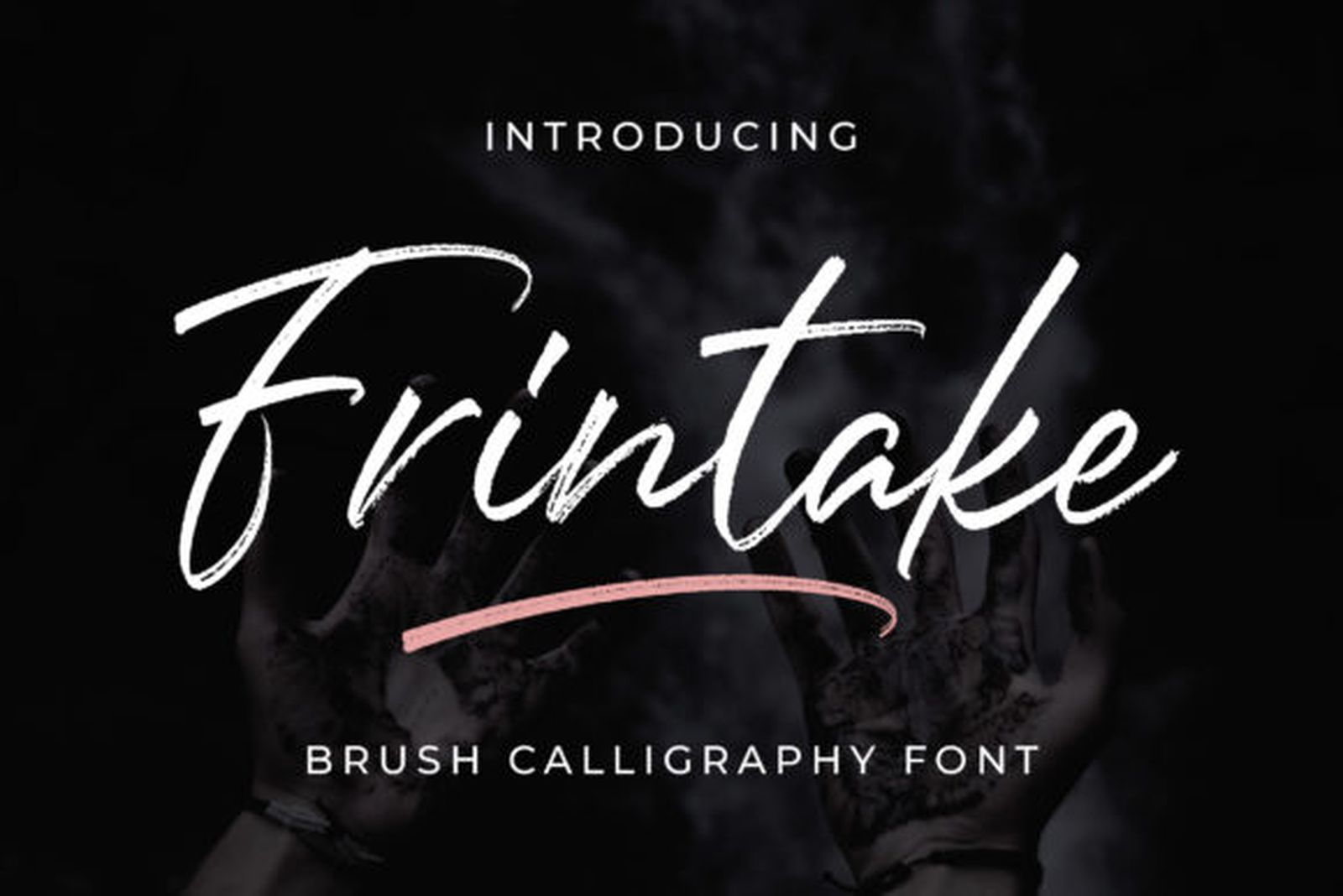
Best For: large single words, back and thigh pieces, textured lettering
Frintake keeps the marks of a dry brush. The stroke edges are rough, the ends break apart where the brush lifted, and the letters vary slightly in weight the way real brushwork does. The specimen sets it in white on black, which makes the texture read like ink rather than type.
That texture is the reason to choose it and the thing to plan around. Set large, the broken edges give the word a hand-painted feel no smooth script can match. Set small, the texture merges and the word simply looks blurry.
6. Rasettagin Font
by bee.genin
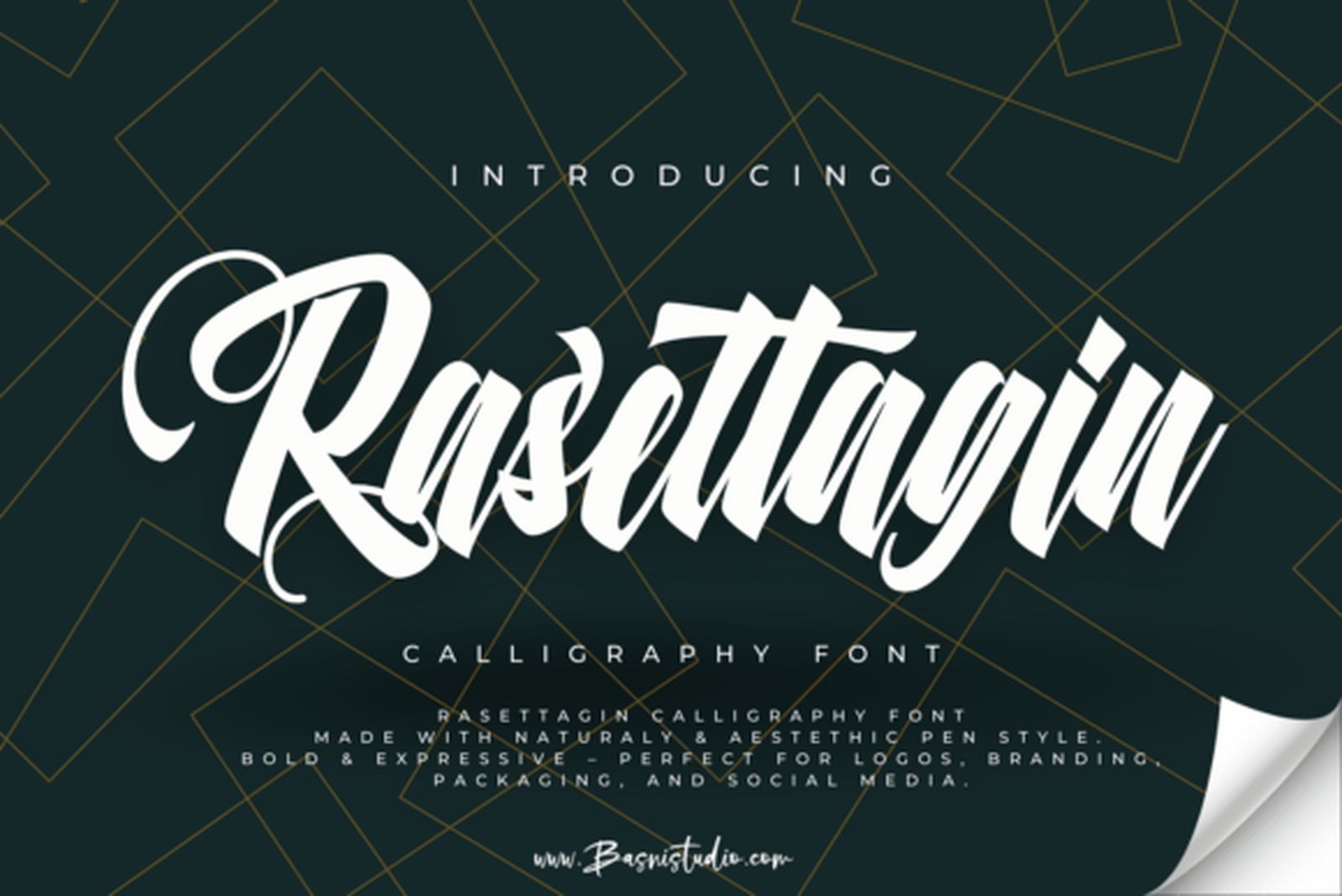
Best For: bold statement words, chest and back lettering, designs seen from a distance
Rasettagin is the heaviest font on this list. The strokes are thick and dense, the letters sit close together and connect firmly, and the slant is strong enough to give the word a sense of speed. White on a dark green specimen, it fills its space almost completely.
Weight is what keeps it legible. Where fine calligraphy depends on hairlines, this one carries the letter shapes in the thick strokes, so it stays readable at a distance. Keep it to short words; long phrases turn heavy fast.
7. Velvet Brush Font
by MinTora
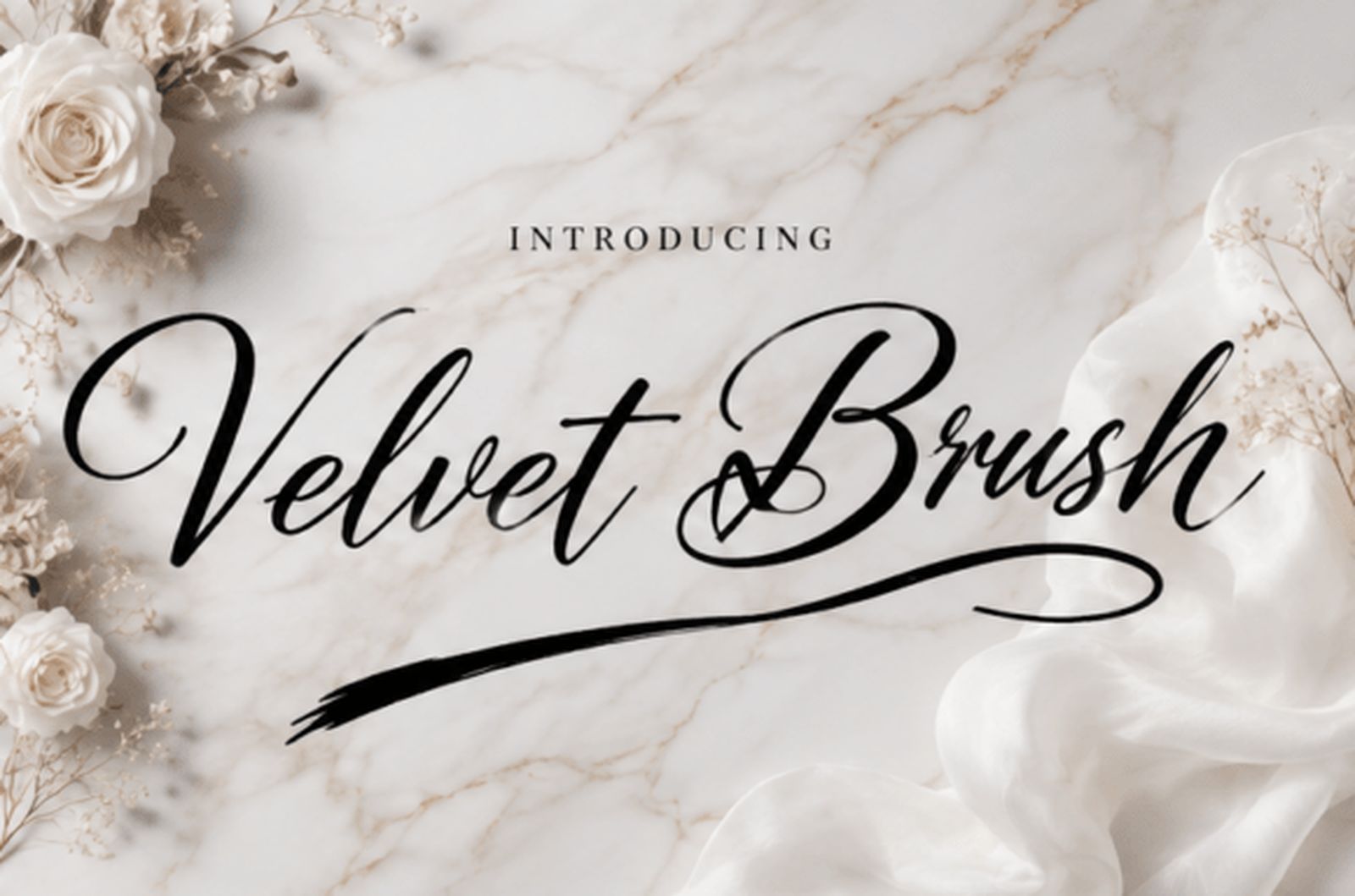
Best For: names with an underline, horizontal placements, signature-style pieces
Velvet Brush balances a confident brush stroke with a long, sweeping tail that runs beneath the word. The letters themselves are medium weight with smooth edges, and the slant is lively without feeling rushed. In the specimen the tail stretches almost the full width of the name.
That tail works as a built-in underline, which suits placements that are wide rather than tall. It also means the font needs horizontal room: squeeze it and the tail collides with the letters it was meant to frame.
8. Charlotte Font
by alpapranastudio
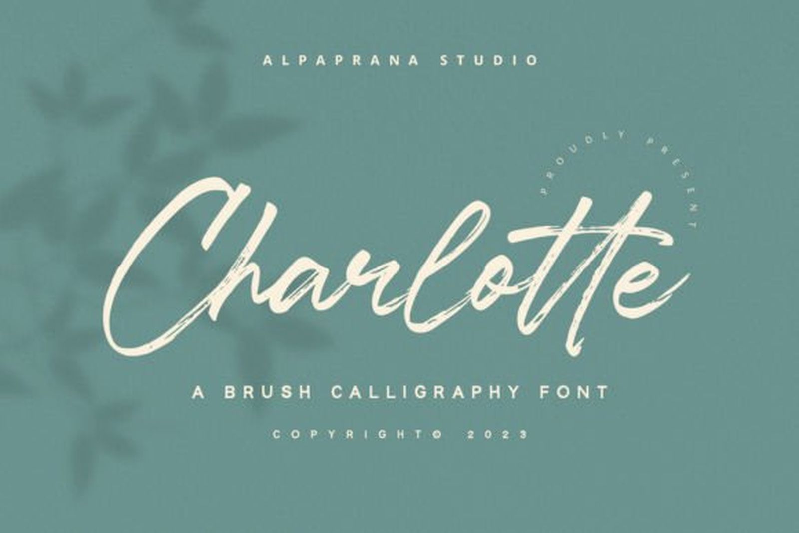
Best For: medium-size names, quotes of a few words, softer brush lettering
Charlotte is the lightest brush font in this group. The strokes show a brush origin in their tapered ends and gentle weight changes, but the edges stay clean and the contrast is moderate. Cream on a sage green specimen, it reads calm rather than energetic.
It sits between brush and classic script, which makes it the easiest of the four to use. A few words stay readable, and the brush character still comes through without needing a large placement.
Flourished Capitals Calligraphy Tattoo Fonts
Large ornamental capitals, sweeping loops and swashes that extend beyond the word. These are one-word fonts that need open space around them.
9. Faithless Font
by Whymore
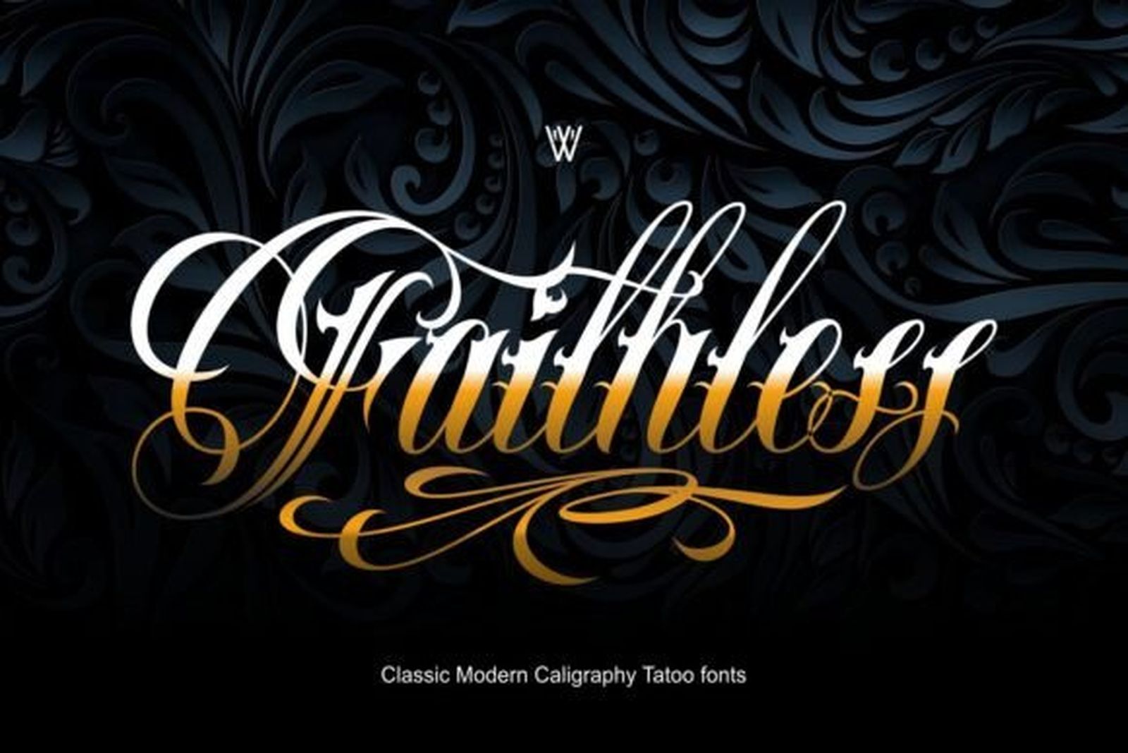
Best For: single statement words, chest pieces, ornamental lettering
Faithless combines strong contrast with loops at both ends of the word. The capital opens with a wide curl, the thick strokes are sharply defined against fine connectors, and the final letter finishes in a trailing swash. The specimen sets it in gold on a dark patterned background, where every loop is visible.
This is a font for one word, set large. The contrast and flourishes give it presence at size, and they are exactly what gets lost if the word is shrunk or packed next to other text.
10. King Slayer Font
by Whymore
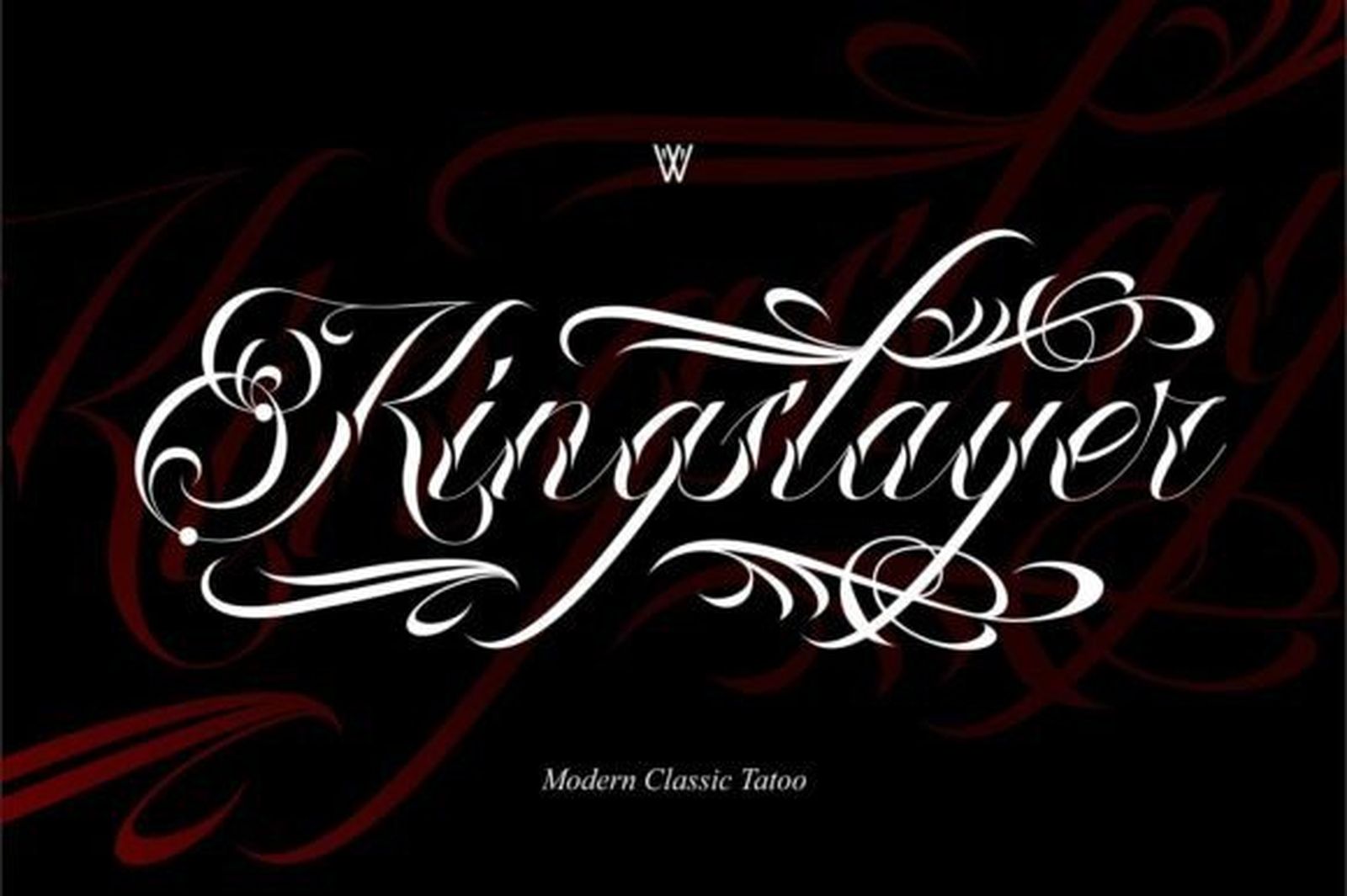
Best For: wide placements, across the chest or upper back, one-word pieces
King Slayer stretches sideways. Long horizontal swashes run out from the capital and the final letters, while the letters between them stay relatively compact. In the specimen, white lettering on a dark red background, the flourishes take up nearly as much width as the word itself.
Plan the placement around those strokes. Across the chest or shoulders they frame the word beautifully; on a narrow wrist or ankle there is simply no room for them.
11. Soul Cahill Font
by Whymore
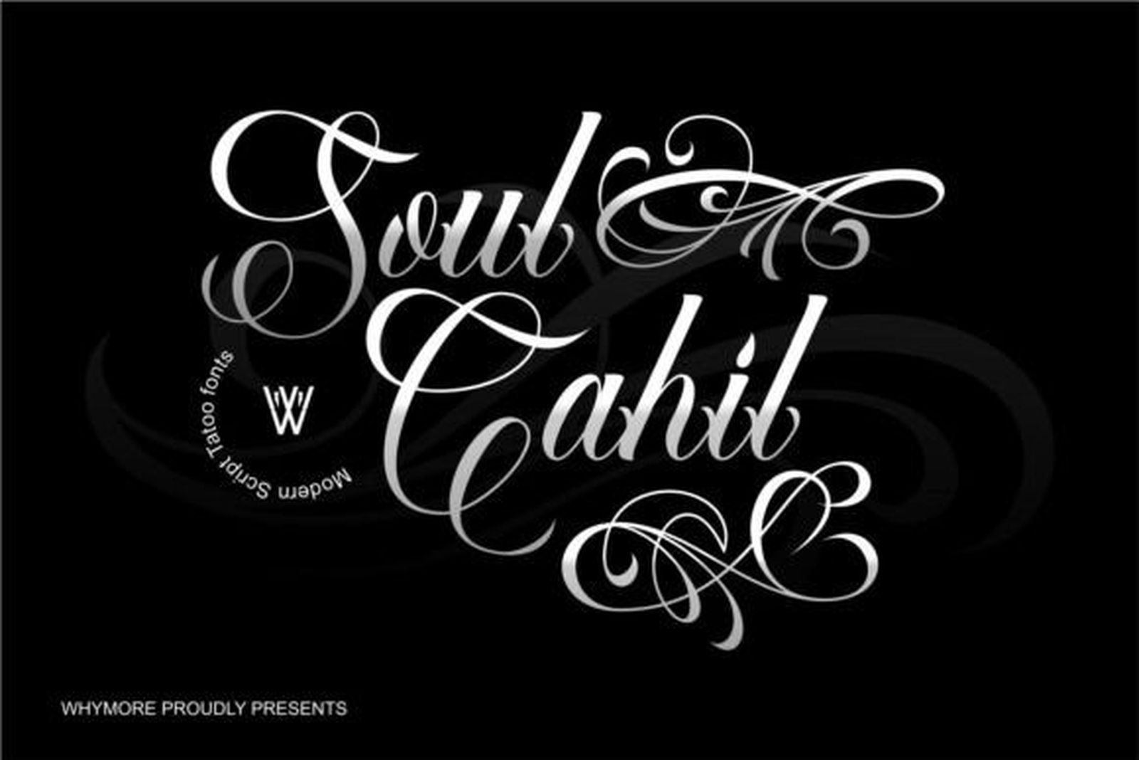
Best For: monograms, a single name with one capital, decorative compositions
Soul Cahill builds its capitals from several overlapping loops. The specimen shows two words stacked, each opening with a capital that curls back on itself more than once, while the lowercase stays simpler and connects in a steady slant.
Those capitals are the whole point and the main limit. One layered capital makes a strong focal point; two or three in the same piece start to compete and the word becomes hard to read. Best used on a single name or as a monogram.
12. Varethia Calligraphy Font
by Shape Studio
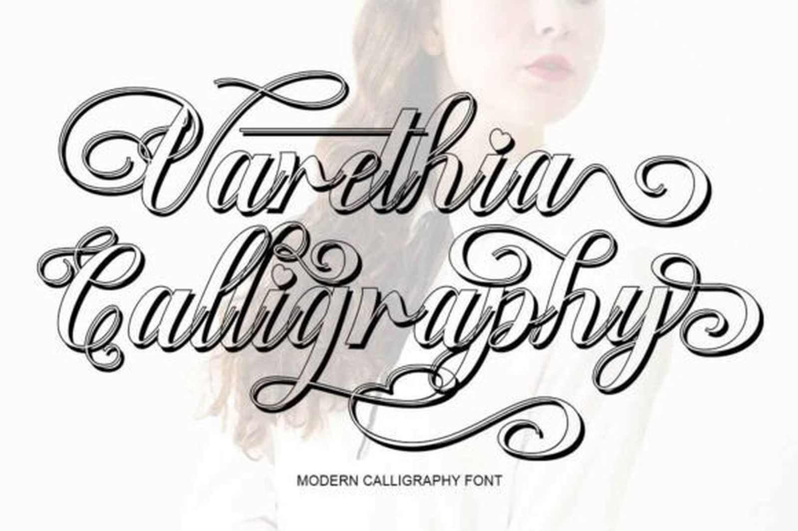
Best For: ornate single words, vintage-style lettering, large decorative pieces
Varethia Calligraphy is the most traditional of the flourished fonts. The contrast is high, almost every capital carries a loop, and the swashes curl both above and below the line of text. In the specimen, two words set in black on a light background, the flourishes interlock between the lines.
That interlocking looks rich in a specimen and needs careful spacing in a real design. Keep it to one word or give a two-line setting generous line spacing so the loops have room to meet rather than tangle.
View Varethia Calligraphy Font →
Monoline Calligraphy Tattoo Fonts
An even stroke from start to finish, with little or no contrast. This is the group for fine-line tattoos, where there are no hairlines to lose.
13. La Rumba Font
by Blessed Print
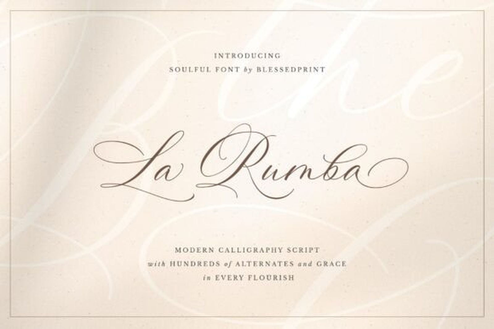
Best For: fine-line names, minimal quotes, delicate script tattoos
La Rumba draws every stroke at almost the same thin weight. The loops are wide and airy, the capitals open with a relaxed curve, and the lowercase flows at a gentle slant. On the pale cream specimen it looks as if it were written with a fine pen in one continuous movement.
An even stroke suits fine-line work: there is no thick-and-thin contrast to fall apart, so the shape of the letter is carried by the line itself. The wide loops still need a little space between words.
14. Andora Ardelion Font
by ogit
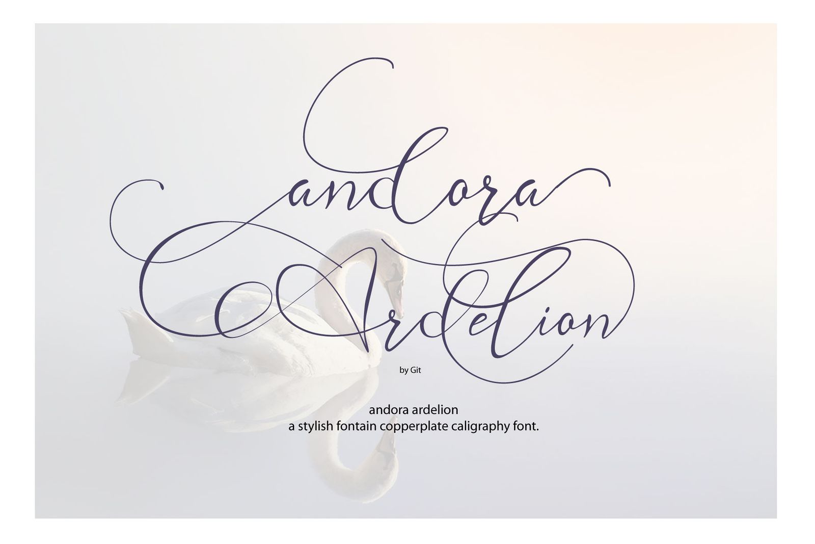
Best For: airy fine-line pieces, rib and collarbone placements, short names
Andora Ardelion is the lightest font on this list. The line is very thin, the ascenders and descenders stretch far above and below the letters, and the capitals trail into long, looping strokes. In the specimen the two words overlap loosely, more like a sketch than a lettering layout.
The long extenders are its charm and its constraint. On a wide, flat placement they give the piece an elegant, floating look; set too small, they run into each other. Give it enough size that the gaps between strokes stay open.
15. Arty Font
by elvinova
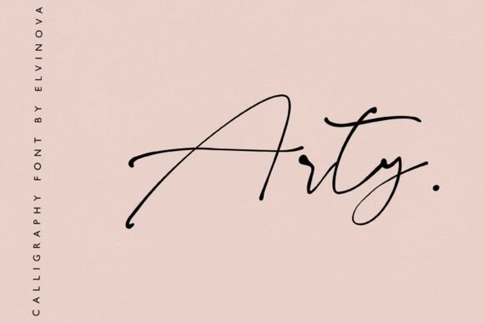
Best For: signatures, initials, handwritten-style tattoos
Arty looks like a quick autograph. The stroke is thin and even, the letters are loosely formed with a fast forward slant, and the capital is drawn as one large, open gesture. The specimen shows a single short word in dark ink on a blush background, finished with a full stop.
That spontaneity is exactly what signature tattoos call for: lettering that looks written by a hand, not set by a program. It is less suited to long quotes, where the loose letterforms become harder to follow.
16. Amelia Script Font
by saidi studio
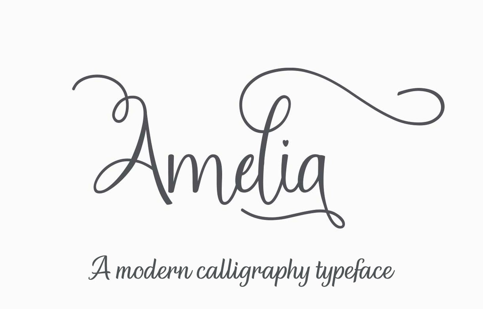
Best For: short quotes, names with dates, clean fine-line lettering
Amelia Script is the most orderly monoline font here. The letters are neatly formed and evenly spaced, the capital has a single clean curve, and one light flourish lifts off the final letter. Set dark grey on a white specimen, it reads easily at a glance.
Order is what makes it the right choice for several words. Where Arty and Andora Ardelion depend on loose gestures, this one keeps each letter distinct, so a short phrase or a name with a date stays readable.
How to Choose a Calligraphy Tattoo Font
Start with the size of the placement. Small placements favour low contrast and short extenders: Adorn Copperplate, Charlotte or Amelia Script. Large placements can carry the hairlines of Noela Nestani or the texture of Frintake.
Count the capitals. Flourished fonts like Soul Cahill and Varethia Calligraphy are built for one capital. If the text has two names or several words starting with capitals, move to Svarajka or Amelia Script.
Match the flourish to the shape of the space. King Slayer and Velvet Brush need width. Mrs. Hannah and Andora Ardelion work better where there is height. Measure first, then shortlist.
Type your own text. Specimens use words chosen to flatter the font. Set the real name or quote at the real size, then look at it from arm’s length. Weak letters show up in seconds.
Check the licence before client work. Personal ink is one thing; selling flash, merchandise or studio branding is commercial use. Terms are listed on each product page.
FAQ
What is the difference between calligraphy and cursive tattoo fonts?
Calligraphy fonts imitate a specific tool, such as a pointed pen, brush or monoline pen, and show it in the stroke. Cursive fonts are defined by connected letters and can be drawn in any style. Many fonts are both, but calligraphy puts the emphasis on stroke contrast and texture.
Which calligraphy style is most legible as a tattoo?
Monoline and low-contrast styles like Amelia Script and Adorn Copperplate, because their letter shapes do not depend on hairlines. Heavy brush fonts like Rasettagin are also legible at size. Flourished capitals are the least legible and best kept to one word.
Are calligraphy fonts good for fine-line tattoos?
Monoline calligraphy is. La Rumba, Andora Ardelion, Arty and Amelia Script draw every stroke at a similar weight, which suits fine-line work. High-contrast copperplate needs more size, because its thin strokes are the first to blur.
Can I combine two calligraphy fonts in one tattoo?
Yes, if they come from different groups. A flourished capital word with a small monoline date underneath works well. Two flourished fonts together compete for the same space.
Are these fonts free?
All sixteen are on Creative Fabrica and covered by an All Access subscription. Individual licensing terms are on each product page.
Choose the Tool Before the Font
For a small, classic name, start with Adorn Copperplate Font. For bold lettering that holds up at a distance, Rasettagin Font. For one ornamental word with room around it, Faithless Font or King Slayer Font. For fine-line work, La Rumba Font or Amelia Script Font.
Decide whether the piece should look written with a pen, painted with a brush, decorated with flourishes or drawn in a single fine line. That one choice removes three quarters of the list, and the right font is usually obvious among what remains.