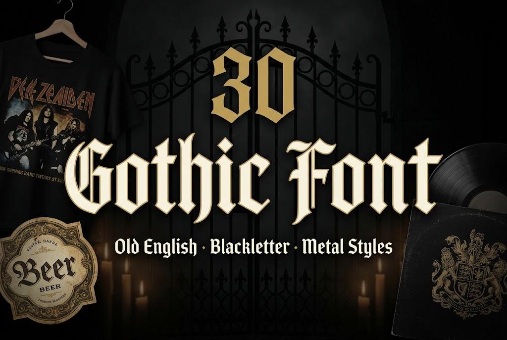
Gothic Font: 30 Old English, Blackletter and Metal Styles for Logo Makers, Band Merch and Poster Designers
A gothic font changes the temperature of a design instantly. Old English letters on a beer label say tradition, the same shapes on a hoodie say attitude, and stretched into spikes they become a black metal logo. That range is why blackletter keeps showing up on brand marks, band merch, posters, album covers and packaging.
This post contains affiliate links. If you buy through them, I may earn a small commission at no extra cost to you.
This list gathers 30 gothic fonts in five groups: classic Old English, Fraktur, modern blackletter for brands, bold gothic capitals for streetwear, and metal styles. I chose each one from its previews on Creative Fabrica, and the notes describe what the letters look like, where they stay readable and what kind of project they suit. All fonts in this list are on Creative Fabrica, and a single All Access subscription unlocks every one of them, so you can test several styles on a real logo or shirt before committing to one.
More gothic and blackletter collections:
24 Gothic Tattoo Fonts
18 Tattoo Font Alphabets
20 Vintage Fonts
28 Bold Fonts
20 Logo Fonts
33 Canva Fonts
Table of Contents
- Classic Old English for Logos, Labels and Mastheads
- Fraktur for Beer Labels, Vintage Posters and Signs
- Modern Blackletter for Brand Logos and Packaging
- Bold Gothic Caps for Streetwear and Merch
- Metal, Band Logo and Album Cover Fonts
- How to Choose a Gothic Font
- FAQ
- Where to Start
Classic Old English for Logos, Labels and Mastheads
Dense vertical strokes, diamond-cut feet and capitals with fine hairline spurs: the shape most people picture when they hear gothic font. These six are the safe classics for heritage logos, labels and anything that should look established.
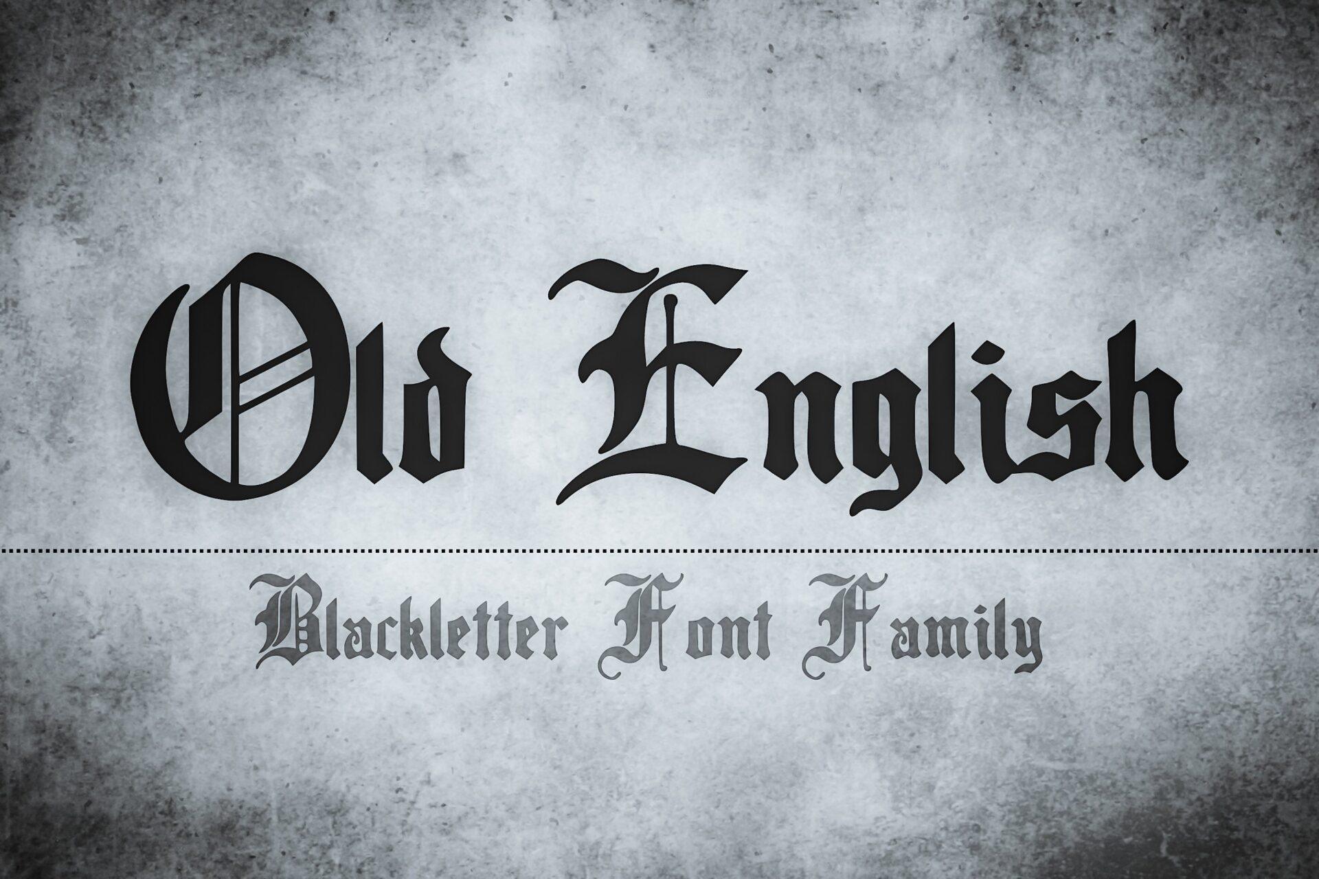
1. Old English Font by The Tenacious Type Studio
Best For: Brewery logos, newspaper-style mastheads, certificates and diploma headings
The textbook Old English shape: tight vertical strokes, pointed diamond feet and capitals with thin spurs that recall manuscript lettering. The preview presents it as a blackletter font family, so you get more than one look to work with.
Use it for a name or a title of two or three words and let a plain serif carry the rest. On a dark label or a stamped logo it reads as heritage straight away. Keep the letter spacing at default: textura that is spaced out starts to fall apart into separate strokes.
2. Black English Font by Bundle
Best For: Heritage apparel logos, whiskey and barbershop labels, poster headlines
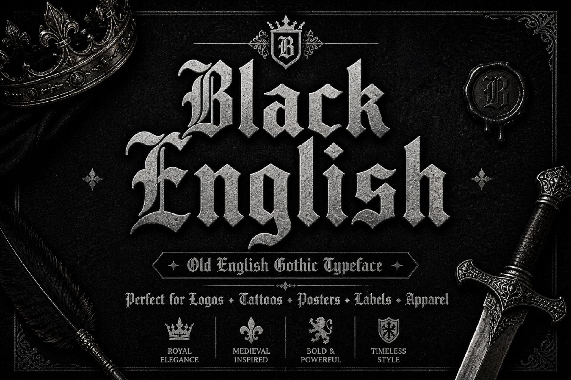
Old English with more drama. The capitals carry thin curls and flicks, while the lowercase stays compact and sharp-edged. The preview surrounds it with a crest, a wax seal and a sword, and lists logos, posters, labels and apparel among its uses.
It needs air around it. Set the brand name on one line, center it under a crest or monogram and put the tagline in small spaced capitals of a simple serif. Avoid setting whole words in capitals: the ornate capitals become hard to read when they sit side by side.
3. Crownspire Font by Eko Kurniawan
Best For: Luxury streetwear logos, album titles, posters with a dark royal mood
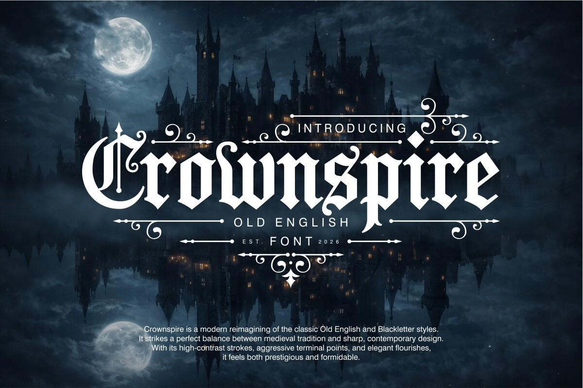
A sharper, more contemporary take on Old English with strong contrast between thick and thin strokes, pointed terminals and swirling flourishes. In the preview the capital C curls into a loop wide enough to frame the next letter.
The flourishes already do the decorating, so skip extra ornaments or keep them as thin lines the way the preview does. It looks best large: a chest print, a poster title or a website header rather than small text on a hang tag.
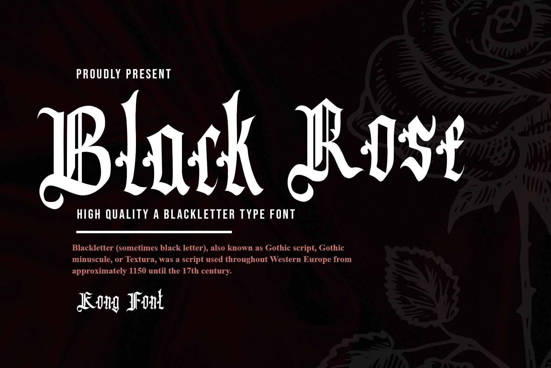
4. Black Rose Font by Freebies
Best For: Band shirts, barbershop signs, gothic event flyers
A tall, narrow textura with diamond-shaped serifs and fine hairline spurs on capitals like B and R. The lowercase is condensed, so long words still fit across a shirt or a sign.
The narrow build helps when the name is long: a band name or a shop name stays on one line where a wider Old English would need two. White on black, as in the preview, is its strongest setting. On light backgrounds go a size up so the hairlines do not disappear in print.
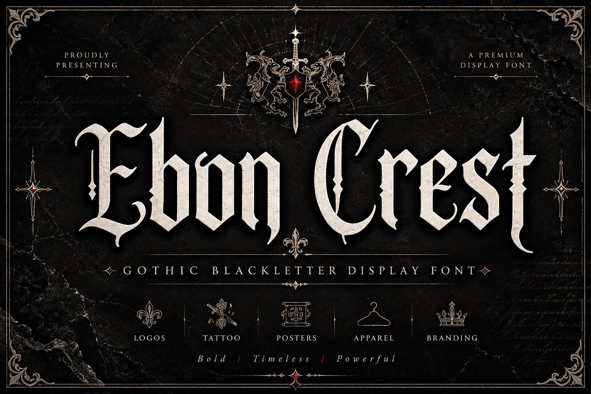
5. Ebon Crest Font by Wow Magic
Best For: Gothic brand logos, book covers, posters and apparel prints
A tall, condensed display blackletter with long spikes on the ascenders and pointed cuts at the ends of the strokes. The preview lists logos, posters, apparel and branding among its uses, and the letters are built like a logo face: a strong vertical rhythm and little clutter inside the shapes.
Set it in one or two words and pair it with a thin serif in spaced capitals, as the preview does with its subtitle. Cream or gold on near-black keeps the spikes crisp. Over a busy photo it needs a solid band of color behind it.
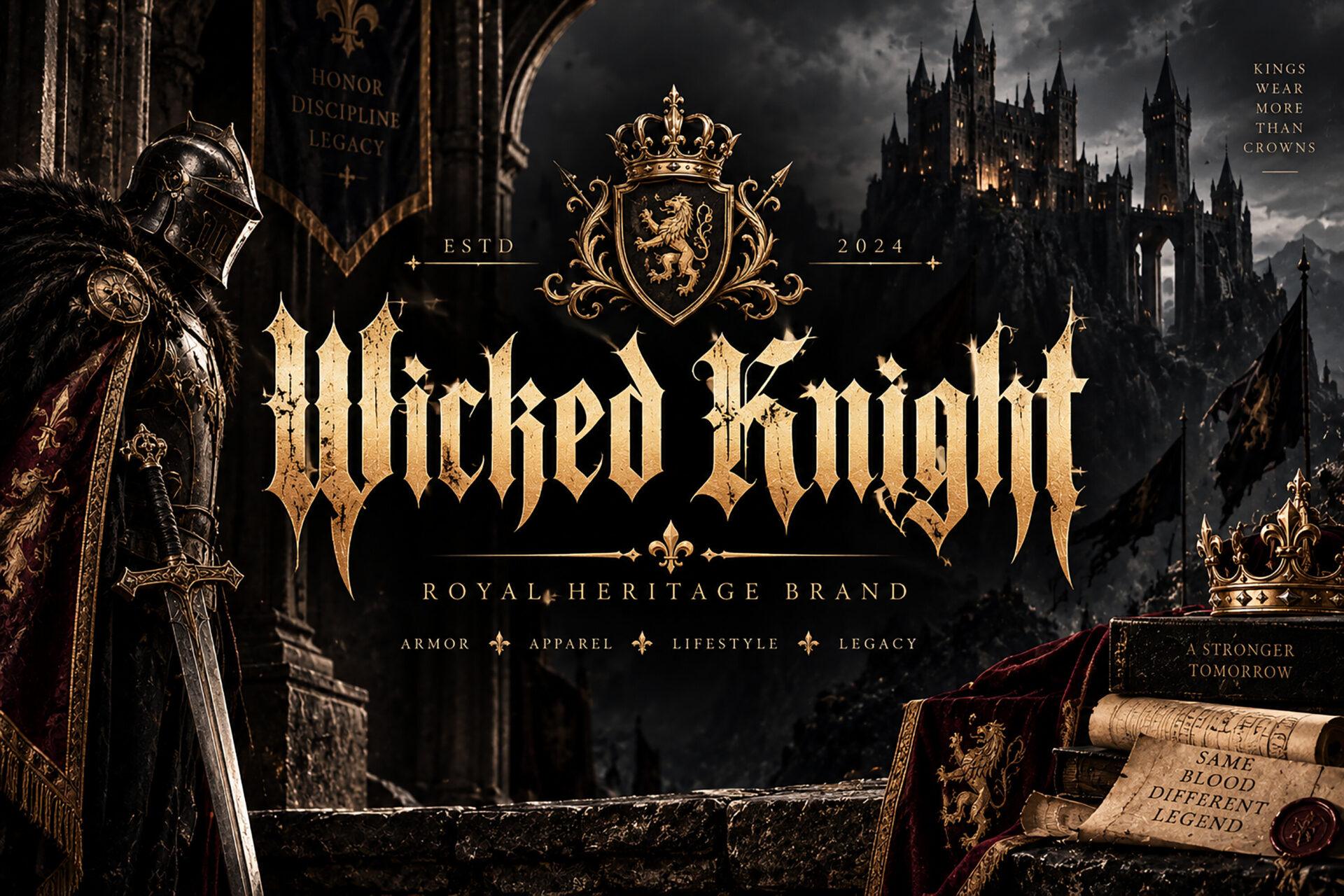
6. Wicked Knight Font by BILLI
Best For: Crest logos, heraldic merch, fantasy book covers and game titles
Compressed blackletter with tall pointed extensions on letters like W and K that rise above the line like spear tips. The preview sets it in gold under a royal crest, and the font is clearly drawn for that kind of emblem.
Place it under or over a badge and keep the text to the brand name. The extended letters need vertical room, so add extra line spacing if a second line follows. For small text on tags, choose a calmer font from this group.
Fraktur for Beer Labels, Vintage Posters and Signs
Fraktur is the rounder, curlier branch of blackletter that German printers and sign painters used for centuries. It feels less like a cathedral and more like an old brewery, bakery or town poster.
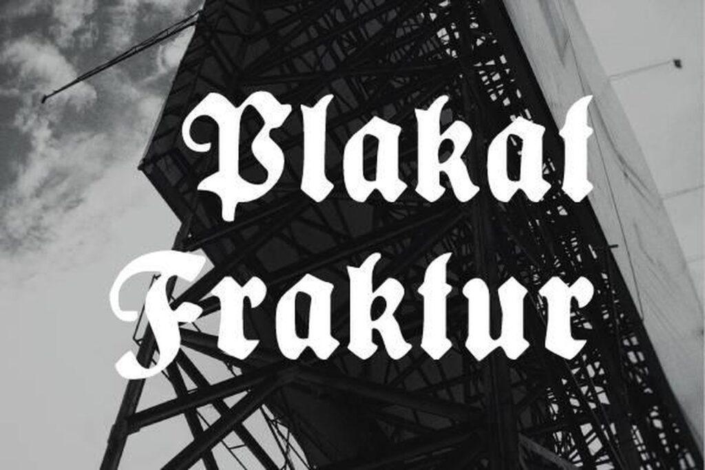
7. Plakat Fraktur Font by Freebies
Best For: Beer and cider labels, Oktoberfest posters, bakery signs
Heavy poster Fraktur: thick black strokes, curly capitals P and F and a compact lowercase that holds together even from a distance. Plakat means poster in German, and the weight matches the name.
Use it as the one loud element on a label, the beer name or the shop name, with details in a small sans serif. The strokes are so dark that it prints well in a single color, which suits stamps, stickers and screen printing.
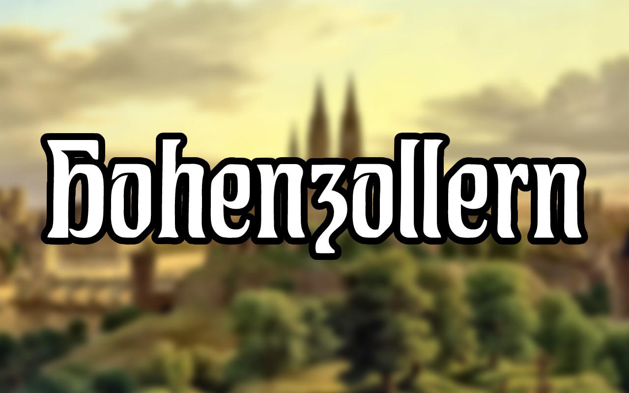
8. Hohenzollern Font by Freebies
Best For: Pub signs, bold product labels, vintage-style T-shirts
A bold, blocky Fraktur with wide strokes and squared-off curves. It looks less calligraphic than most blackletter and more like carved or painted sign lettering.
Its weight makes it one of the easiest fonts in this list to read from across a room, so it fits signage and large prints. The preview places it over a photo with a white outline, a simple trick worth copying when the text sits on an image.
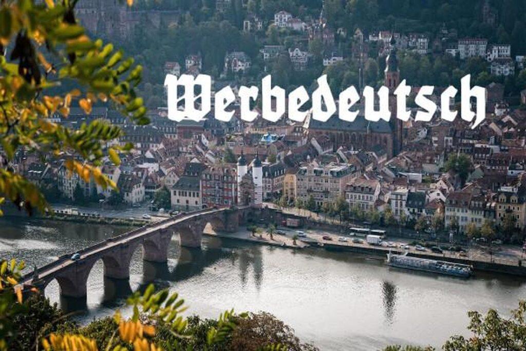
9. Werbedeutsch Font by Freebies
Best For: Retro ads, menu headers, market stall signs and food packaging
A compact advertising Fraktur, chunky and rounded with fairly open counters. It feels friendly rather than dark, closer to an old shop window than to a metal album.
Pick it when you want a European vintage touch without a spooky mood: a café menu, a sausage stand logo, a craft market sign. It sits comfortably next to a simple slab serif.
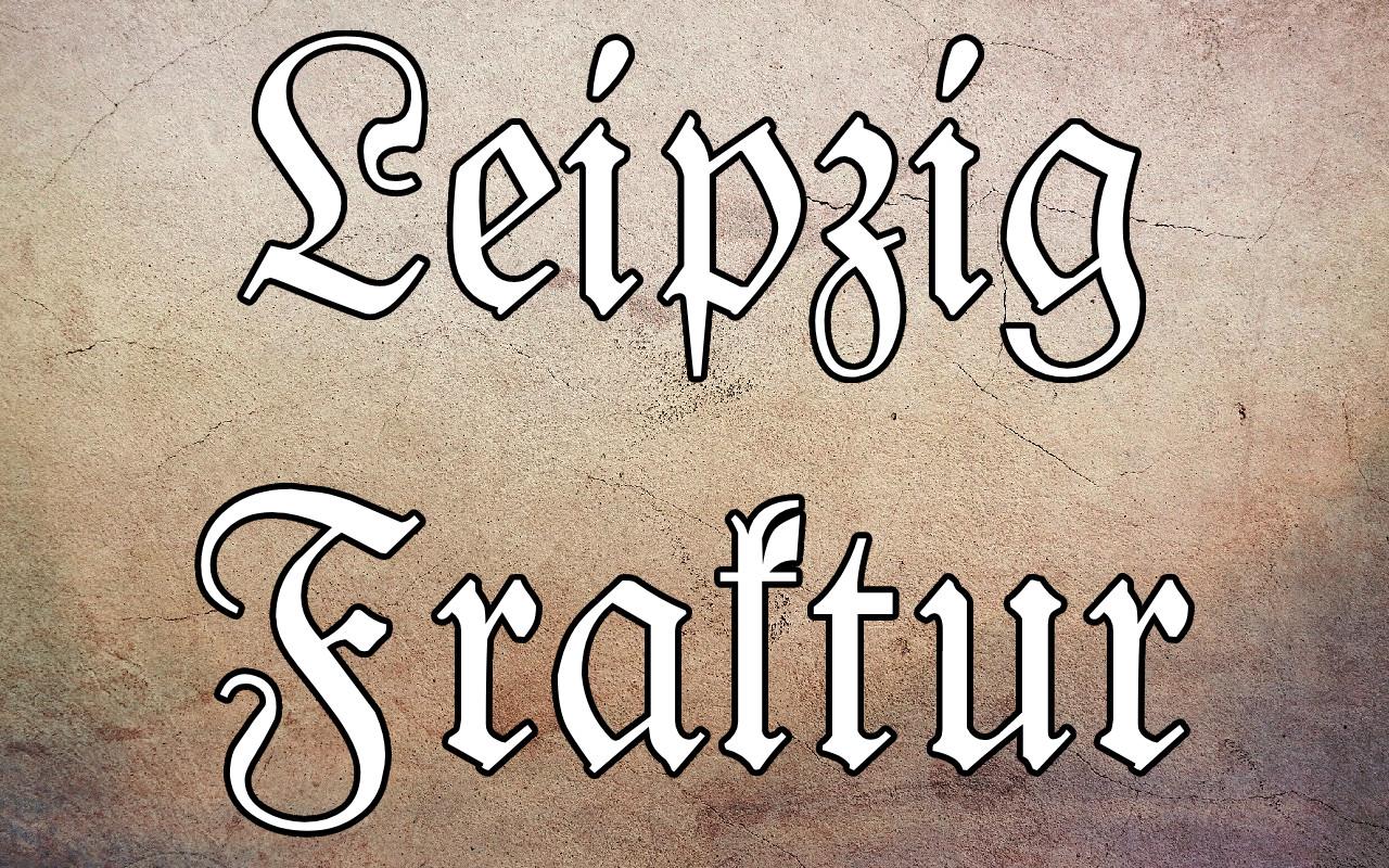
10. Leipzig Fraktur Font by Freebies
Best For: Book titles, certificates, formal invitations and framed quotes
A lighter, more elegant Fraktur with long sweeping capitals L and F. The preview shows it as white letters with a dark outline on parchment, which makes the swash curves easy to see.
This is the most formal choice in the group, closer to a printed book title than to a sign. Use it for names and short headings on paper goods. For merch it needs a large size so the thinner parts survive printing.
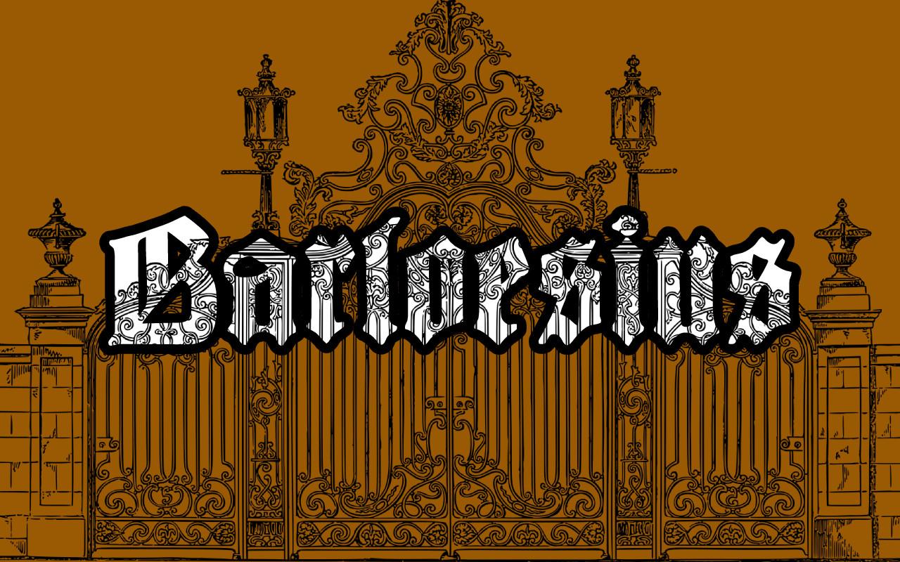
11. Barloesius Font by Freebies
Best For: Ornamental posters, vintage labels, decorative initials
A decorative Fraktur with engraved patterns inside the strokes, so every letter looks cut from an old printing plate. The preview sets it in front of an ornate iron gate, and the mood matches.
The inner pattern is the whole point, so give it size: a poster headline, a large label title or a single drop cap. In small text the engraving fills in and the letters turn into gray blocks.
Modern Blackletter for Brand Logos and Packaging
These keep the broken strokes and pointed feet of gothic lettering but clean them up, soften them or mix them with serif shapes. They are the easiest way to bring a gothic edge into a brand without looking medieval.
12. Dutch Brigade Font by TypeFactory
Best For: Craft beer and coffee branding, vintage labels, packaging
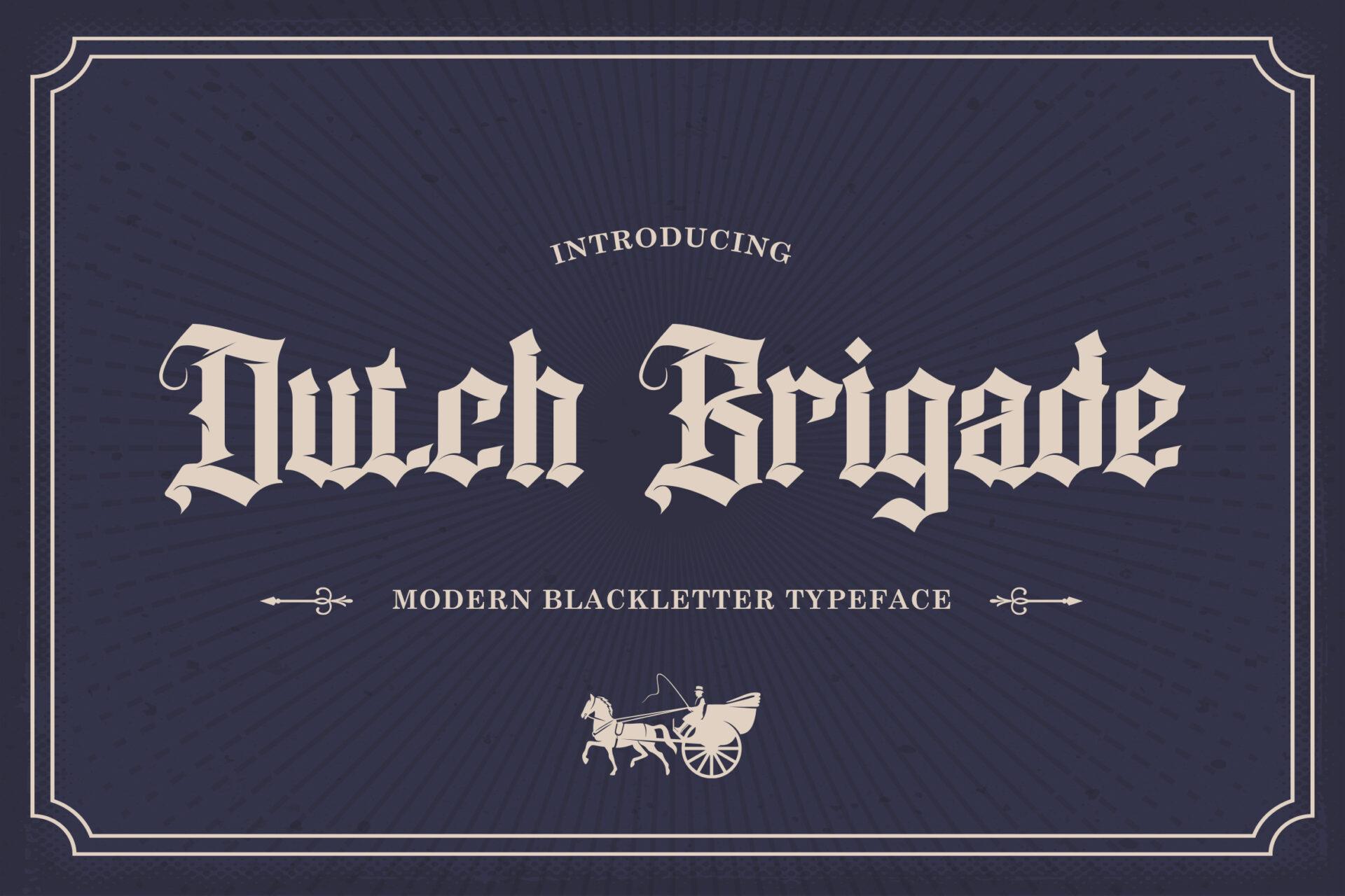
A modern blackletter with softened edges and slightly wider letters than classic textura. The preview frames it with thin borders and a horse carriage illustration, and it has the feel of an old trade sign.
It stays readable for a full brand name and still looks clearly gothic. Pair it with a classic serif for small text and a thin frame or rule. It suits kraft paper and dark navy or green labels.
13. Thornville Font by Creacy Studio
Best For: Boutique logos, candle and perfume labels, editorial titles
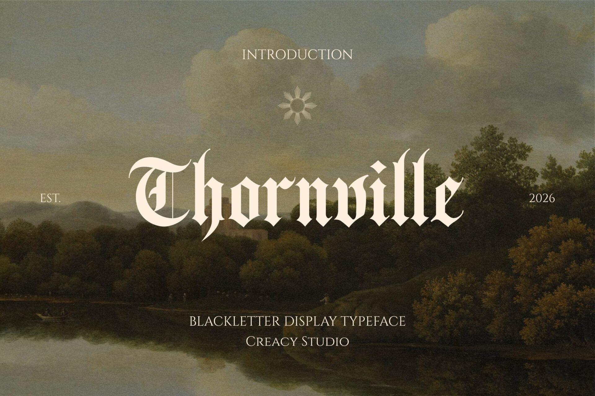
Refined and high in contrast, with a sweeping capital T and thin hairlines that keep the whole word light. Next to the heavier fonts here it reads almost like an elegant serif with gothic bones.
A good fit for brands that want a dark, romantic edge without heaviness: candles, apothecary labels, a book or magazine title. Give it generous space and pair it with a light serif.
14. Brokendays Font by Creative Fabrica Fonts
Best For: Clothing brand logos, album titles, posters with a vintage edge
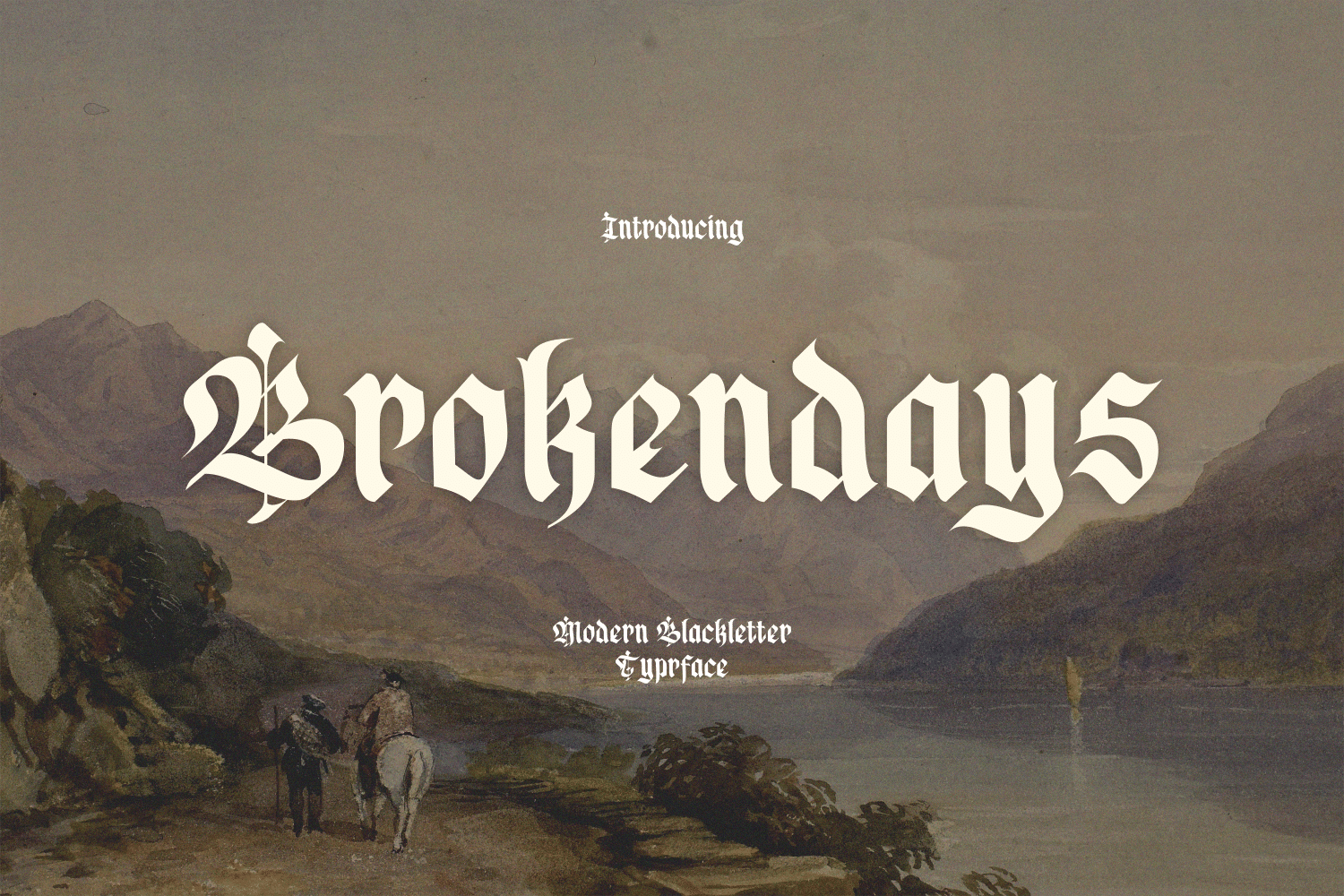
A modern blackletter with expressive capitals: in the preview the B opens with a curled swash, while the lowercase stays upright and compact.
It works well for one or two words on shirts and hoodies. The swash capital gives a natural logo start, so keep the first letter capitalized and the rest lowercase.
15. Death Rider Font by Creative Fabrica Fonts
Best For: Motorcycle club logos, garage merch, patches and stickers
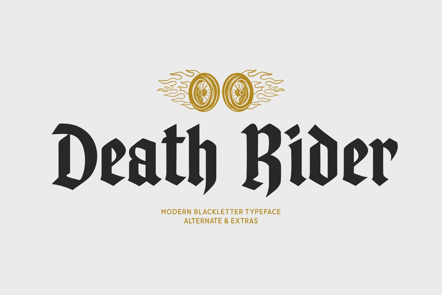
Heavy and compact with little contrast between strokes, so the letters stay solid and dark. The preview mentions alternates and extras and shows the font under a flaming wheels emblem.
Low contrast is a practical advantage: the font holds up in screen printing, embroidery and small sizes better than most here. A strong pick for patches, caps and die-cut stickers.
16. Blitch Font by Whymore
Best For: Fashion logos, streetwear brands, bold editorial headlines
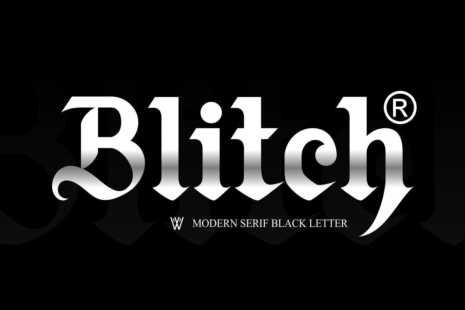
The preview calls it a modern serif blackletter: wide, heavy letters where rounded serif shapes meet gothic cuts, and the h finishes in a long sweeping tail.
It reads more like a brand mark than a medieval font, which makes it useful for fashion and lifestyle logos. Set one word large with a small tagline or registered mark, the way the preview shows it.
17. Velthoven Black Font by Creacy Studio
Best For: Music and nightlife posters, fashion logos, book covers
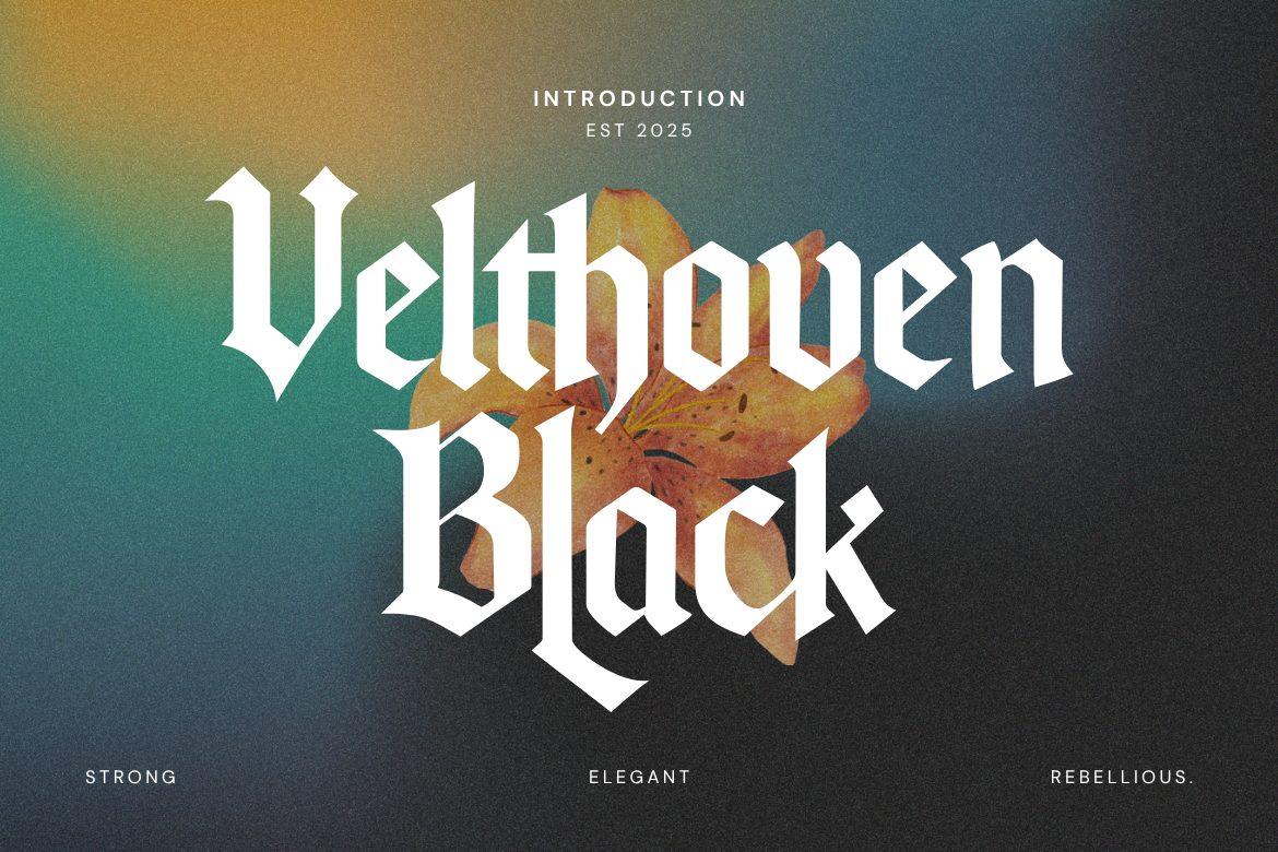
Tall, high-contrast blackletter with long swashes on letters like B and k that reach below the line. The preview sums it up as strong, elegant and rebellious.
Stack two words so the swashes can overlap, and it becomes a ready-made poster or cover title. Keep the background simple, a flat color or a soft gradient as in the preview.
18. Valeria Secret Font by Alit Design
Best For: Album covers, fashion and beauty brands, dramatic posters
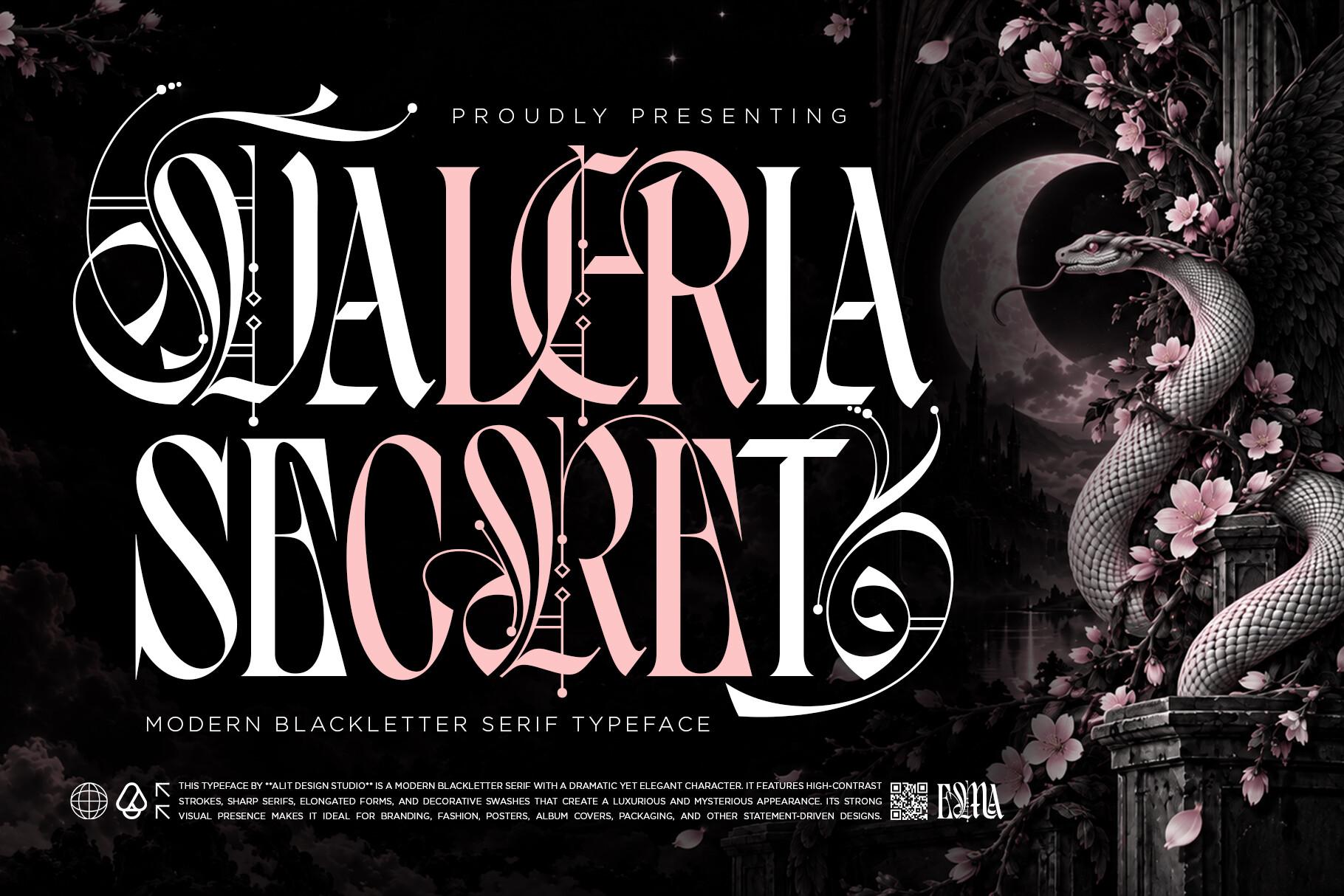
A blackletter serif with dramatic decorative capitals: in the preview the V and the S spiral into ornaments, and some letters carry small diamond details.
This is a pure display font. Use it for a title or a name and let one or two ornate capitals carry the word. A clean sans serif in capitals makes a good partner for everything else.
Bold Gothic Caps for Streetwear and Merch
Capitals first, with notches, angles and cuts borrowed from blackletter. These read faster than textura and keep their shape on hoodies, caps, stickers and posters seen from a distance.
19. Negativo Font by TypeFactory
Best For: Streetwear logos, hoodie prints, gig posters
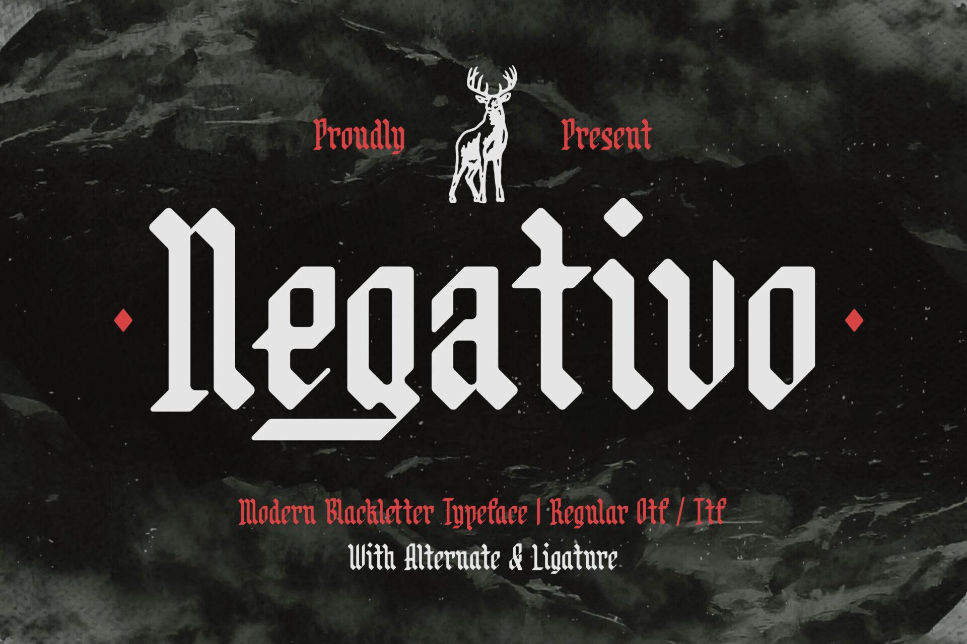
Condensed, angular blackletter with a hooked N and tight letter spacing. The preview notes OTF and TTF files with alternates and ligatures.
The narrow widths let a long name run across a chest print without shrinking. Try an alternate on the first letter to give the word a logo feel.
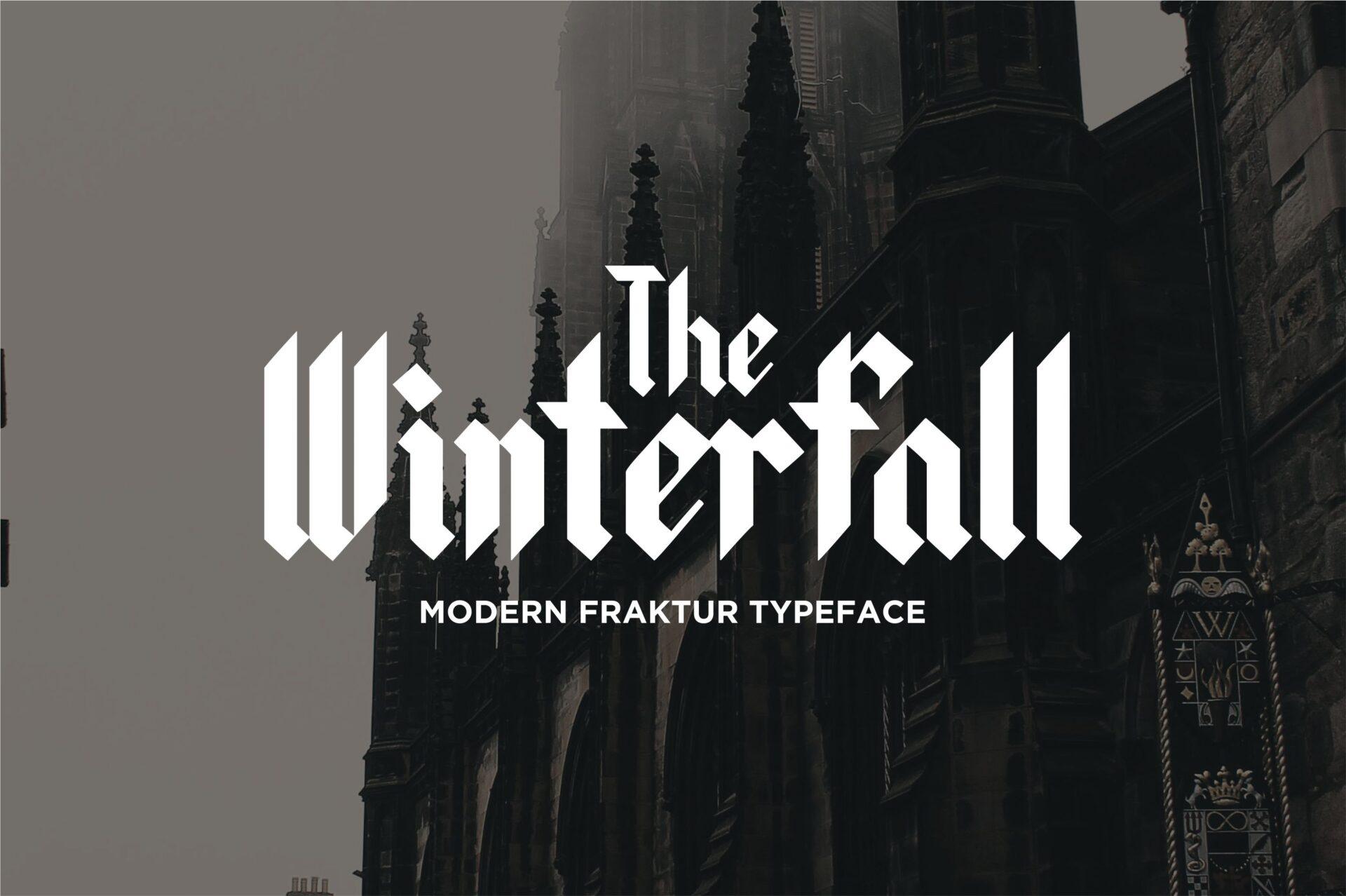
20. Winterfall Font by Alpha Std
Best For: Merch titles, posters, book and game covers
A modern Fraktur that is condensed and bold, with sharp spurs on letters like W and f. The preview sets it in white over a gothic cathedral facade.
It is tidy and even, so it stays legible on shirts and posters. The small The placed above the main word in the preview is a layout idea worth borrowing for titles.
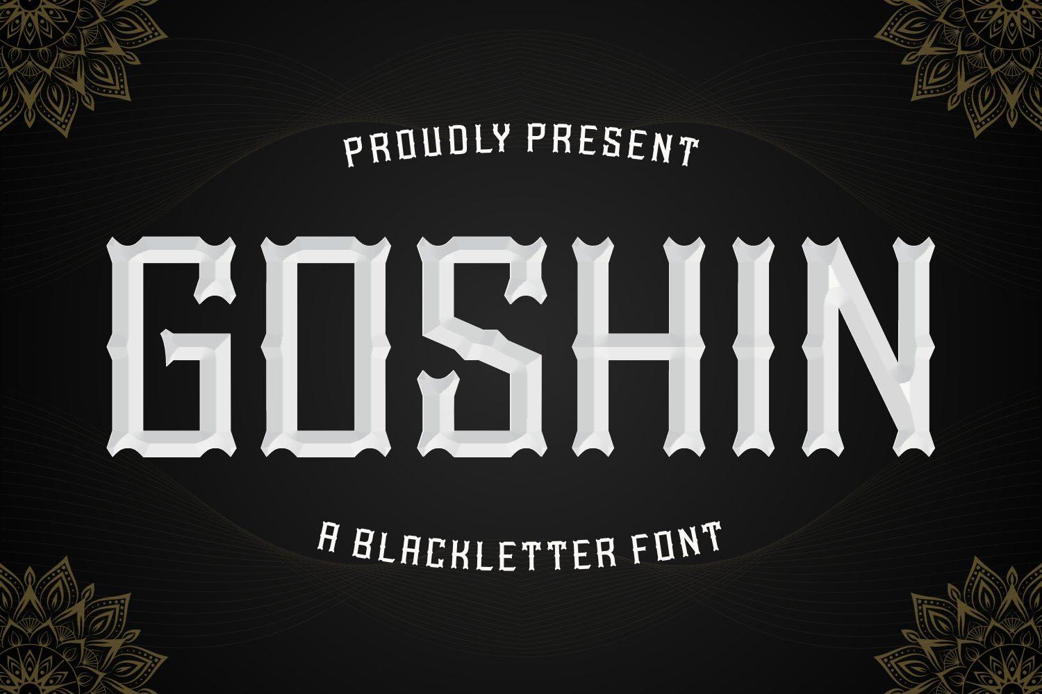
21. Goshin Font by Creative Fabrica Fonts
Best For: All-caps brand names, team-style merch, signage
Capital letters with notched, faceted corners that hint at blackletter without the dense textura strokes. The preview shows them beveled like carved stone.
This is the most legible font in the article. Choose it when a name has to read at a glance: a storefront sign, a cap, a team-style shirt.
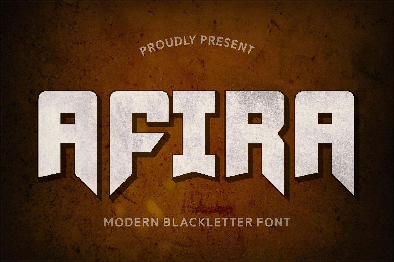
22. Afira Font by Creative Fabrica Fonts
Best For: Bold logos, game titles, posters and stickers
Heavy, blocky capitals with angled cuts, as if a modern blackletter had been reduced to solid slabs. The preview gives it a 3D bevel on a rusty background.
The thick shapes make it practical for stickers, vinyl and embroidery. Pair it with a thin sans serif so the weight contrast does the work.
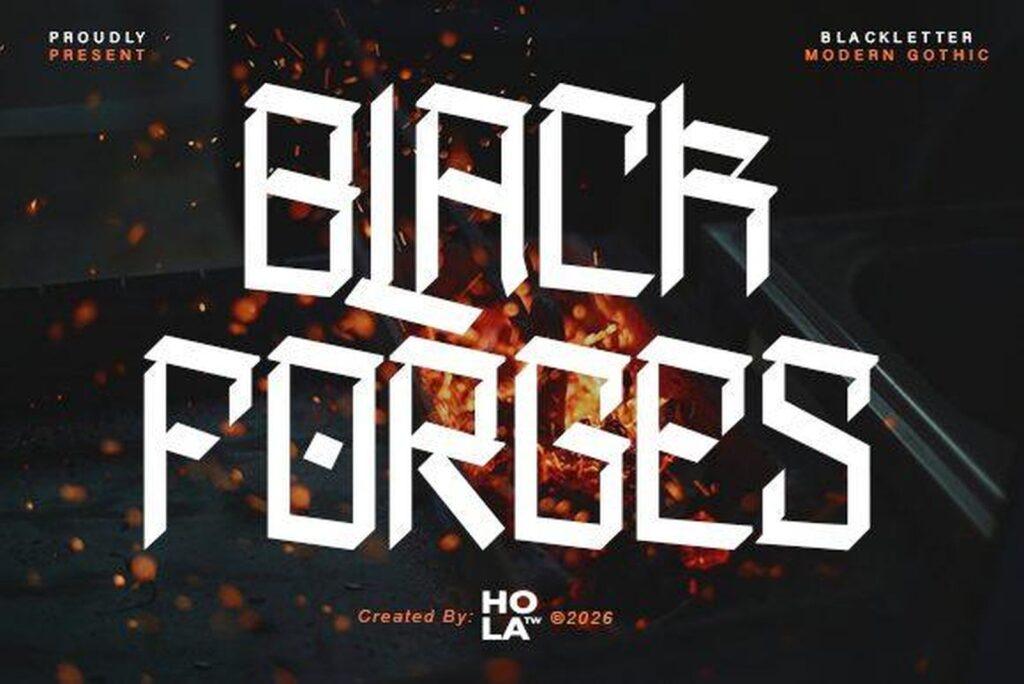
23. Black Forges Font by holatypework
Best For: Edgy streetwear, music event posters, zine covers
Built from straight cuts and sharp angles, with letters that sit slightly unevenly on the baseline, as if cut by hand. The preview labels it modern gothic.
It has a raw, DIY feel, so set it big and tight, white on black or over a gritty photo. For a clean corporate logo, pick something else from this list.
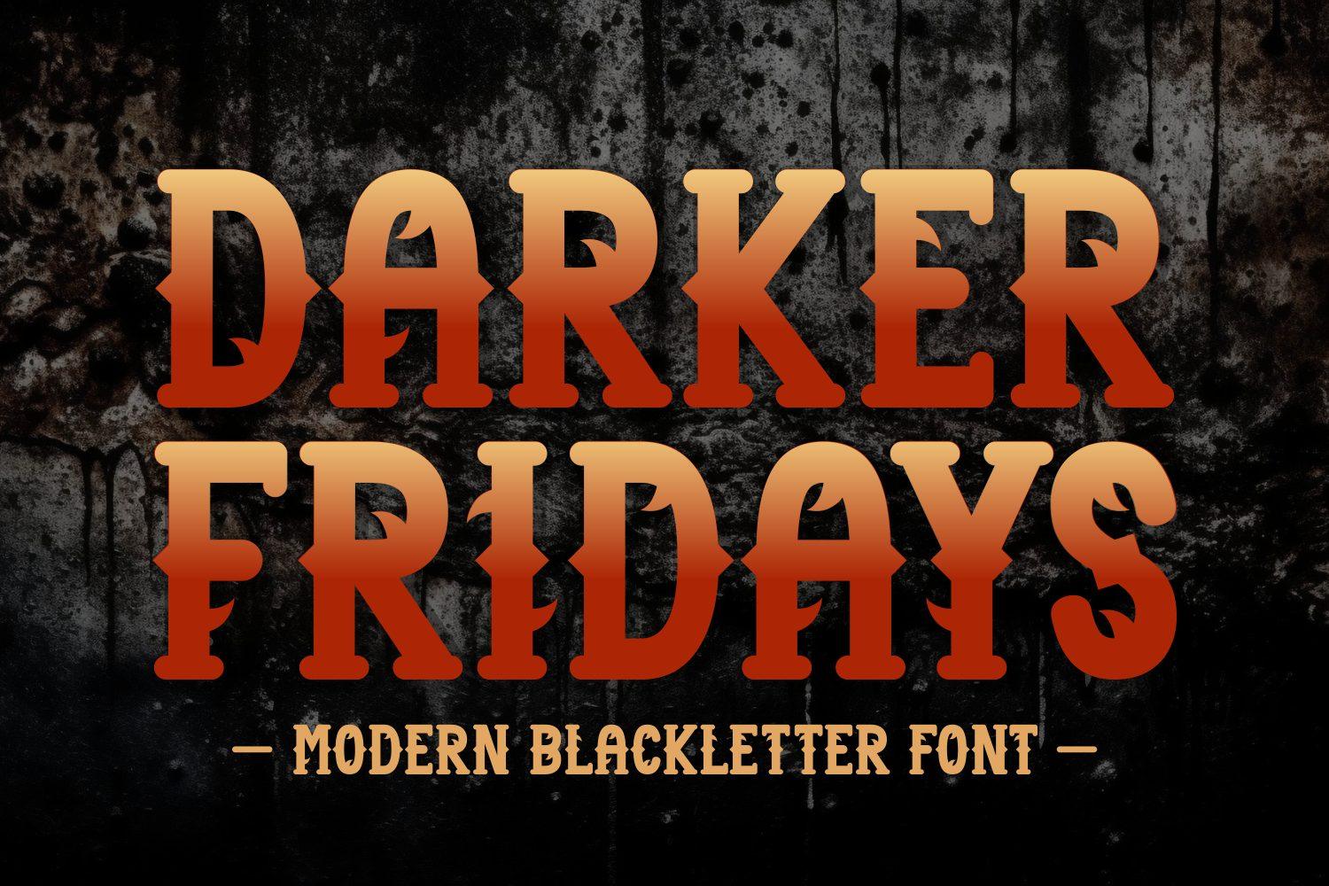
24. Darker Fridays Font by Creative Fabrica Fonts
Best For: Bar and event posters, vintage merch, movie night titles
Wide capitals with pointed blackletter notches and slightly flared serifs, which gives them a vintage poster flavor. The preview fills them with an orange gradient over a grunge texture.
Made for headlines: a bar night poster, an event shirt, a horror movie night title. Gradients and distressed textures suit it well.
Metal, Band Logo and Album Cover Fonts
From hand-drawn gothic to full black metal spikes. The first is calm enough for an album cover, the rest are made for band logos, gig posters and merch tables, where a little illegibility is part of the style.
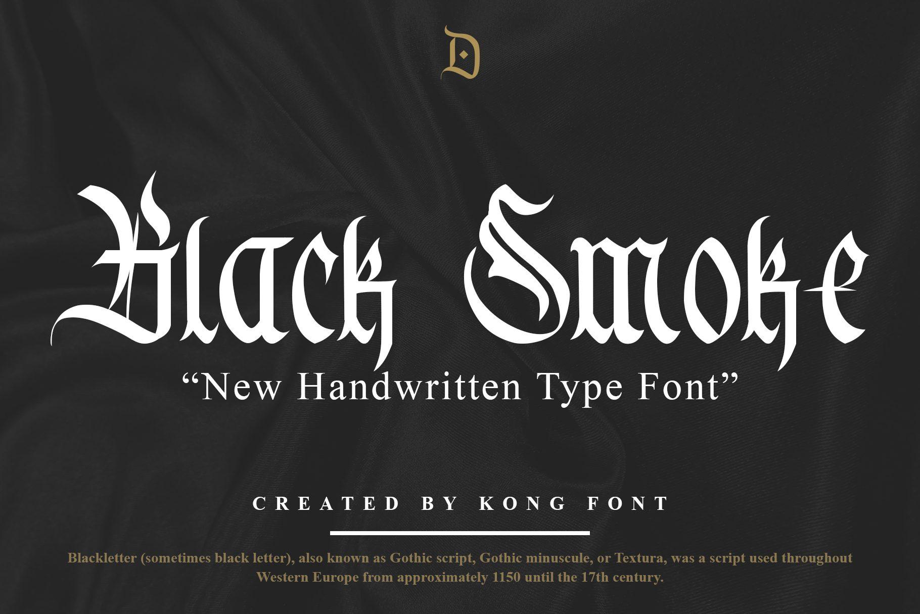
25. Black Smoke Font by Freebies
Best For: Album covers, poster titles, hand-drawn merch
A handwritten blackletter. The strokes look drawn with a broad pen, slightly irregular, with long hairline extensions on letters like B and S. The preview calls it a new handwritten type font.
It brings a personal, ink-on-paper feel that clean textura lacks. Use it for an album title, a poster or a shirt where the lettering should look made by hand rather than typeset.
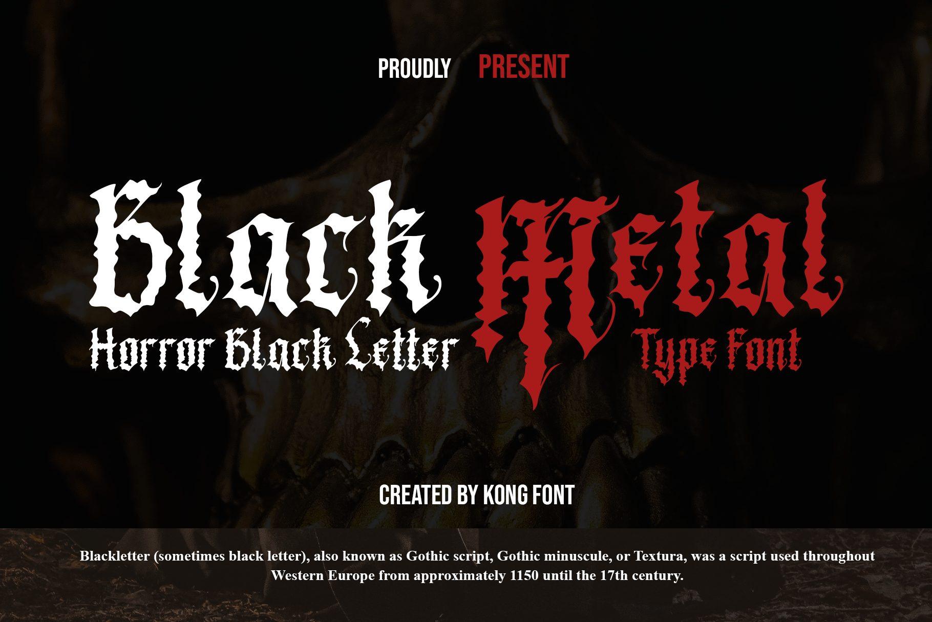
26. Black Metal Font by Freebies
Best For: Horror and metal posters, Halloween merch, album titles
The preview calls it a horror blackletter. The word Black is set as a fairly classic textura, while Metal appears in a rougher, cracked look in red.
It sits between a traditional gothic font and a band logo, so it works for horror events and metal-themed merch that still need readable words. Red on black, as in the preview, is the obvious and effective palette.
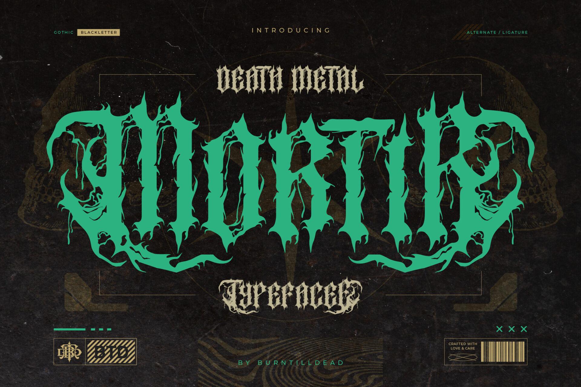
27. Mortir Font by Burntilldead
Best For: Band logos, metal merch, gig posters
Death metal lettering with a blackletter core: flame-like tendrils grow out of the strokes, while the letters underneath stay recognizable. The preview shows it in green with a smaller typeface subtitle.
Readable enough for a band or event name, wild enough for a back print or a poster. Keep it to one word and give it a plain dark background.
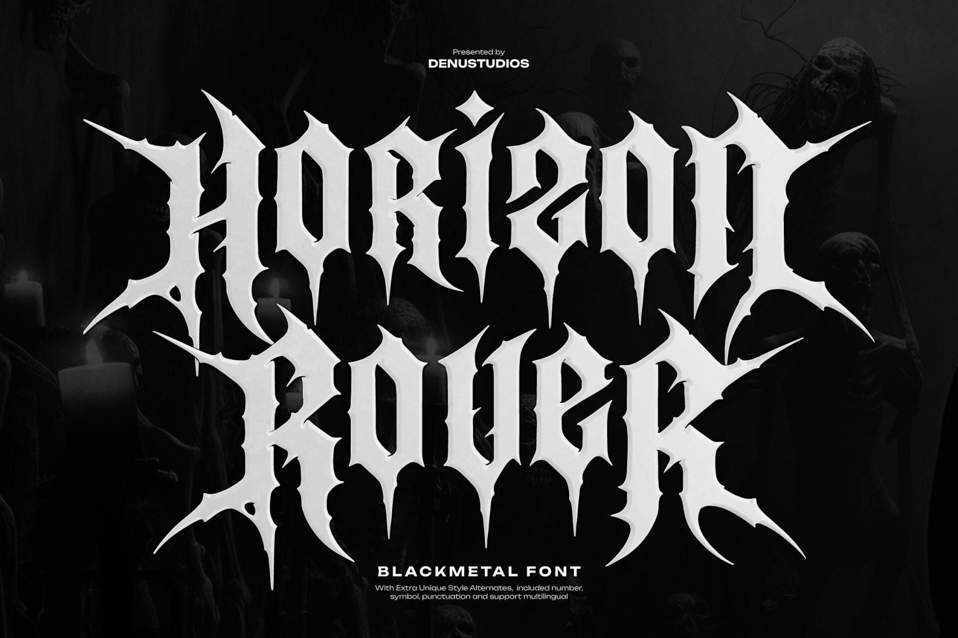
28. Horizon Rover Font by Denustudios
Best For: Black metal band logos, merch, album artwork
A black metal font with long thorn-like extensions shooting out of the capitals. Unlike many logo-style metal fonts, the core letters remain clear, so the name can still be read.
A good entry point if you want the black metal look without drawing a logo by hand. Set two short words stacked, white on black, and let the spikes overlap.
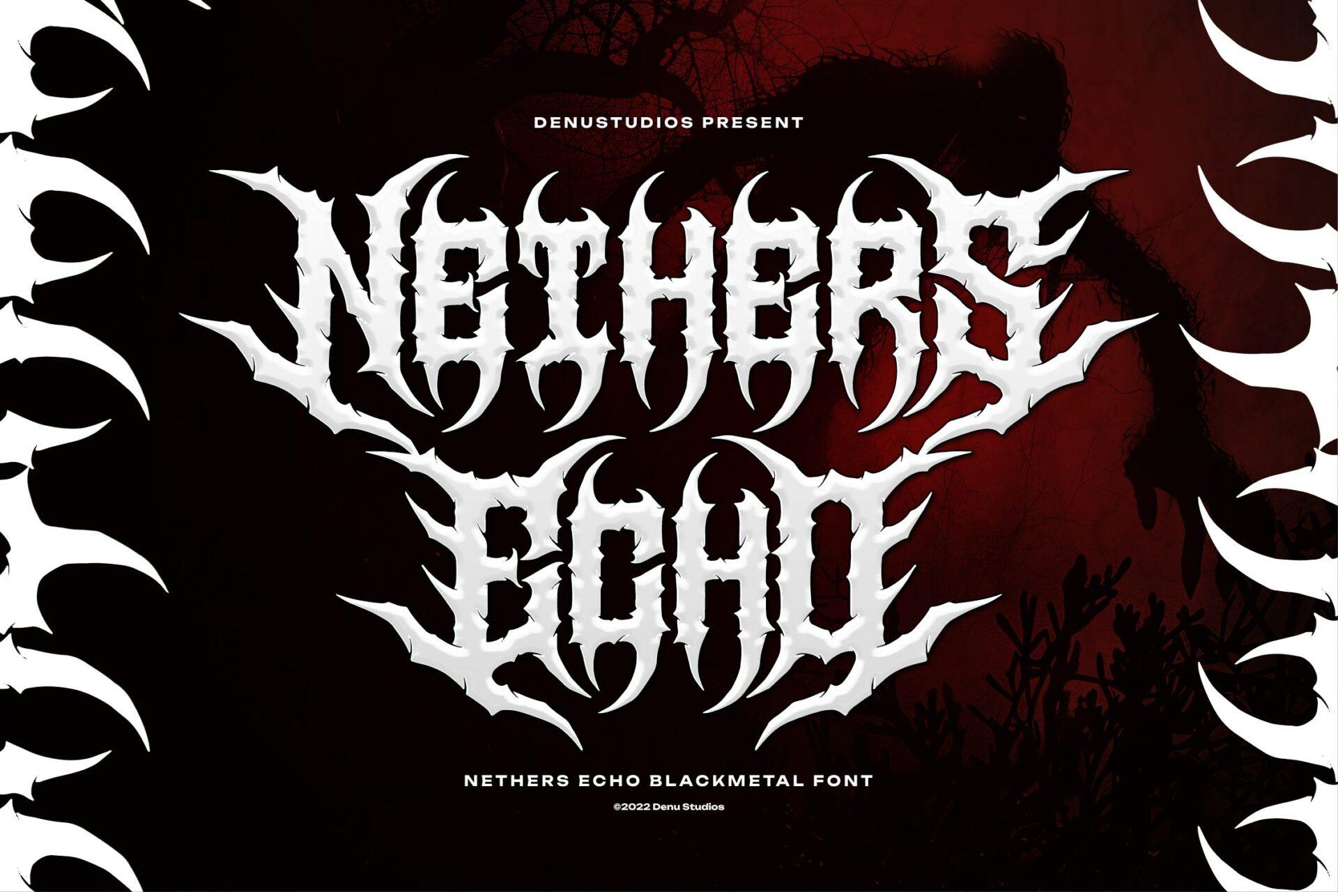
29. Nethers Echo Font by Denustudios
Best For: Band logos, festival posters, dark streetwear
Black metal lettering with curved, horn-like spikes that give the words a symmetrical, almost emblem-like silhouette. The preview frames it with matching horn shapes.
Its symmetry makes it look like a finished logo straight away. Center it and keep surrounding text minimal, because it already fills a lot of space.
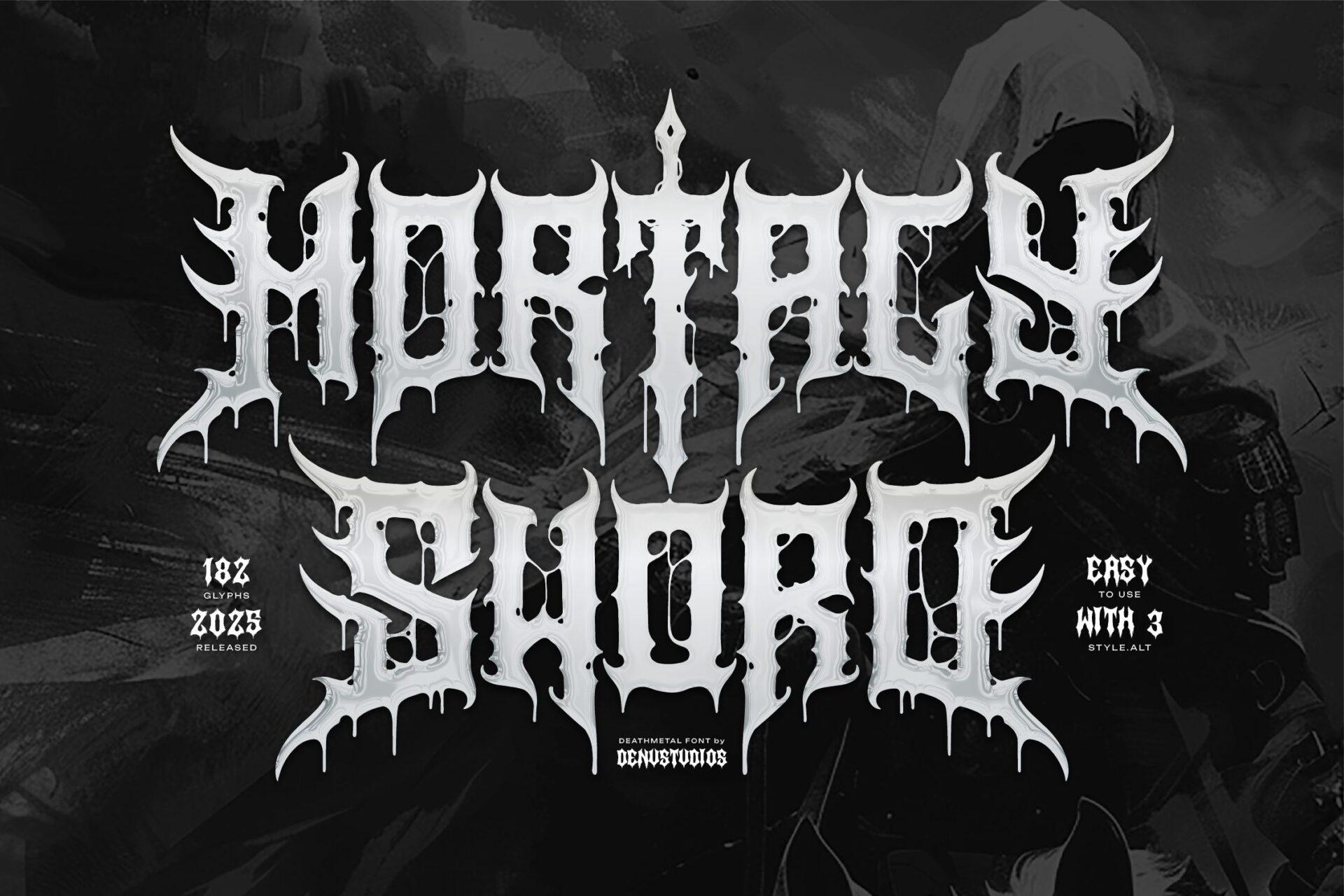
30. Mortaly Sword Font by Denustudios
Best For: Metal band merch, gig posters, album covers
Black metal capitals with icicle-like drips hanging from the strokes and a sword-shaped vertical cutting through the letters. Spiky, cold and sharp in the preview.
The drips need room below the line, so leave space under the word. It works best as the single title on a poster or a back print, with dates and details in a small, plain font.
How to Choose a Gothic Font
Start with where the text will live. A logo that will be embroidered on a cap or printed small on a tag needs low contrast and simple shapes, so look at Death Rider, Goshin, Afira or Hohenzollern. A poster title, an album cover or a chest print can carry hairlines, swashes and spikes, which is where Crownspire, Valeria Secret or the metal fonts belong.
Decide how much mood you want. Classic Old English reads as tradition and craft, Fraktur leans European and vintage, modern blackletter feels like fashion and branding, and metal styles push toward music and horror. The same word can be a brewery or a band depending on which group you pick from.
Avoid all caps in textura. Ornate blackletter capitals were never meant to stand side by side, and whole words in capitals become hard to read. Capitalize the first letter only, or switch to a caps-first font like Goshin or Negativo.
Pair it with something quiet. One gothic font per design is usually enough. Put taglines, dates and prices in a simple serif or sans serif, and let the gothic word be the only thing with character.
FAQ
What is the difference between gothic, Old English and blackletter fonts?
In everyday design talk they mean the same family of lettering. Blackletter is the broad name for the dense, broken-stroke scripts used in Europe in the Middle Ages and later in print. Old English is the popular name for the textura style, the tall and narrow version most people picture. Gothic font is the term most people search for, and it usually points to the same letters. Fraktur is a rounder, curlier branch of blackletter.
Which gothic font is the most readable?
Fonts with lower contrast and simpler capitals read best: Goshin, Death Rider, Hohenzollern and Dutch Brigade are the easiest in this list. Metal fonts with spikes and drips are the hardest, and that is part of their style.
Can I use these fonts for a logo or for merch I sell?
Licenses differ from product to product, so check the license section on each font page before you use it for a logo or products you plan to sell.
Do these fonts work in Cricut Design Space?
Fonts installed on your computer show up in Design Space. Fonts with engraved fills, hairlines or spikes create many tiny pieces when cut, so for vinyl and iron-on projects the bolder fonts in this list are easier to weed.
Where to Start
If you need one gothic font for a logo that must work everywhere, start with Old English or Dutch Brigade. For streetwear and merch, Negativo and Goshin give you the gothic attitude with fast legibility. For a band logo or a gig poster, Horizon Rover is the easiest metal font to read, and Mortir is the most dramatic.