Types of Fonts: 7 Main Font Styles Explained, from Serif and Sans Serif to Script and Blackletter
Every font you will ever scroll past belongs to a family of shapes. Once you can name that family, choosing gets much faster: you stop comparing hundreds of single fonts and start with one question, which type of letter fits this project.
This post contains affiliate links. If you buy through them, I may earn a small commission at no extra cost to you.
This guide walks through the seven main types of fonts: serif, slab serif, sans serif, script, handwritten, blackletter and display. For each one you get the signs to spot it by, the mood it brings and two real examples, so you can see the difference instead of reading about it.
All fonts in this list are on Creative Fabrica, and a single All Access subscription unlocks every one of them, so you can try several styles before committing to one.
More font collections:
106 Serif Fonts
Modern Sans Serif Fonts
Script vs Cursive vs Calligraphy
Vintage Fonts
Tattoo Fonts
Contents
- Types of Fonts at a Glance
- Serif Fonts
- Slab Serif Fonts
- Sans Serif Fonts
- Script Fonts
- Handwritten Fonts
- Blackletter Fonts
- Display Fonts
- How to Tell Font Types Apart
- Mixing Font Types
- FAQ
- Start With the Type, Then the Font
Types of Fonts at a Glance
Typography classification is simply a way of grouping typefaces by the shape of their letters. Designers split some of these groups further, but for picking a font for a real project these seven are the ones worth knowing.
| Type | How to spot it | Mood | Works for |
|---|---|---|---|
| Serif | Small strokes at the ends of letters | Classic, trusted | Books, editorial, elegant brands |
| Slab Serif | Thick, block-shaped serifs, little contrast | Sturdy, retro | Posters, packaging, team merch |
| Sans Serif | No serifs, clean stroke ends | Modern, neutral | Websites, logos, labels |
| Script | Joined, flowing strokes like pen writing | Elegant, personal | Names, invitations, signs |
| Handwritten | Separate, slightly uneven letters like everyday printing | Friendly, casual | Stickers, planners, kids’ designs |
| Blackletter | Dense, narrow, angular strokes | Dramatic, historic | Tattoos, gothic posters, statement titles |
| Display | Built for big sizes, can take any shape | Loud, themed | Headlines, logos, party graphics |
Serif Fonts
A serif is the small stroke that finishes the end of a letter. Serif typefaces are the most traditional category of type, and they come in several sub-styles: old-style, transitional, modern and slab. The two examples below sit at the elegant, high-contrast end of the family.
More serif fonts: Best Serif Fonts
1. Grandeur Font
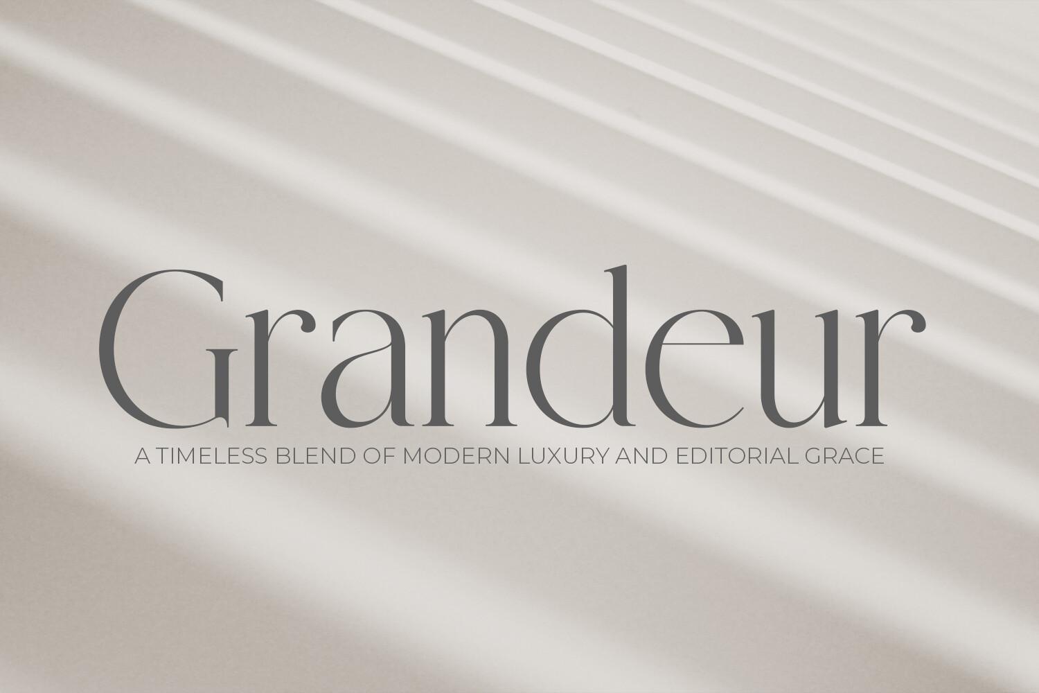
Grandeur Font by OWPictures is a textbook high-contrast serif: thick vertical stems, hairline serifs and joins, and tall ascenders that give the lowercase a slim, upright look. The preview sets the name in lowercase, and the thin strokes are what make it read as luxury rather than bookish.
Those hairlines are also its limit. Set it large, for a brand name or a magazine-style title, and let a plain sans serif carry the small text underneath. At caption size the thin strokes fade and the contrast that makes it special disappears.
Best For: beauty brand logos, editorial headers, elegant product labels
2. Dihot Font
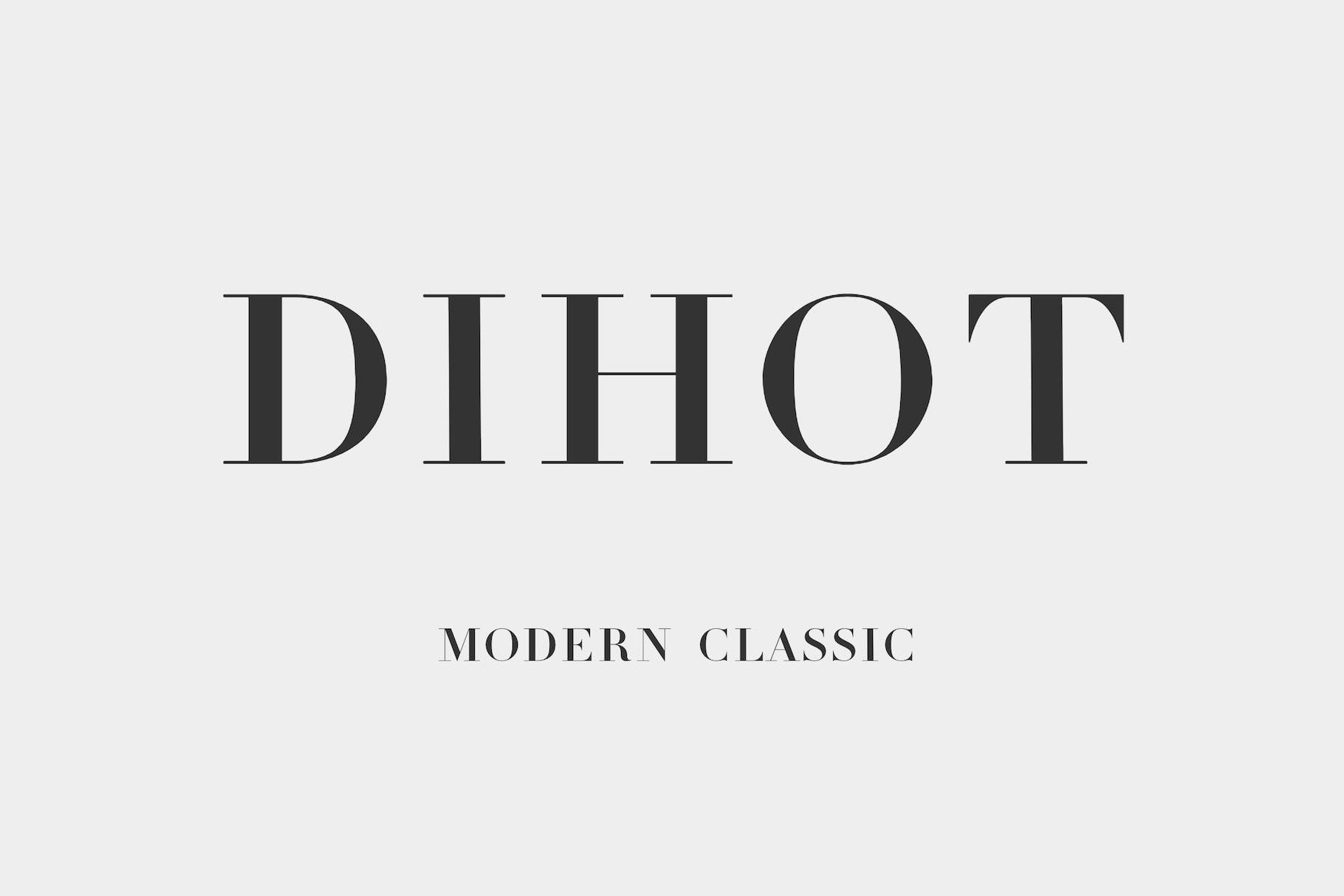
Dihot Font by dennis.hotson shows the serif family in capitals. The preview sets wide, open letters with thin serifs and a clear thick-to-thin rhythm: round D and O, a strong H, a narrow I between them. The subtitle on the preview calls it a modern classic, and that is a fair description of the mood.
Wide capitals like these look best with generous letter spacing, so give the word room on both sides. It works as a short wordmark, a heading on a menu or a line on a framed print. The preview shows capitals only, so check the character map before you plan lowercase text.
Best For: wordmarks, menu headings, framed quote prints
Slab Serif Fonts
Slab serifs became popular in the 19th century for advertising display. To many readers they look like a sans serif with heavy, block-shaped serifs added on: the serifs are nearly as thick as the stems, and the contrast between strokes is low. Courier, the typewriter classic, is a slab serif.
More slab styles:
Bold Serif Fonts
Varsity Fonts
3. Nudes Slab Serif Font
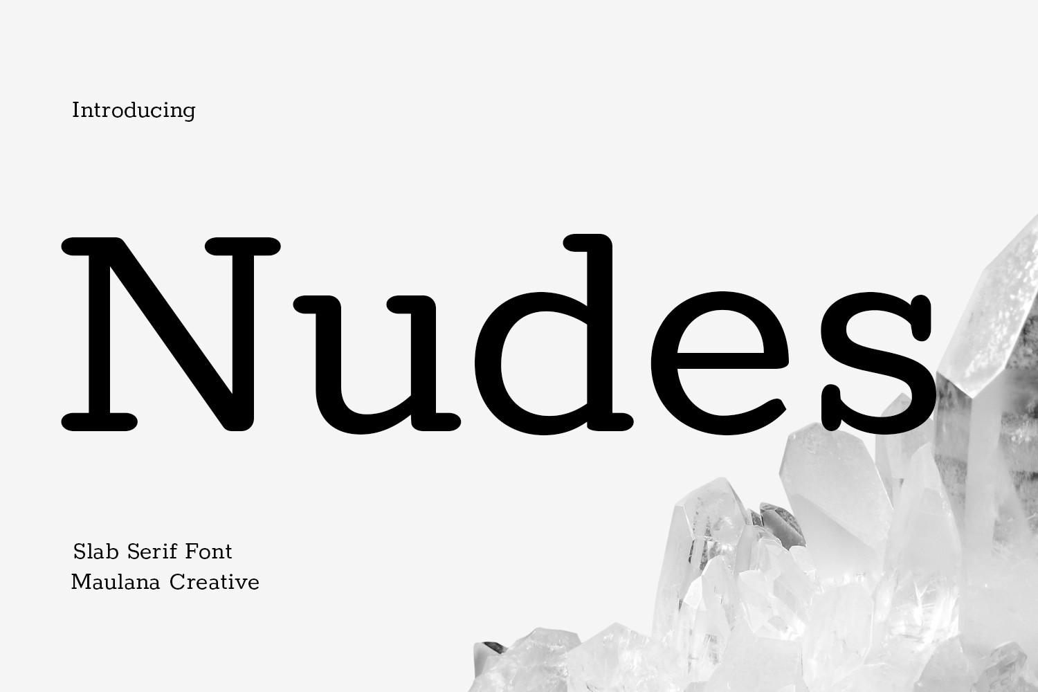
Nudes Slab Serif Font by Maulana Creative is the easiest way to see what a slab is. Look at the feet of the N, u and d on the preview: flat, rectangular serifs with softly rounded corners, almost as heavy as the stems themselves. The strokes keep an even weight, which gives it a typewriter feel without the rough ink texture.
Because the stroke weight is even, it stays readable at medium sizes, which is not true of most display slabs. Use it for a café menu, a book cover title or product labels where you want warmth without decoration.
Best For: café menus, book covers, product labels
4. Giproda Font
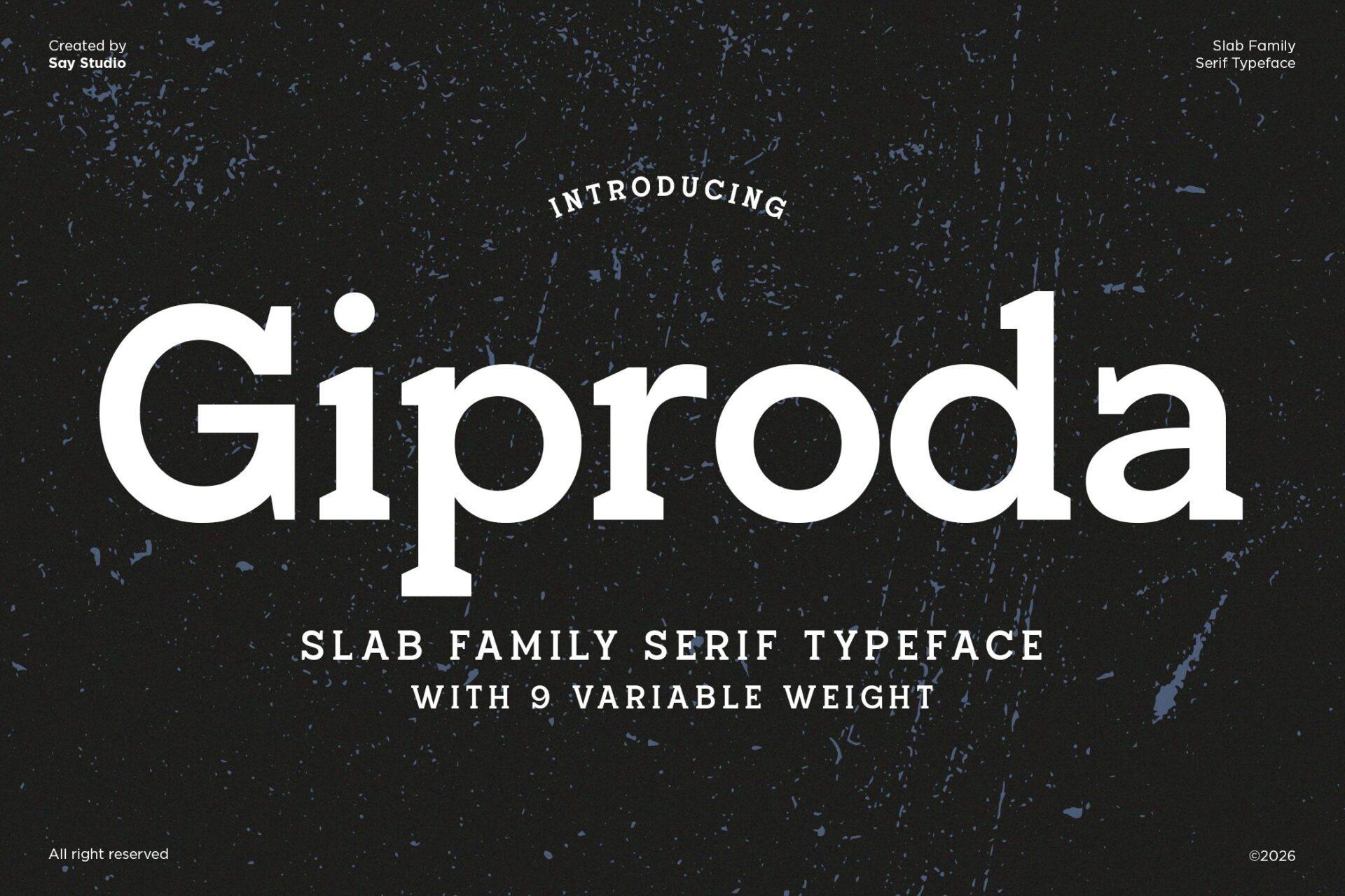
Giproda Font by SayStudio is the heavy end of the slab family. The serifs are solid rectangles, the counters inside a, o and d are compact, and the big G sits on the line like a block. The preview presents it as a slab serif family with 9 weights.
A family with several weights is the practical bonus here: set the headline in the heaviest weight and the subtitle in a lighter one, and the design stays consistent without a second font. Slabs this bold are made for posters, packaging fronts and T-shirt slogans.
Best For: posters, packaging, T-shirt slogans
Sans Serif Fonts
Sans means “without”, so a sans serif is a typeface without serifs: stroke ends are cut clean. Sans serifs were first designed for display and later refined for body text, and today they are the default look of websites and modern brands. Designers split them into sub-styles such as geometric, built on circles and straight lines, and humanist, closer to the proportions of classic Roman letters.
More sans serif fonts: Logo Fonts for Small Business
5. Cenura Font
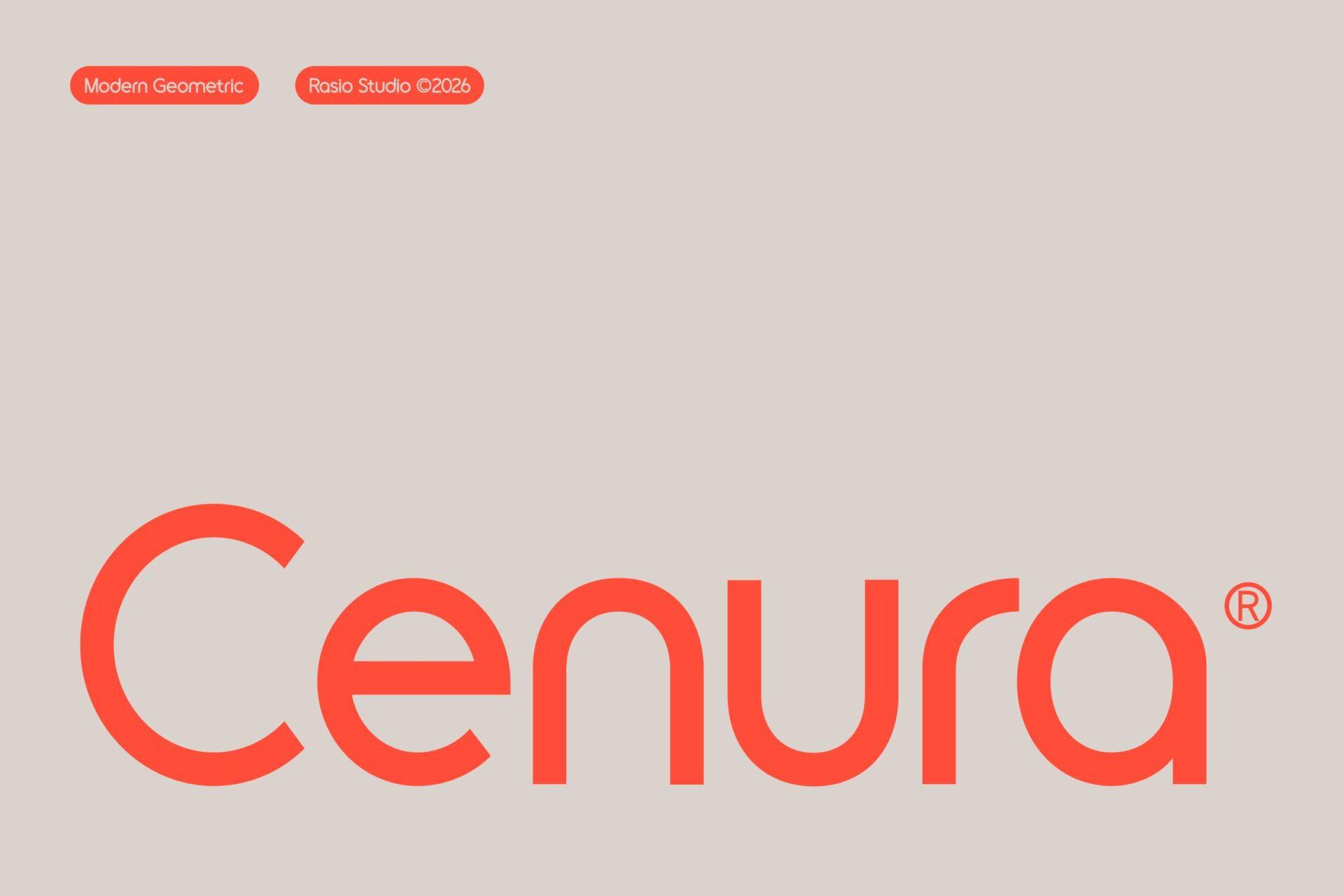
Cenura Font by product.rasiostudio is a clear geometric sans, and the preview labels it that way. The C is close to a full circle, the bowls of e, u and a are round, and the stroke has the same weight everywhere. Nothing is decorative; the shapes do all the work.
Geometric sans serifs shine in short words, so Cenura suits a brand name of one or two words, a website header or a social graphic title. Leave the spacing open: round letters crowded together lose the calm look that makes this style appealing.
Best For: lifestyle and tech logos, website headers, social graphics
6. Mansfield Font
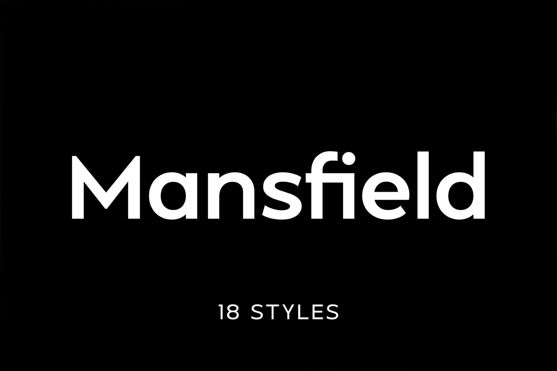
Mansfield Font by Umitype is the neutral side of the sans serif family. The M has straight sides, the lowercase is open and easy to read, and the shapes stay plain enough to disappear into the text. The preview mentions 18 styles.
This is a workhorse rather than a statement font: use it for headings and body text on a website, or under a decorative title from the script or display sections below. A plain sans serif is the safest partner for almost any other type.
Best For: websites, brand systems, body text under a decorative title
Script Fonts
Script fonts imitate handwriting or calligraphy. In most scripts the letters join into one flowing line, the strokes slant and the capitals carry loops or swashes. They are display fonts by nature: beautiful in a name or a short phrase, tiring in a paragraph.
More script fonts:
Script vs Cursive vs Calligraphy
Elegant Cursive Fonts
7. Zephan Font
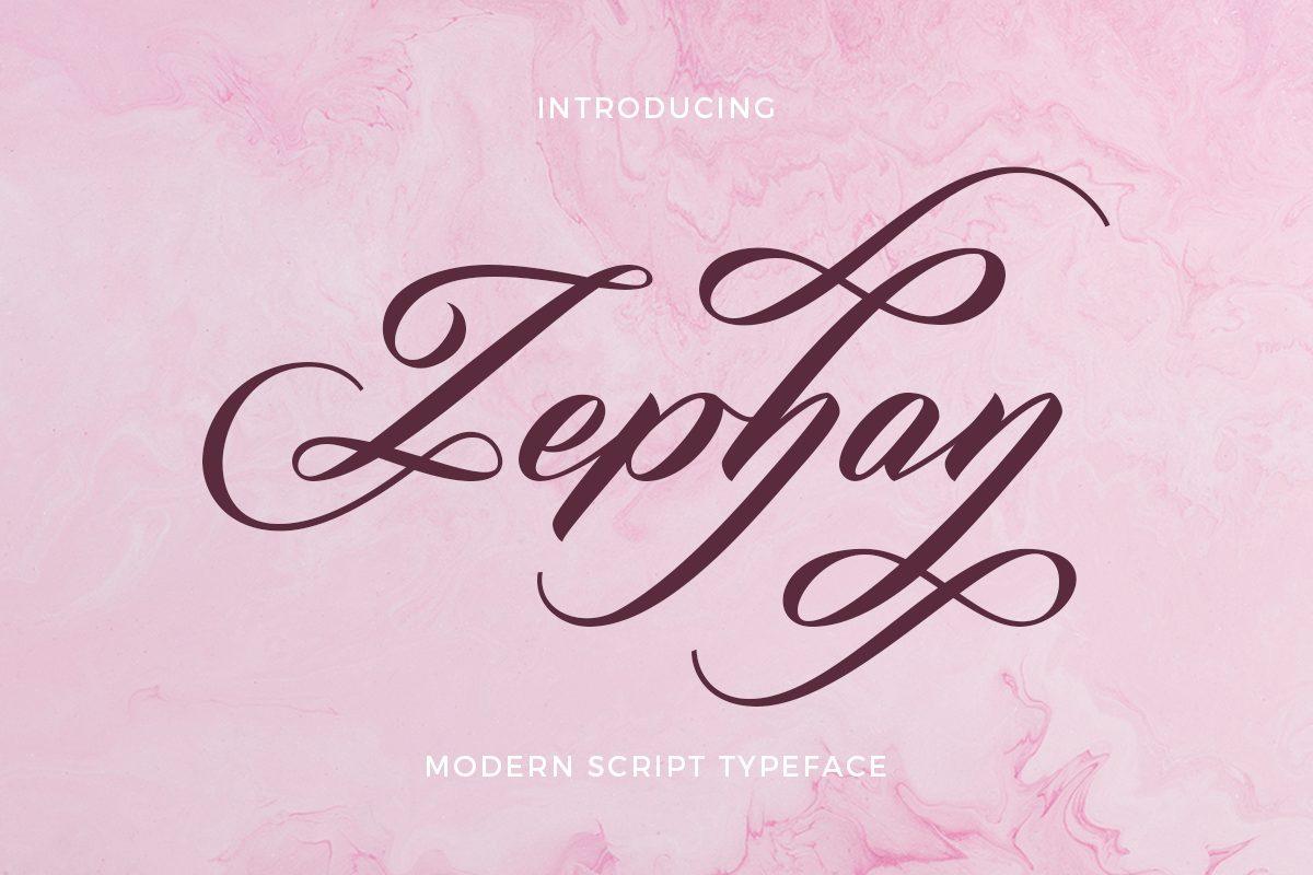
Zephan Font by Aantebas is a formal script at full volume. Thin upstrokes meet heavier downstrokes, the letters lean to the right and join in one line, and the Z, p and y on the preview each end in a long looping swash that wraps around the word.
Those swashes need space, so give Zephan one name or two short words and nothing crowding it. Never set a script like this in all capitals: joined letters are designed to be read in lowercase with one capital at the start.
Best For: wedding names, invitation headings, boutique logos
8. Amelia Rose Font
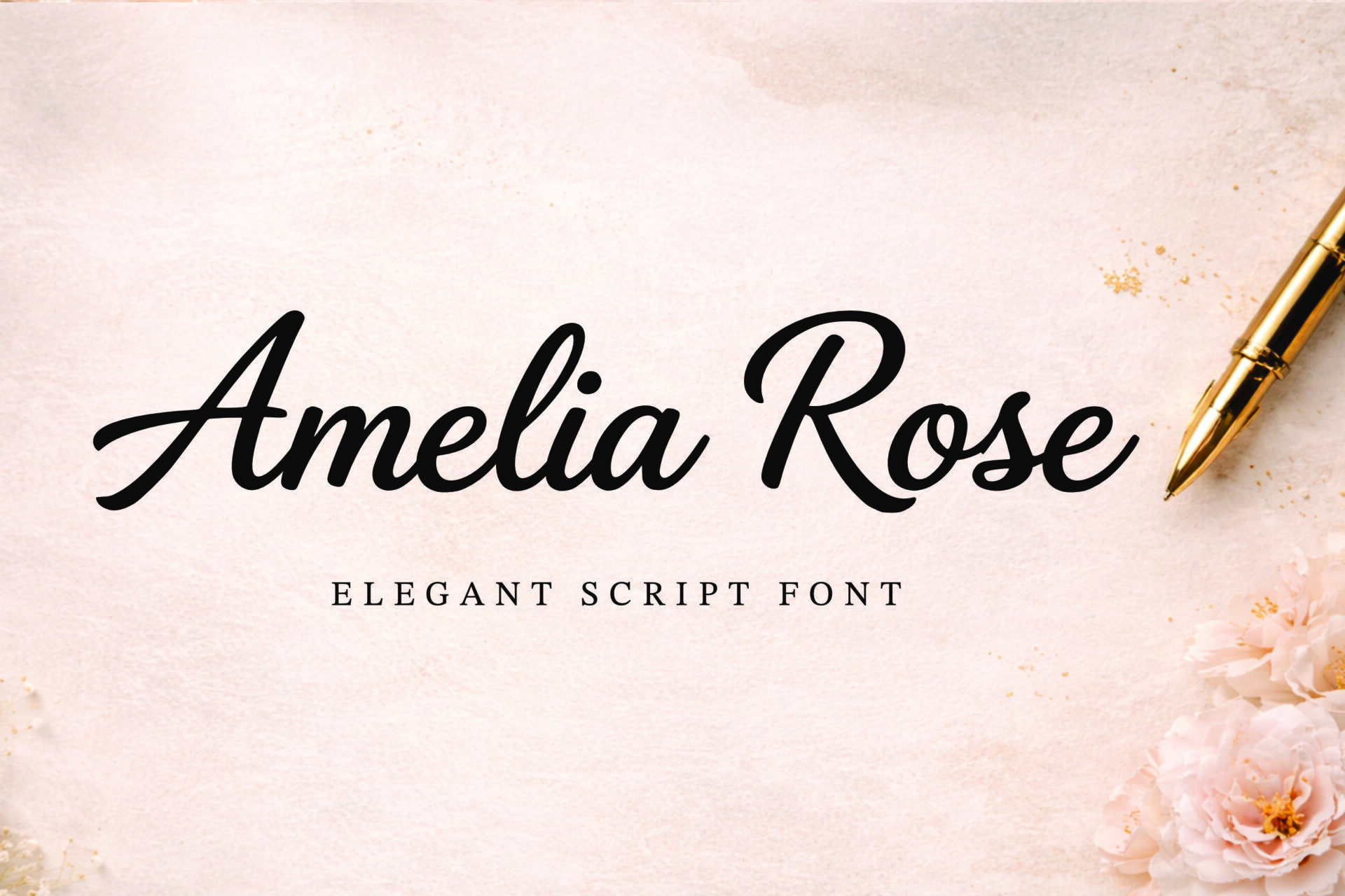
Amelia Rose Font by basyar is a calmer script. The letters still join and slant, but the stroke is heavier and more even, the loops on A and R are rounded rather than dramatic, and there are no long tails. The preview calls it an elegant script font.
Because it has fewer swashes, it handles a full phrase much better than a formal script like Zephan. Try it on a welcome sign, a quote print or a label where the words need to be read quickly from a distance.
Best For: welcome signs, quote prints, boutique labels
Handwritten Fonts
Classic type classifications put handwriting under script, but font shops treat everyday printing as its own group, and for real projects the split is useful. Handwritten fonts look like someone printed the words with a pen or marker: letters stand apart, sizes and baselines wobble slightly, and nothing is formal.
More handwritten styles:
Cute Fonts
Cursive Handwriting Fonts
9. Spizelbug Font
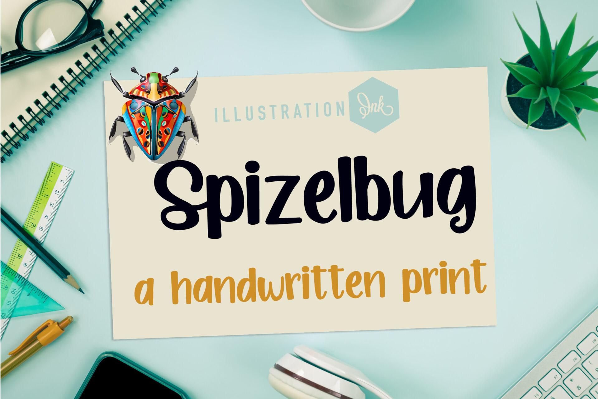
Spizelbug Font by Illustration Ink is a bold handwritten print, and the preview says exactly that. The strokes are thick with rounded ends like a felt marker, every letter stands on its own, and the baseline bounces just enough to feel drawn by hand.
Heavy print like this stays readable at small sizes, which makes it practical for worksheets, classroom labels and stickers. It also works as a cheerful title on a planner page or a kids’ party sign.
Best For: stickers, kids’ worksheets, classroom signs
10. You Are Way Too Cute Font
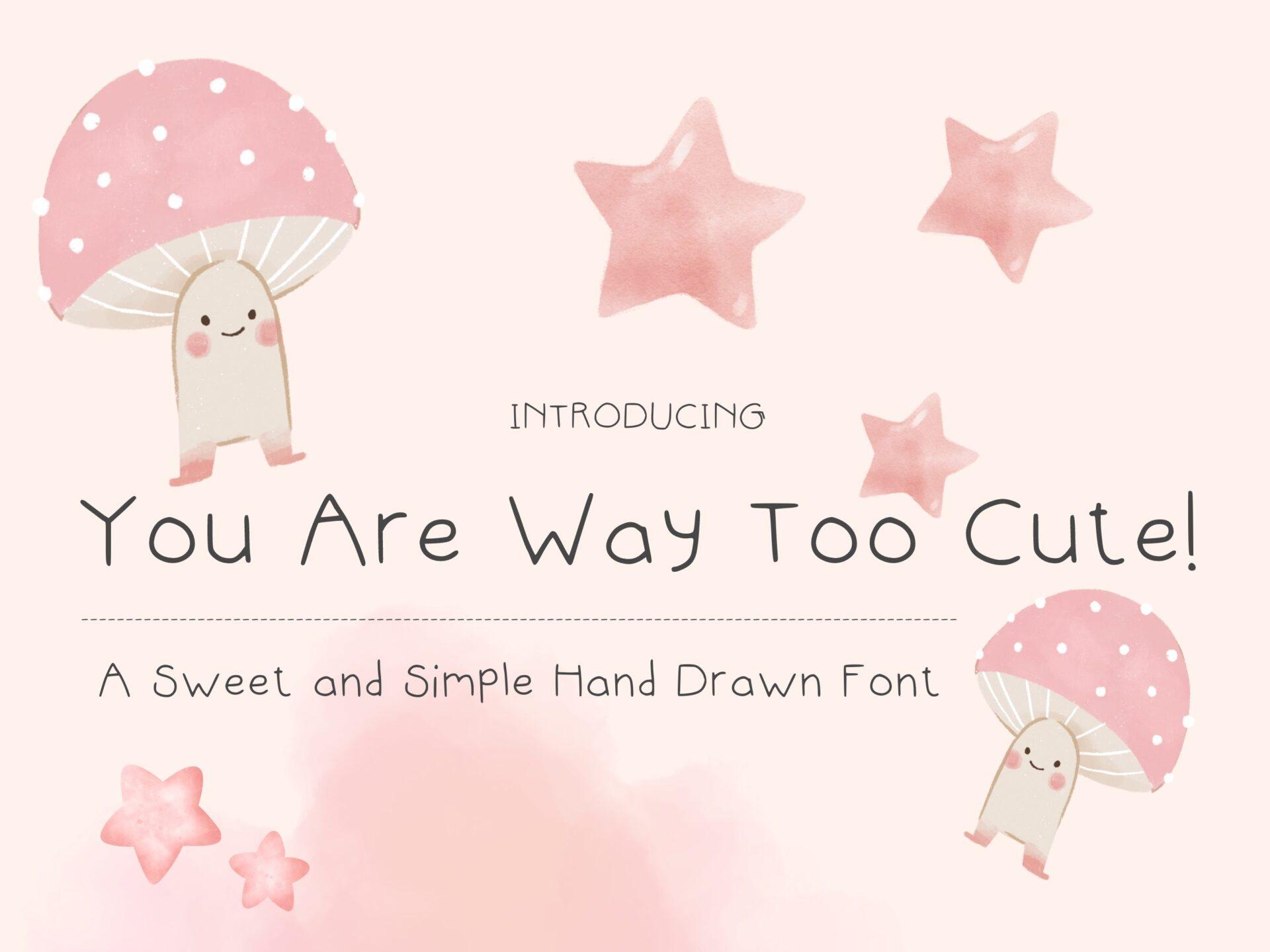
You Are Way Too Cute Font by joyfulstudio is the light opposite of Spizelbug. A thin, even pen line draws wide, rounded letters that never touch, so the words look neatly printed by hand. The preview describes it as a sweet and simple hand drawn font.
Thin handwriting needs a bit of size to hold up, so use it for titles and captions rather than tiny labels, and keep the background plain. It suits soft pastel designs: planner pages, baby shower cards and gentle social posts.
Best For: planner pages, baby shower cards, captions
View You Are Way Too Cute Font →
Blackletter Fonts
Blackletter, also known as Gothic script or Textura, grew out of manuscript lettering from before the invention of movable type. It has a dense, dark texture, narrow and angular lowercase letters with dramatic thick-to-thin strokes, and heavily decorated capitals. Many people search for it as an Old English font.
More blackletter fonts: Gothic Font Tattoo
11. Fifteenth Century Font
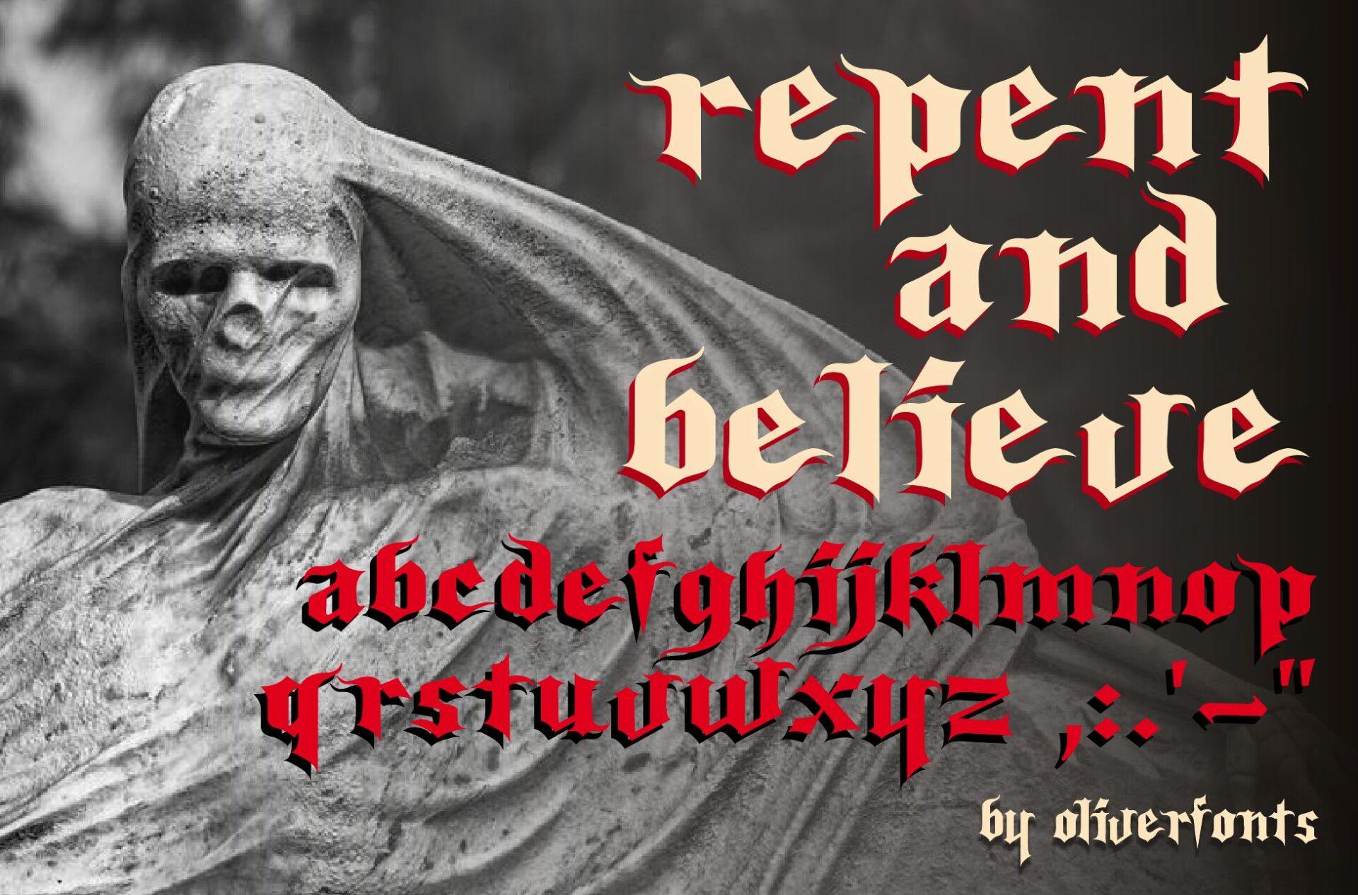
Fifteenth Century Font by OLIVERFONTS is classic, angular blackletter. The preview shows the whole lowercase alphabet: narrow letters, broken curves where a normal font would have round bowls, and diamond-shaped feet. It is set there with a red offset shadow, which makes the sharp edges even more visible.
Dense letters like these are hard to read in long lines, so keep it to a word or a short phrase in lowercase or title case. It is at home in tattoo lettering, band-style posters and dramatic Halloween titles.
Best For: tattoo lettering, band-style posters, Halloween titles
12. Vinque Font
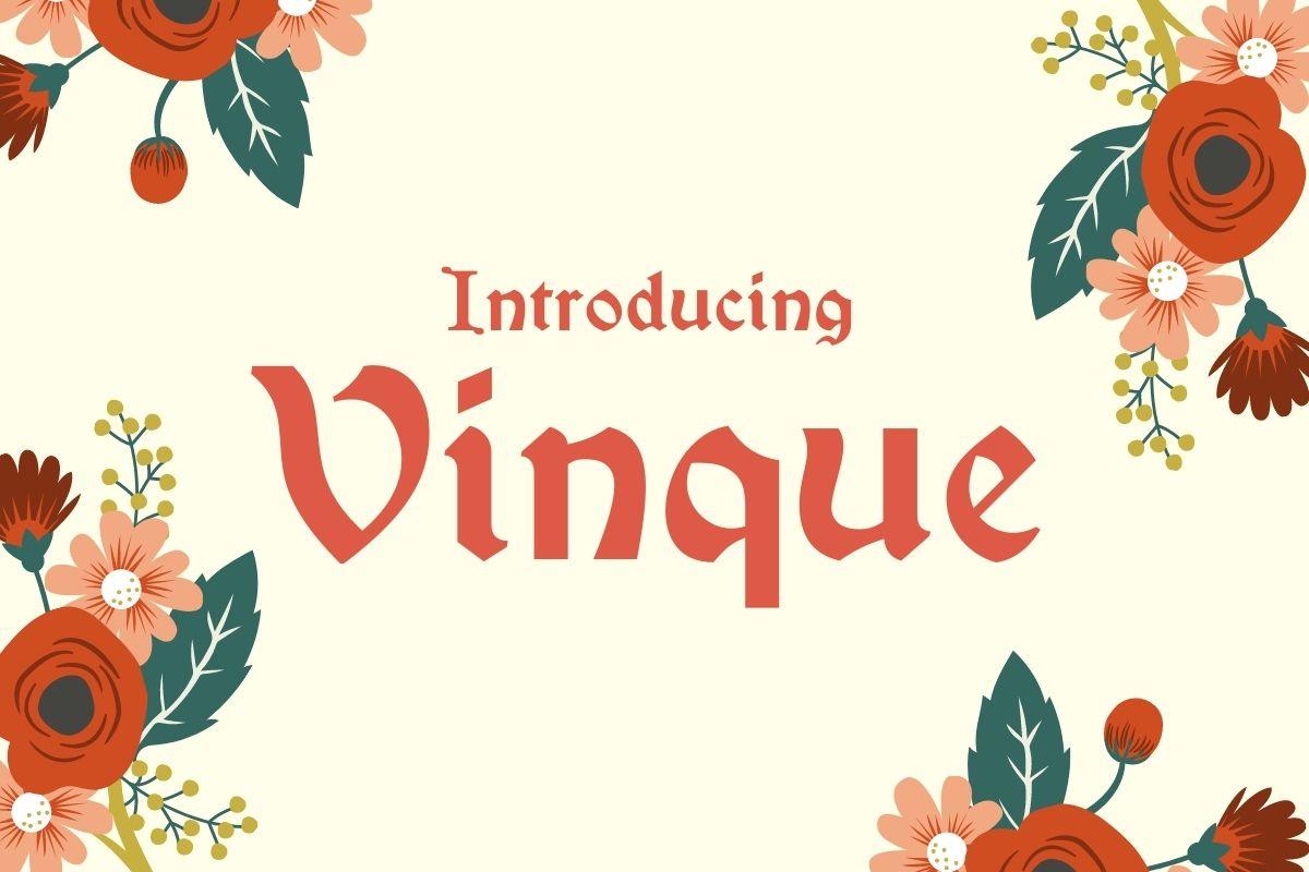
Vinque Font by Typodermic shows that blackletter does not have to look dark. The skeleton is still gothic, with angular joins and a curling V, but the strokes are broad and soft, there are no hairlines, and the letters breathe. On the preview it sits among bright folk-style flowers and looks friendly.
This softer take reads much more easily than textura, so it can carry a full title. Think storybook covers, festival posters or a logo that wants a hint of the medieval without any menace.
Best For: storybook titles, festival posters, gentle gothic logos
Display Fonts
Display, also called decorative, is the broad group for typefaces made to be used large. They can borrow from any other type, serif, sans, script or blackletter, and then push it: unusual shapes, ornaments, outlines, textures. The old rule from metal type still holds: a text font can be enlarged for a heading, but a display font cannot be shrunk for body text.
More display fonts:
Graffiti Fonts
Western Fonts
Whimsical Fonts
13. Barbara Font
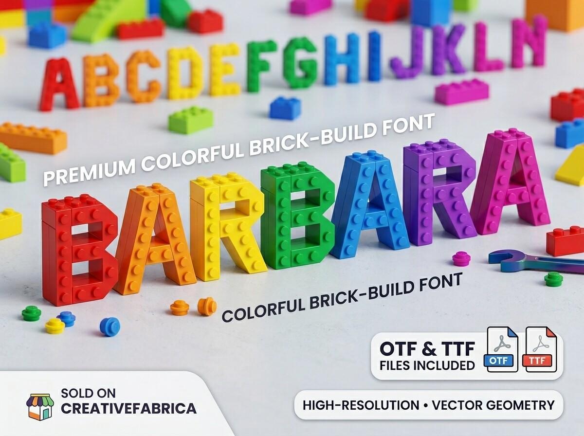
Barbara Font by kulturrno is display at its purest. The preview builds thick capitals out of colorful toy bricks, studs and all, with each letter in a different color, and calls it a colorful brick-build font. The preview also notes OTF and TTF files.
A font like this has one job: one big word that tells everyone what the party or the product is about. Use it for a name on a birthday banner or a headline for a toy shop sale, and keep everything else around it simple.
Best For: kids’ party banners, birthday headings, toy shop graphics
14. Family Heart Font
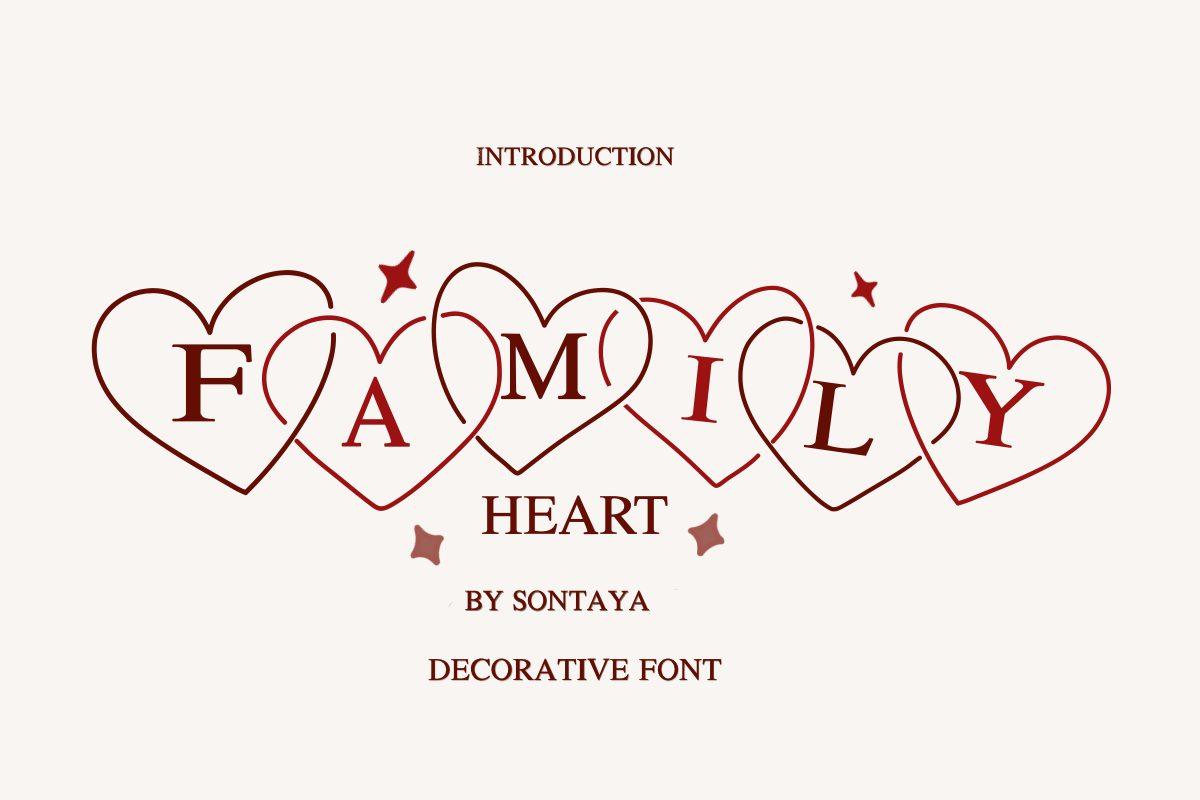
Family Heart Font by Nongyao starts from a simple serif capital and turns it into decoration: on the preview every letter sits inside an outlined heart, and the hearts overlap as the word goes on, so FAMILY becomes a chain of six hearts. The preview labels it a decorative font.
The chain effect works best with short names and words. Use it for a family name sign, a Valentine card or wedding favor tags, and pair it with a plain serif or sans for any extra text.
Best For: family name signs, Valentine cards, wedding favor tags
How to Tell Font Types Apart
Type a word with round and straight letters, for example “Handgloves”, and ask five questions in this order. The first yes gives you the type.
- Does it only make sense big? If it turns into a blur at body size or is built from pictures, ornaments or textures, it is display.
- Are the letters dense, narrow and broken into angles? That is blackletter.
- Do the letters join into a flowing line? That is script. If they look hand drawn but stand apart, it is handwritten.
- Do the strokes end in serifs as thick as the stems? That is slab serif.
- Are there small finishing strokes at the ends? Yes means serif, no means sans serif.
Mixing Font Types
Most good designs combine one expressive type with one quiet one. The expressive font, a script, blackletter or display face, carries the name or headline. The quiet font, usually a sans serif or a simple serif, carries everything else. Two loud types on one page compete, and two scripts side by side almost always look messy.
| Headline type | Safe partner | Example project |
|---|---|---|
| Script | Sans serif or simple serif | Wedding invitation, welcome sign |
| Blackletter | Plain sans serif | Tattoo flash sheet, band poster |
| Display | Sans serif | Party banner, event flyer |
| Slab serif | Sans serif | Café menu, product label |
| High-contrast serif | Neutral sans serif | Beauty brand, magazine layout |
Ready-made pairs: Font Combinations
FAQ
What are the main types of fonts?
Many guides name four: serif, sans serif, script and display. This guide splits out three more, slab serif, handwritten and blackletter, because they look and behave differently enough to matter when you choose a font for a project.
Which type of font is best for body text?
Simple serif and sans serif fonts, often called text typefaces. Display fonts carry too much detail and decoration to stay readable at small sizes.
What is the difference between serif and slab serif?
A slab serif is a kind of serif with heavy, block-shaped serifs and little contrast between thick and thin strokes. Regular serifs are usually finer, often tapering, and many have strong contrast.
Is blackletter the same as Old English or gothic font?
In everyday use, yes. Blackletter is also called Gothic script or Textura, and Old English font is the name most people type into search when they want this look.
Are script and handwritten fonts the same thing?
Technically, handwritten styles belong to the script family. In practice script usually means joined, flowing letters, while handwritten means casual printing with separate letters. The difference between script, cursive and calligraphy has its own guide.
Script vs Cursive vs Calligraphy
Start With the Type, Then the Font
Before you open a font shop, decide which of the seven types your project needs: a trusted serif for a book, a clean sans for a website, a script for a name, a bold display face for a banner. That one choice cuts the search down to a single shelf, and the font you pick from it will fit the job instead of only looking nice in a preview.