Futuristic Fonts: 22 Tech Sans, Cyber Display and Glitch Styles for Gaming Logos, Sci-Fi Posters and Streetwear Drops
Futuristic fonts are what make a gaming logo, a techno flyer or a sci-fi poster feel like it comes from the next decade instead of the last one. Wide geometric letters, sliced corners, stencil splits and glitchy cuts all tell the viewer “tech” before they read a single word, which is why these styles show up on esports jerseys, streetwear drops and album covers.
This post contains affiliate links. If you buy through them, I may earn a small commission at no extra cost to you.
This list collects 22 futuristic fonts in three styles: clean tech sans, cyber and space display, and glitch and bold techno. Each font comes with a note on what the letters actually look like and where they work best, from gaming logos and esports banners to sci-fi posters and streetwear graphics.
All fonts in this list are on Creative Fabrica, and a single All Access subscription unlocks every one of them, so you can try several styles before committing to one.
More display and logo font collections:
30 Display Fonts: Cartoon, Groovy, Vintage and Poster Styles
16 Poster Fonts: Groovy, Brush and Art Deco
28 Bold Fonts: Chunky, Condensed Sans and Groovy
26 Modern Sans Serif Fonts for Small Brands
Table of Contents
Clean Tech Sans Futuristic Fonts
- 1. Konect Font
- 2. Futuristic Clean Font
- 3. Glafort Font
- 4. Getox Font
- 5. Rosnoc Font
- 6. Montreal Font
- 7. Prolane Font
- 8. Barcuda Font
- 9. Futuristic Ballad Font
- 10. Futuristic Tech Print Font
- 11. Sogea Font
- 12. Nevera Font
- 13. Croparo Font
- 14. Borsen Font
- 15. Neon Block Font
- 16. Radical Future Font
- 17. Monoglitch Font
- 18. Hard Signal Font
- 19. Notche Font
- 20. Serez Font
- 21. Sersre Font
- 22. Cold Sign Font
How to Choose a Futuristic Font
How to Make Futuristic Fonts Look Right
FAQ
What Makes a Font Look Futuristic
Most futuristic fonts share a few traits: wide, geometric letters, straight cuts instead of soft joins, and missing or split strokes that the eye fills in on its own. Rounded square shapes recall screens and control panels, thin lines recall neon tubes, and monospaced letters recall code on a terminal.
The style is strongest in short words. A brand name, a game title or a two-word drop name lets the unusual shapes stand out, while a calm sans underneath carries the details. That is the setup most of the fonts below are designed for.
Clean Tech Sans Futuristic Fonts
These fonts keep the letters readable and add the futuristic feel through geometry, cuts and wide shapes. They are the safest picks for logos that have to work on a website, an app and a shirt at once.
1. Konect Font
by RagamKata Studio
Best For: Gaming studio logos, tech startup wordmarks, app splash screens
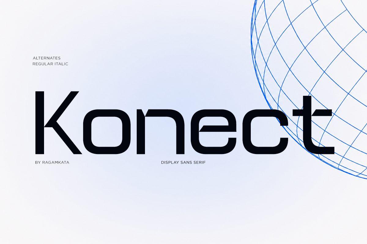
Konect is a wide geometric sans with flat terminals and a few cut-in details: the n and the e have small gaps where the strokes stop short, and the c and t are trimmed into crisp hooks. The letters are black and even, so the word reads instantly while those little breaks keep it from looking like a plain sans.
The preview lists alternates and a regular italic, so you can switch the slant for a speed feel on esports banners. Set it in title case with normal spacing; the cuts disappear when the tracking is pushed too wide.
2. Futuristic Clean Font
by weknow
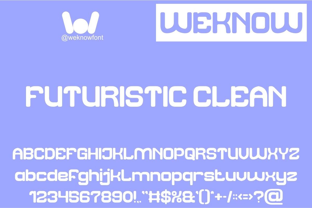
Best For: Retro arcade titles, kids’ tech party invites, sticker sheets
Futuristic Clean is a rounded, square-ish display font that looks like a classic arcade cabinet logo. Corners are soft, the counters are boxy, and letters like k, w and x have playful shortcuts that make the alphabet feel friendly rather than cold.
The preview shows a full set of caps, lowercase, numbers and punctuation, so short phrases and scores work well. Keep it bold and big on flat color backgrounds; at small sizes the tight counters of e and a start to fill in.
3. Glafort Font
by Drizy Studio
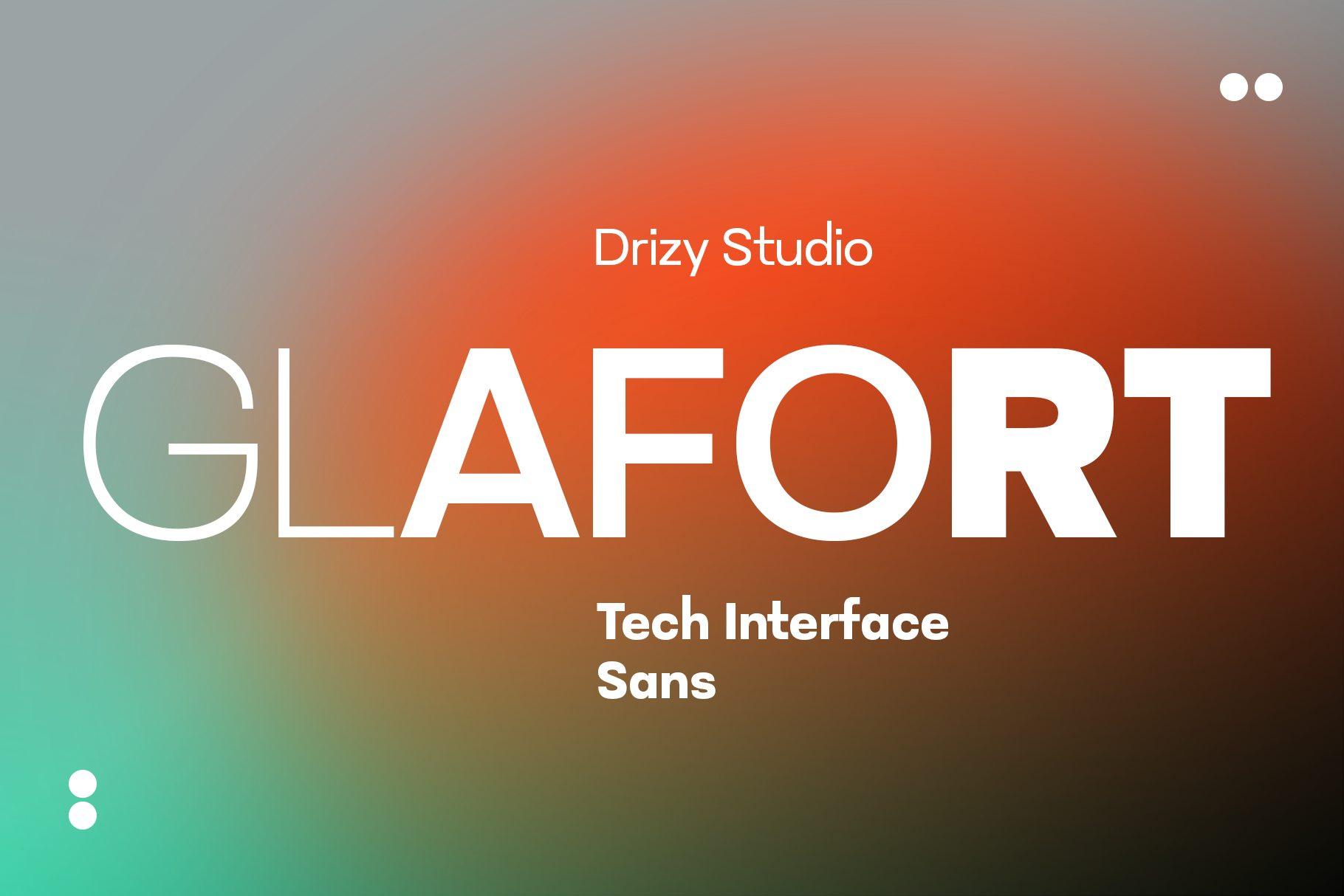
Best For: Tech brand headlines, UI-style posters, product launch covers
Glafort mixes weights in one word on the preview: hairline outlined letters sit right next to heavy solid ones, and the shapes stay wide and squared. The label on the cover calls it a tech interface sans, and it does read like a dashboard heading.
Use the contrast on purpose: thin weight for the first half of a brand name and the heavy weight for the second half gives a ready-made logo. On gradient backgrounds like the specimen, keep the text white and let the weights do the work.
4. Getox Font
by Auliacreative
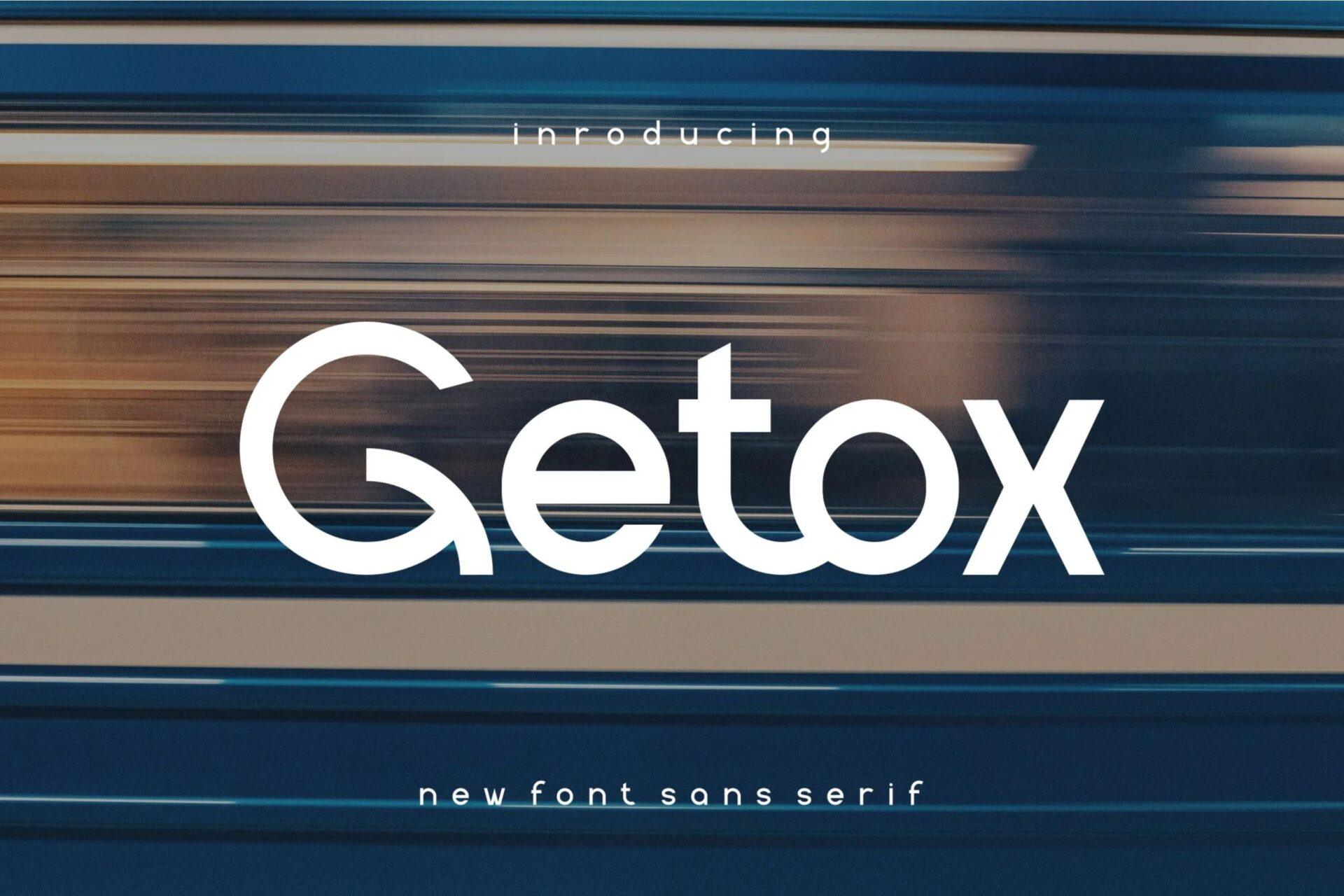
Best For: Car and motorsport merch, streetwear logos, YouTube gaming thumbnails
Getox is a heavy rounded sans with very wide, smooth curves. The G opens into a big hook, the t has a short rounded crossbar and the x is broad, so the word looks fast and soft at the same time, like a sticker on a racing car.
It needs only a few letters to make an impact, so it suits short brand names and thumbnail titles. Pair it with a light, spaced sans for small labels, the way the specimen does with its tagline.
5. Rosnoc Font
by Letterna
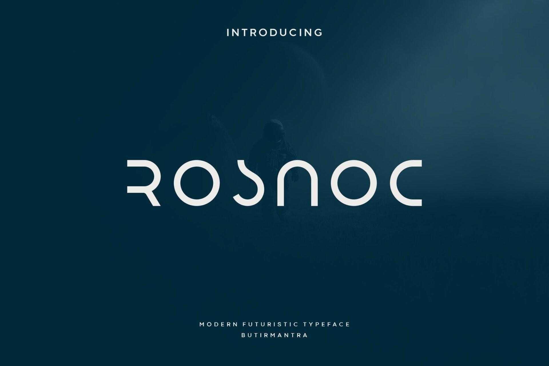
Best For: Space-themed posters, minimal tech logos, sci-fi book covers
Rosnoc is a thin, light display font built from open arcs and straight lines. Letters lose pieces on purpose: the R is just a curve and a leg, the S is split into two halves and the N looks like a rounded arch, which gives the word a quiet space-station feel.
Because the letters are so reduced, it reads best in short uppercase words with generous letter spacing. Put it on a dark background in white or pale grey and keep everything else around it minimal.
6. Montreal Font
by Umitype
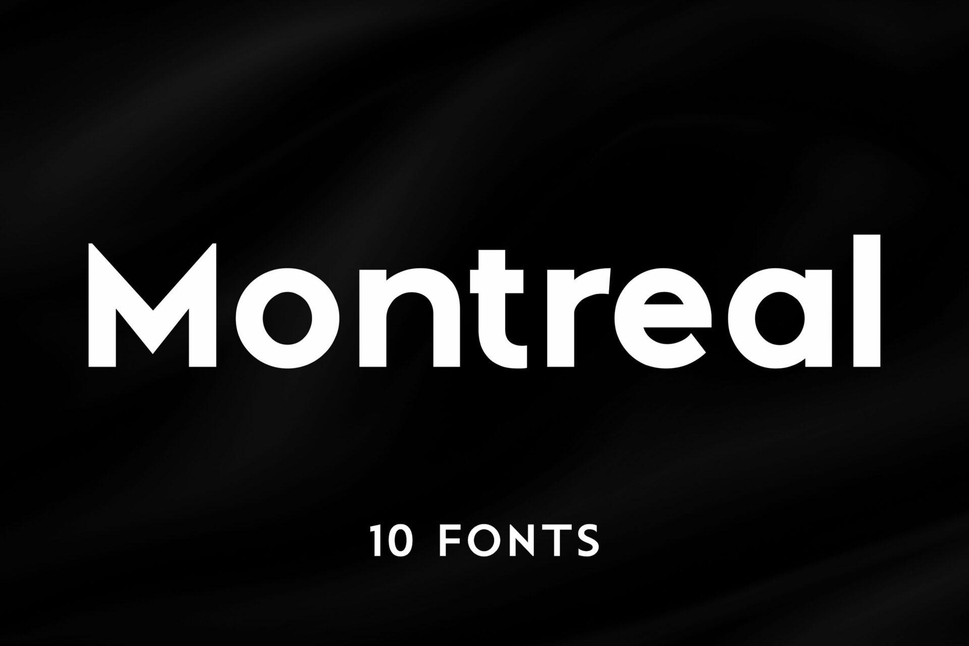
Best For: Clean gaming brand wordmarks, tech event signage, website headers
Montreal is the most neutral pick in this list: a bold geometric sans with round o, a single-storey a and short, sharp joins. The futuristic feel comes from the clean geometry rather than from any tricks, which makes it easy to read at any size.
The preview shows 10 fonts in the family, so it can carry both the headline and the small text of a layout. Use it as the readable partner for a louder display font from the sections below.
7. Prolane Font
by Artiveko
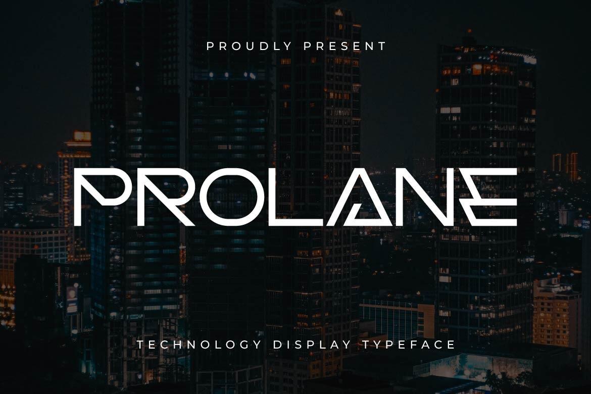
Best For: Sci-fi movie posters, electronic music flyers, tech podcast covers
Prolane is a light, extended display caps font with sharp angles and long horizontal strokes. The R and the A are cut into wedge shapes, the E is three thin bars without a spine and the N leans like a lightning bolt, so it feels like a title card from a sci-fi film.
It comes alive large and on dark city or space photos, as in the specimen. Keep it to one or two words and add a small spaced sans line under it for dates or credits.
8. Barcuda Font
by Glyphonic
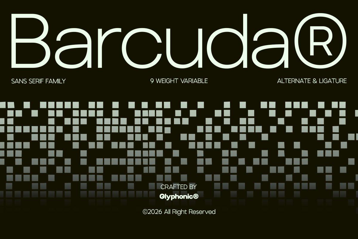
Best For: Tech startup brands, modern packaging, clean app interfaces
Barcuda is a light, round geometric sans with very open letters and an even stroke. On its own it reads almost calm; the futuristic part comes from the pixel-block pattern on the specimen and the precise, almost engineered circles of a, d and o.
The preview mentions a 9-weight variable family with alternates and ligatures, so you can build a whole brand system from it. Use the light weight for big wordmarks and a heavier weight for buttons and small type.
Cyber and Space Display Fonts
Here the letters start to break, split and glow. These fonts work best large, for titles and one-word logos, on posters, covers and game screens.
9. Futuristic Ballad Font
by ChekArt
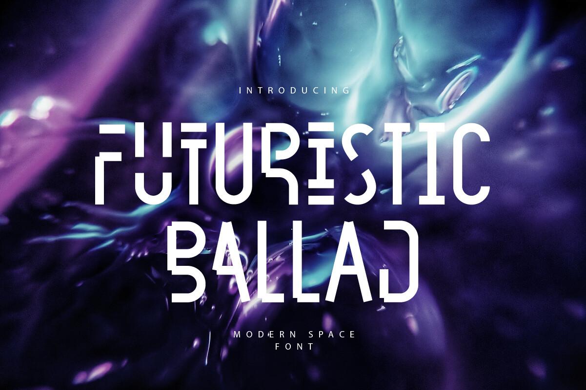
Best For: Space party invites, sci-fi game titles, neon event posters
Futuristic Ballad is a condensed caps font where every letter is split into stencil-like parts. The U is two separated strokes, the S and the R are broken into blocks and the A in Ballad turns into a 4-like shape, so the word looks coded, like a message from another planet.
The splits make it hard to read in long words, so use it for a title and one short subline. It looks strongest in white over dark, glowing purple or blue artwork, like the cover shows.
10. Futuristic Tech Print Font
by Heidi Vargas-Smith
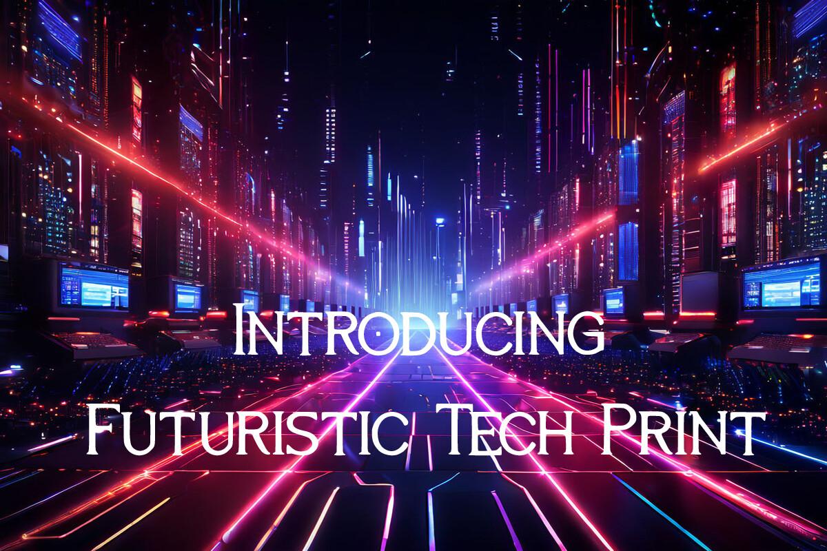
Best For: Cyberpunk flyers, sci-fi book titles, tech conference banners
Futuristic Tech Print is a small-caps style font with thin, slightly flared strokes and tiny cuts in the letters, especially visible in the C, R and T. It looks less like a hard tech sans and more like printed lettering from a retro sci-fi novel.
On the specimen it sits over a neon cyber street, and that is the right mood for it: busy, glowing backgrounds where a calm, readable title helps. It is one of the few picks here that can handle a full line of text.
View Futuristic Tech Print Font
11. Sogea Font
by pandekastudio
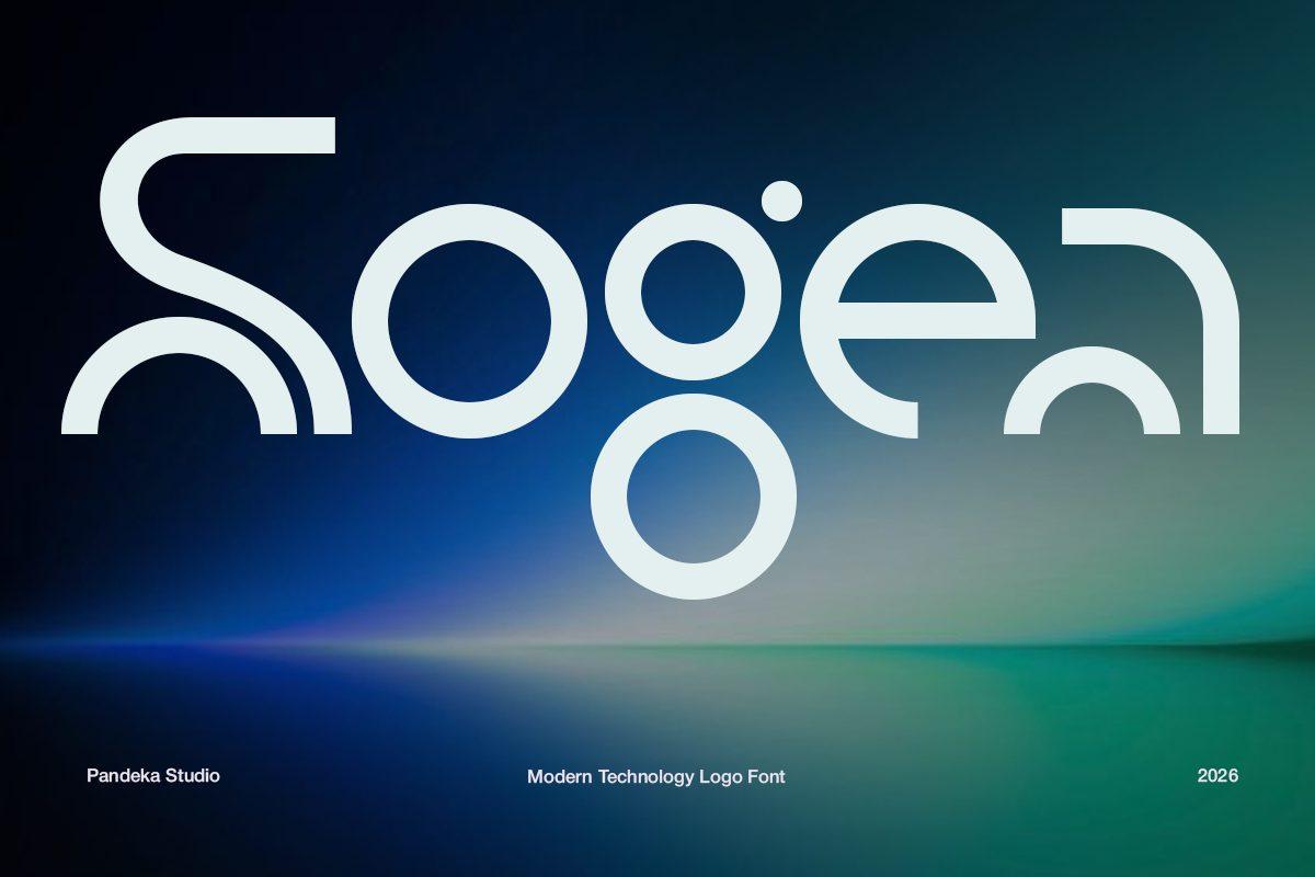
Best For: Tech logo marks, app icons with lettering, futuristic brand names
Sogea is built from thick rounded lines and full circles. The S is two parallel arcs, the g is a ring hanging from a loop and the a is a bent open curve, so each letter almost turns into a small icon. The specimen calls it a modern technology logo font, and that is exactly how it reads.
Keep it for short names of four to six letters and give it plenty of space around. Because the letters are so unusual, test your exact word before you commit: some combinations read better than others.
12. Nevera Font
by Almeera Studio
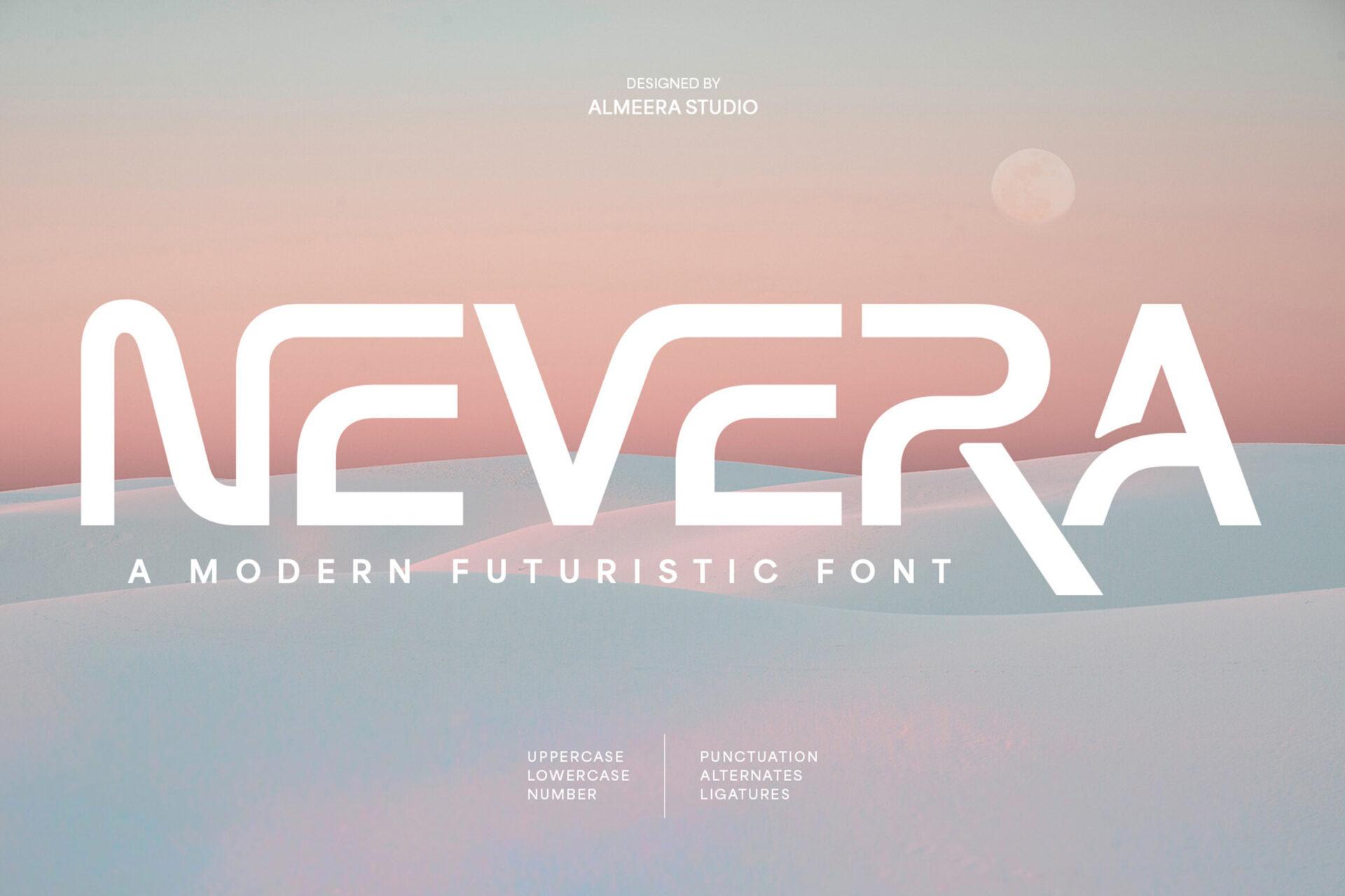
Best For: Futuristic brand logos, streetwear prints, tech album covers
Nevera is a bold extended display font with sharp diagonal cuts. The N, E and V are sliced at angles, and the R ends in a long tail that sweeps under the next letters, which gives the word a fast, aerodynamic look.
The preview lists uppercase, lowercase, numbers, punctuation, alternates and ligatures, so you have room to play with the tail and the cuts. It works on soft pastel backgrounds too, not only on black, which makes it a good pick for a lighter futuristic brand.
13. Croparo Font
by Letterna
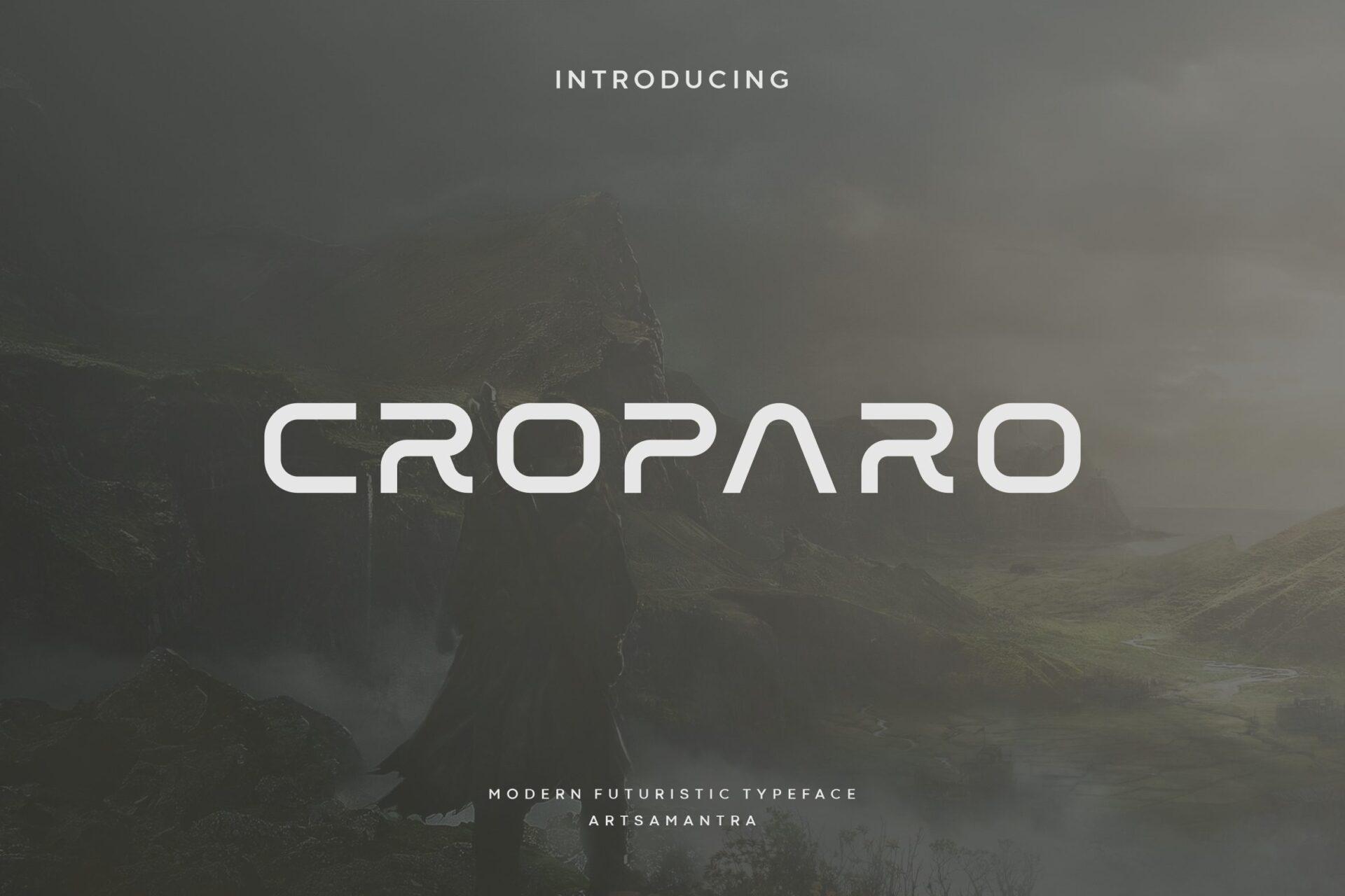
Best For: Minimal sci-fi titles, tech product names, film-style end cards
Croparo is a medium-weight wide sans with rounded corners and open shapes. The C, R and P are left slightly open, and the A has no crossbar, so the word feels light and spacious, a bit like lettering on a spacecraft hull.
Set it in uppercase with extra letter spacing and keep it centred, the way the specimen shows it over a misty landscape. It pairs well with a thin text sans for subtitles.
14. Borsen Font
by product.rasiostudio
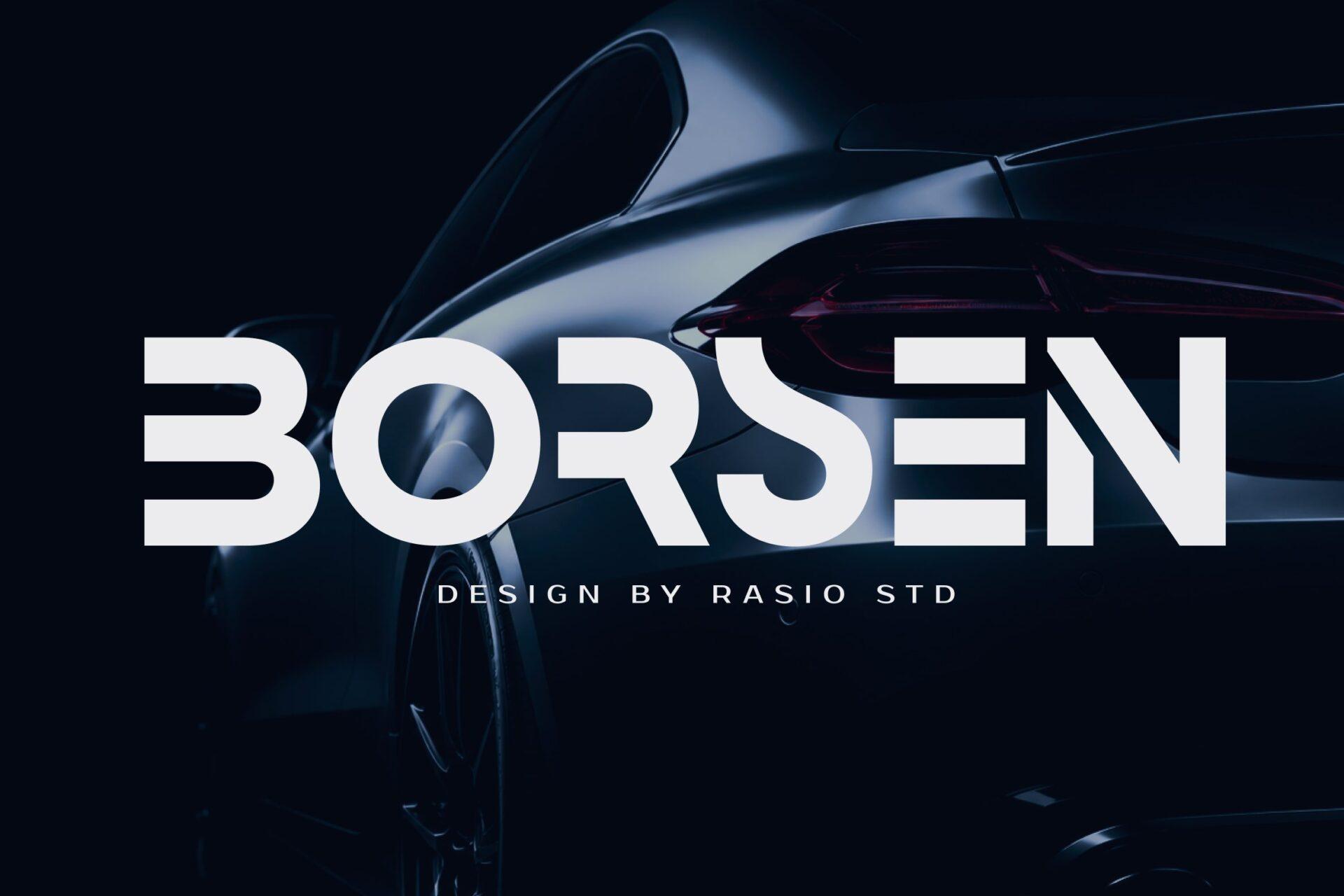
Best For: Car brand merch, racing team logos, bold streetwear graphics
Borsen is a heavy, wide caps font with square shapes and small cut-in details: the B has a notch in the middle, the S is built from straight segments and the E and N are cut into sharp corners. It feels solid and mechanical, like a badge on a sports car.
It fills a line fast, so short names work best. Use it in white or silver on black and add one thin line of spaced text under it, like the specimen does with its credit line.
15. Neon Block Font
by Line creative
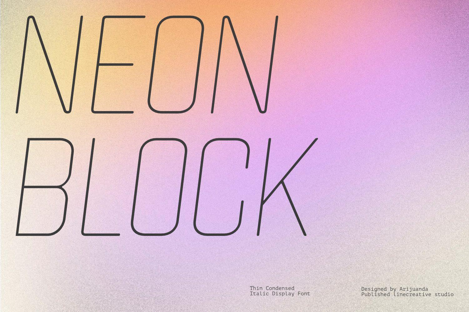
Best For: Neon sign mockups, retro-futuristic posters, minimal tech headers
Neon Block is a thin, condensed italic font made of single lines with rounded corners, so each letter looks like a bent neon tube. The preview calls it a thin condensed italic display font, and the slant gives the words a sense of motion.
Because the strokes are hairline thin, it needs size: use it big on posters and banners, never in small text. A glow effect in Canva or Photoshop turns it into a convincing neon sign.
16. Radical Future Font
by Funtype Co.
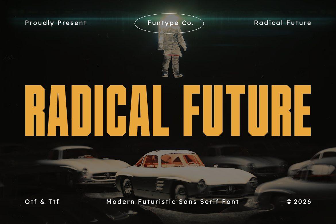
Best For: Retro-futuristic event posters, sci-fi movie night flyers, bold shirt prints
Radical Future is a tall, condensed sans with very heavy strokes and square counters. It looks like the title of a 1970s sci-fi film poster: tight spacing, straight sides and almost no curves, which gives it a strong vertical rhythm.
Use it in warm colors like the orange on the specimen, over dark photos with an old-school space feel. It fits long titles in a narrow space, so it works on shirt prints and tall poster formats.
Glitch and Bold Techno Fonts
The heaviest and loudest part of the list: monospaced, ink trap, blade-like and extended fonts for esports, techno flyers and streetwear drops.
17. Monoglitch Font
by Glyphonic
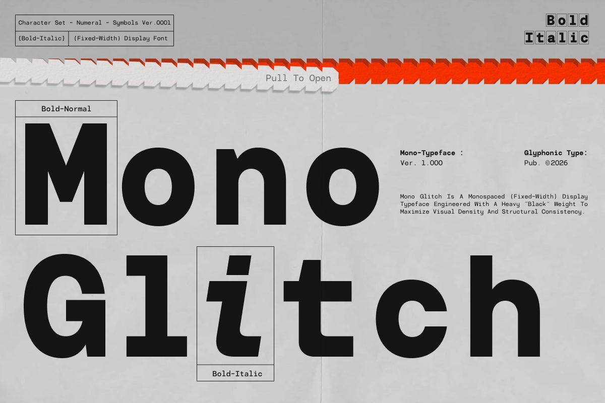
Best For: Hacker-style posters, coding brand merch, glitch art covers
Monoglitch is a bold monospaced font, so every letter takes the same width, like text on an old terminal. The specimen shows a bold normal and a bold italic and marks single letters with boxes and notes, which turns the whole layout into a technical spec sheet.
Lean into that look: put the words in boxes, add version numbers and small labels around them. It suits developers, tech podcasts and any design that should feel like code on a screen.
18. Hard Signal Font
by HipFonts
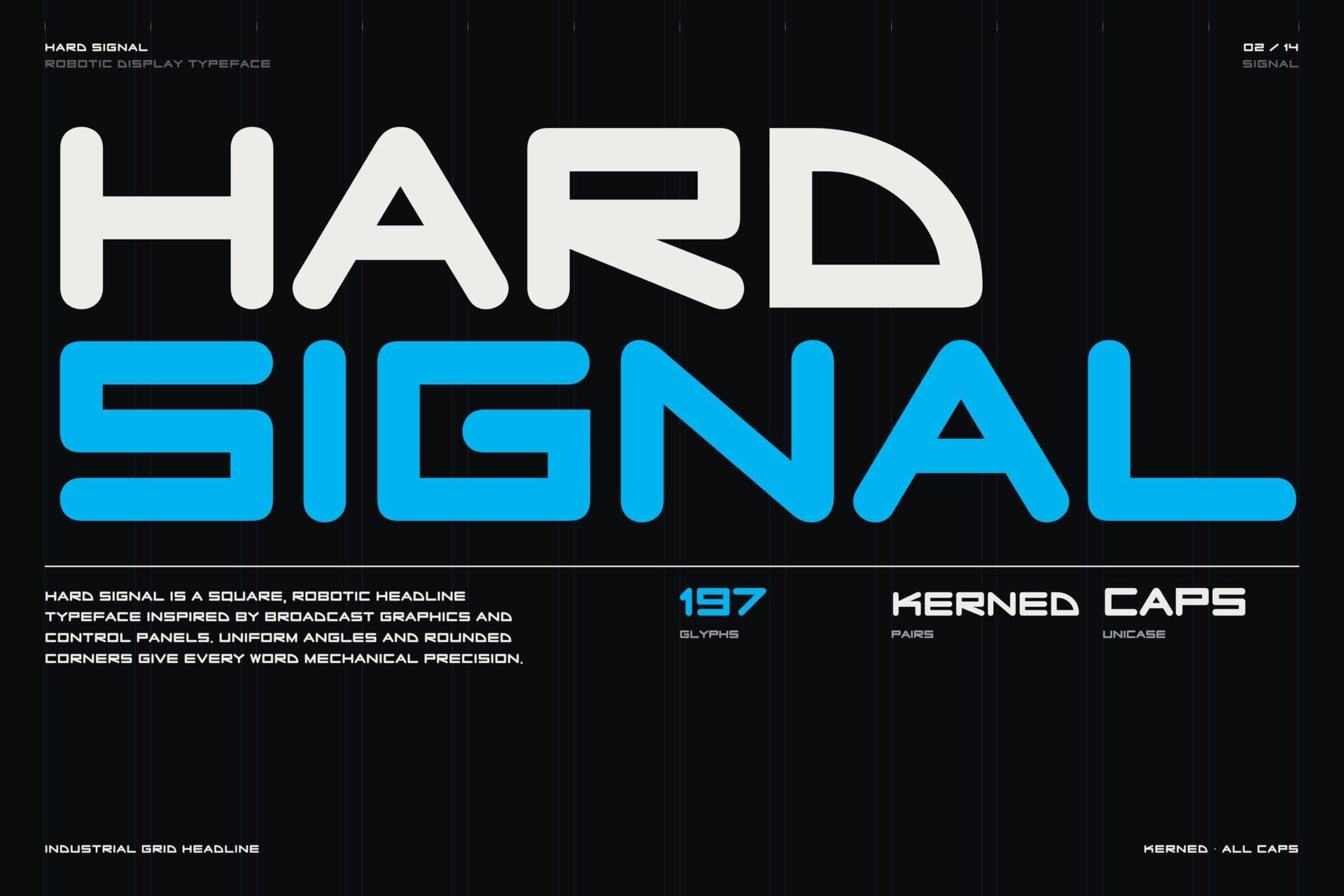
Best For: Esports team names, robotics club logos, broadcast-style graphics
Hard Signal is a wide, square caps font with rounded corners and very even strokes. The specimen describes it as a square, robotic headline typeface inspired by broadcast graphics and control panels, and the two-color HARD SIGNAL title shows how well it fills a block.
The preview mentions 197 glyphs, kerned pairs and an all-caps design, so you write in capitals only. Stack two words in two colors, as on the cover, for a quick esports or tech logo.
19. Notche Font
by Indotype Foundry
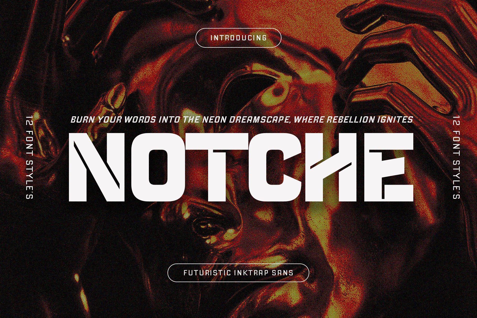
Best For: Rave flyers, streetwear drops, techno album artwork
Notche is a heavy condensed sans with deep ink traps: the joins of N, T, C and H are cut with sharp notches, which makes the letters look carved. The specimen calls it a futuristic ink trap sans and shows 12 font styles.
The notches are the whole point, so set it big and black or white over loud imagery like the red cover. With 12 styles you can use a lighter one for subtitles and keep the boldest for the headline.
20. Serez Font
by Letterna
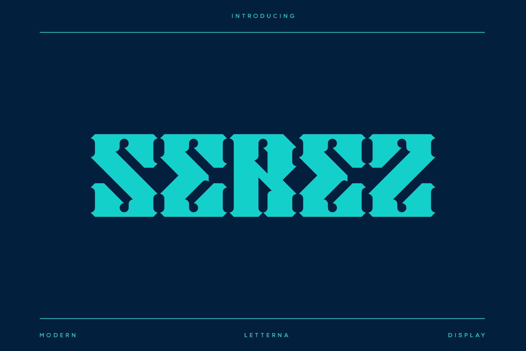
Best For: Techno event posters, streetwear logos, cyber gothic merch
Serez is a sharp, wide display font that mixes futuristic shapes with a hint of blackletter: the strokes have pointed spurs and small rounded holes, and the letters lock tightly together. On the specimen it is set in bright cyan on deep navy.
Use it for one-word logos and drop names where you want something harder than a clean tech sans. Keep it big and simple, with lots of space around the word.
21. Sersre Font
by Letterna
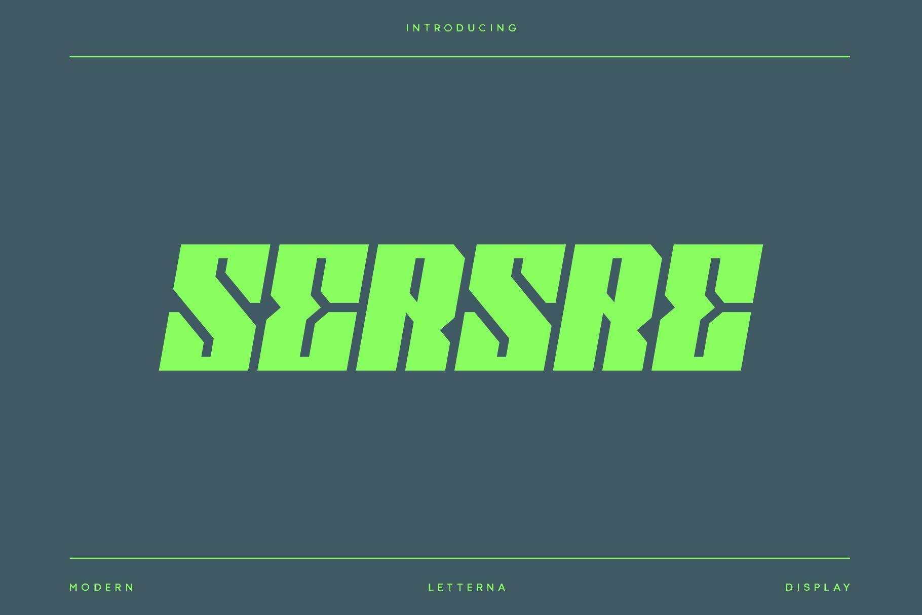
Best For: Glitch-style shirt prints, techno flyers, gaming clan logos
Sersre is a slanted, heavy display font with sharp angles and cut-out notches, so each letter looks like it is breaking apart in motion. The bright green on the specimen gives it a strong cyber, almost glitchy energy.
It is louder than Serez from the same studio, so it suits short words on shirts and flyers rather than logos that need to stay calm. Pair it with a monospaced or simple sans for dates and details.
22. Cold Sign Font
by Typia Nesia
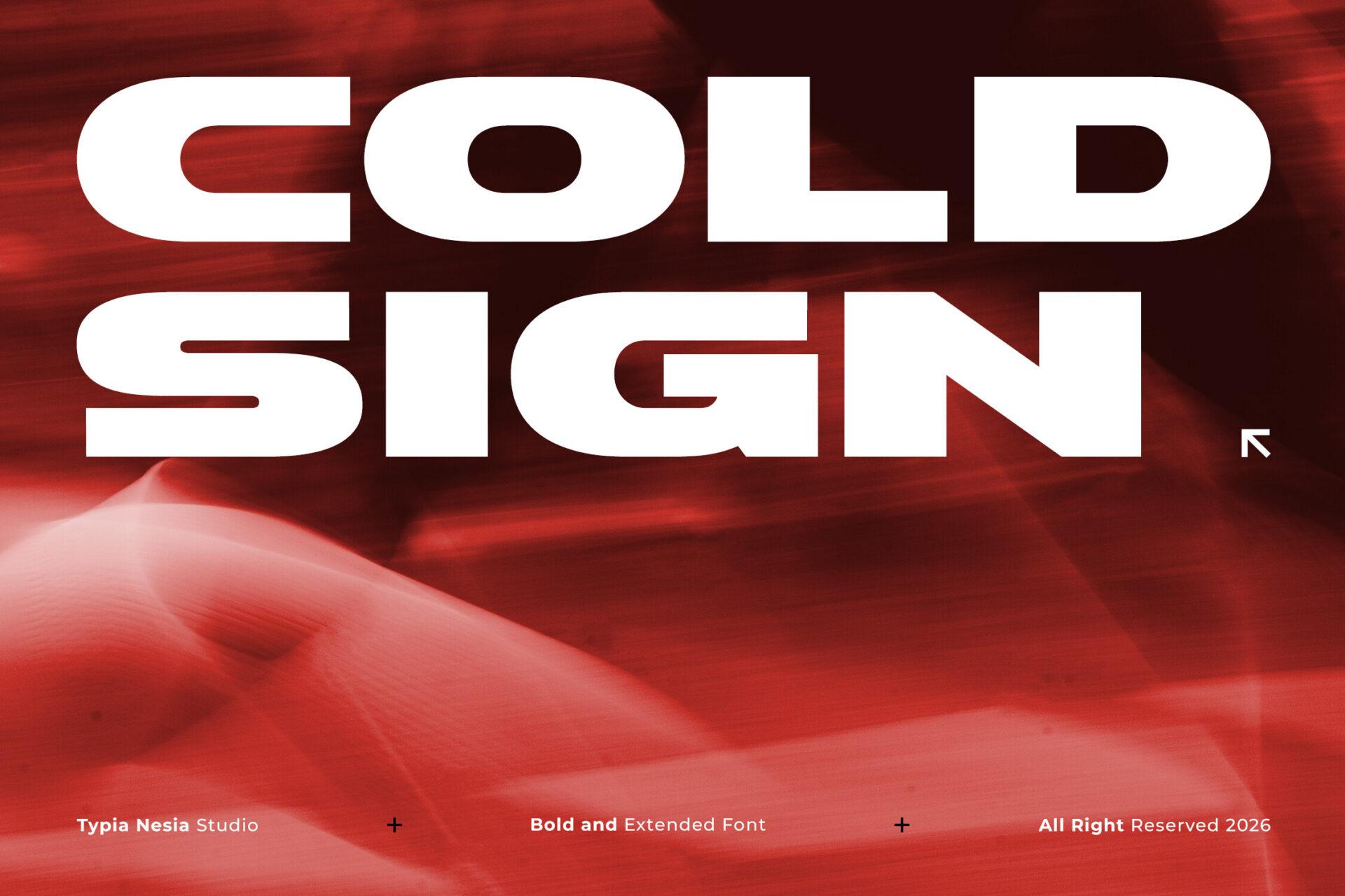
Best For: Streetwear drops, sneaker brand graphics, bold sports posters
Cold Sign is an extremely bold and wide sans, described on the preview as a bold and extended font. The letters are short and broad with tiny counters, so the words look like solid slabs, especially in white over the red specimen background.
Use it for two short lines that fill the full width of the design, like COLD SIGN on the cover. It looks best with minimal extras: a small arrow, a thin line, one line of tiny text.
How to Choose a Futuristic Font
Start with where the name will live. A logo that has to sit on a website header, an app icon and a hoodie needs a readable clean tech sans like Konect, Montreal or Barcuda. A poster or game title that is seen once and big can take a split or glitch font like Futuristic Ballad, Sogea or Sersre.
Then check your exact word. Futuristic fonts often change letters a lot, so type your real brand or event name before deciding. Look at the letters that repeat most, and at R, S, A and E, which are the ones designers like to cut and reshape.
Finally, think about the mood: cold and technical (Hard Signal, Monoglitch), spacey and light (Rosnoc, Croparo, Neon Block), or loud and street (Cold Sign, Notche, Borsen). Picking the mood first narrows 22 options down to three or four.
How to Make Futuristic Fonts Look Right
Pair one futuristic display font with one plain sans. The display font takes the name or title, the sans takes dates, prices and small details. Two expressive fonts in one layout fight each other and the tech look turns messy.
Give the letters room. Wide fonts need space on both sides, and thin fonts need size. Dark backgrounds with a single bright accent color, such as cyan, acid green or orange, are the classic setting, but light pastel layouts also work with fonts like Nevera and Neon Block.
FAQ
Can I use futuristic fonts for a gaming logo?
Yes, most of these fonts are made for logos and headlines. Wide caps fonts like Hard Signal, Borsen and Getox are especially easy to turn into esports and gaming team logos. Check the license on the Creative Fabrica product page before using a font in a logo you sell under.
Which futuristic font is easiest to read?
The clean tech sans fonts read best: Montreal, Barcuda, Konect and Futuristic Tech Print stay clear even in longer lines. Split and glitch fonts like Futuristic Ballad, Sogea and Sersre are better kept to one or two words.
What font pairs well with a futuristic display font?
A simple geometric or monospaced sans is the safest partner. In this list, Montreal and Barcuda can act as the readable second font next to louder picks like Notche, Cold Sign or Nevera.
Can I use these fonts in Canva?
You can upload OTF or TTF font files to Canva on a paid plan such as Canva Pro or Teams. After uploading, the font appears in the font menu under uploaded fonts.
Final Thoughts
Futuristic fonts work best when one style leads the whole design. Choose a clean tech sans for a brand that must stay readable everywhere, a cyber or space display for titles and covers, or a glitch and bold techno font for drops and flyers that need to hit hard. Test your real words, keep the second font simple, and the layout will look like the future without trying too hard.