Retro Fonts: 34 Groovy 70s, Script, Futurism and Distressed Styles for Shirt Designers, Poster Makers and Café Owners
Retro fonts do half the design work before you add a single shape. A swollen 70s capital, a script with a tail or a neon outline tells people which decade you mean in one glance, which is why these styles keep coming back on shirts, gig posters, café menus and small brand logos.
This post contains affiliate links. If you buy through them, I may earn a small commission at no extra cost to you.
The 34 fonts below are grouped into six styles: groovy 70s display fonts, retro bubble fonts, distressed and block fonts, retro scripts, retro futurism with 80s neon, and retro serifs. Each card shows the preview, what the letters look like and where they work best.
More vintage and display font collections:
20 Vintage Fonts: Retro Script, Groovy and Art Deco
Display Fonts: 30 Cartoon, Groovy and Poster Styles
Poster Fonts: 16 Groovy, Brush and Art Deco Styles
Bubble Font: 34 Groovy, Graffiti and Kawaii Styles
All fonts in this list are on Creative Fabrica, and a single All Access subscription unlocks every one of them, so you can try several styles before committing to one.
Groovy 70s Retro Fonts
Swollen capitals, wavy outlines and stacked shadows: these are the fonts behind most 70s-style shirts and posters. They want big sizes and short words.
1. Retro Holly Font
by Ade (7NTypes)
Best For: Band tees, record-sleeve titles and summer market posters
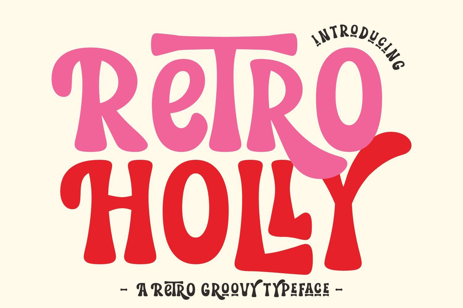
Retro Holly Font sets tall, swollen capitals that lean against each other like a crowd at a festival. The bowls are big and soft, the counters stay small, and on the cover the hot-pink letters sit on a cream outline with a dark drop shadow, which is exactly the stacked 70s look people try to fake with three layers in Canva.
Let it carry one or two words and give it real size. Repeat the cream-outline-plus-shadow trick in your own colors and it reads as vintage even on a plain background; a thin sans underneath is enough for dates and small print.
2. Stay Funky Font
by Meow Creation
Best For: Kids’ party shirts, sticker sheets and pastel shop banners
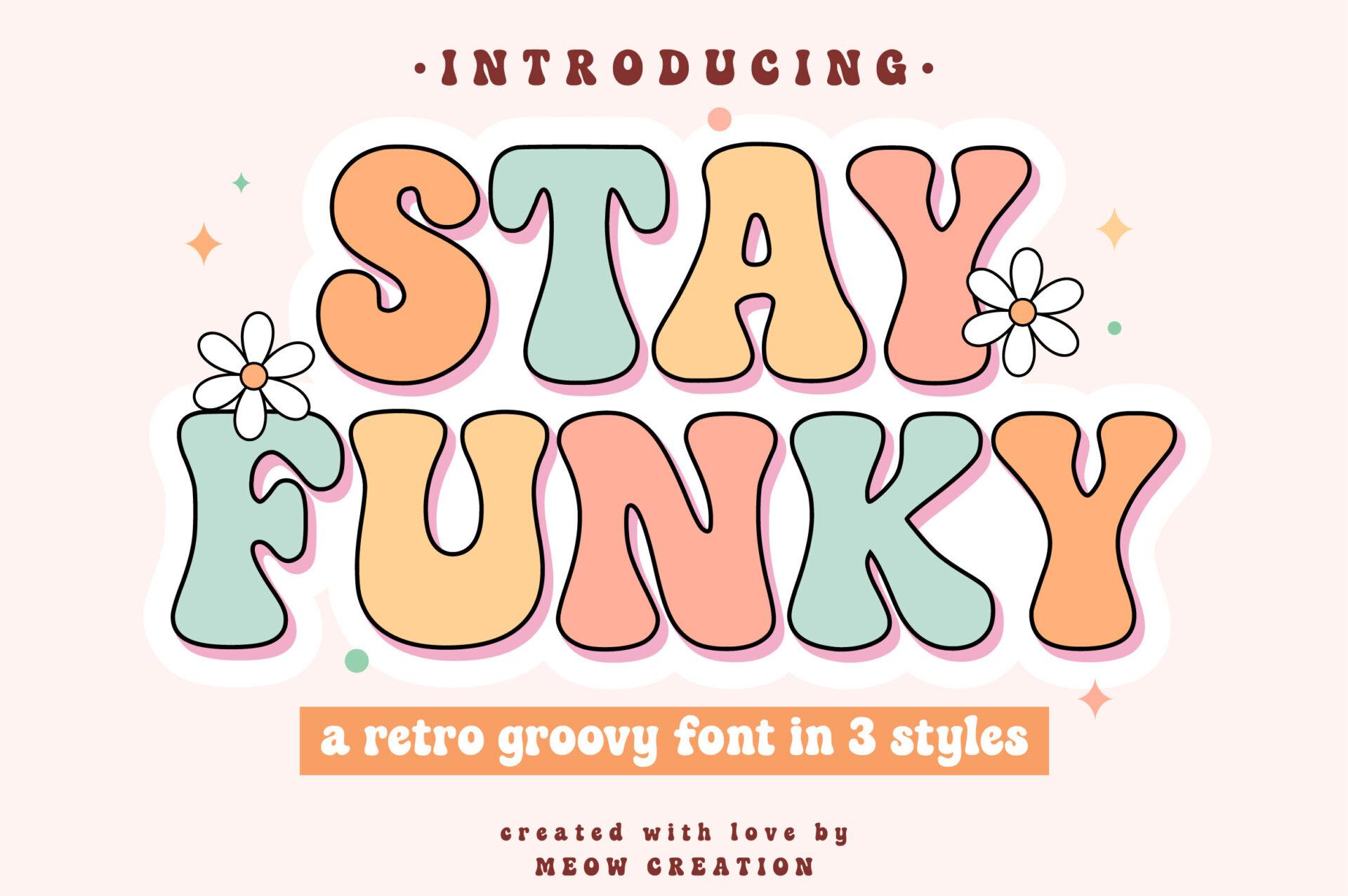
Stay Funky Font is puffy and cheerful: rounded capitals with soft corners, slightly wobbly baselines and a candy palette of butter yellow, pink and mint on the cover. The letters overlap a little, so a word looks like a single squishy shape rather than a row of separate characters.
It is happiest in pastel and on light backgrounds. Use it for a name, a short slogan or a shop title, and keep the supporting text calm so the bounce in the letters stays the main event.
3. De Augusta Font
by Subectype
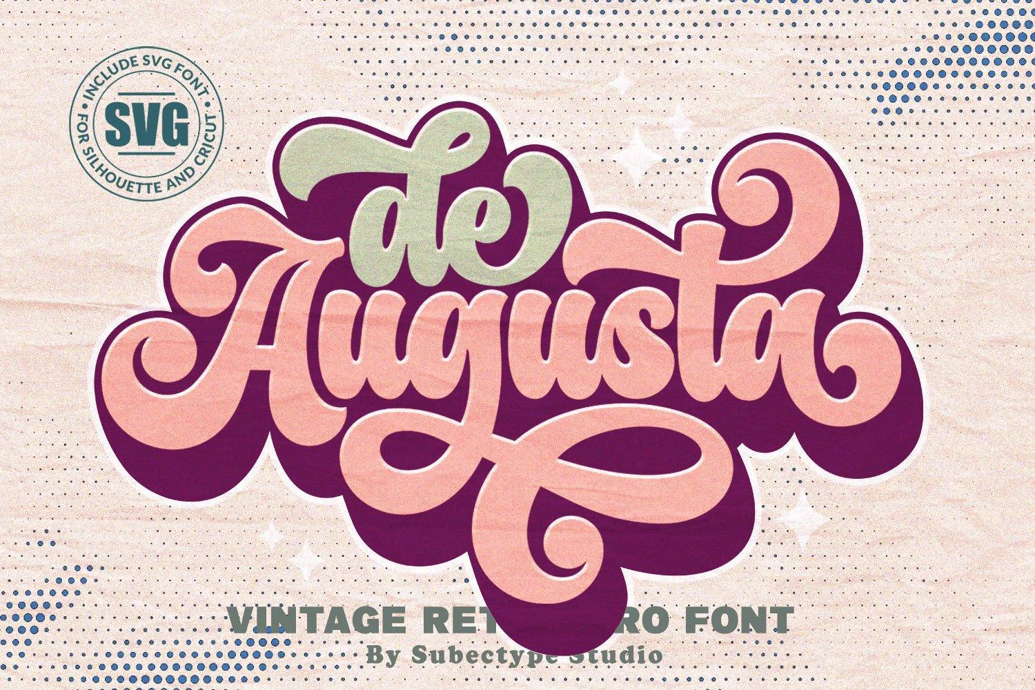
Best For: Café logos, vintage-style mugs and retro boutique packaging
De Augusta Font is a heavy, swinging lowercase script with fat strokes and tight loops, shown on the cover with a lilac-and-plum layered shadow and an SVG badge. The connections are thick and confident, so a word like “augusta” turns into one solid emblem.
Treat it as a logo font. Two words at most, with a curved line or a small badge shape around them, and it already feels like a 70s soda label. Lowercase works better than all caps here.
4. Wavy Retro Font
by MaxArt
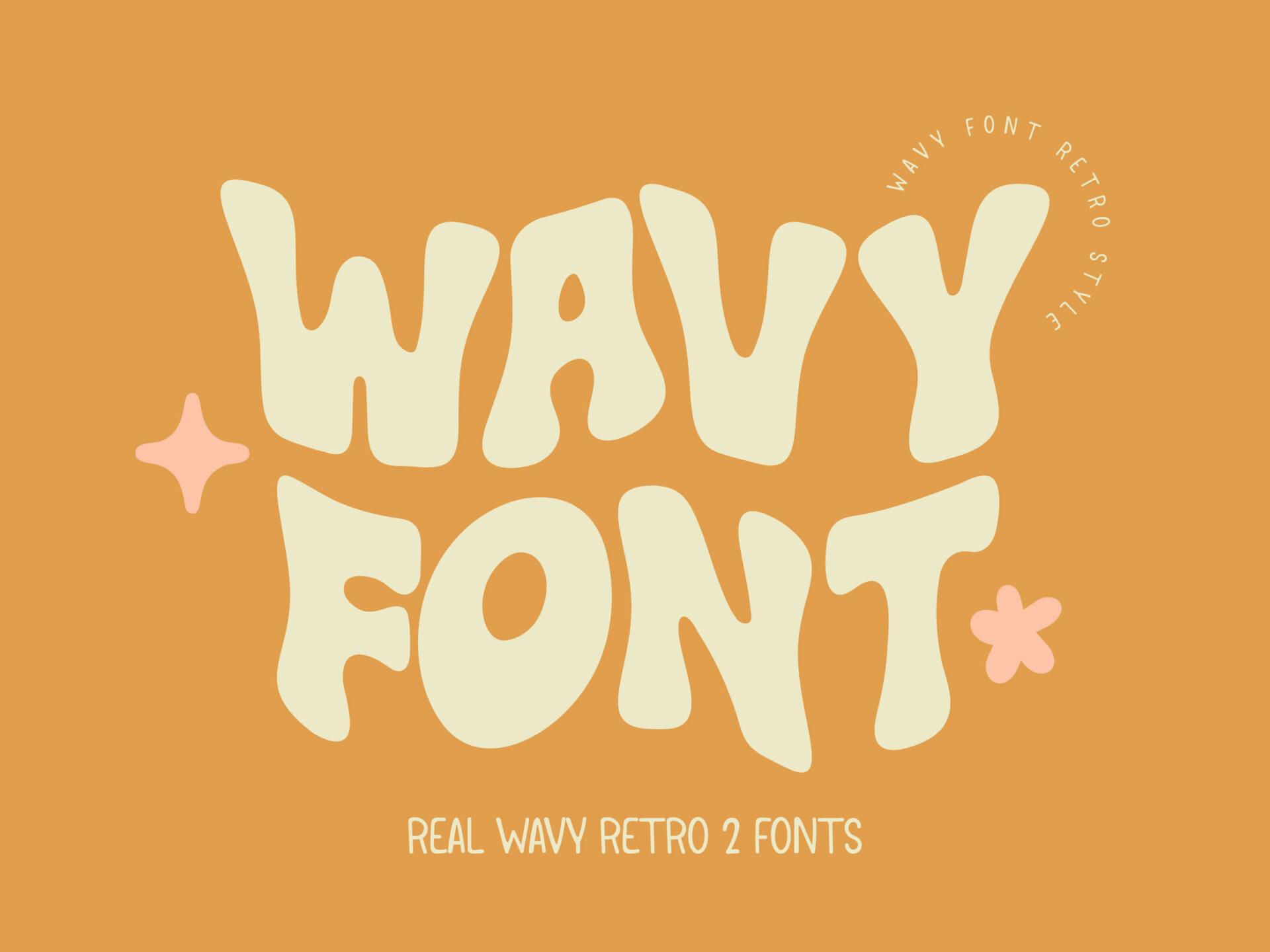
Best For: Surf shop shirts, summer sale graphics and playlist covers
Wavy Retro Font bends every capital as if it were printed on a ripple: cream letters on a hot orange background, with strokes that swell and pinch along a wave. The shapes are simple, so the movement comes from the distortion, not from extra decoration.
Short words show the wave best, longer lines start to look seasick. It pairs well with sunshine colors and a straight, clean sans for the details.
5. Roocy Retro Font
by HeroMan
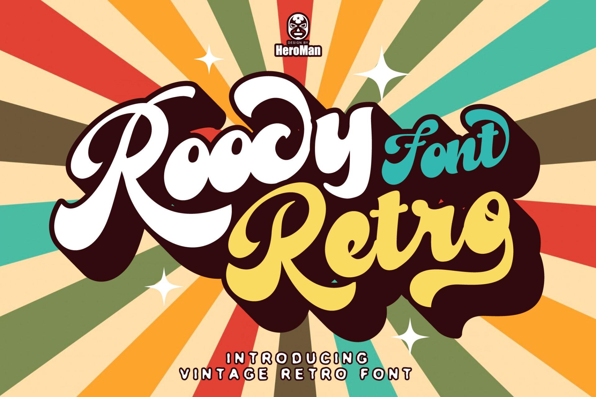
Best For: Vintage tees, sunburst posters and diner signs
Roocy Retro Font is a bold connected script with round, bouncy letters, presented in cream with a deep brown outline and a multi-colored drop shadow over a rainbow sunburst. The italic slant and fat loops make it feel like lettering painted on the side of a van.
It needs a strong background to shine, a sunburst, a stripe band or a solid color block. Add the stacked shadow in two or three warm colors and keep the rest of the design flat.
6. Hippie in Love Font
by HappyDesigns
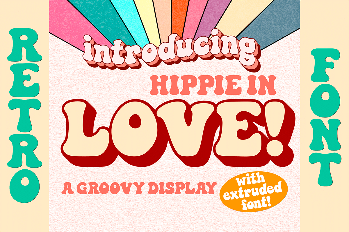
Best For: Groovy event flyers, love-themed shirts and retro quote prints
Hippie in Love Font is a chunky display face with rounded, slightly squeezed capitals and a built-in extruded look: the cover shows red letters with a cream face and deep 3D sides, and announces an extruded companion font. The letters are thick enough to read from across a room.
Use the extruded effect for the headline only and let the flat version handle a second line. It suits loud, happy phrases; quiet copy will feel out of place in it.
7. Sunday Swing Font
by FVBFontArt
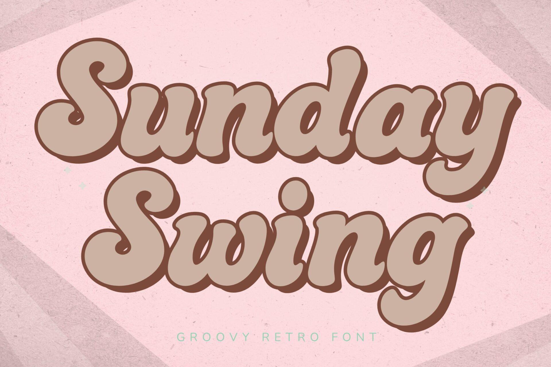
Best For: Weekend market banners, brunch menus and soft retro prints
Sunday Swing Font has rounded, heavy letters with a gentle swing to the baseline, shown in warm taupe with a cream outline and a lighter offset shadow on a pink checked background. It is groovy but softer than most of this group, with no sharp corners anywhere.
Muted palettes suit it: mocha, blush, sage. It works for a cozy café menu header or a market banner where you want 70s warmth without the loud rainbow.
8. Chunky Retro Font
by HansCo
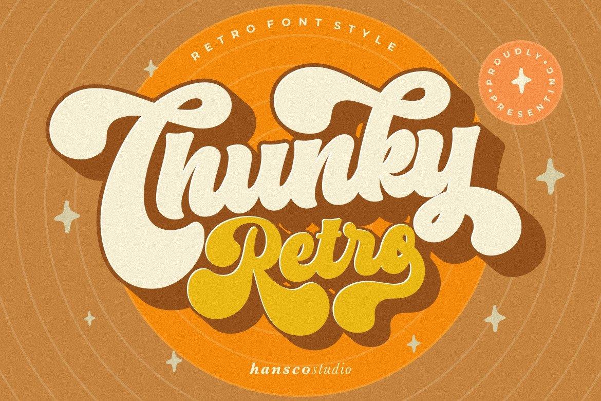
Best For: Logo badges, vintage stickers and orange-and-cream product labels
Chunky Retro Font is a fat, slanted script with a long swash under the word, shown in cream with an orange layered shadow inside a round badge. Every stroke is thick, and the loops are tight, so it holds up even when the design is small, such as a sticker.
Place it inside a circle or an oval and you have a ready vintage badge. Orange, mustard and brown make it look most like the 70s originals.
9. Groovy Magic Font
by Kernova Fonts
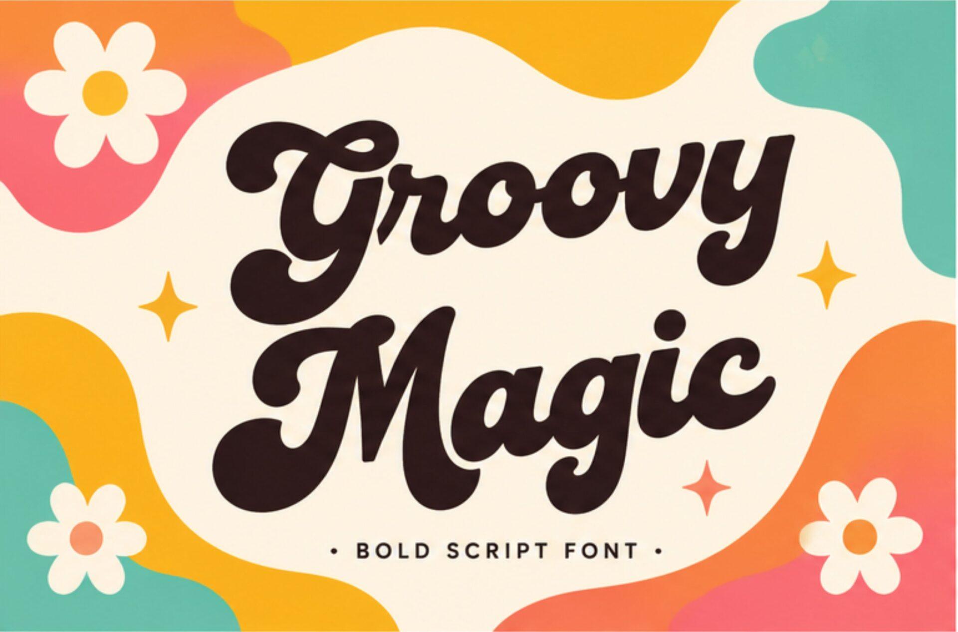
Best For: Bold slogan tees, flower-power stickers and playful brand names
Groovy Magic Font is a bold black script with fat round letters and generous swashes, shown on a wavy multicolor background with daisy shapes. Compared with the layered fonts above it is plain black on the cover, which makes it easy to color your own way.
Because it is a single solid script, it cuts cleanly as a one-color design. Pair it with a few daisy or star doodles and it already looks finished.
10. Funky Retro Font
by airotype
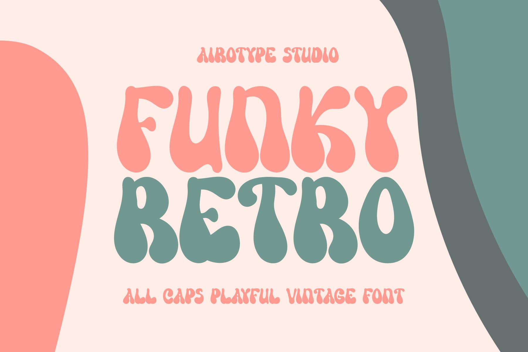
Best For: Vintage-style shop signs, tote bags and playful event titles
Funky Retro Font is an all-caps display face with tall, wobbly letters whose stems bulge in the middle, shown in salmon and teal on a pale background. The cover calls it an all caps playful vintage font, and the irregular shapes do look hand-cut.
It is designed for capitals, so write in caps and stack the words into a block. Two contrasting colors per line, like on the cover, are enough to make it pop.
11. Cosmed Retro Font
by HansCo
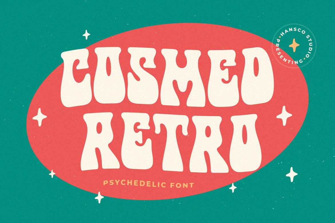
Best For: Psychedelic posters, music merch and bold shop windows
Cosmed Retro Font is labeled psychedelic on its cover, and the shapes back that up: wavy, melting capitals in cream, set inside a red oval on a teal background. The letters stretch and squeeze so that each word fits its outline like a puzzle.
Give it a shape to fill, an oval, an arch or a wavy band, and it looks like a real 60s–70s poster. Keep the colors high contrast; the wobbly letters need a clean edge to stay readable.
12. Retro Bloom Font
by Zetastock
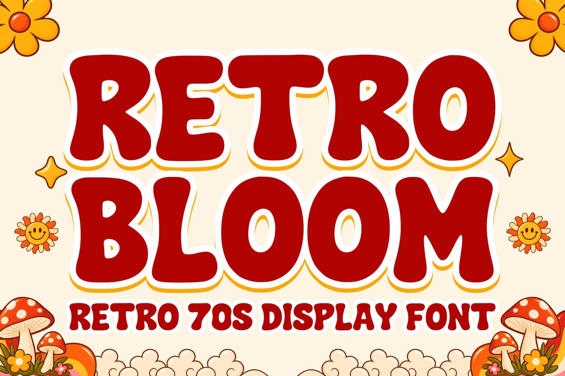
Best For: Mushroom-and-flower merch, garden market posters and 70s-themed parties
Retro Bloom Font is described on its cover as a retro 70s display font: heavy capitals with slightly flared ends, in red with a thick cream outline, surrounded by daisies and mushrooms. It is bolder and more upright than the scripts in this group, closer to a vintage sign.
Use it where you need a strong, readable headline with a 70s feel, like a market name or a party title. Cream outline on red or brown is the easy win.
Retro Bubble Fonts
Bubble fonts are the softer side of retro, inflated letters that feel playful rather than loud. They suit kids’ designs, funny slogans and sweet products.
13. Cloudy Dreams Font
by Sakti Avellin
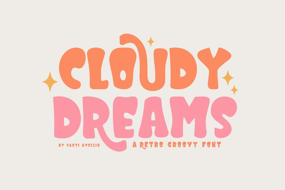
Best For: Nursery prints, cute shirts and pastel party signs
Cloudy Dreams Font is a soft bubble font with puffy, rounded capitals in orange and pink, finished with little sparkle accents on the cover. The letters are wide and friendly with almost no straight lines, which gives them the inflated look of 70s kids’ graphics.
Pastels and white space suit it best. It reads well on a child’s name sign or a baby shower banner, and it is clear enough for a short phrase on a tee.
14. Tired Mood Font
by Meow Creation
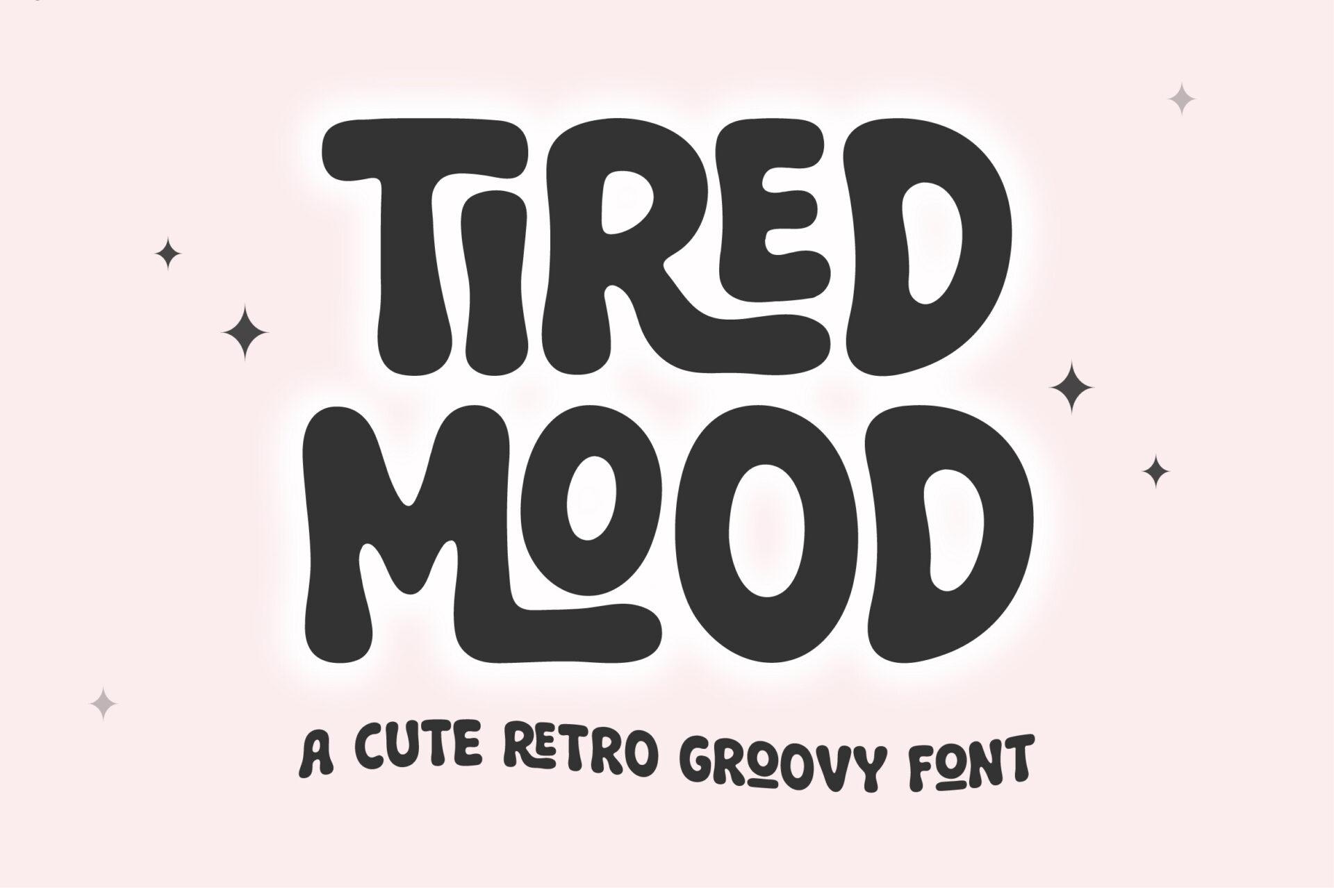
Best For: Funny slogan shirts, mugs and sticker quotes
Tired Mood Font is a heavy, black, wavy bubble font, called a cute retro groovy font on its cover. The capitals sag and swell slightly, so a phrase like “tired mood” really looks a bit tired, which is the joke.
It is made for short, funny text: mood phrases, coffee jokes, sticker captions. One color on a pastel background is all it needs.
15. Honey Glaze Font
by Black Cat Designs
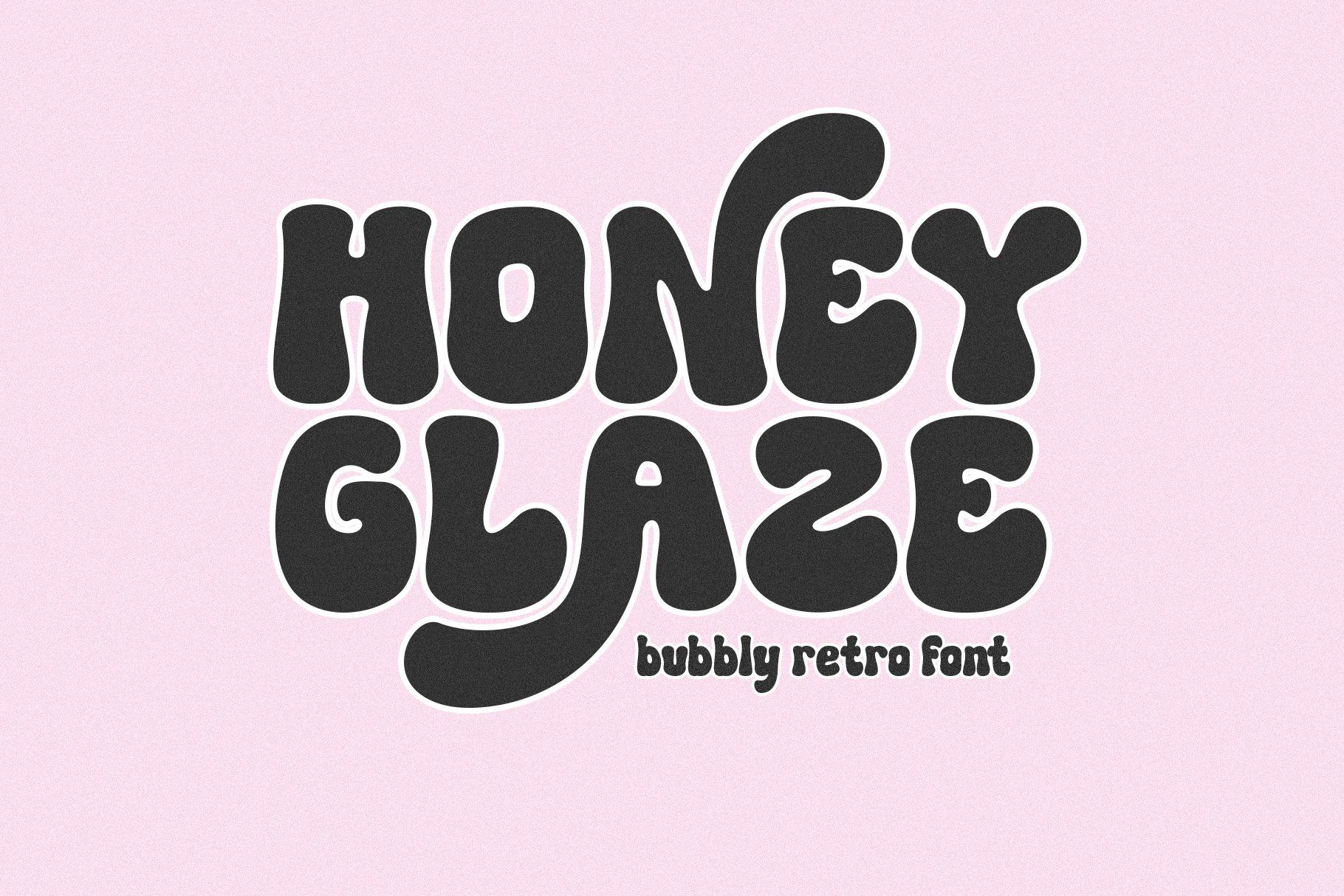
Best For: Bakery labels, sweet-shop logos and cozy Instagram titles
Honey Glaze Font is a bubbly retro font, in its own words, with dark, swollen letters that look poured rather than drawn. The cover shows lowercase in deep charcoal on soft pink, and the round dots and fat bowls give it a dripping-honey softness.
Food and sweet products are its natural home. Use it in brown or deep berry on a cream label and pair it with a simple serif for the ingredients.
Distressed and Block Retro Fonts
When retro should look worn, not new, use these. Texture and heavy blocks make a design feel like it was printed decades ago.
16. Block Retro Font
by TaralArt
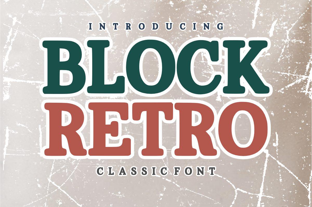
Best For: Old-school shirts, workshop logos and vintage label mockups
Block Retro Font is a condensed, heavy serif in capitals, presented on its cover as a classic font in dark green and brick red over worn, scratched paper. The serifs are short and blunt, which gives it the look of old printed tickets and grocery signs.
Stack two words in two colors exactly like the cover and you get an instant vintage label. Add a paper texture to the background rather than to the letters if you need it to cut cleanly.
17. Grunge Retro Font
by mardanimirza12
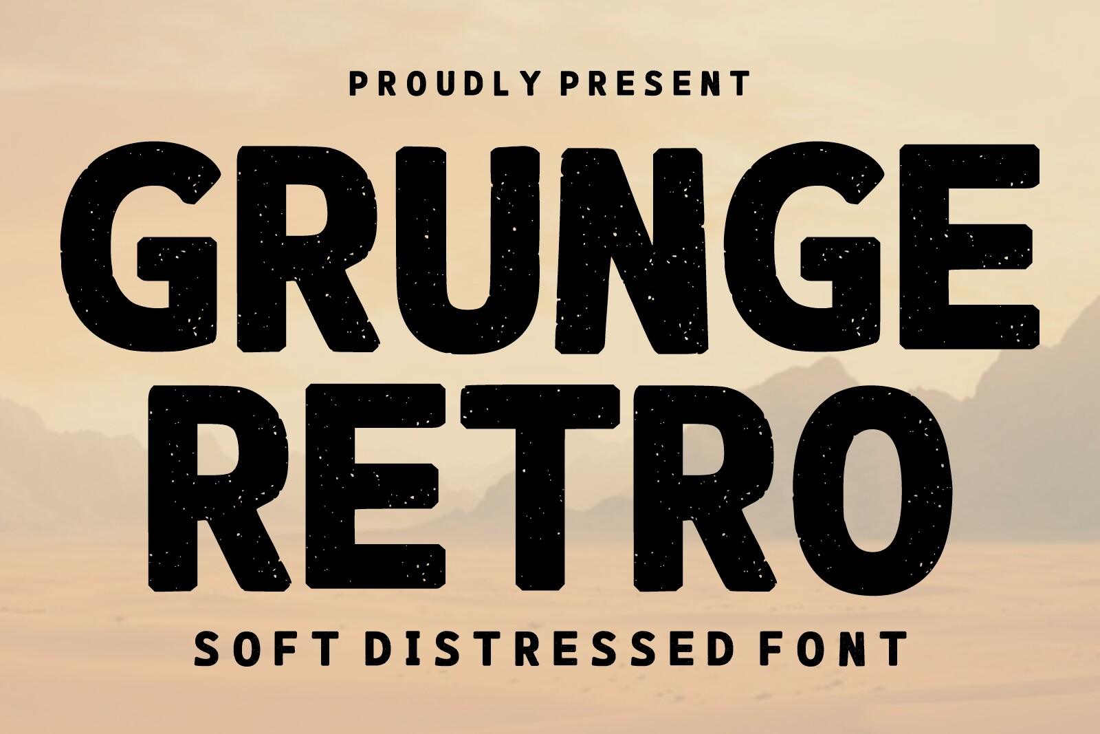
Best For: Faded band tees, worn gym shirts and poster titles
Grunge Retro Font is a heavy, rounded sans in capitals with a soft distressed texture inside the strokes, described as a soft distressed font on the cover. The letters are tight and bold, while the speckled texture makes them look like an old screen print.
It suits print-on-demand shirts where a slightly worn look is the goal. Keep a solid backup font for small text, because the texture eats fine details.
18. Varsity Grunge Font
by Infinity art Studio
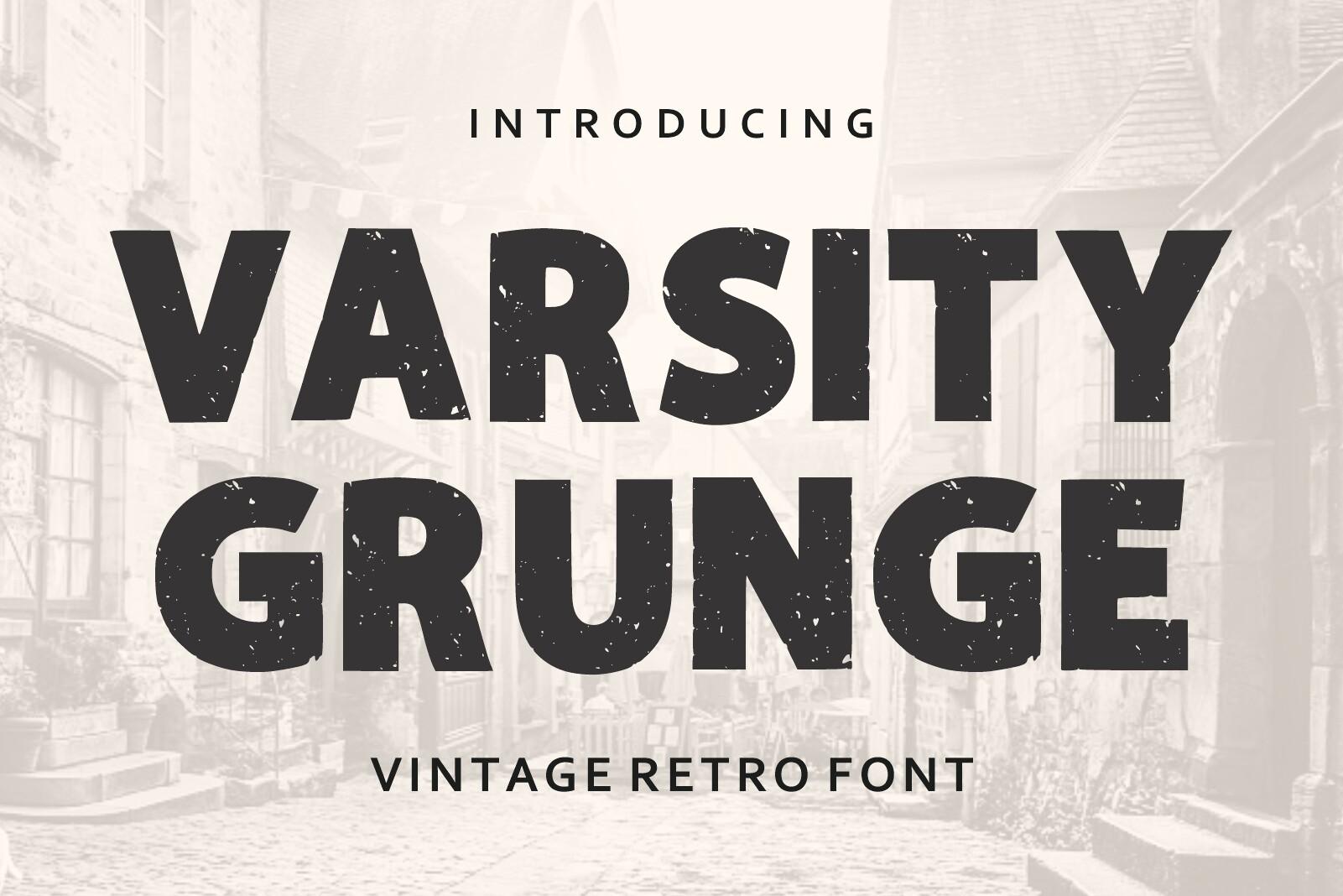
Best For: Throwback team shirts, college-style hoodies and gym posters
Varsity Grunge Font is a wide, heavy display face with a worn print texture, labeled vintage retro font on its cover. The capitals are broad and square-shouldered like campus lettering, but the scuffed fill makes them look decades old.
Arch it over a number or a year and you have a throwback team design. It holds up at large sizes on dark and light fabric.
Retro Script Fonts
Connected scripts with thick strokes, tails and layered shadows, from baseball jerseys to diner signs.
19. Hanky Font
by Lettersweet
Best For: Retro shop logos, baseball-style tees and bold stickers
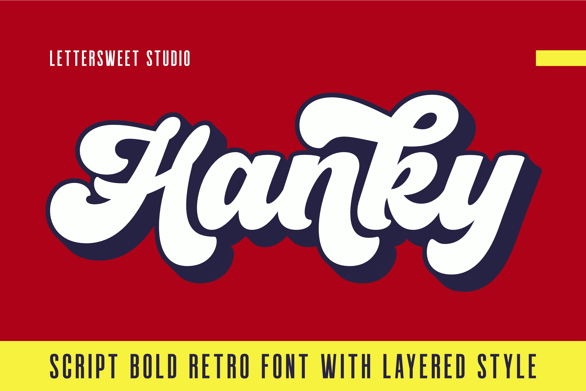
Hanky Font is a bold, round script that its cover sums up as a script bold retro font with layered style: white letters with a navy outline sit on a red background over a yellow stripe. The strokes are thick and the joins are short, so the word reads as one chunky ribbon.
Use the layered look for logos and tees, and let the plain script handle smaller lines. It looks right with a tail underline or a simple stripe below the word.
20. Baseball Classic Font
by Craft Artist
Best For: Team shirts, game-day banners and sporty brand names
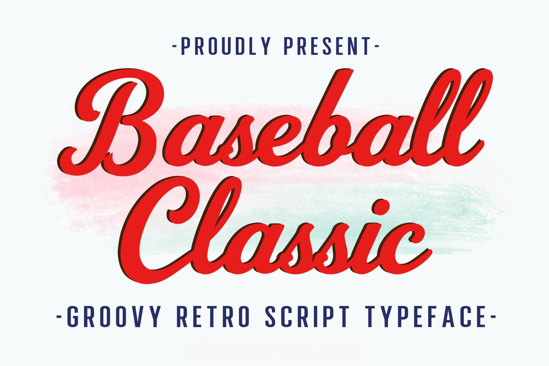
Baseball Classic Font is a slanted connected script with a sweeping tail, shown in red on its cover with a subtitle calling it a groovy retro script typeface. The capitals are bold with a little flourish, and the lowercase keeps an even, sporty rhythm.
Add a tail under the word and you have the classic jersey look. It also works outside sports, for any brand that wants an all-American retro feel.
21. Vintage Children Font
by Keithzo (7NTypes)
Best For: 70s-style posters, kids’ book titles and retro event names
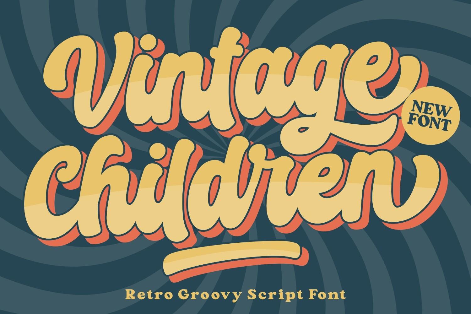
Vintage Children Font is a big, bouncy retro groovy script with thick strokes and round loops, shown in mustard with an orange layered shadow over a swirling teal and brown background. The letters connect in a loose, playful way that feels hand-painted.
The wavy background on the cover is a good hint: give it a strong pattern or color block behind and let the words fill most of the space.
22. Standley Font
by Natural Ink
Best For: Sports-style shirts, garage signs and vintage poster headlines
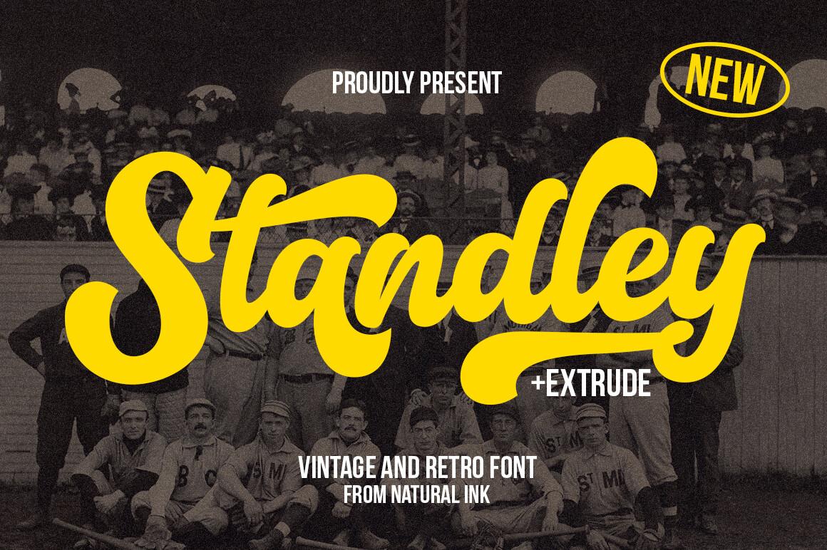
Standley Font is a heavy slanted script in bright yellow, shown on its cover over an old sepia photo, with a note that it comes with an extrude version. The letters are thick and slightly condensed, with a bold capital that leads the word.
Use the extrude style for depth on a poster or a shirt. On dark backgrounds the bright, heavy script is readable even from far away.
23. Krandish Font
by airotype
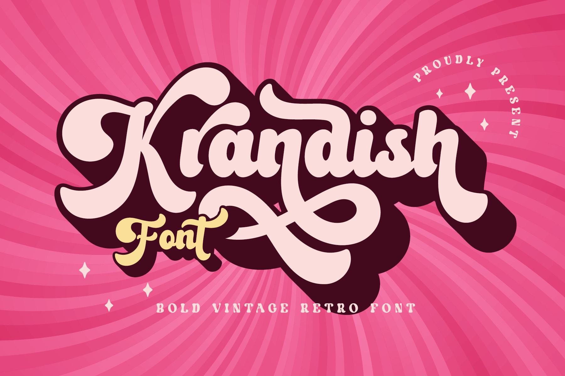
Best For: Beauty shop logos, pink party graphics and retro stickers
Krandish Font is a bold vintage retro script with exaggerated swashes and curly capitals, shown in light pink with a dark burgundy outline on a hot pink sunburst. It is more decorative than the other scripts here, with loops that spill past the letters.
Keep it to one word, ideally a name, and give the swashes room so they do not collide with other elements. Pink and berry tones fit its personality.
24. Bello Curve Font
by thomasaradea
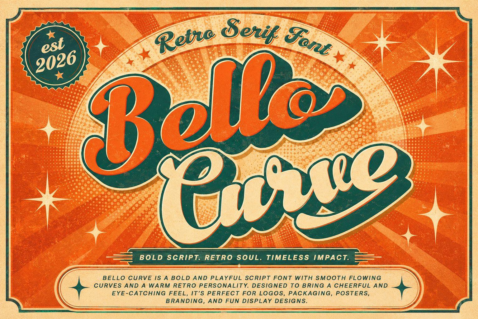
Best For: Café menus, retro food packaging and vintage poster titles
Bello Curve Font sits between script and serif: the cover labels it a retro serif font, yet the letters swing and join like a bold script, with small serif endings. It is shown in green with an orange shadow inside an ornate orange frame.
That mix makes it a good headline for menus and food labels, where you want warmth but still need clear letters. Put it inside a frame or a badge like on the cover.
Retro Futurism and 80s Neon Fonts
The past’s idea of the future: space-age geometric capitals, neon tubing and synthwave gradients.
25. Space Retro Font
by Pian45
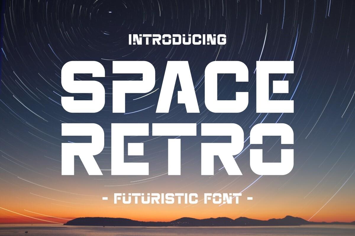
Best For: Sci-fi posters, synth music covers and tech-themed merch
Space Retro Font is a wide, geometric capital font with squared-off curves, presented as a futuristic font over a starry orbit photo. The letters are clean and white, with the kind of rounded rectangles you remember from 70s space-age logos.
It reads clearly at any size, so it can carry a full title. Use it over a dark or photographic background and keep the letter spacing a little open.
26. Triplo Font
by Plotterfreak – Kikomin
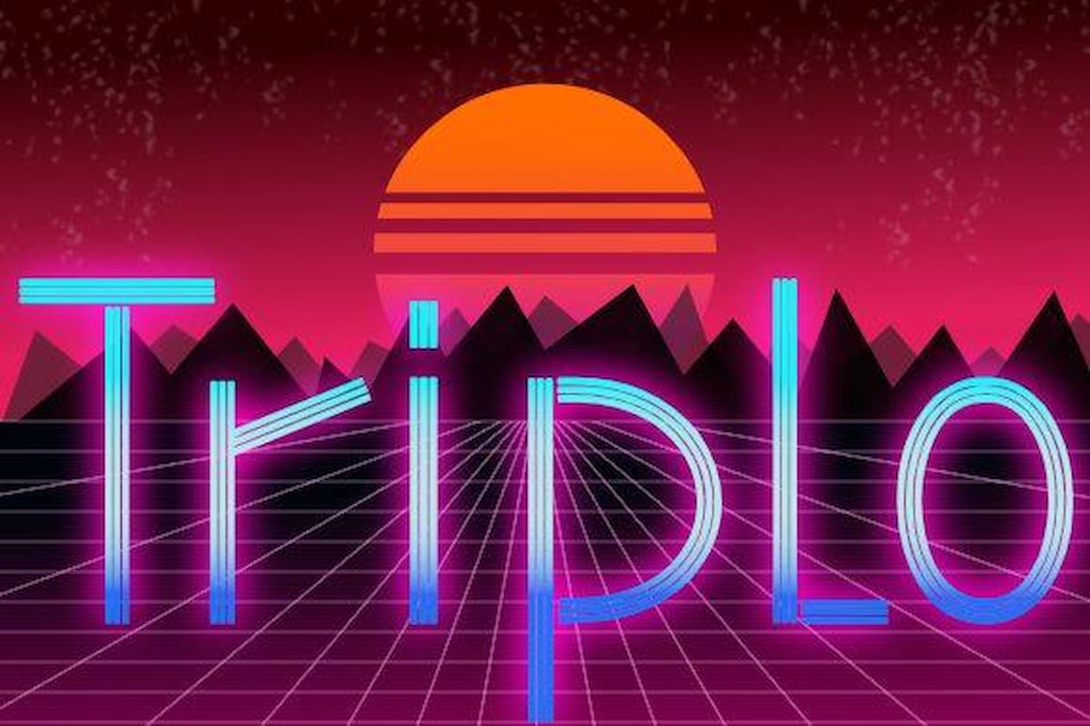
Best For: Synthwave posters, neon party invites and 80s throwback merch
Triplo Font is a thin, monoline display face drawn in neon pink and blue on its cover, in front of a classic synthwave sunset and grid. The strokes are light and evenly weighted, so it looks like glowing tubing rather than ink.
Add a glow effect and a dark background and it does the 80s by itself. Because it is thin, give it size and avoid busy textures behind it.
27. Nexbloc Font
by Juru Rancang Graphic
Best For: Retro-futurist posters, bold brand marks and music event titles
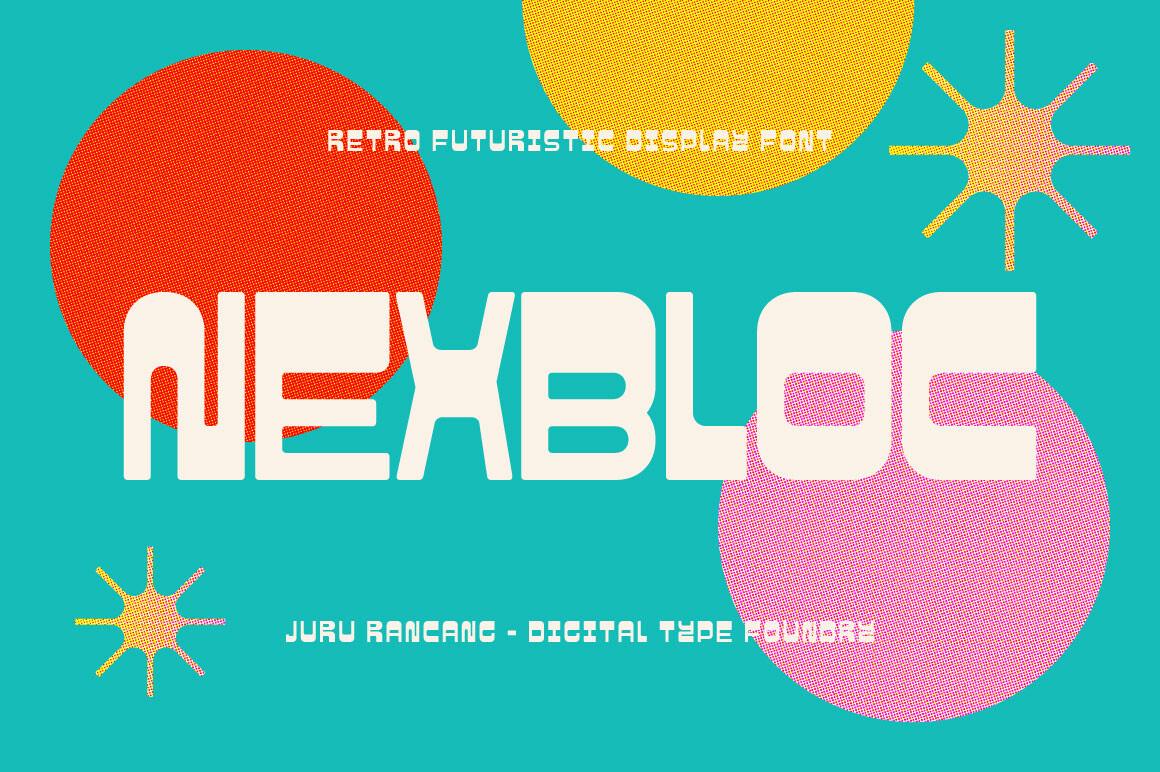
Nexbloc Font is a heavy, geometric retro futuristic display font, as its cover calls it, with blocky capitals cut by thin gaps, shown in white on teal with red and yellow circles. It feels like a 70s idea of the future: bold, round and modular.
It is made for big headlines. Pair it with flat circles or sunbursts in two or three colors and a plain sans for the details.
28. Neon Future 2 Font
by arukidz.fl
Best For: Neon sign mockups, gaming graphics and night event flyers
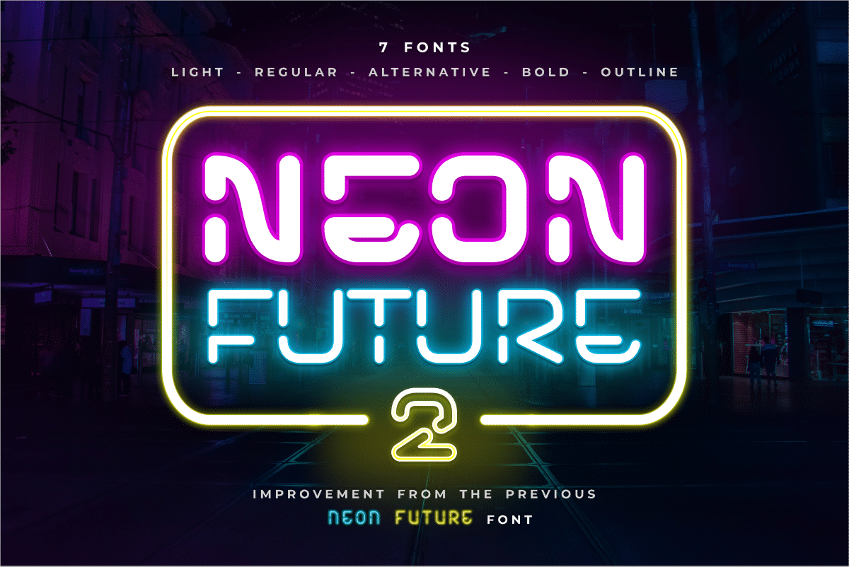
Neon Future 2 Font is styled like bent neon tubes: on the cover the words glow in pink, teal and yellow inside a neon frame, and a header line lists several styles including an outline. The rounded corners and even strokes match real neon sign lettering.
Use the outline style with a glow on a near-black background for a convincing sign effect. It also works for gaming thumbnails and night-party flyers.
29. Gravity Shift Font
by Gleb Guralnyk
Best For: Album covers, retro-tech branding and layered poster titles
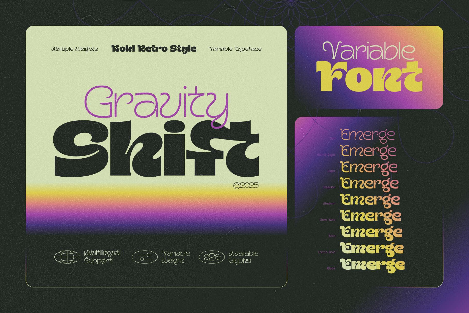
Gravity Shift Font is a bold, compressed display face shown with a sunset gradient and stacked repeats of the same word, and the cover marks it as a variable font. The letters have a smooth, slightly stretched 80s feel, especially in the heavier weights.
Repeat the word in several weights or colors, like on the cover, to build an echo effect. It suits music and tech projects where you want retro without the groovy curls.
Retro Serif Fonts
Soft, heavy and high-contrast serifs that bring a 70s magazine or packaging feel to logos and headlines.
30. Fresh Mango Font
by Shakira Studio
Best For: Fruit-stand branding, cocktail menus and retro magazine titles
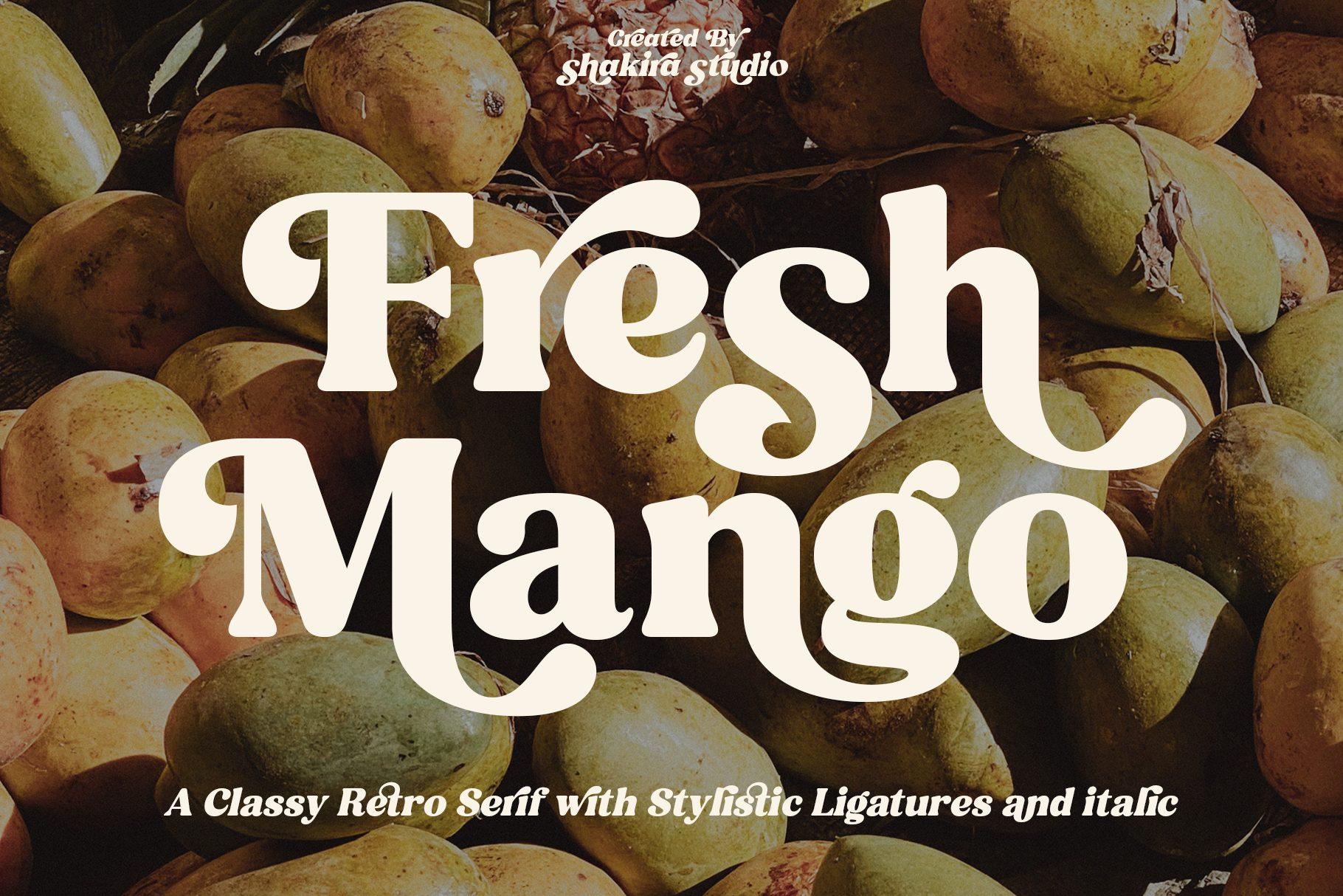
Fresh Mango Font is a heavy, soft-edged serif with bouncy curves, described on its cover as a classy retro serif with stylistic ligatures and italic. The bowls are round and the serifs are gentle, so the word looks both bold and friendly over the mango photo.
The ligatures and italic give you a way to make a logo look custom. It is a good choice for food and drink brands that want a 70s magazine feel.
31. Milgraph Font
by abbasystudio
Best For: Poster headlines, vintage packaging and bold shop signs
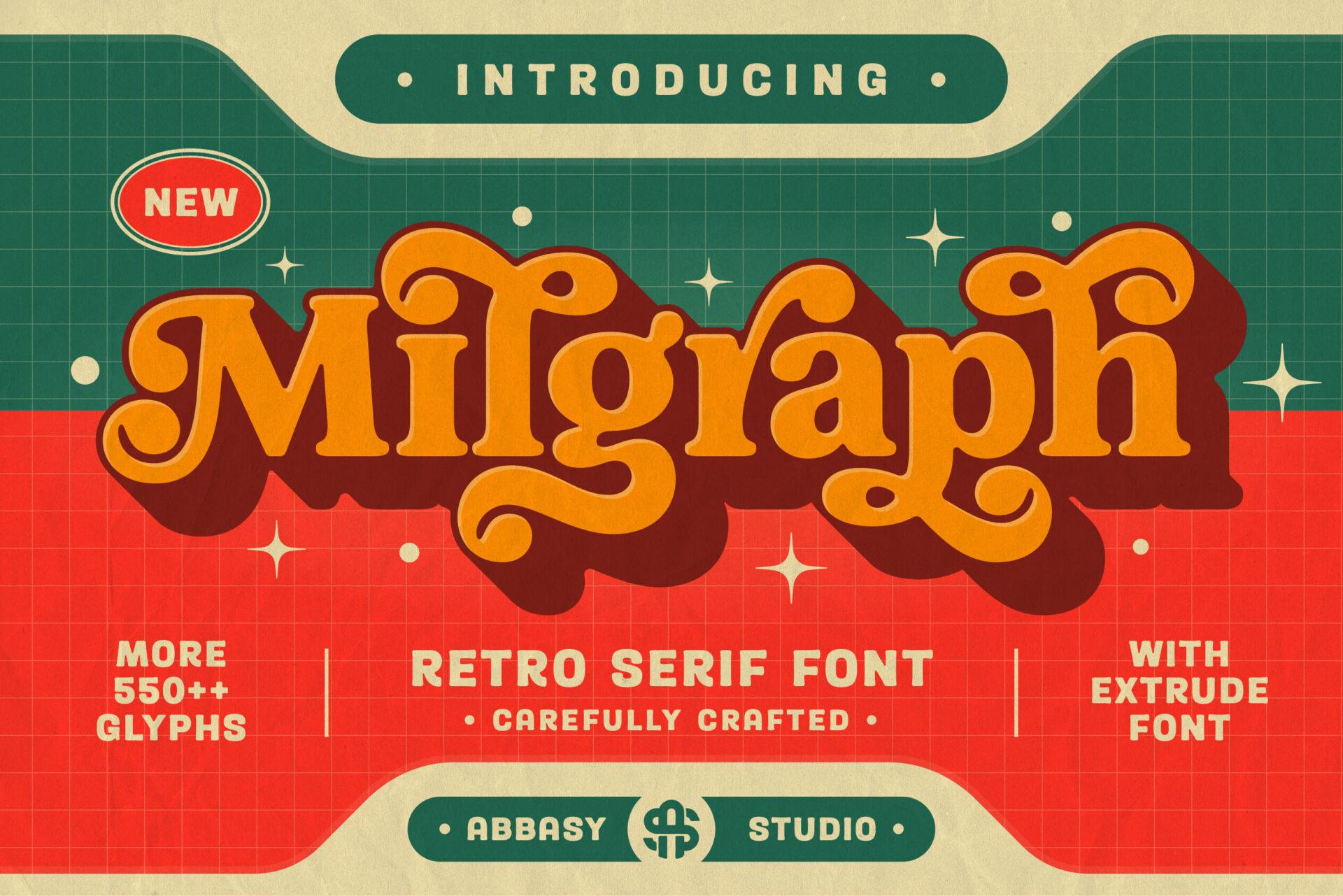
Milgraph Font is a chunky retro serif with swelling strokes, shown in orange with an extruded dark shadow on a red-and-green poster. The cover advertises more than 550 glyphs and an extrude font, so the 3D look in the preview is built in.
The extrude style makes it a headline on its own. With that many alternates it is worth trying a few letter variants before you finalize a logo.
32. Kalero Font
by font-liner
Best For: Bold product labels, retro coffee brands and statement shirts
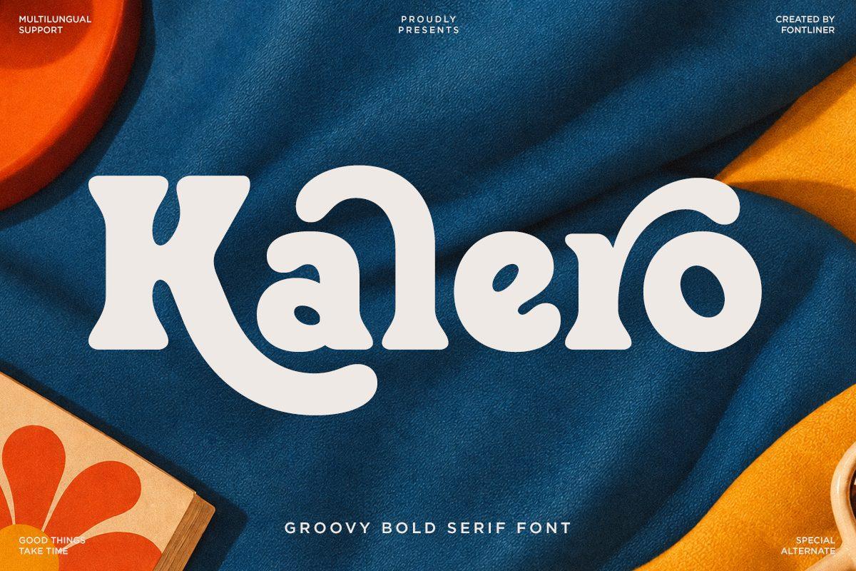
Kalero Font is a groovy bold serif, as its cover says: thick, rounded letters with soft wedge serifs, set in cream on a deep blue fabric photo. The shapes are compact and heavy, close to the 70s cooper-style serifs used on old packaging.
It works for a single strong word on a label or a shirt. Warm cream on blue, brown or orange is the most natural pairing.
33. Louis Walter Font
by flawless-and-co
Best For: Boutique logos, book covers and elegant retro wedding signs
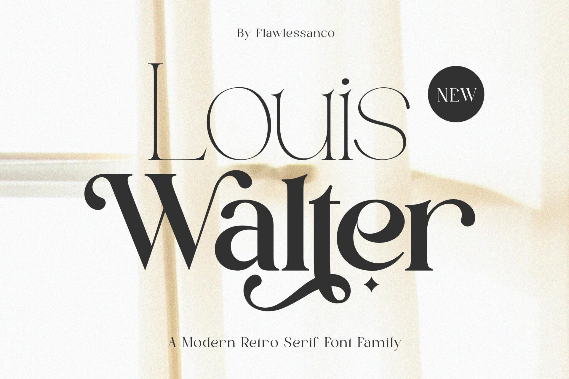
Louis Walter Font is a modern retro serif font family, according to its cover, with high contrast between thick and thin strokes and soft ball shapes on the ends. It is the most refined font in this list: retro in its curves, but calm enough for a luxury brand.
Use it where groovy would be too loud: a boutique name, a book title or a wedding welcome sign with a 70s mood. Black on cream with lots of space suits it.
34. Picky Retro Font
by Keithzo (7NTypes)
Best For: Bakery and café logos, recipe cards and warm product labels
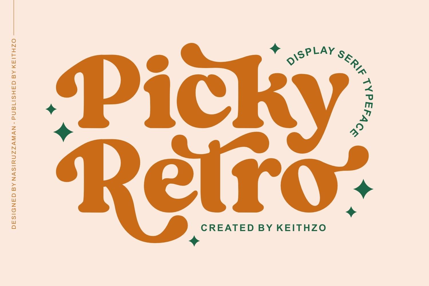
Picky Retro Font is a display serif typeface with bouncy, swashed lowercase in caramel orange, shown on a peach background. The letters tilt a little and the curls on the ends keep it playful, while the serifs keep it readable.
It is a good middle ground between the scripts and the serifs here. Try it for a café or bakery name and pair it with a plain sans for the menu.
How to Choose a Retro Font
Start with the decade you want people to recognize. Swollen, wavy capitals like Retro Holly or Cosmed Retro say 70s straight away; neon outlines such as Triplo or Neon Future 2 say 80s; soft heavy serifs like Kalero or Fresh Mango point to old packaging and magazines.
Then think about how the design will be made. A stacked shadow looks great on a poster but makes a cut file more complex, so for vinyl and single-color prints a solid script like Groovy Magic or a flat bubble font like Tired Mood is easier. Distressed fonts such as Grunge Retro or Varsity Grunge are best for printed shirts, where the worn texture is part of the look.
Finally, test the actual words. Retro display fonts are built for short titles, and many of them lose clarity in long lines, so write your real name or slogan in the preview before choosing, and keep a clean sans or serif nearby for the small text.
Retro Fonts FAQ
What is the difference between retro and vintage fonts?
The words are often used for the same thing. In practice, retro usually means styles from the 60s to the 80s, like groovy, bubble and neon lettering, while vintage covers older looks too, such as Victorian and Art Deco type.
Which retro fonts work for t-shirts?
Bold, readable shapes hold up best on fabric: Hanky, Baseball Classic, Varsity Grunge and Hippie in Love are good starting points. Very thin fonts like Triplo need a large size and strong contrast to read on a shirt.
How do I get the stacked 70s shadow effect?
Duplicate the text two or three times, change the color of each copy and nudge them down and to the side. Some fonts in this list, such as Milgraph, Standley and Hippie in Love, show an extrude version on their covers that builds the depth for you.
Find Your Decade, Then Commit
Pick the group that matches the mood of your project, choose one headline font from it and support it with one simple text font. One strong retro voice per design looks far better than three competing ones.