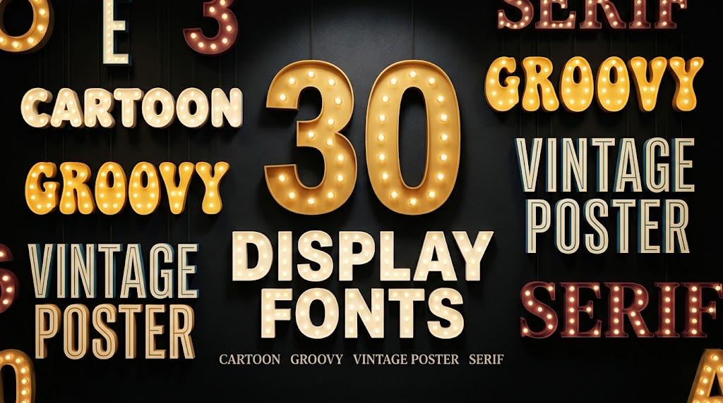
Display Fonts: 30 Cartoon, Groovy, Vintage, Poster and Modern Serif Styles for Headline Makers, Logo Designers and Shirt Crafters
A display font has one job: to be seen first. It is the font on the poster headline, the shirt slogan, the shop sign and the Instagram cover, set big enough that its shape matters as much as the words. That is why display fonts can be cartoonish, melting, distressed or extremely narrow in ways a text font never could.
This post contains affiliate links. If you buy through them, I may earn a small commission at no extra cost to you.
This list gathers 30 display fonts in six groups: cartoon and comic, groovy and retro, vintage, condensed poster, modern serif and playful handmade. Each font is described from its real preview, with notes on where it works and where it needs care. All fonts in this list are on Creative Fabrica, and a single All Access subscription unlocks every one of them, so you can try several styles before committing to one.
More display-style font collections:
28 Bold Fonts: Chunky, Condensed and Groovy
27 Fun Fonts: Quirky, Kids and Doodle
20 Vintage Fonts for Logos and Labels
34 Bubble Fonts: Groovy, Graffiti, Kawaii
30 Cool Fonts: Graffiti, Groovy, Comic
Table of Contents
- Cartoon and Comic Display Fonts
- Groovy and Retro Display Fonts
- Vintage Display Fonts
- Condensed Poster and Headline Fonts
- Modern Serif Display Fonts
- Playful Handmade Display Fonts
- What Makes a Font a Display Font
- How to Choose a Display Font
- FAQ
- Where to Start
What Makes a Font a Display Font
Text fonts are designed to disappear: you read the words, not the letters. Display fonts are the opposite. They are drawn for sizes where the reader notices every curve, so designers can exaggerate contrast, squeeze letters, add outlines, textures or decoration. The trade-off is that most display fonts stop working at small sizes and in long paragraphs.
In practice, a display font is the headline layer of a design. You pick it for mood, set it for one to five words, and let a simple serif or sans carry the rest.
Cartoon and Comic Display Fonts
Cartoon display fonts are drawn to look like they belong in a speech bubble or on a game title screen. They carry thick outlines, puffed shapes and a lot of color, so they read well at a distance and at thumbnail size.
1. Boozley Font by Maulana Creative
Best For: Comic posters, kids’ party signs, sale banners
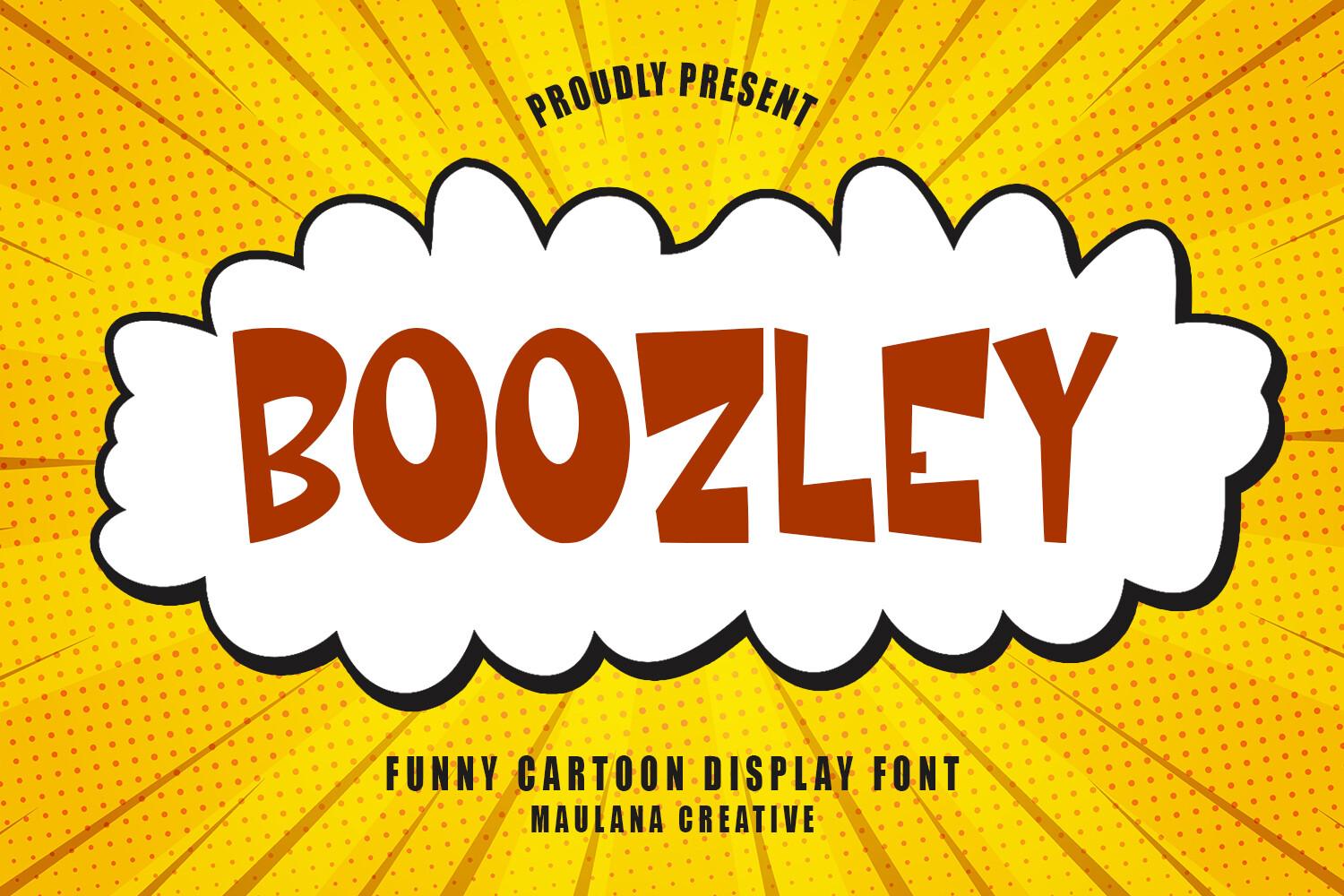
Boozley is a chunky all-caps cartoon face with rounded corners and letters that sit slightly off the baseline, so the word bounces instead of standing in a straight row. In the preview the dark red letters get a white outline and sit inside a cloud-shaped comic burst on yellow halftone rays, which is exactly the setting it was drawn for.
Use it for one loud word or a short phrase: BOOM, SALE, PARTY TIME. Give the letters an outline or a cloud shape behind them the way the preview does, and keep any second line in a plain rounded sans so the comic energy stays in the headline.
2. Super Space Font by Creative Fabrica Fonts
Best For: Game titles, space party invites, video thumbnails
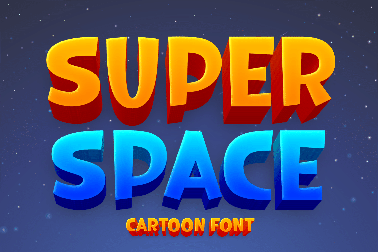
Super Space shows heavy block capitals with a deep 3D extrusion underneath, filled with a warm orange-to-yellow gradient on the first word and a bright blue gradient on the second. Set against a starry navy sky, the letters look like an arcade logo or the title card of a Saturday morning cartoon.
The effect depends on the extrusion and gradient, so treat it as a title font and build the color in your design app. Two short words stacked on two lines, like in the preview, is the format that works best; a long sentence loses the 3D drama.
3. Super Brave Font by Creative Fabrica Fonts
Best For: Superhero parties, 4th of July shirts, team banners
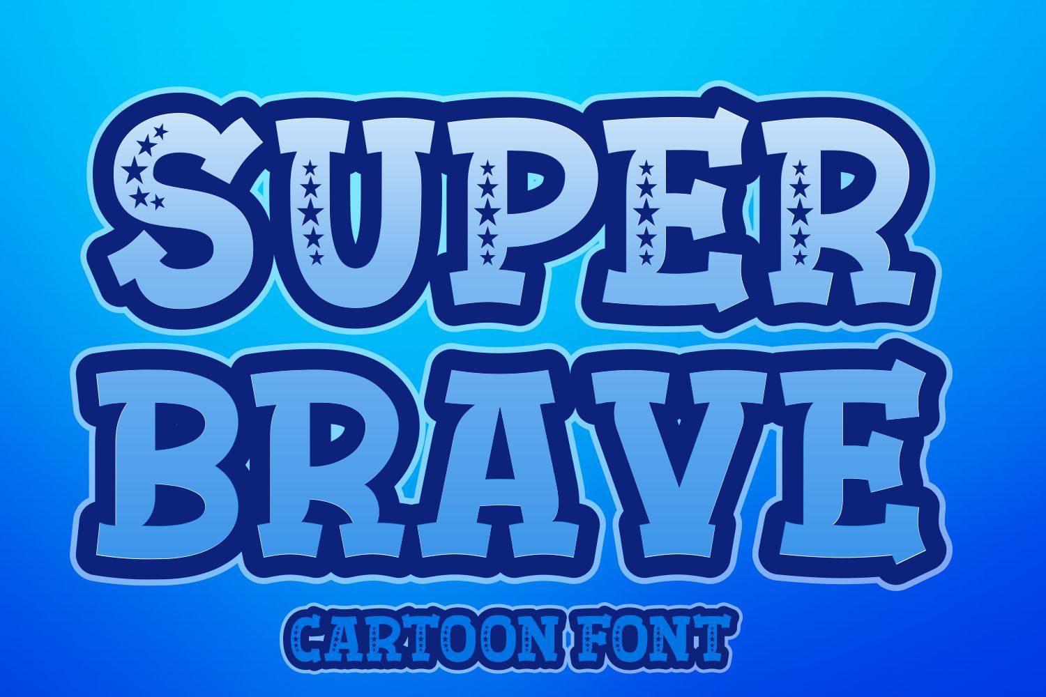
Super Brave is a bold cartoon capital set with a soft, slightly rounded outline and small white stars running down the inside of the strokes. In blue on blue, with a darker shadow edge, it reads like a superhero badge or a patriotic team banner.
The stars inside the strokes are the detail people notice, so make the letters large enough for them to show. Red, white and blue palettes suit it naturally; for a kids’ party, set the child’s name in Super Brave and keep the date and address in a simple sans.
4. Play Ink Font by Creative Fabrica Fonts
Best For: Kids’ brands, stickers, playful social graphics
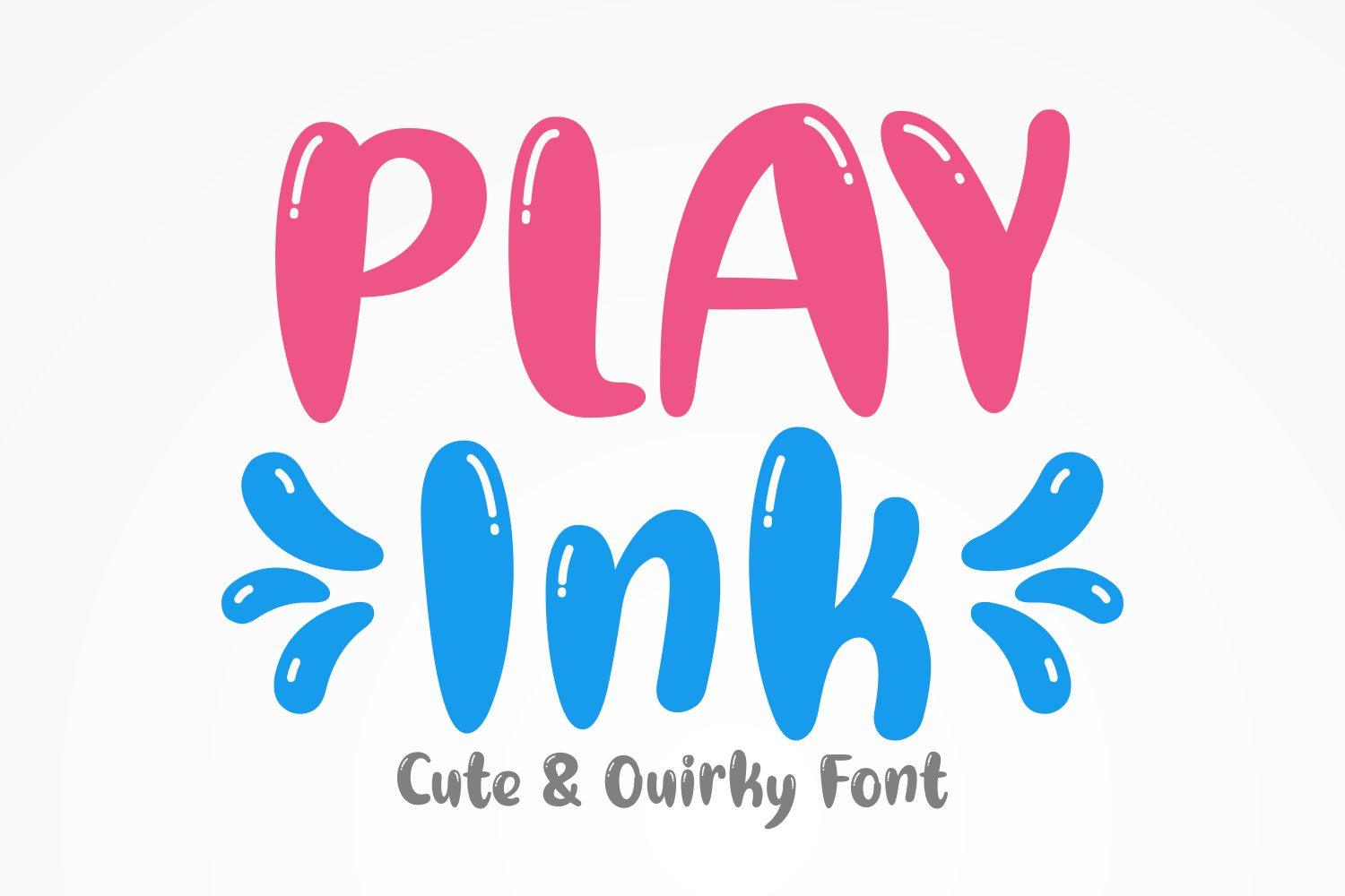
Play Ink has tall, rounded, slightly squeezed letters with a glossy highlight on each stroke, so they look like they were inflated. The preview pairs pink capitals with blue letters and little ink splashes, under the line “Cute & Quirky Font”.
It works best in two bright colors, one per word, as in the preview. The narrow bubble shapes stay readable in short words on stickers and kids’ product labels; for long text, switch to a regular sans and save Play Ink for the name.
5. Takugi Font by RagamKata Studio
Best For: App graphics, streetwear tees, social media headlines
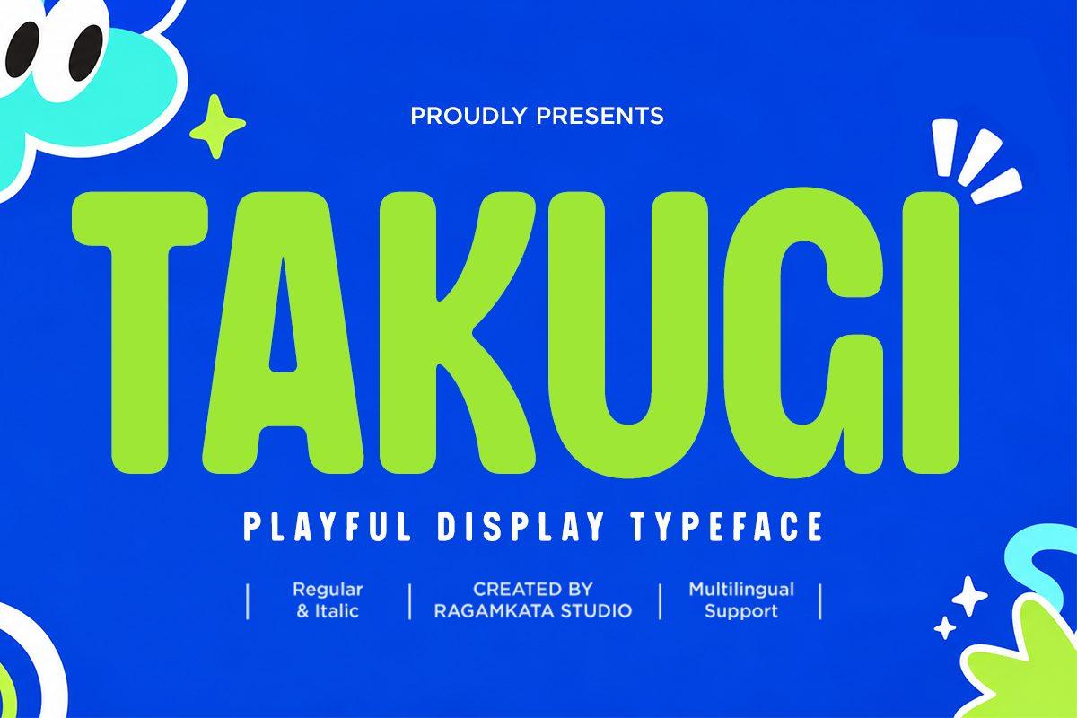
Takugi is a heavy, playful sans with soft corners and letters that lean into each other, shown in lime green on electric blue. The preview mentions Regular and Italic styles and multilingual support, so it can stretch beyond one headline word.
Its cartoon feel comes from shape rather than decoration, which makes it the most practical font in this group for brand use. Try it for a bold app banner or a streetwear print in two contrasting colors, and use the italic for a call-to-action line.
Groovy and Retro Display Fonts
Groovy display fonts borrow from 1970s posters and record covers: soft fat curves, swollen terminals and letters that seem to melt or bounce. They look best in warm retro palettes of orange, mustard, brown and pink.
6. Groove Heart Font by Bundle
Best For: Retro shirts, record-style posters, café menus
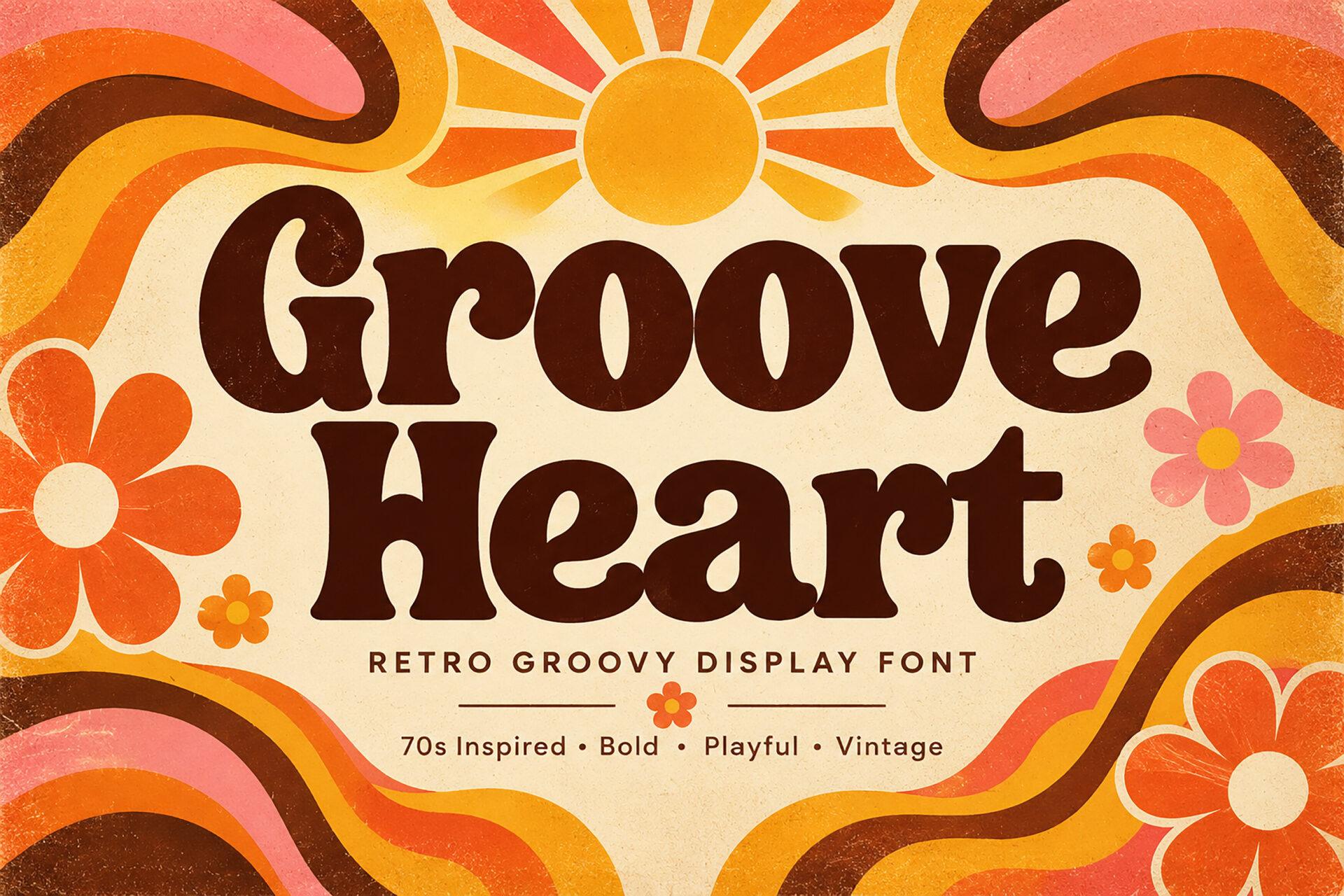
Groove Heart is a fat 70s display with soft wedge serifs and bulging curves, set in deep brown over orange sunburst waves and daisies. The preview tags it as 70s inspired, bold, playful and vintage, and the letters really do sit together like an old album title.
Stack two short words and let them nearly touch, as in the preview. It pairs well with retro backgrounds and a clean sans for the small print; on a shirt, a one-color brown or burnt orange print keeps the vintage tone.
7. Soul Wave Font by HansCo
Best For: Boho shop logos, summer event posters, candle labels
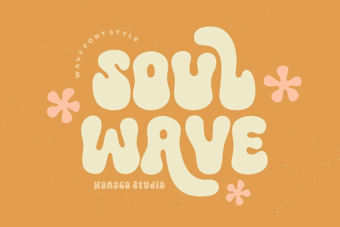
Soul Wave has tall, soft, melting letters whose stems swell and narrow like a slow wave. In cream on orange with pink flowers, it has a calm, sunny mood rather than the loud bounce of other groovy fonts.
Because the shapes are tall and soft, it fits narrow formats: candle jars, vertical posters, Pinterest pins. Keep a lot of space around it and use one flat background color so the wavy outlines stay clean.
8. Friezy Font by Font Liner
Best For: Summer festival posters, retro stickers, surf shop graphics
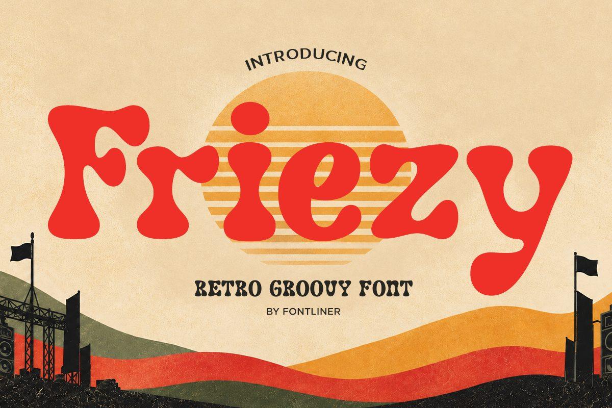
Friezy is a heavy, rounded retro face in bright red, with plump letters and a slightly bouncing rhythm. The preview places it over a hazy desert sunset with flags, which pushes it toward a road-trip and festival feel.
Use it for event names and short slogans. It holds up in a single strong color, so it is a good choice for one-color screen prints and stickers; add a thin outline or a cream offset shadow if the background is busy.
9. Hey Chunky Font by Meow Creation
Best For: Bold shirt quotes, bakery signs, retro logos
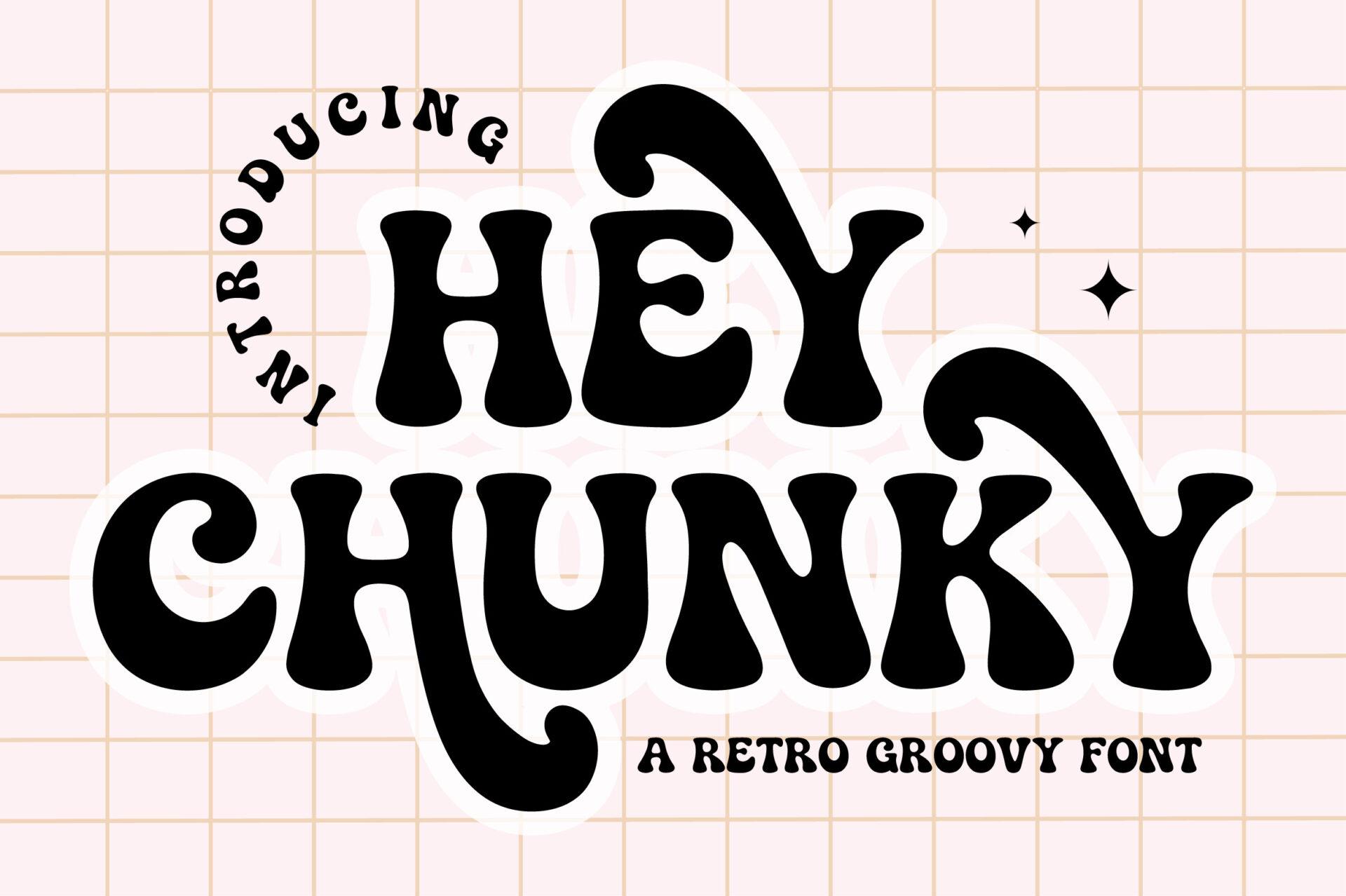
Hey Chunky is a black, very heavy retro face with flared bottoms and a curling Y tail that sweeps under the word. The weight is so dense that the counters close to small slits, which gives it a confident 70s poster look.
Set it big and in one color; the heavy shapes do all the work. It is strong for short phrases on shirts and tote bags, and the swashy letters make a good wordmark for a café or bakery. Avoid small sizes, where the narrow counters fill in.
10. Sugar Peachy Font by Dharmas Studio
Best For: Planner stickers, kids’ party invites, retro social posts
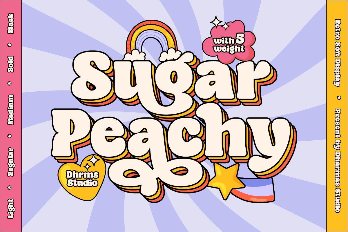
Sugar Peachy is a soft bubble-retro face with rounded letters, shown in cream with a dark outline and an offset shadow over pastel rays and a rainbow. The preview says it comes with five weights, from light to black, which is rare for a playful display.
The weight range is the reason to pick it: a heavy weight for the title and a lighter one for the subtitle keep the same retro shapes across a whole design. Pastel pink, peach and lilac suit it best.
Vintage Display Fonts
Vintage display fonts imitate old labels, saloon signs, circus posters and printed packaging. Many come with distressed textures or ornamental details, so they need a calm layout around them.
11. Honey Biscuit Font by Zetastock
Best For: Bakery labels, food packaging, vintage shop signs
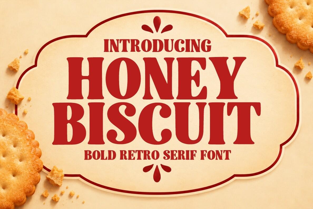
Honey Biscuit is a bold retro serif in red, with soft bracketed serifs and round, generous bowls. In the preview it sits inside a cream label frame with crackers around it, like the lid of an old biscuit tin.
It is made for food: jar labels, cookie boxes, bakery menus. Put it inside a badge or label shape, use one warm color, and pair it with a small clean serif or script for the flavor name.
12. Dusty Legend Font by riki.studio
Best For: Outdoor brand shirts, camp posters, beer labels
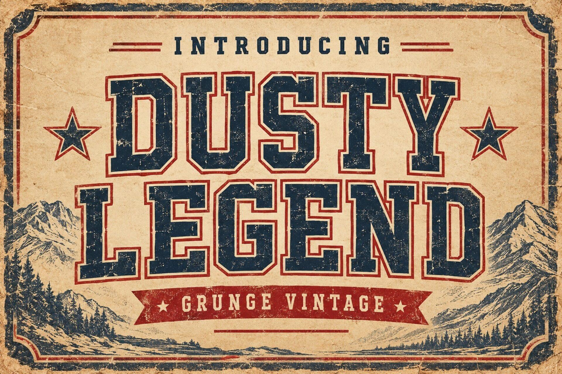
Dusty Legend is a condensed, slab-flavored capital set with a worn grunge texture, shown in navy on a parchment background with stars and a mountain scene. The rough edges are part of the letters, so it looks printed and faded right away.
It fits outdoor and Americana themes: national park posters, hiking club shirts, craft beer labels. Use it in caps on two lines, and keep the background textured or neutral so the distressing reads as intentional.
13. Luca Font by grifvixcolor
Best For: Whiskey labels, circus posters, ornate book covers
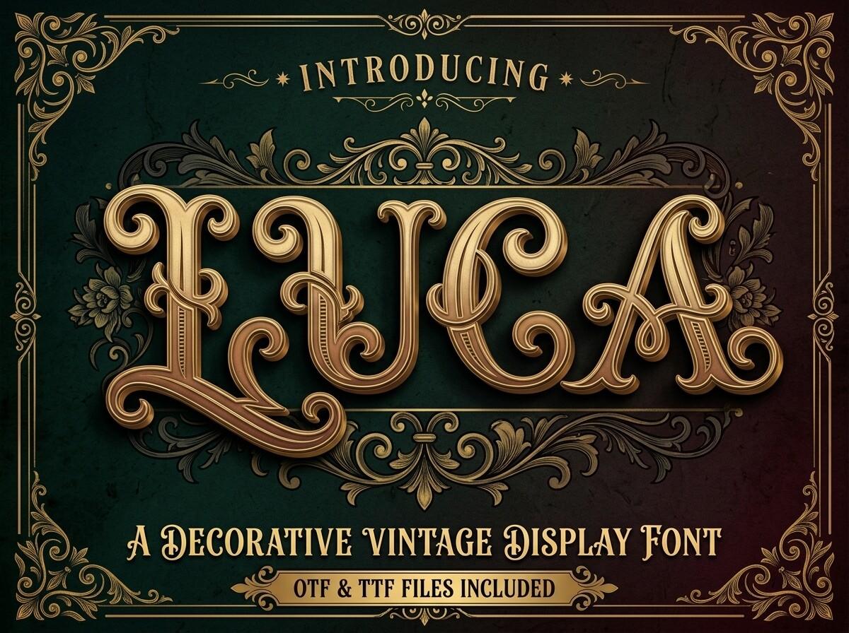
Luca is an ornate decorative capital font with inline cuts, swelling curves and Victorian flourishes, rendered in gold on deep green inside an engraved frame. The preview notes that OTF and TTF files are included.
This is a font for one or two words and a rich frame around them. Use it for a label name or a poster title and let a plain serif carry everything else; at small sizes the inline details disappear.
14. Billvane Font by BILLI
Best For: Restaurant logos, theater posters, vintage book titles
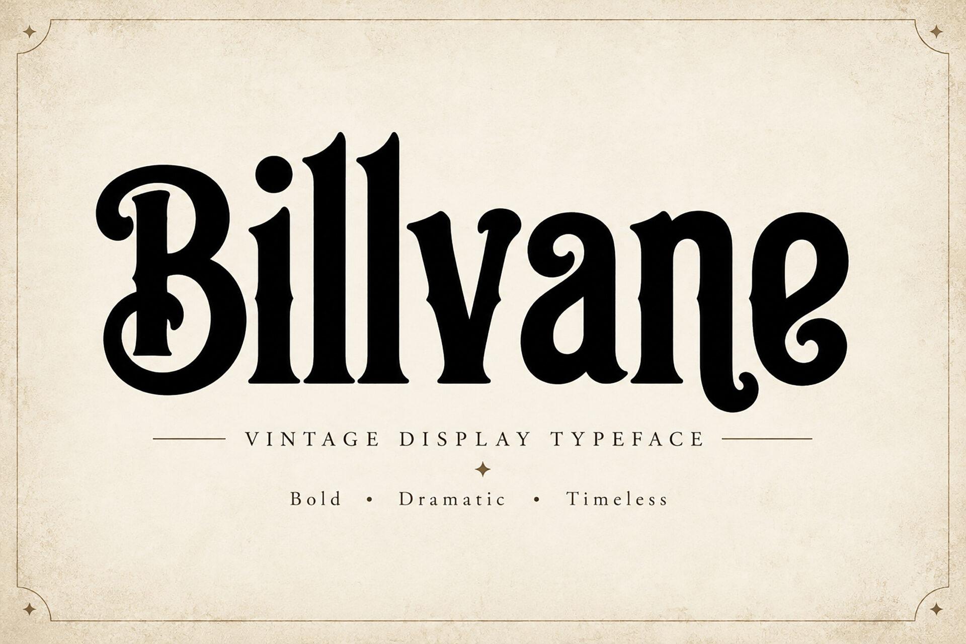
Billvane is a high-contrast black serif with ball terminals and curling hooks on letters like the B and e. The preview describes it as bold, dramatic and timeless, and the shapes do recall old playbills and saloon menus.
It works in mixed case, which is unusual for a vintage display, so a restaurant or barbershop name can be set naturally. Pair it with a thin sans for addresses and keep a cream or paper background.
15. Rustovia Font by BILLI
Best For: Western labels, barbershop logos, rustic signage
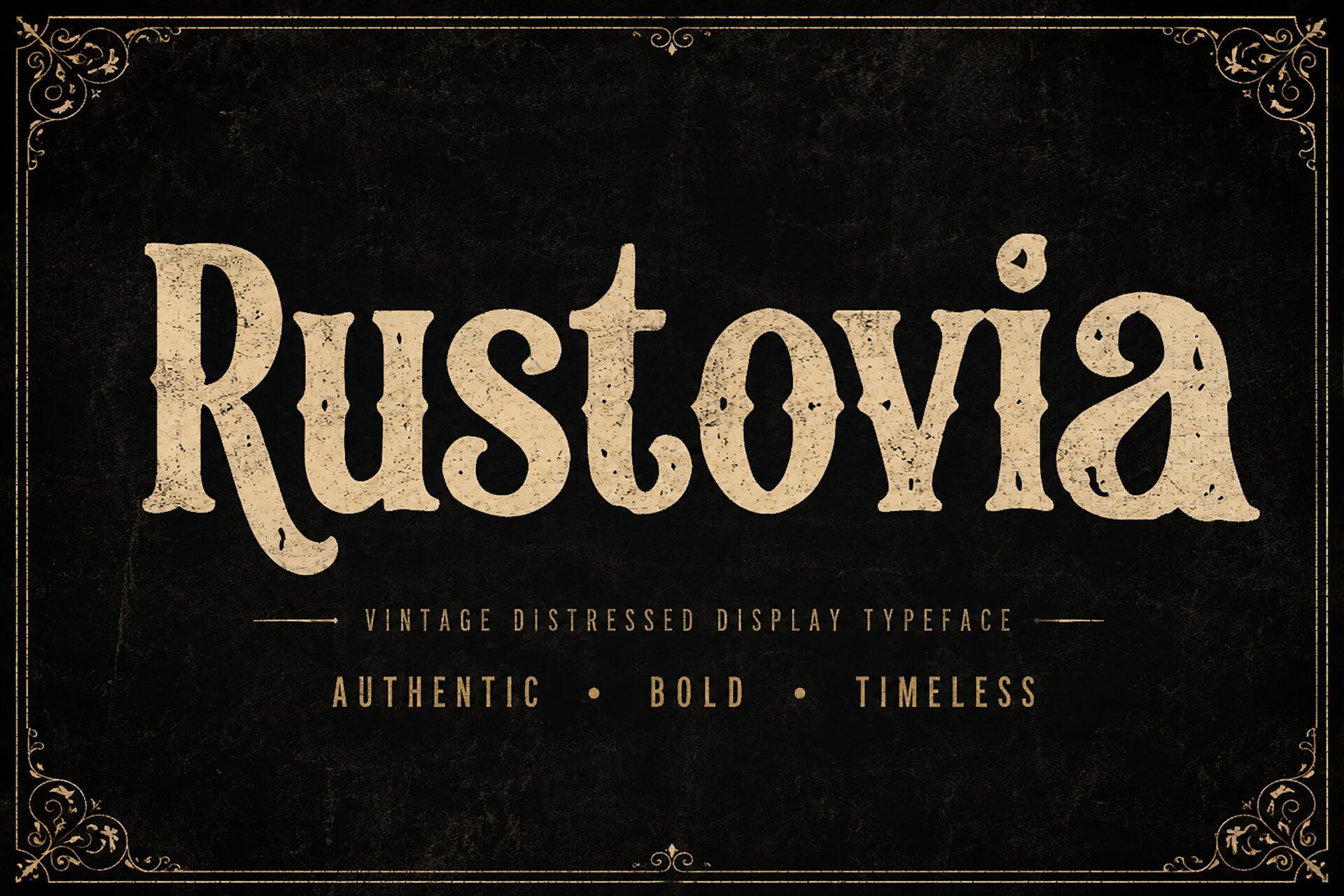
Rustovia is a cream serif with flared wedge serifs and a slightly distressed surface, set on black inside an ornamental border. The preview calls it a vintage distressed display typeface, and it has a quieter, more classical shape than Billvane from the same designer.
Use it for signs and logos that need to look established: a barbershop, a ranch, a distillery. Light letters on a dark background, as in the preview, show the texture best.
Condensed Poster and Headline Fonts
Condensed display fonts fit a lot of height into a narrow space. They are the workhorses of event posters, magazine covers and sports graphics, where the headline has to be huge but the layout is tight.
16. Gorteg Font by Maulana Creative
Best For: Event posters, sports graphics, bold packaging
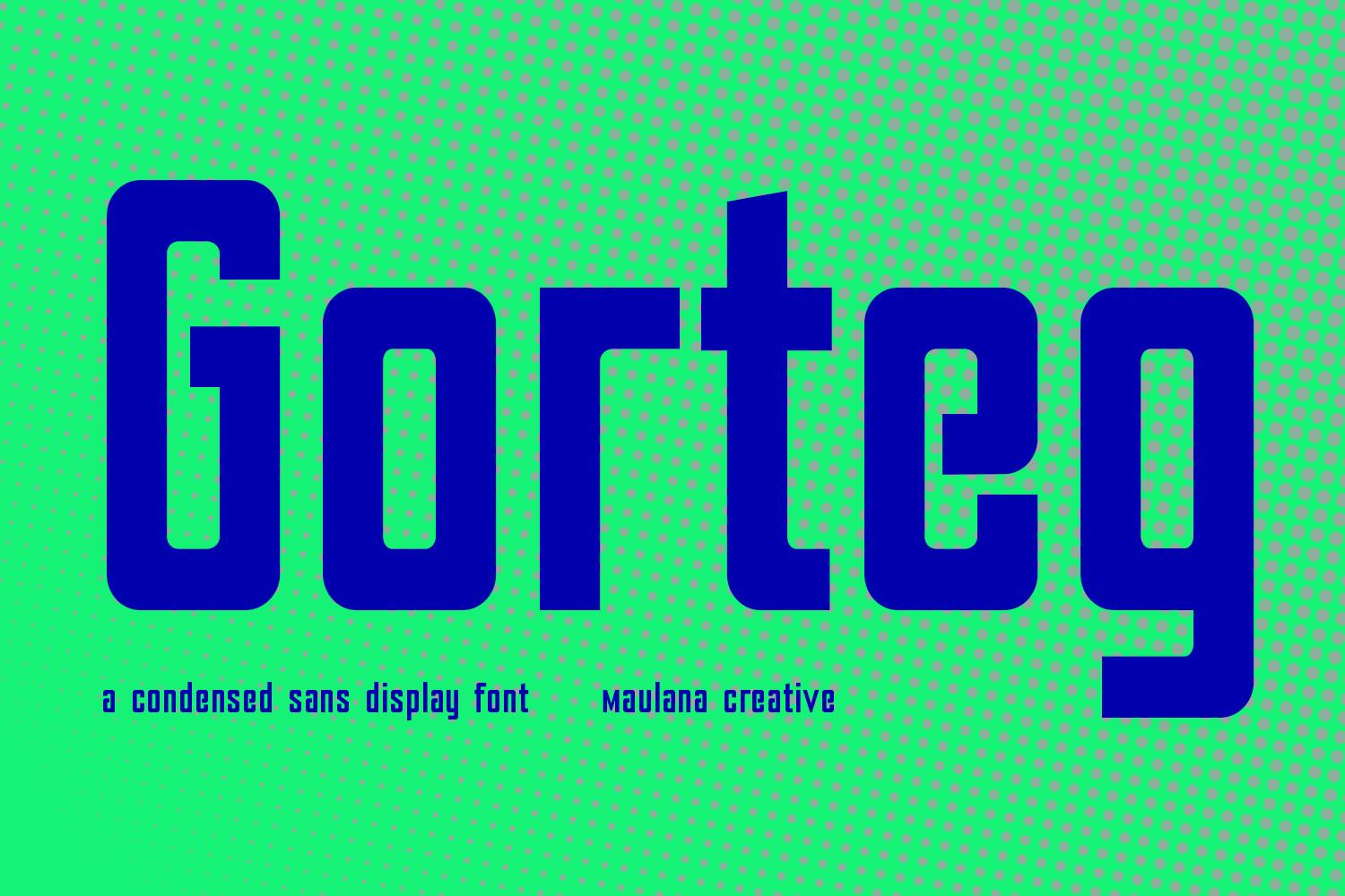
Gorteg is a tall condensed sans with squared, slightly rounded counters and straight vertical strokes. Dark blue on bright green in the preview, it looks like the headline of a gig poster or a sports drink can.
Set it big and tight: it is built to fill the top of a poster. Mixed case works as well as caps, which makes it more flexible than most condensed display fonts; use generous line spacing if you stack several lines.
17. Copzen Font by Bundle
Best For: Magazine headlines, gym branding, bold product labels
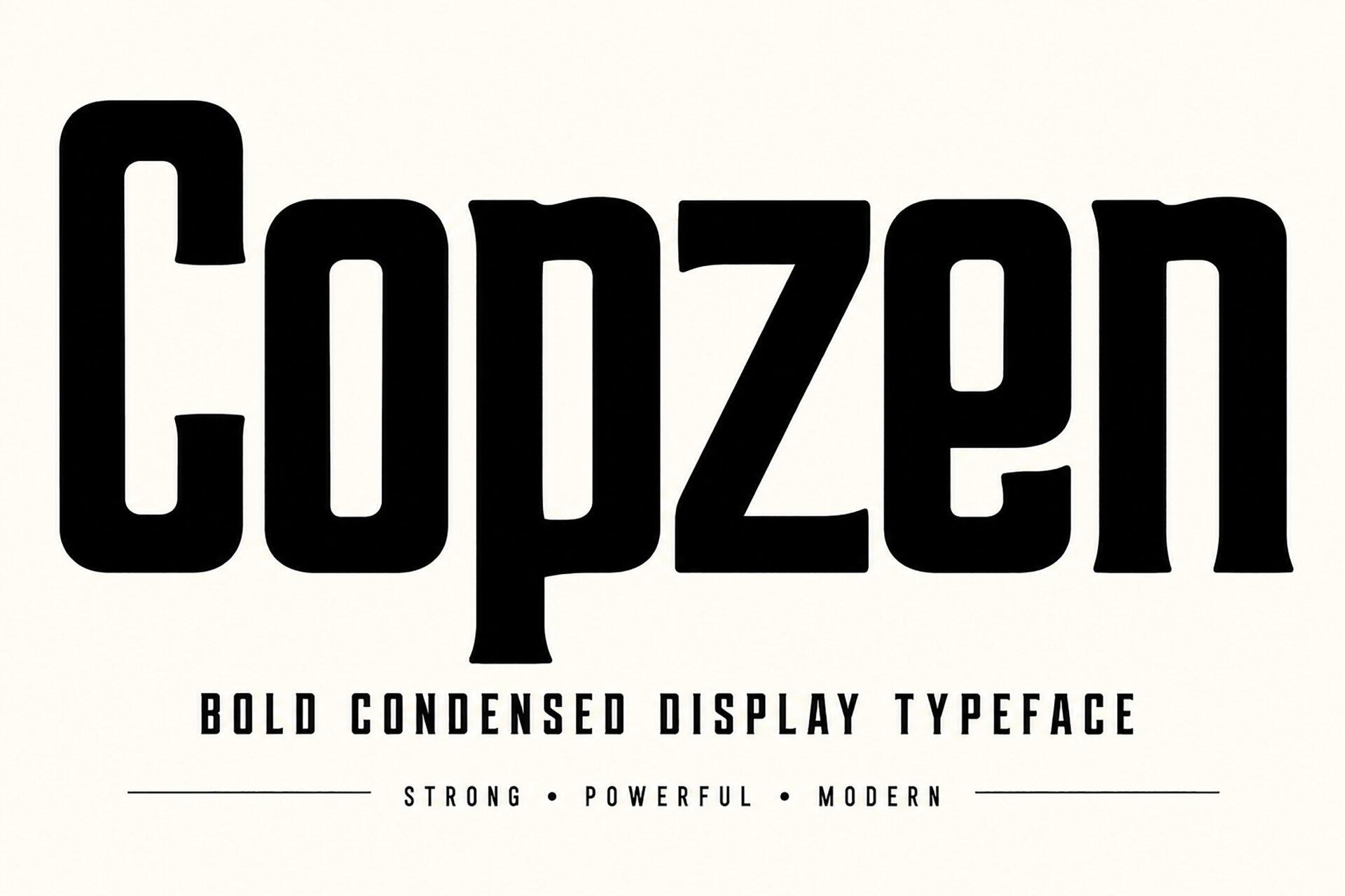
Copzen is a very tall, heavy, condensed face in black, with tight narrow counters. The preview tags it as strong, powerful and modern, and the letters fill almost the whole frame height.
Use it where you need maximum height in minimum width: a single word on a gym poster, a product name on a narrow label, a magazine cover line. Black on white or white on black keeps it sharp.
18. Eswak Font by qrdesignstd
Best For: Album covers, streetwear prints, bold social headlines
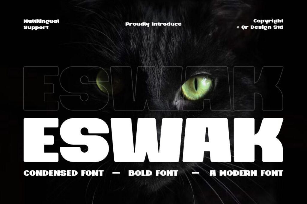
Eswak is a heavy, tightly spaced modern capital font shown in white on black, with a large outlined echo of the word behind it. The preview describes it as condensed and bold and mentions multilingual support.
The outlined-echo layout in the preview is worth copying: repeat the word in outline behind the solid version for a layered streetwear look. It is strong for album art and drop announcements on social media.
19. Bronik Font by Bundle
Best For: Concert posters, editorial headlines, fitness brands
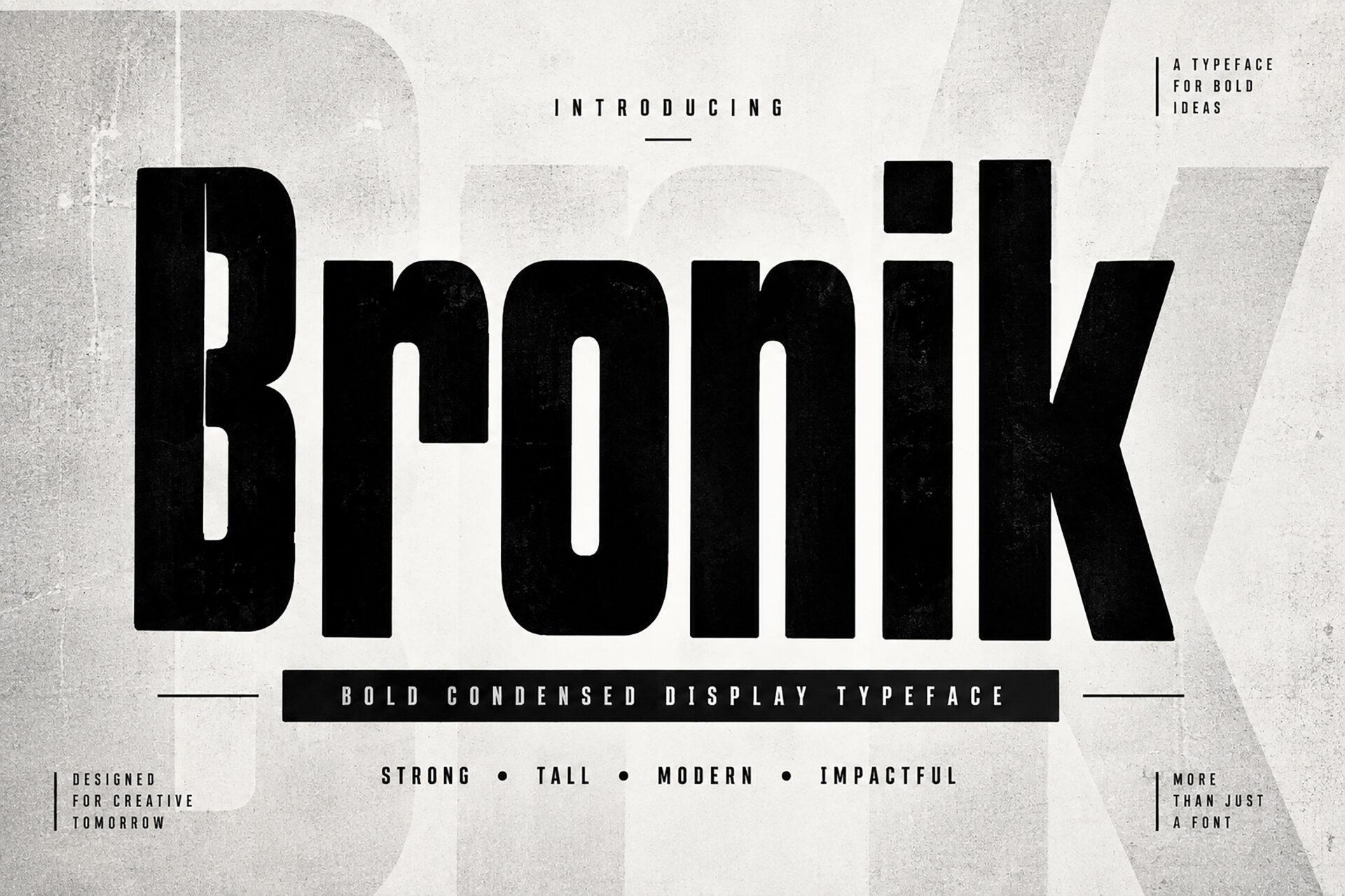
Bronik is an ultra-condensed black sans with tall, slim letters and tiny counters. The preview tags it strong, tall, modern and impactful, and it reads like the cover line of a fashion or music magazine.
Use one or two words in huge size and let white space do the rest. It pairs well with a light, wide sans for a high-contrast editorial look; avoid it in body text and small captions.
20. Torvessa Font by Colourful
Best For: Outdoor posters, adventure brands, vintage-style headlines
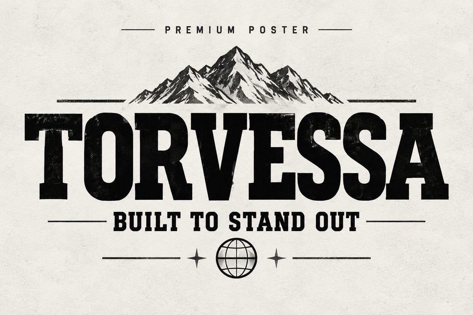
Torvessa is a bold slab serif in caps, black on a paper texture with a mountain illustration above and the line “Built to Stand Out” below. The block serifs give it a sturdy, printed-poster feel.
It is a good bridge between the poster and vintage groups: strong enough for headlines, classic enough for travel posters and adventure brands. Pair it with a small condensed sans for dates and details.
Modern Serif Display Fonts
Serif display fonts bring contrast and personality to branding: thick and thin strokes, ball terminals, sharp wedges. They look elegant at large sizes on covers, packaging and social posts, but are not meant for long paragraphs.
21. Soul Veyra Font by DREAM
Best For: Beauty brands, fashion editorials, packaging
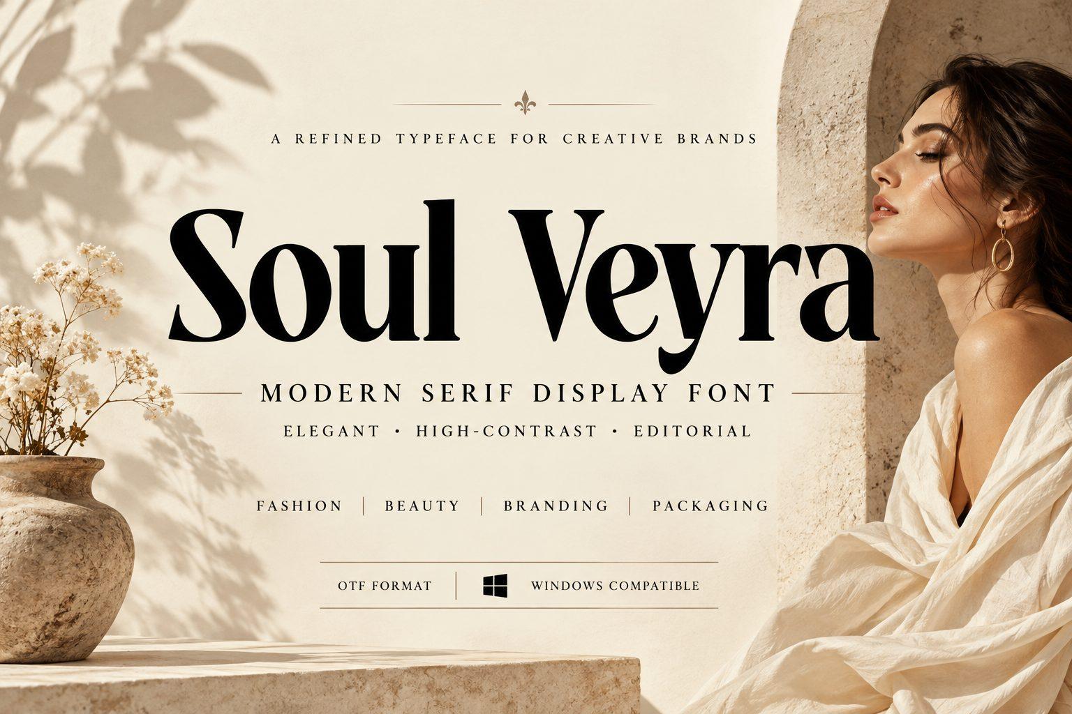
Soul Veyra is a high-contrast black serif with fine hairlines and soft rounded bowls, shown on a warm beauty photo. The preview tags it elegant, high-contrast and editorial, and lists fashion, beauty, branding and packaging as uses.
It works in mixed case for brand names and short taglines. Give it a light, warm background and plenty of space; pair it with a small spaced-out sans for the subtitle.
22. Different Cultures Font by Shakira Studio
Best For: Book covers, event posters, bold social quotes
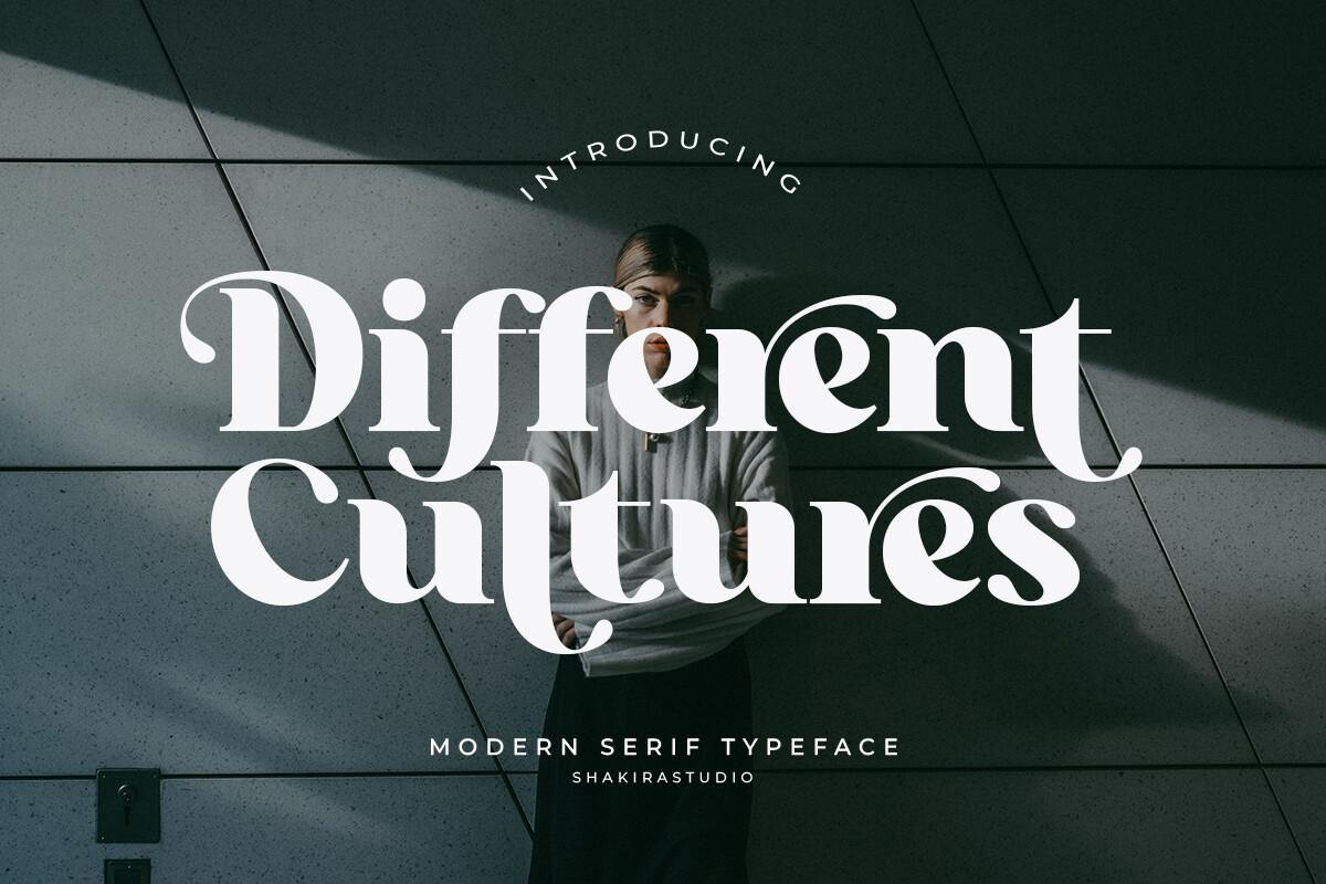
Different Cultures is a heavy serif with exaggerated curling terminals and swelling round shapes, set in white over a dark portrait. The weight and curls make it more playful than a classic serif.
Use it for a title on a dark photo, as in the preview: white letters on a moody image are its best setting. Short phrases and two-word titles work; long lines become busy.
23. Great Warrior Font by thomasaradea
Best For: Logos, posters, statement headlines
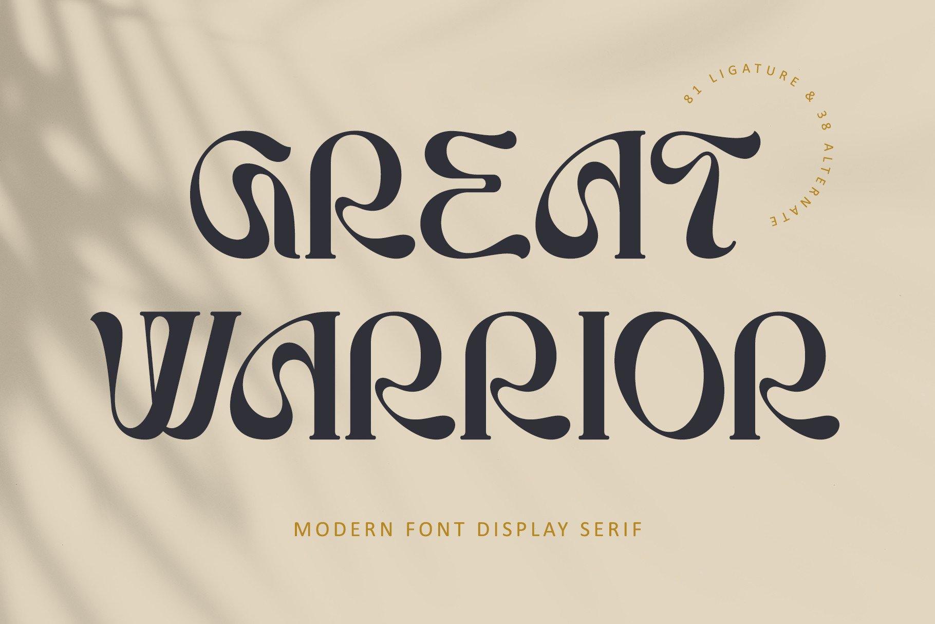
Great Warrior is a modern display serif with unusual connected shapes, like the R and A flowing into each other, in dark grey on a soft beige background. The look is part art deco, part contemporary branding.
Set it in caps for logos and headlines and use the connected letters as the design feature. A muted background and one dark color keep the shapes legible.
24. Almanac Zitole Font by afkaristudio
Best For: Luxury labels, fashion headers, theater posters
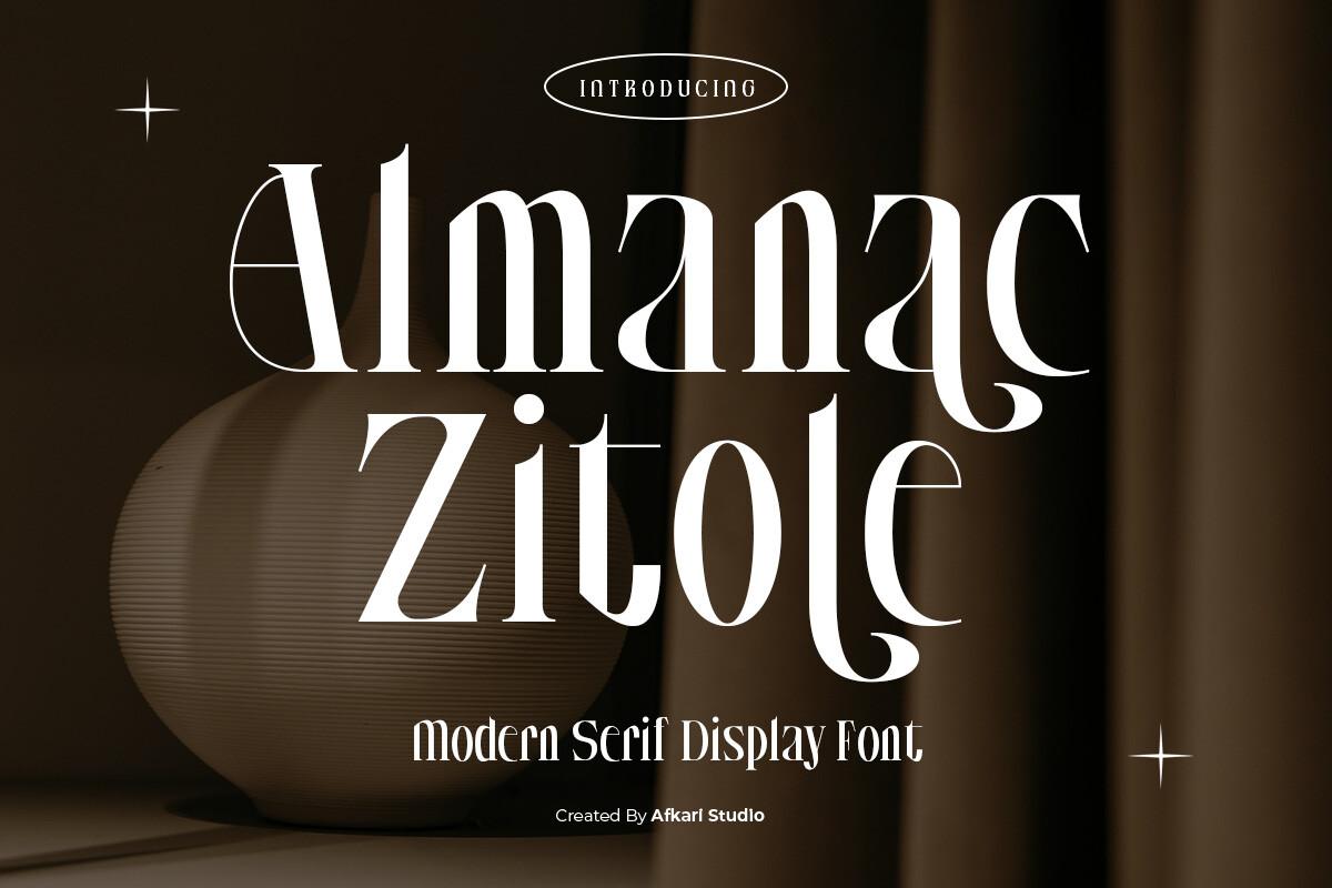
Almanac Zitole is a tall, condensed, high-contrast serif with a long swash on letters like the Z, shown in cream on dark brown. The tall proportions make it look refined and slightly theatrical.
Its narrow width suits vertical formats: perfume labels, wine labels, Pinterest pins and posters. Pair it with a script or a thin sans for the secondary line.
25. Mestika Font by Keithzo (7NTypes)
Best For: Brand wordmarks, editorial covers, minimal posters
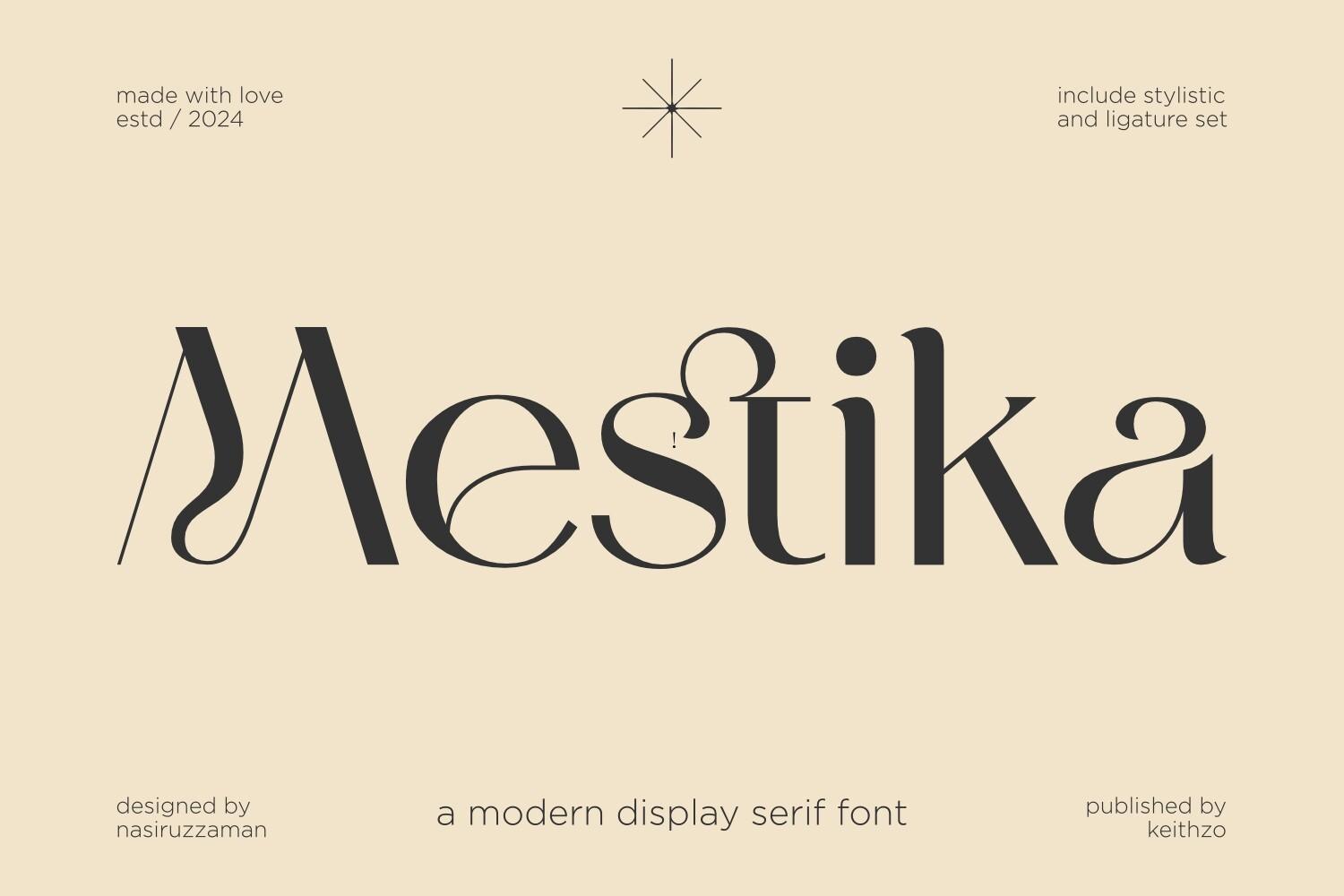
Mestika is a modern display serif with dramatic contrast: very thin hairlines and wide swelling curves, with an M that bends like a ribbon. On a beige background with a single star accent, it feels minimal and editorial.
Set one word big and keep everything else small and quiet. It is ideal for a boutique wordmark or a magazine-style cover; at small sizes the hairlines get lost.
Playful Handmade Display Fonts
Handmade display fonts keep the marks of a brush or marker. They feel friendly and personal, and they are a good fit for kids’ products, crafts and casual social posts.
26. Satru Font by Vilogsign
Best For: Kids’ products, craft shop logos, cheerful posters
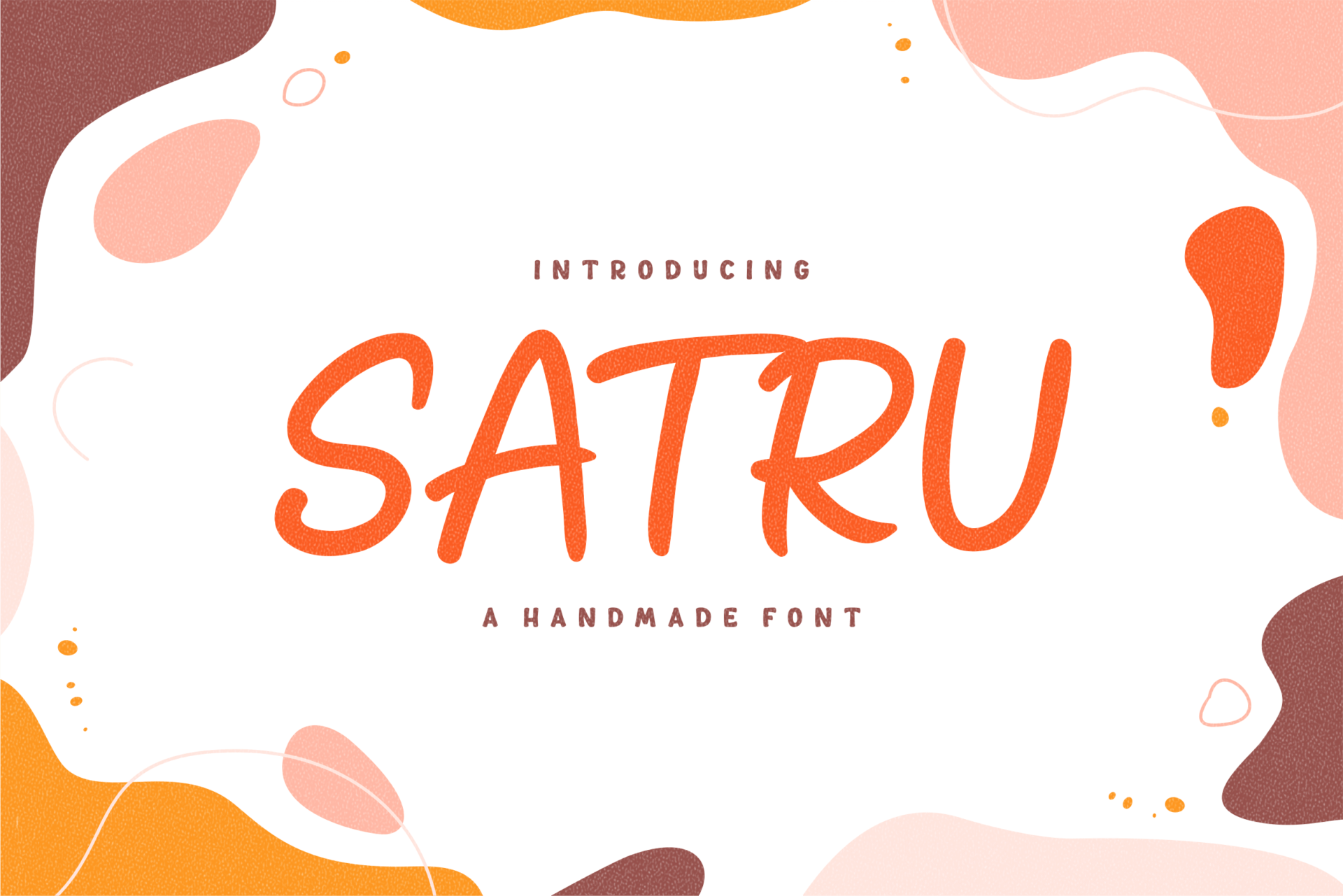
Satru is a handmade playful display with rounded, slightly uneven caps drawn in an even marker stroke. In orange on cream with pink abstract blobs, it looks hand-painted but neat.
It works for friendly brands and kids’ items where a perfect geometric font would feel cold. Use it in one bright color and pair it with a rounded sans for small text.
27. Say Hello Font by Eddygoodboy
Best For: Greeting cards, baby shower signs, cute stickers
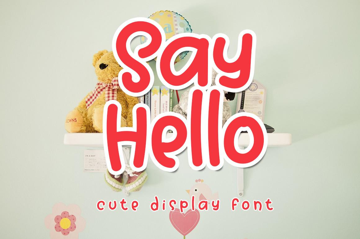
Say Hello is a thick, round handwritten display in red with a white outline, shown on a nursery shelf with a teddy bear. The preview calls it a cute display font, and the soft shapes fit that description.
Write short greetings: Hello, Oh Baby, Thank You. The outline style from the preview helps on photos and colored backgrounds; keep the rest of the design simple.
28. Fern Fronds Font by putracetol
Best For: Garden shop logos, plant stickers, nature-themed party signs
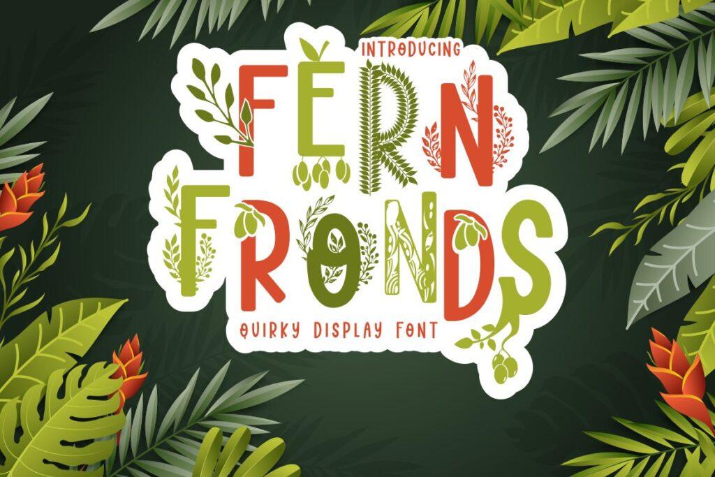
Fern Fronds is a quirky display whose capitals are filled with fern and leaf patterns, in green and orange with a white sticker border. On a jungle background it looks like a botanical sticker sheet.
The leaf details need size, so keep it to a name or a short title. It suits plant shops, garden markets and jungle-themed kids’ parties; use plain colors around it so the patterns stay visible.
29. Rekan Font by CrafterFonts
Best For: Handmade product labels, rustic signs, bold quotes
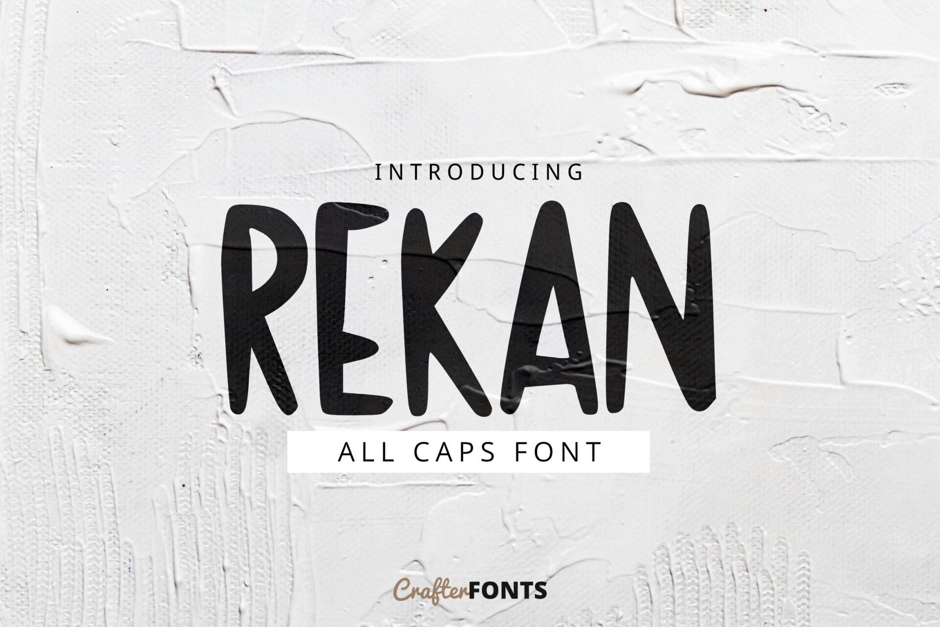
Rekan is an all-caps brush font with a dry, rough stroke, shown in black on a light textured wall. The strokes vary in width like real brush lettering, which gives it a raw, hand-painted feel.
Use it for short bold quotes, workshop signs and handmade product labels. Black on a textured light background, as in the preview, shows the dry-brush edges best.
30. Animal Cute Font by Fox7
Best For: Kids’ worksheets, zoo party invites, nursery decor
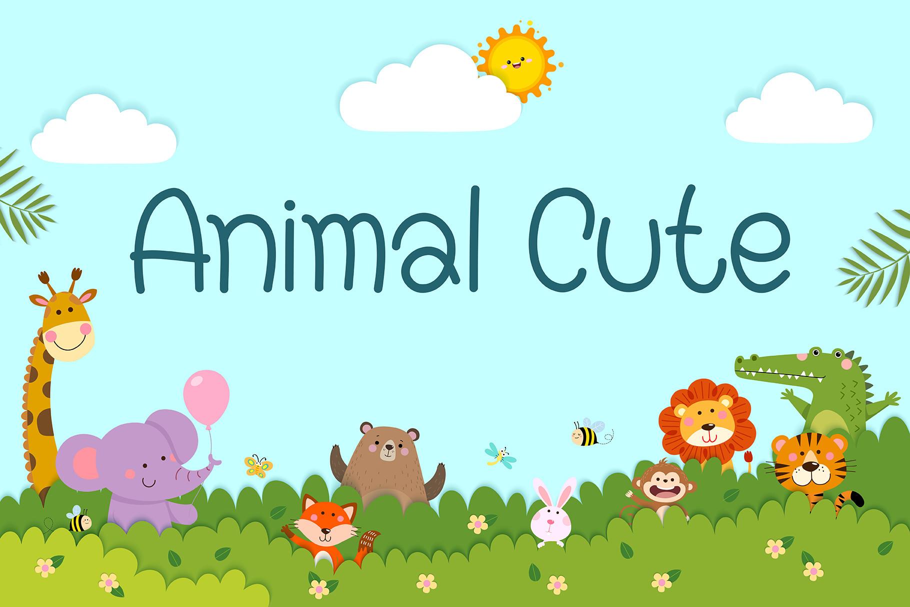
Animal Cute is a rounded monoline font in teal, with simple friendly letterforms and open counters. The preview places it above a cartoon zoo scene, and the clean shapes suit children’s materials.
It is the most readable font in this group, so it can carry more than a headline: classroom labels, worksheet titles, birthday invites. Pair it with illustrations rather than heavy decoration.
How to Choose a Display Font
Start with the mood, not the font. Cartoon and handmade styles say fun and friendly; groovy says retro and relaxed; vintage says established and crafted; condensed says loud and modern; high-contrast serif says premium and editorial. Pick the group first, then compare two or three fonts inside it.
Next, test the actual word. Display fonts change character with different letters: a font that looks great on the designer’s preview word may feel awkward with your brand name. Type the real word, look at it at the final size, and check the letters you use most.
Finally, think about where it will live. A condensed font suits narrow posters and labels, a wide cartoon font suits square social posts and thumbnails, and fonts with fine hairlines or small details need large print sizes. If the design will be cut on a Cricut or screen-printed, prefer solid shapes without thin textures.
FAQ
Can I use a display font for body text?
Not really. Display fonts are designed for large sizes and short text. In paragraphs their decoration and tight spacing make reading slow, so pair them with a plain serif or sans for anything longer than a line or two.
How many display fonts should one design use?
One is usually enough. A single display font for the headline and one simple supporting font keep a design clear; two display fonts compete for attention.
What is the difference between a display font and a decorative font?
Decorative fonts are a type of display font with ornaments, patterns or illustrations inside the letters. All decorative fonts are display fonts, but a plain condensed sans or a high-contrast serif can also be a display font without any ornaments.
Which display fonts work for logos?
Fonts that stay recognizable in one color and at small sizes: the condensed group, the modern serifs and the cleaner cartoon sans like Takugi. Heavily textured or patterned fonts work better as poster titles than as logos.
Where to Start
For a kids’ party or a playful brand, start with the cartoon group: Boozley for comic energy, Play Ink for something sweeter. For retro shirts and posters, Groove Heart and Hey Chunky carry the 70s mood. For labels and signs that should look old and trusted, try Honey Biscuit or Billvane. For loud modern headlines, Bronik and Gorteg fill the space, and for premium branding, Soul Veyra and Mestika bring contrast without noise.