Poster Fonts: 16 Groovy, Brush, Bold Script and Art Deco Styles for Gig Posters, Event Flyers and Wall Prints
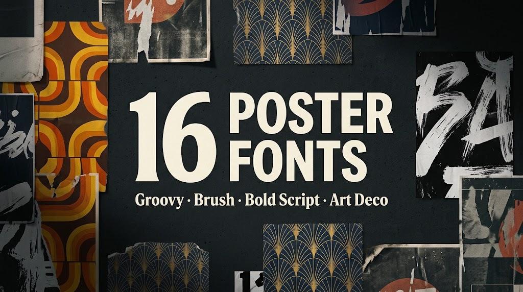
A good poster font has one job: grab attention from across the street and set the mood before anyone reads the details. This list collects 16 poster fonts from Creative Fabrica in four styles, groovy 70s letters, rough brush capitals, bold scripts and gold Art Deco, for gig posters, event flyers, shirt prints and wall art.
This post contains affiliate links. If you buy through them, I may earn a small commission at no extra cost to you.
All fonts in this list are on Creative Fabrica, and a single All Access subscription unlocks every one of them, so you can try several styles before committing to one.
More display font collections:
Display Fonts: 30 Cartoon, Groovy, Vintage, Poster and Modern Serif Styles
Table of Contents
- Groovy and Retro Poster Fonts
- Brush and Handwritten Poster Fonts
- Bold Script Poster Fonts
- Art Deco Poster Fonts
Groovy and Retro Poster Fonts
Groovy poster fonts take their cue from 70s gig bills and record sleeves: soft swollen letters, bouncy baselines and warm color stacks. They need room and a short headline, and they reward you with instant mood.
1. Camed Groovy Font by Authentic Studio
Best For: Retro concert posters, sticker sheets, summer sale flyers
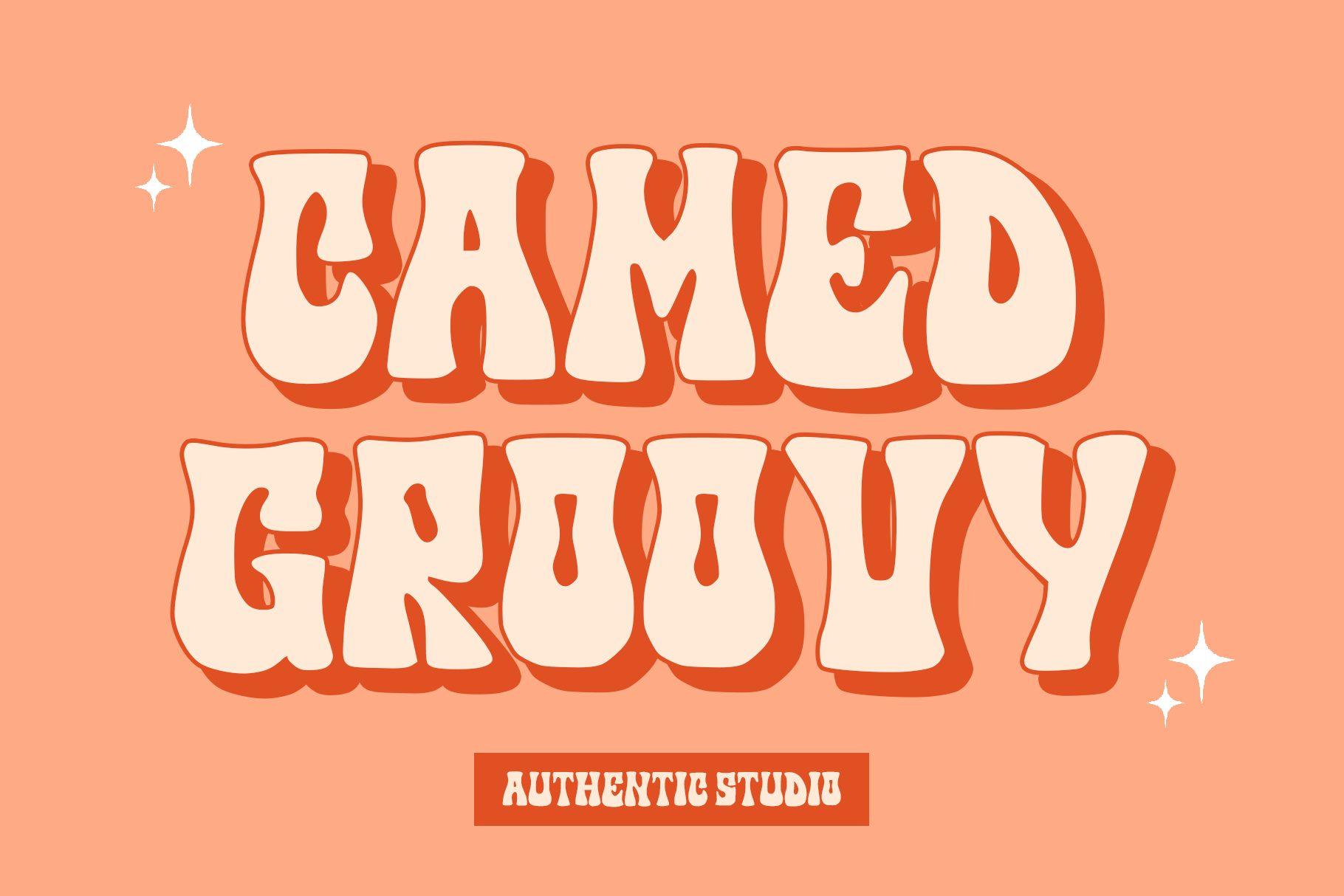
Camed Groovy is all fat rounded capitals that lean into each other, and the preview shows it stacked with a second offset layer behind the letters, cream over red on a peach ground. The shapes are wide and soft, with no sharp corners anywhere, so even a two-word line reads like a 70s album title.
Give it two or three words and a lot of space around them. The layered shadow look in the preview works best when the colors stay close in temperature, like orange, red and cream; on a busy photo background the letters lose their outline and start to blur together.
2. Stay Trendy Font by Meow Creation
Best For: Bold shirt prints, retro wall prints, Cricut decals
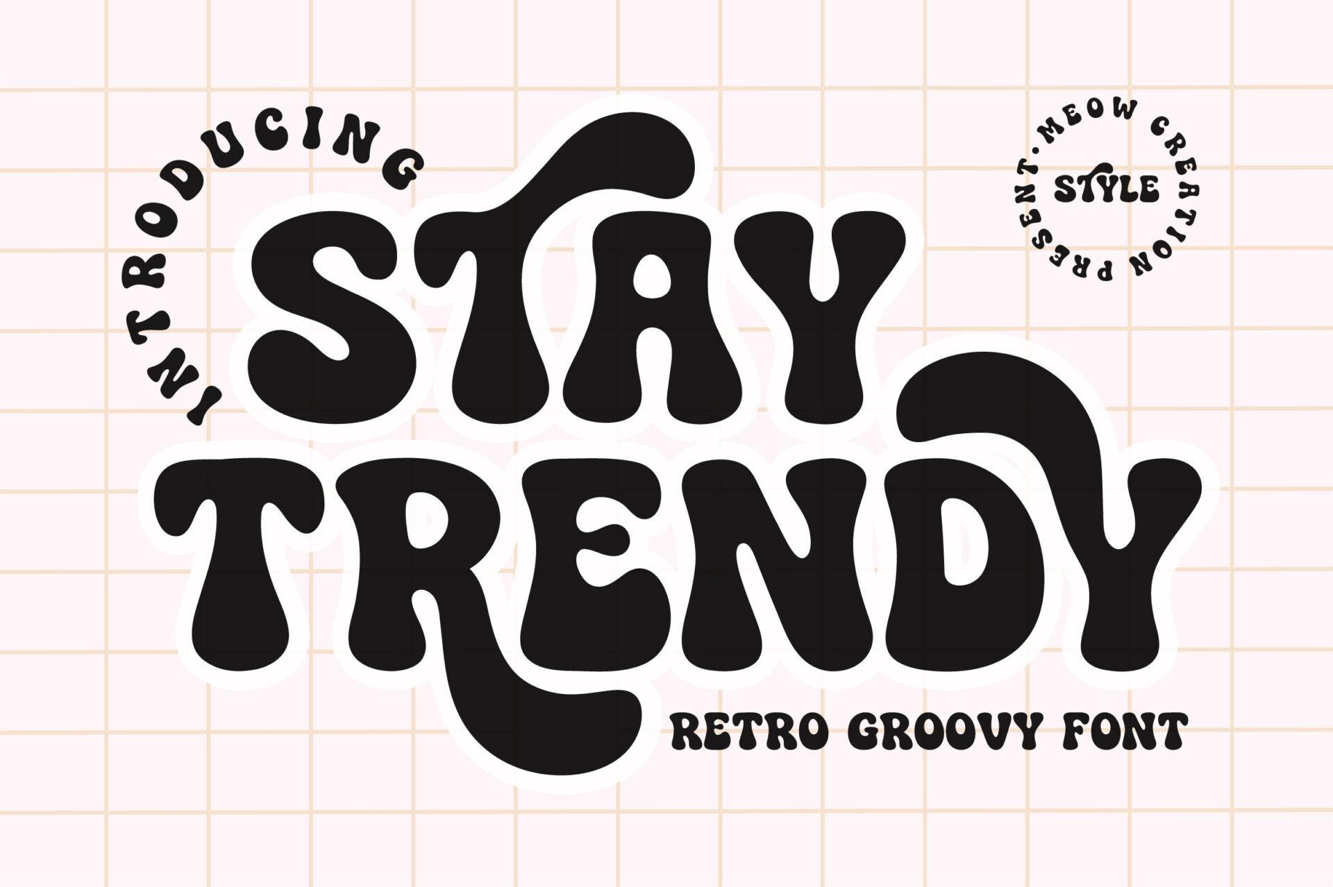
Stay Trendy is heavy, black and tightly packed. The letters swell into round terminals and sit so close together that the counters nearly close up, which gives a word a chunky, almost liquid silhouette, labeled in the preview as a retro groovy font.
This one is strongest in a single color at large size, where the tight spacing turns a word into one solid shape. At small sizes the closed-up counters make letters like R and E hard to tell apart, so keep it for the headline and set dates and venue in a plain sans.
3. Real Wavy Stacked Font by SVG Bloom
Best For: Repeated-word shirts, stacked text posters, sticker designs
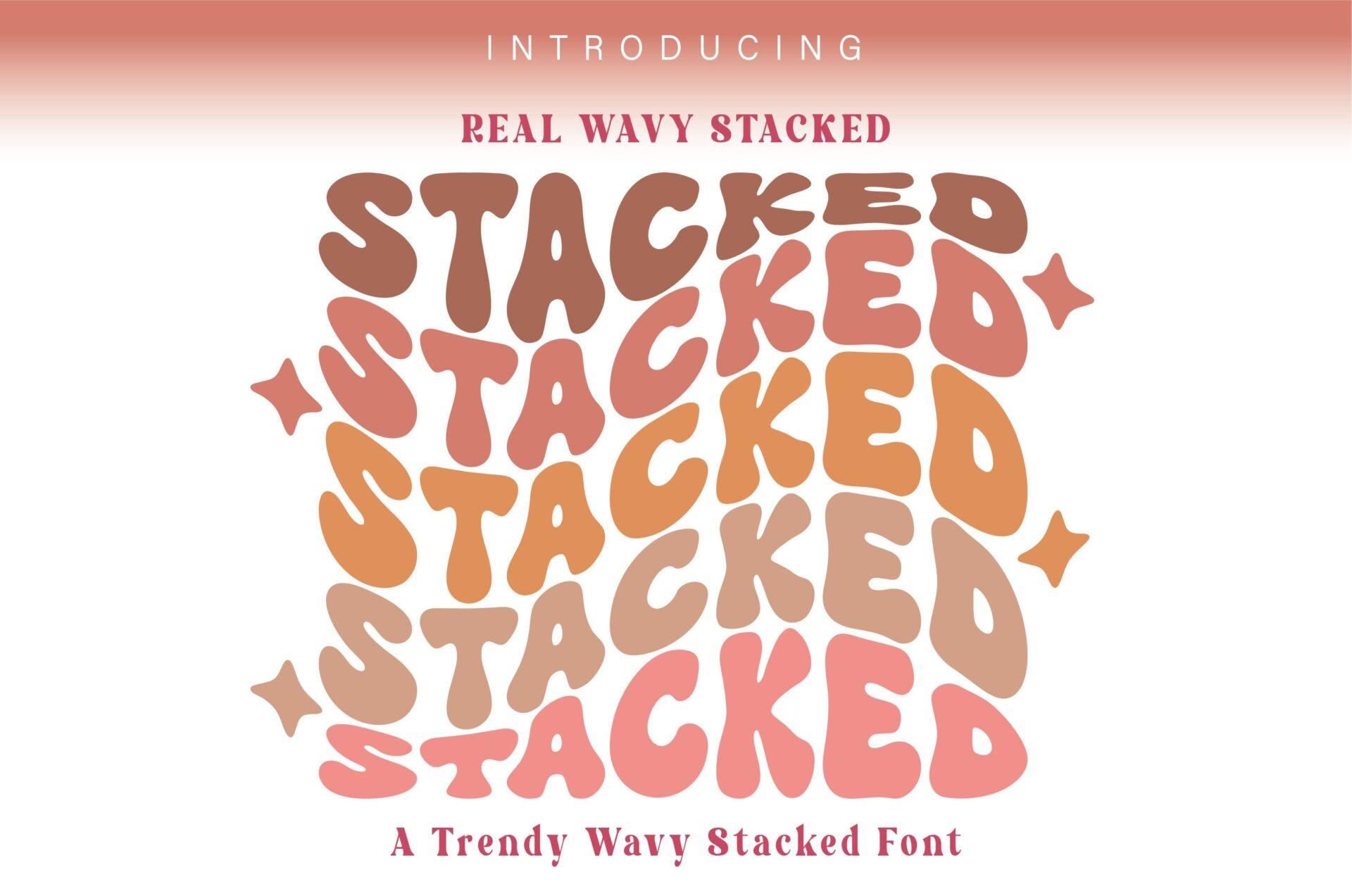
Real Wavy Stacked is built for the repeated-word look: the preview shows one word set five times in a column, each row bending in a wave and stepping through a warm gradient from orange to pink. The letters are condensed and bold, so the rows lock together without gaps.
Pick one short word, like a name, a city or a mood, and repeat it four to six times with a slight color shift per line. The effect falls apart with long words, because the wave stretches and the rows stop reading as a pattern.
4. Funky Daze Font by wtl.typography
Best For: Groovy event flyers, kids’ room prints, retro product labels
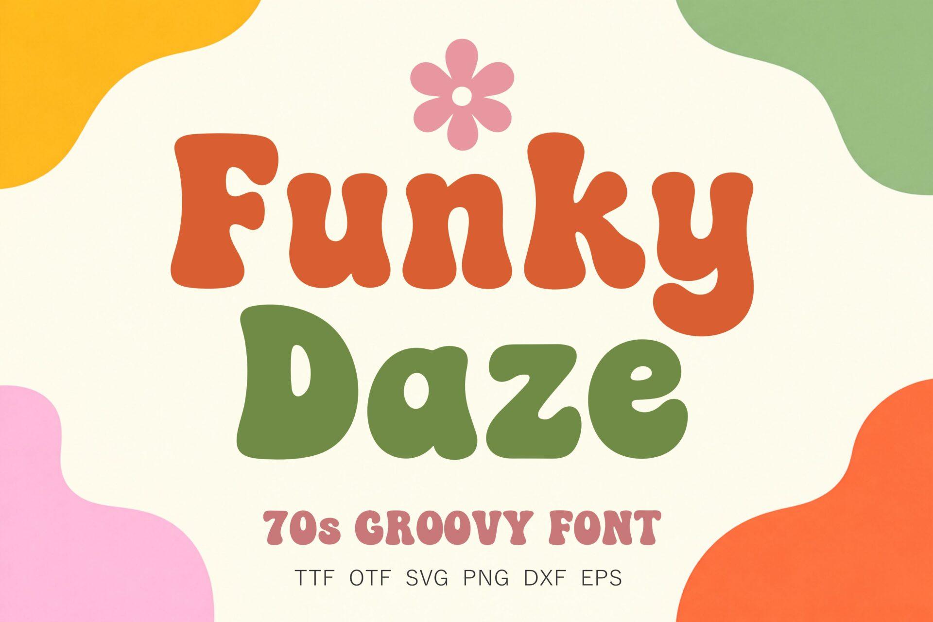
Funky Daze is labeled a 70s groovy font in its preview, and the letters show why: rounded, soft-cornered capitals and lowercase with slightly uneven weight, shown in orange and olive green on a cream ground with a flower doodle. It looks friendlier and lighter than the heavy stacked styles above.
Use it where the poster should feel warm rather than loud, such as a farmers’ market flyer or a nursery print. It pairs well with a simple rounded sans for the small print, and it holds up better in two-line layouts than the chunkier fonts in this section.
Brush and Handwritten Poster Fonts
Brush poster fonts look painted rather than drawn. Dry edges, uneven pressure and fast strokes give gig posters and street-style flyers their energy, and they forgive slightly rough printing.
5. Buzzer Font by sensatype
Best For: Gig posters, sports promos, gritty event flyers
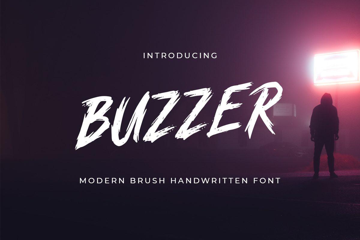
Buzzer is a slanted brush capital with ragged edges, shown in white on a dark, misty photo in its preview, where it is called a modern brush handwritten font. Each stroke ends with a dry, split tip, so the word looks like it was painted fast with a stiff brush.
It reads best in white or a single bright color over dark photography. Keep tracking normal, because the rough edges already add texture, and set the supporting details in a clean condensed sans so the poster does not turn into noise.
6. Dirty Stroke Font by saridezra
Best For: Band posters, streetwear prints, sports flyers
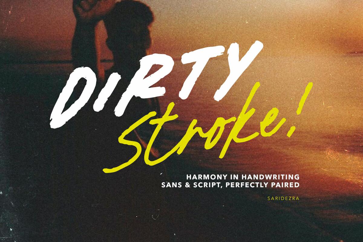
Dirty Stroke comes as a pair, as its preview spells out: a dry-brush sans for capitals and a looser brush script for accents. In the preview, white rough caps sit above a yellow script word with an exclamation mark, over a dark orange sunset photo.
The pairing does the layout work for you: put the main word in the sans and one or two accent words in the script, in a contrasting color. Avoid using the script for long lines; it is meant for a punchy second word, not a paragraph.
7. Fortieth Font by Gassstype Studio
Best For: Bold sale posters, festival flyers, shirt slogans
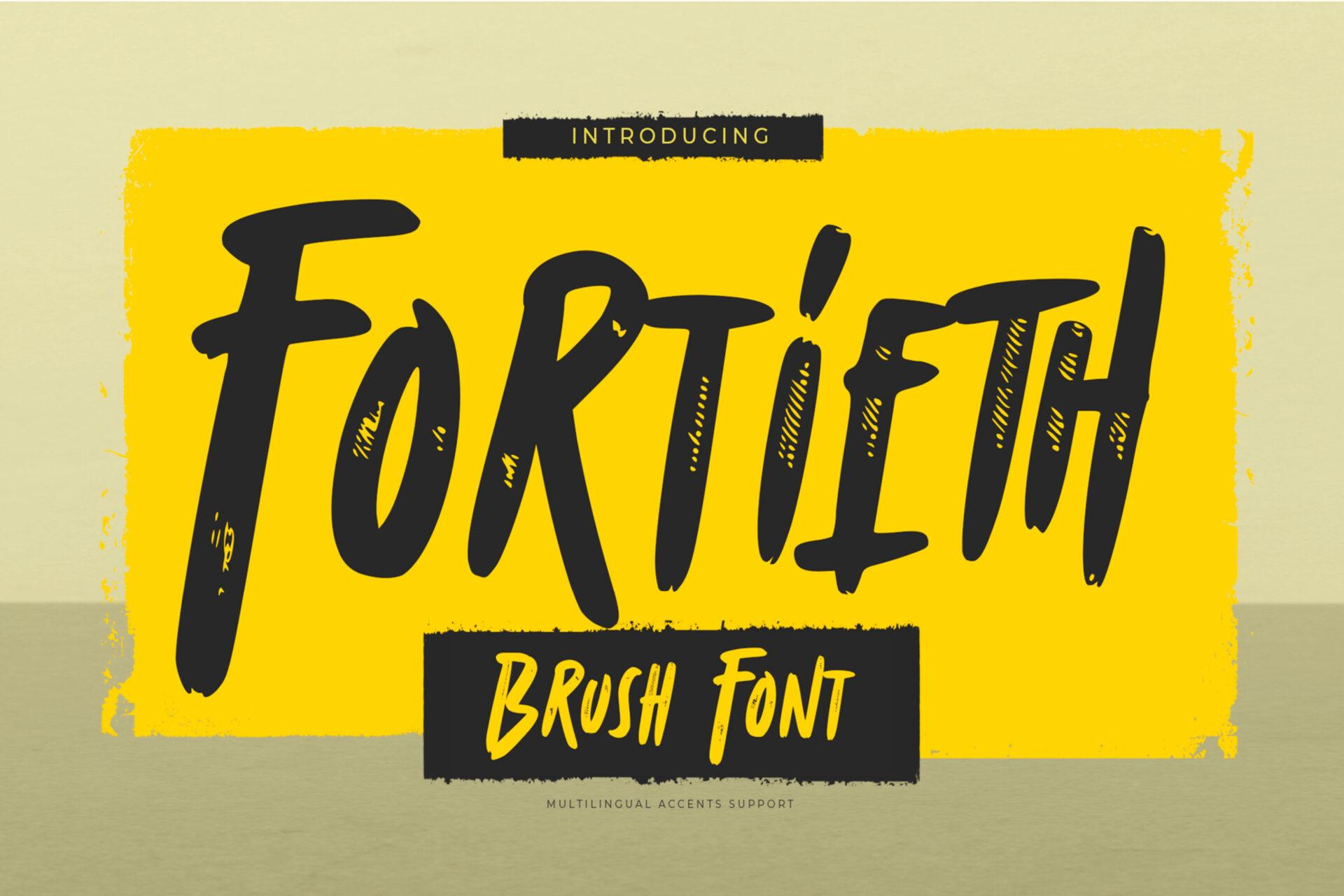
Fortieth is a heavy brush capital with thick, square-ish strokes and rough dry edges, shown in black on a bright yellow ground in its preview, where it is labeled as a brush font. It feels blunter and more upright than Buzzer.
This is a good choice when the poster must be read from across a room. Black on yellow, as in the preview, is the obvious combo; it also works knocked out in white on a red or black block. Give it short words in capitals only.
8. Headmista Font by Tebaltipis.std
Best For: Outdoor event posters, adventure brands, travel prints
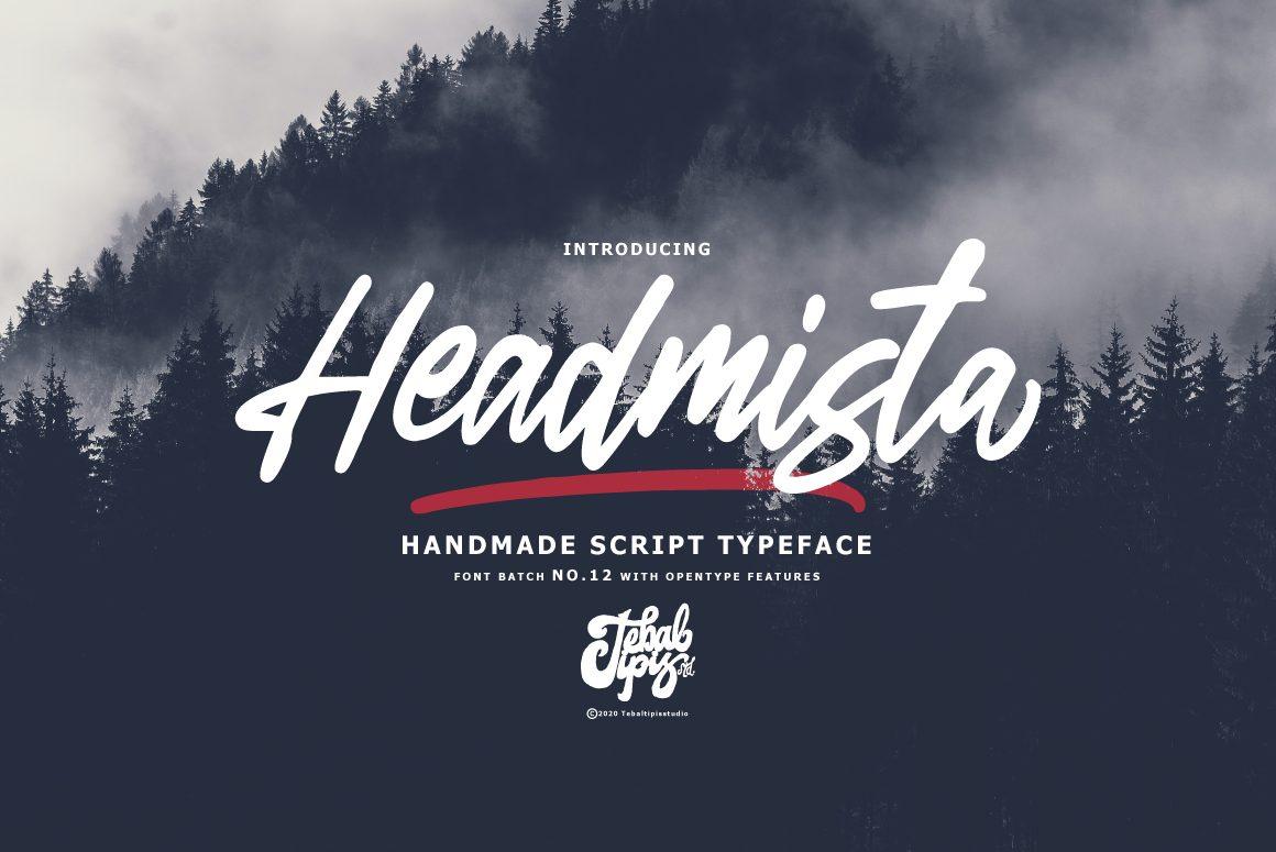
Headmista is a handmade brush script with long connected strokes, shown in white over a misty forest photo with a red brush underline in its preview, where it is called a handmade script typeface. The letters slant and flow, with natural thick-thin variation from the brush.
It suits posters built around a strong photo, where the script floats over the image. A swash underline like the one in the preview helps anchor the word; keep the second line short and set it in small, widely spaced capitals.
Bold Script Poster Fonts
Bold scripts sit between groovy and brush: connected letters, but with enough weight to carry a poster headline. They shine on single words and short phrases where a plain font would feel flat.
9. Hioganke Font by ahweproject
Best For: Retro shop posters, food event flyers, vintage-style labels
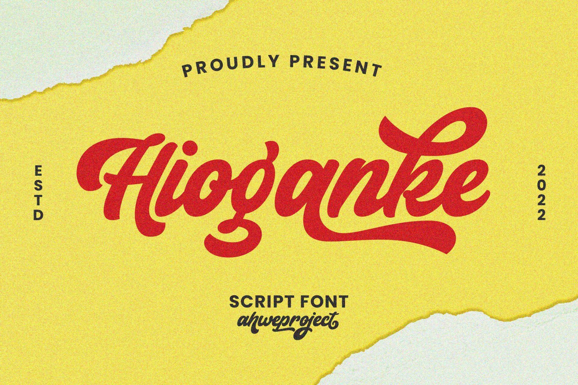
Hioganke is a heavy connected script with a sporty retro feel. The preview shows it in red on a torn yellow paper background, with long tails trailing under the word and a small badge layout around it, labeled as a script font.
Use it for one word with a tail, like a shop name or event title, and let the tail sweep under the supporting text. Red on yellow or cream keeps the vintage sign-painter look; on a dark background, add a thin outline so the thinner joins stay visible.
10. Hidroluke Font by Lettersweet
Best For: Party posters, playful wall prints, shirt designs
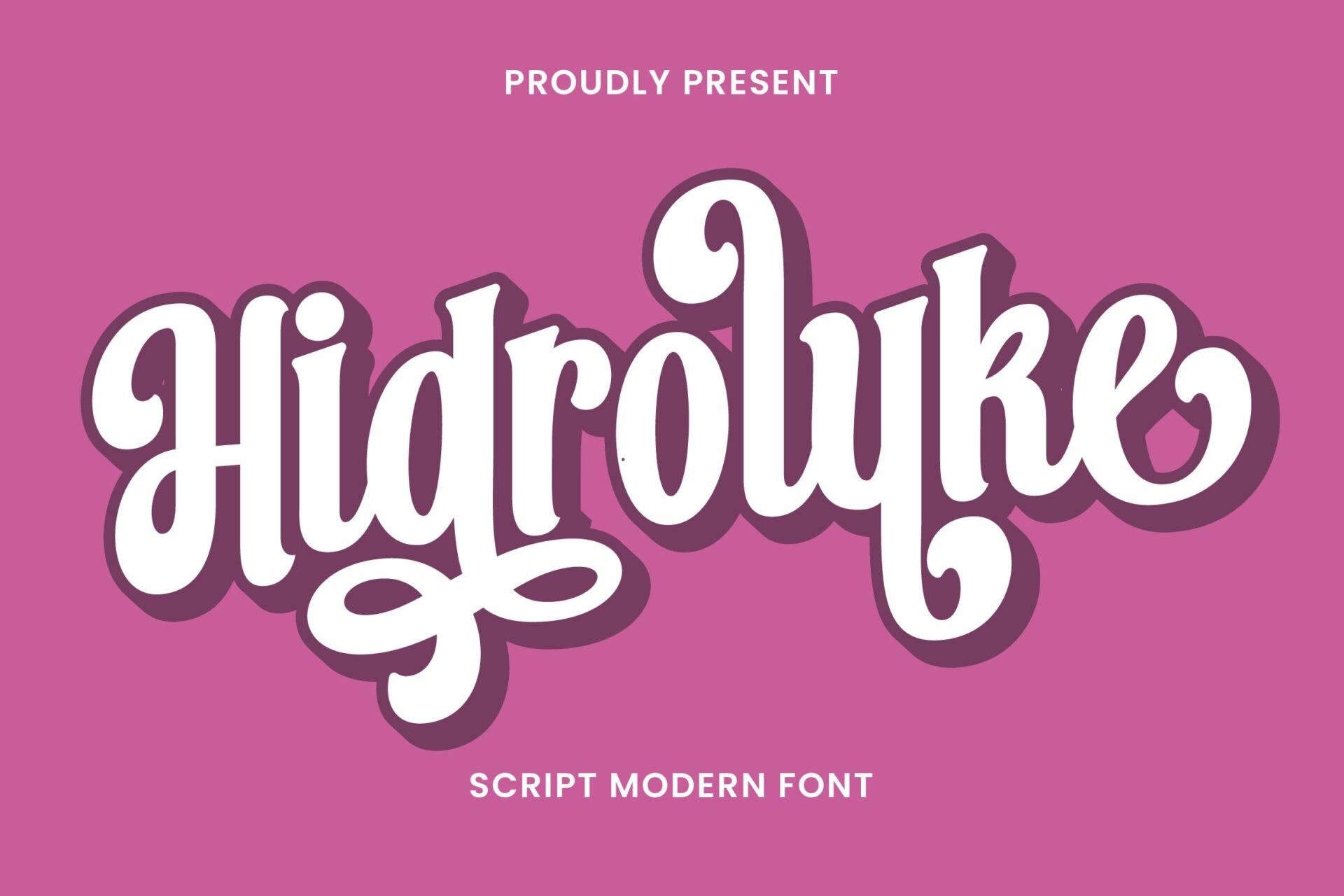
Hidroluke is a plump, bouncy script with heavy strokes and a dark drop shadow, shown in white on magenta in its preview, labeled as a script modern font. The letters jump up and down along the baseline, which makes a word look cheerful and animated.
It works best as a single headline word with a shadow, as in the preview. Set the rest of the poster in a quiet sans, because two bouncy fonts side by side compete. It is less suited to formal events.
11. Shalbie Font by TypeFactory
Best For: Movie-style posters, dramatic promos, book covers
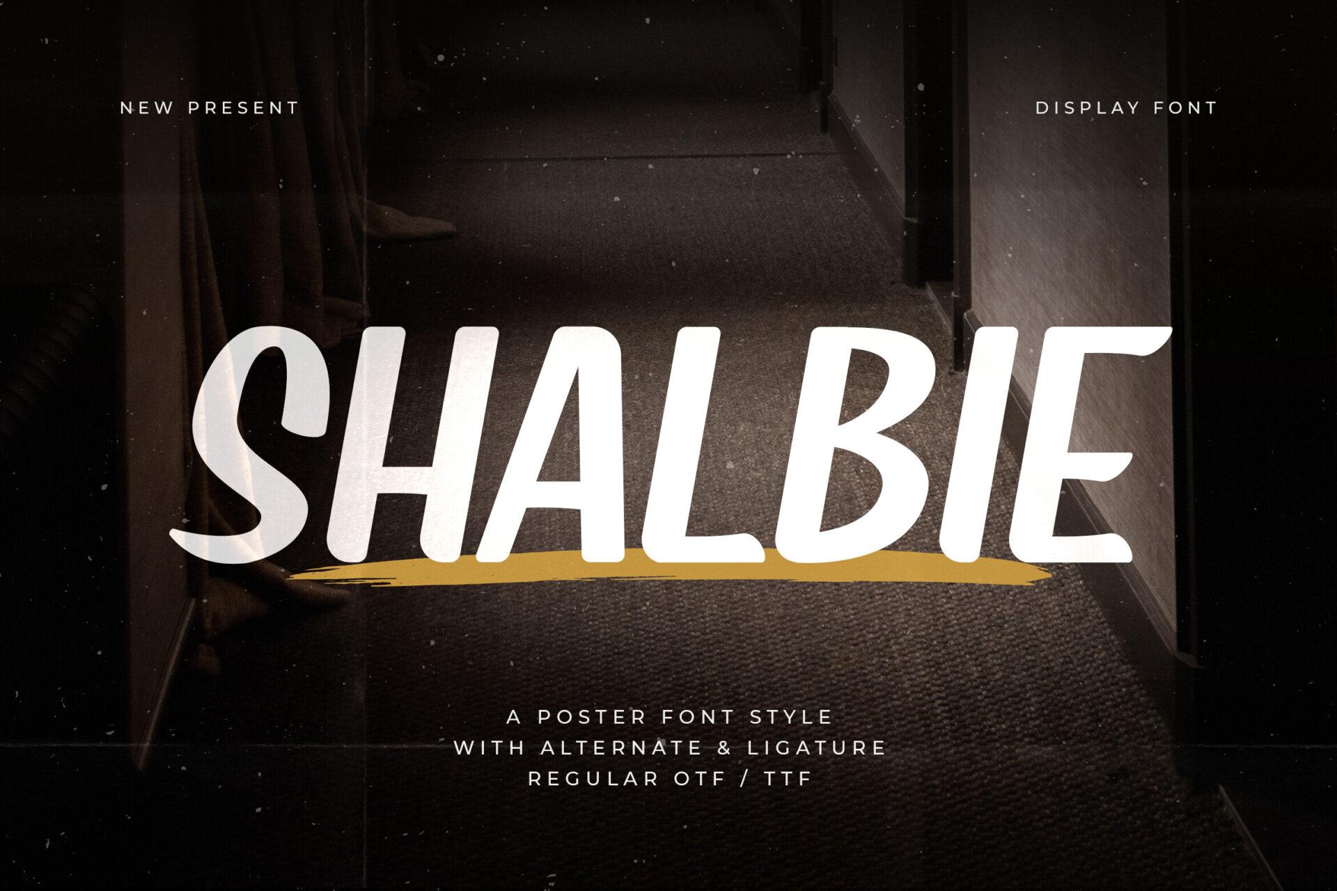
Shalbie shows up in its preview as tall white brush capitals with rough edges, set large over a dark photo, so the word reads like a film title. Compared to the scripts in this section, it is more upright and cinematic.
Put it over moody photography and keep the title to one or two words. It pairs well with small, letterspaced sans serif credits underneath, the classic movie-poster structure.
12. Santara Font by meisuseno
Best For: Music posters, streetwear graphics, bold album-style art
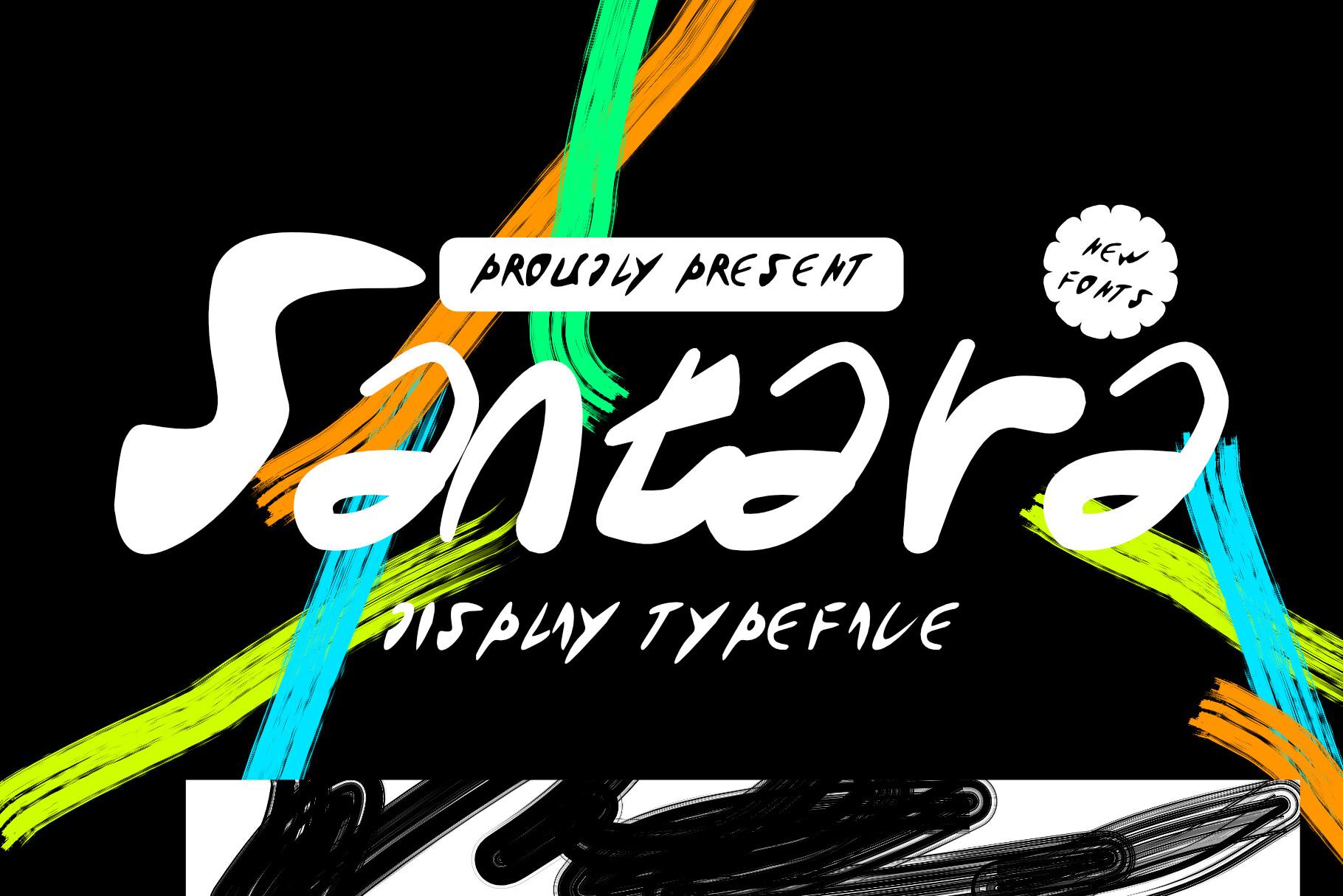
Santara is an expressive brush script with thick, fast strokes, shown in white over colorful paint swashes on black in its preview, where it is called a display typeface. The letters are wide and energetic, with sharp brush tips.
It is made for loud designs: neon colors, paint textures and black backgrounds. Keep it to a single word and use a plain bold sans for everything else, so the brush strokes stay the focus.
Art Deco Poster Fonts
Art Deco poster fonts bring 1920s glamour: geometric capitals, fan shapes and strong vertical lines. They are made for gala posters, cocktail menus and gold-on-black wall prints.
13. Aven Font by Raholco
Best For: Gala posters, Gatsby party invites, gold wall prints
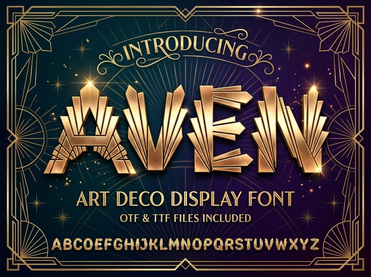
Aven is an Art Deco display capital with fan-like inner details and stepped shapes in the letters. The preview shows it in a gold metallic effect inside an ornate frame on dark green, with the full alphabet underneath, and notes that OTF and TTF files are included.
The gold texture in the preview is the designer’s mockup styling, so plan to add your own gold or foil effect. It reads best large and centered, with plenty of dark background around it.
14. Ains Font by Raholco
Best For: Cocktail menus, New Year’s Eve posters, vintage event signs
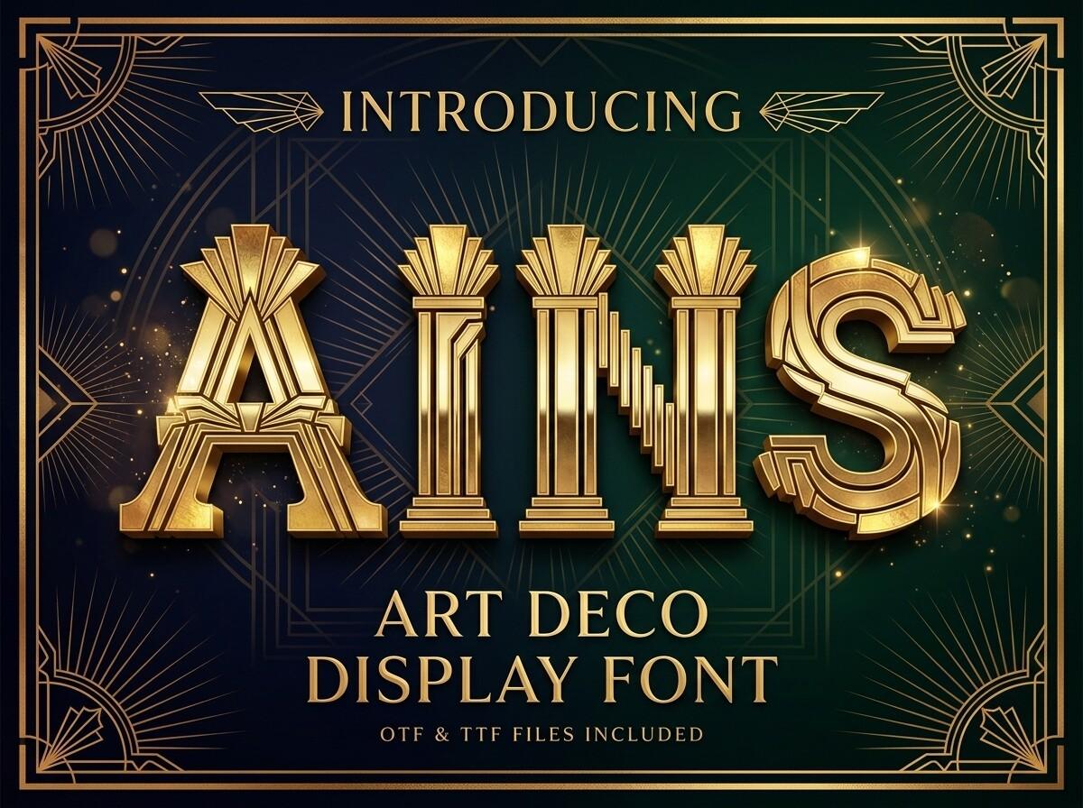
Ains is another Art Deco display capital from the same designer, with sun-ray fan ornaments built into letters like A and S. The preview shows it in gold on a dark teal background, labeled as an Art Deco display font.
Its decorative inner details need size, so use it for a two- to four-letter title or a short word. Pair it with a thin geometric sans for the details, and keep the color palette to gold, black and one deep jewel tone.
15. Cady Font by Raholco
Best For: Hotel-style signs, luxury event posters, deco labels
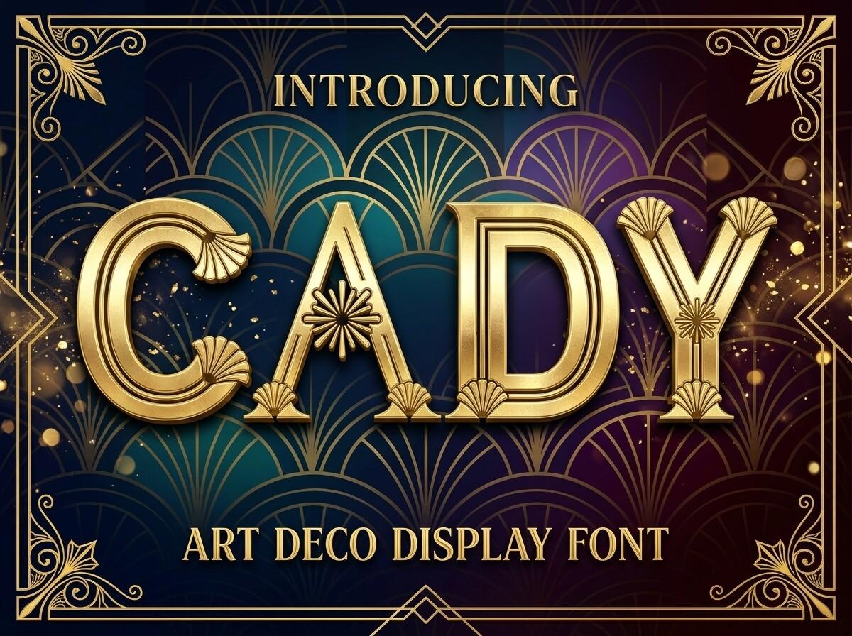
Cady has rounder, softer Art Deco capitals than Aven and Ains, with ornamental lines inside the strokes. The preview shows it in gold within a fan-pattern frame on dark teal, labeled as an Art Deco display font.
Its rounded shapes make it a little friendlier, so it works for wedding receptions or bar signage as well as galas. Use it in capitals only and give it generous letter spacing.
16. Silvadeco Font by Typia Nesia
Best For: Bar posters, minimal deco prints, premium labels
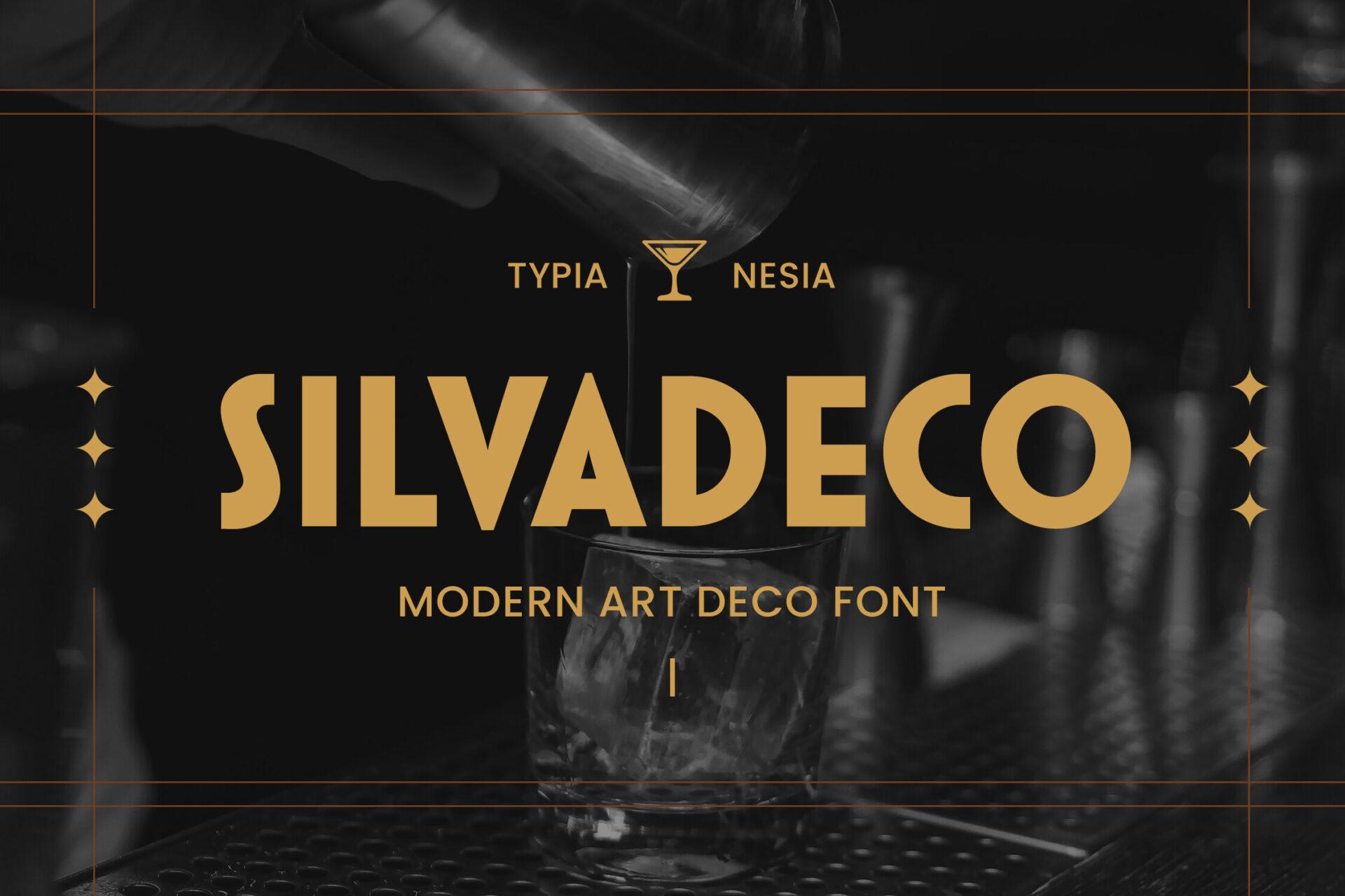
Silvadeco is a tall, thin Art Deco capital, called a modern Art Deco font in its preview, where it appears in gold on black with a small cocktail-glass emblem. It is lighter and more minimal than the three Raholco styles above.
Choose it when you want the deco mood without heavy ornament, such as a cocktail bar poster or a clean product label. It needs a dark or rich background to keep its thin strokes visible.
How to Choose a Poster Font
Start with distance. A poster on a wall is read from several meters away, so the headline font needs open shapes and real weight; heavy groovy letters, Fortieth-style brush caps and bold scripts pass this test, while thin deco styles need large sizes and a dark background.
Then match the mood to the event. Groovy styles say summer, music and nostalgia; brush fonts say energy, sport and street; bold scripts feel retro and friendly; Art Deco reads as evening, glamour and premium. Pick one display font per poster and set dates, venue and prices in a plain sans so the information stays readable.
Finally, test the actual words. Display fonts change character with the letters you type, so write the real headline before you decide, not just the font name.
Poster Fonts FAQ
How many fonts should a poster use?
Usually two: one display font for the headline and one simple sans or serif for everything else. A third font tends to make a poster look busy.
Can I use these fonts for small text?
Not really. Fonts like Stay Trendy and Real Wavy Stacked are built for big headlines; at small sizes their tight spacing and heavy shapes make letters hard to tell apart.
Do the Art Deco fonts come in gold?
The gold in the Aven, Ains, Cady and Silvadeco previews is the designers’ presentation styling. Plan to add your own gold texture or foil effect in your design app.
For more headline styles across cartoon, vintage and modern serif looks, see the main collection:
Display Fonts: 30 Cartoon, Groovy, Vintage, Poster and Modern Serif Styles