Fun Canva Fonts: 24 Bouncy, Cartoon, Wavy and Retro Groovy Styles for Birthday Invites, Classroom Posters and Shop Promos
Canva’s built-in playful fonts show up on every second birthday invite and bake sale flyer, so the same few shapes keep repeating. Uploading your own font is the quickest way to make a design look like yours. This list collects fun fonts from Creative Fabrica that work well in Canva: bouncy caps for party headlines, chunky cartoon letters for kids’ projects, wavy retro styles for shop promos and loose doodle scripts for classroom posters.
This post contains affiliate links. If you buy through them, I may earn a small commission at no extra cost to you.
Each font below comes with a note on how its letters look, where it holds up and where it starts to break, so you can pick one for the job instead of scrolling through hundreds.
All fonts in this list are on Creative Fabrica, and a single All Access subscription unlocks every one of them, so you can try several styles before committing to one.
More Canva font collections:
33 Canva Fonts to Upload
Free Canva Fonts
Cute Canva Fonts
Whimsical Canva Fonts
Cool Canva Fonts
Fun Fonts
Contents
Bouncy and Cartoon Fun Canva Fonts
1. Booom Font
2. Sweet Cookies Font
3. Fierce Chunky Font
4. Reaktion Kids Bold Font
5. Hype Rock Font
6. Retro Munch Font
7. Ice Cream Cone Font
8. Gliter Surprise Font
Retro and Groovy Fun Canva Fonts
9. Madista Vintage Font
10. Gencity Font
11. Moment Sunlight Font
12. Barbie Room Font
13. Thick Amore Font
Handwritten and Doodle Fun Canva Fonts
14. Ghinna Joyfun Font
15. Milky River Font
16. Madison’s Tail Font
17. Friday Feels Font
18. Skit Cut Font
19. Think Font
20. Holiday December Font
21. Ragamuffin Font
Fun Canva Font Duos
22. King Jelly Font
23. Pretty Summer Font
24. Grandma House Duo Font
How to Choose a Fun Font for Canva
How to Upload These Fonts to Canva
FAQ
Bouncy and Cartoon Fun Canva Fonts
1. Booom Font
Booom Font by Rashdrawn
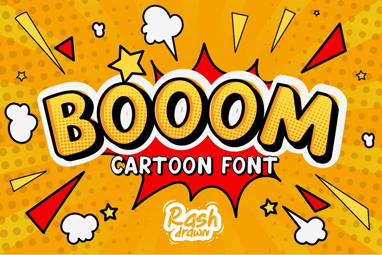
Best For: Comic-style sale banners, kids’ party headlines and one-word stickers
Booom is a heavy cartoon face with thick outlines and letters that lean into each other like a comic sound effect. The shapes are rounded at the corners, so even at full weight it reads cheerful rather than aggressive.
Give it one or two words and lots of room. In Canva it looks best on a bright flat background with a contrasting outline or shadow; a full sentence in Booom gets crowded fast, so pair it with a plain sans for any details.
2. Sweet Cookies Font
Sweet Cookies Font by Fontlicious
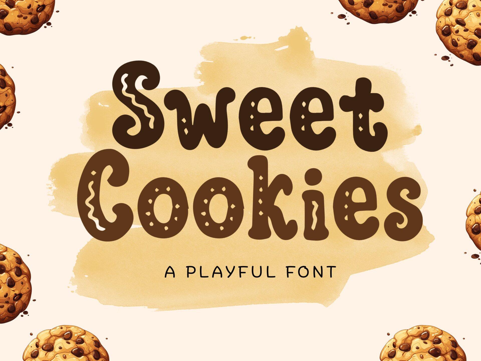
Best For: Bake sale flyers, cookie labels and cosy café menus
Sweet Cookies has soft, puffy letters with a thin inner line that looks like piped icing. Letters sit at slightly different heights, which gives the word a homemade, wobbly rhythm.
Brown or warm caramel tones suit it best, exactly as the preview shows. Use it for the name of the treat or the event title, and keep prices and dates in a simple rounded sans so they stay easy to scan.
3. Fierce Chunky Font
Fierce Chunky Font by Anto (7NTypes)
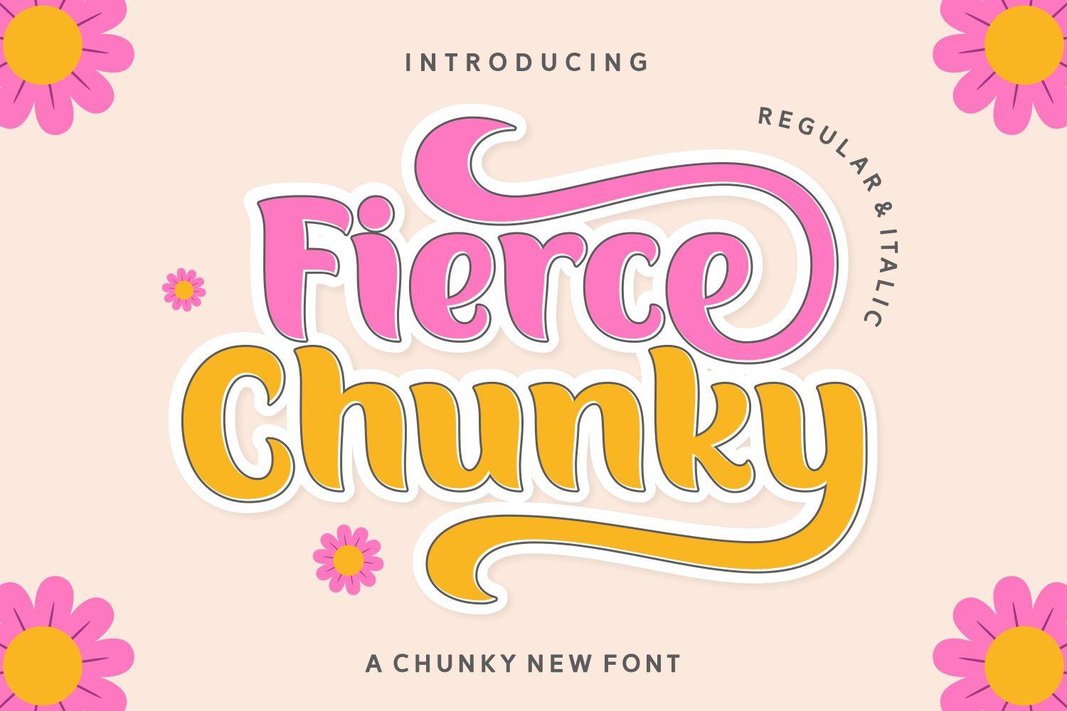
Best For: Retro birthday invites, flower-power posters and bold shirt slogans
Fierce Chunky is a fat, swashy display face with curled terminals and a playful seventies bounce. The preview shows both an upright and an italic style, so you get a little movement when one word needs to pop.
Stack two short words and colour them differently, the way the preview mixes pink and mustard. The swashes need space on the sides, so avoid squeezing it into narrow Canva text boxes.
4. Reaktion Kids Bold Font
Reaktion Kids Bold Font by TonisArtStudio
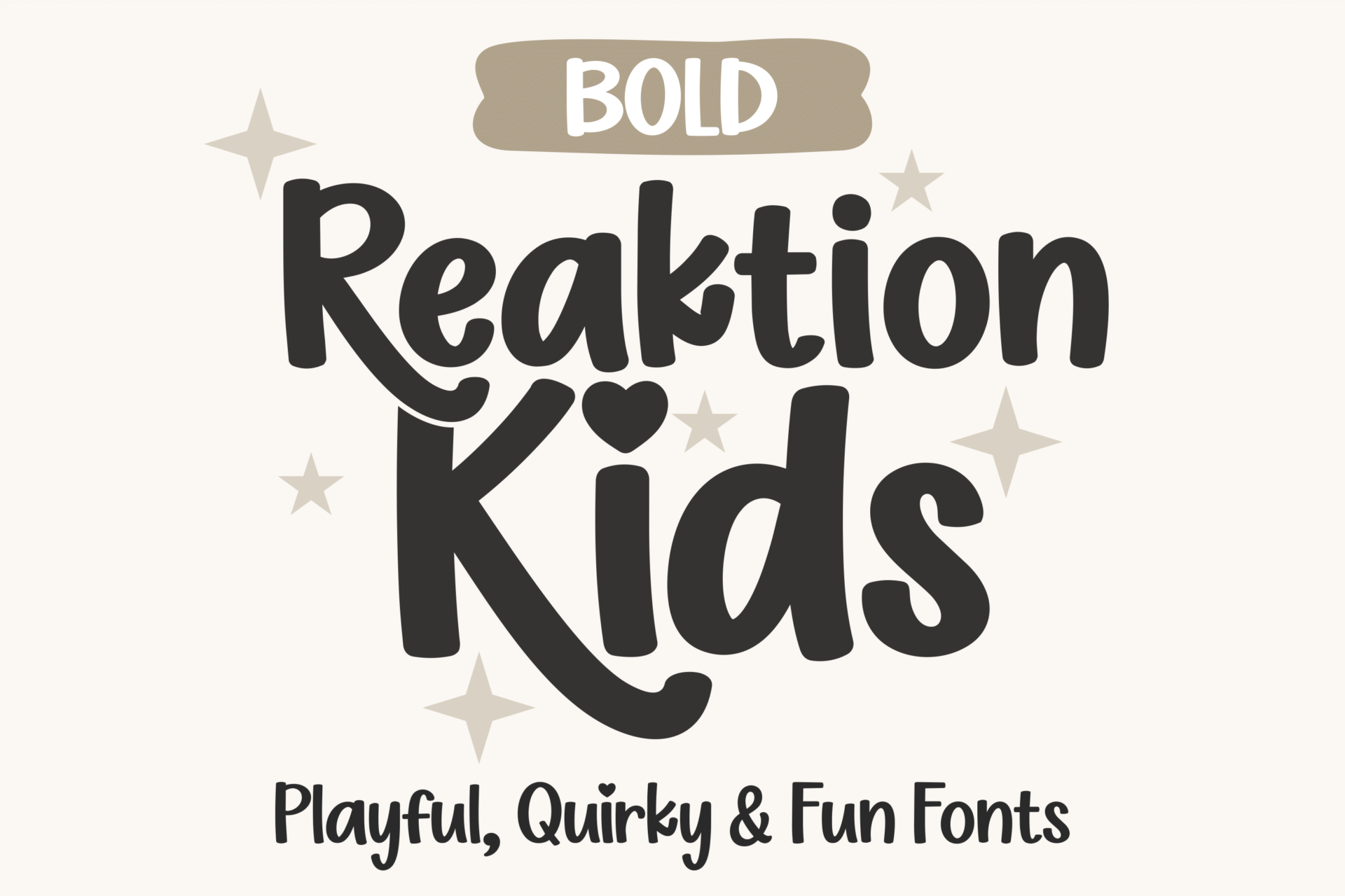
Best For: Kids’ class posters, toy shop logos and playroom signs
Reaktion Kids Bold is a rounded, heavy sans with slightly uneven letters, as if they were cut out by hand. Counters are open and generous, which keeps words legible from across a room.
It is one of the most readable picks on this list, so it can carry a short headline plus a subline. Try it in a single dark colour on pastel; the shapes are lively enough without extra effects.
5. Hype Rock Font
Hype Rock Font by Typia Nesia
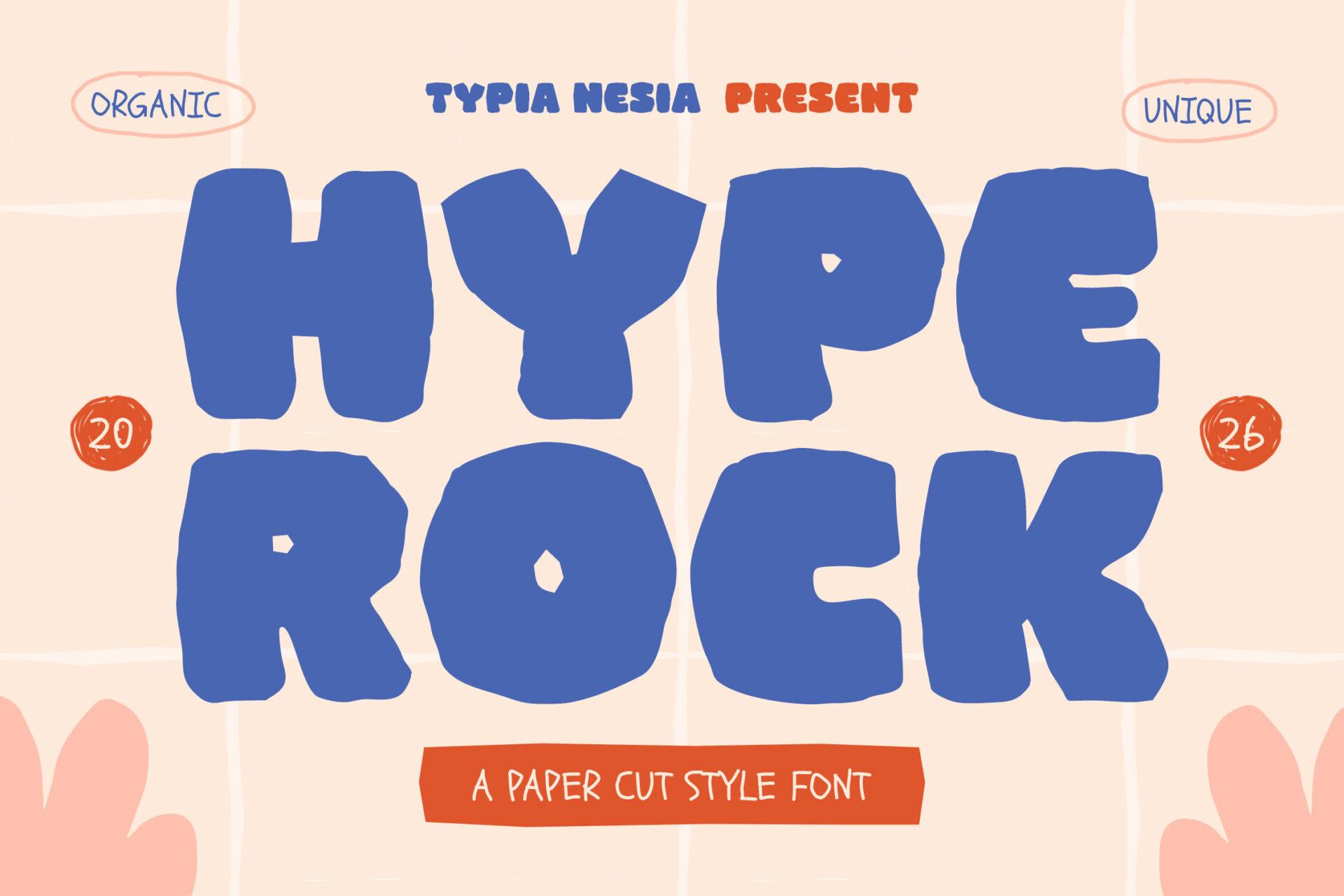
Best For: Craft fair posters, kids’ activity sheets and handmade shop banners
Hype Rock looks like letters snipped from construction paper: chunky, with ragged edges and blobby curves. The texture is part of the shape, so it keeps that cut-paper feel even in flat colour.
Lean into the paper look in Canva with a solid colour block behind each word. It loses detail when small, so keep it for titles above roughly 40 px and let a clean font handle body text.
6. Retro Munch Font
Retro Munch Font by Yarman (7NTypes)
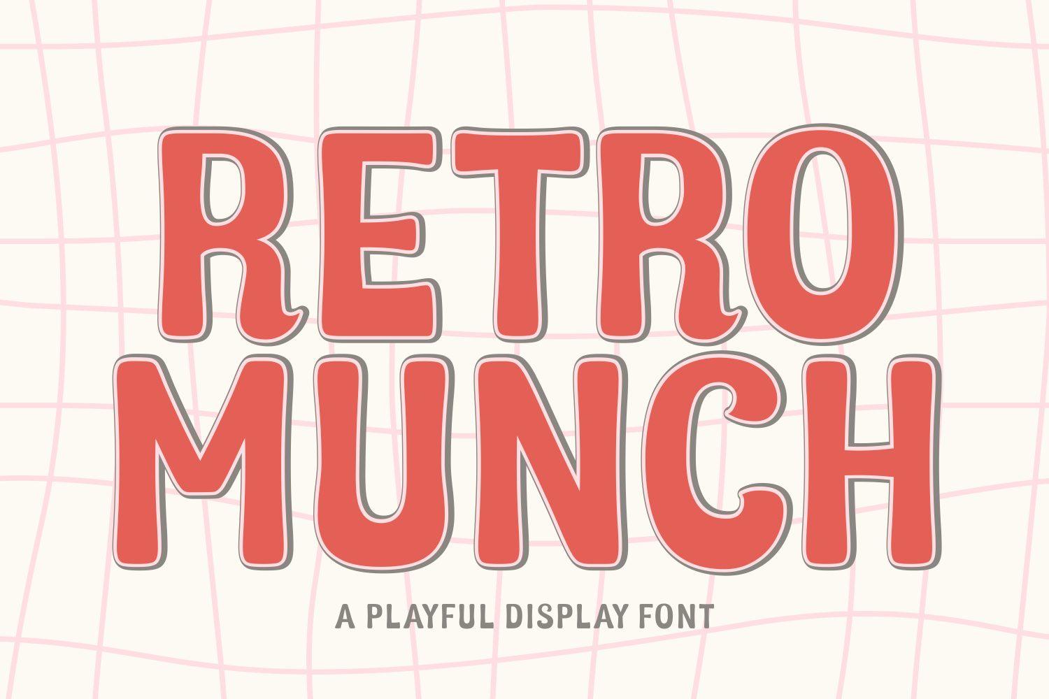
Best For: Diner-style menus, snack labels and retro sale graphics
Retro Munch is a tall, tightly spaced display caps face with a thin white inline running through each letter. It has a vintage snack-packaging feel without heavy distressing.
The inline is the star, so use colours that contrast with it, like red or teal. Because the letters are condensed, it fits long words such as shop names on narrow banners better than most bubbly fonts.
7. Ice Cream Cone Font
Ice Cream Cone Font by Adalin Digital
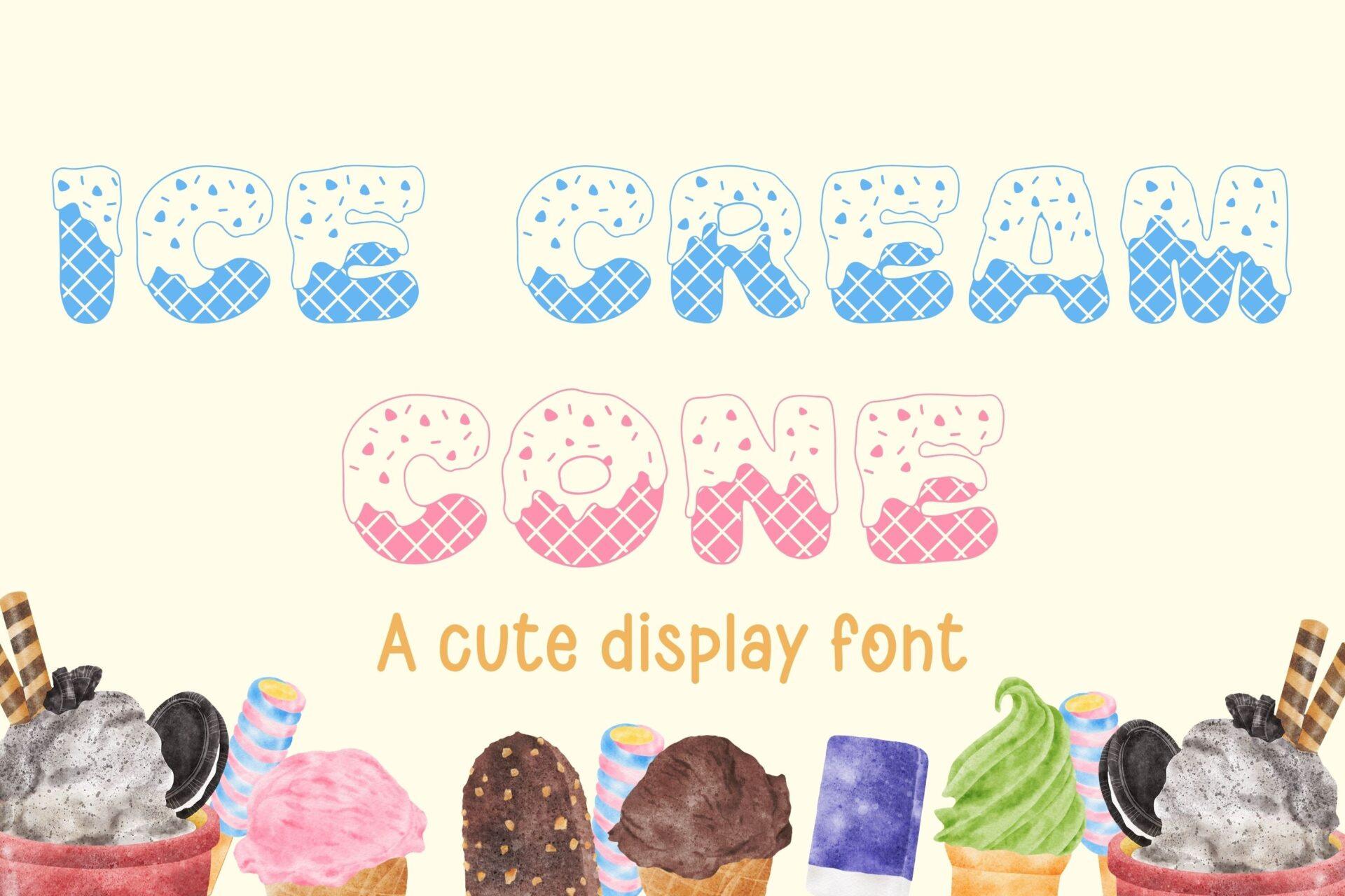
Best For: Summer party invites, ice cream shop promos and kids’ birthday banners
Ice Cream Cone is a decorative caps font where each letter is filled with a pattern like a waffle cone or sprinkles, in soft pastel shades in the preview. It is a picture as much as a typeface.
Treat it as artwork: one short word, large, on a light background. At small sizes the pattern turns to noise, so it is not a font for dates, addresses or anything people need to read quickly.
8. Gliter Surprise Font
Gliter Surprise Font by riki.studio
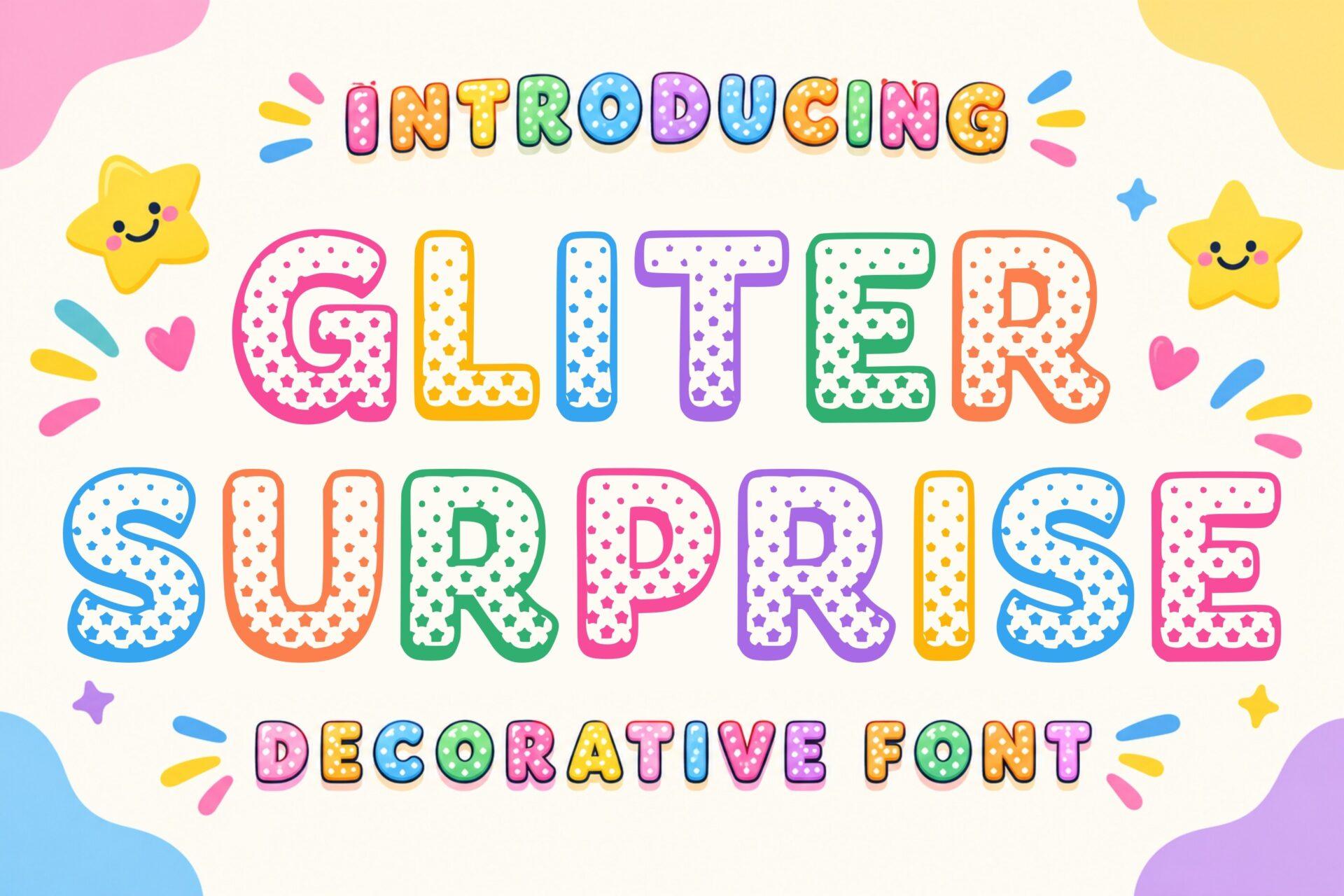
Best For: Rainbow party banners, classroom displays and sticker sheets
Gliter Surprise has rounded caps filled with polka dots, and the preview colours every word differently in bright rainbow tones. It feels like a party decoration more than a text font.
Use it where colour is the point, such as a birthday banner with one colour per letter. Set it on white or a very light tint, since the dots disappear on busy photo backgrounds.
Retro and Groovy Fun Canva Fonts
9. Madista Vintage Font
Madista Vintage Font by IM Studio

Best For: 70s-style shirt designs, retro shop logos and sunburst posters
Madista Vintage is a thick retro script with sweeping tails and a strong slant, set in the preview over an orange sunburst. Each word looks like it came off a vintage soda sign.
It works best as a single headline word or a short name. Add a drop shadow or an offset outline in Canva to push the 70s look, and keep the rest of the layout simple so the script can breathe.
10. Gencity Font
Gencity Font by Dryy.type
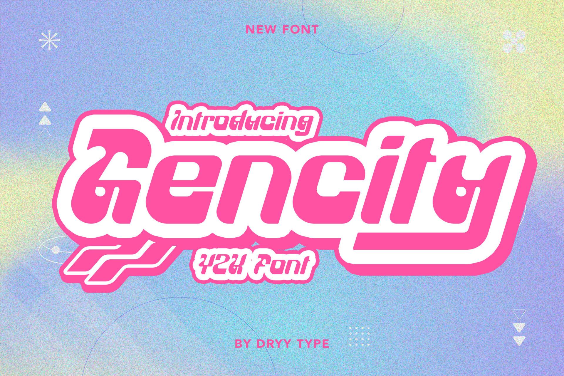
Best For: Y2K social posts, beauty promos and party flyers
Gencity is a forward-leaning script with sharp, stretched strokes and a sporty Y2K energy. The preview shows it in hot pink with a layered outline effect against a soft gradient.
Pair it with candy gradients and chrome or holographic backgrounds. It reads well for one or two words; longer phrases get busy because of the long connecting strokes.
11. Moment Sunlight Font
Moment Sunlight Font by Riman (7NTypes)
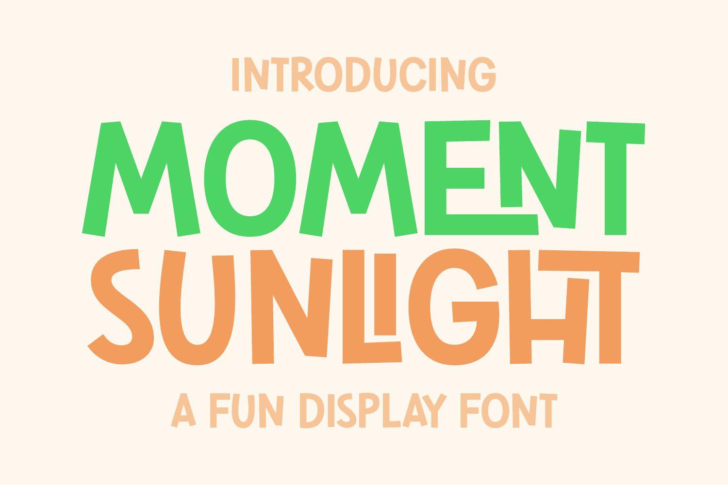
Best For: Summer event posters, café specials and cheerful shop signs
Moment Sunlight is a tall, slightly condensed display caps face with a gentle wobble in the strokes. It is cleaner than most fonts here, so it bridges playful and readable.
Use it in two contrasting colours, like the green and orange of the preview, for a headline that stays fun without shouting. It also holds up as a subtitle under a louder script.
12. Barbie Room Font
Barbie Room Font by anamalmusyaffaCreative
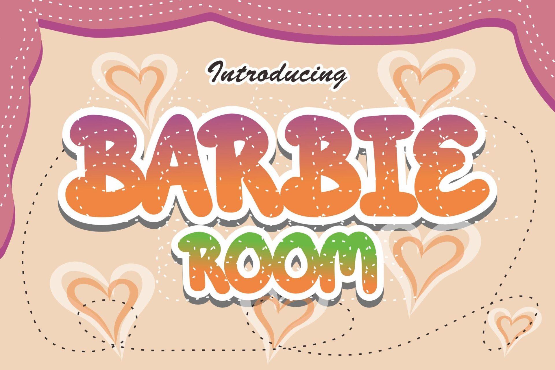
Best For: Girly birthday invites, pink party themes and sleepover printables
Barbie Room has fat, rounded caps with a glossy, gradient look in pink and orange in the preview, framed by hearts. The letters are wide and bubbly, almost like inflated balloons.
Choose it for pink-heavy designs and short titles like a name or a party theme. It takes a gradient fill in Canva nicely; avoid using it for small text where the round shapes start to blend.
13. Thick Amore Font
Thick Amore Font by airotype
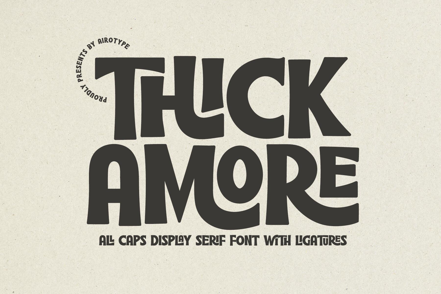
Best For: Retro logos, bold quote prints and café chalkboard designs
Thick Amore is a heavy all-caps display serif with soft, rounded serifs and tight spacing. The preview mentions ligatures, so pairs of letters can join into one shape for a custom-lettered look.
Set it in one solid colour on a calm background; it already carries a lot of weight. It suits words you want to feel warm and a bit nostalgic, such as a bakery name or a short quote.
Handwritten and Doodle Fun Canva Fonts
14. Ghinna Joyfun Font
Ghinna Joyfun Font by Jasm (7NTypes)
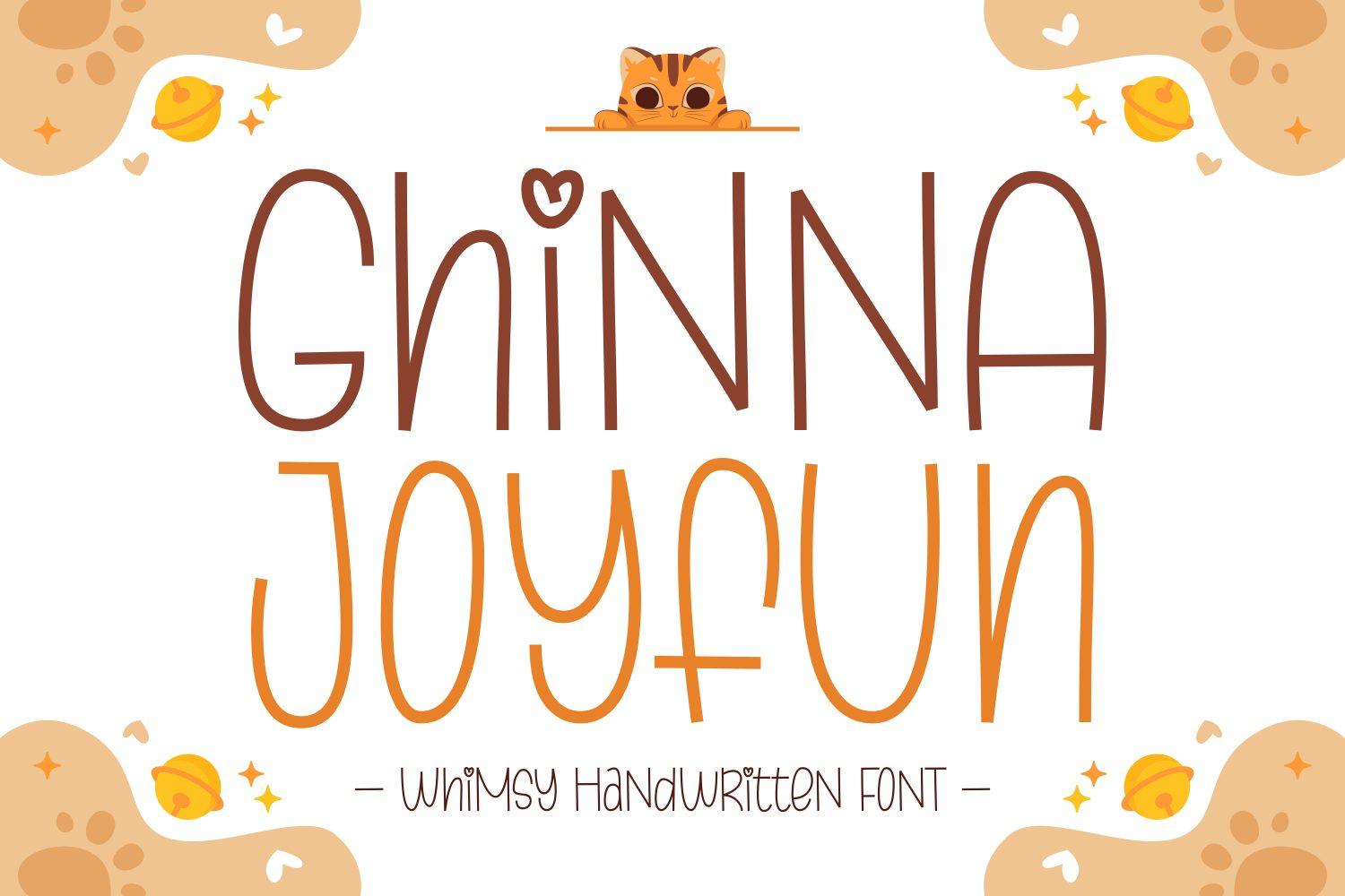
Best For: Kids’ party invites, playful planner pages and shop labels
Ghinna Joyfun is a tall, thin handwritten font with loopy strokes and a small heart on some letters. The lines are light and bouncy, closer to a felt-tip doodle than a bold display face.
Because the strokes are thin, give it a darker colour and a medium to large size. It pairs well with a chunky font from the first section if you need a strong headline above it.
15. Milky River Font
Milky River Font by Iradvilyuk
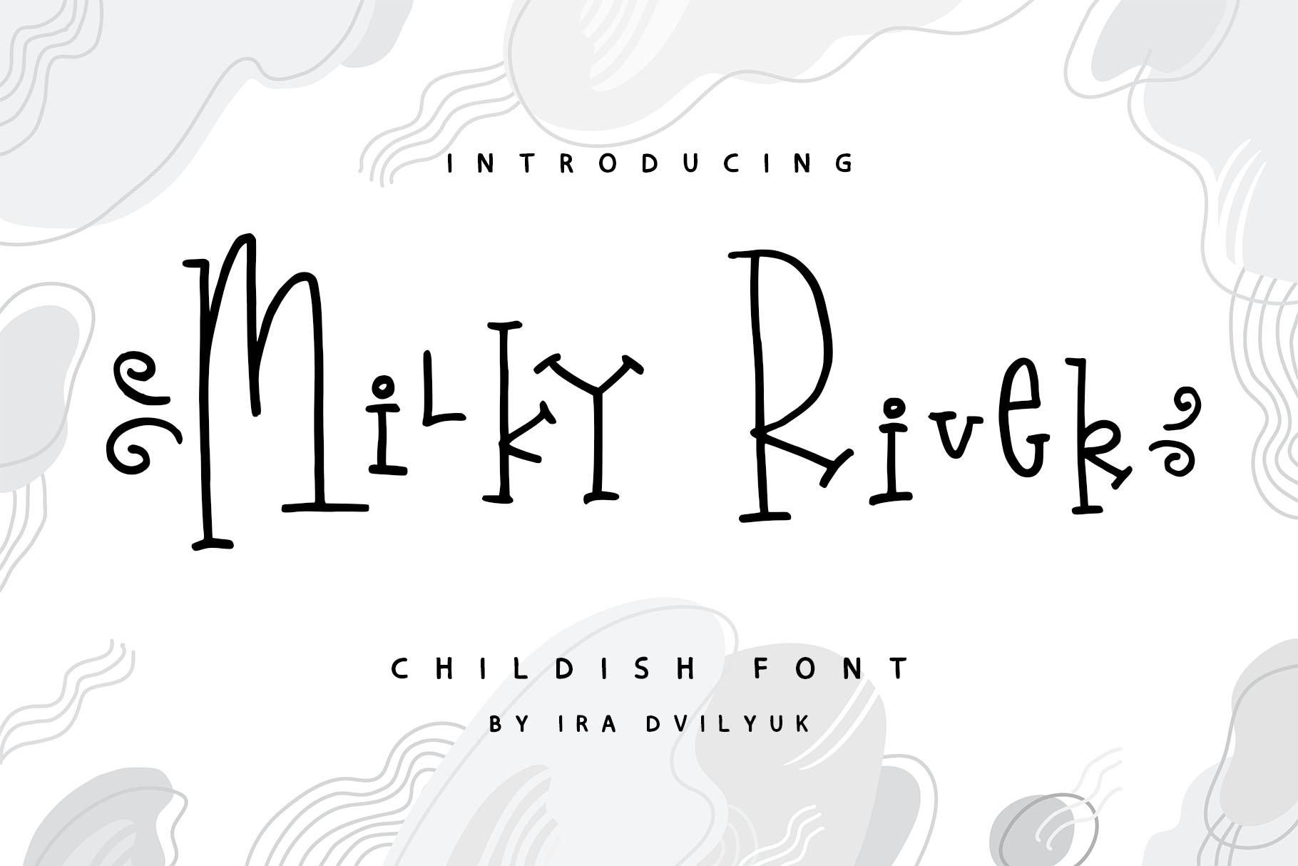
Best For: Storybook titles, nursery prints and quirky gift tags
Milky River is described in its preview as a childish font: thin, spindly letters with curly hooks and swirls at the ends. It has a slightly odd, fairytale charm.
Keep it in black or a deep ink colour on light backgrounds. It looks great as a title on a nursery print or a story page; for long text, the curls make it harder to read.
16. Madison’s Tail Font
Madison’s Tail Font by freelingdesignhouse
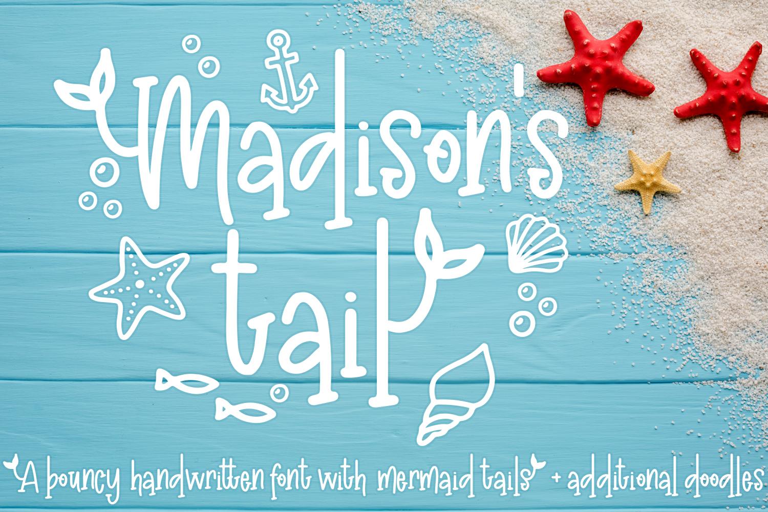
Best For: Beach party invites, summer camp signs and mermaid birthday decor
Madison’s Tail is a bouncy handwritten font, and the preview notes mermaid tails and extra doodles such as starfish and shells. Letters jump up and down a little, which keeps words lively.
Use the doodles as small accents next to a name or headline. It fits sea and summer themes naturally; in a Canva layout, give it a white or sand background to keep the thin lines visible.
17. Friday Feels Font
Friday Feels Font by Kristy Hatswell
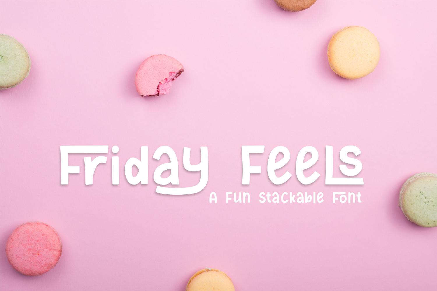
Best For: Social quotes, planner stickers and café menu boards
Friday Feels is a narrow handwritten caps font, and its preview calls it stackable, meaning words sit neatly on top of each other in tight blocks. The strokes are clean and even.
Stack a short phrase into three or four lines for a quote graphic. It is readable enough for menu items and labels, which makes it one of the more practical choices in this list.
18. Skit Cut Font
Skit Cut Font by dmletter31
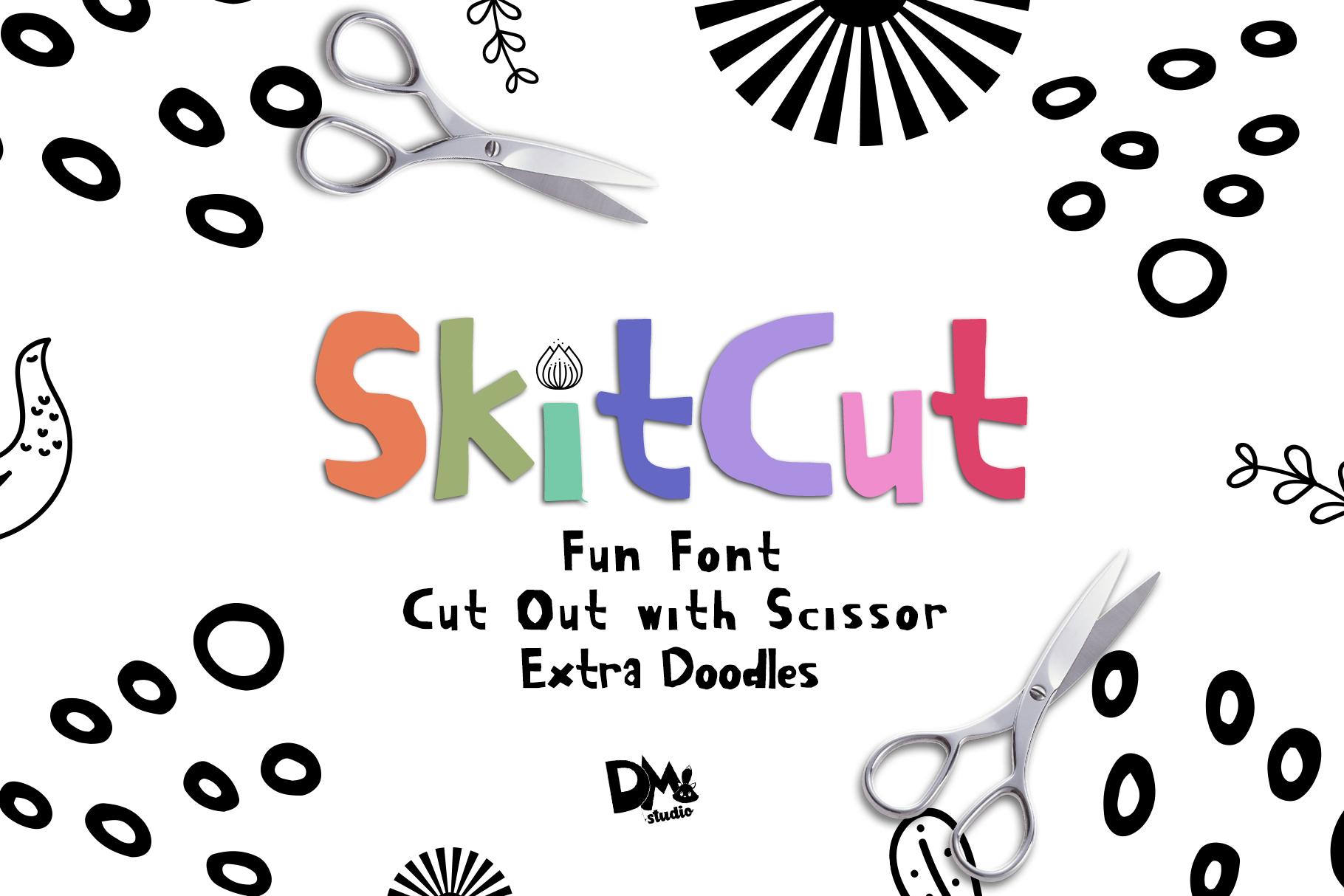
Best For: Scrapbook pages, craft class handouts and kids’ activity posters
Skit Cut looks like letters cut out with scissors, and the preview mentions extra doodles. The shapes are a bit uneven and colourful, like a paper collage made at a craft table.
Colour each letter differently for a cut-paper effect, or keep it one colour for a calmer look. It works for short titles; use a neat handwritten font next to it for any instructions.
19. Think Font
Think Font by Carolina Valtuille
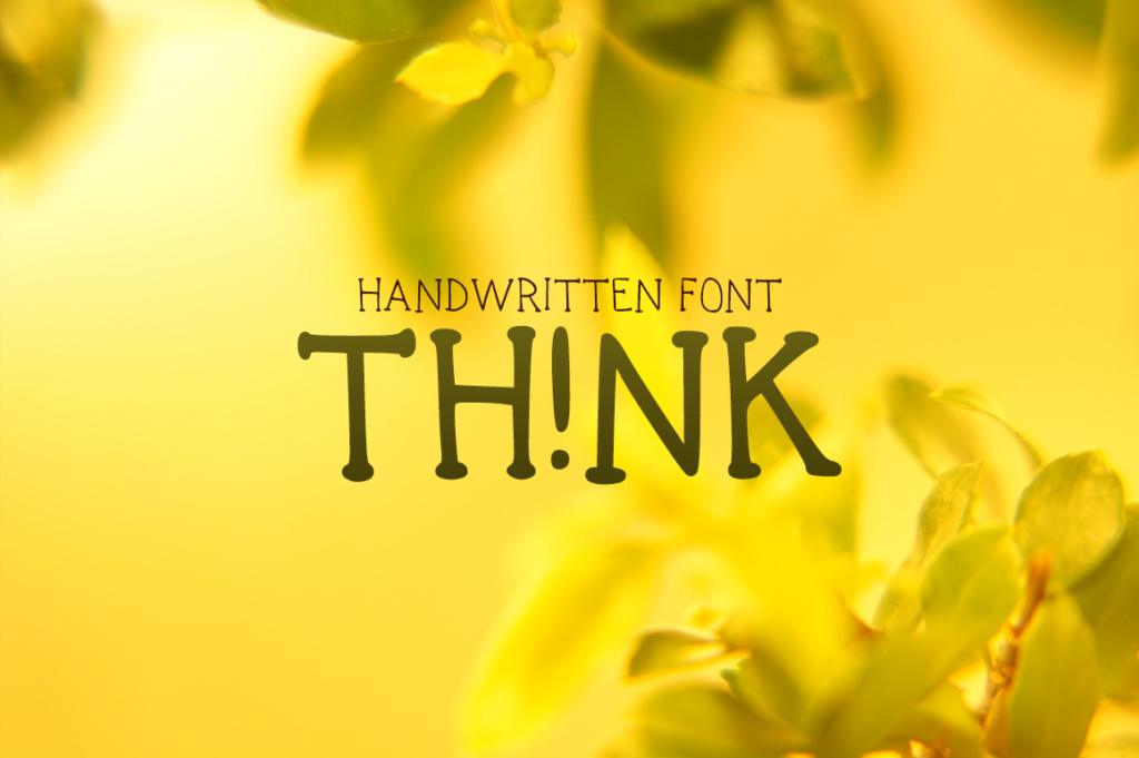
Best For: Notes-style social posts, teacher handouts and simple labels
Think is a simple hand-drawn caps font with a marker feel. In the preview the I is swapped for an exclamation mark, which gives words a small surprise without making them hard to read.
It is a calm, everyday choice for text that should look handwritten but stay legible. Use it for short phrases on planners or classroom printables, next to a bolder title font.
20. Holiday December Font
Holiday December Font by william jhordy
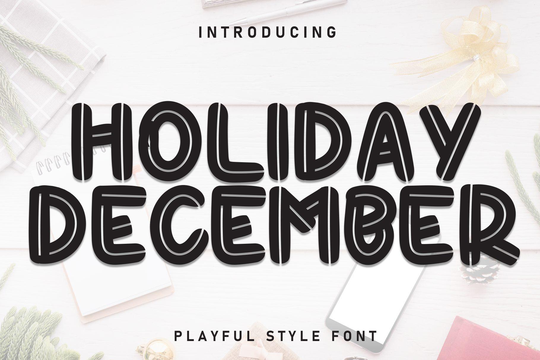
Best For: Year-round gift tags, journal headers and hand-lettered signs
Holiday December is a tall handwritten caps font with a double-line effect inside the strokes. Despite the name, the letters themselves have no seasonal decoration, so it works any time of year.
The double line gives it a drawn-by-marker look that suits headers and labels. Set it in black on a light background; at small sizes the inner line closes up, so keep it large.
21. Ragamuffin Font
Ragamuffin Font by Illustration Ink
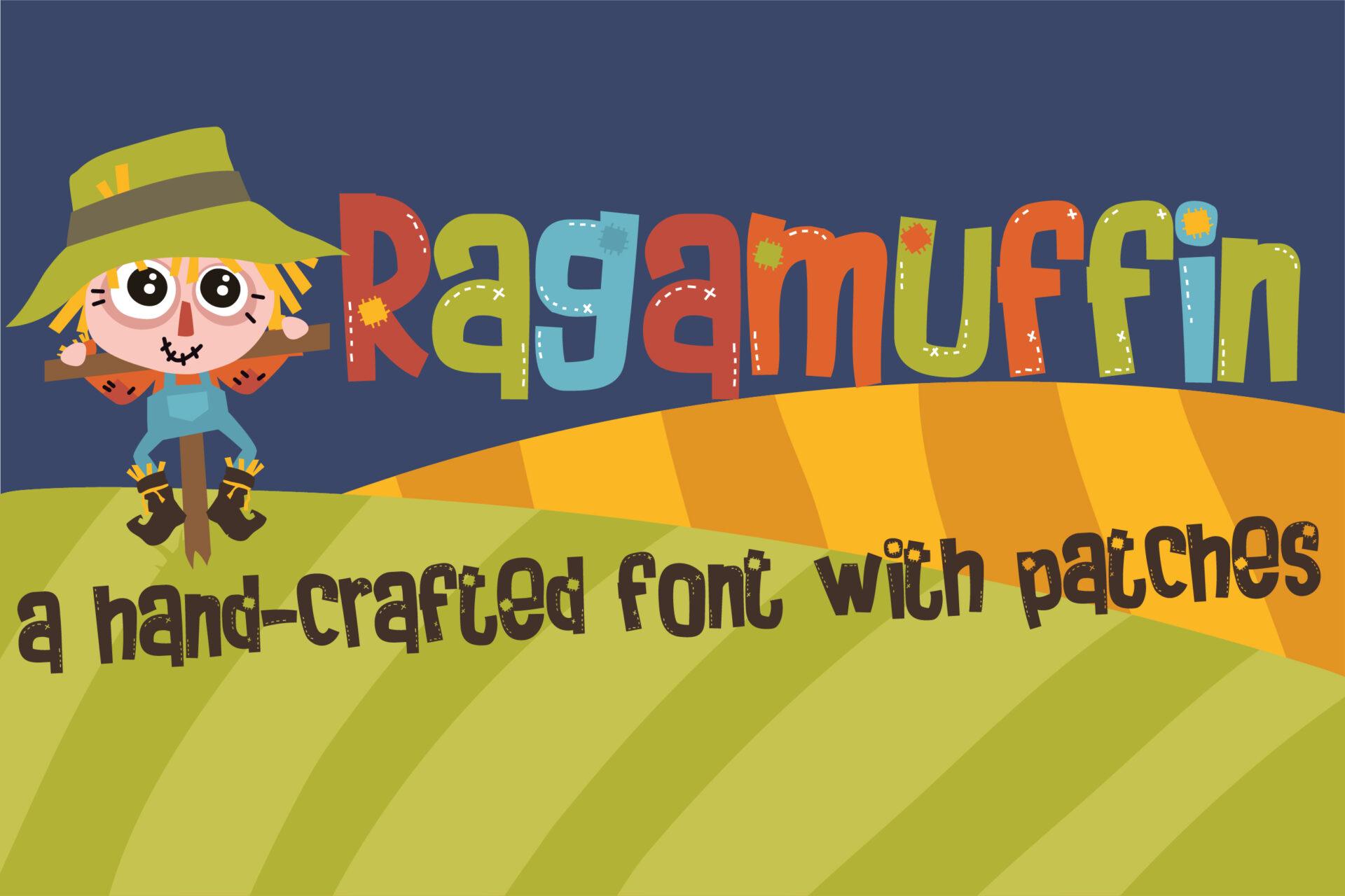
Best For: Autumn fairs, scarecrow-themed kids’ crafts and patchwork shop logos
Ragamuffin is described as a hand-crafted font with patches: letters look stitched together from bits of fabric, with little patch details. The preview pairs it with a scarecrow illustration.
It suits rustic, crafty and harvest themes. Give it one or two words in warm colours; the patch details need size to show, so it is not a font for small print.
Fun Canva Font Duos
22. King Jelly Font
King Jelly Font by airotype
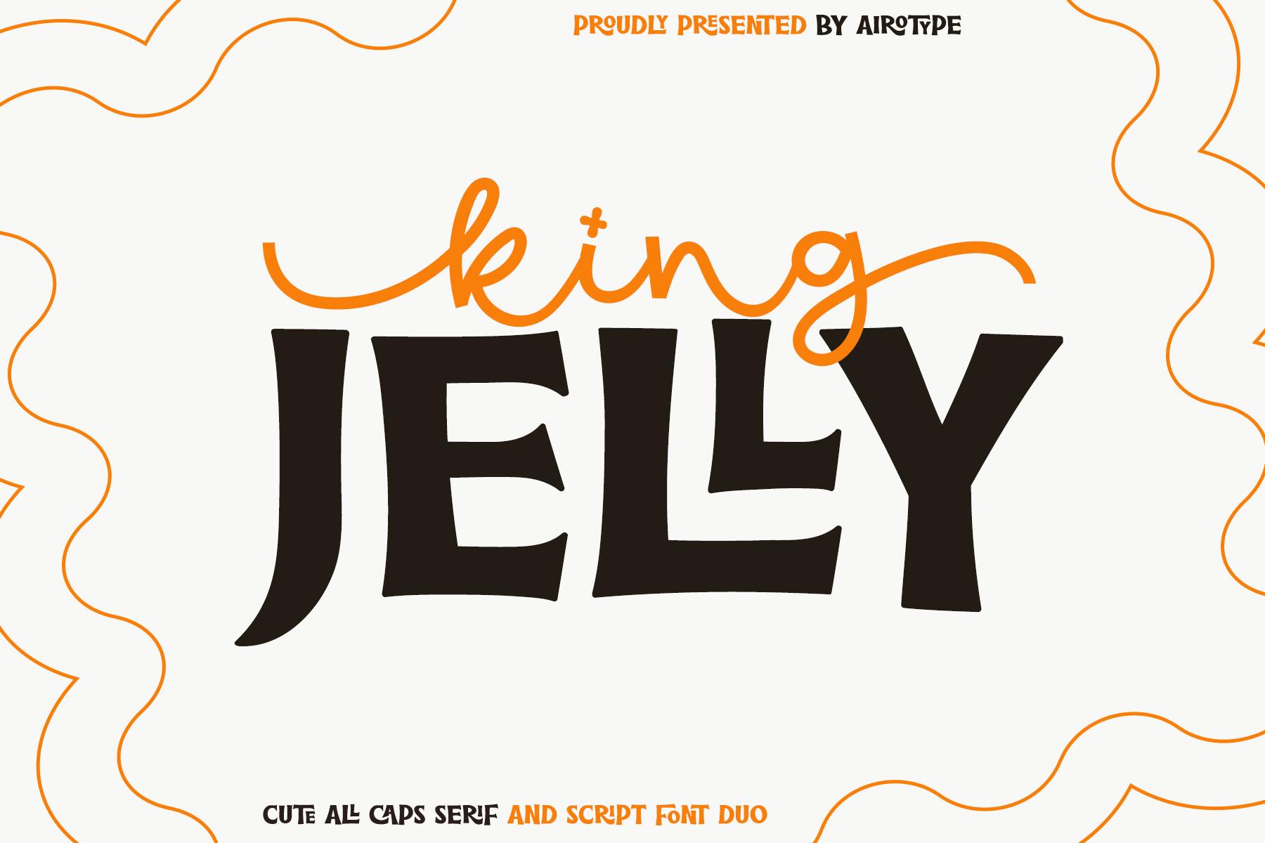
Best For: Kids’ birthday invites, playful brand names and café menus
King Jelly is a duo: chunky, slightly wobbly caps with soft serifs, plus a loose script. In the preview the script sits above the caps in orange, like a handwritten note over a bold title.
Use the duo exactly that way in Canva: a short script word above or before the caps. Having both styles in one family saves you hunting for a matching pair.
23. Pretty Summer Font
Pretty Summer Font by airotype
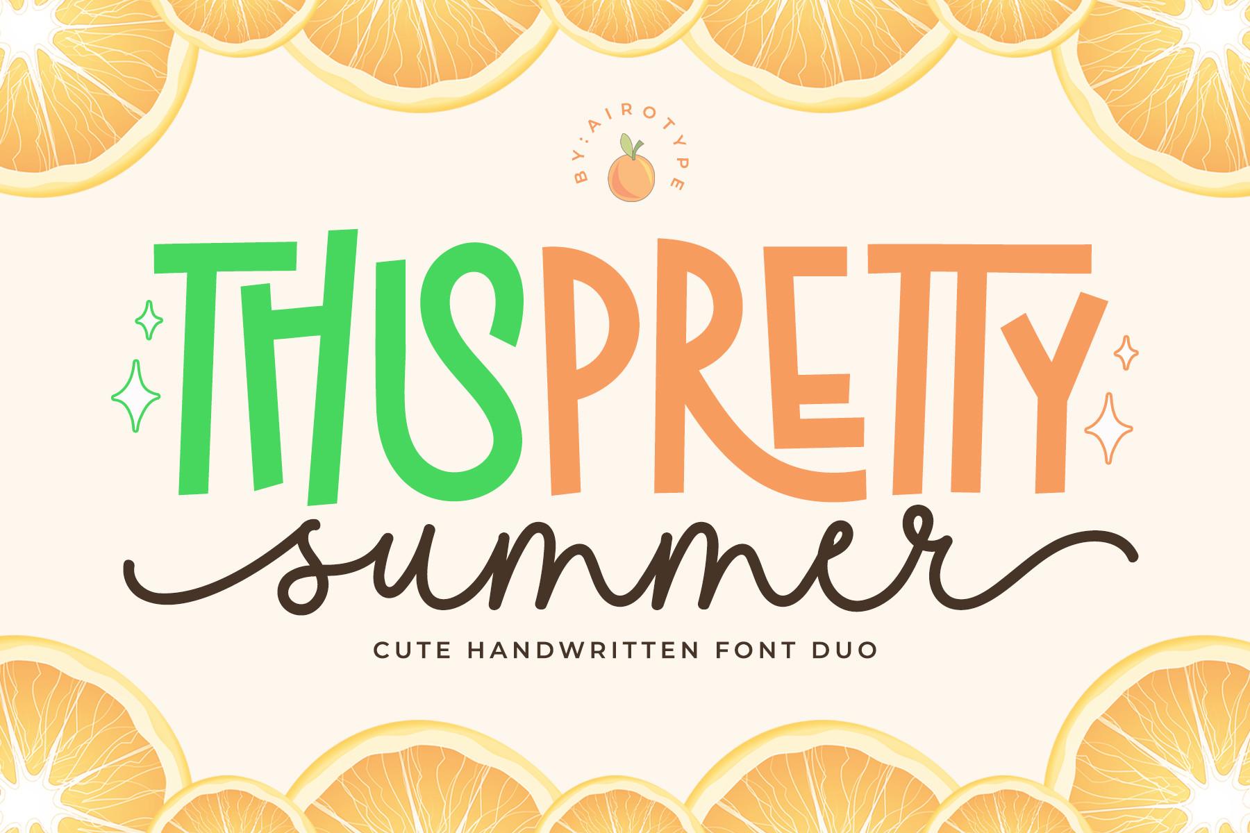
Best For: Summer party flyers, lemonade stand signs and seasonal shop promos
Pretty Summer is a cute handwritten font duo: tall, slightly bouncy caps in the preview’s green and pink, plus a flowing script for a second line. The overall mood is bright and casual.
Mix the two colours of the caps across one word for a playful look, then add the script for the subtitle. It suits light, airy backgrounds with fruit or flower graphics.
24. Grandma House Duo Font
Grandma House Duo Font by kammaqsum

Best For: Cosy family event invites, home bakery labels and nursery decor
Grandma House Duo combines puffy, rounded caps with a thin, looping script. In the preview the script runs over the bold word, a ready-made layered title.
Copy that layering in Canva by placing the script on top of the caps in a contrasting colour. Soft pinks and creams fit it best; the thin script needs a solid background to stay visible.
How to Choose a Fun Font for Canva
Start with the size it will live at. Patterned and textured fonts like Ice Cream Cone, Gliter Surprise or Hype Rock need to be big. If the text will end up small on a phone screen or a printed tag, pick something cleaner such as Reaktion Kids Bold, Friday Feels or Think.
Count the words. Chunky cartoon faces and retro scripts shine on one to three words. For a longer phrase or a menu, a narrow or stackable font like Retro Munch or Friday Feels keeps everything on the page without shrinking it.
Match the font to the theme, not just the mood. Sweet Cookies says bakery, Madison’s Tail says beach, Ragamuffin says harvest fair. A font that fits the subject does half the design work for you.
Pair loud with quiet. One fun font per design is usually enough. Put dates, times and details in a plain sans, or use a duo like King Jelly or Grandma House Duo where the two styles are already made to work together.
How to Upload These Fonts to Canva
Download the font from Creative Fabrica and unzip the file. You will usually find OTF or TTF files inside; either format can be uploaded.
In Canva, open Brand (or Brand Kit), find the Fonts section and choose Upload a font, then select the file. Once it finishes, the font appears in the font menu of any design under your uploaded fonts.
If a font has a separate style, like an italic or the script half of a duo, upload each file on its own. Special characters or swashes stored in hidden glyph slots may not be reachable in Canva, so test the letters you need before building a whole design around them.
FAQ
Do I need Canva Pro to upload fonts?
Canva lets you upload custom fonts on its paid plans (Pro, Teams and education accounts). On a free account the upload option is not available, so you would see the font only in other apps.
Can I use these fonts on products I sell?
Fonts downloaded with a Creative Fabrica subscription come with a commercial licence, but check the licence on each product page before printing shirts or selling printables, because terms can differ by product.
Why does my fun font look different from the preview?
Previews often add colours, outlines, shadows and textures that are not part of the font itself. In Canva you can recreate them with effects like Shadow, Outline or a gradient fill on the text.
Which fonts here are easiest to read at small sizes?
Reaktion Kids Bold, Friday Feels, Moment Sunlight and Think keep their shapes best when small. The patterned and textured fonts are meant for big headlines.
Pick One Fun Font and Build Around It
The quickest way to a fun Canva design is to choose one font that fits the theme, use it big for the headline, and keep everything else simple. Start with a cartoon face for kids’ projects, a retro script for shirts and promos, or a handwritten style for planners and classroom pages, and let the font set the tone.