Writing Fonts: 26 Marker, Brush Pen, Gel Pen, Chalk and Crayon Styles for Planners, Teachers and Sign Makers
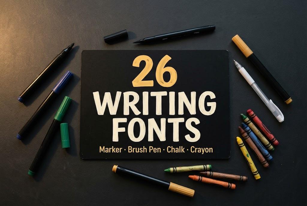
A writing font is any typeface that looks like it came straight from a pen, marker or piece of chalk rather than from a type foundry. This collection sorts writing fonts by the tool behind the letters: chunky felt-tip markers, brush pens with real pressure, everyday gel pen notes, classroom chalk and kids’ crayons.
This post contains affiliate links. If you buy through them, I may earn a small commission at no extra cost to you.
Pick by tool and the job gets easier. Markers carry shirts and posters, brush pens add energy to headlines, pen fonts fill planner pages, chalk fonts make menus and classroom boards, and crayon fonts belong on anything made for kids.
All fonts in this list are on Creative Fabrica, and a single All Access subscription unlocks every one of them, so you can try several styles before committing to one.
More handwritten font collections:
Cursive Fonts: 36 Signature, Handwritten, Wedding, Retro and Brush Styles
Handwriting Fonts for Planners, Labels and Cricut
Lettering Fonts: 50 Hand Lettering, Doodle, Calligraphy and Vintage Styles
Calligraphy Fonts: 32 Modern, Brush, Copperplate and Monoline Styles
Script vs Cursive vs Calligraphy Explained
Typewriter Font: 22 Vintage, Inky and Handwritten Styles
Table of Contents
- 1. Chunky Marker Font
- 2. Swift Marker Font
- 3. Aesthetic Marker Font
- 4. Fluid Form Font
- 5. Galardino Font
- 6. Affinity Font
- 7. Sheena is a Punk Rocker Font
- 8. Montero Brush Font
- 9. Beverly Catherine Font
- 10. Coffee Black Font
- 11. Lemon Dessert Font
- 16. Chalkboard Font
- 17. School Board Font
- 18. Warmstreak Font
- 19. Munchee Font
- 20. Sketch Chalk Font
Marker Fonts
Marker fonts copy the flat, even line of a felt-tip: no thick-thin contrast, just solid strokes that read from across a room.
1. Chunky Marker Font
Chunky Marker Font by squeebcreative
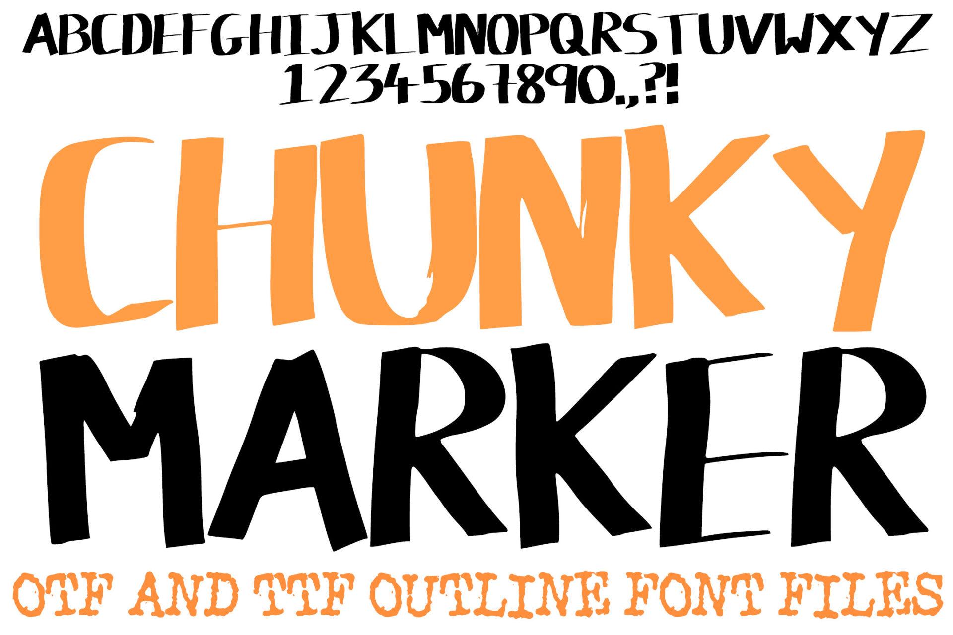
Best For: Big headline words on shirts, posters and sale signs.
Tall, condensed capitals with heavy strokes and slightly rough edges, the way a fat marker leaves ink when you press hard. The preview shows a full uppercase alphabet with numbers, and it also mentions outline files alongside the solid version.
Keep it to a word or two per line and let the height do the work. The outline style is handy for two-color layering: solid in one color, outline offset on top.
2. Swift Marker Font
Swift Marker Font by Bundle
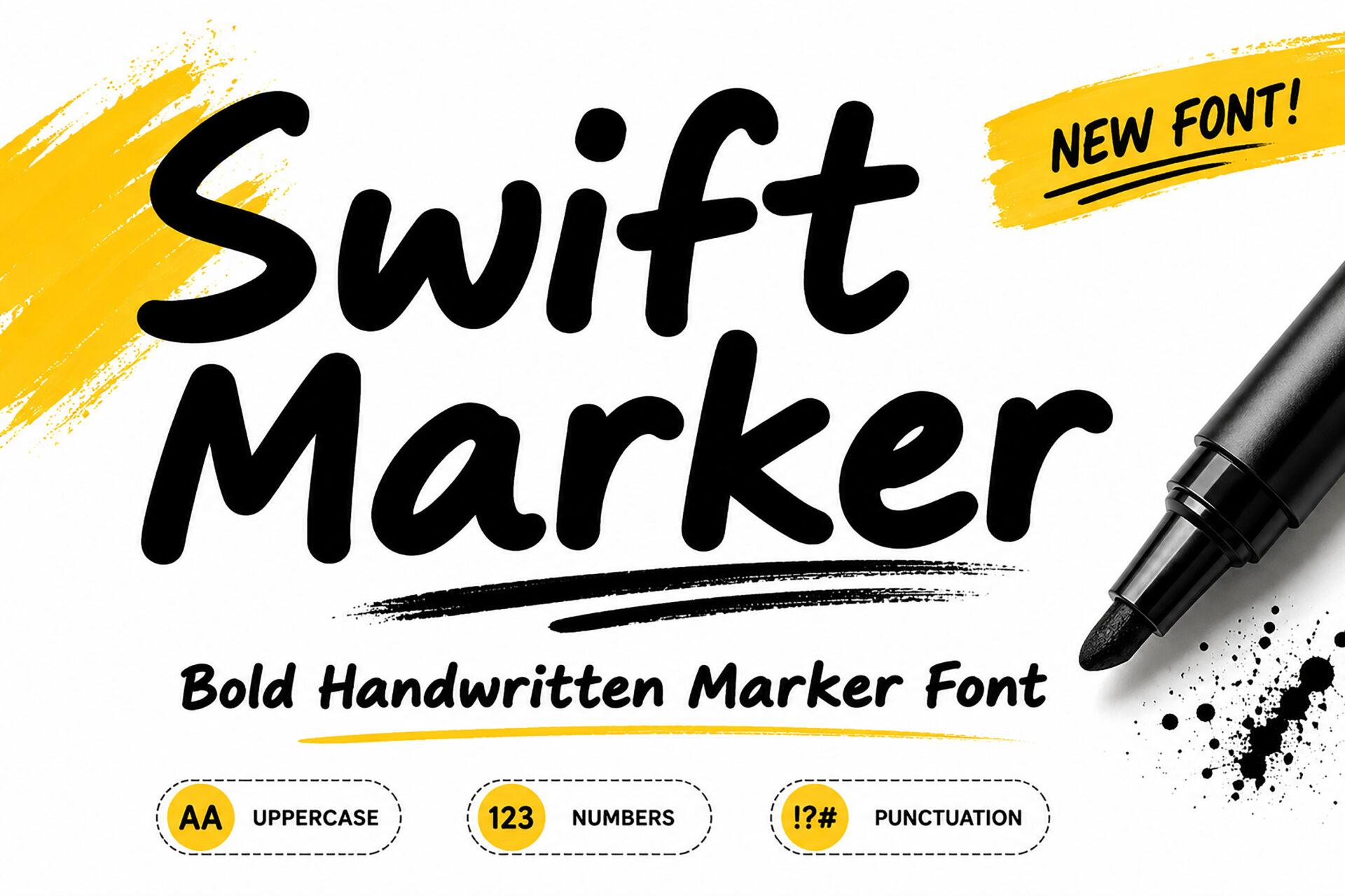
Best For: Fast, energetic quotes, sport and gym graphics, sticker text.
A bold, forward-leaning handwritten marker with mixed case and quick, confident strokes. The specimen highlights uppercase, numbers and punctuation, so short phrases with dates or prices are covered.
The slant already adds motion, so pair it with a calm upright sans for any supporting line. It looks its best set large on a plain background with a splash or swipe graphic.
3. Aesthetic Marker Font
Aesthetic Marker Font by MVMET
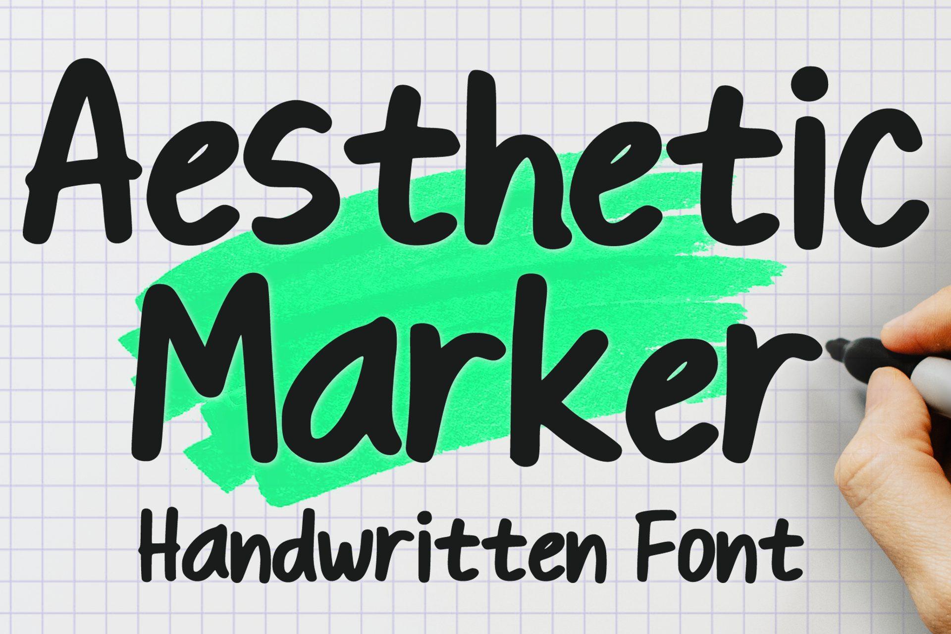
Best For: Planner headers, Instagram story titles, study notes.
Heavy, rounded lowercase with soft bounce, closer to a chisel marker in a notebook than to a sign painter’s tool. The preview pairs it with a bright highlighter swipe behind the words.
Copy that idea: a translucent color block behind one word turns it into a planner header instantly. It stays readable at small sizes too, which helps on printables.
4. Fluid Form Font
Fluid Form Font by IngingDigitalArt
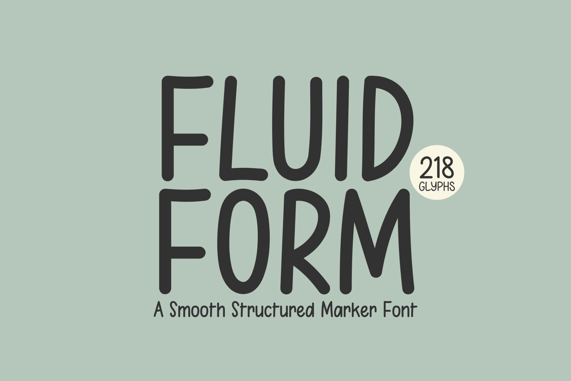
Best For: Product labels, menu boards, clean handmade branding.
A structured marker font in condensed capitals with smooth, rounded stroke ends. The preview points to 218 glyphs, and the letters feel tidier and more even than most hand-drawn options.
Choose it when you want a handmade touch without the mess. It sits well in narrow columns like jar labels or price tags, where wide fonts would crowd the space.
5. Galardino Font
Galardino Font by Sibelumpagi Studio
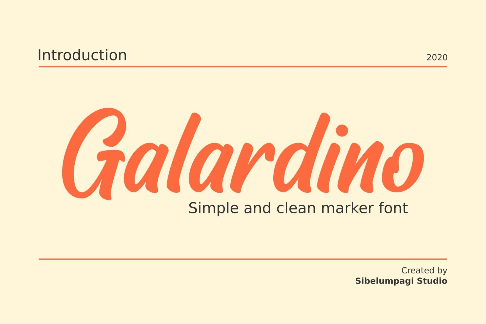
Best For: Casual notes, café chalkboards in digital form, light branding.
A slanted, medium-weight marker hand in mixed case, simple and clean, with a quick everyday rhythm. It looks like neat writing from a fine-tip marker rather than a showy display style.
Use it for longer phrases where heavier markers would get tiring to read. It pairs easily with a bold sans headline above it.
Brush Pen Fonts
Brush pen fonts keep the pressure changes of a flexible tip, so strokes swell and thin, and dry edges show where the ink ran out.
6. Affinity Font
Affinity Font by The Tenacious Type Studio
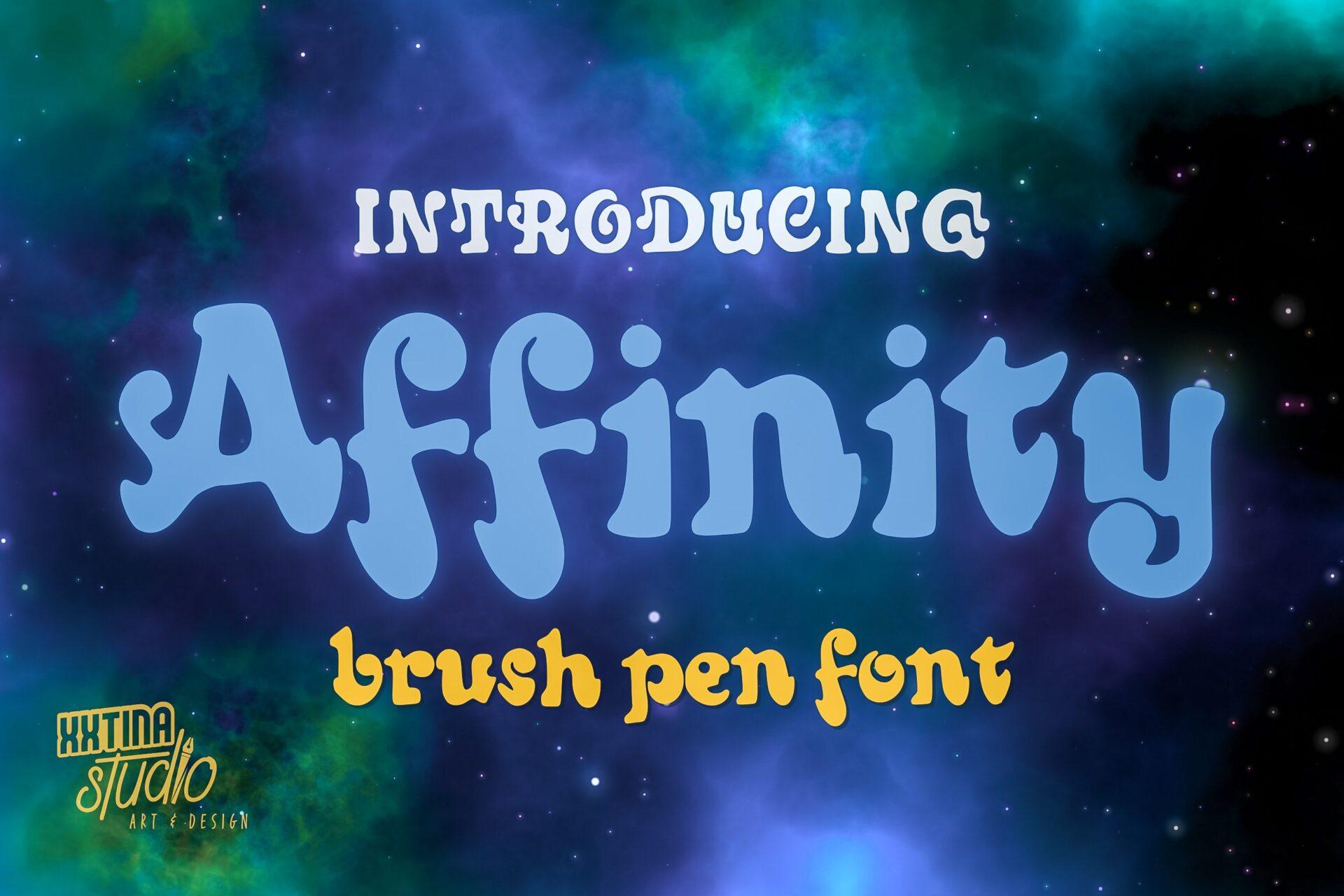
Best For: Retro shirts, party posters, playful logos.
Fat, bouncy letters with round counters and a groovy wobble, written with a brush pen held almost upright. The preview sets it in soft blue with a script tagline in yellow.
It is loud enough to carry a whole poster on its own. Give it generous letter spacing on light backgrounds so the round shapes do not merge.
7. Sheena is a Punk Rocker Font
Sheena is a Punk Rocker Font by The Tenacious Type Studio
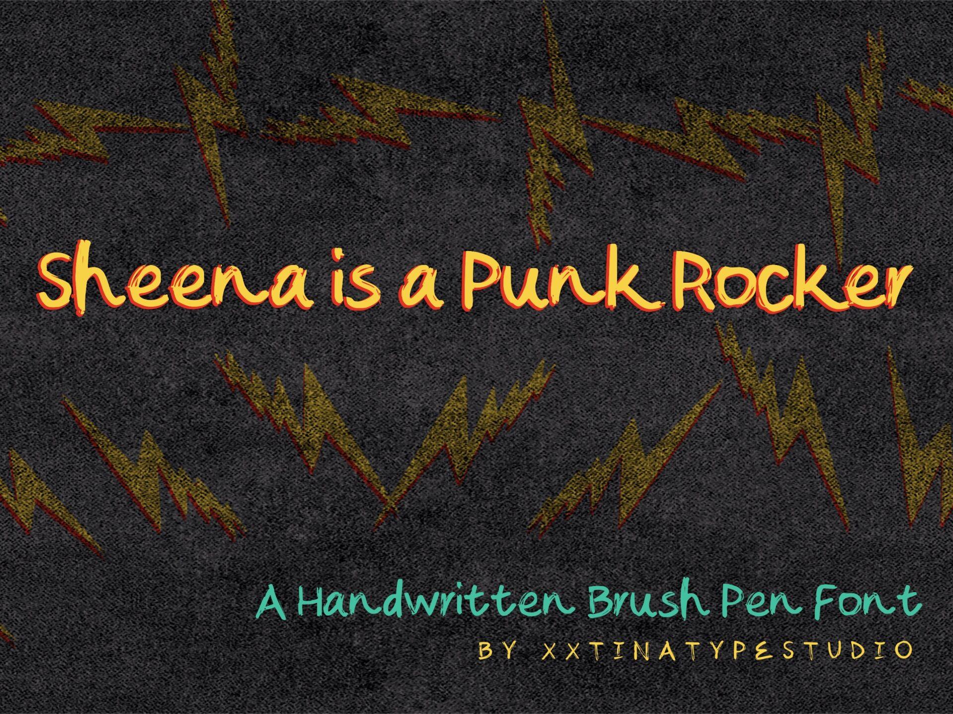
Best For: Gig flyers, zine covers, edgy merch.
A narrow, scratchy handwritten brush pen with uneven heights and a rebellious, scribbled-in-a-hurry feel. Mixed case keeps full sentences possible.
This is the font for a phrase, not a single word. Set it in a bright color on dark backgrounds, like the orange-on-black in the preview.
8. Montero Brush Font
Montero Brush Font by Kernova Fonts
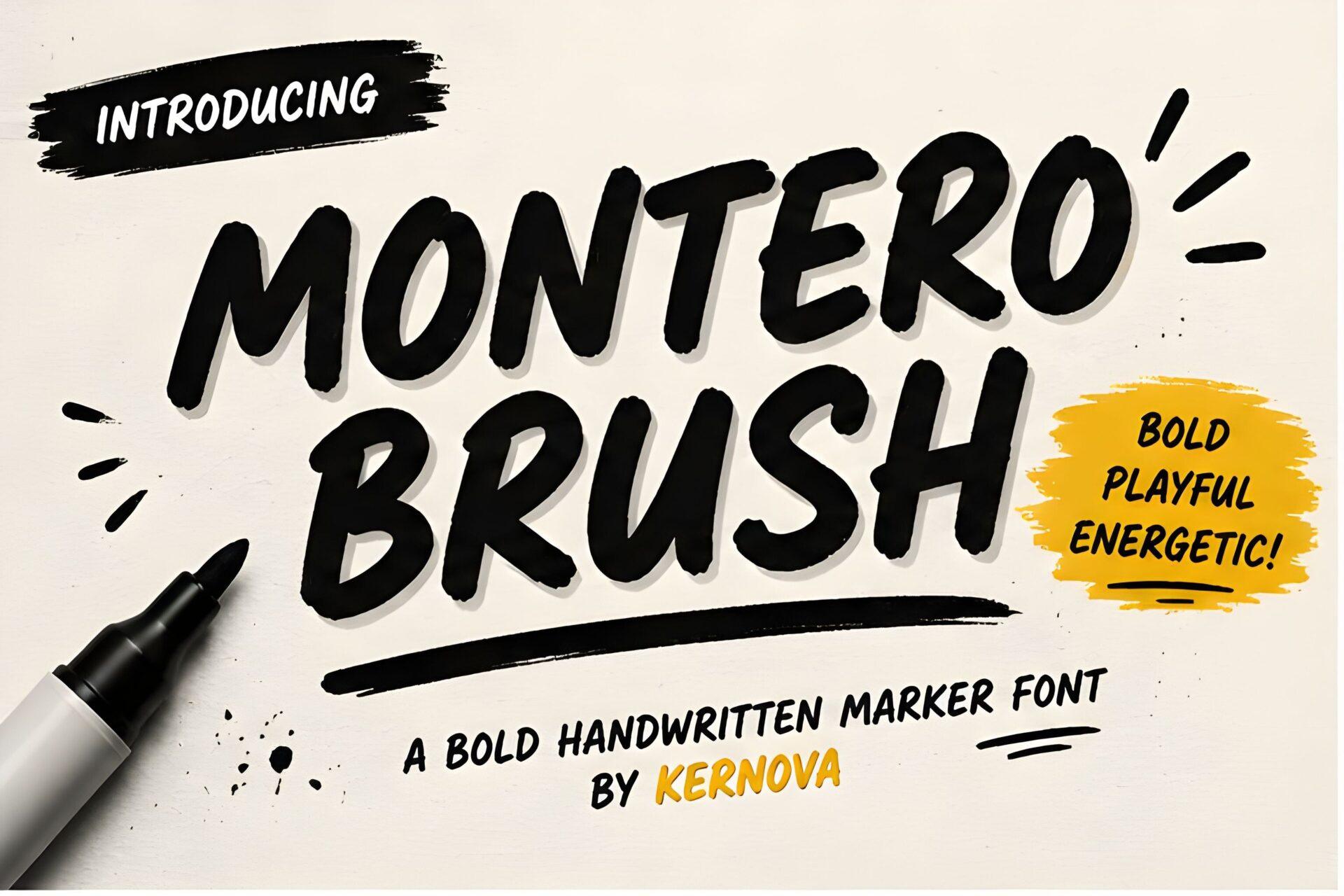
Best For: Bold shirt text, YouTube thumbnails, sale banners.
Heavy, slanted brush capitals with dry, textured stroke edges, labelled as a bold, playful handwritten marker font. Strokes look fast and confident.
Thick shapes survive vinyl cutting and screen printing better than thin scripts. Keep supporting text in a simple sans so the texture stays the focus.
9. Beverly Catherine Font
Beverly Catherine Font by Attract Studio
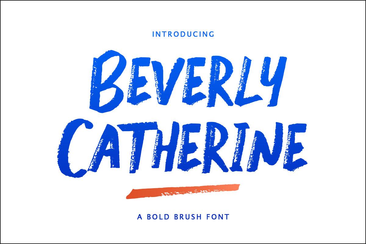
Best For: Book covers, posters, statement headlines.
Tall uppercase brush letters with visible streaks and dry-brush texture inside each stroke. The preview shows it in deep blue with a painted underline.
The streaks need room, so use it big. Add one brush swash underneath, as the preview does, instead of extra decoration.
10. Coffee Black Font
Coffee Black Font by Designvector10
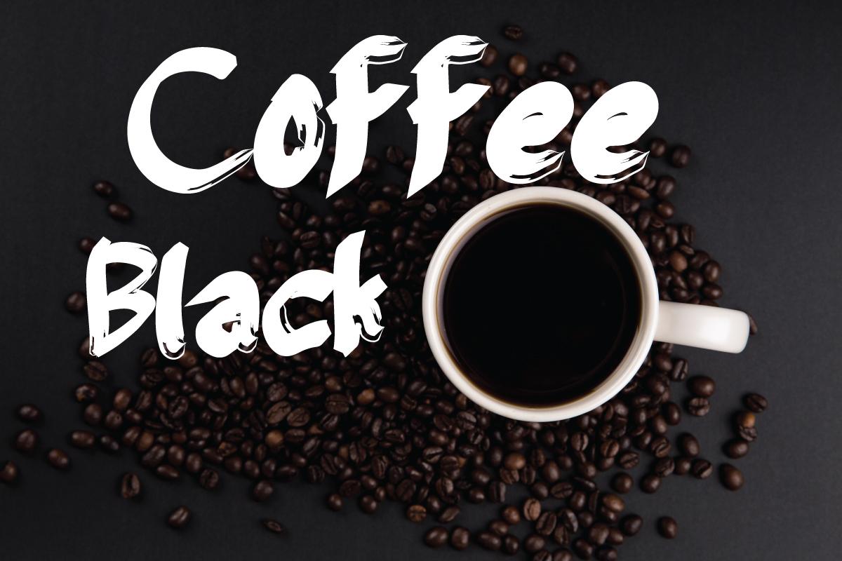
Best For: Café menus, coffee bags, moody social posts.
Heavy mixed-case brush lettering with rough, broken edges, like a near-empty brush pen dragged across paper. White on dark is how the preview shows it.
Dark backgrounds suit the rough edges best. Try it on kraft-paper textures for packaging mockups.
11. Lemon Dessert Font
Lemon Dessert Font by RantauType
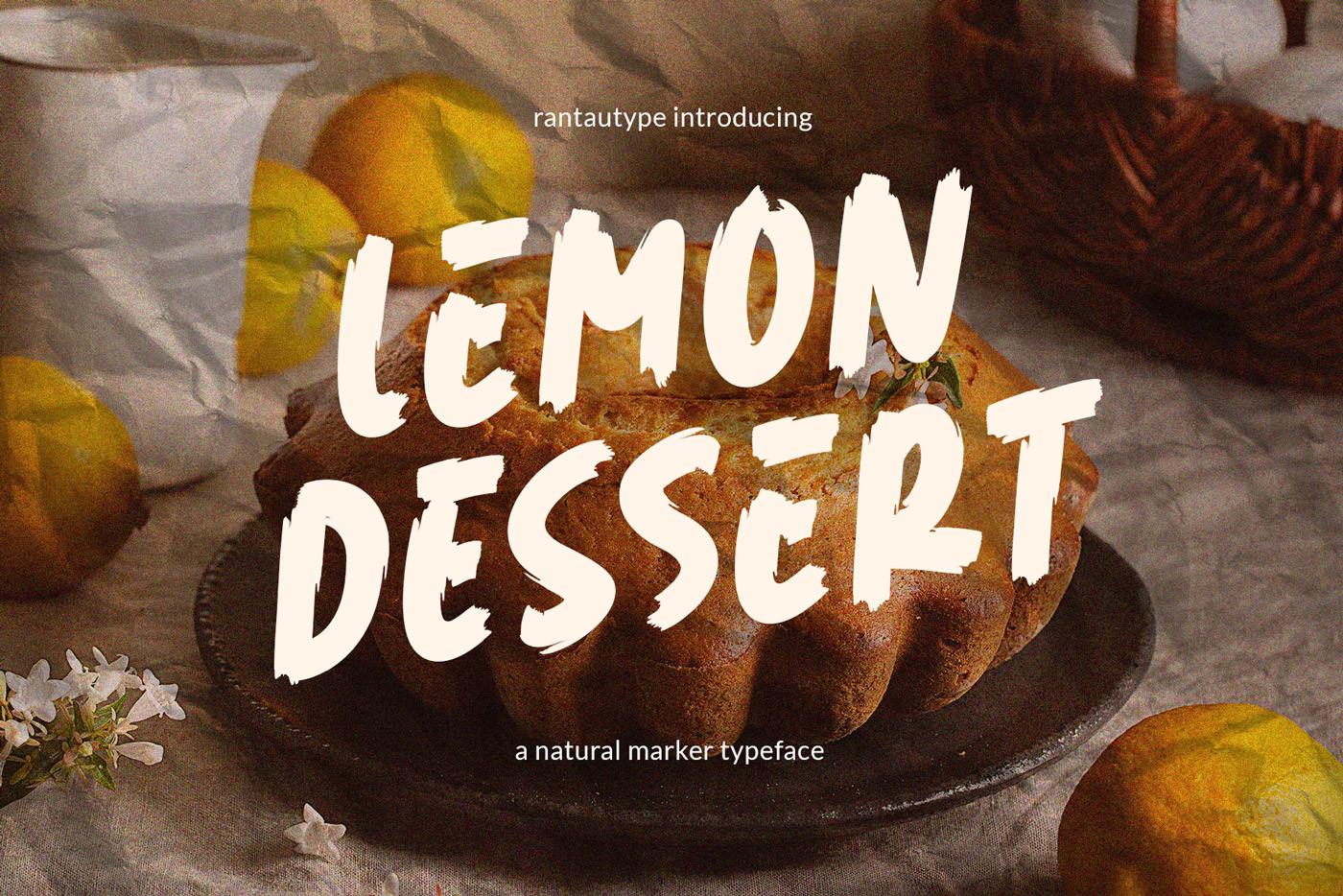
Best For: Bakery labels, recipe cards, food photos.
Bouncy brush capitals with a natural dry texture, described on the preview as a natural marker typeface. Letters hop up and down on the baseline.
It reads well layered over food photos with a slight shadow. Keep words short, since the bounce makes long lines feel busy.
Pen and Notebook Fonts
These fonts look like everyday writing in a notebook: ballpoint, gel pen or fineliner, thin and steady.
12. Gel Pen Bold Font
Gel Pen Bold Font by Fatia hafida
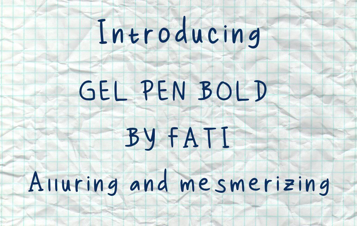
Best For: Teacher printables, planner pages, journaling cards.
Mixed-case print handwriting with an even monoline stroke, like a bolder gel pen. The preview sets it in blue on graph paper, and letters keep a slight natural wobble.
Because the stroke is even, it holds up in paragraphs, not only titles. Blue ink on a white or grid background makes worksheets look hand-filled.
13. Mono Note Font
Mono Note Font by North Studio
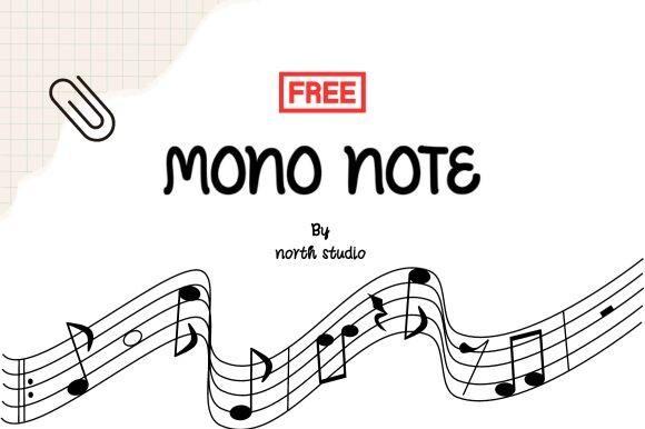
Best For: Labels, notebook covers, music and study printables.
Plain uppercase handwriting with a thin, consistent line, like block letters written with a fineliner. Simple and very legible.
Use it where clarity matters: labels, flashcards, schedules. A bit of extra tracking makes it look even tidier.
14. Ballpoint Cute Font
Ballpoint Cute Font by MVMET
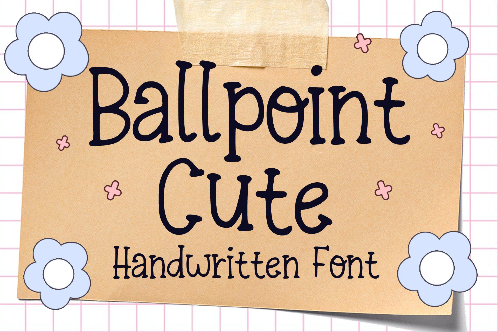
Best For: Kids’ printables, scrapbook stickers, cute journaling.
Rounded, friendly letters with a ballpoint-style stroke and a playful bounce. The preview places it on kraft paper with flower stickers.
It suits soft pastel palettes and sticker sheets. Combine it with a tiny doodle or icon instead of a second decorative font.
15. Studyhack Font
Studyhack Font by CalligraphyFonts
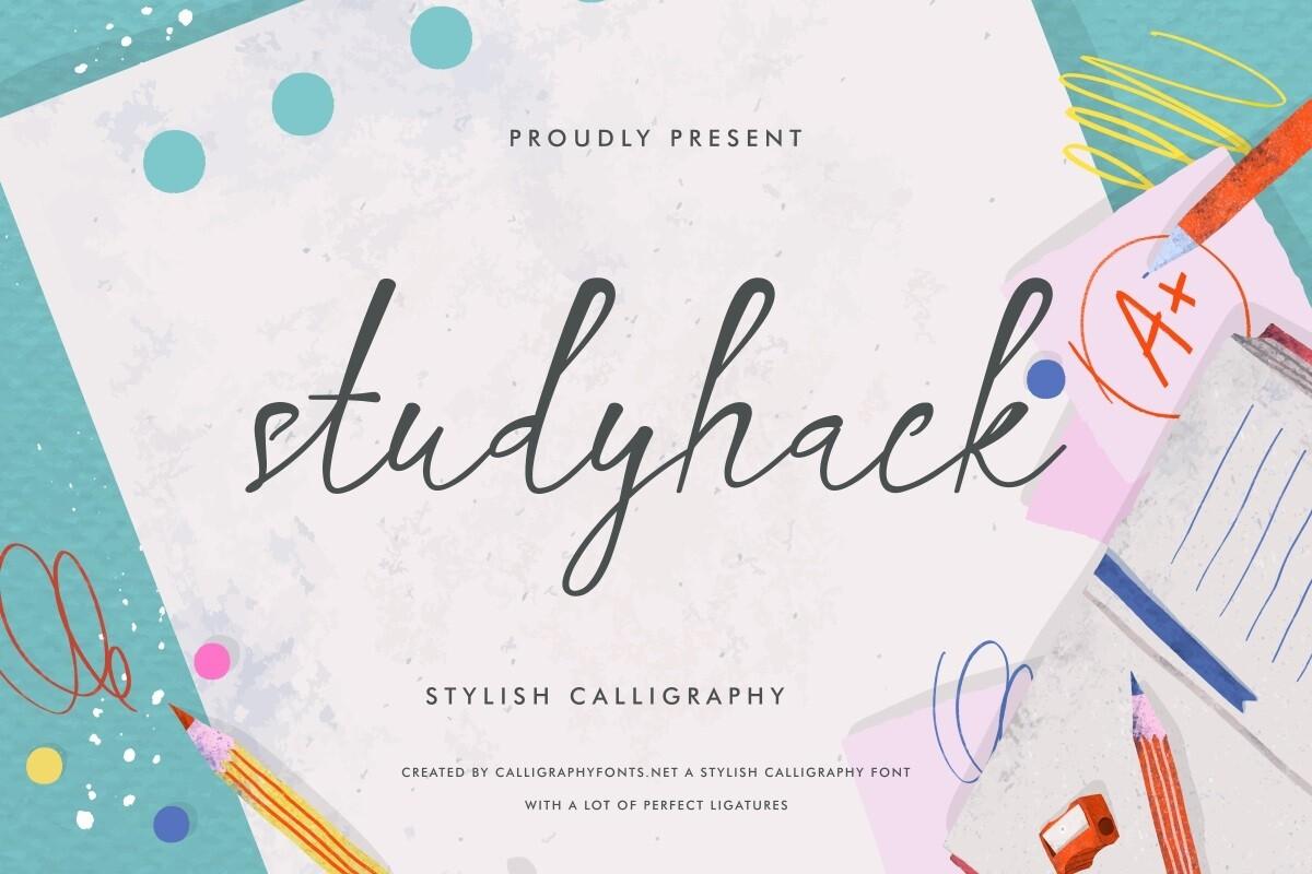
Best For: Study notes, aesthetic headers, school-themed graphics.
A thin, quick connected hand, like neat notes written with a fine pen. The preview surrounds it with pencils and an A+ sticker.
Use it for titles above notes written in a print font. Keep it fairly large, as the thin strokes disappear at small sizes.
Chalk and Chalkboard Fonts
Chalk fonts carry grain inside every stroke, so they look right on dark green or black backgrounds.
16. Chalkboard Font
Chalkboard Font by MVMET
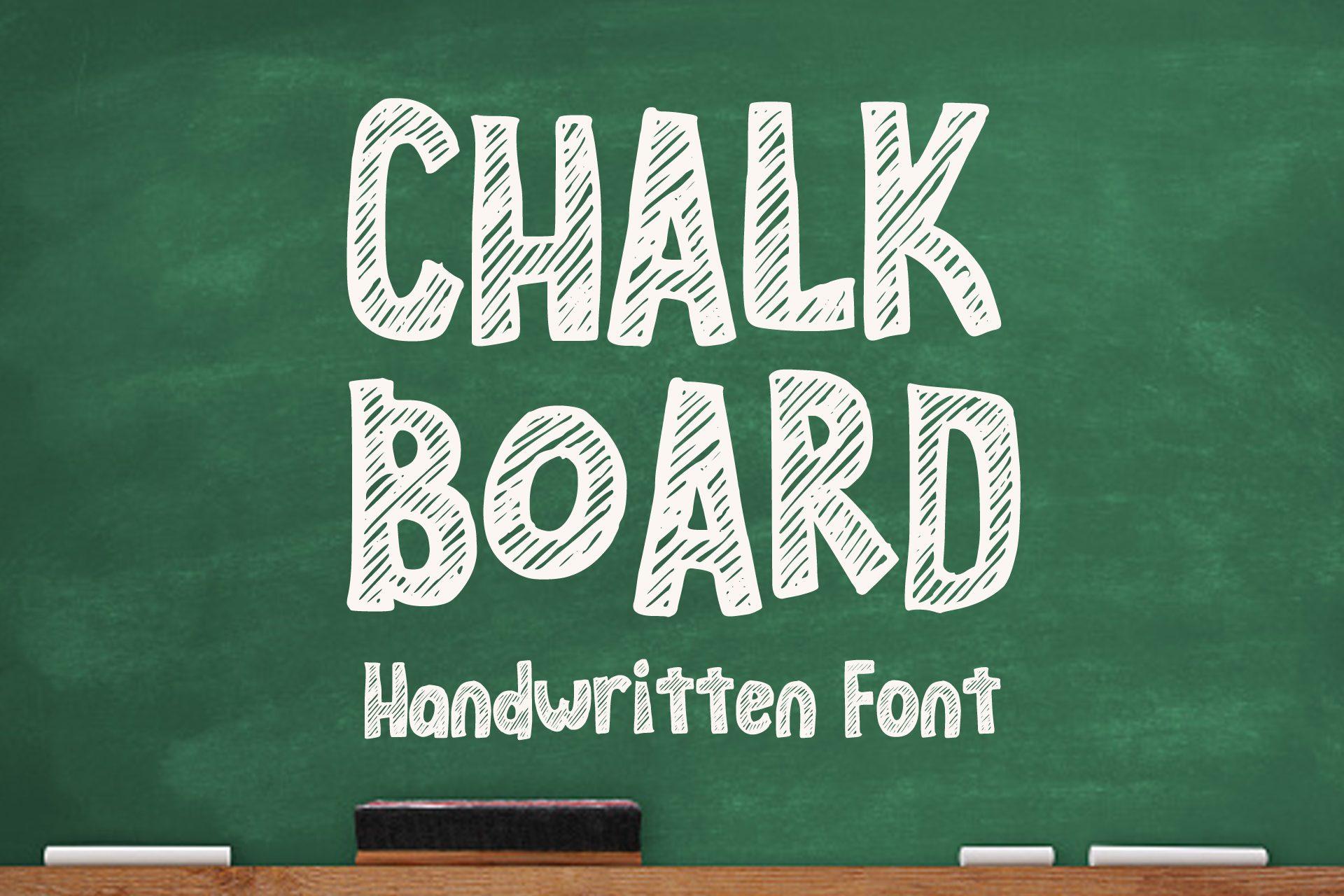
Best For: Classroom signs, back-to-school posts, menu boards.
Tall white capitals filled with grainy chalk texture, shown on a classic green board. Strokes are slightly uneven, like letters written by hand on a wall board.
Put it on deep green or charcoal and keep the color off-white rather than pure white for a realistic chalk look.
17. School Board Font
School Board Font by Rashdrawn
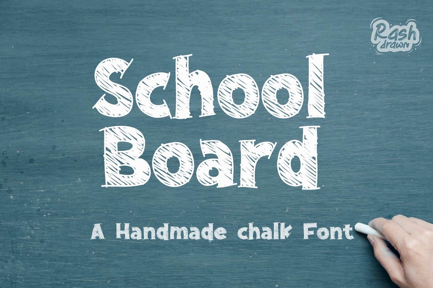
Best For: Teacher printables, classroom door signs, welcome boards.
A handmade chalk font in mixed case with rounded shapes and soft chalk texture. The preview shows it on a blue-gray board.
Its friendly mixed case works for full welcome messages. Add simple chalk doodles like stars or arrows to finish the board.
18. Warmstreak Font
Warmstreak Font by letterhanna
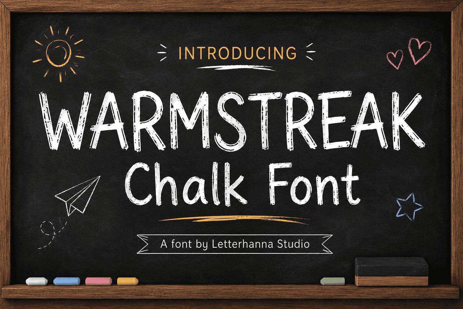
Best For: Café specials, kids’ party boards, cozy signs.
Thinner chalk capitals with a light, sketchy texture, shown with small doodles around them on a black board.
Lighter weight leaves room for several lines of text, so it suits menus and lists. Mix it with a heavier chalk font for headers.
19. Munchee Font
Munchee Font by letterhanna
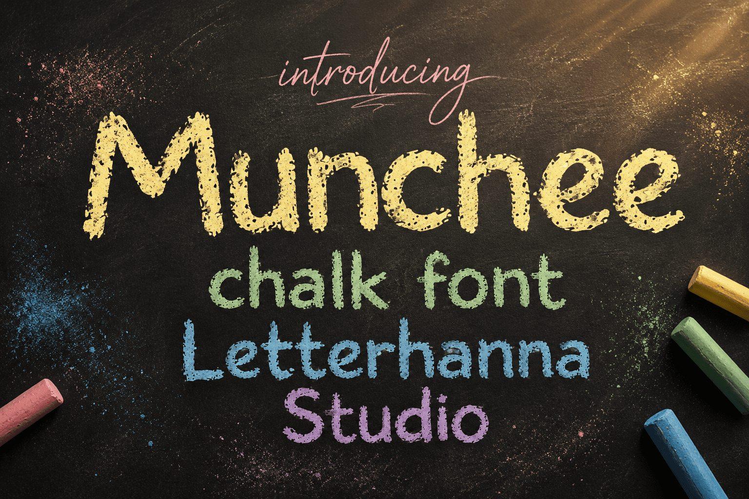
Best For: Colorful kids’ menus, birthday boards, snack signs.
Mixed-case chalk letters in soft rainbow pastels, with a dusty, layered texture. Rounded shapes keep it playful.
Give each word a different pastel, as the preview does. It shines on black backgrounds where the colors pop.
20. Sketch Chalk Font
Sketch Chalk Font by Rizkky (7NTypes)
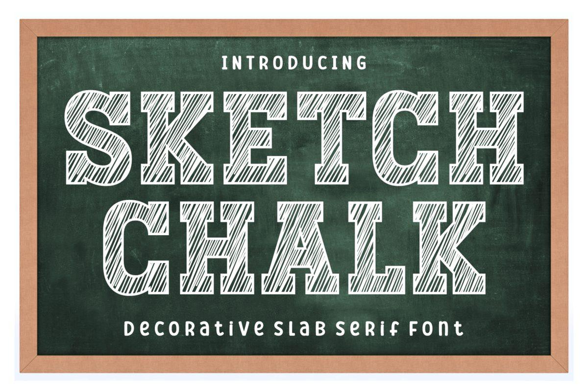
Best For: Vintage chalk menus, pub boards, rustic signs.
A decorative slab serif with hatched sketch lines filling each letter, as if drawn and shaded with chalk. It looks more crafted than casual.
Use it for a single title, then switch to a simpler chalk hand for the menu items below.
Pencil and Crayon Fonts
Pencil and crayon fonts are the softest writing tools here: grainy, waxy and often colorful, made for kids and classroom designs.
21. Pencil Note Font
Pencil Note Font by MVMET
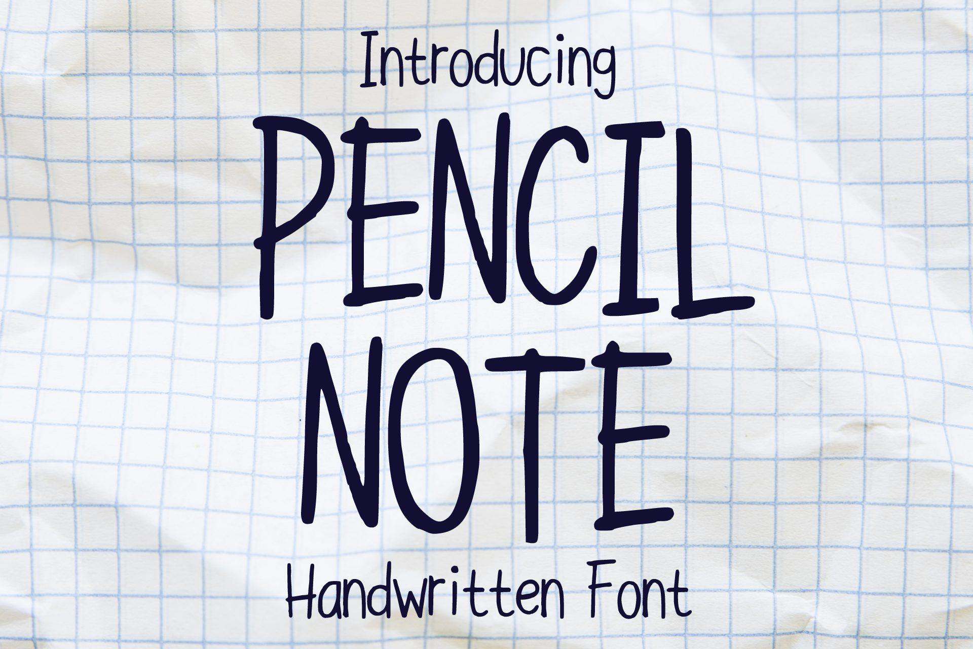
Best For: Worksheets, notebook covers, simple planner labels.
Tall, condensed handwritten capitals in dark navy on graph paper, neat and slightly irregular.
Narrow letters fit lots of text in small boxes, which helps on worksheets. Pair it with a lowercase handwritten font for instructions.
22. Skinny Pencil Font
Skinny Pencil Font by MVMET
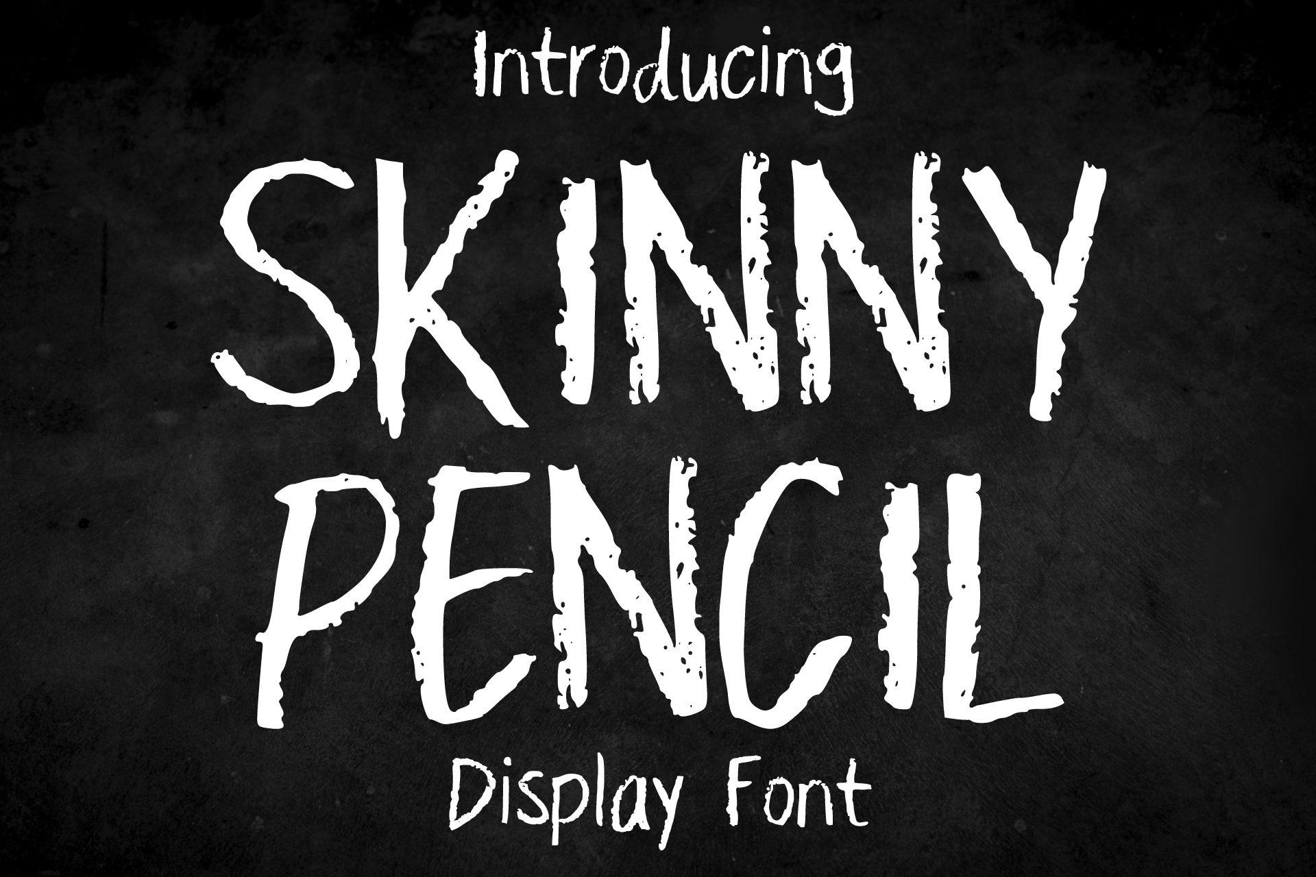
Best For: Chalk-style posters, minimal school graphics, labels.
Very thin, tall capitals with a grainy pencil texture, presented as a display font in white on black.
Set it big and bright, since thin strokes need size. It looks great as a quiet contrast to a chunky headline.
23. Crayon Pastel Font
Crayon Pastel Font by MVMET
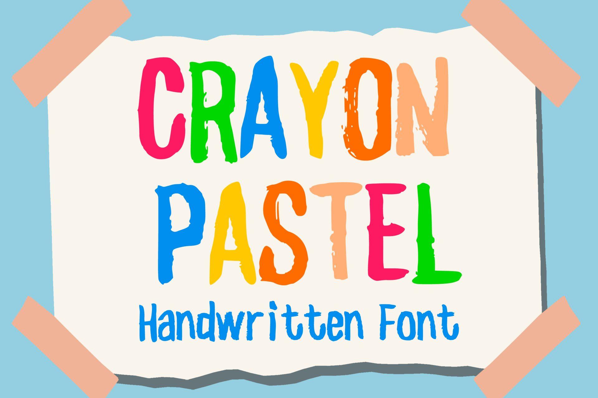
Best For: Kids’ party signs, classroom decor, children’s book covers.
Bold, colorful capitals with waxy crayon texture, shown on a taped paper sheet in bright primary colors.
Color each letter differently for a classroom-banner look, or keep one color for a cleaner title.
24. Crayon Glaze Font
Crayon Glaze Font by yunitaecy
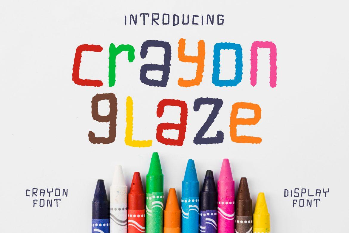
Best For: Kids’ brand logos, toy labels, playful headings.
Rounded lowercase letters with crayon grain, each letter in its own color. The preview calls it both a crayon font and a display font.
Lowercase makes it gentler than most kid fonts, so it works for parenting brands, not only for children.
25. Playful Crayon Font
Playful Crayon Font by LivelyAutumn 11.11
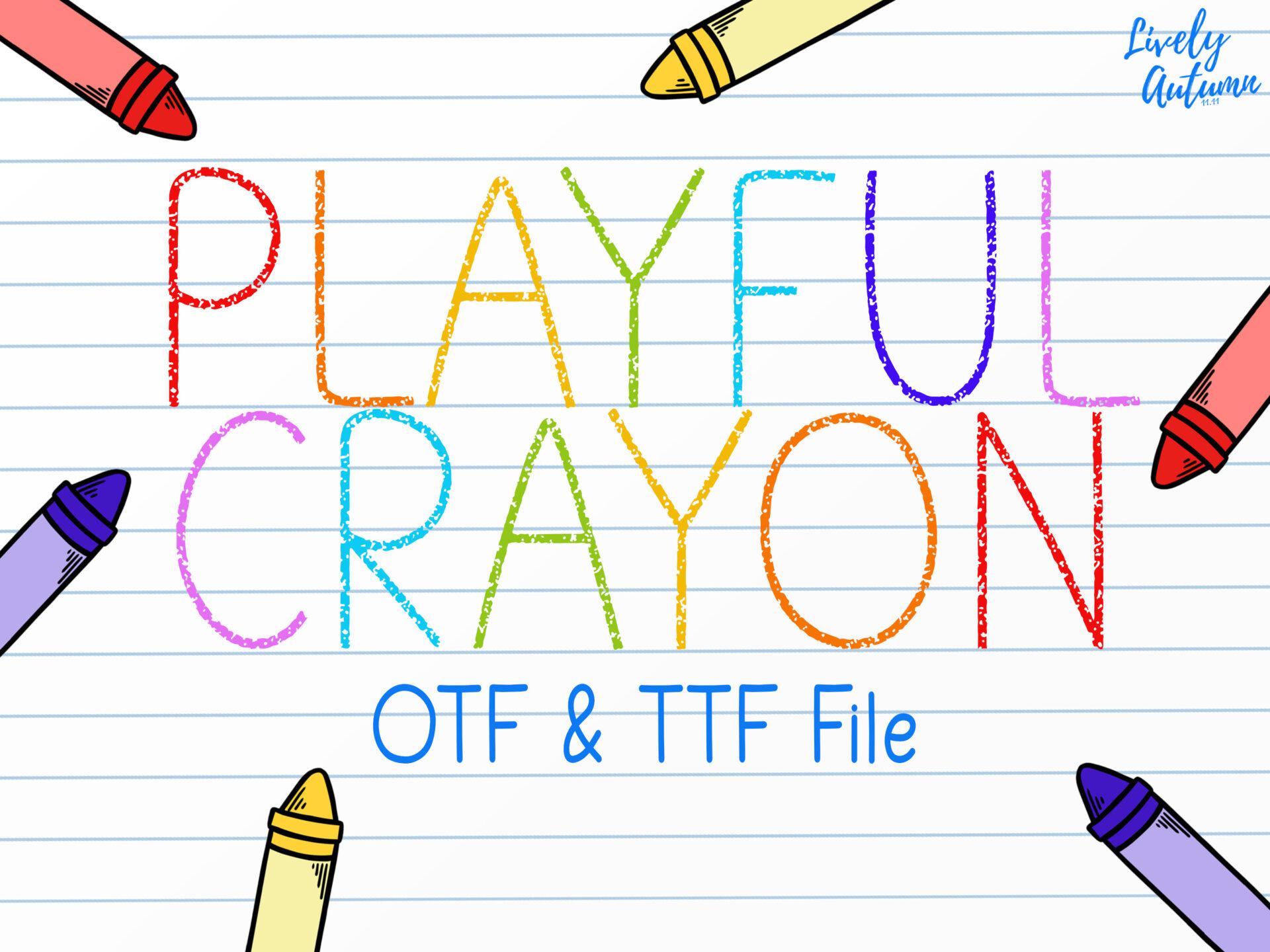
Best For: Lined-paper printables, early learning cards, sweet invitations.
Light, thin uppercase drawn with colored crayons on lined paper, with a slightly shaky child-like line.
Keep it airy: white or lined backgrounds and one or two colors. Its light weight suits names and short titles.
26. Kindergarten Crayon Font
Kindergarten Crayon Font by squeebcreative
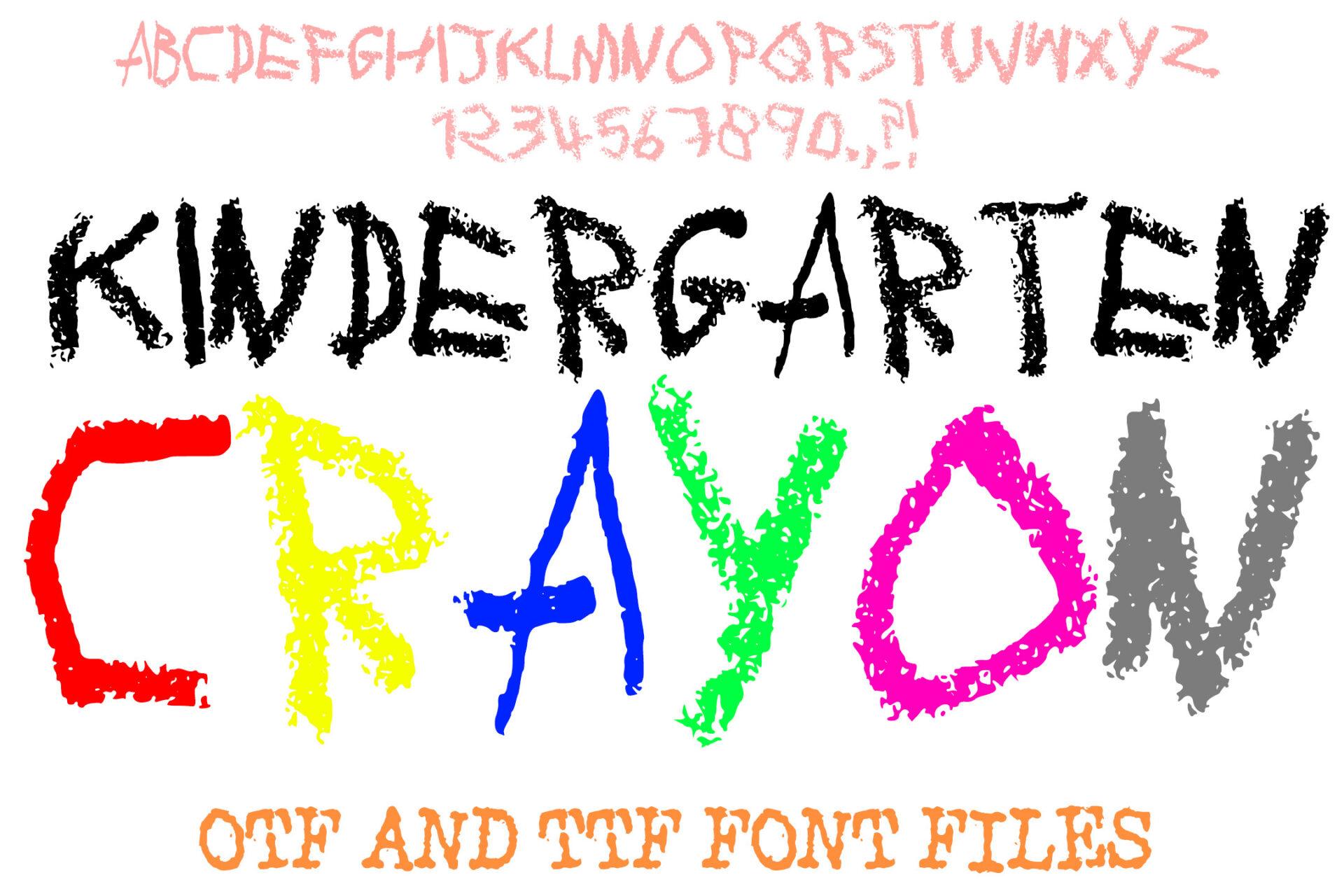
Best For: Back-to-school graphics, art class posters, kids’ shirts.
Rough, scribbly capitals in bright colors, like letters colored in by a small child. The preview shows the full alphabet and numbers.
It is the most childlike option here. Use it for one bold word and keep the rest in a neat print font.
How to Choose a Writing Font
Start with the surface, not the font. A shirt or poster read from a distance needs a marker or bold brush pen. A planner page or worksheet needs a pen font with an even stroke that stays readable in small sizes. Dark boards and menus call for chalk, and anything for children feels right in pencil or crayon.
Next, check how many words you need to set. Textured fonts like dry brush, chalk and crayon look great on one to five words and get tiring in paragraphs. If you need longer text, pair one textured headline font with a clean pen font or a simple sans for the body.
Finally, test the letters you will actually use. Type your real headline, name or menu item before you commit: repeated letters, numbers and punctuation are where handwritten fonts most often look off.
Writing Fonts FAQ
What are writing fonts?
Writing fonts are typefaces that imitate real handwriting tools such as markers, brush pens, gel pens, chalk, pencils and crayons. They differ from cursive fonts in that most of them are printed letters, not connected script.
Which writing fonts are best for teachers?
Chalk and pen fonts work best for classroom use: chalkboard styles for signs and welcome boards, and even, monoline pen fonts for worksheets and labels, because they stay legible at small sizes.
Can I use writing fonts in Canva?
Fonts you download as OTF or TTF files can be uploaded to Canva on plans that allow custom font uploads. Check each font’s file formats on its page before you buy.
What is the difference between a marker font and a brush pen font?
A marker font has an even stroke with flat or rounded ends. A brush pen font changes thickness with pressure and often shows dry, streaky edges.
Pick one tool that fits your project, try two or three fonts from that group with your real words, and keep the rest of the design simple so the handwriting stays the star.