23 Sports Fonts for Jerseys, Numbers & Team Logos
Sports fonts do a job most lettering never has to: they get read from the bleachers, across a field and on the back of a player who is running. The shapes that pass that test are wide, heavy and simple, with numbers that hold up as well as the letters.
This post contains affiliate links. If you buy through them, I may earn a small commission at no extra cost to you.
This list is sorted by what you are making. Jersey and number fonts for names on the back, varsity and college fonts for arches and class shirts, bold and vintage fonts for racing, gyms and retro prints, and scripts with tails for team logos.
All fonts in this list are on Creative Fabrica, and a single All Access subscription unlocks every one of them, so you can try several styles before committing to one.
More font collections:
20 Logo Fonts for Small Business Branding, Shop Signs and Product Labels
25 Bold Serif Fonts for Logos, Posters and Vintage Packaging
Table of Contents
- Jersey & Number Fonts
- Varsity & College Fonts
- Bold & Vintage Sports Fonts
- Sports Script Fonts with Tails
Jersey & Number Fonts
These are built for the back of a shirt: block letters, numerals that match them, and outlines that give a second color somewhere to sit. If the design has to carry a player name and a number, start here.
1. Baseball Athlete Jersey Font
by Bundle
Best For: baseball jerseys, team names across the chest, posters for game day
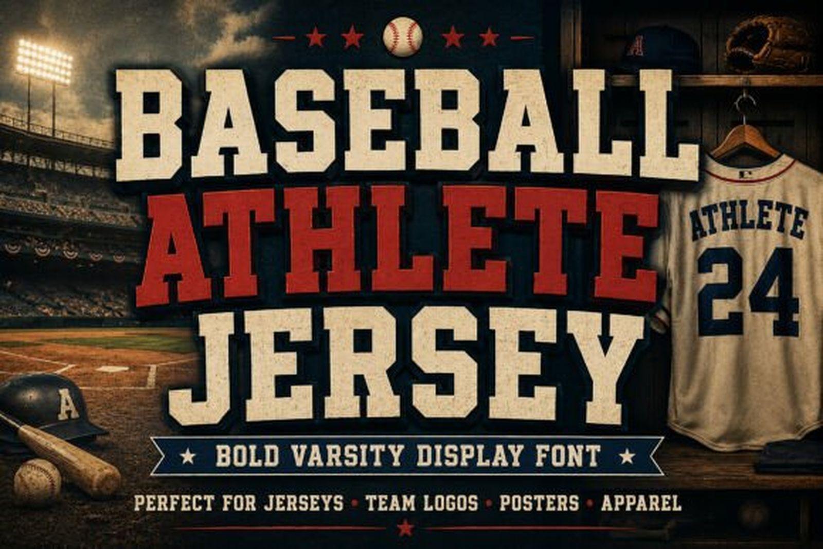
Baseball Athlete Jersey Font is a heavy varsity display with short, blunt serifs and wide capitals. In the preview it is set in cream and red on a dark ballpark scene, with the same letters stitched onto a jersey, and that is exactly the use it was drawn for.
The letters are broad enough to take a thick outline without closing up, so a two-color treatment works well: fill in one team color, outline in the other. Keep it to short words. A team name or a surname reads cleanly, a full sentence starts to feel crowded.
View Baseball Athlete Jersey Font →
2. Abcd Jersey Font
by riki.studio
Best For: two-color jerseys, college tees, heat transfer vinyl lettering
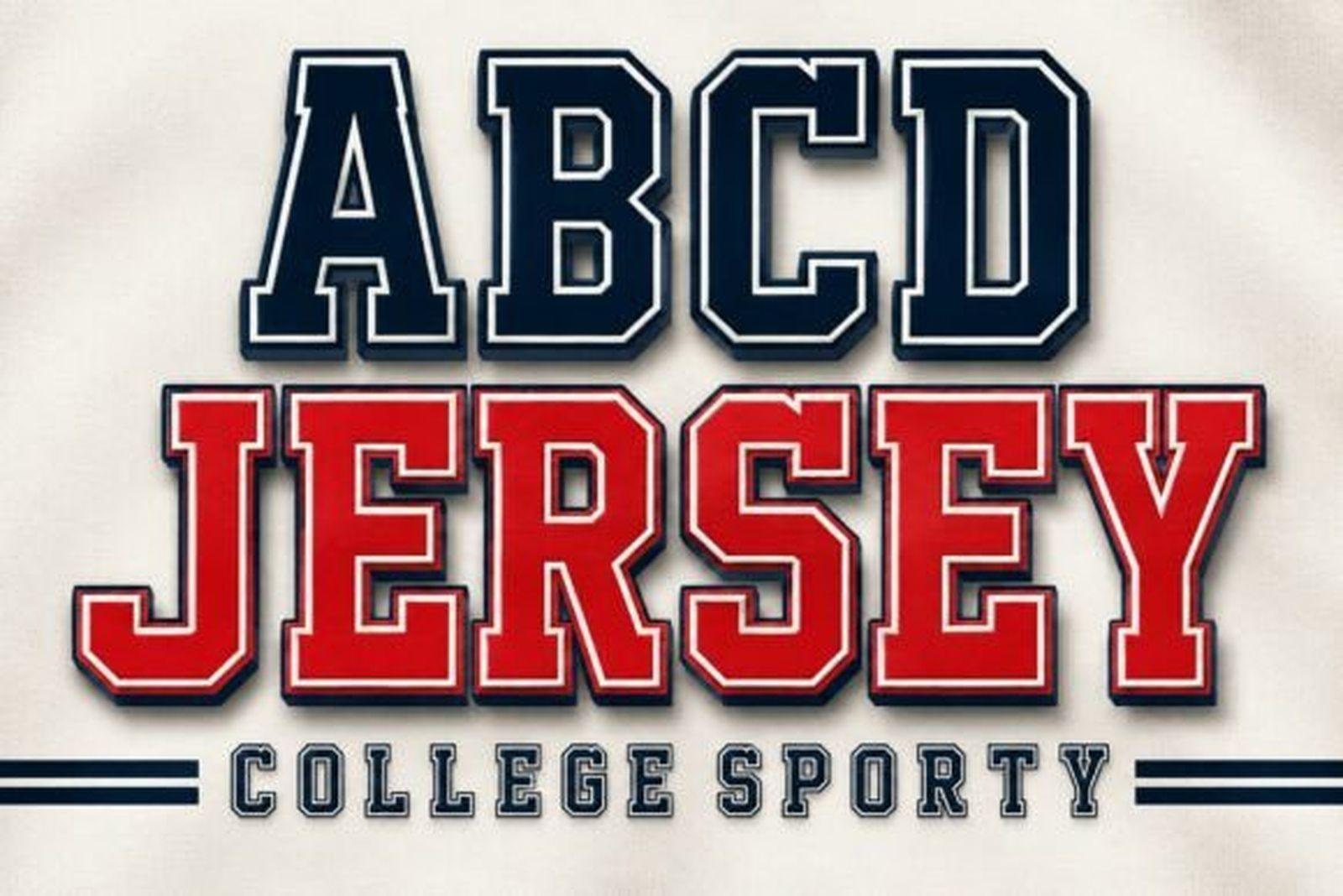
Abcd Jersey Font is classic athletic block lettering: tall capitals, square slab serifs and a straight, even rhythm. The preview stacks navy over red, each word with a light offset outline, which is the look of a printed college shirt.
Because the shapes are so regular, it lines up well in a straight row across a chest or down a sleeve. Pair it with a plain sans for small details like the year or the city, and let this one carry the main word.
3. Jersey Modern Font
by WNIdesign
Best For: throwback jerseys, retro team tees, club patches
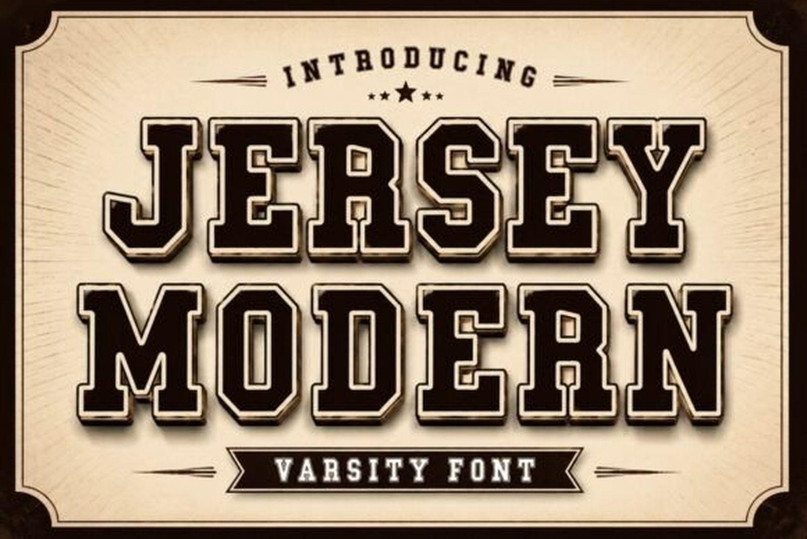
Despite the name, Jersey Modern Font leans vintage. The slab capitals are dark brown with a cream inline and a shadow, set on an aged paper background, much like an old program cover.
The built-in look of an inline plus a shadow means one color alone can still feel layered. It suits throwback kits, anniversary shirts and club badges where you want the design to look like it has been around for decades.
4. Sports Jersey Font
by Cute Cat
Best For: names on the back, stacked layouts, clean one-color prints
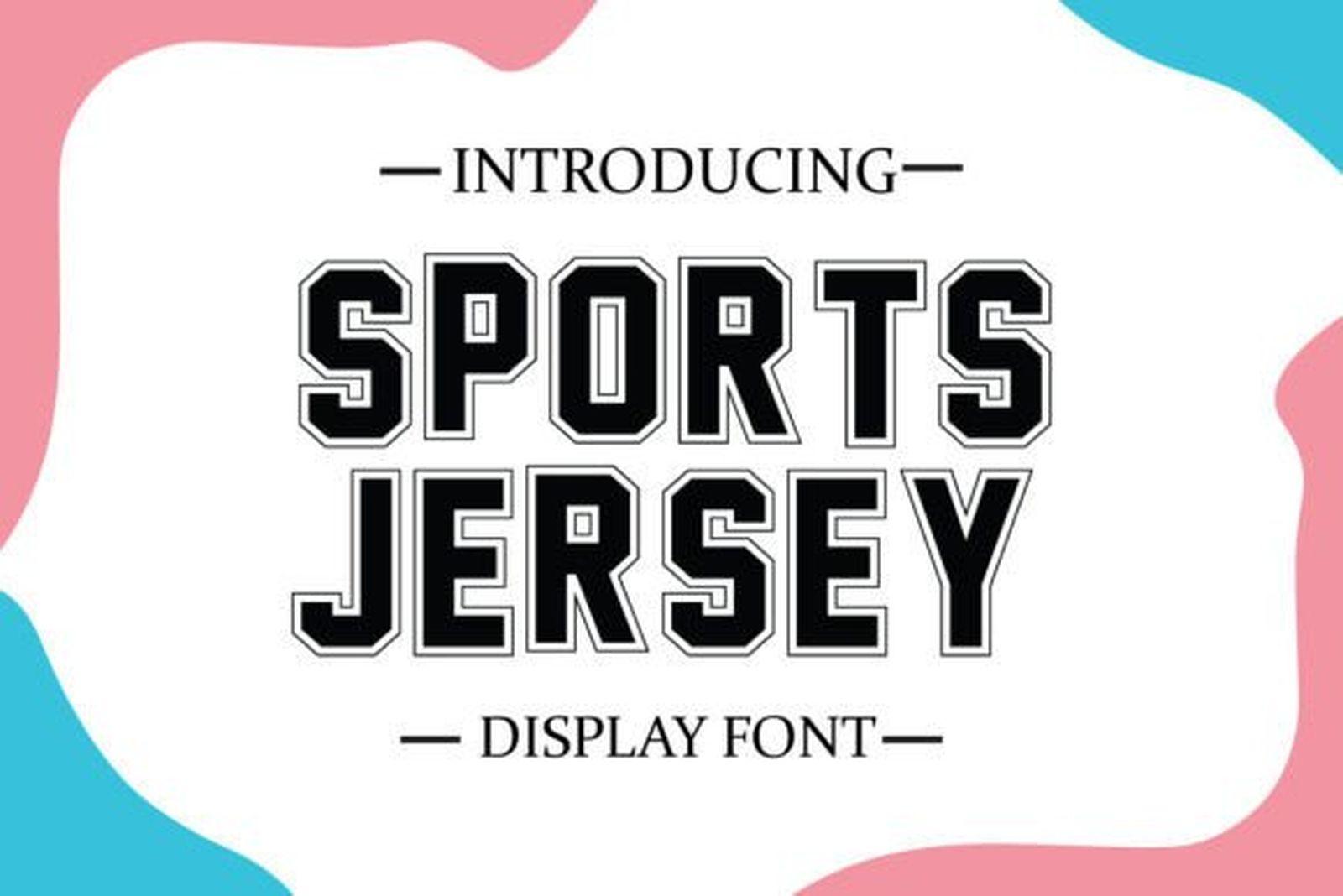
Sports Jersey Font is a condensed block face drawn in outline, with a thin line running inside each stroke. The preview keeps it simple: black letters on white, framed by a light border.
The narrow proportions help with long surnames that would overflow a wider varsity face. Stack two words, center them, and the outline style gives texture without a second color, which keeps printing costs down on small team orders.
5. Varsity Spirit Font
by TonisArtStudio
Best For: cutting machines, iron-on numbers, spirit wear
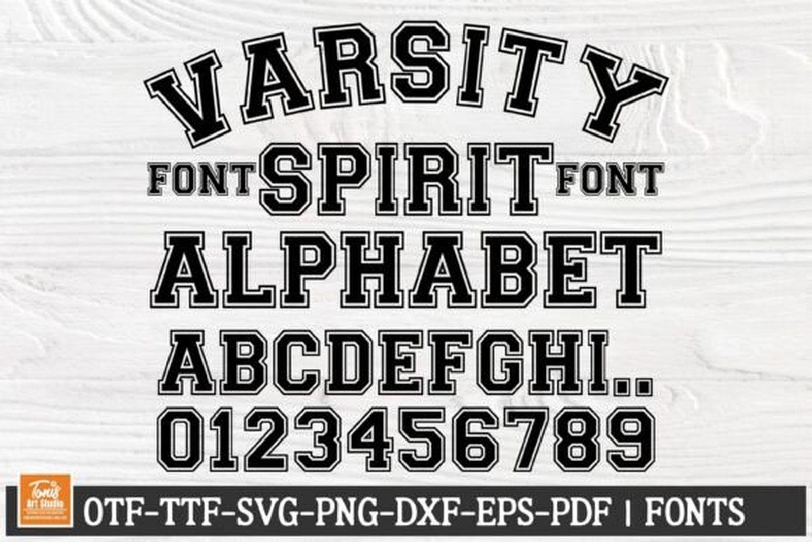
Varsity Spirit Font shows the full picture in one image: an arched headline, the alphabet and the digits 0 to 9. The letters are classic varsity with pronounced slab serifs and a firm, upright stance.
The preview lists OTF, TTF, SVG, PNG, DXF, EPS and PDF files, which makes it practical for vinyl and cutting machines, not only for typing. Use it when you need matching letters and numbers for a whole roster.
6. Athletic Font
by mardanimirza12
Best For: arched chest lettering, school spirit shirts, game day banners
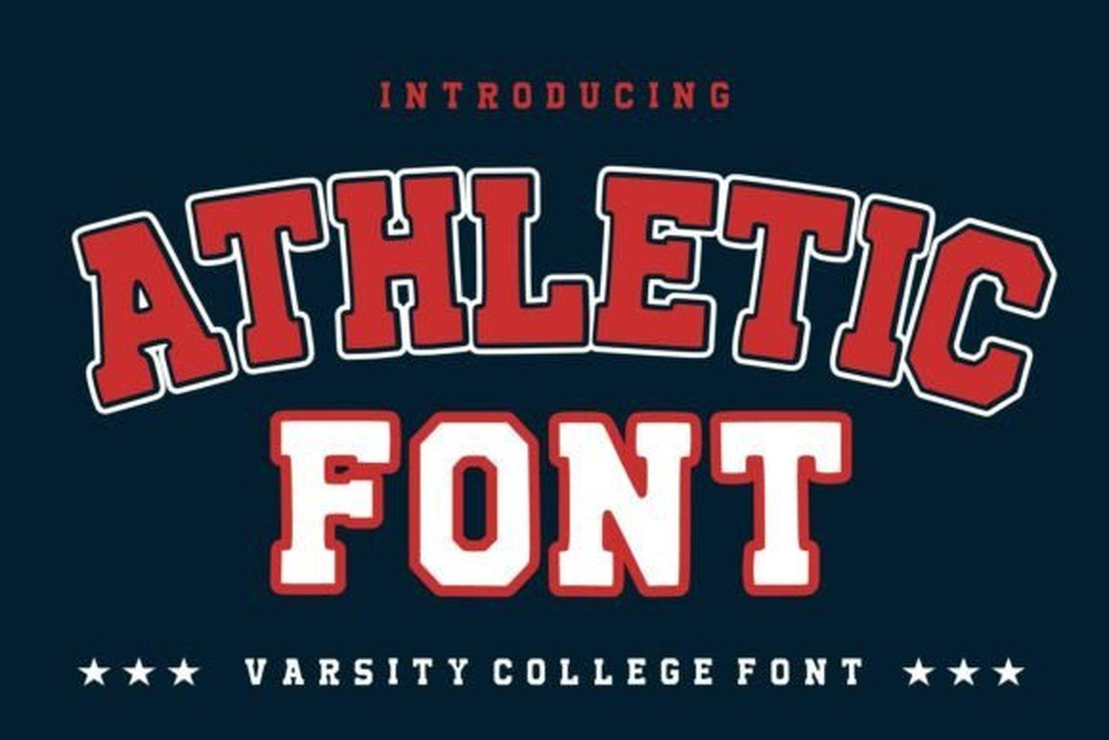
Athletic Font is red block lettering with a white outline, shown curved into an arch over a second straight line, on a navy field with a row of stars. It is the most recognizable college layout there is.
The outline sits outside the letter, so it holds up when the word bends. Arch the team name, keep the second line straight, and you have a spirit shirt layout in two steps.
Varsity & College Fonts
The college look: slab serifs, tight letter fits and shapes that bend into an arch without falling apart. These work for jackets, class shirts, pennants and anything that should feel like school pride.
7. Athlete Final Font
by 29Graphic
Best For: senior shirts, football posters, distressed apparel
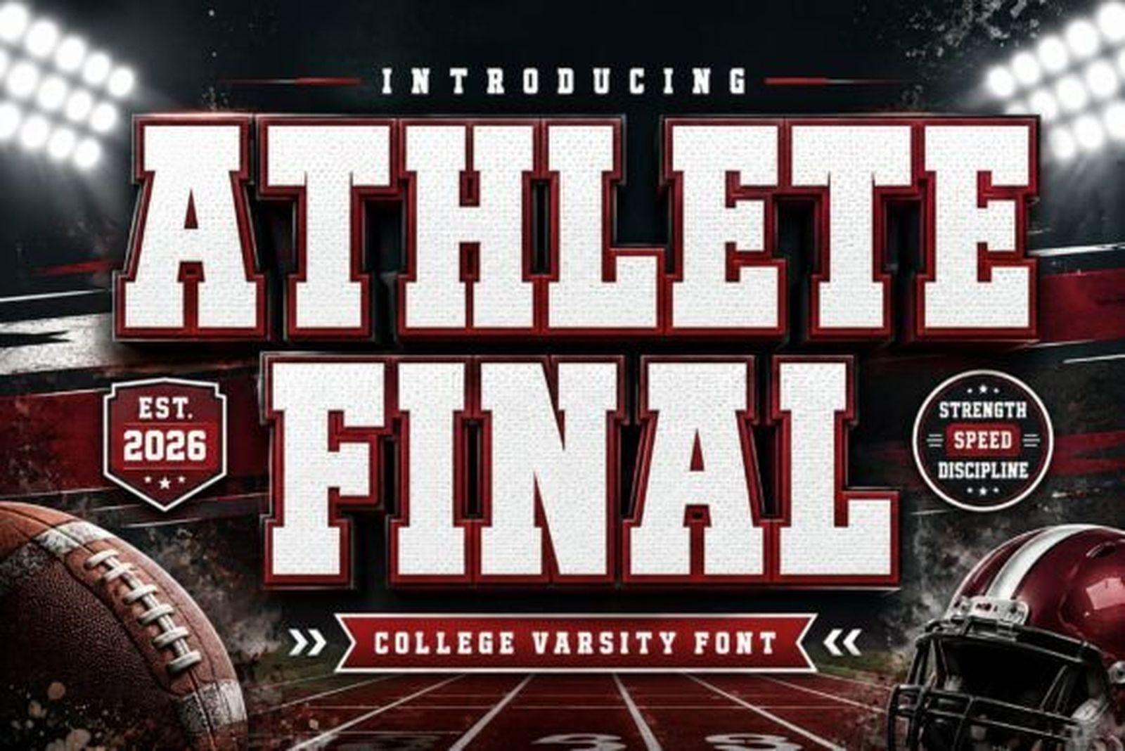
Athlete Final Font is a college varsity face with a worn texture, as if the letters were printed on a shirt that has been through a few seasons. The preview puts white capitals with a dark outline over a football field.
That weathered surface is the reason to pick it. It saves you from adding a grunge effect later and works best big, on posters and the front of a tee, where the texture has room to show.
8. Senior Font
by basyar
Best For: class of shirts, graduation banners, varsity jackets
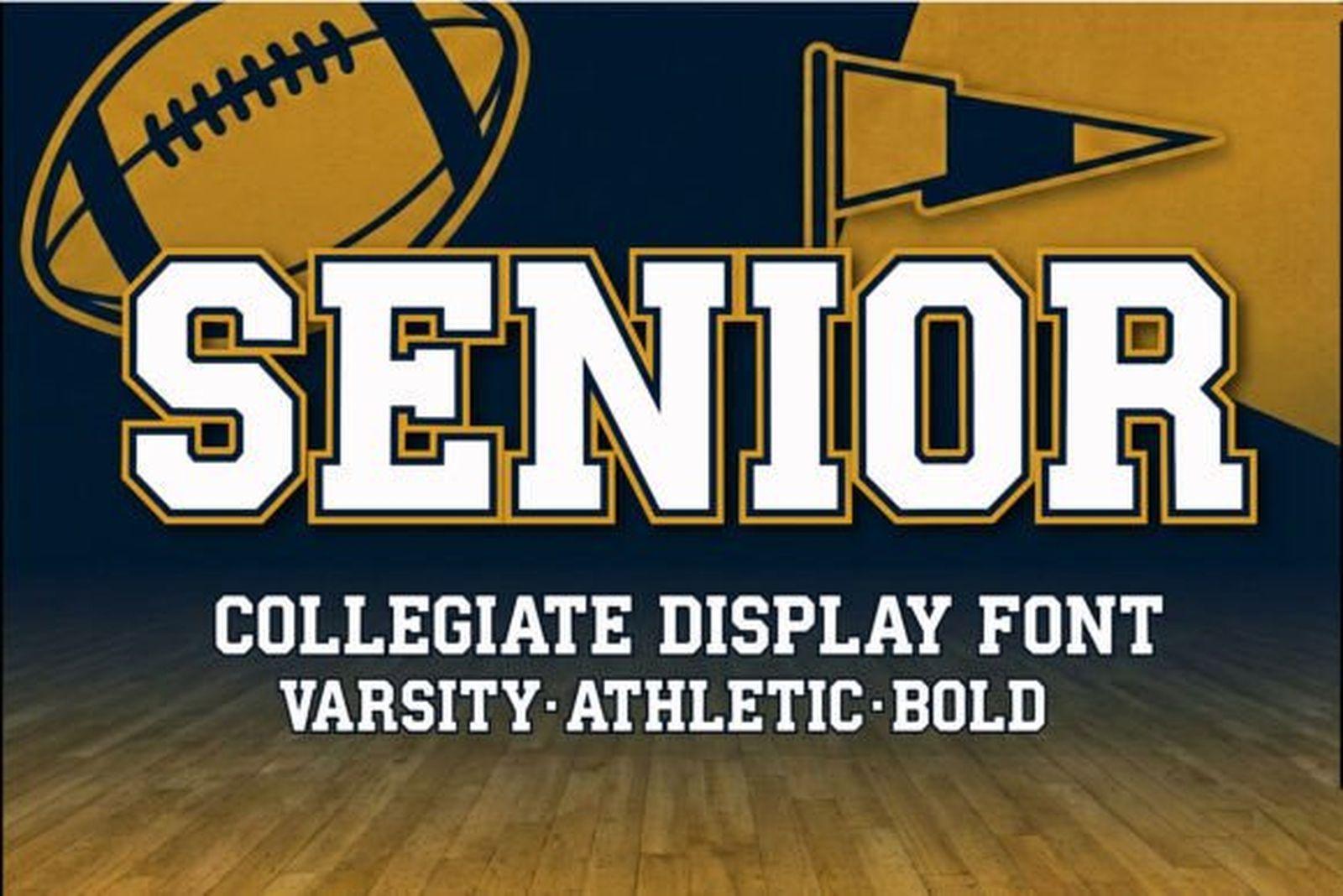
Senior Font is a collegiate display with thick slab serifs and a confident, slightly wide stance. The preview sets the word in cream with a dark outline over navy and gold, next to a football and a pennant.
It is made for the year-end moment: senior shirts, class banners, the back of a jacket. Pair it with a simple sans for the year and the school name underneath.
9. Mascot College Font
by Almairatype Studio
Best For: mascot arches, college crest wordmarks, pennants
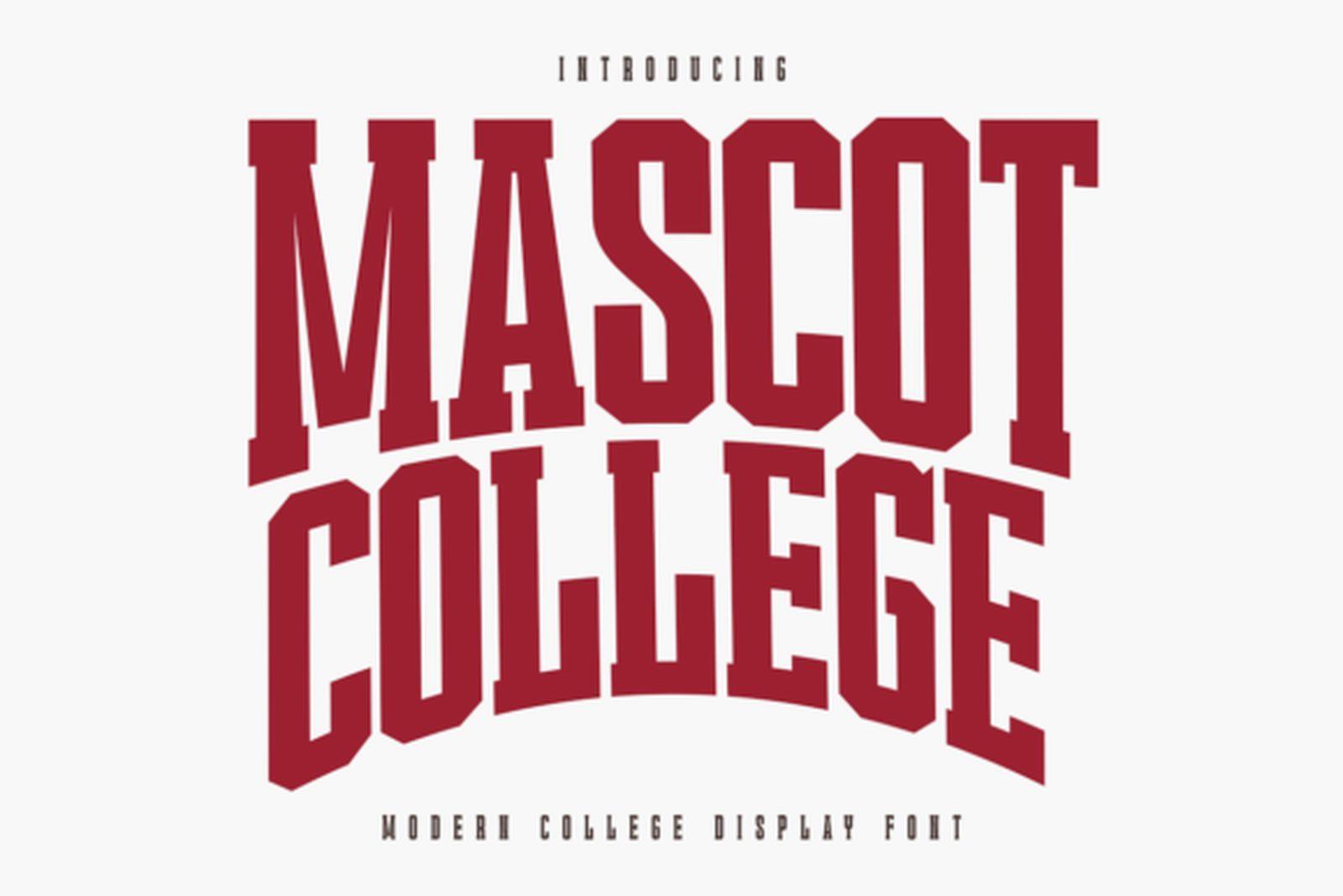
Mascot College Font is tall and condensed, with sharp slab serifs and a firm vertical rhythm. In the preview the words are set in maroon and pulled into a wide arch.
Condensed letters are the easiest to arch, and this one keeps its shape along the curve. It fits the classic layout of a mascot name bent over an emblem or a pennant with a long word.
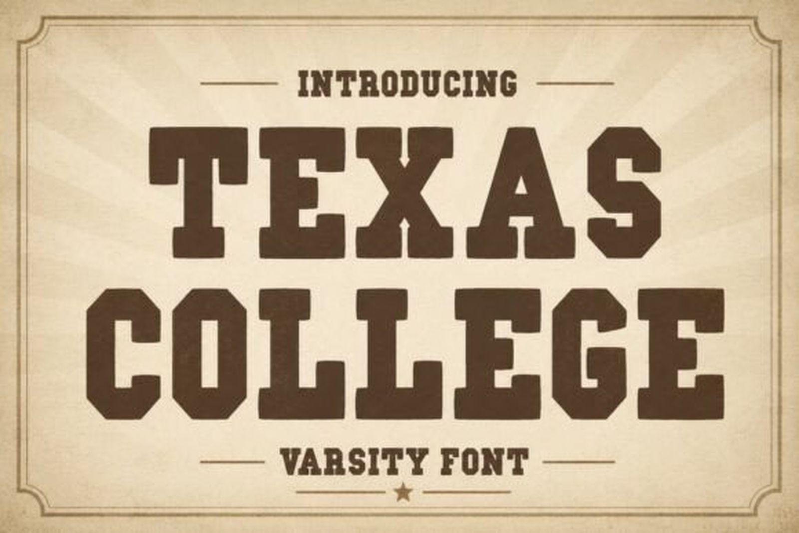
10. Texas College Font
by WNIdesign
Best For: retro college tees, western-leaning team merch, vintage posters
Texas College Font is a heavy slab varsity in dark brown on a cream sunburst background, finished with a small star. The letters are wide and compact, with serifs that almost feel like wood type.
The mood is more old print shop than modern stadium. It works on retro tees, rodeo and western events, and team merch that should feel warm rather than sharp.
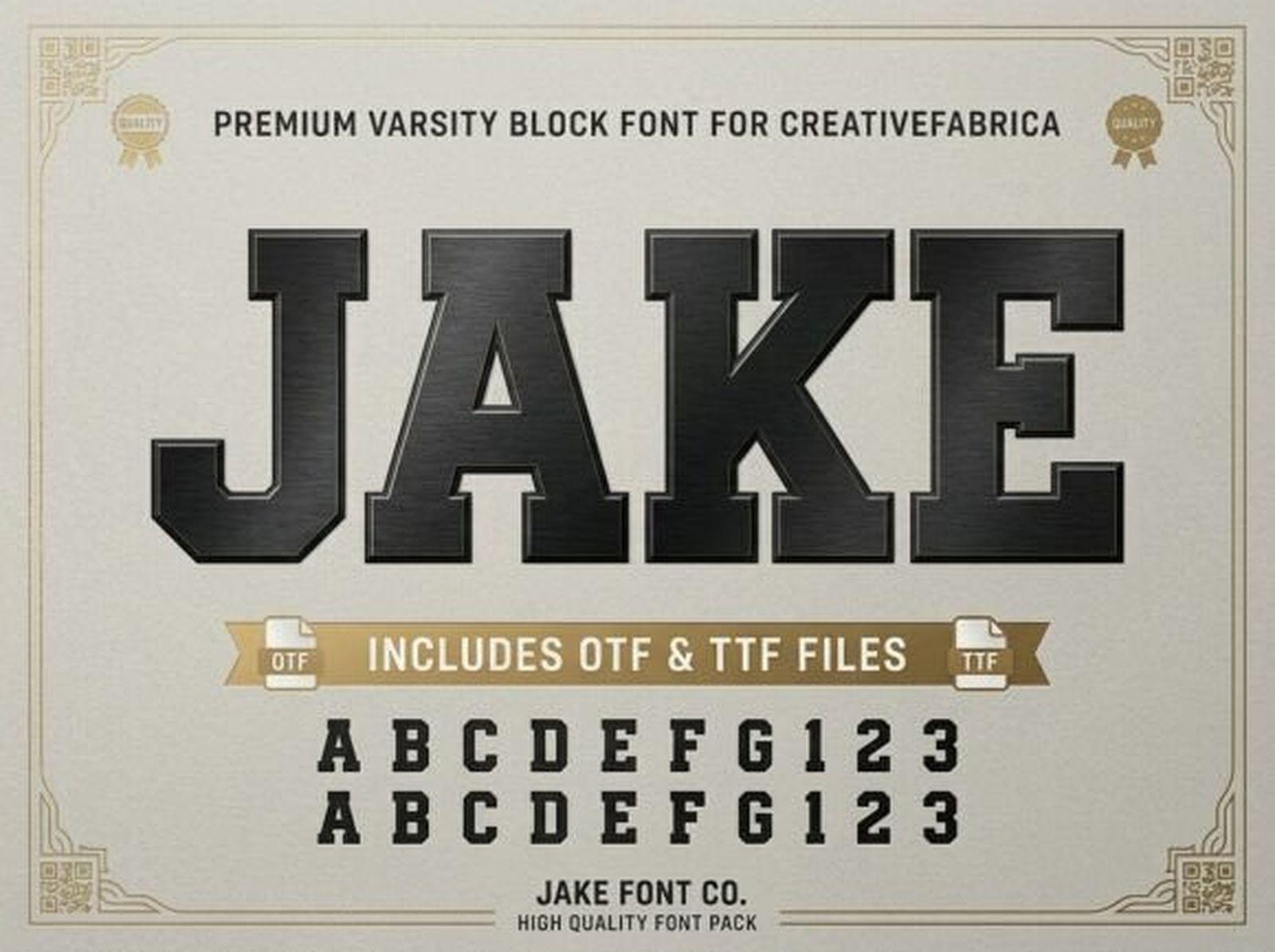
11. Jake Font
by Raholco
Best For: one-word logos, bold numbers, jacket patches
Jake Font is a varsity block face shown with letters and numerals side by side. The preview renders it in a metallic style, which shows how the plain shapes take an effect well.
The clean, even strokes make it a good base for embossed, foil or 3D treatments. Use it for a single strong word or a number, where the shape can stay large and simple.
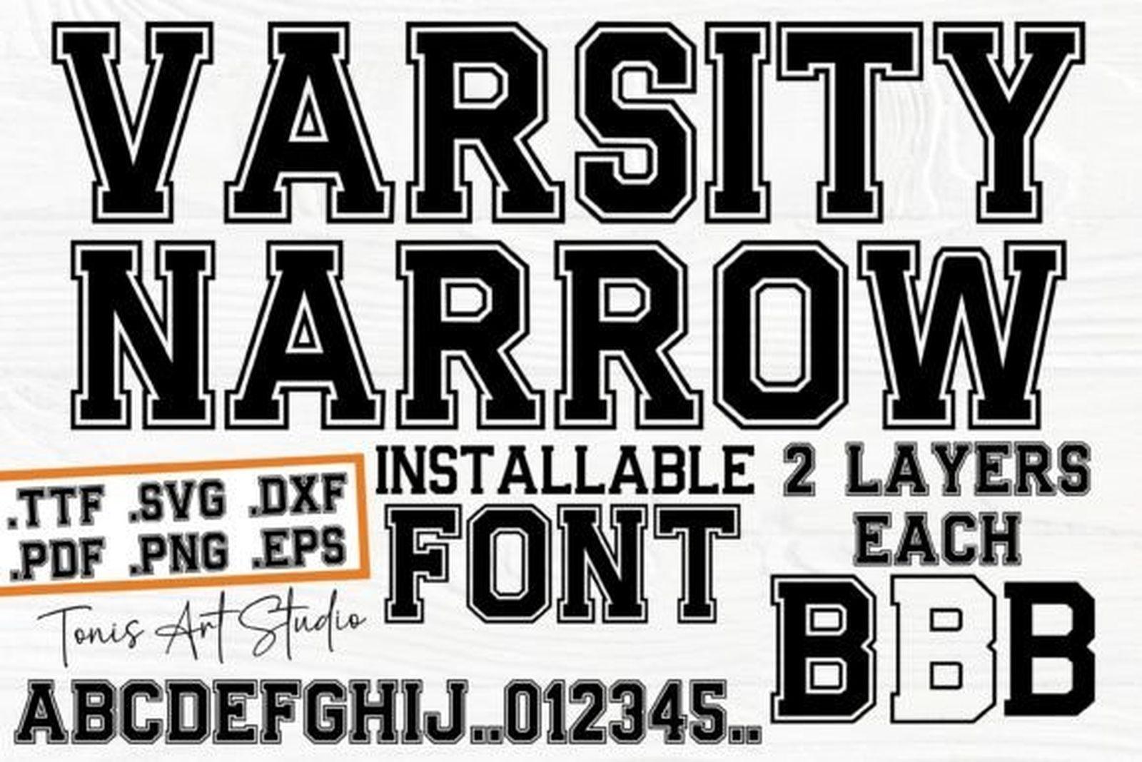
12. Varsity Narrow Font
by TonisArtStudio
Best For: long surnames on jerseys, two-color layering, vinyl cutting
Varsity Narrow Font is a condensed take on the varsity block. The preview notes that it installs as two layers, fill and outline, and lists OTF, TTF, SVG, DXF, PNG, PDF and EPS files.
The two layers are the useful part: type the word once in each layer and color them separately, instead of building an outline by hand. The narrow width helps when the name is long and the shirt is not.
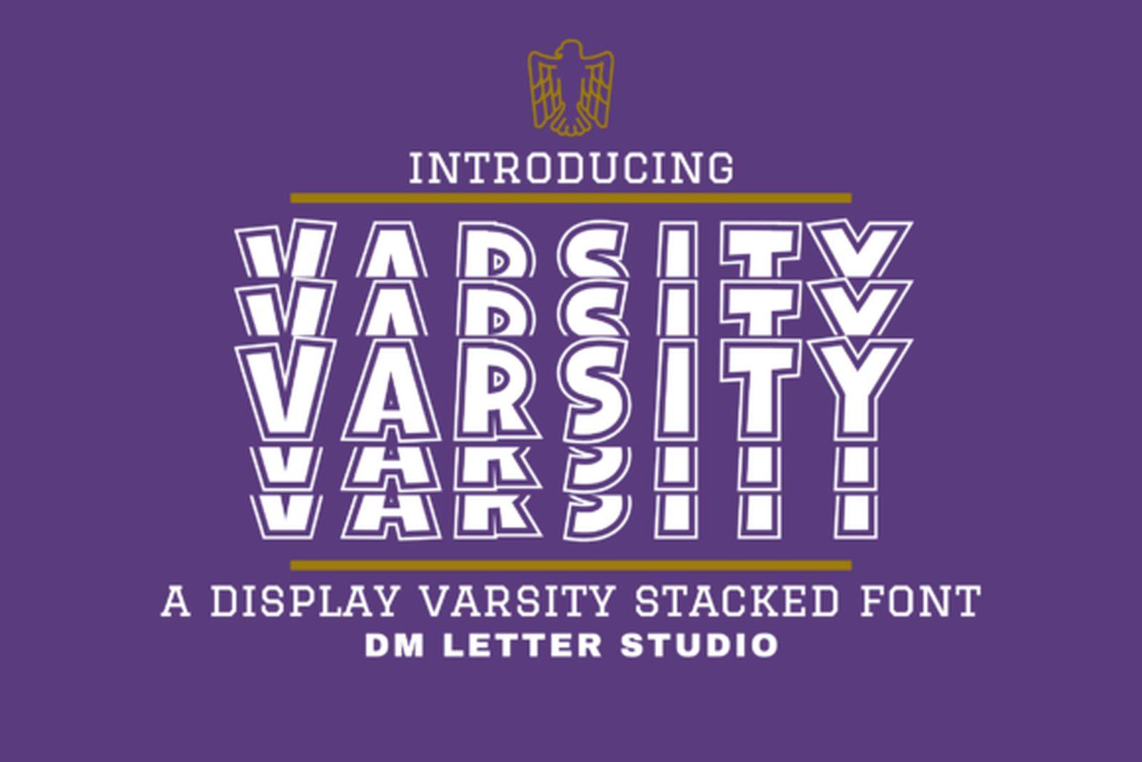
13. Varsity Stacked Font
by dmletter31
Best For: spirit wear with repeated team names, bold statement tees
Varsity Stacked Font repeats each word in stacked echo lines, so a single team name becomes a column of outlines. The preview shows it in white on purple.
It is a display effect rather than a text face. Use it for one word, repeated, as the whole design of a shirt, and leave the details to a simpler font.
14. Home Plate Font
by kitaleigh
Best For: baseball team monograms, caps, small badges
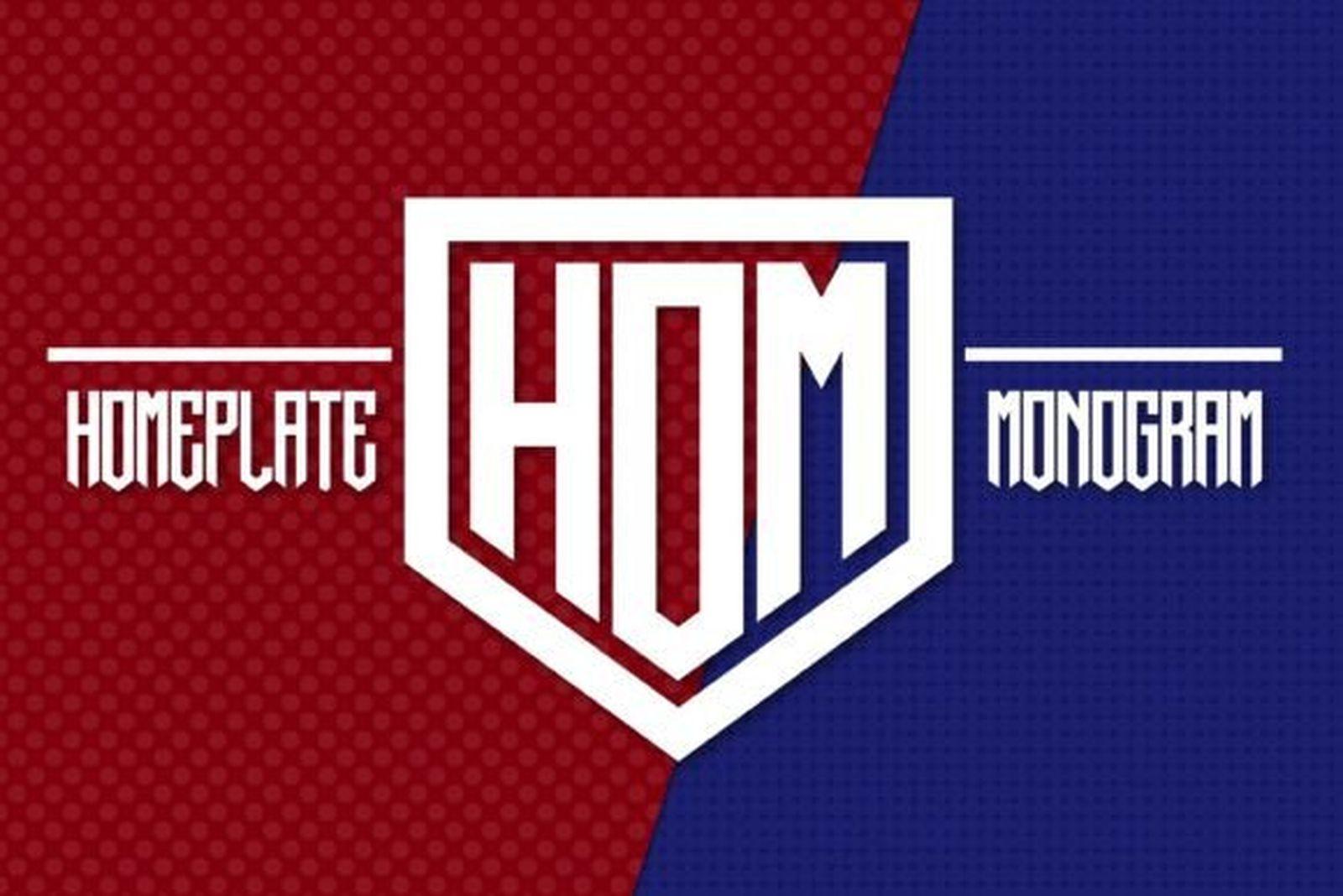
Home Plate Font is a monogram font: the letters sit inside a shield shaped like a baseball home plate. The preview shows three letters locked together in red and white on a split red and blue background.
It gives you a ready team mark without drawing a crest. Use it for initials on a cap, a small chest badge or a sticker, and set the full team name elsewhere in a varsity face from this list.
Bold & Vintage Sports Fonts
Not every sports design is a jersey. Racing, running, gyms and retro posters call for letters that are heavier, faster or rougher than a clean varsity block.
15. Vintage Varsity Font
by TonisArtStudio
Best For: throwback posters, vintage athletics tees, worn club prints
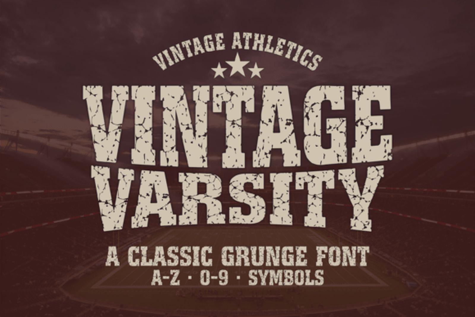
Vintage Varsity Font is a classic slab varsity with a grunge texture worked into every letter. The preview sets it in cream on dark brown under a small star arch and notes A to Z, 0 to 9 and symbols.
The texture does the aging for you. It suits vintage athletics tees and old-school posters, and with numbers included it can cover a jersey number too.
16. Outline Font
by turz74347
Best For: vintage posters, layering over a solid face, retro prints
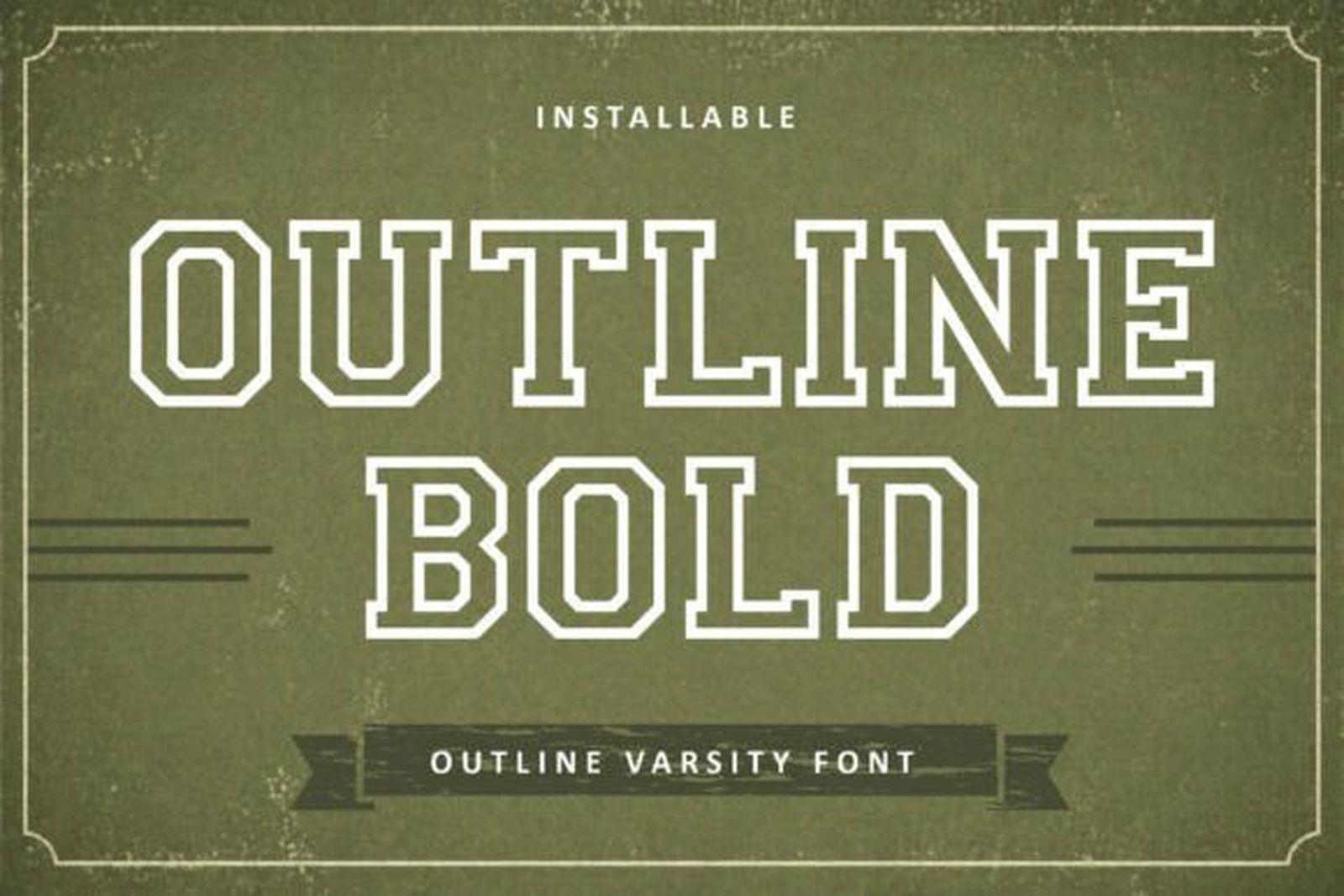
Outline Font is a varsity face drawn only as a double outline, shown in cream on olive green with a small ribbon banner. The inside of each letter is empty.
On its own it reads light and retro. Layered over a solid varsity from this list, slightly offset, it turns into a two-tone jersey effect.
17. Fast Area Font
by Storic
Best For: motorsport, running clubs, speed-themed posters
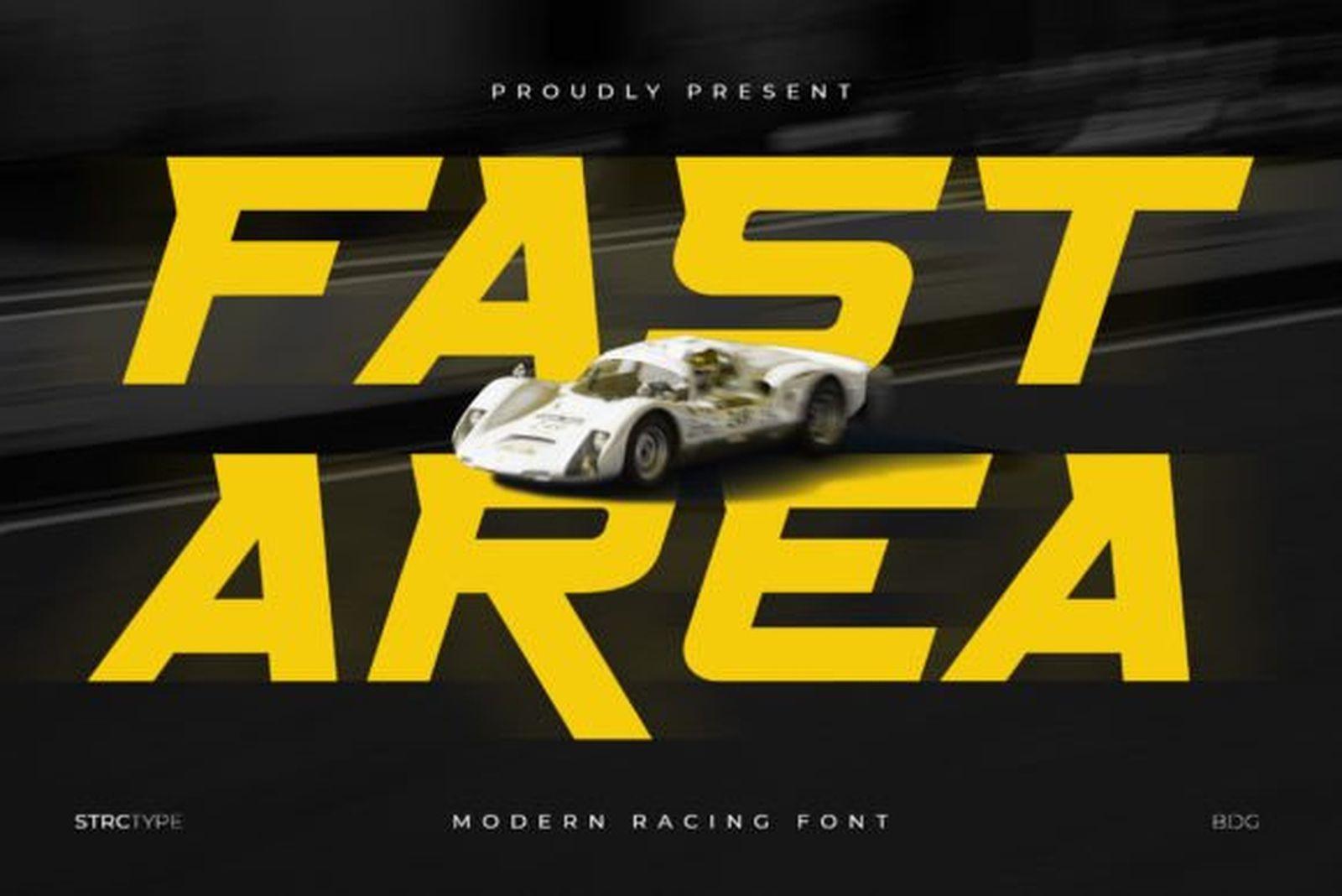
Fast Area Font is a wide italic racing face, set in yellow on a dark road with a race car. The letters are heavy with sharp cuts, and the slant carries a sense of motion.
It fits anything about speed: racing teams, running clubs, cycling events. Give it plenty of width, because the shapes need room to feel fast.
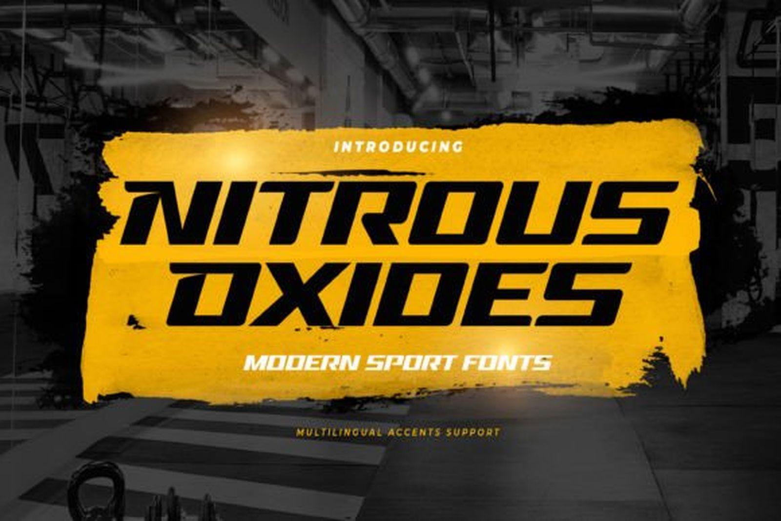
18. Nitrous Oxides Font
by Gassstype Studio
Best For: racing tees, gym posters, energy-heavy headlines
Nitrous Oxides Font is extra bold and italic, with sharp angled corners, set in black over a yellow brush stroke. The letters sit tight together and push forward.
It has more aggression than Fast Area Font, so it suits gyms, combat sports and racing merch. Keep it to a headline and pair it with a plain sans for everything else.
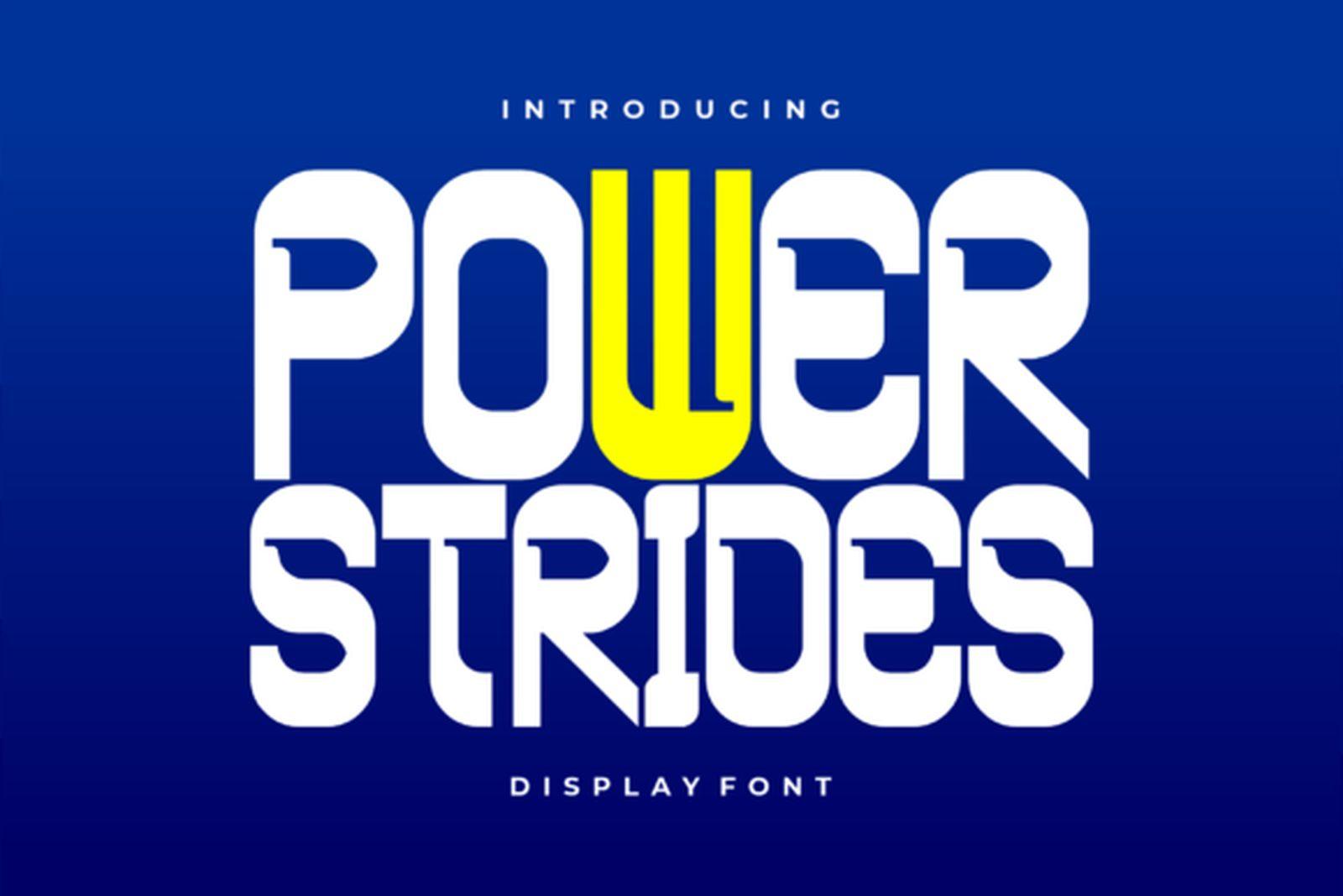
19. Power Strides Font
by asf-graphics
Best For: fitness studios, youth leagues, bold headlines
Power Strides Font is a heavy upright display with soft, rounded corners, shown in white and yellow on bright blue. The letters are packed tight and feel friendly rather than aggressive.
That friendliness makes it a good pick for youth leagues, school sports days and fitness studios. It stays readable from a distance, even in a single color.
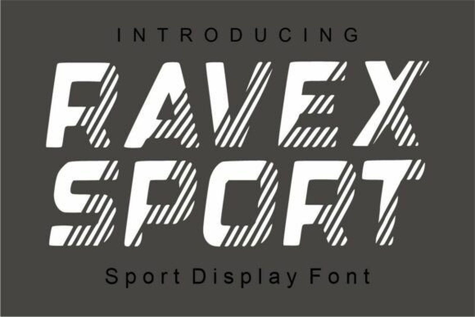
20. Ravex Sport Font
by fana studio
Best For: track and field, cycling, sportswear graphics
Ravex Sport Font is an italic sport display with horizontal stripes cut through the letters, shown in white on dark grey. The stripes read like speed lines.
The effect is built into the letters, so the word already looks like sportswear graphics. Use it large, for event names and chest prints, where the stripes stay visible.
Sports Script Fonts with Tails
The swash underline under a baseball script is its own tradition. The three fonts here pair a script with a varsity block, so the logo word and the team name come from one family.
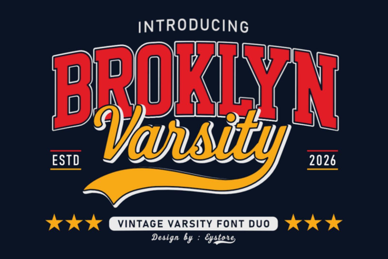
21. Broklyn Varsity Font
by Eystore
Best For: baseball-style wordmarks, retro club logos, team tees
Broklyn Varsity Font is a vintage varsity duo: a red block face for the main word and a yellow script with a long tail swinging underneath. The preview frames it with stars and an established date.
This is the classic baseball layout in one package. Set the city or club in the block, the nickname in the script, and let the tail underline both.
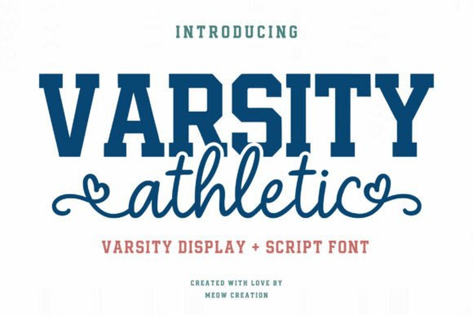
22. Varsity Athletic Font
by Meow Creation
Best For: cheer and dance teams, softer sports logos, spirit shirts
Varsity Athletic Font combines a navy varsity display with a light script that loops into a small heart-shaped swash. It is described in the preview as a varsity display plus script font.
The script is thinner and softer than in the other two picks, so it suits cheer, dance and school spirit designs. Keep the script word short, one word, so the loops stay readable.
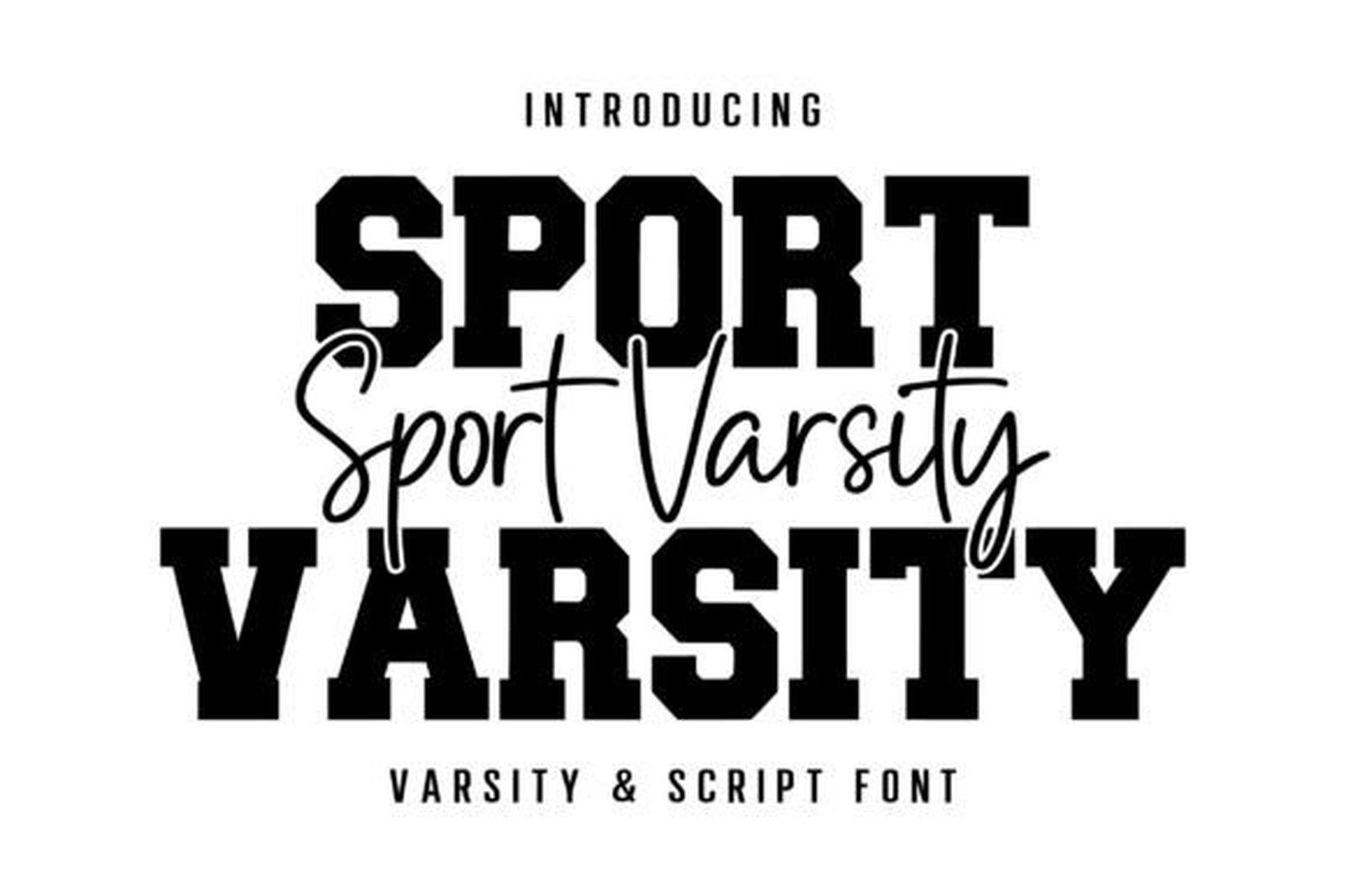
23. Sport Varsity Font
by Aura Design
Best For: layered tee designs, script-over-block lockups
Sport Varsity Font is a black varsity block paired with a thin signature-style script, set in the preview as a script line running across the block letters.
That overlap is the layout to copy: a big block word, and a light script laid across it in a second color. It gives a tee more depth than either style alone.
How to Choose a Sports Font
Start with distance. A sports design is usually read from far away, so shrink your mockup to the size of a thumbnail. If the word is still clear, the font will work on a field or in a gym. Thin scripts and tight outlines are the first things to disappear.
Check the numbers before you commit. If the design needs a player number, open the preview and look for the digits. Several fonts here show 0 to 9 right in the image, and a font without matching numerals means mixing two faces on one shirt.
Match the width to the name. Long surnames and two-word team names fit better in a condensed face like Varsity Narrow Font or Sports Jersey Font. Short names and single numbers can take a wide block like Baseball Athlete Jersey Font.
Plan the colors early. Outline and two-layer fonts are made for two-color prints. If you are printing in one color, pick a face with a built-in inline or texture, such as Jersey Modern Font or Athlete Final Font, so the design still has depth.
Keep scripts for logos. A script with a tail is great for a team name or a nickname, but it is the wrong choice for a number or a small line of text. Let the script carry one word and give everything else to a block face.
FAQ
What kind of font is used on sports jerseys?
Most jerseys use block or varsity lettering: heavy capitals with short slab serifs, often with an outline in a second color. The fonts in the Jersey & Number Fonts group of this list are drawn in that tradition.
Which of these sports fonts show numbers in the preview?
Varsity Spirit Font, Varsity Narrow Font, Jake Font and Vintage Varsity Font all show digits in their preview images. For the rest, open the font page and check the character set before you plan a number around it.
What is a sports font with a tail?
It is a script where the last letter swings into a long underline, the swash you see under many baseball team names. Broklyn Varsity Font is the clearest example in this list.
Can I use these fonts for team merch I sell?
Creative Fabrica states that its subscription covers personal, commercial and print on demand use. Terms can differ from product to product, so read the license on the font page before you start selling.
Can I cut these fonts with a cutting machine?
Bold block fonts cut cleanly because they have no hairline strokes. Varsity Spirit Font and Varsity Narrow Font list SVG and DXF files in their previews, which makes them the easiest to use with cutting software.
Start with the Number, Then the Name
If your design has a number on it, choose the font that handles the number first, then check that the letters match. If it is a logo, start with the script and find a block face to sit under it. Pick one group from this list, compare two or three fonts side by side at the real size, and go with the one that still reads from across the room.