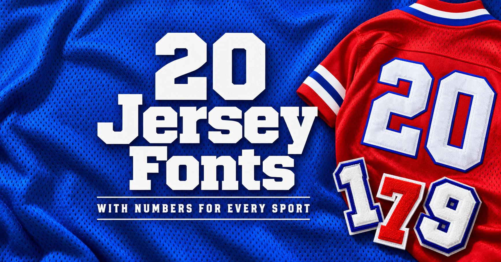
20 Jersey Fonts with Numbers for Baseball, Basketball, Soccer and Hockey Kits
A jersey font has one job the rest of the shirt does not: the number. It has to read from the stands, from across a field or rink, and on the back of someone who is moving. So in this list every font is shown with its full alphabet and its numerals 0 to 9, taken from the font’s own character specimen, so you can check the digits before anything else.
This post contains affiliate links. If you buy through them, I may earn a small commission at no extra cost to you.
The fonts are grouped by sport: baseball jersey fonts, basketball jersey fonts, soccer jersey fonts and hockey jersey fonts. Most of them work across sports, so treat the groups as a starting point rather than a rule.
All fonts in this list are on Creative Fabrica, and a single All Access subscription unlocks every one of them, so you can try several styles before committing to one.
More font collections:
23 Sports Fonts for Jerseys, Numbers & Team Logos
20 Logo Fonts for Small Business Branding, Shop Signs and Product Labels
Table of Contents
Baseball Jersey Fonts
Baseball lettering leans on tradition: slab serifs, vintage textures and the occasional script across the chest. These five come with full sets of numerals, so the name on the back and the number under it can share one style.
1. Jersey Font
by mardanimirza12
Best For: baseball uniforms, vintage team tees, numbers on the back
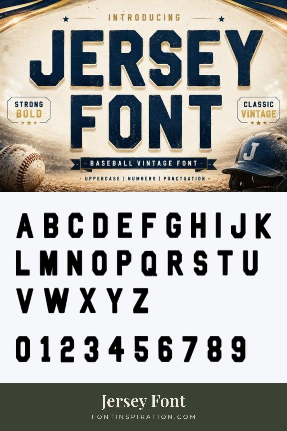
Jersey Font is a condensed, heavy block face with clipped corners. The preview sets it in navy on a sunlit baseball scene and labels it a baseball vintage font with uppercase, numbers and punctuation.
The specimen shows capitals only, so plan the whole design in caps. The numerals are tall and narrow, which helps when a two-digit number has to fit between the shoulder blades.
2. Jersey Baseball Font
by mardanimirza12
Best For: classic baseball jerseys, team names across the chest, coach shirts
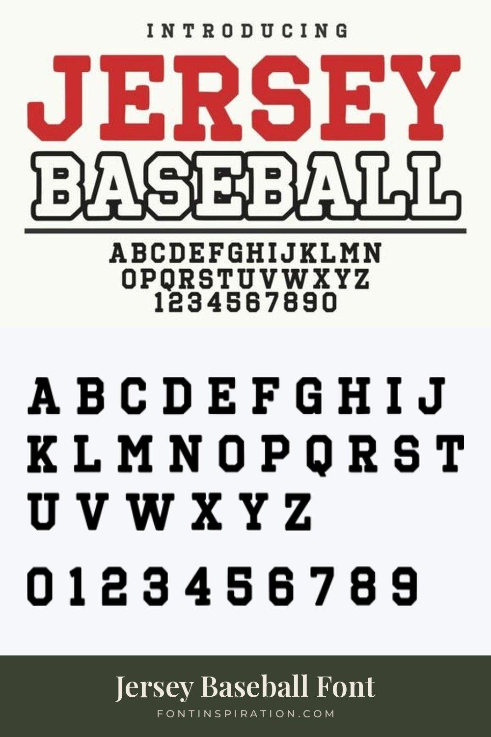
Jersey Baseball Font is a straight slab serif varsity with sturdy, squared serifs. The preview shows the word jersey in solid red and baseball as an outline, with the full alphabet and the digits 1 to 0 set underneath.
It is the most traditional face in this group. The even slab serifs and wide numerals are what most people picture when they think of a baseball uniform.
3. Frestype Atlethic Duo Font
by Artisan Themes
Best For: baseball-style logos, name and nickname lockups, retro team shirts
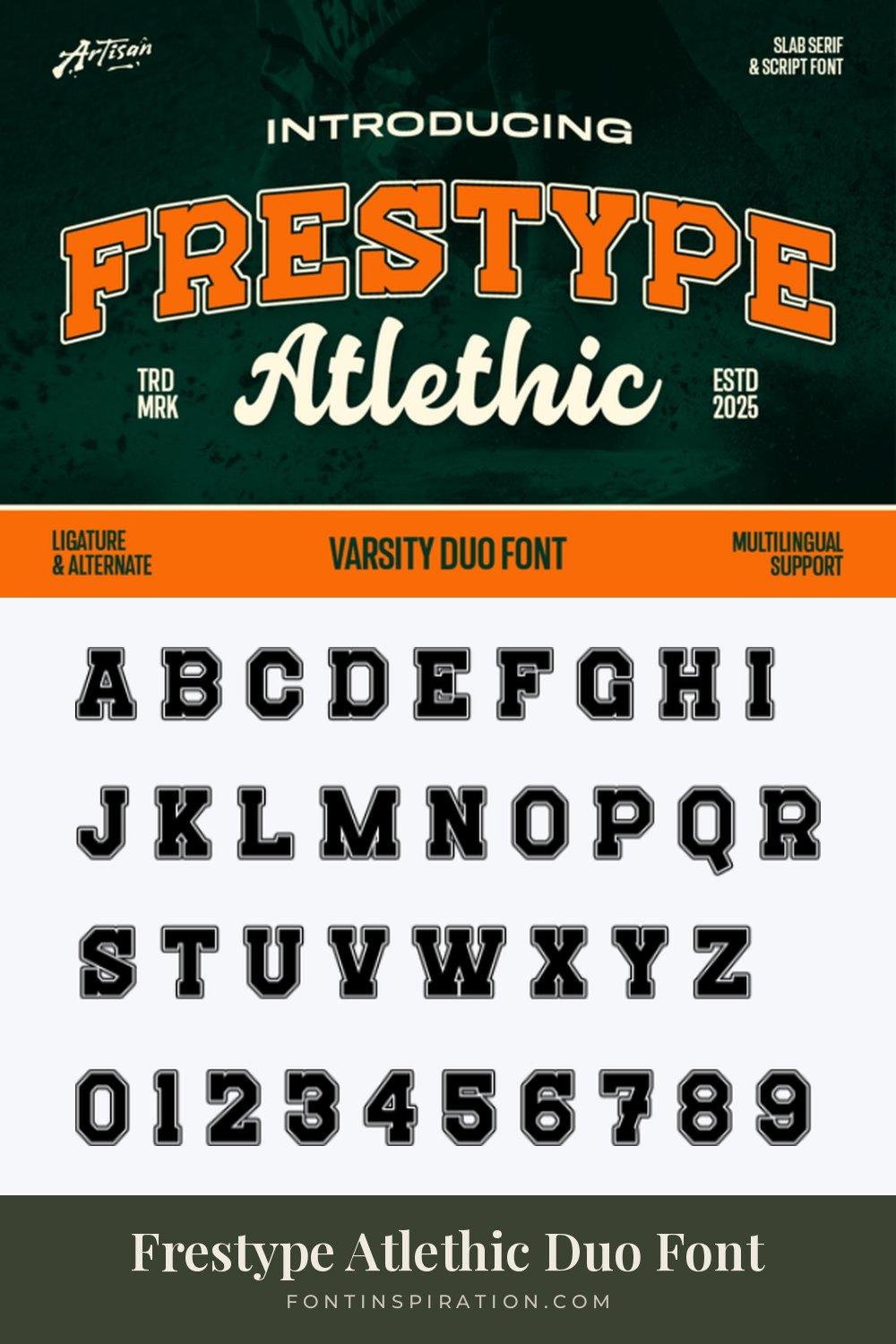
Frestype Atlethic Duo Font pairs an arched slab serif varsity with a bold script, shown in orange and cream on dark green. The preview calls it a varsity duo font and lists ligatures, alternates and multilingual support.
The specimen shows the varsity half with an outline built into each letter, and the numerals follow the same style. Set the team name in the varsity, the nickname in the script, and the numbers stay consistent with the block letters.
View Frestype Atlethic Duo Font →
4. Flash Jersey Font
by Dreamspace.studio
Best For: distressed baseball tees, vintage game day shirts, throwback posters
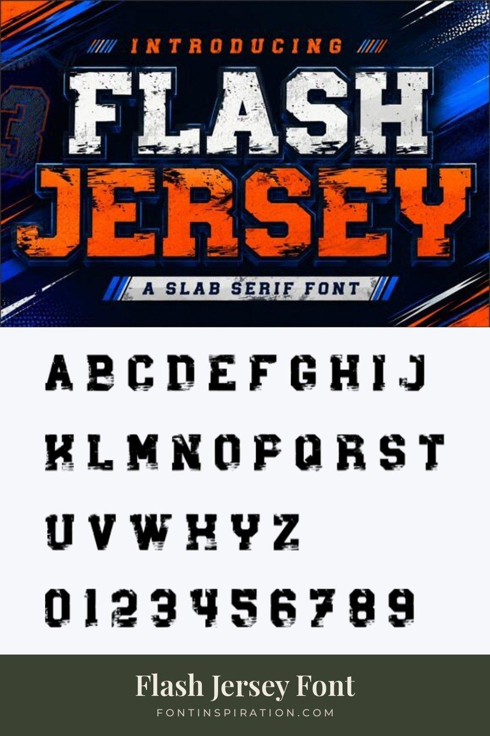
Flash Jersey Font is a slab serif with a scratched, worn texture inside every letter. The preview sets it in white and orange with dark outlines against a blue sports background.
The specimen keeps that texture on both letters and numerals, so a printed shirt looks broken in from day one. Use it large, where the texture can show.
5. Sportsjerseystyle Regular Font
by TaralArt
Best For: clean team numbers, bold chest lettering, one-color prints
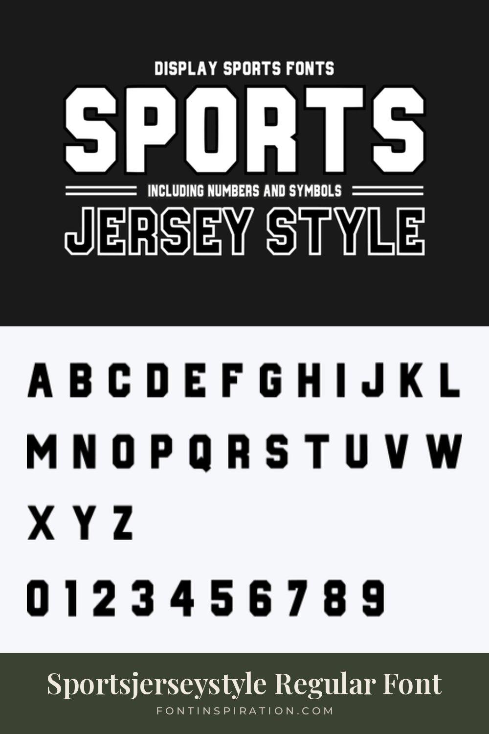
Sportsjerseystyle Regular Font is a heavy, squared sans with clipped corners. The preview sets it in white on black, mentions numbers and symbols, and shows a second line styled with an outline.
The specimen letters are solid and very even, which makes it one of the most readable faces in this list. It suits numbers that need to stay clear from far away.
View Sportsjerseystyle Regular Font →
Basketball Jersey Fonts
Basketball jerseys carry big numbers on a small tank top, so the letters need weight and the numbers need to stay clear at a large size. These five are heavy varsity and college faces.
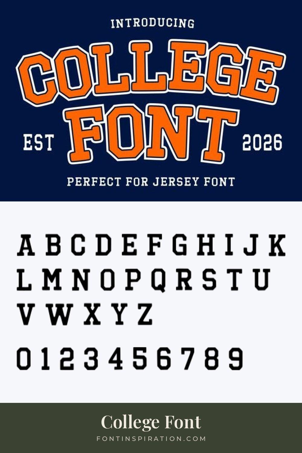
6. College Font
by Infinity art Studio
Best For: college basketball tanks, arched team names, school spirit tees
College Font is a classic slab serif varsity, shown in orange with a white outline, arched over a second line on navy. The preview calls it perfect for jersey lettering.
The specimen letters are clean and slightly narrow, and the numerals match their weight. It is a safe, familiar choice for a school team that wants the look everyone recognizes.
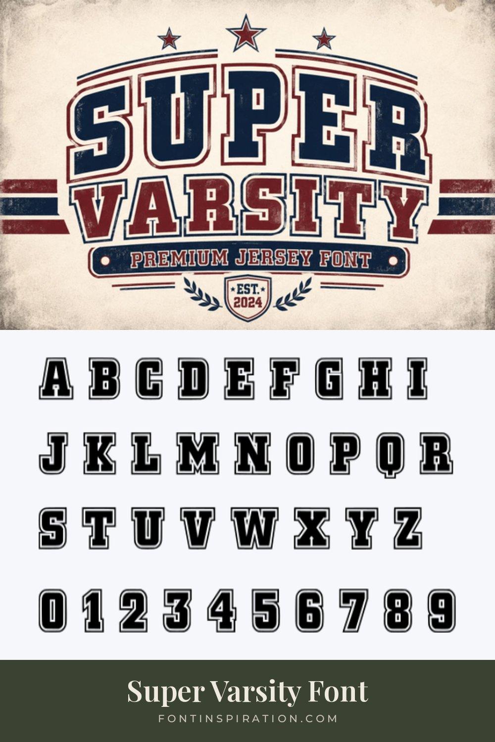
7. Super Varsity Font
by KiddoCraft
Best For: two-tone jerseys, varsity jackets, vintage basketball shirts
Super Varsity Font is a bold slab varsity with a thin outline built into every letter. The preview sets it in navy and deep red on a worn cream background and calls it a premium jersey font.
The built-in outline gives the letters a second edge without extra work. The numerals in the specimen carry the same double edge, which is exactly the look of stitched tackle twill numbers.
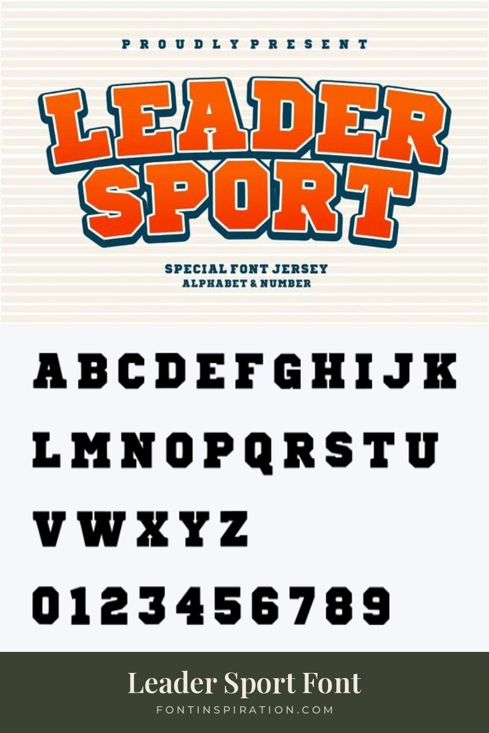
8. Leader Sport Font
by riki.studio
Best For: youth league jerseys, bright team merch, arched chest lettering
Leader Sport Font is a heavy slab serif, shown in an orange gradient with a dark outline, arched above a second line. The preview describes it as a jersey font with alphabet and numbers.
In the specimen the letters are wide and solid, with short slab serifs. It works for bright youth league kits and anything that should feel energetic rather than vintage.
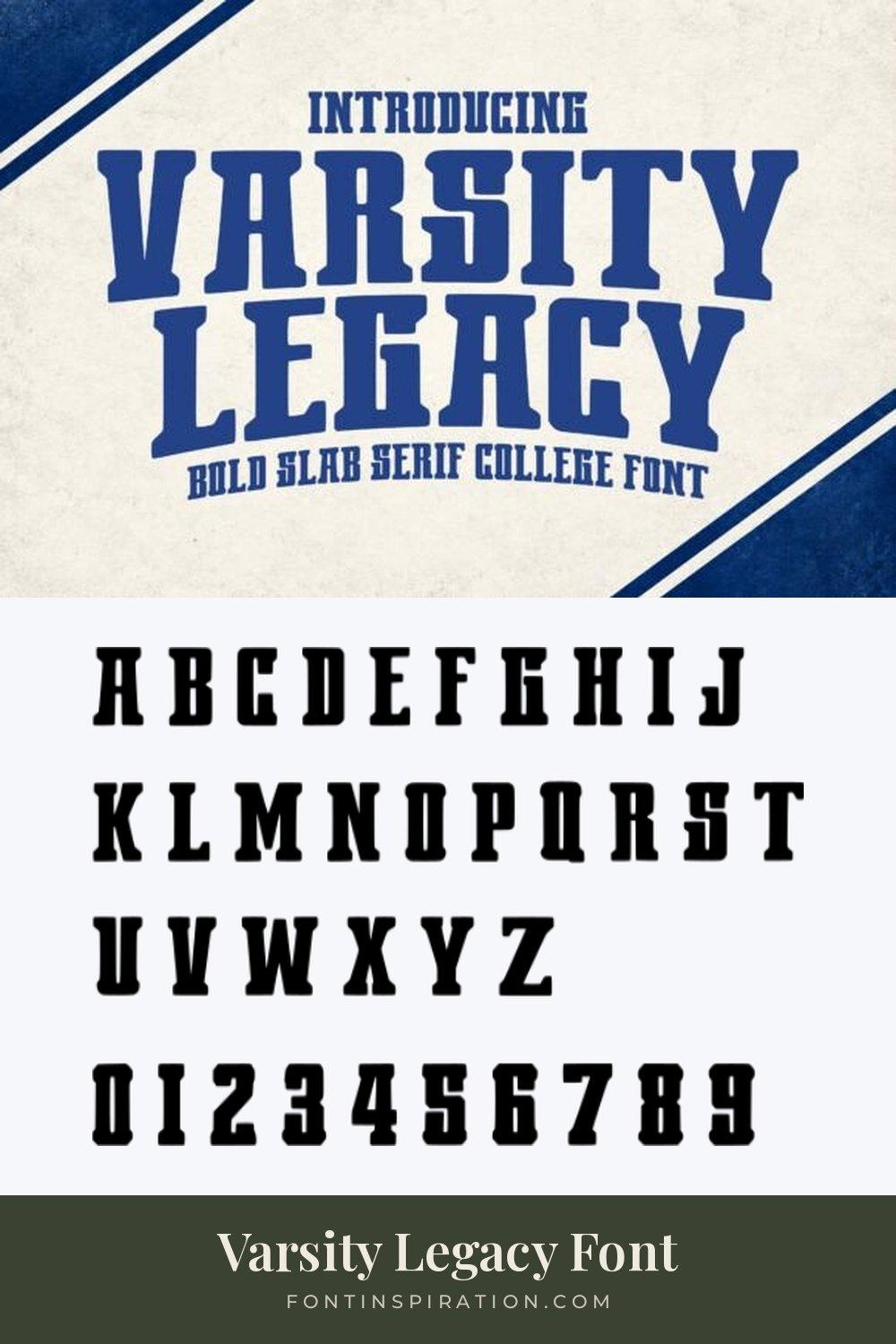
9. Varsity Legacy Font
by Soho Studio
Best For: retro basketball jerseys, college banners, old-school team shirts
Varsity Legacy Font is a condensed slab serif with flared, bracketed serifs, set in royal blue on a worn paper background. The preview calls it a bold slab serif college font.
The flared serifs give it an old-school, almost western feel. The narrow proportions help with long names, and the numerals keep the same flare.
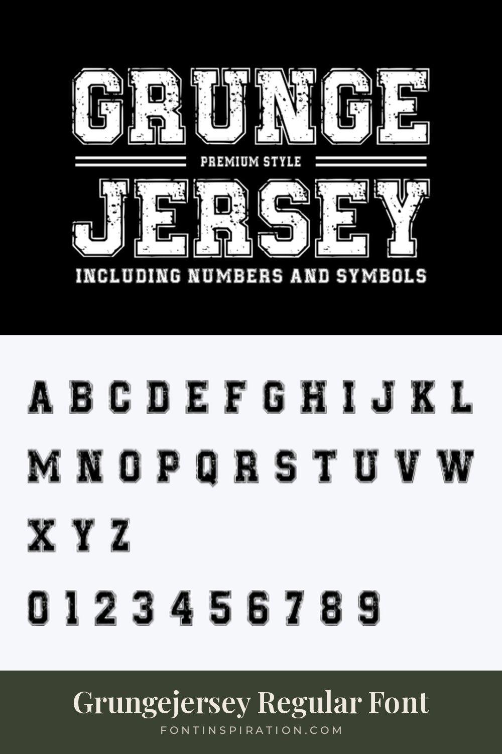
10. Grungejersey Regular Font
by TaralArt
Best For: distressed team tees, streetwear-style jerseys, gym shirts
Grungejersey Regular Font is an outlined varsity with a heavy grunge texture inside every letter, shown in white on black. The preview states that it includes numbers and symbols.
The texture is part of the font, so there is no need to add a distress effect later. It works best on dark shirts, where the worn look reads clearly.
View Grungejersey Regular Font →
Soccer Jersey Fonts
Soccer kits usually go for cleaner, more modern shapes: condensed letters, sharp corners and numbers designed to be read across a pitch. These five lean contemporary.
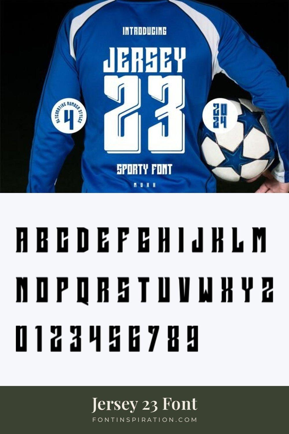
11. Jersey 23 Font
by mukhstd
Best For: soccer kit numbers, player names, modern sports posters
Jersey 23 Font is a tall, condensed face with angular cuts and a 3D shadow on the numbers, shown in white on the back of a blue soccer shirt. The preview mentions alternative number styles.
The specimen letters are very narrow, which suits long surnames. The numerals are the highlight here, so give the number most of the space on the shirt.
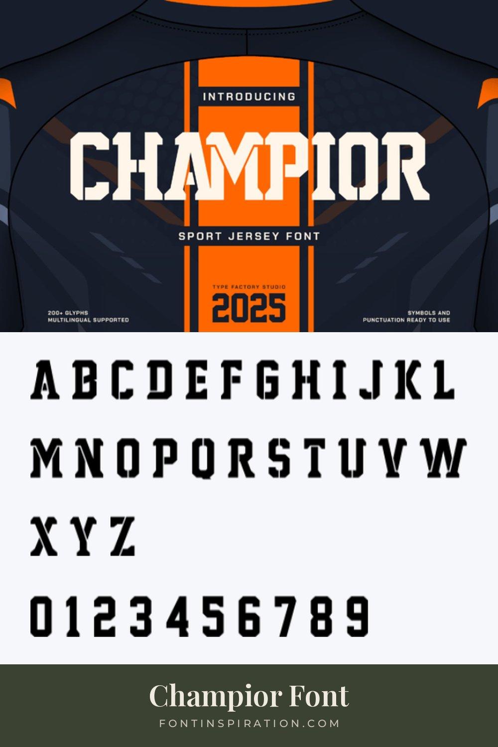
12. Champior Font
by TypeFactory
Best For: modern club kits, esports jerseys, bold team branding
Champior Font is a slab-style display with stencil-like cuts through the letters, shown in cream on a navy and orange jersey. The preview lists more than 200 glyphs and multilingual support.
The cuts make it feel sharp and modern, closer to a club kit than a college shirt. The numerals in the specimen carry the same breaks, so letters and numbers match.
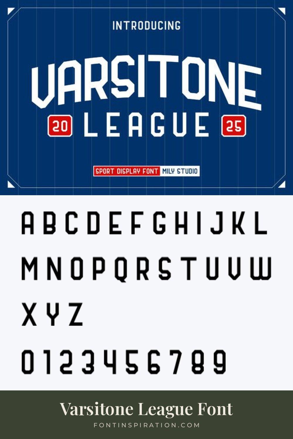
13. Varsitone League Font
by Mily Studio
Best For: clean soccer names and numbers, league logos, minimal kits
Varsitone League Font is a condensed sans with clipped corners and simple, geometric shapes, set in white on a royal blue pinstripe background. The preview calls it a sport display font.
It is one of the cleanest faces in this list. The plain numerals read clearly at any size, which makes it a good fit for league kits and minimal designs.
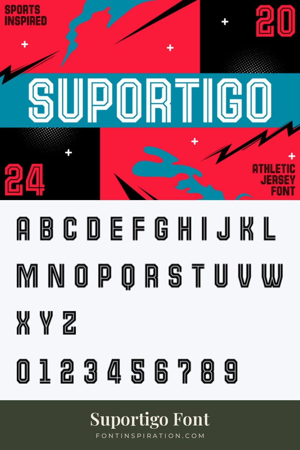
14. Suportigo Font
by konstantinestudio
Best For: retro soccer kits, inline number designs, sports posters
Suportigo Font is a condensed face with an inline stroke running through each letter, shown in white on a bright red, blue and black background with the numbers 20 and 24.
The inline gives the letters a two-tone look with a single color. It suits retro-style kits and posters where the numbers are part of the design.
15. Optimal Jersey Font
by Dreamspace.studio
Best For: bold match day kits, team posters, large back numbers
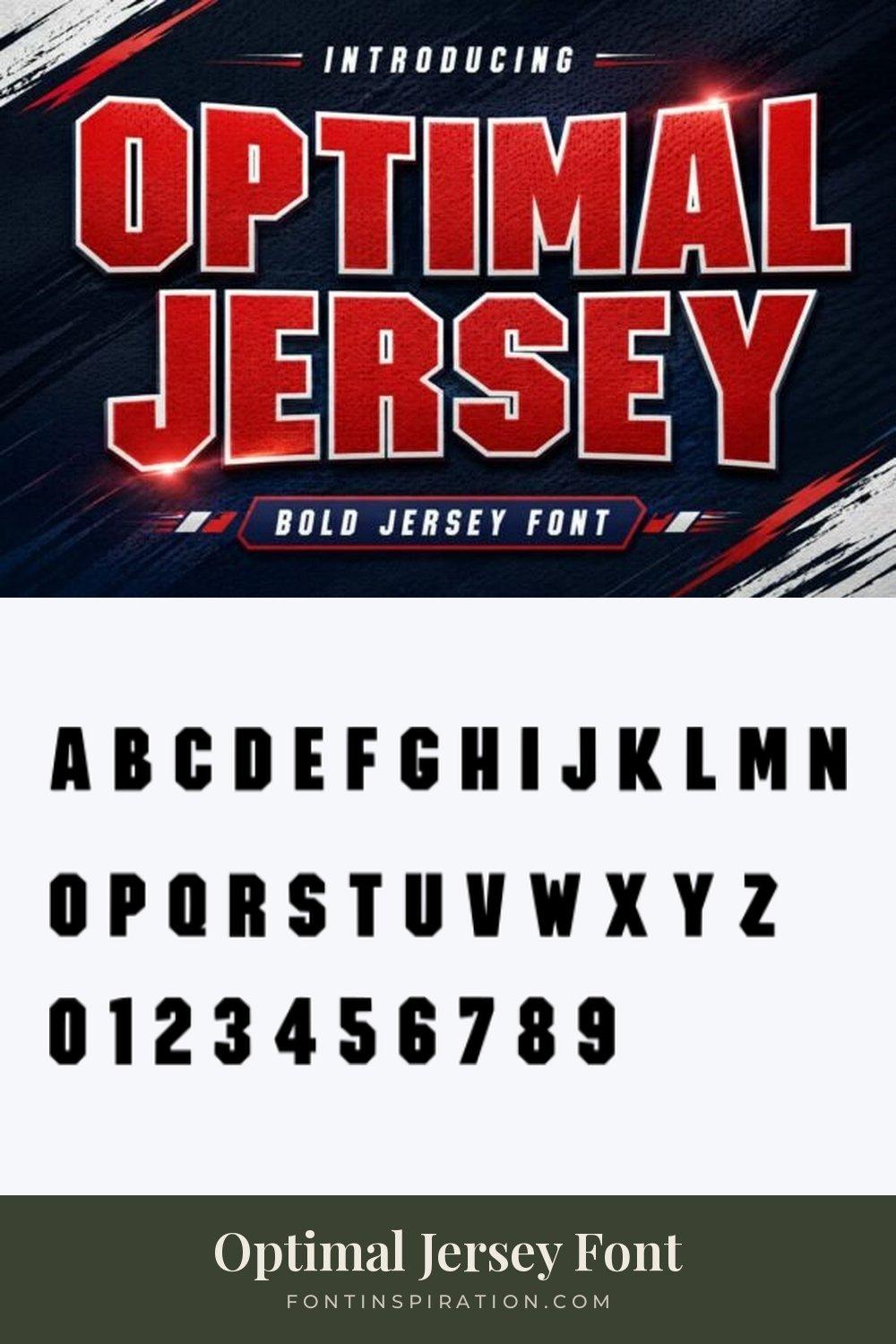
Optimal Jersey Font is a heavy, condensed sans with clipped corners, shown in red with a white outline and a mesh texture. The preview calls it a bold jersey font.
The specimen letters are tall and tightly spaced, and the numerals are heavy and clear. It is a strong pick when the number is the main element of the shirt.
Hockey Jersey Fonts
Hockey jerseys love outlines and layered numbers, stitched in two or three colors. These five come with outlines, inlines or textures that make that layered look easy.
16. Heyjae Font
by glyphstyle
Best For: hockey jersey numbers, angular team names, inline designs
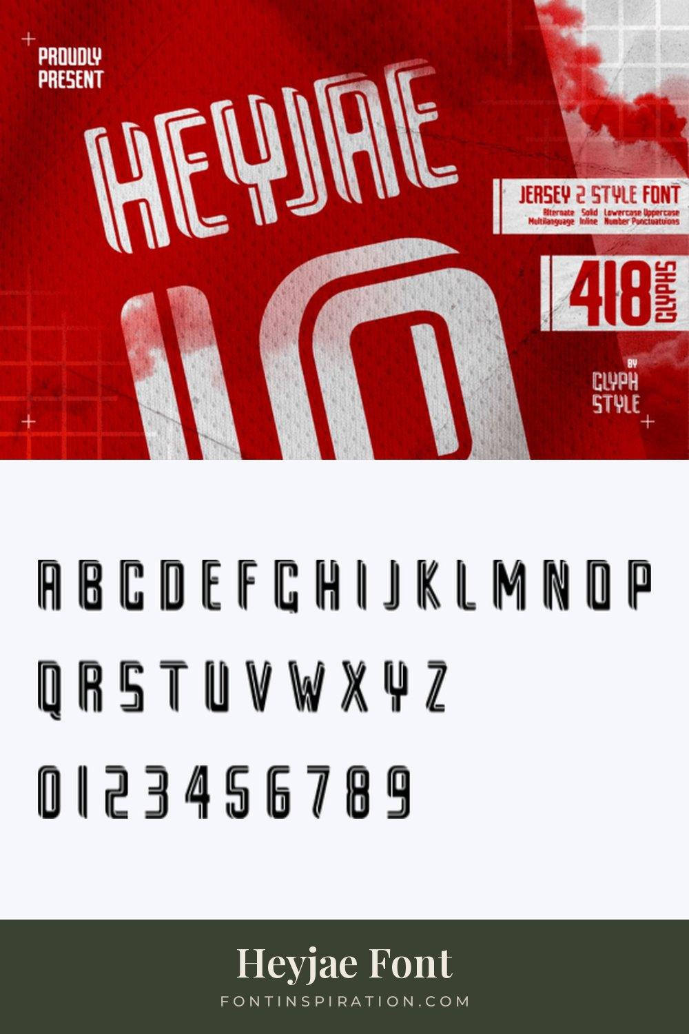
Heyjae Font is an angular, condensed face with an inline stroke, shown in white on red jersey mesh. The preview calls it a jersey font in two styles, solid and inline, and mentions 418 glyphs.
The two styles are useful for layered numbers: a solid version underneath and the inline on top. The specimen shows the inline letters and numerals together.
17. Jersey Distressed Font
by TonisArtStudio
Best For: vintage hockey jerseys, worn team tees, throwback numbers
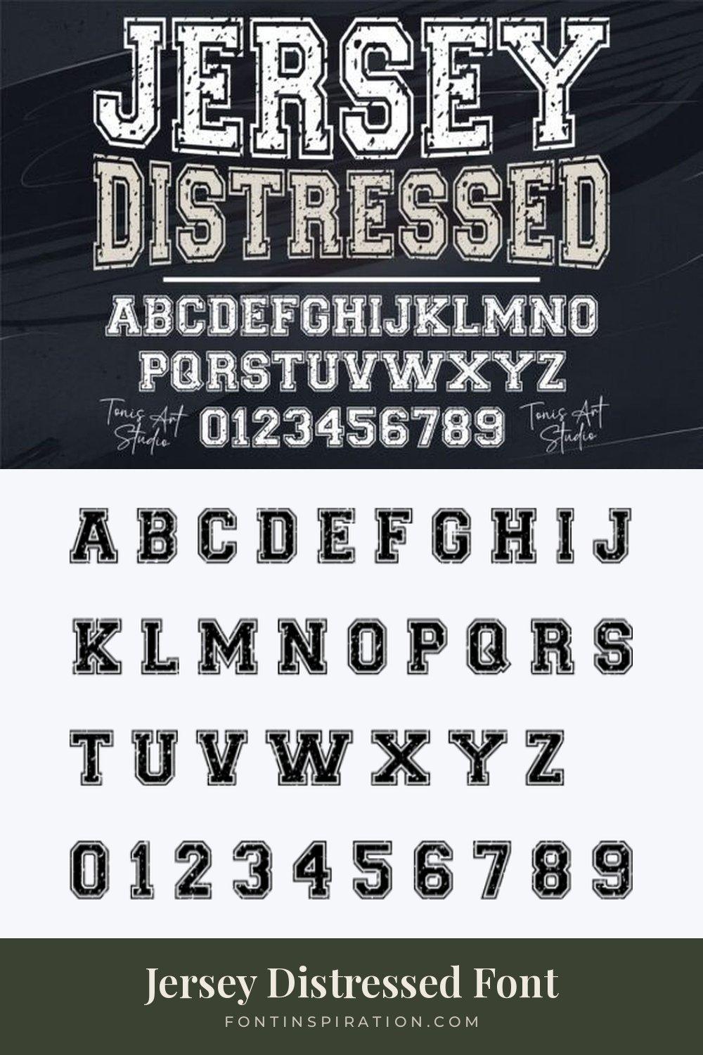
Jersey Distressed Font is an outlined varsity with a distressed texture, shown on a dark background with the full alphabet and the digits 0 to 9.
The outline and the texture together give the look of an old, washed jersey. It suits throwback hockey kits and vintage team tees.
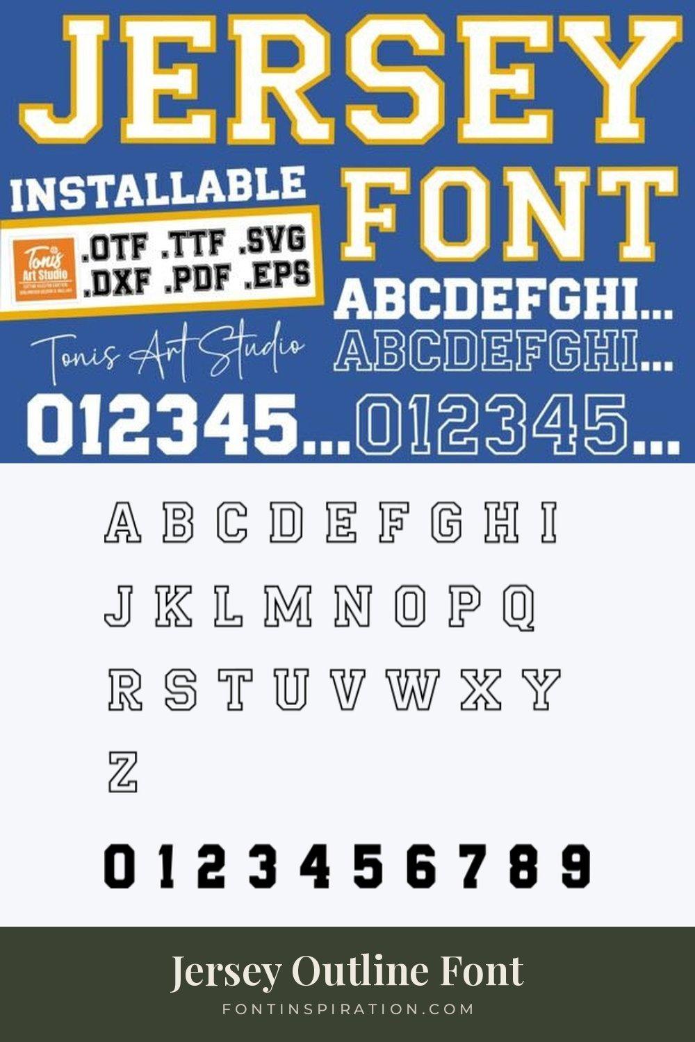
18. Jersey Outline Font
by TonisArtStudio
Best For: two-color hockey numbers, vinyl cutting, layered lettering
Jersey Outline Font is a classic varsity shown in the preview as a solid version and an outline version, with the files listed as OTF, TTF, SVG, DXF, PDF and EPS.
The specimen shows the outline letters together with solid numerals. Layering the solid and outline versions gives the stitched two-color look of a hockey number, and the SVG and DXF files make it practical for cutting machines.
19. Jersey Number Font
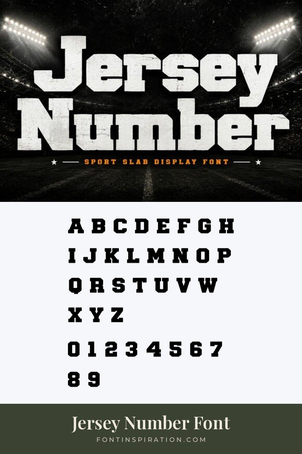
by Bundle
Best For: big back numbers, football and hockey kits, stadium posters
Jersey Number Font is a heavy slab display, shown with a worn texture in white against a stadium at night. The preview calls it a sport slab display font.
The specimen shows clean letters in both upper and lower case, and heavy numerals with short slab serifs. As the name says, the numbers are the point: they stay solid and readable at a large size.
20. Blocksmith Outline Font
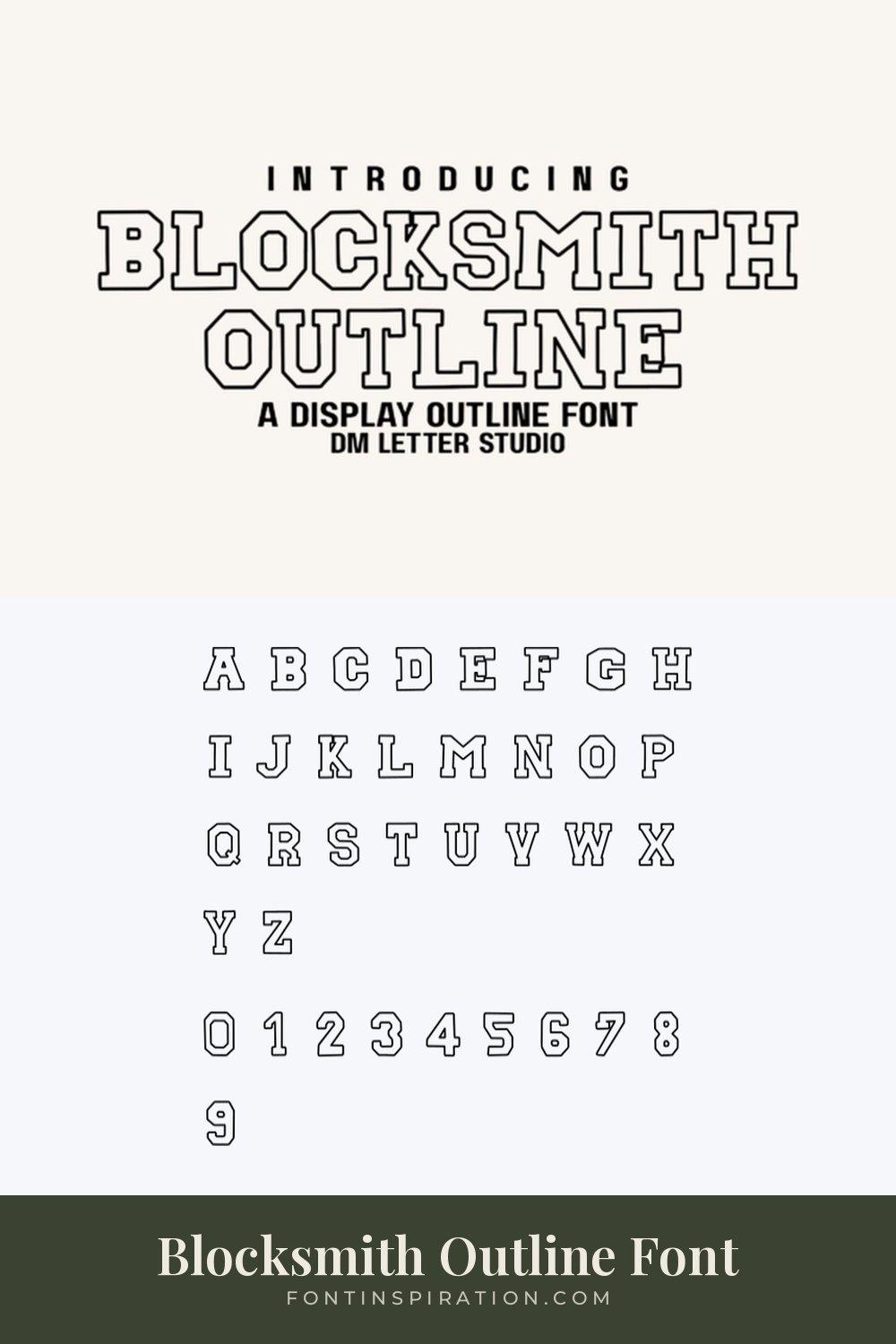
by Sharon ( DmStudio )
Best For: outline numbers for layering, light jersey designs, varsity patches
Blocksmith Outline Font is a slab varsity drawn only as an outline, shown in black on a light background. The preview describes it as a display outline font.
On its own it reads light and graphic. Layered over a solid varsity from this list, it becomes the outer edge of a two-color hockey number.
View Blocksmith Outline Font →
How to Choose a Jersey Font
Start with the numbers. Look at the 0 to 9 row in each image before you look at the letters. Check that the 1 is not too thin next to the 0 and the 8, and that the 4 and the 7 are easy to tell apart at a distance.
Test two-digit numbers. Most shirts carry two digits, so type 17, 23 and 88 in the font and look at the space between them. Condensed faces like Jersey 23 Font or Optimal Jersey Font keep two wide digits on a narrow back.
Match the width to the names. Long surnames need a condensed face. Short names and single-word team names can take a wide slab like Leader Sport Font or College Font.
Plan the layers. Stitched and heat-pressed numbers are often two or three colors. Fonts with outline or inline versions, like Jersey Outline Font, Heyjae Font or Blocksmith Outline Font, make that layered look much easier.
Check the lowercase. Some jersey fonts are capitals only, others include lowercase letters. If the design needs a nickname or a line of text in lowercase, check the font’s specimen before you commit.
FAQ
What font is used on sports jerseys?
Most jerseys use block or varsity lettering, either slab serif or condensed sans, often with an outline in a second color. Every font in this list follows that tradition and includes numerals.
Do all of these jersey fonts include numbers?
Yes. Each image in this list shows the numerals 0 to 9 from the font’s own character specimen, under the alphabet.
Which jersey fonts have outline versions?
Jersey Outline Font is shown with a solid and an outline version, Heyjae Font comes in solid and inline styles according to its preview, and Blocksmith Outline Font is an outline-only face. Super Varsity Font and Frestype Atlethic Duo Font have an outline built into the letters.
Can I cut these fonts with a cutting machine?
Heavy block and varsity fonts cut cleanly because they have no hairline strokes. Jersey Outline Font lists SVG and DXF files in its preview, which makes it the easiest choice for cutting software.
Can I use these fonts on jerseys I sell?
Creative Fabrica states that its subscription covers personal, commercial and print on demand use. Terms can differ from product to product, so read the license on the font page before you start selling.
Pick the Number First
Choose the font whose numbers you like, then check that the letters work for the names. Print a test at real size, pin it to a wall and step back a few meters. If the number is still clear from there, the font will hold up on the field, the court or the ice.