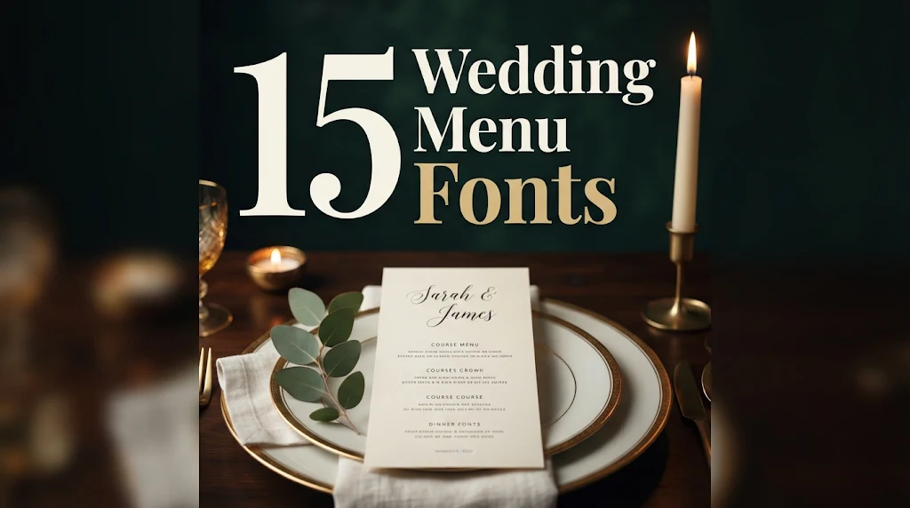
15 Wedding Menu Fonts for DIY Couples and Stationery Makers: Calligraphy Titles, Readable Serifs and Ready-Made Font Duos
A wedding menu has two jobs that pull in opposite directions. The top of the card should feel special, with the couple’s names or a beautiful “Menu” title, while the list of courses has to stay easy to read in candlelight. One font rarely does both well, and that is why menu design is really about choosing a pair.
This post contains affiliate links. If you buy through them, I may earn a small commission at no extra cost to you.
This list splits 15 wedding menu fonts by the role they play. First come calligraphy and script fonts for titles and names, then readable serifs for course names and headings, and finally ready-made font duos and casual scripts for couples who want a matching set without pairing fonts themselves.
All fonts in this list are on Creative Fabrica, and a single All Access subscription unlocks every one of them, so you can try several styles before committing to one.
More wedding font collections:
27 Wedding Fonts for Invitations, Signs and Cricut Projects
25 Best Font Combinations for Weddings
14 Elegant Serif Fonts for Wedding Invitations
Signature Fonts: 28 Monoline, Brush and Wedding Script Styles
In this list
Calligraphy and Script Fonts for Menu Titles and Names
- 1. Master Handmade Font
- 2. Jesintha Font
- 3. Chemistry Valentine Font
- 4. The Standing Still Font
- 5. Love Story Font
- 6. Wedding Font by PeamCreations
- 7. Sidosari Font
- 8. Signature Mango Font
Readable Serifs for Courses and Headings
Ready-Made Font Duos and Casual Scripts
How to Build a Wedding Menu with Two Fonts
Wedding Menu Font FAQ
Calligraphy and Script Fonts for Menu Titles and Names
These fonts belong at the top of the card: the couple’s names, the date or a single word like “Menu”. They need room and size, so give each one space and let a calmer font handle the food.
1. Master Handmade Font
Master Handmade Font by PiPi Creative
Best For: Couple names at the top of the menu, “Dinner” and “Menu” titles
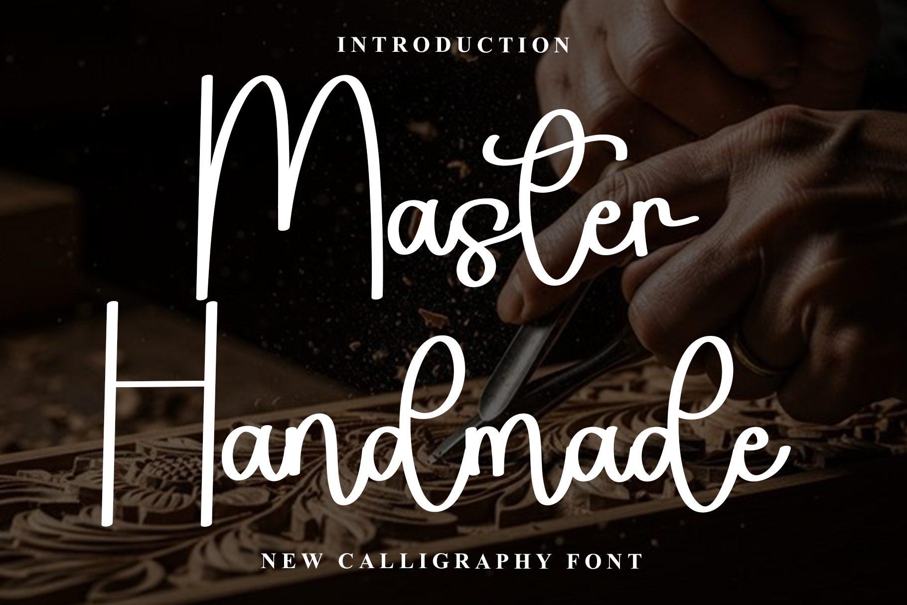
Master Handmade is presented on its cover as a new calligraphy font, set in white on a dark background. The strokes are thin and quick, and the capitals end in long flourishes that sweep under the word.
On a menu card, give it the top third and nothing else: the couple’s names or a single word like “Menu”. Its fine lines need size, so keep it large and let a serif from the next section carry the dishes.
2. Jesintha Font
Jesintha Font by mayuilhamcreative
Best For: Formal reception menus, monograms and couple names
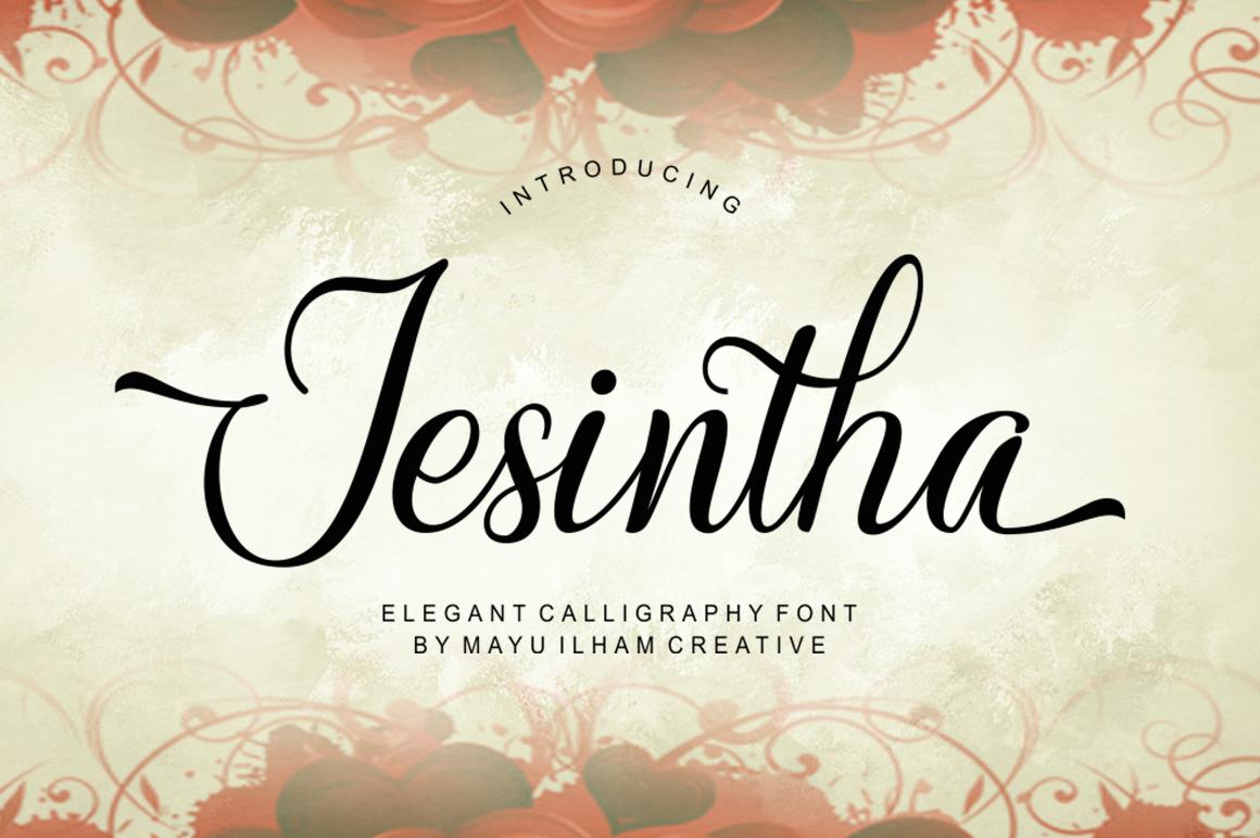
Jesintha is labeled an elegant calligraphy font, and the preview shows why: a capital J with a long, sweeping swash and a smooth, even rhythm through the lowercase.
Use that swash as the decorative moment of the whole card, ideally on a name that starts with a capital that carries it well. Pair it with a quiet serif in small caps for course headings.
3. Chemistry Valentine Font
Chemistry Valentine Font by ArtLine Design

Best For: Minimal modern menus and narrow menu cards
Chemistry Valentine is a tall, narrow handwritten script with long ascenders and compact bowls. On the cover two words stack neatly, and the condensed width keeps them from spreading sideways.
That narrow build fits slim menu cards placed on a folded napkin, where a wide calligraphy would run out of room. Set the names in two lines, centered, with generous space below.
4. The Standing Still Font
The Standing Still Font by ogit
Best For: Relaxed, editorial menus and signature-style names
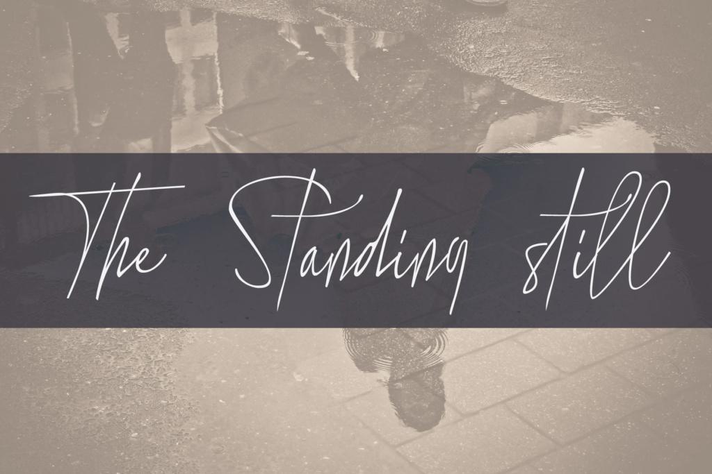
The Standing Still looks like a quick personal signature: a light, slanted script with loose joins and long horizontal strokes, shown in white over a muted photo on its cover.
It suits couples who want the menu to feel handwritten rather than formal. Keep it to names or a short line such as “Dinner is served”, and set the courses in a clean serif to balance its speed.
5. Love Story Font
Love Story Font by Aveni Letter Type
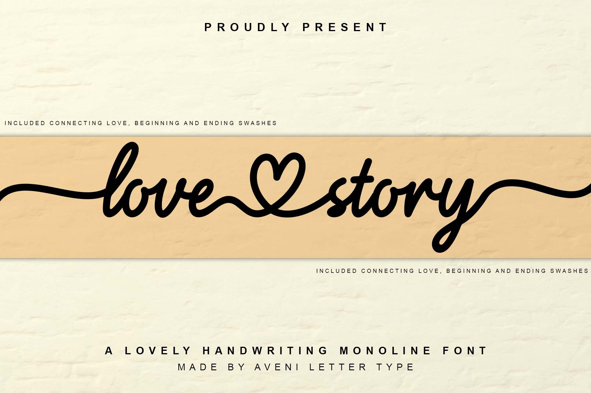
Best For: Romantic menus where a heart detail fits the theme
Love Story is a smooth script whose cover shows a small heart worked into the connection between the two words. The letters are rounded and joined, with a calm, even slant.
Save the heart for one spot, such as between the couple’s names, rather than repeating it across the card. The rest of the menu stays cleaner if every other line is set in a serif.
6. Wedding Font by PeamCreations
Wedding Font by PeamCreations
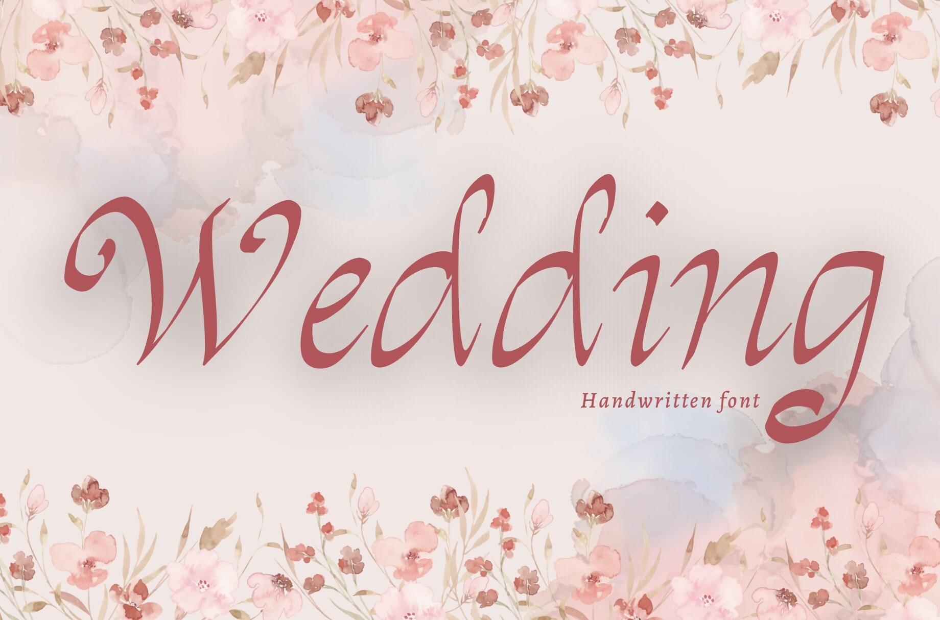
Best For: Garden and floral wedding menus, soft rose color schemes
This Wedding font is a handwritten script set in dusty rose on a floral cover. The letters lean forward with a pen-like contrast, and the capital W opens the word with a wide curve.
It sits naturally on menus with watercolor flowers or greenery. Print the title in a muted color that matches the florals and keep the food list in a dark neutral for contrast.
7. Sidosari Font
Sidosari Font by Burntilldead
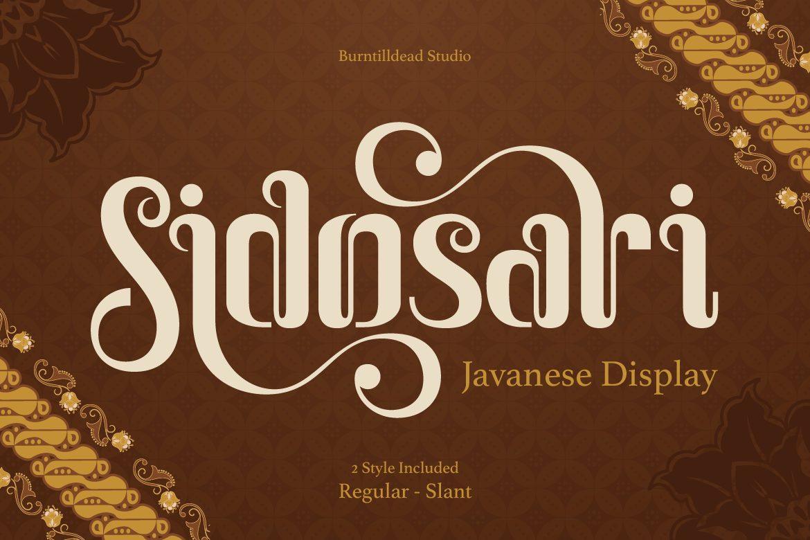
Best For: Bold menu titles for boho, vintage and cultural celebrations
Sidosari is a decorative display font with curling terminals on several letters; the cover names it a Javanese display. It is set in cream on a deep brown, batik-inspired background.
It is a heading font with real personality, so give it one word, like “Menu” or “Feast”, and nothing else. Paired with a simple serif for the dishes, it gives the card a warm, crafted feel.
8. Signature Mango Font
Signature Mango Font by Shakira Studio
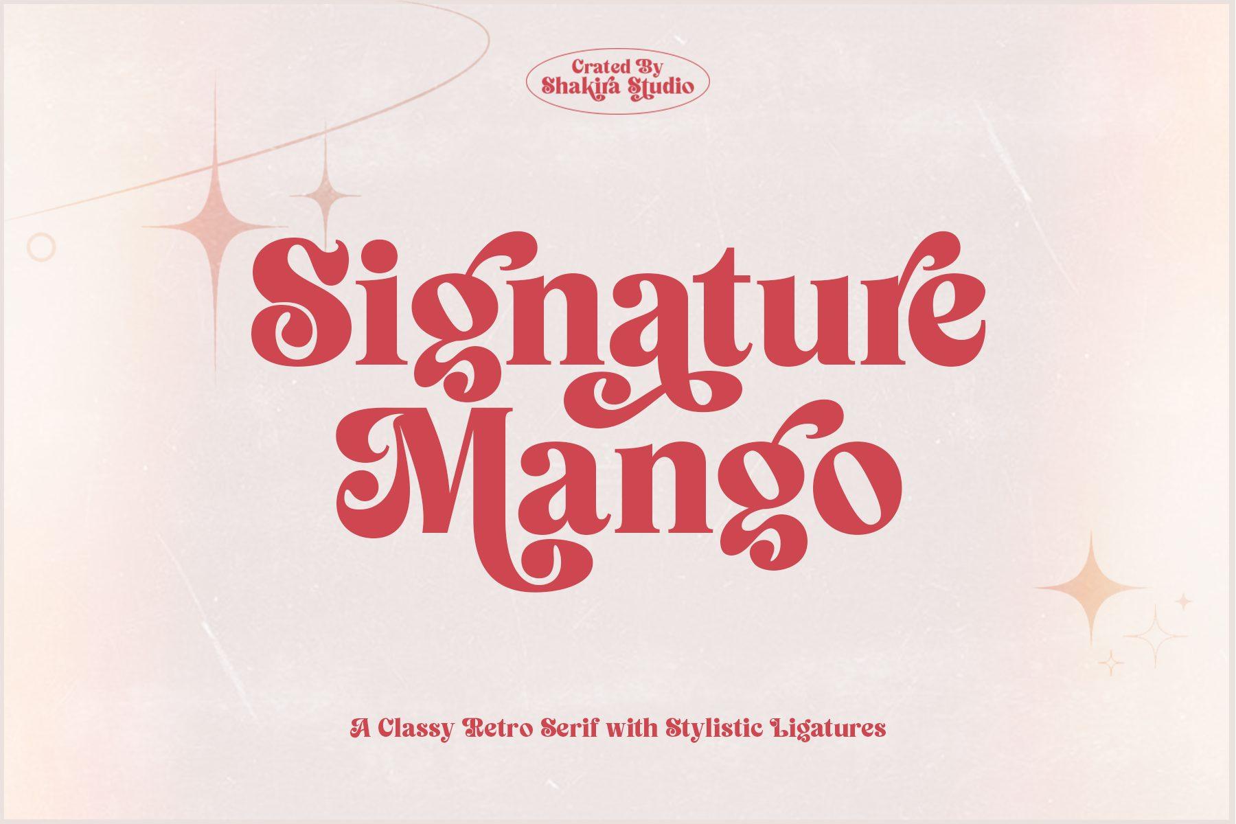
Best For: Retro and 70s-inspired reception menus
The cover calls Signature Mango a classy retro serif with stylistic ligatures. The letters are bold with soft, flared serifs, and the preview shows them in a warm red.
It brings a retro mood to the top of the menu without needing illustration. Use it for the title, then switch to a lighter serif or sans for the courses so the card does not feel heavy.
Readable Serifs for Courses and Headings
Serifs carry the part guests actually read. Course names, dish descriptions and section headings stay legible at small sizes and in dim light when the letters are steady and evenly spaced.
9. Rebus Font
Rebus Font by vatesdesign
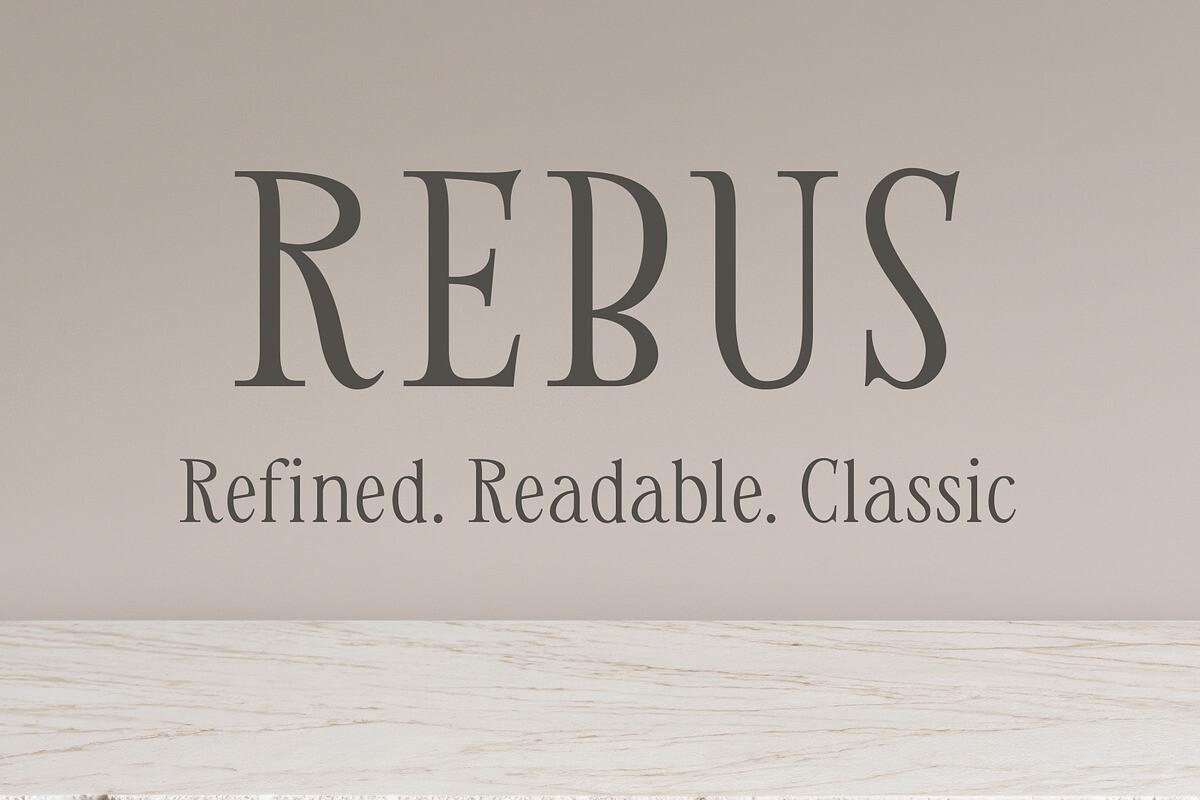
Best For: The food list itself: course names and dish descriptions
Rebus is a classic serif with steady proportions; its cover sums it up as refined, readable and classic. The capitals are calm and evenly spaced, with modest contrast between thick and thin strokes.
This is the font for the part of the menu guests actually read. Set the dish names in Rebus, the descriptions a size smaller, and let any of the calligraphy fonts above sit at the top.
10. Gadies Font
Gadies Font by ElegantFont
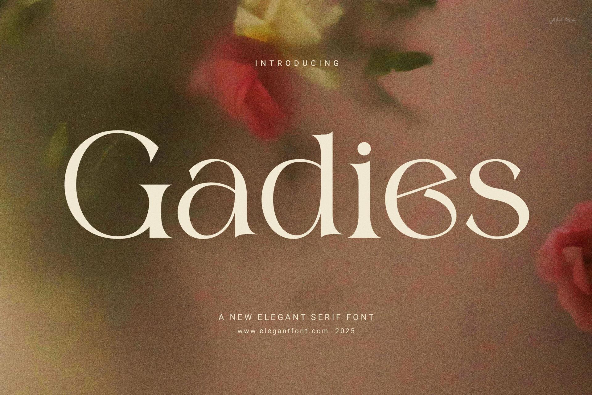
Best For: Course headings and refined, high-contrast menu layouts
Gadies is shown as a new elegant serif font: high contrast, sharp thin hairlines and generous curves. On the preview it reads as a luxurious display serif.
Because the hairlines are fine, use it for headings like “Starter”, “Main” and “Dessert” rather than long descriptions. It pairs easily with a flowing script for the couple’s names.
11. Flow Serif Font
Flow Serif Font by setiawanarief111
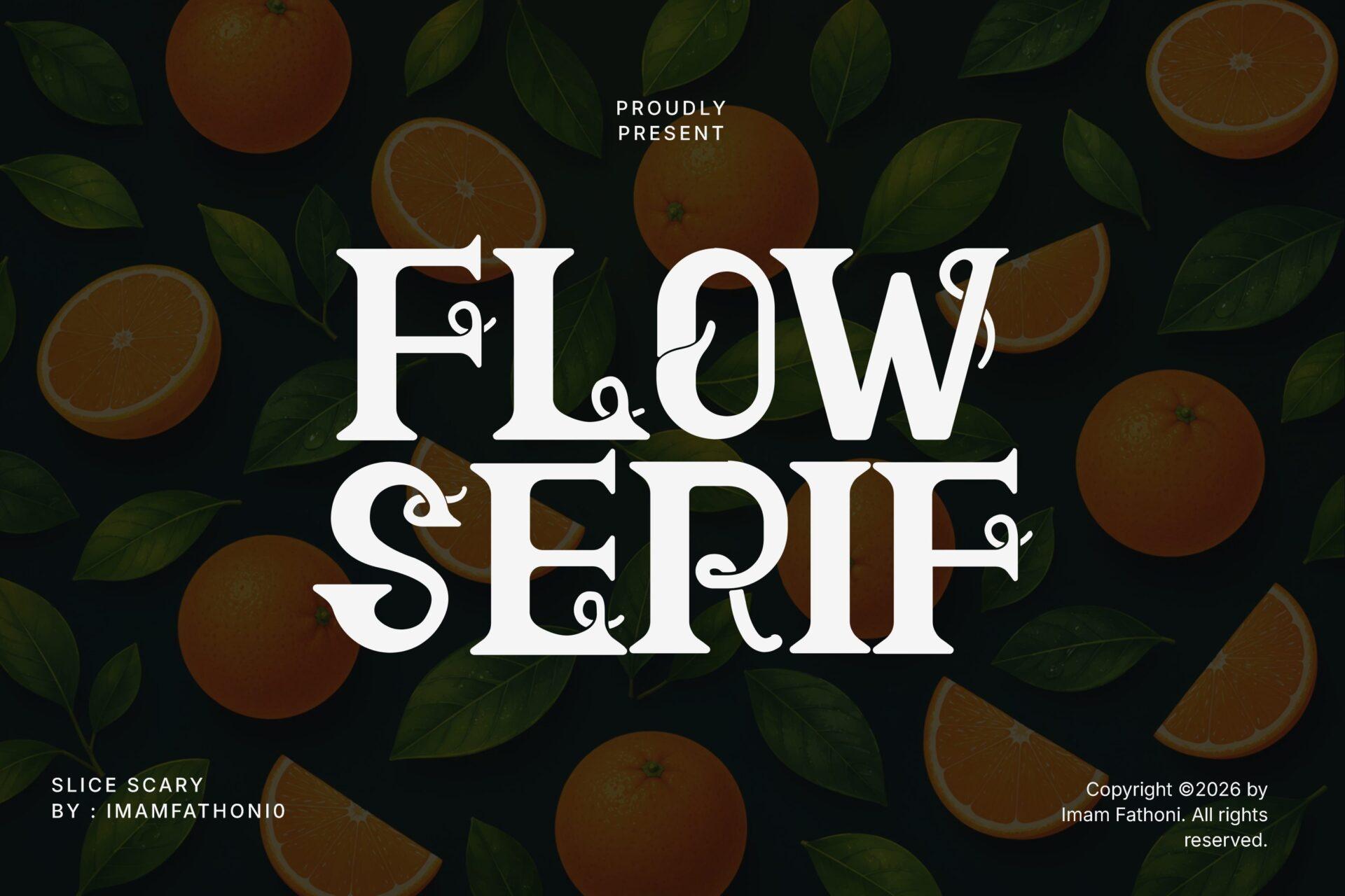
Best For: Section headings with a decorative touch
Flow Serif is a bold serif with curling, swashy details on some letters, set in white on a dark green cover with oranges. It sits between a classic serif and a decorative display face.
Too ornate for long dish descriptions, it works as a heading font, especially for “Dessert” or “Late Night Snacks”. Keep the body text in a plainer serif so the decoration stays special.
12. Little Farmhouse Font
Little Farmhouse Font by ABC Font
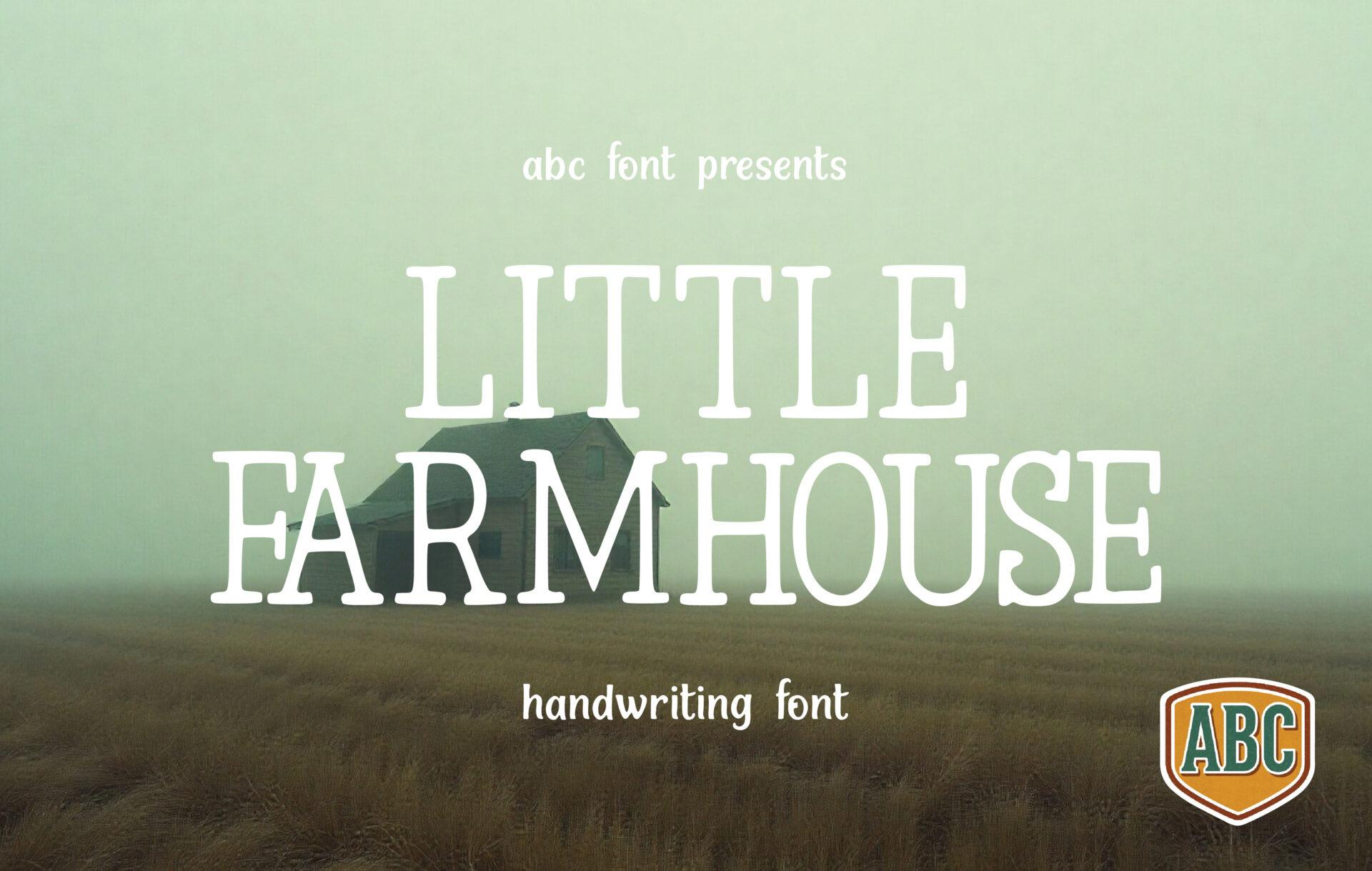
Best For: Rustic and barn wedding menus, chalkboard-style cards
Little Farmhouse is set in tall, thin capitals with small serifs; the cover labels it a handwriting font. The light strokes and narrow letters give it a quiet, countryside feel.
Use it for course headings or a short line under the title on rustic menus printed on kraft or cream card. It also looks natural on wood or chalkboard-style signs that match the menu.
Ready-Made Font Duos and Casual Scripts
If pairing two fonts feels like guesswork, these make it simpler: a duo designed as a set, or a relaxed script with enough weights to cover both titles and courses.
13. Dusty Garden Font
Dusty Garden Font by saridezra
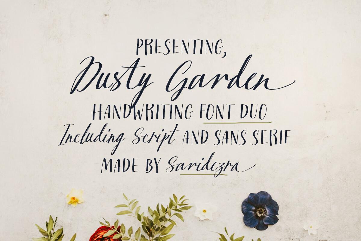
Best For: An all-in-one menu: script names plus sans for dishes
Dusty Garden is a handwriting font duo; the cover states it includes a script and a sans serif. The script is loose and natural, and the sans is set in caps underneath it on the preview.
This is the easiest route to a matching menu: the script for names and titles, the sans for courses, both designed to sit together. It removes the guesswork of pairing two fonts from different designers.
14. Tasty Breakfast Font
Tasty Breakfast Font by baletype
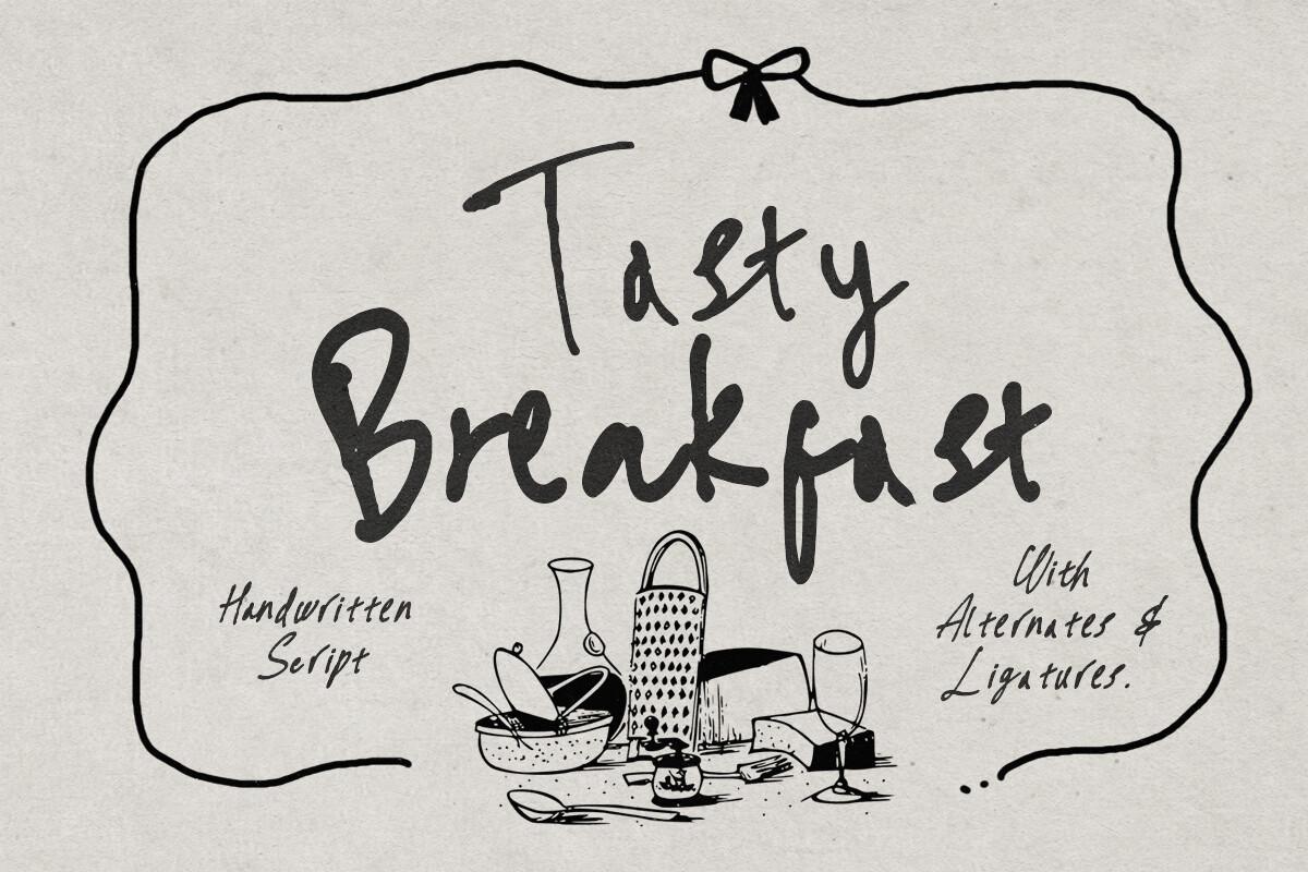
Best For: Brunch weddings, dessert tables and food-themed menus
Tasty Breakfast is a handwritten script shown with hand-drawn glasses and tableware on its cover, which also mentions alternates and ligatures. The letters are bold and friendly with a slight bounce.
The food illustrations on the cover hint at its natural home: brunch receptions, dessert bars and drink menus. Use the alternates on the title only and keep the rest of the card plain.
15. Sherly Font
Sherly Font by banks
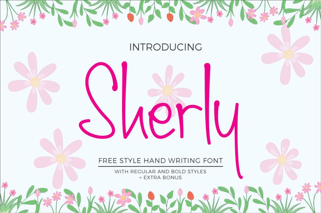
Best For: Casual menus, rehearsal dinners and drink lists
Sherly is a freestyle handwriting font, and the cover lists regular and bold styles. The preview shows it in bright pink with relaxed, uneven letters.
Having two weights in one family helps on a menu: bold for the title, regular for course names. It suits relaxed celebrations like a rehearsal dinner or a welcome party more than a black-tie reception.
How to Build a Wedding Menu with Two Fonts
Give each font one job. The script takes the names or the title; the serif takes everything else. Mixing them inside the food list makes the card look busy and slows reading.
Test the food list at real size. Print one card at home before ordering. Read the dish descriptions at arm’s length in a dim room; if you squint, choose a steadier serif or set the text a size larger.
Match the mood, not just the style. A garden wedding sits well with a soft handwritten script and a classic serif. A retro or boho celebration can take a bold display title like Signature Mango Font or Sidosari Font, as long as the courses stay simple.
Carry the pair through the day. Use the same two fonts on place cards, table numbers and the bar menu, so every piece on the table looks like part of one set.
Wedding Menu Font FAQ
What font size works for a wedding menu?
Keep the title clearly the largest element and set the dish names large enough to read without lifting the card. Print a test card and adjust from there rather than relying on screen size.
Can I set the whole menu in a script font?
You can, but long dish descriptions in script are hard to read, especially in candlelight. A script for the title and a serif for the courses is the safer, more elegant choice.
Should the menu match the invitation fonts?
It does not have to match exactly, but repeating at least one font from the invitation ties the day together. Many couples keep the invitation script for names and choose a simpler serif for the menu text.
Start with the Food List
Pick the serif first, because it has the hardest job. Once the course names read well, choose a script or display font for the title that suits the mood of the day, and test the pair on one printed card. If you want a shortcut, start with a duo like Dusty Garden Font and adjust from there.