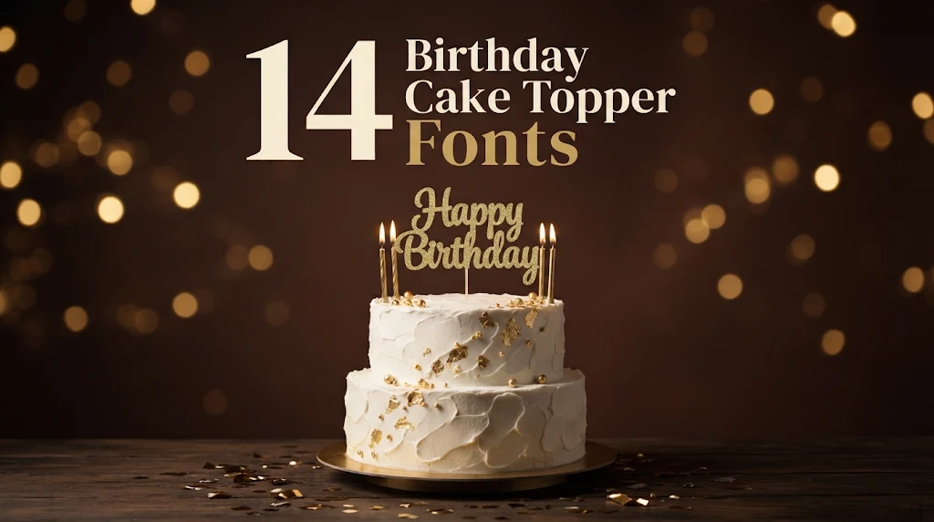
14 Birthday Cake Topper Fonts for Cricut Crafters and Party Hosts: Bold Script, Bouncy Caps and Balloon Letters
A cake topper is a tiny sign with a hard job. It has to read from across the room, survive a cutting machine, and stand upright in frosting without snapping. That is why the font matters more here than on a card: a beautiful hairline script can look perfect on screen and fall apart the moment you lift it off the mat.
This post contains affiliate links. If you buy through them, I may earn a small commission at no extra cost to you.
This list groups 14 birthday cake topper fonts by how they behave on a real topper. Connected scripts come first, because a word that joins up can be welded and cut as one piece. Then come bouncy caps and handwritten letters for names that need extra readability, and finally balloon and display letters for printed toppers and party themes.
All fonts in this list are on Creative Fabrica, and a single All Access subscription unlocks every one of them, so you can try several styles before committing to one.
More birthday font collections:
Happy Birthday Font: 21 Bold, Script and Balloon Styles
Happy Birthday Font Aesthetic: 18 Soft Script and Lettering Styles
Bubble Font: 34 Bubble Letter Fonts
16 Dinosaur Birthday Fonts: Cute, Spiky and Bone
In this list
Connected Scripts That Cut in One Piece
- 1. Cake Topper Font by putrasyahreza00
- 2. Honey Birthday Font
- 3. Baby Birthday Font
- 4. Twenty Birthday Font
- 5. Affiline Font
- 6. Aurelyta Font
- 7. My Birthday Font
Bouncy Caps and Handwritten Letters
- 8. Cake Topper Font by CraftedType Studio
- 9. Sweet Milky Font
- 10. Bilang Kangen Font
- 11. Breaking Bread Font
Connected Scripts That Cut in One Piece
These scripts join their letters, or come close enough that a little kerning closes the gaps. That is the quality that lets a name or “Happy Birthday” be welded and cut as a single piece.
1. Cake Topper Font by putrasyahreza00
Cake Topper Font by putrasyahreza00
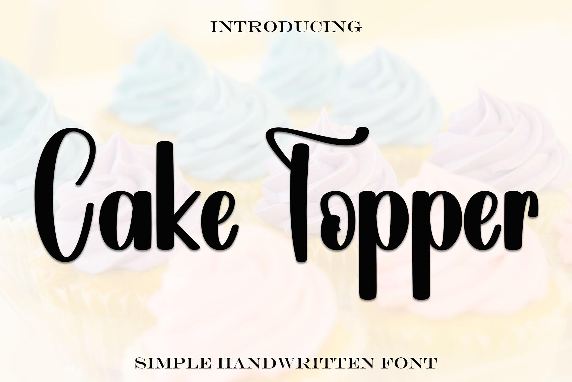
Best For: Name toppers cut from glitter cardstock, “Happy Birthday” in one line
The black letters on the preview are thick and sit tightly together, so each word reads as one solid shape. The capitals keep a simple handwritten build, and the lowercase has short, even joins rather than long hairline tails.
That density is what you want on a Cricut topper: there are few thin spots to tear when you lift the piece off the mat. Set the name, tighten the letter spacing until every letter touches, then weld and add a backing layer or a skewer bar underneath.
2. Honey Birthday Font
Honey Birthday Font by Creatype Designer
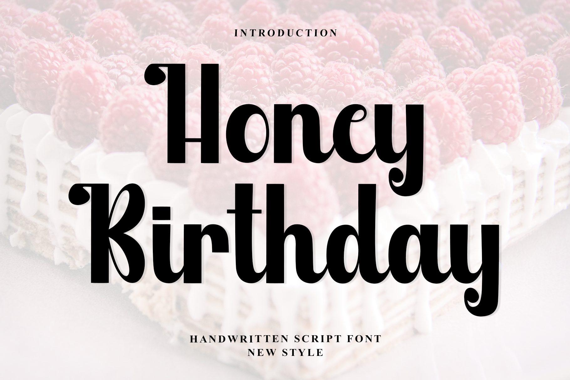
Best For: Bold age toppers, “Happy 30th” and short family names
Honey Birthday is a heavy black script with round bowls and tall, confident capitals. On the cover the letters lean in close and the strokes stay chunky from start to finish.
A heavy script like this survives being cut small, which helps on cupcake toppers as well as a full cake. Pair the word with a large age number set in the same font, so the topper reads from across the room.
3. Baby Birthday Font
Baby Birthday Font by andikastudio
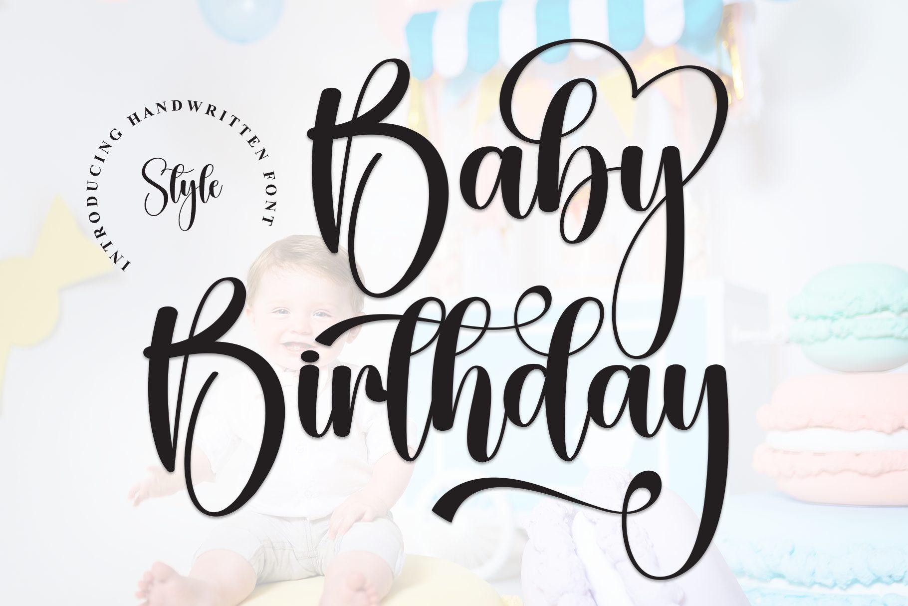
Best For: First birthday toppers, baby names and smash cake signs
The capitals in Baby Birthday carry big looping swashes, while the lowercase stays bold and compact. On the preview the loop of the B sweeps over the rest of the word like a frame.
Use that swash on purpose: it can act as a built-in border that holds a short name together after welding. Keep long names to one capital swash, or the topper gets wide and floppy.
4. Twenty Birthday Font
Twenty Birthday Font by Creativewhitee
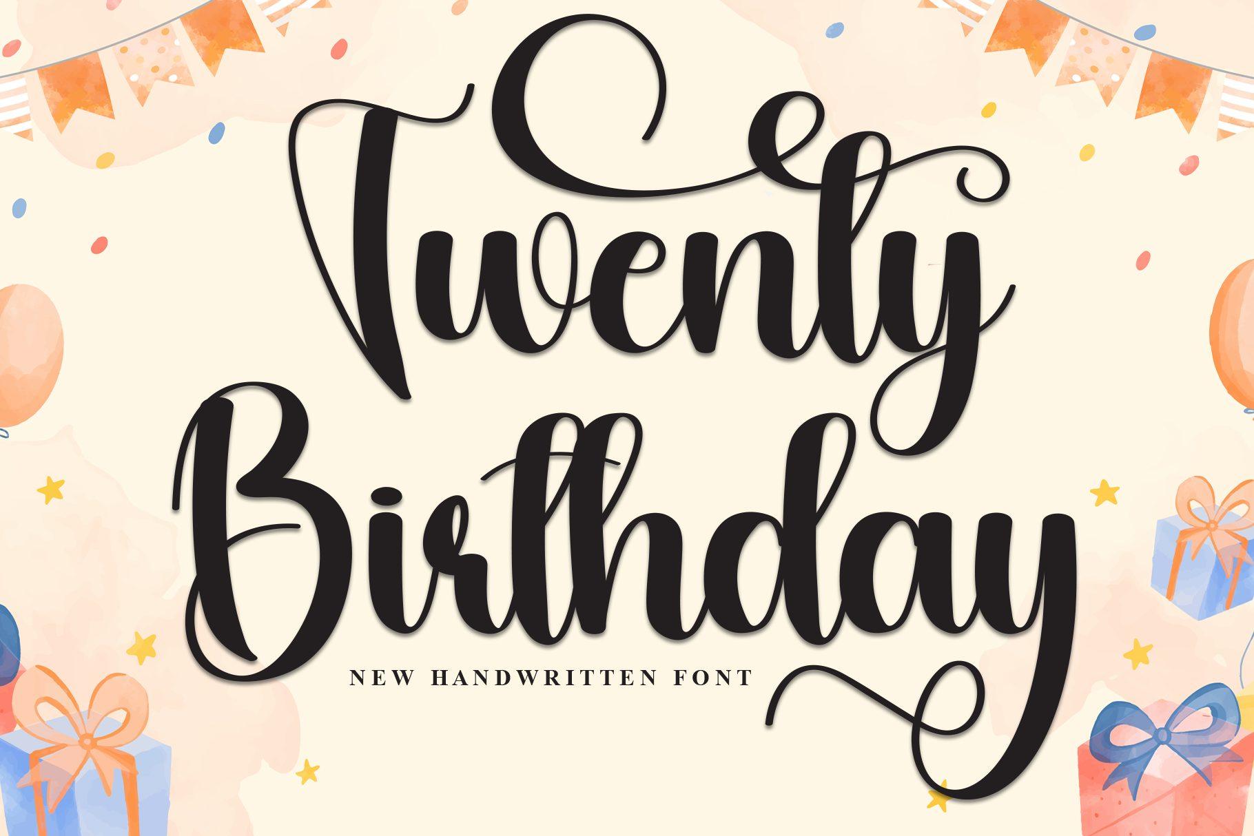
Best For: Milestone toppers like “Twenty”, “Forty” and “Cheers to 50”
Twenty Birthday is a calligraphy script with long entry and exit strokes and generous loops on the capitals. The preview stacks two words, and the tails of the top line reach toward the bottom one.
That reach makes two-line toppers easier: overlap the tails slightly and weld, and both lines become one piece. Cut it from mirror cardstock or acrylic at a decent width, because the thinnest strokes are where the contrast is.
5. Affiline Font
Affiline Font by Creative Fabrica Fonts
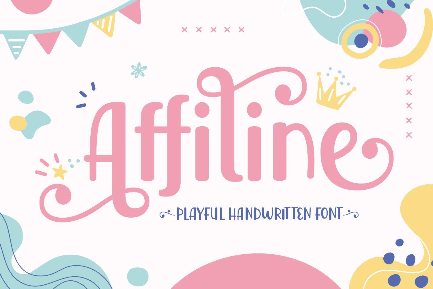
Best For: Girls’ party toppers, pastel themes and printed cake picks
Affiline is a playful handwritten script shown in pink, with curly flourishes coming off the capitals. The letters bounce slightly off the baseline, which keeps the word light.
The flourishes are the fragile part. For a cut topper, thicken the design with an offset before cutting; for a printed topper on photo paper, use it as it is and let the curls do the decorating.
6. Aurelyta Font
Aurelyta Font by Creative Fabrica Fonts
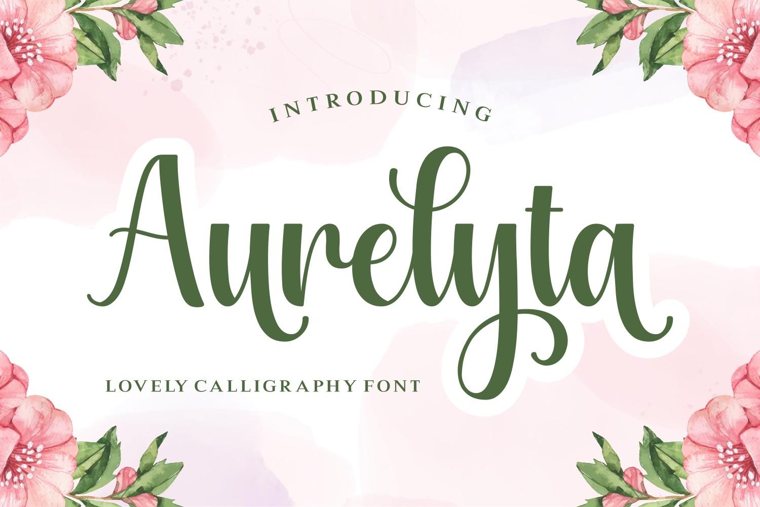
Best For: Elegant printed toppers, acrylic toppers and garden party cakes
Aurelyta is described on its cover as a calligraphy font, and it looks like one: thick downstrokes, thin upstrokes and connecting strokes, all set in a calm green on the preview.
With this much contrast, it works best where nothing has to hold the letters together on its own, such as a printed topper on card or a laser-cut acrylic piece with a solid backing shape.
7. My Birthday Font
My Birthday Font by StudioAKTYPE
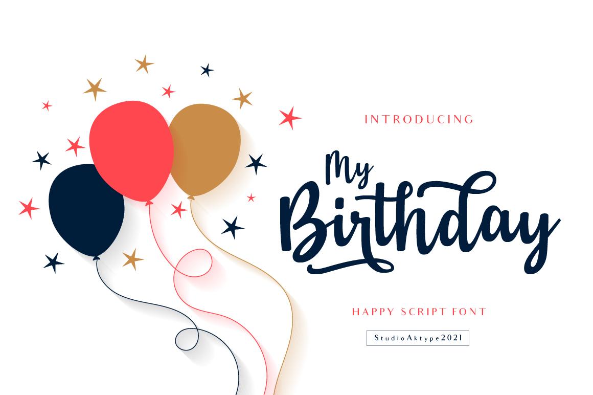
Best For: Printed toppers, balloon-themed parties and cupcake picks
My Birthday is a navy script with a light, airy stroke, shown next to a bunch of balloons on its cover. The capitals are relaxed and the joins are slim.
It is lighter than the scripts above, so treat it as a print font for toppers or give it a thick offset layer before cutting. One word per pick, such as a name or “Yay”, suits it best.
Bouncy Caps and Handwritten Letters
Capitals and loose handwriting read faster than a flowing script, which helps with kids’ names and toppers seen from a distance. Most of these letters do not touch on their own, so plan to overlap them or rest them on a bar.
8. Cake Topper Font by CraftedType Studio
Cake Topper Font by CraftedType Studio
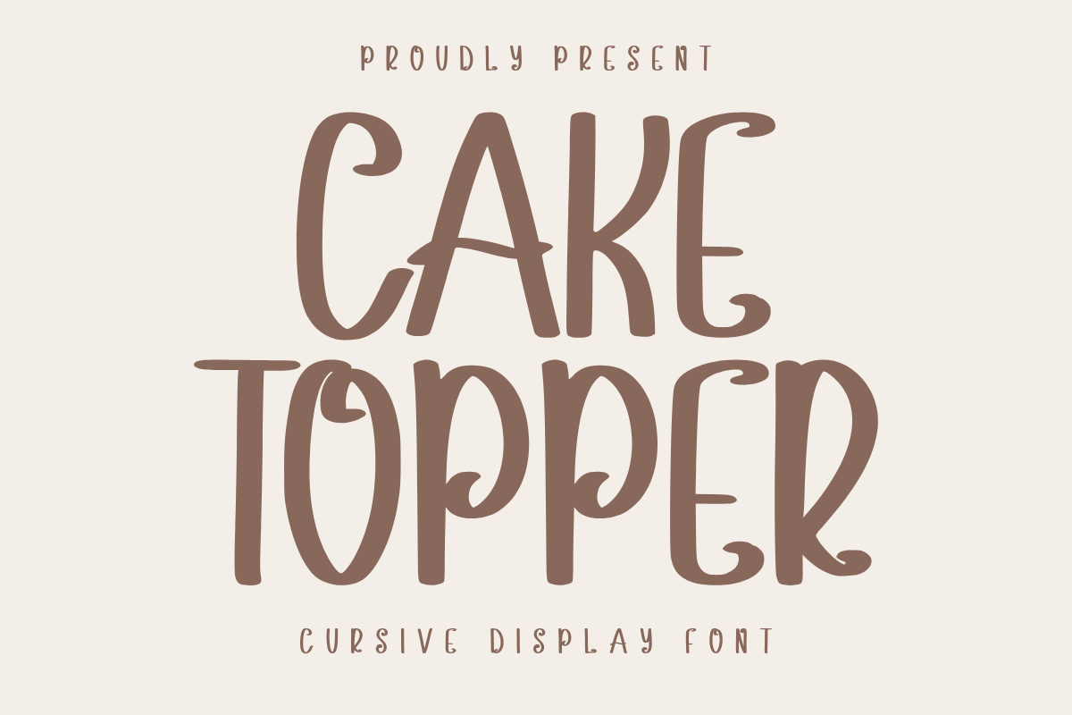
Best For: Kids’ name toppers in caps, rustic and farmhouse cakes
This Cake Topper is set in tall, narrow capitals with a bouncing baseline; the cover calls it a cursive display font. Some letters have small curls at the ends, but the caps stay separate rather than joined.
Because the letters do not connect, overlap them by hand before welding, or add a solid bar underneath that every letter rests on. Caps also make short names easy to read from the other end of the party table.
9. Sweet Milky Font
Sweet Milky Font by Creative Fabrica Fonts
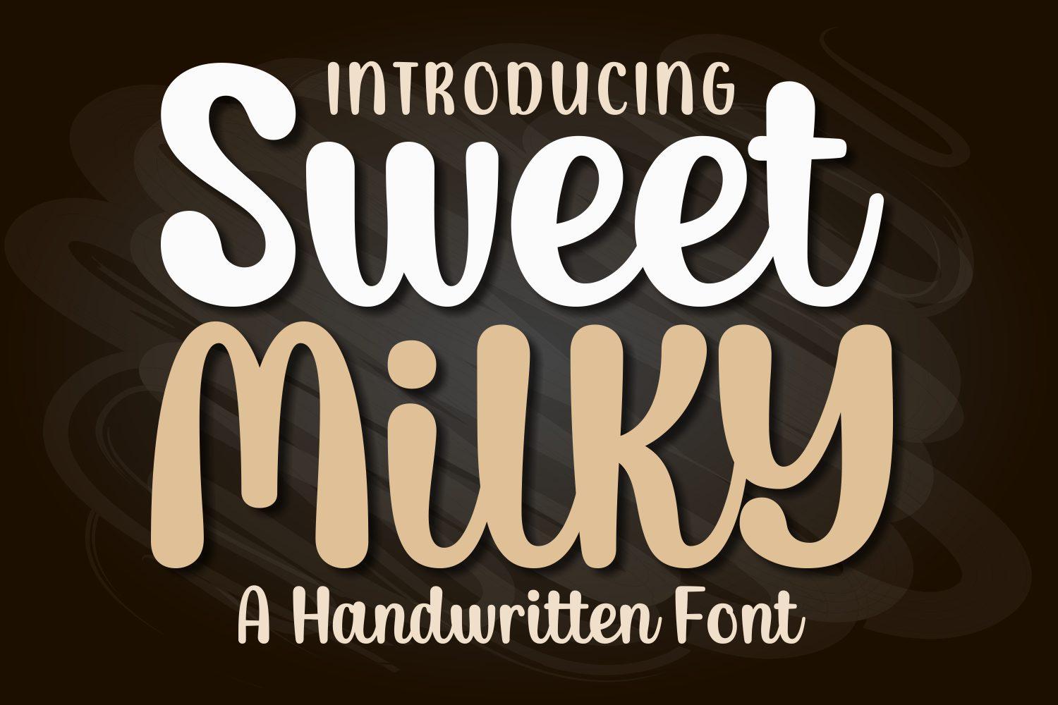
Best For: Chunky kids’ toppers, dessert table signs and candy themes
Sweet Milky is a bold, rounded handwritten font with soft corners and wide letters. On the preview the words stack in two colors and stay readable even at a glance.
Thick rounded letters cut cleanly and hold up on cardstock without extra layering. They also look good in two layers: a white base cut slightly larger and the name in color on top.
10. Bilang Kangen Font
Bilang Kangen Font by Creative Fabrica Fonts
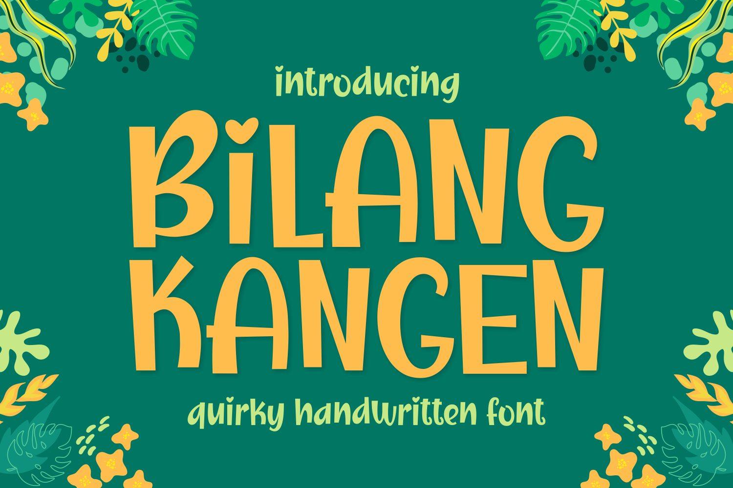
Best For: Fun ages, silly party themes and teenage birthday toppers
Bilang Kangen is a quirky, bold handwritten font, and its cover says exactly that. The letters wobble a little in size and angle, which gives the word an informal, cheerful feel.
Use it where the cake has a bit of humor, like a “Finally 13” or “Officially Old” topper. The heavy strokes make it one of the easier fonts here to cut without tearing.
11. Breaking Bread Font
Breaking Bread Font by GeekMissy
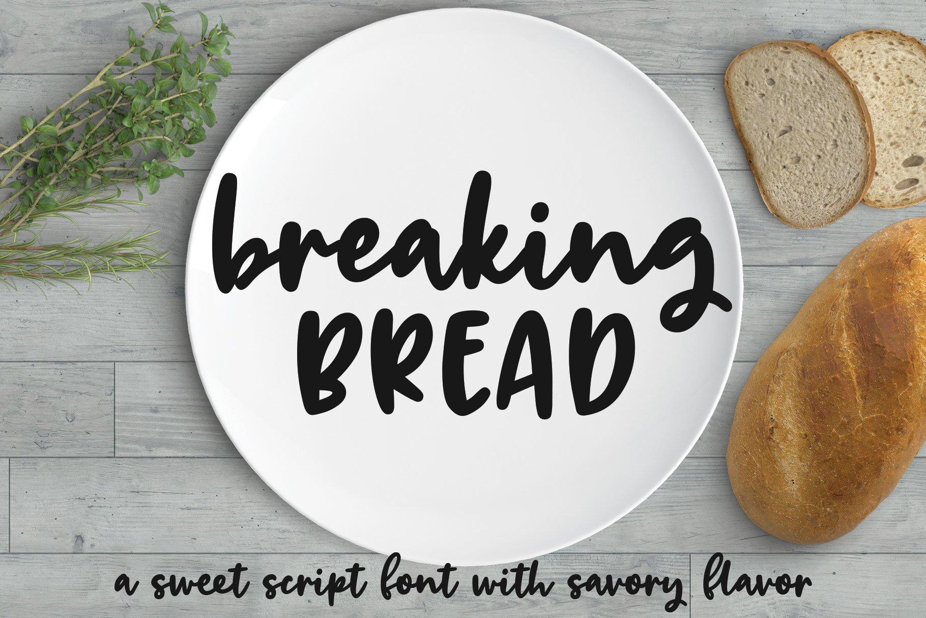
Best For: Two-word toppers: script name plus a word in caps
Breaking Bread pairs a lowercase script with bold capitals; the cover shows both in one design and calls it a sweet script font. The script is round and friendly, the caps are blocky and steady.
That pairing is ready-made for toppers like “happy BIRTHDAY” or “sweet SIXTEEN”. Let the script word overlap the caps slightly and weld the two lines into a single cut.
Balloon, Display and Novelty Letters
Puffy, decorated and display letters bring the party theme straight onto the cake. Some cut beautifully; others carry so much detail that printing is the better route.
12. Boisterous Shindig Duo Font
Boisterous Shindig Duo Font by Denise Chandler
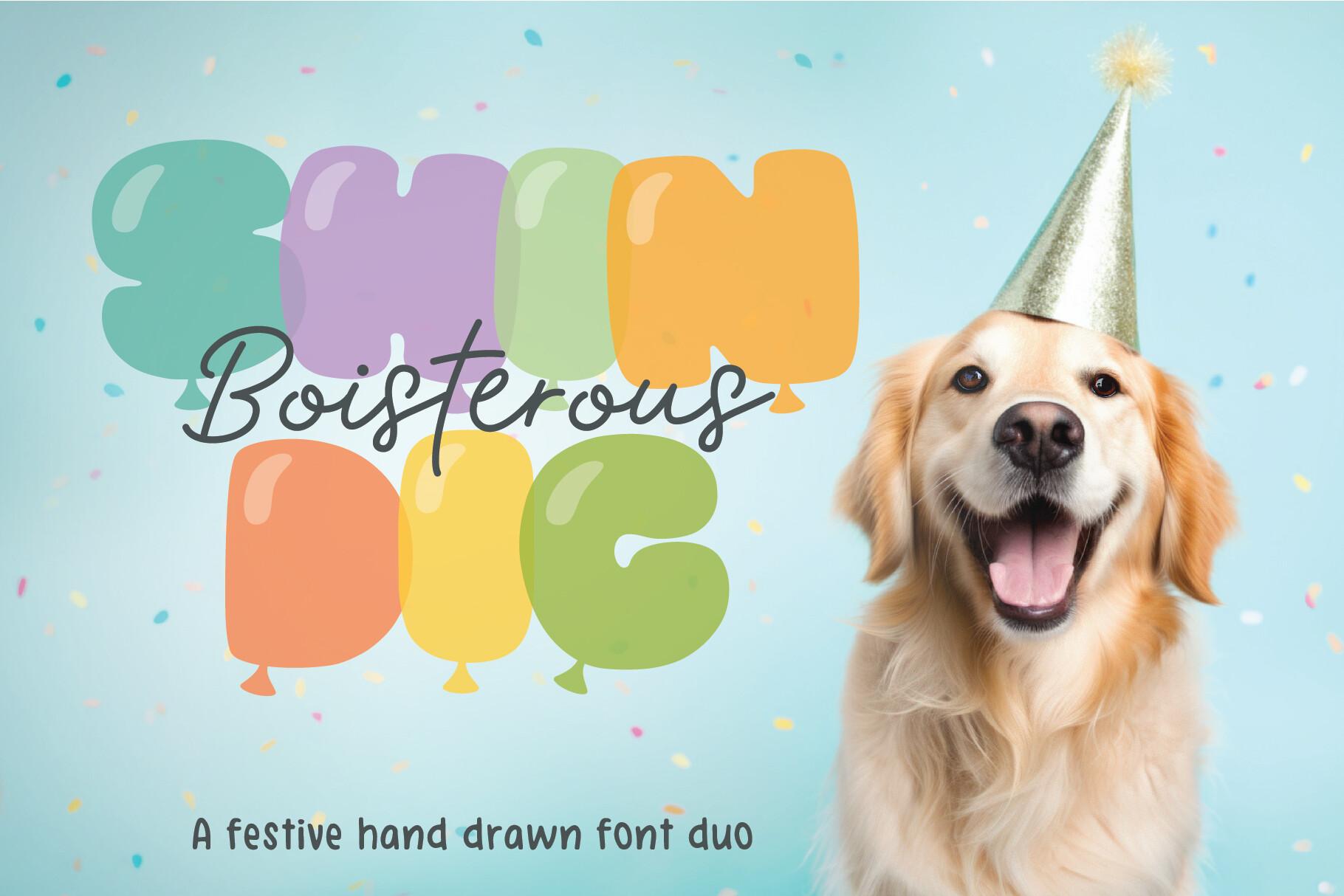
Best For: Balloon-letter toppers, pastel party themes and printed picks
The cover presents it as a festive hand drawn font duo: puffy balloon letters in pastel colors plus a thin script for an accent word. The balloon shapes are round and full, like inflated letters.
Use the balloon letters for the name or age and keep the thin script for a printed accent only. For a cut topper, the balloon half is the part that will cut well.
13. Celebration Nova Font
Celebration Nova Font by ABC Font
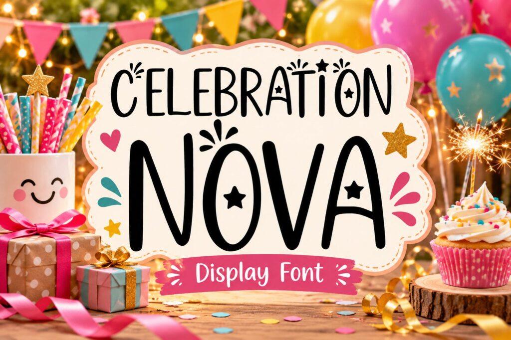
Best For: Bold party toppers, “Let’s Celebrate” and age numbers
Celebration Nova is a bold display font in capitals; the cover labels it a display font and decorates it with small stars. The letters are heavy and upright, with a slightly playful edge.
Heavy display caps are the most forgiving style for a first Cricut topper. Weld the word to a star or banner shape and the whole piece cuts as one.
14. Happy Birthday Font by squeebcreative
Happy Birthday Font by squeebcreative
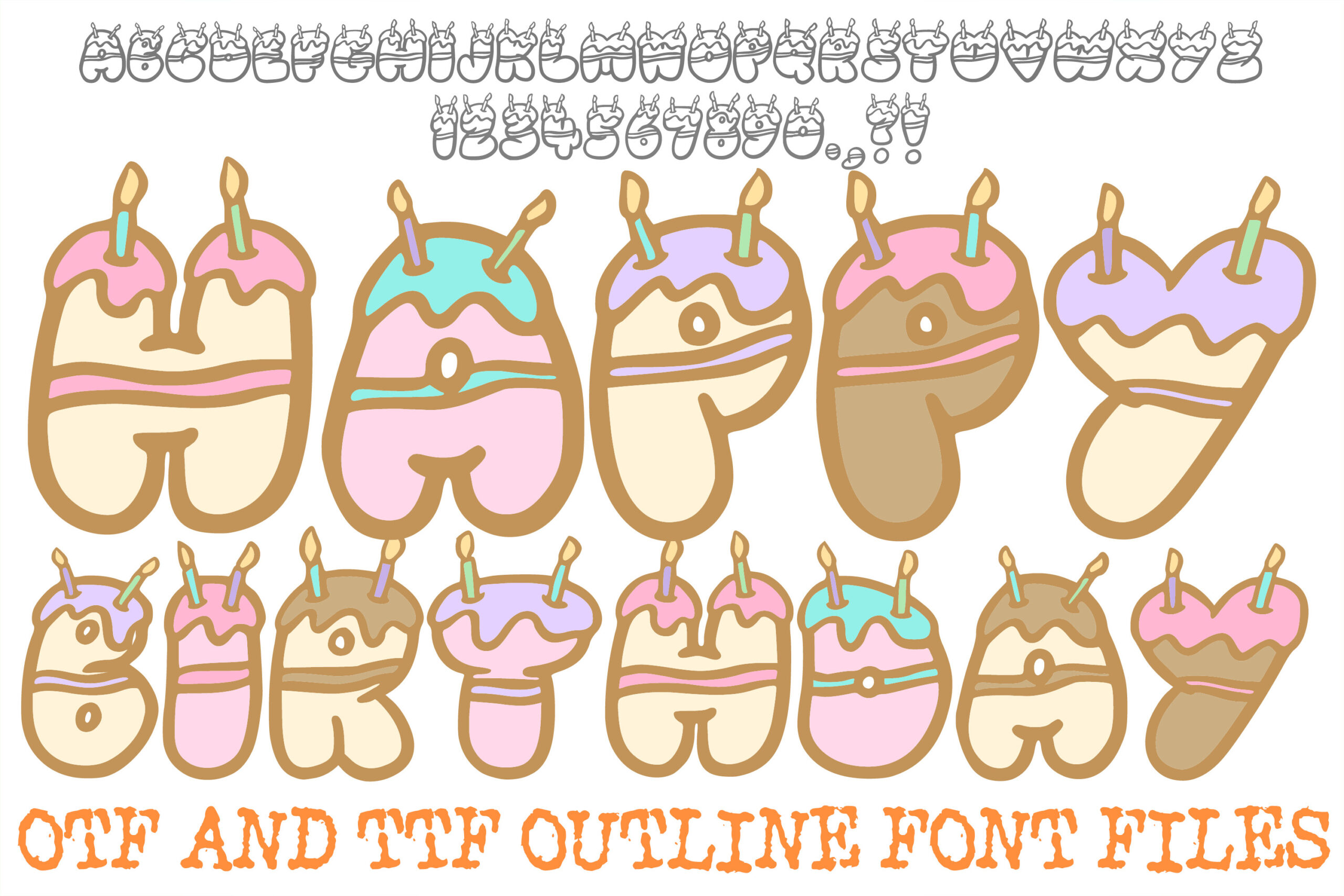
Best For: Printed toppers, cake-shaped letters and birthday stickers
Here every letter is drawn as a little cake with frosting and candles. The cover states it comes as OTF and TTF outline font files, and the preview shows the letters in pastel colors.
Since the letters are outlines with lots of small detail, they make more sense printed than cut. Print a name on photo paper, cut around the whole word with a print-then-cut setting, and glue it to a stick.
How to Choose a Cake Topper Font
Decide first: cut or print. A topper cut from cardstock, wood or acrylic needs letters that touch or can be made to touch, with strokes thick enough to hold their shape. A printed topper on photo paper or sticker sheet can use thin calligraphy, outlines and colorful novelty letters, because the paper carries the design.
Check the thinnest stroke. Type the actual name at the size you will cut, zoom in and look for hairlines and tiny joins. If you can barely see a connection on screen, the blade will not keep it. Thicken the word with an offset, or pick one of the heavier scripts above.
Weld before you cut. Tighten the letter spacing so every letter overlaps its neighbor, then weld the whole word into one shape. Unconnected caps can rest on a bar, a star or a banner that becomes part of the cut.
Keep it short. One name, one age, or a two-word phrase works best. Long phrases make the topper too wide for the cake and too floppy to stand on a single stick.
Cake Topper Font FAQ
What kind of font is best for a Cricut cake topper?
A bold connected script or heavy display caps. Connected letters weld into one piece, and thick strokes survive cutting and handling. Thin calligraphy is better saved for printed toppers.
Can I use a thin script font for a cut topper?
Yes, if you add an offset layer behind it. Cut the offset from a sturdy material as the base, cut the script in a second color, and glue the two together so the base takes the strain.
How do I make a two-line topper cut as one piece?
Move the lines close enough that a tail, a swash or a capital from one line overlaps the other, then weld everything. Scripts with long loops, like Twenty Birthday Font, make this easier.
Pick the Topper, Then the Font
Start from how the topper will be made. For a cut name, go straight to the connected scripts and the heavy caps. For a printed pick, enjoy the calligraphy, balloon and cake-shaped letters. Type the real name in two or three candidates, look at them at actual size, and the right one usually stands out in a minute.