Tattoo Fonts Alphabet: 18 Script, Old English, Chicano and Fine-Line Alphabets for Name and Word Tattoos
A tattoo fonts alphabet is the quickest way to judge a lettering style before it goes on skin. A cover image shows one word that the designer chose because it looks good. The full alphabet shows every letter, including the ones that are easy to confuse: an I that looks like a J, a u that looks like an n, a gothic capital you cannot name on its own.
This post contains affiliate links. If you buy through them, I may earn a small commission at no extra cost to you.
This list gathers 18 tattoo writing fonts in four groups: script and cursive, Chicano, Old English and fine-line. For each one you see a single slide with its full alphabet, and the notes point out which letters are hard to tell apart and what to check when you spell your own name or word. All fonts in this list are on Creative Fabrica, and a single All Access subscription unlocks every one of them, so you can try several styles before committing to one.
More tattoo font collections:
40 Tattoo Fonts
26 Tattoo Name Fonts
22 Tattoo Quote Fonts
20 Cursive Tattoo Fonts
16 Calligraphy Tattoo Fonts
16 Tattoo Lettering Fonts
24 Gothic Tattoo Fonts
17 Tattoo Fonts for Men
21 Tattoo Fonts for Women
23 Number Tattoo Fonts
22 Typewriter Fonts
Table of Contents
- Script and Cursive Alphabets
- Chicano Alphabets
- Old English Alphabets
- Fine-Line Alphabets
- How to Read a Tattoo Font Alphabet Before You Choose
- FAQ
- Where to Start
Script and Cursive Alphabets
Flowing script is the most requested tattoo writing style, and it is also where letters blur together fastest. Each alphabet below is shown on one slide, so you can check every capital before you commit to a spelling.
1. Black Forrest Font by madeDeduk
Best For: Old-school script names with a decorative first letter, chest and forearm pieces
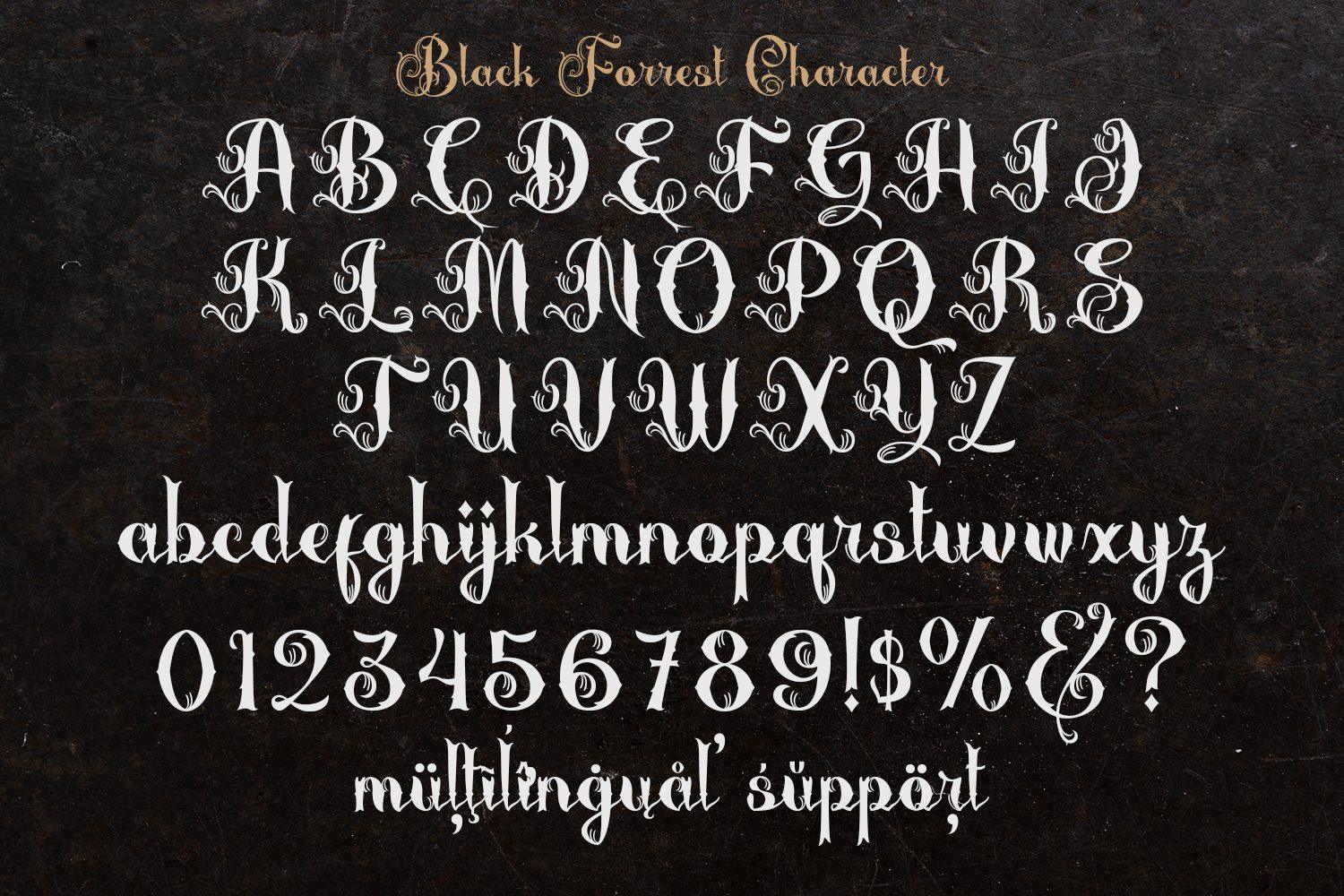
A vintage script with heavily curled capitals. On the character slide every uppercase letter carries loops at the top and the bottom, while the lowercase is an upright calligraphic hand with clear contrast between thick and thin strokes. Numbers and a few symbols sit in the same style, and the slide notes multilingual support.
The capitals are the part to study. Their curls are so full that a few of them only read in context, so test your initial on its own before you build a monogram. On the slide the first row of capitals stops at I and the next row starts at K, so look for the J on the product page before you plan a name like Jade or Joseph. The lowercase is the easy part: it stays open and readable, which makes this a good choice for a full name with one ornate capital in front.
2. Lillian Smith Font by lemonthe
Best For: Signature-style names, wrist and collarbone script, one-word tattoos
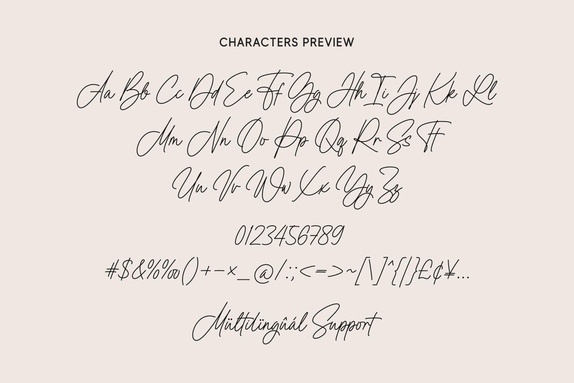
A quick signature script set out on the slide as pairs, Aa Bb Cc through Zz, followed by numbers and punctuation. The capitals are tall and looped, the lowercase is small and fast, and the whole alphabet leans to the right like a real pen signature.
Because the lowercase is so small next to the capitals, the middle of a word does most of the work and the shapes there get close: u, n and v are all quick strokes, and i and j depend on their dots and the tail of the j. Spell your word out letter by letter from the slide rather than trusting a typed preview. Short names and single words suit it best; a long word turns into one fast line.
3. Ronald Billion Font by a piece of cake
Best For: Handwritten names that need a slightly heavier line, forearm and calf
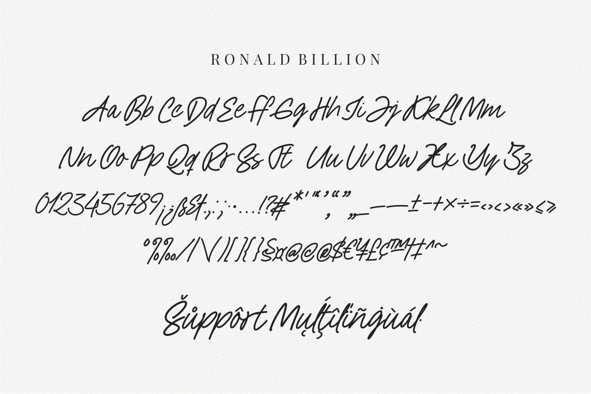
A handwritten script with a darker stroke than most signature fonts. The slide runs the whole alphabet as pairs, Aa to Zz, in two lines, then numbers, punctuation and accented letters under a Multilingual Support line.
The pairs show how close some capitals sit to their neighbours in this hand: check I against J and U against V before you sign off on a stencil. The heavier line is the reason to pick it over a hairline script, since it holds a little better at small sizes. Keep generous spacing between words if you set more than one.
4. Signature Austine Font by Essentials Studio
Best For: Short names and initials in a thin signature style, wrist, ankle and finger
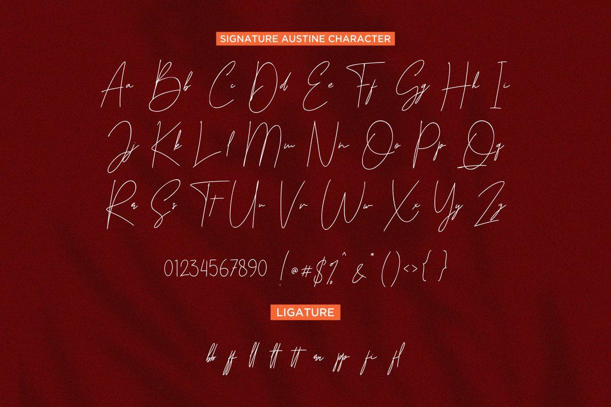
A very thin signature script. The character slide is built differently from the others: each capital stands next to its lowercase letter, and the lowercase is tiny, often not much more than a short stroke beside a tall capital. Numbers, symbols and a row of ligatures follow underneath.
That size difference is the thing to plan around. In a word, the capital carries the shape and the lowercase reads as a quick line, so long names lose their letters. Use it for short names, initials or a single meaningful word, and compare each lowercase letter on the slide with your spelling, because several of them are small enough to look alike at tattoo size.
Chicano Alphabets
Chicano script mixes ornate capitals with a tighter lowercase. These four fonts show both halves on one slide, which matters because the capitals are where most spelling mistakes happen.
5. Loyalty Chicano Font by Blankids Studio
Best For: Chicano names and family words, back, chest and forearm
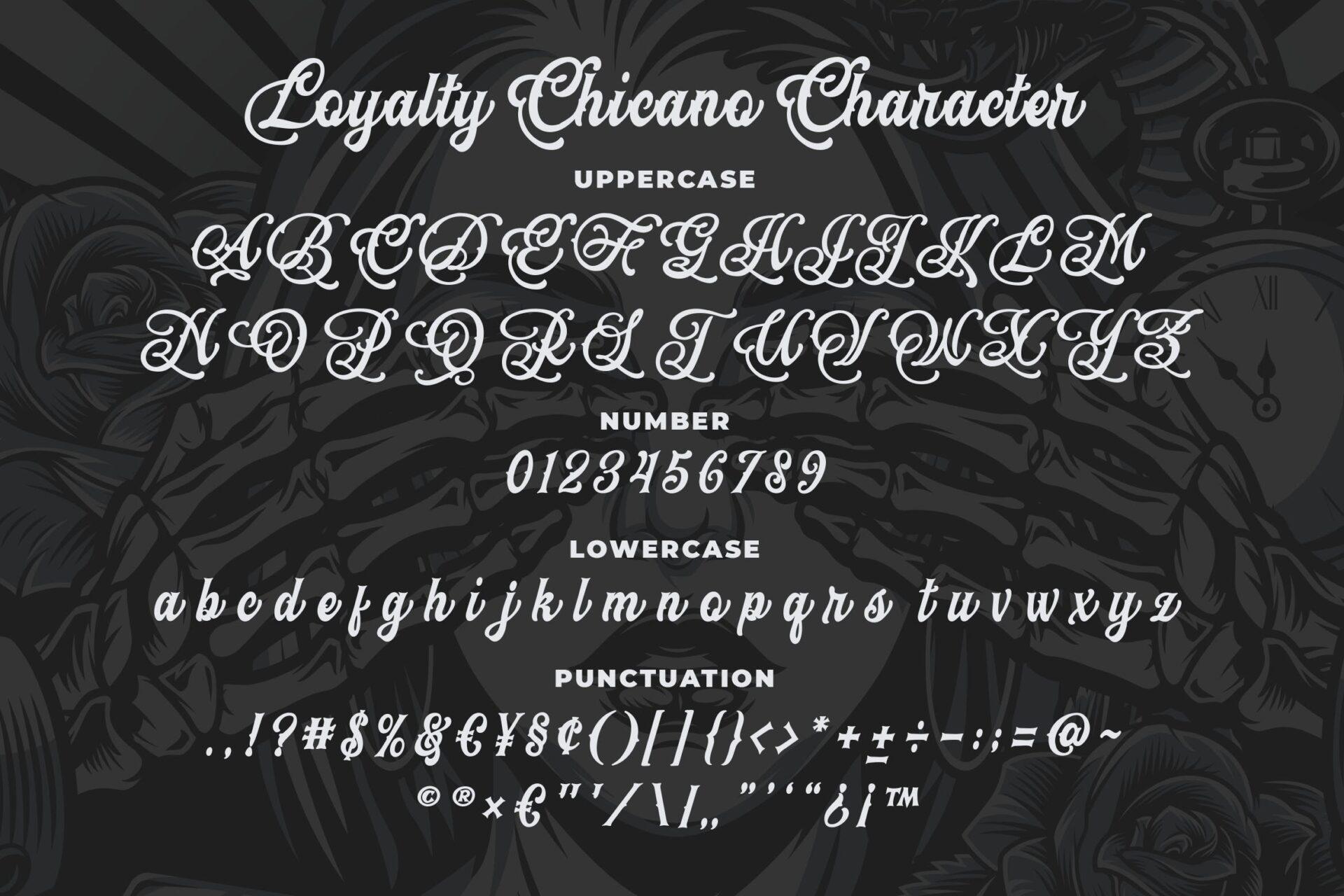
A classic Chicano script with swashed, heavily decorated capitals and a calmer slanted lowercase. The character slide lists uppercase, numbers, lowercase and punctuation in that order, so the full alphabet is in one place.
The capitals are ornate enough that some pairs need a second look: compare I with J, and T with F, since all four start from similar curled tops. The lowercase is much plainer and stays readable, so the safest structure is one decorative capital and lowercase for the rest of the word. That is also the classic Chicano layout for names like Familia or a surname across the back.
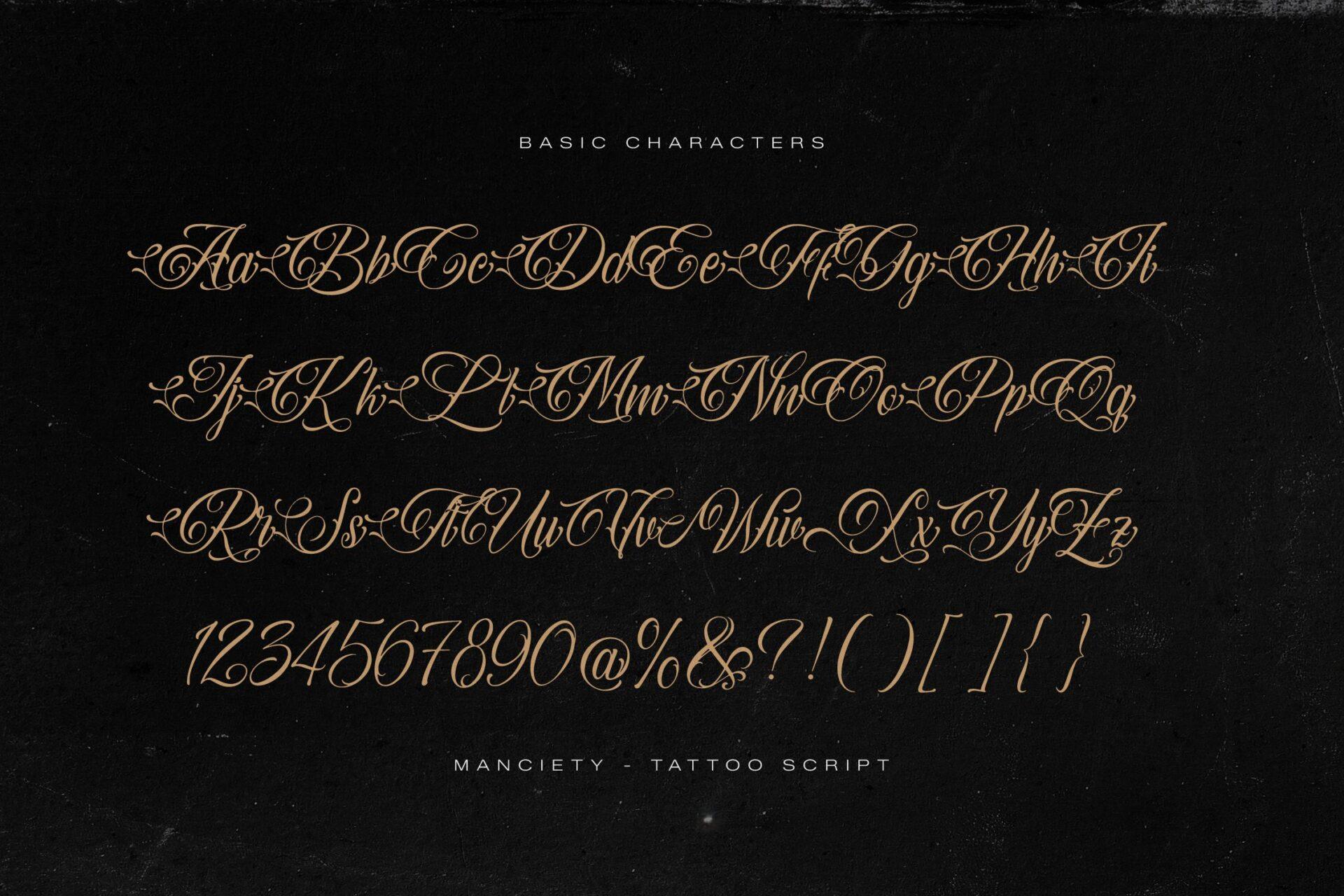
6. Manciety Font by Denustudios
Best For: Tattoo script names with long lead-in strokes, back and forearm
The slide is titled Manciety Tattoo Script and shows the basic characters as pairs, Aa Bb Cc to Zz, followed by numbers and symbols. Every capital opens with a long horizontal entry stroke that runs into the letter from the left, and the lowercase is slanted and calligraphic.
Those entry strokes make the capitals look connected even when they stand alone, so leave room on the left of the word for the swash to land. I and J share the same tall looped form here, so check which one the slide gives you before you approve a stencil. The design works best in one long line across a forearm or the upper back, where the lead-in stroke has space.
7. Mexicala Font by Alit Design
Best For: Chicano lettering with Old English capitals, lowrider-style names and words
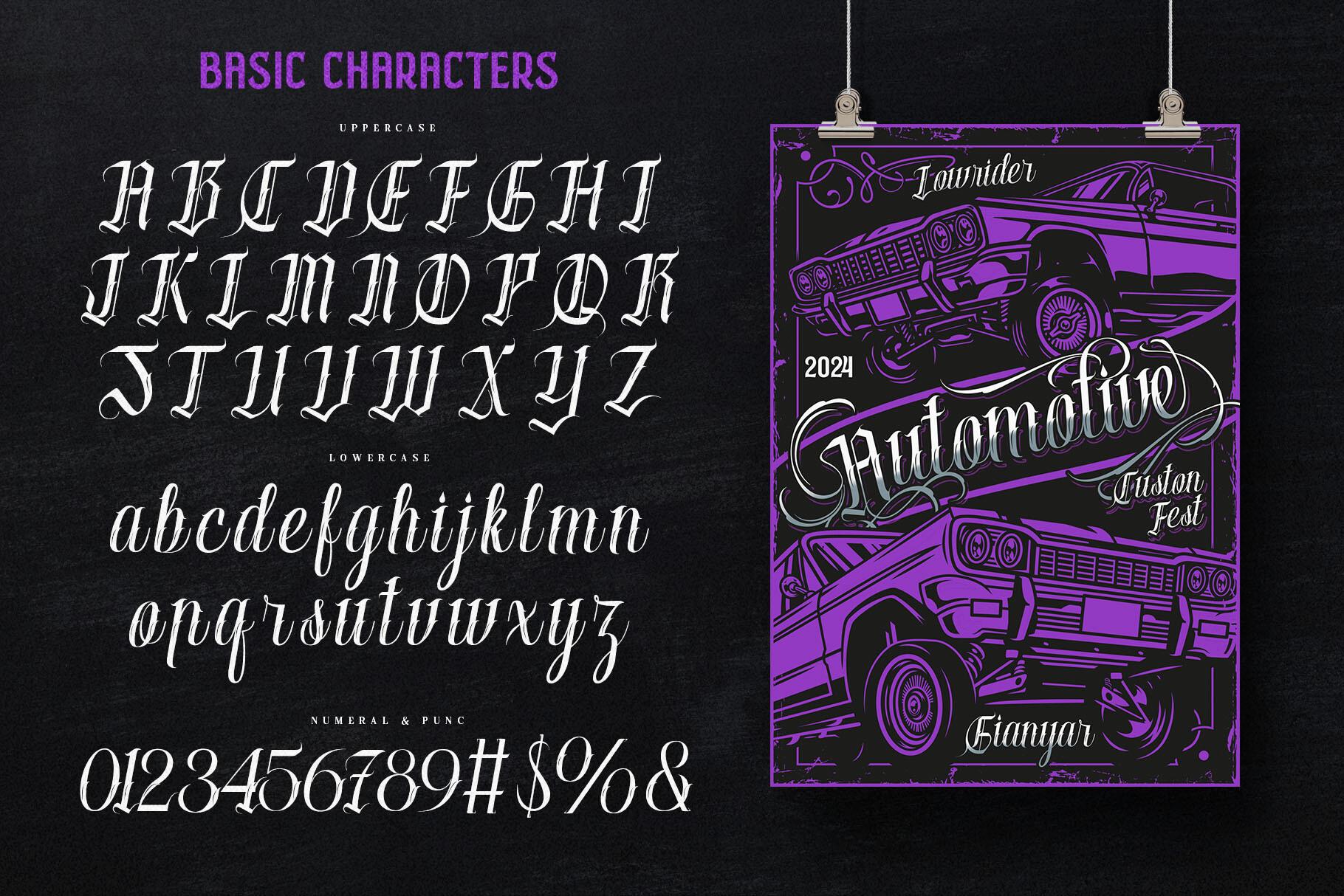
A Chicano font that pairs blackletter-style capitals with an upright, narrow script lowercase. The basic characters slide shows uppercase, lowercase, then numerals and a few symbols, next to a lowrider poster that uses the font.
The capitals follow Old English logic, so the usual blackletter pairs apply: I and J are close, and some capitals read better in a word than alone. The lowercase is narrow, with letters like u, n and m built from similar upright strokes, so give it a little extra spacing at small sizes. A capital from this set followed by the script lowercase gives you the classic mixed Chicano look without combining two fonts.
8. Igniss Son Font by Denustudios
Best For: Tall Chicano-gothic capitals, single words, surnames and initials
A narrow, tall Chicano-gothic alphabet. The basic character slide sets the capitals A to Z with plenty of space around each one, then the lowercase in one condensed line. The capitals have thin hairline flicks; the lowercase is small and very narrow.
Several capitals share the same tall structure, so check I against J, and U against V, before you choose your spelling. In the lowercase, the narrow width turns m, n and u into rows of upright strokes. The font looks strongest in capitals only, one short word or a surname down the spine or across the ribs, where the height can work.
Old English Alphabets
Old English and blackletter capitals are the hardest letters in tattoo lettering to read, and they are also the most permanent mistakes. Use these slides to check every capital in your word, not only the first one.
9. Dark Old English Font by Chonada
Best For: Classic Old English names and words, chest, stomach and neck
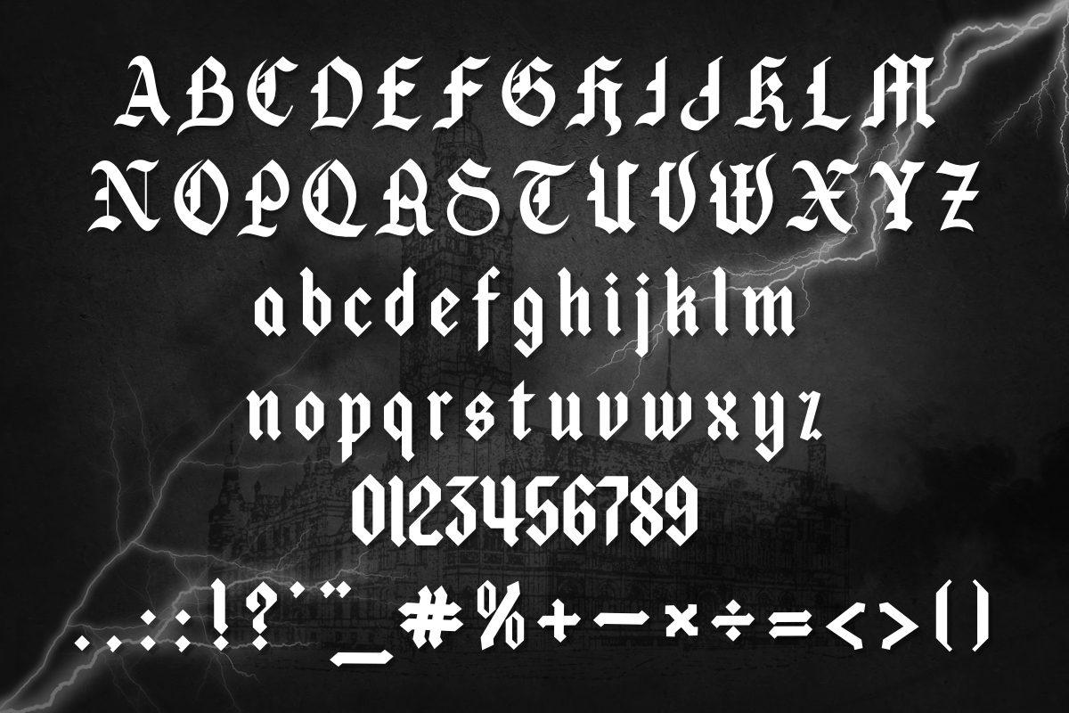
A straightforward Old English alphabet: capitals in two rows, lowercase in two rows, numbers and punctuation underneath, white on a dark stormy background. The letterforms are traditional blackletter with heavy vertical strokes and pointed ends.
The capitals are traditional, which means the traditional problems: I and J are almost the same letter, and some capitals only make sense once the rest of the word follows. In the lowercase, n and u are built from the same two strokes, so a name like Luna or Bruno needs a careful look. It is one of the more readable Old English sets here, which makes it a safe first choice for a chest or stomach word.
10. Black Sultanah Font by WAP
Best For: Fraktur-style capitals with an open lowercase, names and single words
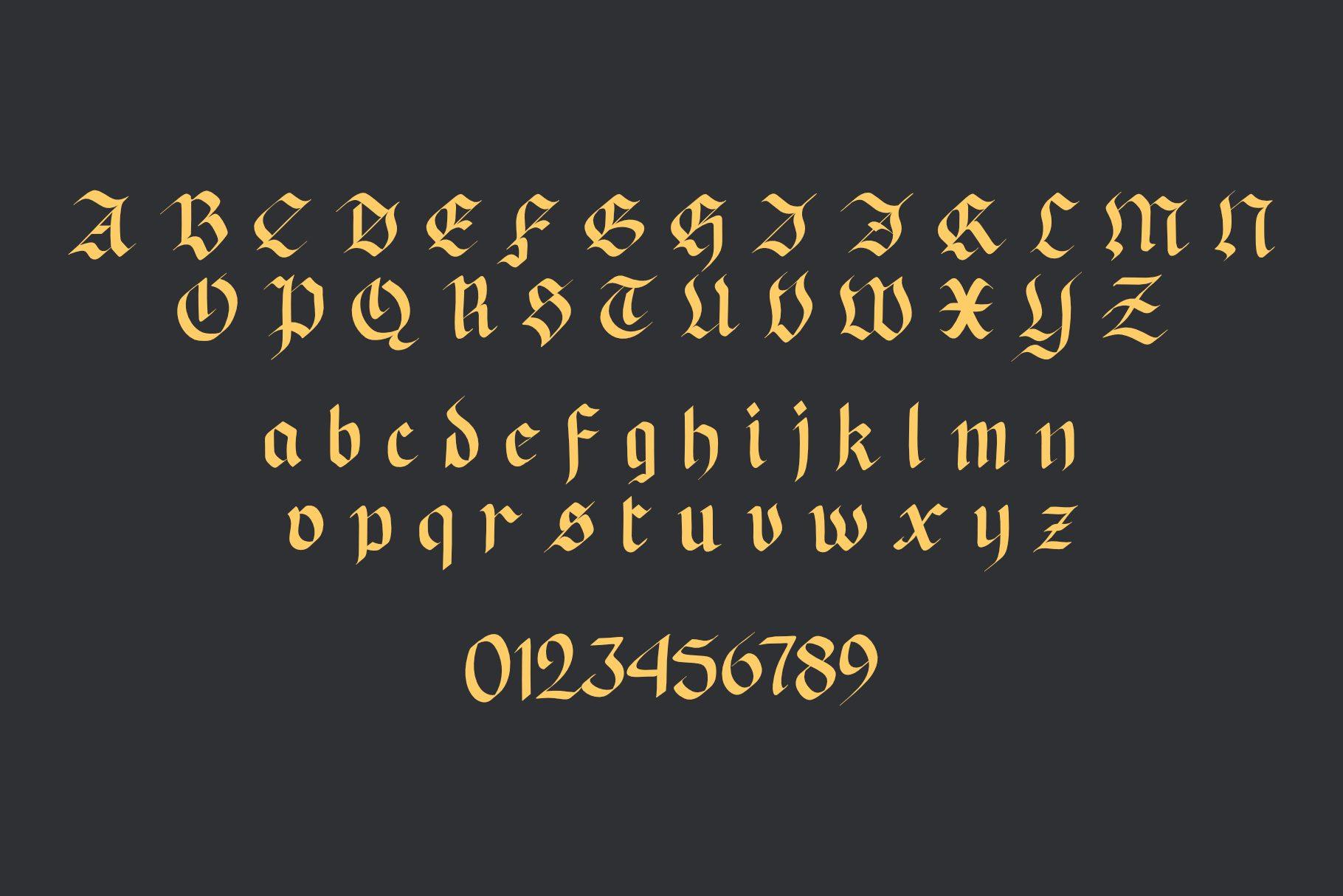
Gold Fraktur letters on a charcoal slide: capitals in two rows, lowercase in two rows, numbers below. The capitals are elaborate and spread wide, while the lowercase is lighter and more open than classic textura.
Read the capitals one by one. Fraktur capitals do not always look like their modern versions, and several here would be hard to name out of context; I and J in particular are close. The lowercase is the friendly half of this font, so the best structure is one capital and the rest in lowercase. That keeps a name readable without losing the Fraktur character.
11. Danger Gothic Font by holyline design
Best For: Heavy gothic lettering for bold words, stomach, chest and knuckles
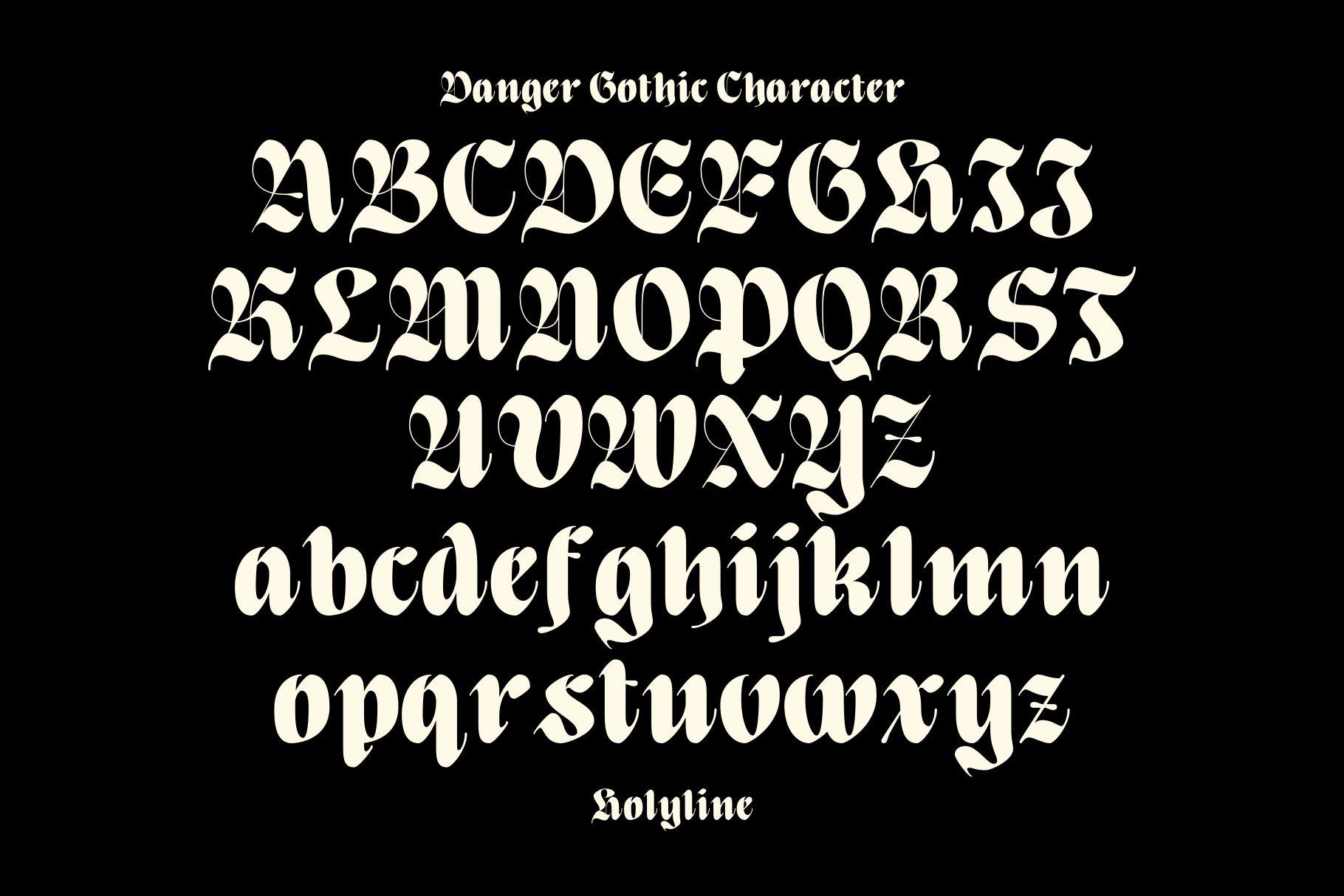
A heavy blackletter with dramatic capitals. The character slide sets the uppercase in three rows and the lowercase in two, cream on black. The lowercase is dense and dark; the capitals are wide and ornate.
Some capitals here look very different from their modern forms: the A, for example, could read as an N or a U on its own. Check the first letter of your word against the slide before anything else. The lowercase is compact and holds weight well, which is why the font suits short, bold words where the letters can be large.
12. Kingching Font by Eko Kurniawan
Best For: Condensed gothic lettering, tall narrow words, ribs, spine and forearm
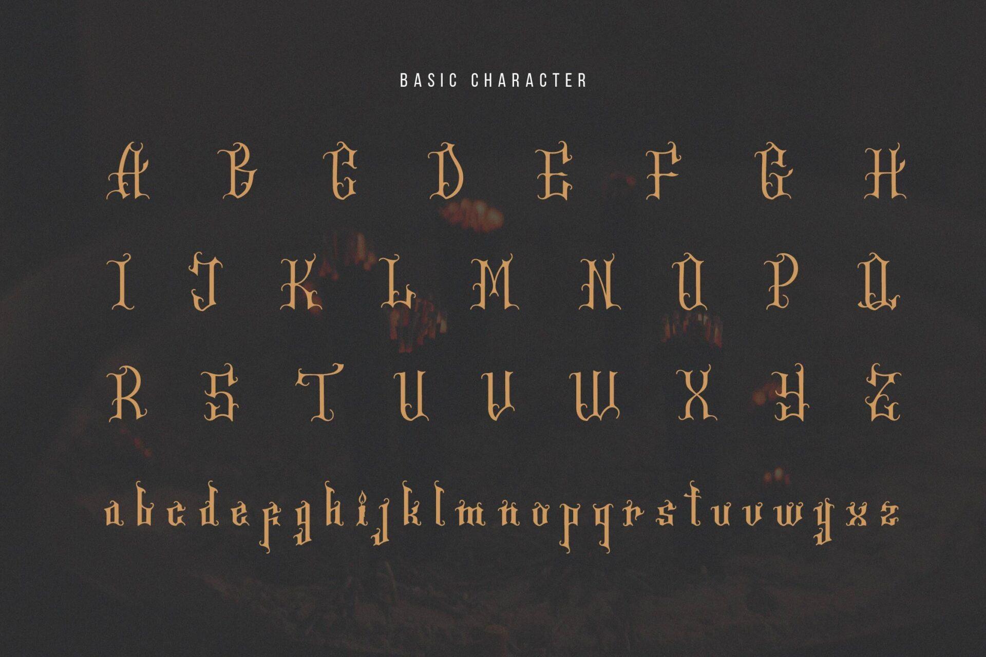
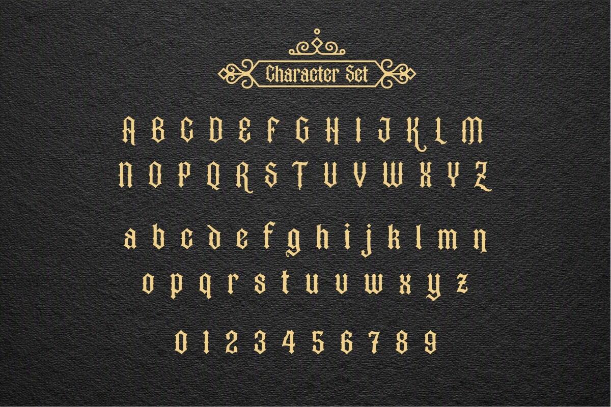
A narrow gothic alphabet that is much plainer than classic Old English. The character set slide shows capitals in two rows, lowercase in two rows and widely spaced numbers, gold on a dark textured background. The capitals keep a blackletter feel but lose most of the decoration.
Because it is so condensed, the lowercase turns m, n and u into rows of similar vertical strokes, so add letter spacing if your word has several of them. The capitals are easier to read than in most blackletter fonts, which makes this a good pick if you want gothic lettering that strangers can still read. Tall, narrow placements like the spine or the side of the forearm suit its proportions.
13. Devonxa Font by Typia Nesia
Best For: Blackletter names with alternate capitals, chest, back and forearm
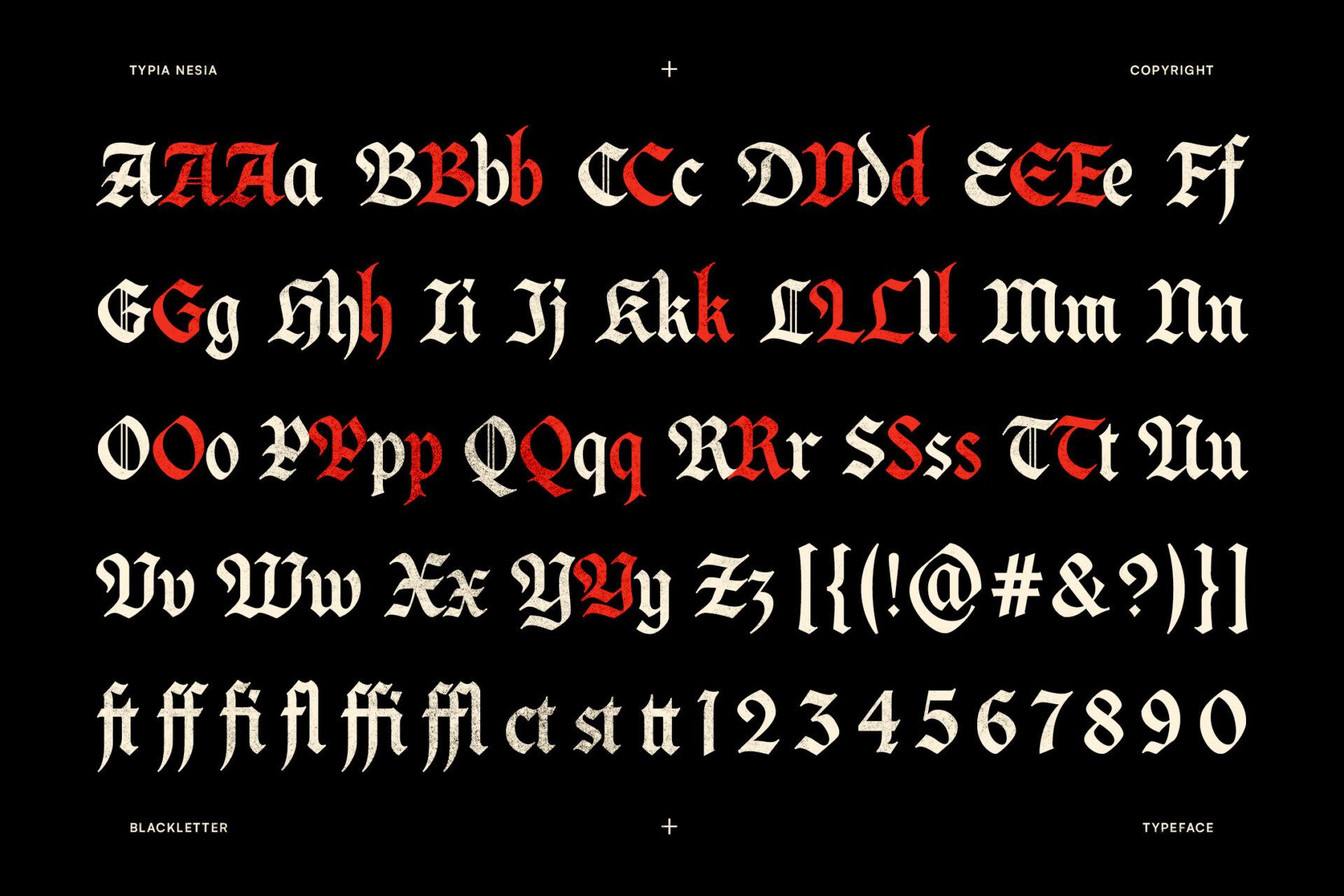
A blackletter set shown on one slide with capitals, alternate capitals and lowercase side by side: the alternate versions appear in red next to the standard ones. Below the alphabet there are ligatures such as ff, fi, fl, ct, st and tt, plus brackets, symbols and numbers 1 to 0.
The alternates are the reason to choose it. Many letters have a second capital, so you can pick the version that reads best for your initial, but use one style per word so the line stays consistent. Compare I and J carefully, since both standard and alternate forms are close. The st and tt ligatures help with names like Kristen or Matteo.
14. Coldtwine Font by Typia Nesia
Best For: Bold modern blackletter, short words, knuckles and forearm
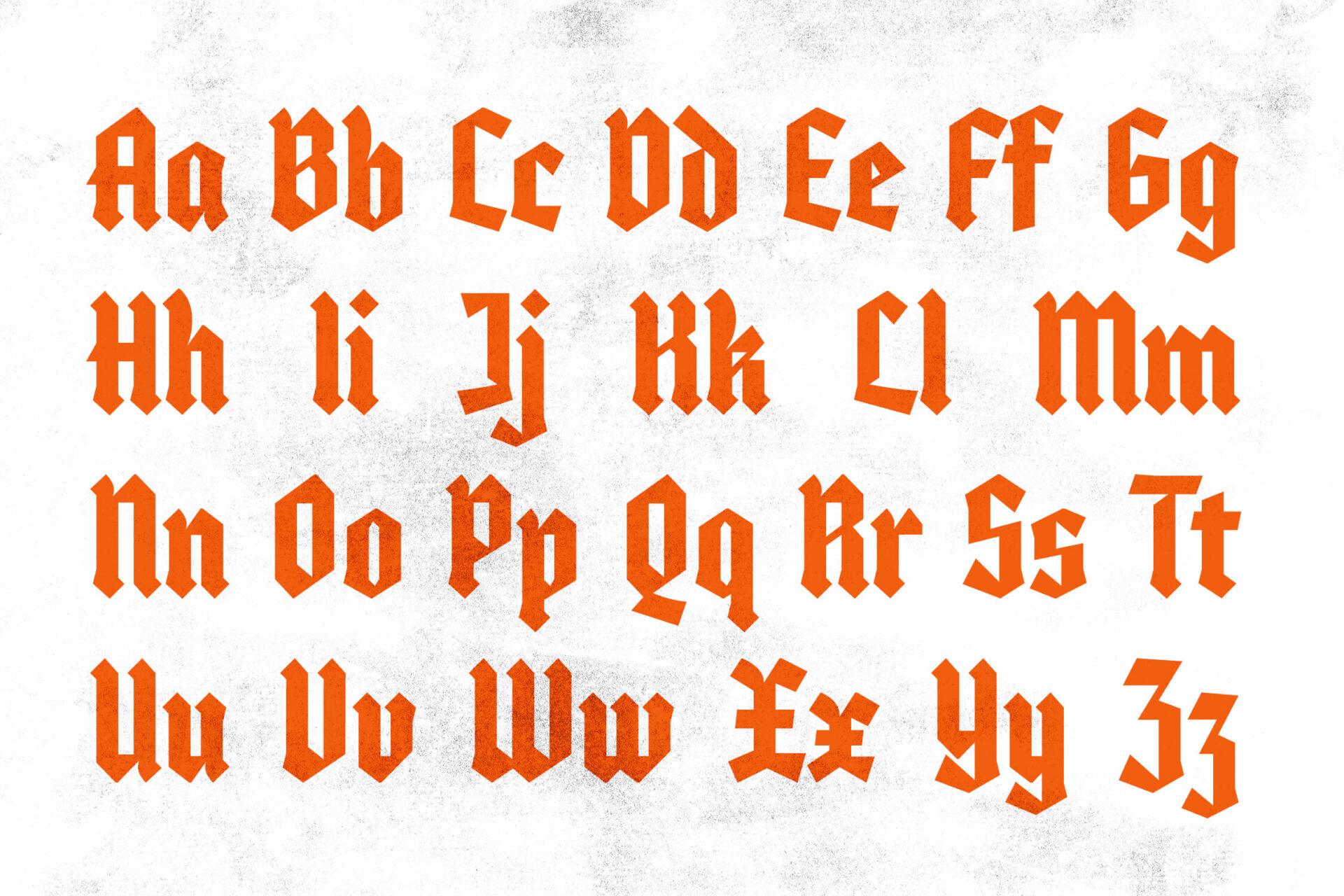
A bold, simplified blackletter shown as large pairs, Aa to Zz, in orange on a light textured background. The forms are heavy and sharply cut, with less decoration than traditional Old English.
Capitals and lowercase are close in shape for letters like C, O and S, so the capital does not always stand out at the start of a word; scale it up a little if you want it to. Check I against J, as in most blackletter. The weight and simple cuts make this one of the better choices for small, bold words where finer blackletter would fill in.
Fine-Line Alphabets
Fine-line scripts are drawn with a single thin stroke, so the alphabet slide shows almost exactly how the tattoo will look. The risk is not decoration but scale: thin letters need room to stay apart.
15. Hirosuke Font by Zafara Studios
Best For: Monoline names and words, wrist, ankle and behind the ear
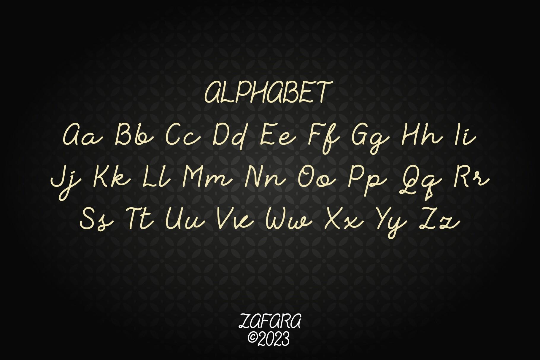
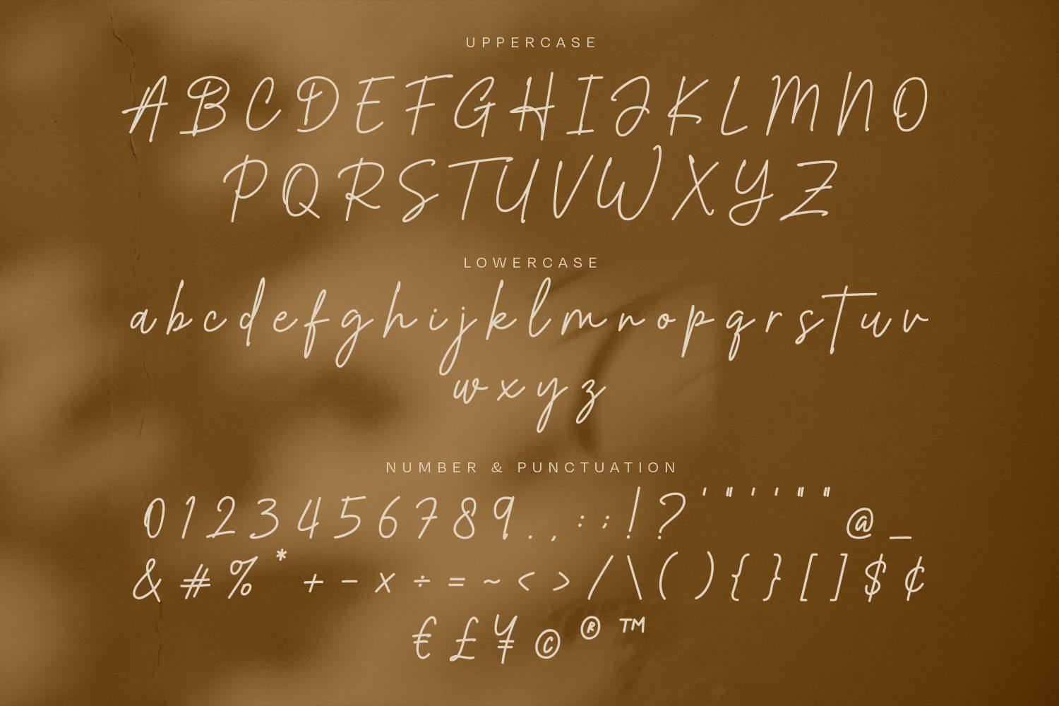
A monoline signature script. The alphabet slide shows only the letters, as pairs from Aa to Zz in three rows, in a thin gold line on black. The line weight stays the same through every curve, and the letters lean gently to the right.
With an even line, the shapes carry all the meaning, so check U against V and I against J, which are close in this hand. Numbers are not on this slide; they appear on a separate slide in the gallery, so look there if you plan a date. A monoline like this is a natural fit for fine-line work, as long as the word is large enough that the loops do not close up.
16. Port Fairy Font by Typnco
Best For: Delicate handwritten names, collarbone, rib and wrist
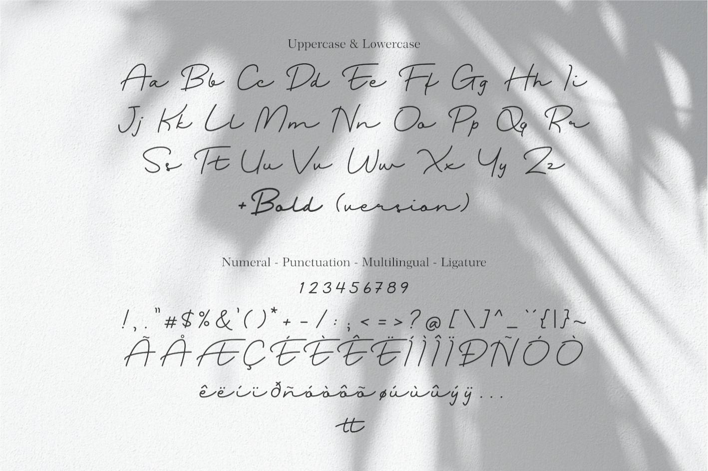
A delicate handwritten script. The slide shows uppercase and lowercase pairs, then numerals, punctuation, accented letters and ligatures. A note on the slide mentions a bold version, which is useful if the thin weight looks too light for your placement.
The lowercase is airy and fast, so u, n and v are close, and the dots on i and j are small. Before choosing between the regular and bold, think about size: the regular reads well on a collarbone or rib piece with some width, while the bold version is the safer option for a small wrist word.
17. Beristone Font by Typebae
Best For: Fine-line names with double letters, wrist, forearm and collarbone
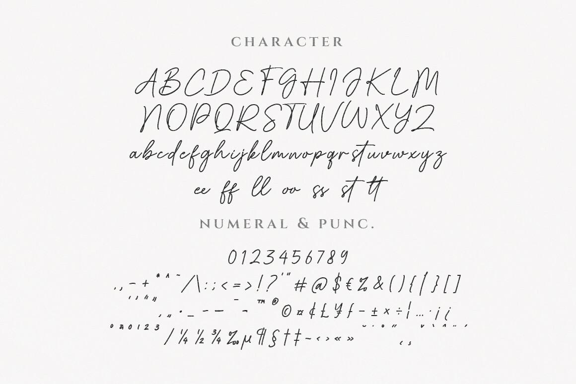
A thin signature script with its whole alphabet on one slide: capitals in two rows, lowercase in one line, then a row of double-letter ligatures, numbers and punctuation. The ligatures shown are ee, ff, ll, oo, ss and tt.
Those ligatures are what make this font useful for names. Double letters in a signature script usually look like a mistake; here they are drawn as a pair, so names like Isabella, Matteo or Jessie stay smooth. The capitals are tall and looped, so check I against J. Give the word enough size for the lowercase loops to stay open.
18. Rostalia Font by krenstudioid
Best For: Readable fine-line script, names and short words for first tattoos
A fine-line script with more space between letters than most signature fonts. The slide sets the uppercase in two rows, the lowercase in two rows and the numbers and punctuation below. The capitals are fairly upright and simply drawn; the lowercase is thin and evenly spaced.
This is the most readable of the fine-line alphabets here: the letters sit apart and keep their own shapes. The usual thin-script pairs still apply, so compare I and J in the capitals and u and n in the lowercase. It is a good choice for a first tattoo, when you want a script that anyone can read.
How to Read a Tattoo Font Alphabet Before You Choose
Start with your own word, not the cover. Write it out by hand, then find each of its letters on the alphabet slide one by one. A font that looks perfect on the designer’s sample word can turn awkward on yours, usually because of one capital or one double letter.
Check the known look-alikes first. In script and Chicano fonts, compare I with J and T with F, since they often start from the same curled top. In Old English, compare I with J, and in the lowercase n with u, which are built from the same strokes. In fine-line scripts, look at u, n and v, and at the dots on i and j, which can disappear when the tattoo is small.
Then look at what the slide does not show. Some slides skip numbers or put them on a separate image, and a few leave out a letter in the layout, so open the product page if you plan a date or a name with a less common capital. Finally, ask your artist to print the word at the real size: a full alphabet tells you how the letters are built, but only the stencil shows how they behave together on your body.
FAQ
Which tattoo fonts alphabet is easiest to read?
Fine-line and script alphabets with separate, evenly spaced letters read best. In this list, Rostalia Font and Kingching Font are the most readable in their groups: Rostalia as a script, Kingching as a gothic style with simplified capitals.
Which letters are hardest in Old English tattoo fonts?
The capitals I and J are the most common problem, because many blackletter fonts draw them almost the same. In the lowercase, n and u are built from the same strokes. Some decorative capitals, like the A in Danger Gothic Font, can read as a different letter on their own.
Can I use capitals from one tattoo font and lowercase from another?
You can, but it is easier to pick a font that already mixes the two. Mexicala Font, for example, pairs Old English style capitals with a script lowercase in one alphabet, so the strokes match.
What are the best tattoo script fonts for names with double letters?
Look for fonts with double-letter ligatures. Beristone Font includes ee, ff, ll, oo, ss and tt, and Devonxa Font has st and tt ligatures in a blackletter style, so names like Isabella or Matteo stay smooth.
Where to Start
If you want a script name that anyone can read, start with Rostalia Font or Hirosuke Font. For a Chicano piece with ornate capitals, Loyalty Chicano Font and Manciety Font show the whole range on one slide. For Old English, Dark Old English Font is the classic choice, and Devonxa Font gives you alternate capitals when your initial does not look right. Whichever you choose, spell your word out from the alphabet before you take it to the studio.