Fun Fonts: 27 Quirky, Kids, Doodle and Funky Styles for Crafters, Teachers and Party Hosts
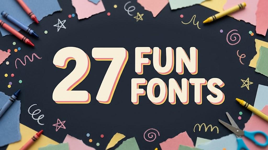
Fun fonts do one thing very well: they make people smile before they read a single word. A goofy headline, a font made of little aliens, letters drawn with crayons or a wavy 70s stack can turn a plain invitation, a shirt or a classroom sign into something people want to look at.
This post contains affiliate links. If you buy through them, I may earn a small commission at no extra cost to you.
This list gathers 27 fun fonts in four groups: quirky and funny display fonts, kids fonts for classrooms, doodle and craft fonts, and funky retro fonts. Each font is shown in its real preview, with a note on where it works and where it needs care. All fonts in this list are on Creative Fabrica, and a single All Access subscription unlocks every one of them, so you can try several styles before committing to one.
More playful font collections:
31 Cute Fonts
23 Whimsical Fonts
34 Bubble Letter Fonts
30 Cool Fonts
28 Bold Fonts
Table of Contents
- Quirky and Funny Display Fonts
- Fun Kids Fonts for Classrooms
- Doodle and Craft Fonts
- Funky Retro Fun Fonts
- How to Choose a Fun Font
- FAQ
- Where to Start
Quirky and Funny Display Fonts
Quirky fonts get their humor from the letters themselves: odd curves, characters hidden inside the strokes, shapes borrowed from neckties or alien heads. These seven are for party posters, funny shirts, comic titles and any headline that should make people smile before they read it.
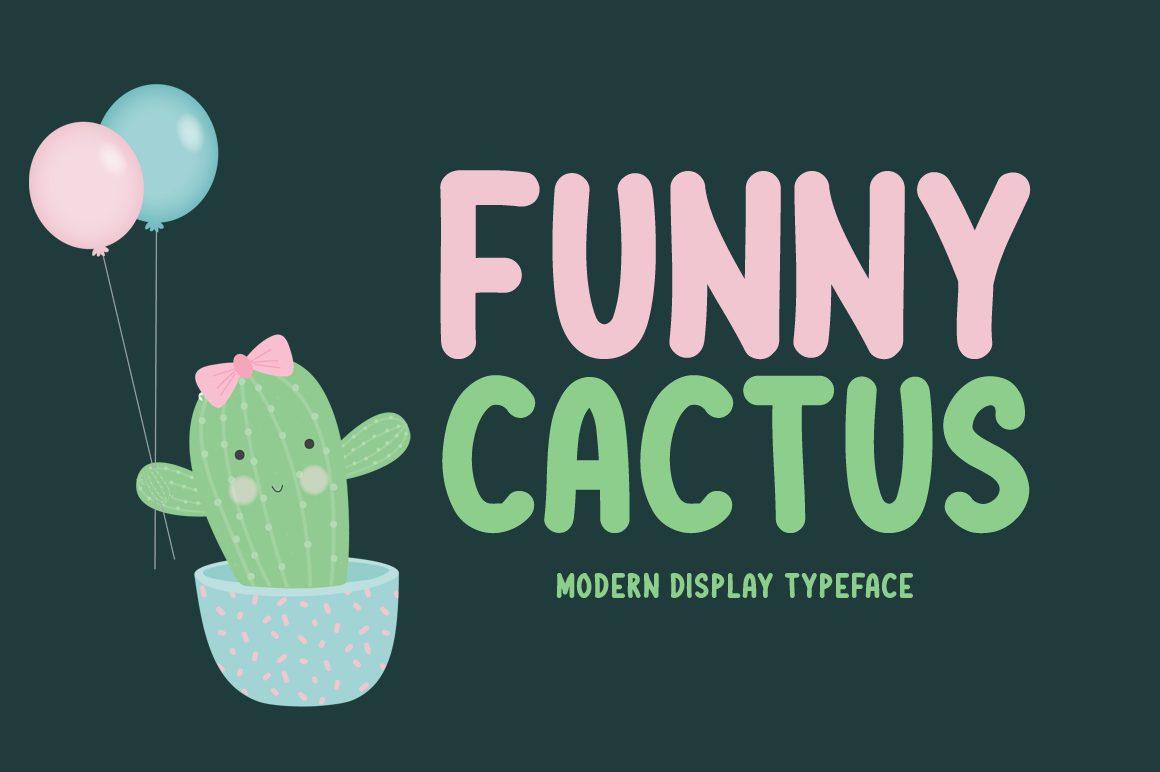
1. Funny Cactus Font by Shattered Notion
Best For: Party invitations, kids’ birthday signs, cute shop labels
A rounded all-caps display font with soft, slightly uneven strokes. The letters are simple and upright, but the ends are blunt and the bowls of C, S and U are a little puffy, so a word looks friendly rather than corporate.
Funny Cactus is the calm member of this group, which makes it easy to use. It holds up in two lines of a party invitation, on a pastel label or as a title above a doodle. Pair it with a small handwritten font for the details and let a cute illustration bring the joke.
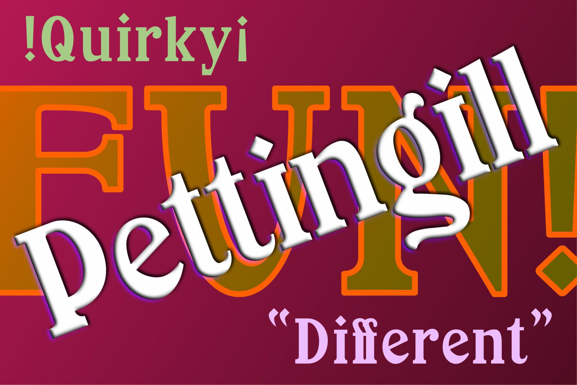
2. Pettingill Font by Chuck’s Fonts
Best For: Comedy show posters, quirky book covers, retro event flyers
A quirky serif with swelling strokes, unexpected curves and a slightly theatrical feel. The preview shows it big and small: an outlined FUN! in the background, the name set at an angle with a drop shadow, and a quoted Different underneath with its own odd ligature.
This is the font for a joke that should look a little old-fashioned, like a vaudeville bill or a circus poster. Set one or two words large and tilt them, as the preview does, or add a shadow. In long text the unusual shapes start to tire the eye, so keep it to titles.
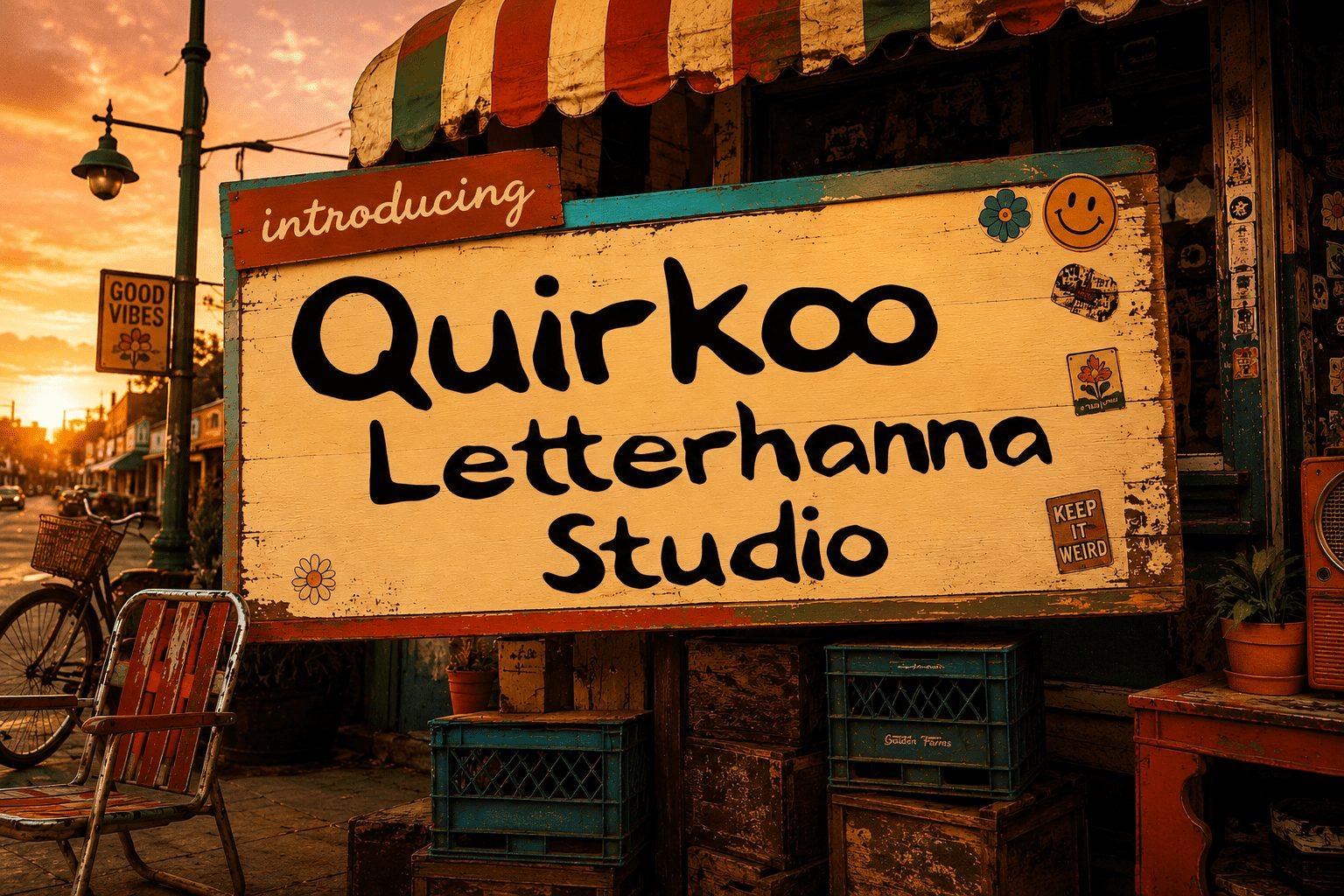
3. Quirkoo Font by letterhanna
Best For: Café chalk signs, market stall boards, handmade product tags
A hand-drawn marker font in mixed upper and lower case, with thick rounded strokes and a gently bouncing baseline. The preview puts it on a weathered shop sign, and it fits there: the letters look written quickly by someone with a sure hand.
Quirkoo works best where a real person would write by hand: a menu board, a price card, a craft fair sign. It stays readable in full sentences, so it can carry a short note as well as a title. Keep the background textured or warm so the marker feel makes sense.
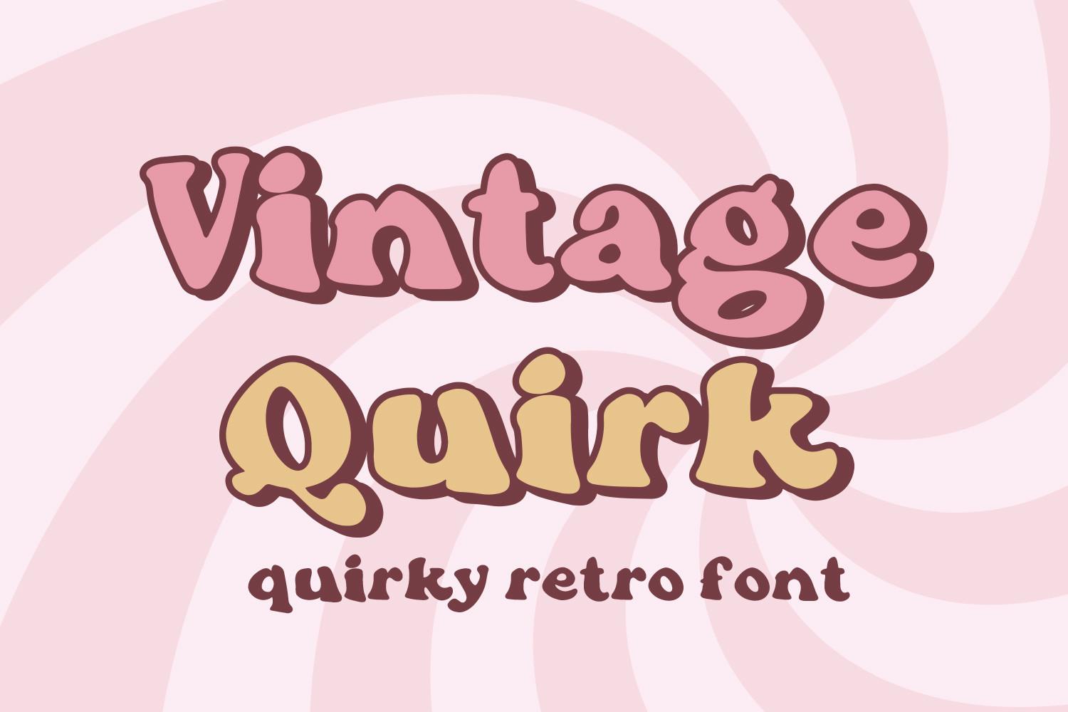
4. Vintage Quirk Font by freelingdesignhouse
Best For: Retro shirts, 70s party invitations, sticker designs
A soft, heavy retro serif with rounded serifs and bulging curves, shown with a dark outline and a dropped shadow. The lowercase is as chunky as the capitals, and the k and q have the playful swing that gives the font its name.
Vintage Quirk feels like a 70s sticker or a retro candy wrapper. Set it in two warm colors with an offset outline, as the preview does, and it does all the work on a shirt or a sticker sheet. Give it tight spacing: the round shapes look best when the letters almost touch.
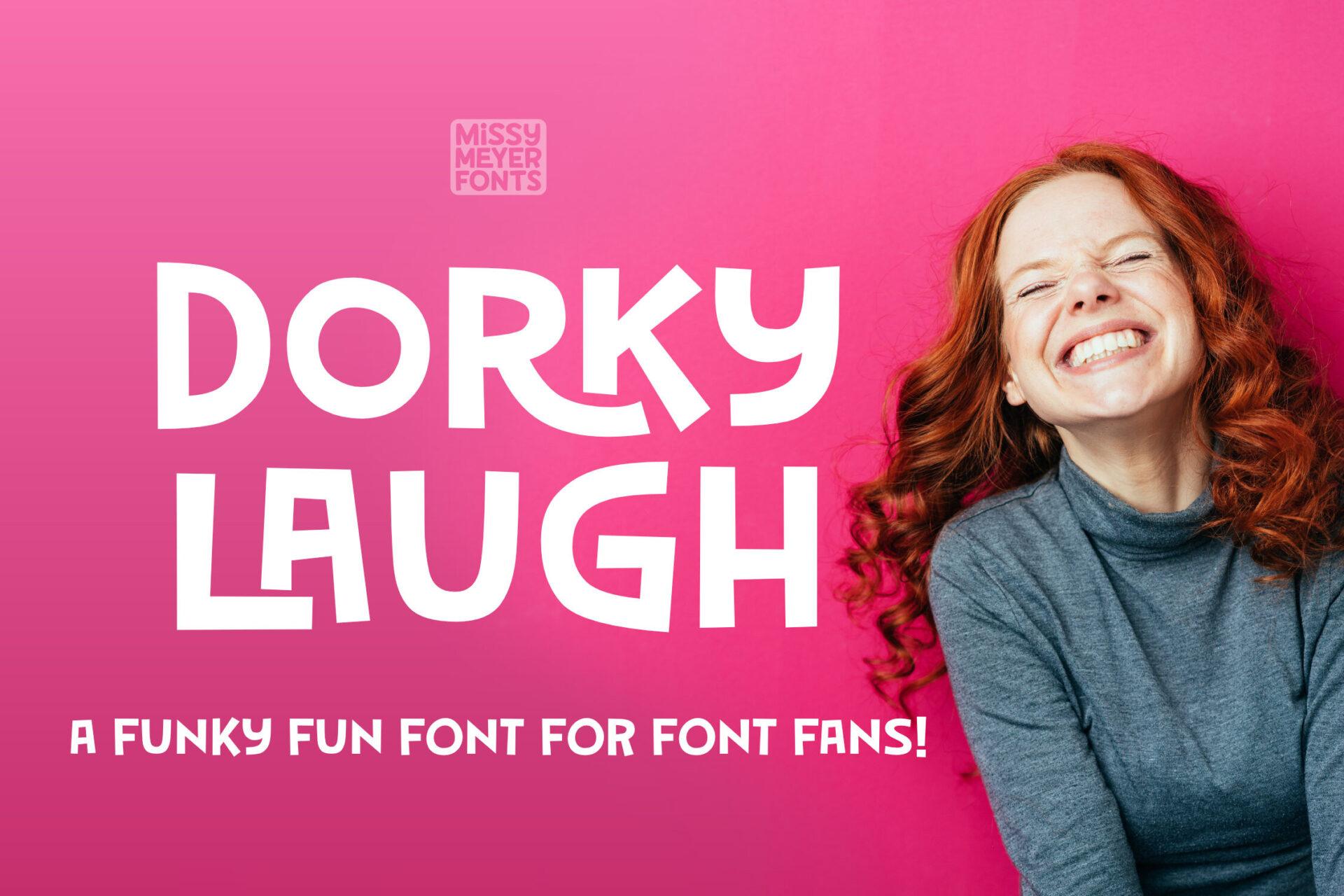
5. Dorky Laugh Font by GeekMissy
Best For: Comic headlines, podcast covers, funny quote shirts
An all-caps display with mixed stroke weights and slightly awkward shapes: the K has a curled arm, the G and the R take unusual turns, and some strokes are thick where you expect them to be thin. The result looks deliberately goofy but still clean.
Dorky Laugh suits humor that is more clever than cute. It reads well in a short headline over a photo, as in the preview, and on a podcast or video cover. Use it in one flat color on a bold background and keep the rest of the design simple, because the letters are already the joke.
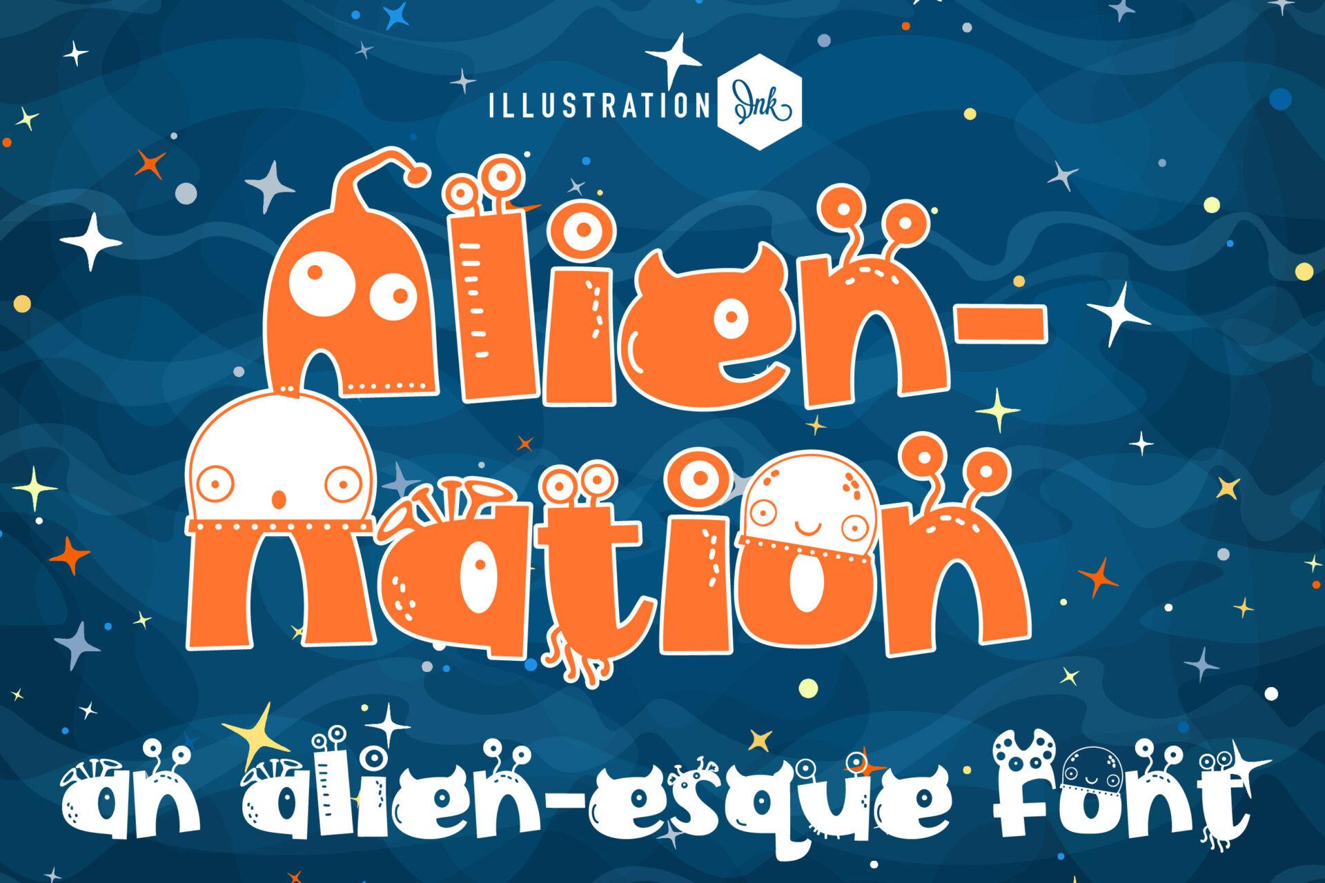
6. Alien-nation Font by Illustration Ink
Best For: Space-themed kids’ parties, sci-fi birthday shirts, Halloween crafts
Every letter here is a little creature: round bodies with eyes, antennae, stitched seams and small monster faces built into the strokes. The preview sets it in orange on a starry blue sky, with a lowercase line underneath in the same alien style.
Alien-nation is made for a theme, so give it one. A space birthday banner, a kid’s name on a party shirt or a sci-fi game night flyer will show off the details. The creatures need size to be seen, so use it for one or two short words and switch to a plain rounded font for dates and addresses.
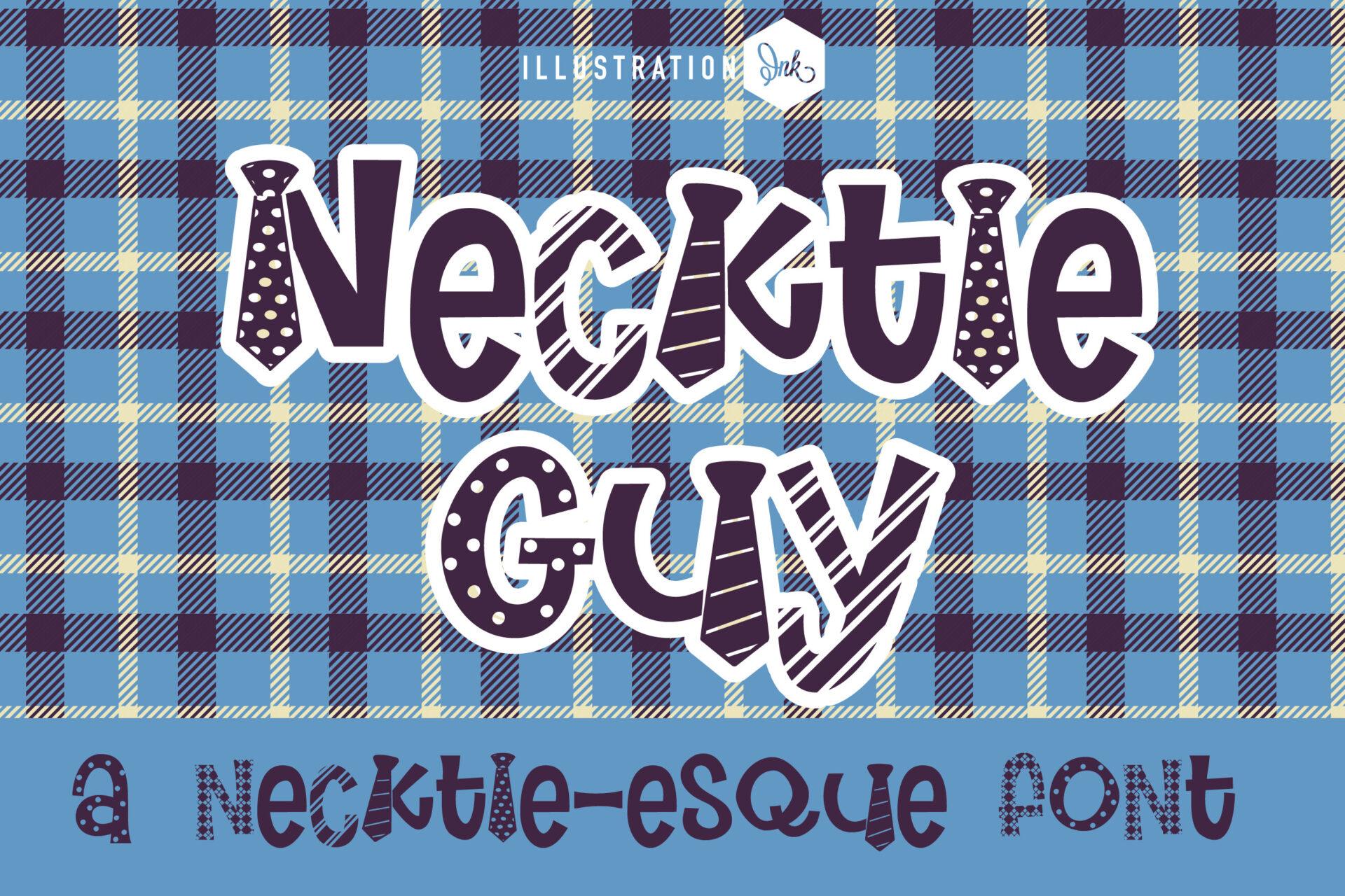
7. Necktie Guy Font by Illustration Ink
Best For: Father’s Day cards, office party signs, dad joke shirts
A pattern font where the letters are shaped like neckties: narrow tops, wide pointed ends, and fills with dots, stripes and diagonal lines. Capitals and lowercase mix freely, and every letter has a white outline that keeps it clear on the plaid background of the preview.
Necktie Guy has an obvious home: Father’s Day, a retirement party, a grandpa birthday or a shirt with a dad joke. It reads clearly in a title, but the patterns blur at small sizes, so set it large. On a Cricut, it works better as a print-and-cut design than as a single-color vinyl cut.
Fun Kids Fonts for Classrooms
Kids fonts need to be simple enough for a child to read and cheerful enough to make them want to. These seven are for classroom decor, worksheets, name labels, school event flyers and kids’ party designs.
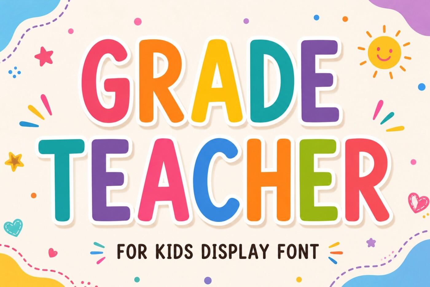
8. Grade Teacher Font by WNIdesign
Best For: Classroom posters, worksheet titles, bulletin boards
A rounded all-caps display font with clear, open shapes and a slightly hand-drawn edge. In the preview every letter is a different bright color with a soft shadow, which shows how well the plain shapes take a rainbow treatment.
Grade Teacher is easy for early readers: the letters are familiar, upright and well spaced. Use it for a bulletin board heading, a classroom rules poster or the title of a worksheet. Alternate colors letter by letter for decor, and keep one dark color for anything children need to read quickly.
9. ABCD Display Font by Sahira Studio
Best For: Alphabet charts, classroom labels, kids’ book covers
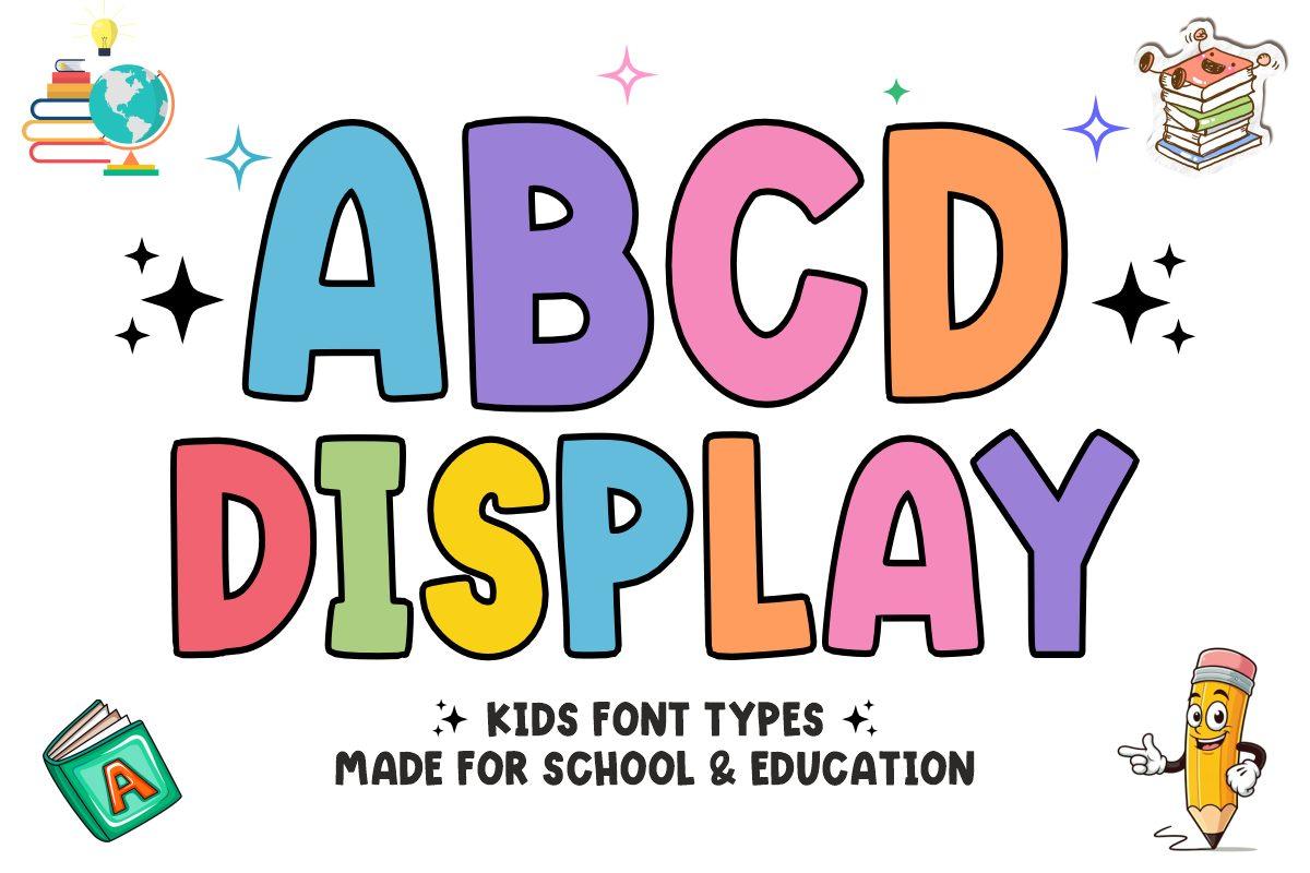
A puffy, rounded capital font with a dark outline around every letter and a light hand-drawn wobble. The preview fills each letter with a different pastel color, so the word looks like cut-out shapes on a classroom wall.
ABCD Display was made for school and education designs, and it shows. It is ideal for an alphabet chart, a reading corner sign or labels on storage boxes. Because of the outline, it stays readable even in pale colors on a white background, which is rare for pastel designs.
10. Alphabet Adventure Font by anamalmusyaffaCreative
Best For: Kindergarten projects, kids’ party invitations, game titles
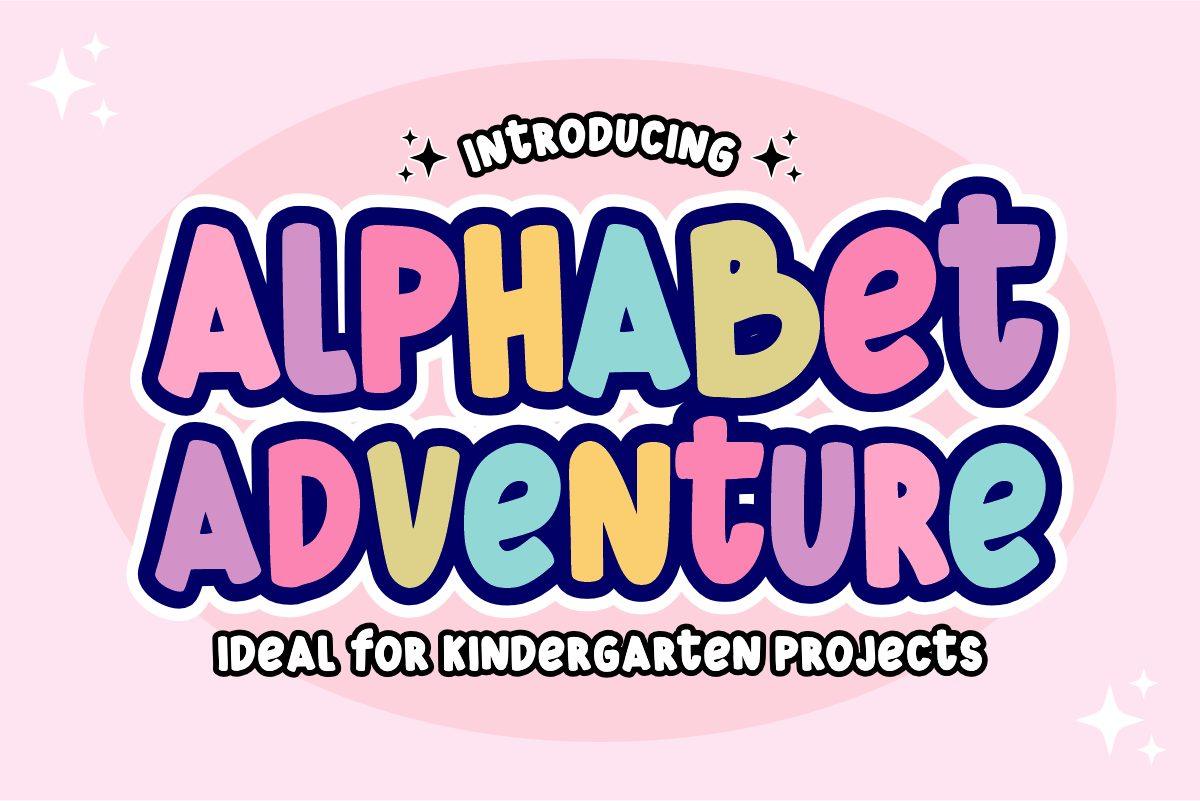
A bouncy, heavy display font that mixes capital and lowercase shapes in one word: the preview shows a lowercase b, e and t among the capitals, with letters sitting at slightly different heights. Thick outlines and a drop shadow make it look like a sticker.
This one has more energy than the other kids fonts here. Use it for a kids’ party title, a kindergarten project cover or a board game name, where a bit of chaos is welcome. Keep the text short, since the mixed letter shapes are harder for beginning readers in long lines.
11. Too Cool for School Trio Font by Denise Chandler
Best For: Teacher shirts, school event flyers, back-to-school signs
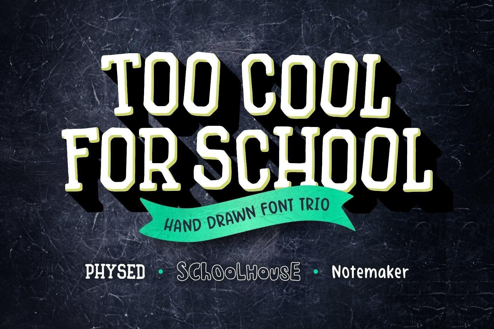
A trio of hand-drawn fonts, named on the preview as Physed, Schoolhouse and Notemaker. The headline is set in tall, slightly condensed slab capitals with a deep drop shadow on a chalkboard, and the other two styles add a decorative school font and a simple handwriting.
Having three matching styles makes this the most practical set in the group for a whole project. Use the slab capitals for a back-to-school banner or a teacher shirt, and the handwriting for dates and notes on the same flyer. It also looks right in white on dark green or black, like chalk.
12. Monkey Kids Font by agnyhasyastudio
Best For: Kids’ name labels, jungle party invitations, picture book titles
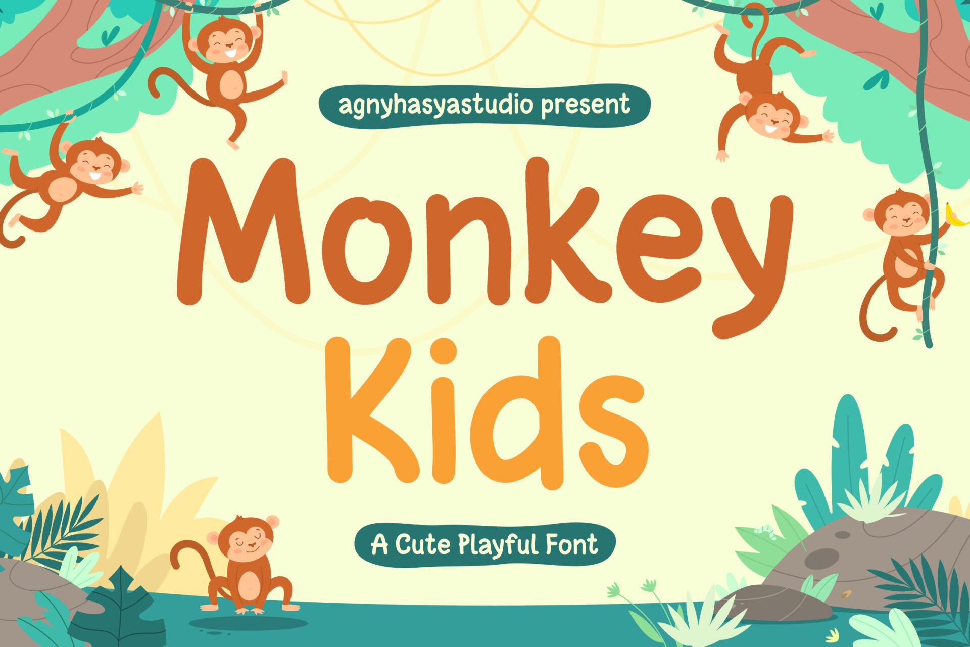
A rounded, monoline handwritten font in upper and lower case, with soft ends and gently irregular letters. It is light and clear rather than heavy, so the M, k and y keep their open, childlike shapes.
Monkey Kids is one of the most readable fonts in this list, which makes it useful for longer kids’ text: a name label, a party invitation, a short story title. It pairs naturally with a heavier display font from this group, for example Jungle Kids for the title and Monkey Kids for the details.
13. Jungle Kids Font by Mozatype
Best For: Safari birthday banners, camp signs, adventure-themed shirts
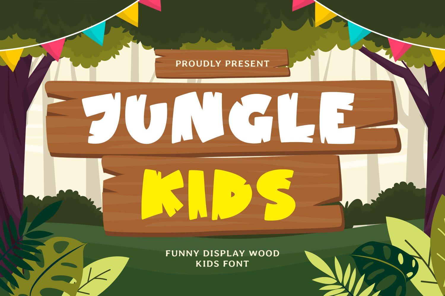
Chunky capitals with chipped, notched edges, as if each letter was carved out of wood. The preview places them on wooden plank signs in a jungle scene, and the rough cuts make the word feel handmade rather than printed.
Jungle Kids fits any outdoor or adventure theme: a safari party, a summer camp sign, a zoo trip shirt. It is heavy enough to cut in vinyl, and the notches give it character without hurting legibility. Set it in white or yellow over a brown wood texture to repeat the preview’s look.
14. Jurassic Playground Font by MVMET
Best For: Dinosaur birthday parties, kids’ adventure posters, boys’ shirts
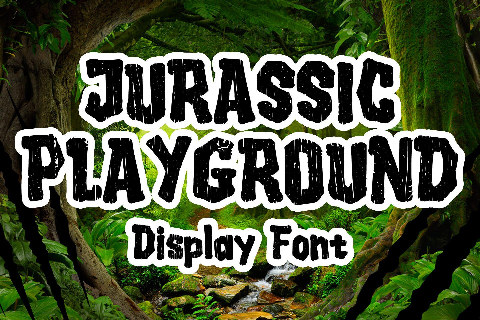
Tall, condensed capitals with a rough, distressed texture that eats into the edges of the letters. The preview adds a white sticker outline and sets a heavier mixed-case line, Display Font, underneath in the same rough style.
This is the obvious font for a dinosaur party, but it also works for any adventure poster that should look a little wild. The texture is part of the letters, so it looks printed on old paper even on a clean background. For shirts, test the texture at your print size: very small details can disappear.
Doodle and Craft Fonts
These fonts look made by hand with craft supplies: pencils, crayons, scissors, paper scraps and mosaic tiles. Several of them are color or texture fonts, so they are made to be printed rather than cut from one sheet of vinyl.
15. Pencil Doodle Font by Issie_Studio
Best For: Back-to-school designs, teacher gifts, classroom printables
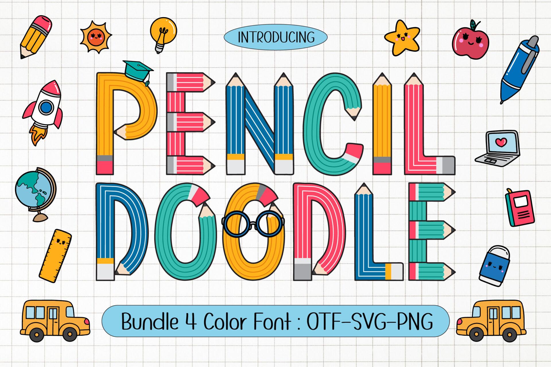
Each letter is built from pencils: striped bodies, sharpened tips, erasers and even round glasses in one O. The preview describes it as a color font in OTF, SVG and PNG formats, which explains the full colors inside every letter.
Pencil Doodle tells its theme at first glance, so it suits school designs better than anything else in this group. Use it for a back-to-school banner, a teacher appreciation card or the title of a printable. Color fonts only show their colors in apps that support them, so check your design app first, or use the PNG letters if your app does not.
16. Crayon Craft Font by putracetol
Best For: Kids’ art class posters, coloring page titles, playroom decor
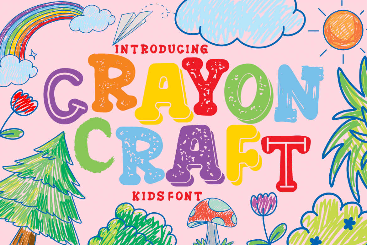
Bouncy capitals with a waxy crayon texture inside the strokes, so each letter looks colored in by a child. The letters lean and rise at different angles, and the preview sets them in bright crayon colors over a page of scribbled drawings.
Crayon Craft belongs on anything about drawing and making: an art class poster, a coloring book cover, playroom wall art. The texture shows best in strong colors on a light background. Pair it with a simple rounded font like Monkey Kids when you need a smaller line of text.
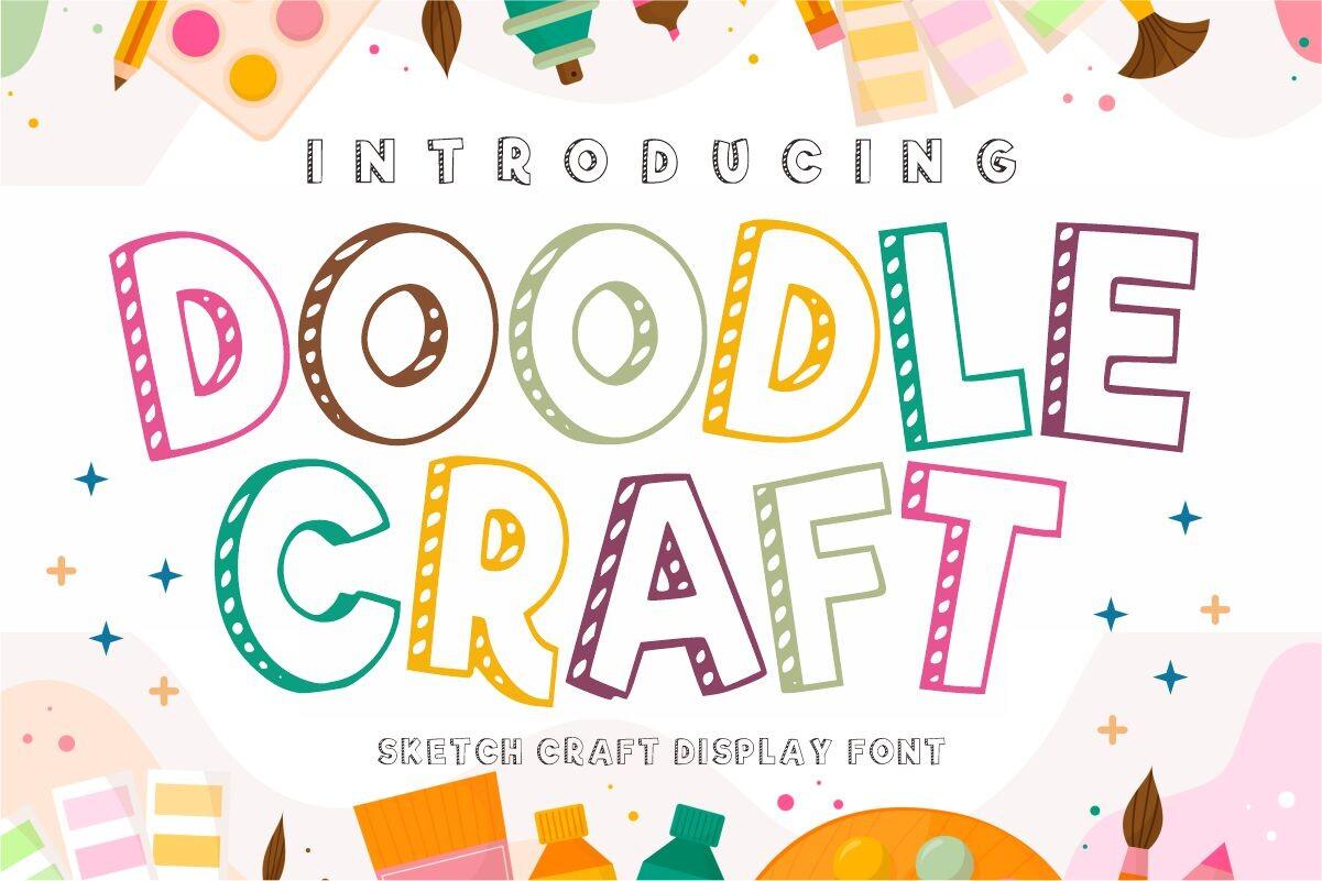
17. Doodle Craft Font by fana studio
Best For: Scrapbook titles, journal headers, craft workshop flyers
Outline capitals drawn with a sketchy line and filled with hatching, stripes and dashes. The preview calls it a sketch craft display font and shows it in several colors, with the inner lines looking like quick pen marks.
Doodle Craft gives a page the look of a hand-decorated notebook. It works well for scrapbook titles, bullet journal headers and flyers for a kids’ craft workshop. The thin outlines need some size and contrast, so set it large and avoid busy backgrounds.
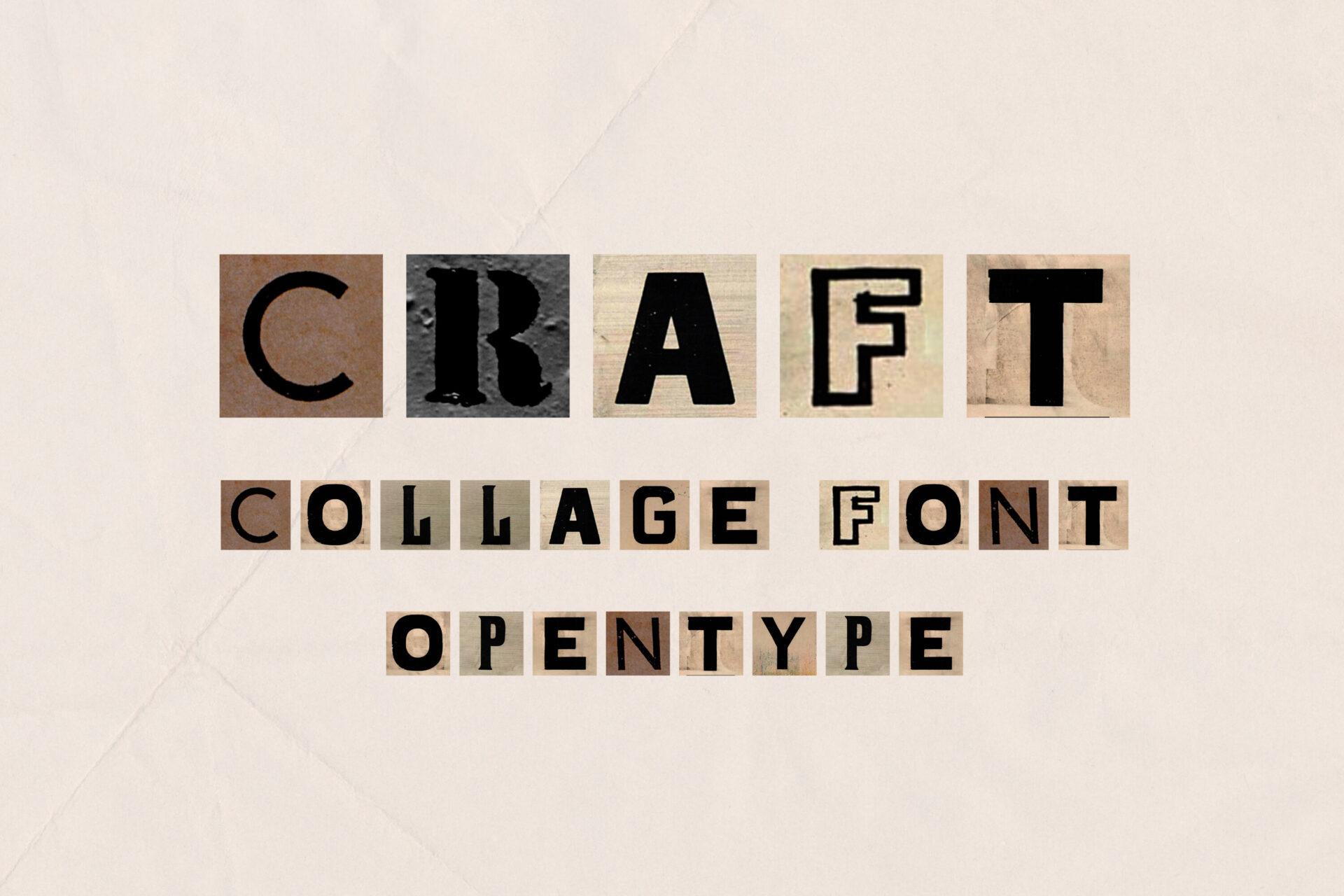
18. Craft Font by elvinova
Best For: Collage posters, zine covers, scrapbook pages
A collage font where every letter sits on its own scrap of paper, cut from different textures and shades, like a ransom note made from magazine clippings. The preview calls it a collage font with OpenType, and the letters change from one to the next.
Craft is for designs that should look cut and pasted: a zine cover, a music night poster, a mystery party invitation. Keep the text short and in capitals so the collage effect stays readable. Plain backgrounds work best, since the font already brings plenty of texture.
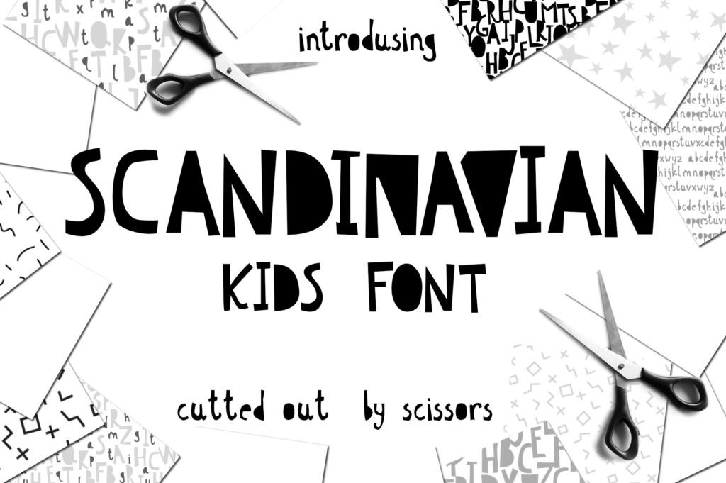
19. Scandinavian Font by Iradvilyuk
Best For: Nursery prints, kids’ room posters, minimalist kids’ brands
Narrow capitals with straight, angled edges, as if each letter was cut from black paper with scissors. The preview says exactly that, cut out by scissors, and shows how the uneven cuts give the word a simple, handmade rhythm.
Scandinavian is the quiet option in this group: black, simple, a little Nordic. It fits nursery wall prints, a kids’ room name poster or a small brand of children’s clothing that wants a handmade feel without bright colors. It also suits single-color printing, since there are no fills or textures to lose.
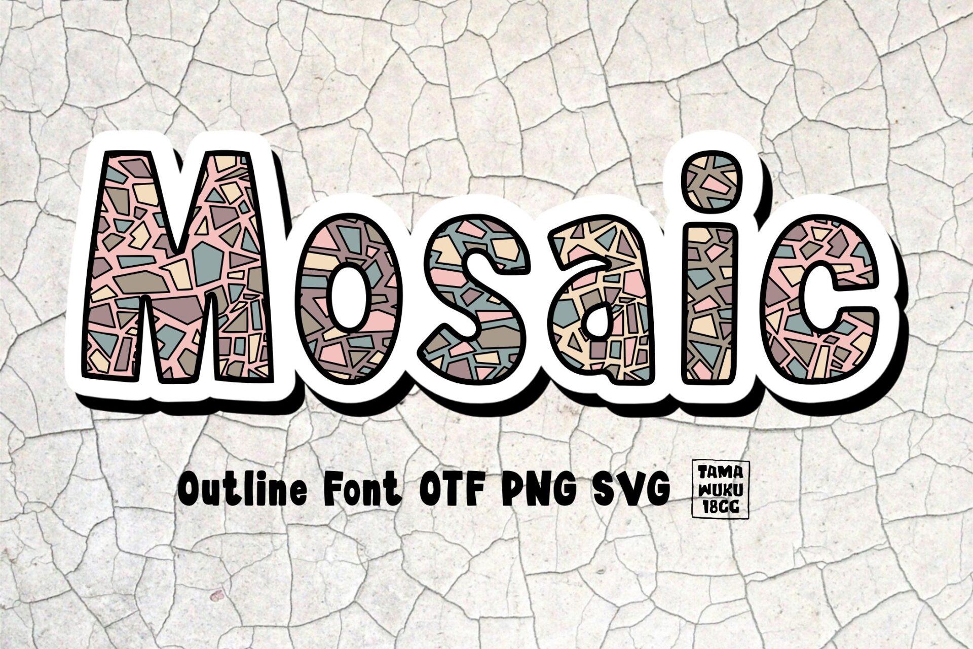
20. Mosaic Font by DREAMs Soul G.
Best For: Craft fair signs, art studio logos, decorative posters
Heavy letters filled with small irregular tiles in soft colors, with a white outline and a dark shadow around each letter. The preview lists it as an outline font in OTF, PNG and SVG, and the tile pattern makes every word look like a mosaic panel.
Mosaic fits anything about art and handmade work: a pottery studio sign, a craft fair banner, a mosaic workshop flyer. The tile details need size, so use it for one or two words. For the rest of the text choose a plain sans in one of the tile colors.
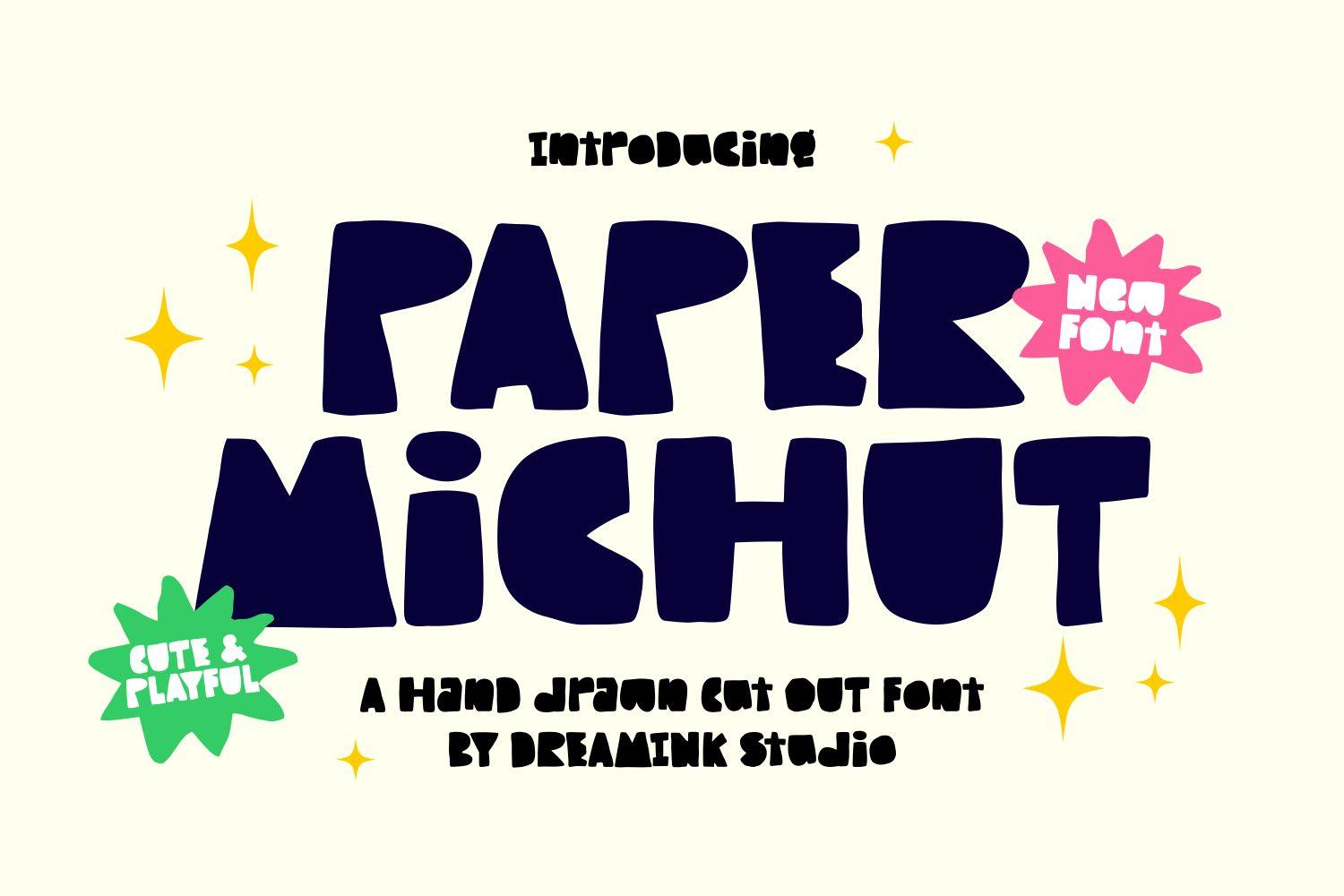
21. Paper Michut Font by Dreamink (7ntypes)
Best For: Sticker designs, kids’ shop logos, playful social posts
A heavy hand-drawn cut-out font with wobbly edges, wide strokes and tight counters. The preview calls it a hand-drawn cut out font and shows it in dark navy, with a smaller line in a lighter, mixed-case version of the same style.
Paper Michut is bold enough to work as a logo for a small kids’ brand or a sticker shop, and it cuts cleanly from vinyl because the shapes are solid. Give it a bright accent shape behind it, like the pink and green badges in the preview, to bring out the cut-paper look.
Funky Retro Fun Fonts
Funky fonts take their fun from the 60s and 70s: melting shapes, wavy stacks, thick round letters and swashy scripts. These six are for retro shirts, groovy party invitations, stickers and anything that should feel happy and a little nostalgic.
22. Wavynes Font by Damai (7NTypes)
Best For: Stacked shirt designs, retro posters, groovy party banners
A heavy retro serif made for wavy stacked text: the preview repeats the name four times in shades from brown to peach, and each line bends in a wave. The letters themselves are bold with soft serifs and round counters.
Wavynes is built for one popular layout: the same word repeated in a stack of fading colors. It is ready-made for retro shirts and posters, where that look is common. Use three to five lines in a warm gradient and keep the word short, so the wave stays visible.

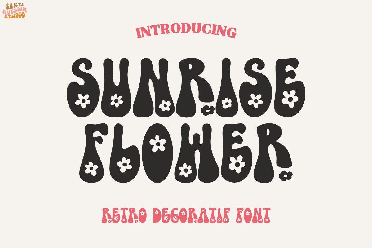
23. Sunrise Flower Font by Sakti Avellin
Best For: Groovy birthday invitations, flower shop signs, hippie shirts
A melting groovy display font with drippy, bulging letters and small daisies inside the counters. The preview sets it in dark gray on cream, which shows how the white flowers pop out of the heavy shapes.
Sunrise Flower is the most decorative retro font here. It suits a groovy birthday, a flower market sign or a 70s style shirt. The daisies are part of the letters, so you only need one color to get the full effect, which makes it easy to print. Keep it to a short title, two words at most.
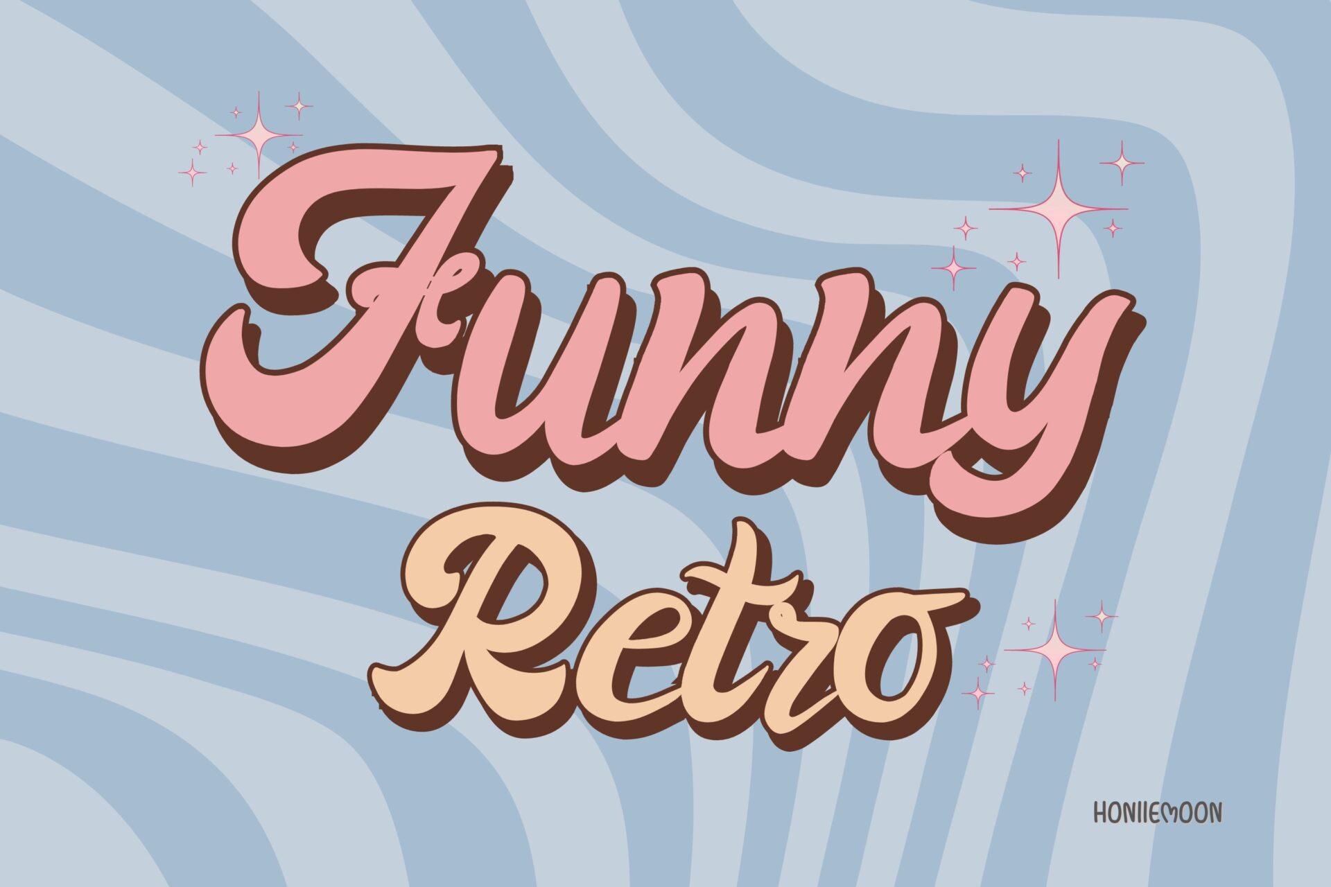
24. Funny Retro Font by Honiiemoon
Best For: Retro shirt slogans, bakery logos, 70s party invitations
A bold retro script with thick, rounded strokes, connected letters and a big swinging capital. In the preview it has a dark outline and a shadow, and the second line shows that it looks just as good in a lighter cream color.
Funny Retro is the script of this group: friendly, bold and easy to read. It fits a shirt slogan, a bakery or ice cream shop name and a 70s party invitation. Add an outline or offset shadow in a second color, as in the preview, and it will hold its own even on a busy background.
25. Thick Baby Font by Ade (7NTypes)
Best For: Bubble shirt designs, cute stickers, baby shower signs
A very heavy, rounded all-caps font with soft corners and tiny counters. The letters are almost round blocks, and the preview sets them in gray with a thin light outline on pink, with smiling daisies in the corners.
Thick Baby is the boldest font in the list and the easiest to cut in vinyl. Use it for one big word on a shirt, a sticker, a baby shower sign or a playful logo. Because the counters are so small, give it a bit of extra letter spacing at small sizes.

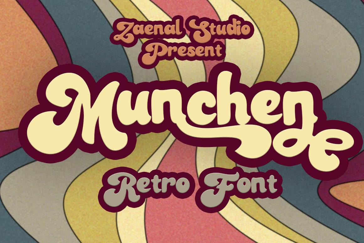
26. Munchen Font by Zaenal Studio
Best For: Retro logos, coffee shop signs, vintage shirt designs
A heavy retro script with round, tightly connected letters and a long swash tail on the last letter. The preview gives it a thick dark outline over a background of wavy 70s stripes, and a second line in the same style in a smaller size.
Munchen is made for a name: a café, a brand of sauces, a retro shirt slogan. The swash on the last letter works best when the word ends in a letter like n or e, so test your own word. Add a thick outline in a darker color and you get the classic 70s sign look.
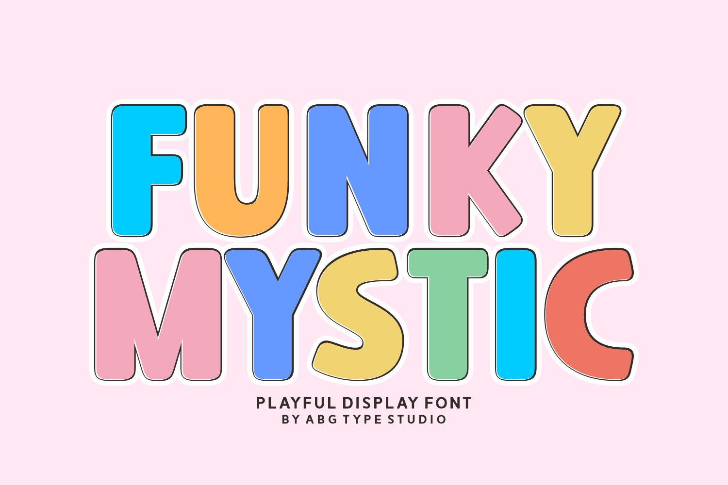
27. Funky Mystic Font by abg
Best For: Kids’ party banners, colorful shop signs, playful brand headings
A rounded, chunky all-caps sans with soft corners and simple shapes. The preview colors each letter differently in bright and pastel shades with a thin outline, and the straight, friendly letters keep the word clear.
Funky Mystic is the most flexible font in this group: it can look retro in warm colors or cheerful and modern in candy colors. Use it for a party banner, a colorful shop sign or headings on a playful website. It is also a good partner for the busier fonts in this list.
How to Choose a Fun Font
Start with the audience. A font that makes adults laugh is not always the one children can read. For classroom signs, worksheets and anything early readers need to understand, stay with clear kids fonts like Grade Teacher, ABCD Display or Monkey Kids. For shirts, posters and party designs for adults, the quirky and retro fonts have more personality.
Let the theme choose the details. Many fun fonts are built around one idea: aliens, neckties, pencils, dinosaurs, daisies. When your project has the same theme, the font tells the story on its own. When it does not, a theme font will look random, and a flexible font like Funky Mystic, Funny Cactus or Thick Baby is the safer choice.
Check how you will produce it. Solid heavy fonts like Thick Baby, Paper Michut and Jungle Kids cut cleanly from vinyl. Pattern, texture and color fonts like Necktie Guy, Mosaic, Craft and Pencil Doodle lose their details in a single-color cut, so they are better printed, or used with print and cut.
Use one fun font per design. Two loud fonts compete with each other. Choose one for the title and add a calm partner for dates, names and longer text: a simple rounded font or a clear handwriting works with almost every font in this list.
FAQ
What are fun fonts?
Fun fonts are display fonts made to feel playful rather than neutral. They can be quirky shapes, kids fonts, doodle and texture fonts, or retro styles with waves, swashes and melting letters. They are meant for short text like titles, names and slogans, not for long paragraphs.
Which fun fonts are best for kids?
For children who are learning to read, choose simple upright letters: Grade Teacher, ABCD Display and Monkey Kids are the clearest in this list. For party designs and decor, where reading matters less, themed fonts like Jungle Kids, Jurassic Playground and Alien-nation add more excitement.
Can I use fun fonts with a Cricut?
Solid fonts are the easiest to cut: Thick Baby, Paper Michut, Funny Cactus and Jungle Kids have thick strokes and simple outlines. Fonts with patterns, textures or several colors, like Necktie Guy, Mosaic or Pencil Doodle, keep their look only when printed, so use print and cut for them.
What is the difference between fun fonts and funky fonts?
Fun is the wider idea: any font that feels playful, from a kids font to a goofy display. Funky usually means a retro 60s or 70s style with groovy curves, wavy shapes and thick rounded letters, like Wavynes, Sunrise Flower and Munchen.
Where to Start
If you need one font that works for almost any playful project, start with Funky Mystic or Thick Baby: both are simple, bold and easy to color. For classroom work, Grade Teacher and the Too Cool for School Trio cover titles and notes. For a themed party, pick the font that matches the theme, from Alien-nation to Jurassic Playground, and keep everything else plain.
For retro shirts and stickers, Wavynes and Funny Retro give the most effect with the least work. And if you want a design that looks handmade, try Craft, Scandinavian or Crayon Craft and let the texture of the letters carry the whole layout.