Bold Fonts: 28 Chunky, Condensed Sans, Script and Groovy Styles for Logo Makers, Shirt Designers and Small Brands
Bold fonts do the loudest job in design: they carry the brand name, the headline and the one word on a shirt that people read from across the street. But bold does not have to mean one heavy block of letters. It can be puffy and cute, narrow and sporty, scripted and juicy, or bent into a groovy 70s shape.
This post contains affiliate links. If you buy through them, I may earn a small commission at no extra cost to you.
This list gathers 28 bold fonts in four groups: chunky bold fonts, bold sans serif fonts for logos, bold script fonts, and funky and groovy bold fonts. Each font is shown in its real preview, with a note on where it works and where it needs care. All fonts in this list are on Creative Fabrica, and a single All Access subscription unlocks every one of them, so you can try several styles before committing to one.
More logo font collections:
20 Logo Fonts
25 Bold Serif Fonts
26 Modern Sans Serif Fonts
19 Font Pairings for Logos
Table of Contents
- Chunky Bold Fonts
- Bold Sans Serif Fonts for Logos
- Bold Script Fonts
- Funky and Groovy Bold Fonts
- How to Choose a Bold Font
- FAQ
- Where to Start
Chunky Bold Fonts
Chunky fonts are the heaviest and friendliest bold fonts: thick strokes, small counters and soft or rounded corners. These seven are for snack labels, kids’ merch, thumbnails and any design where one short word should be seen first.
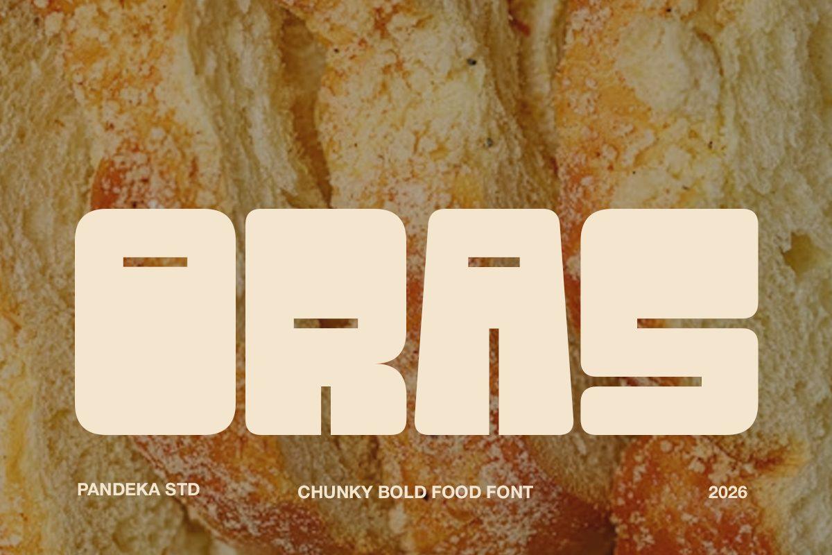
1. Oras Font by pandekastudio
Best For: Bakery logos, food packaging, menu headers
A heavy, blocky all-caps display where the letters are almost solid slabs: the counters of the O, R and A shrink to narrow horizontal slots, and the corners are only slightly softened. Set as a word, it reads like a stamped label or a loaf-shaped sign rather than ordinary type.
Oras needs room and a short word. A one-word brand name, a product type like BREAD or SNACK, or a menu section header will hold its shape; a full sentence turns into a dark wall. Give it generous letter spacing at small sizes so the slot counters stay open, and pair it with a plain sans for the details.
2. Choco Chips Font by Creativewhitee
Best For: Bake sale signs, kids’ shirts, snack labels
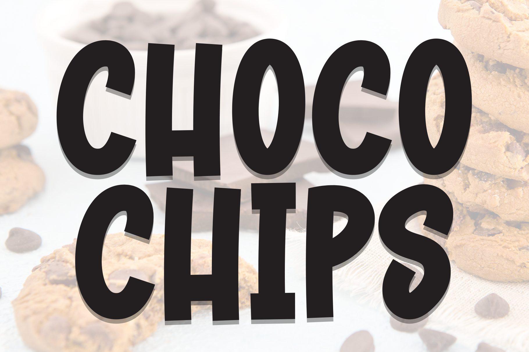
Tall, heavy capitals drawn by hand: the strokes wobble a little, the letters lean in slightly different directions and the baseline is not perfectly straight. In the preview each letter sits on a soft offset shadow, which shows how the shapes look with a second color layer behind them.
Because the letters are tall and fairly narrow for a chunky font, Choco Chips fits longer words than most styles in this section, so names like CHOCOLATE or COOKIES still fit a sticker or a jar label. It works well in a single dark color on kraft paper or a bright shirt.
3. Chubby Gum Font by agnyhasyastudio
Best For: Stickers, kids’ merch, playful social graphics
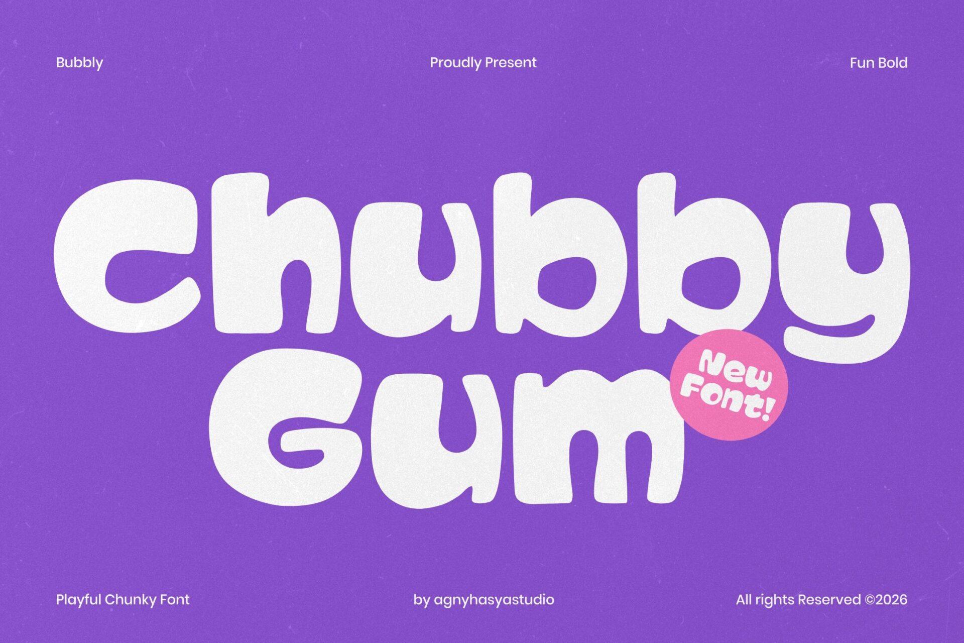
A puffy, rounded lowercase with swollen strokes and tiny counters, like letters squeezed out of a tube. The C curls in on itself, the b and y have short round tails, and every end is completely soft, with no sharp corner anywhere in the word.
This is the friendliest font in the chunky group, so keep it for cheerful projects: sticker sheets, a toy shop banner, a birthday post. On Cricut vinyl the solid shapes cut cleanly, but the small counters can fill in at tiny sizes, so set it at least a few inches tall.
4. Bold Raxon Font by DREAM
Best For: YouTube thumbnails, kids’ party graphics, toy packaging
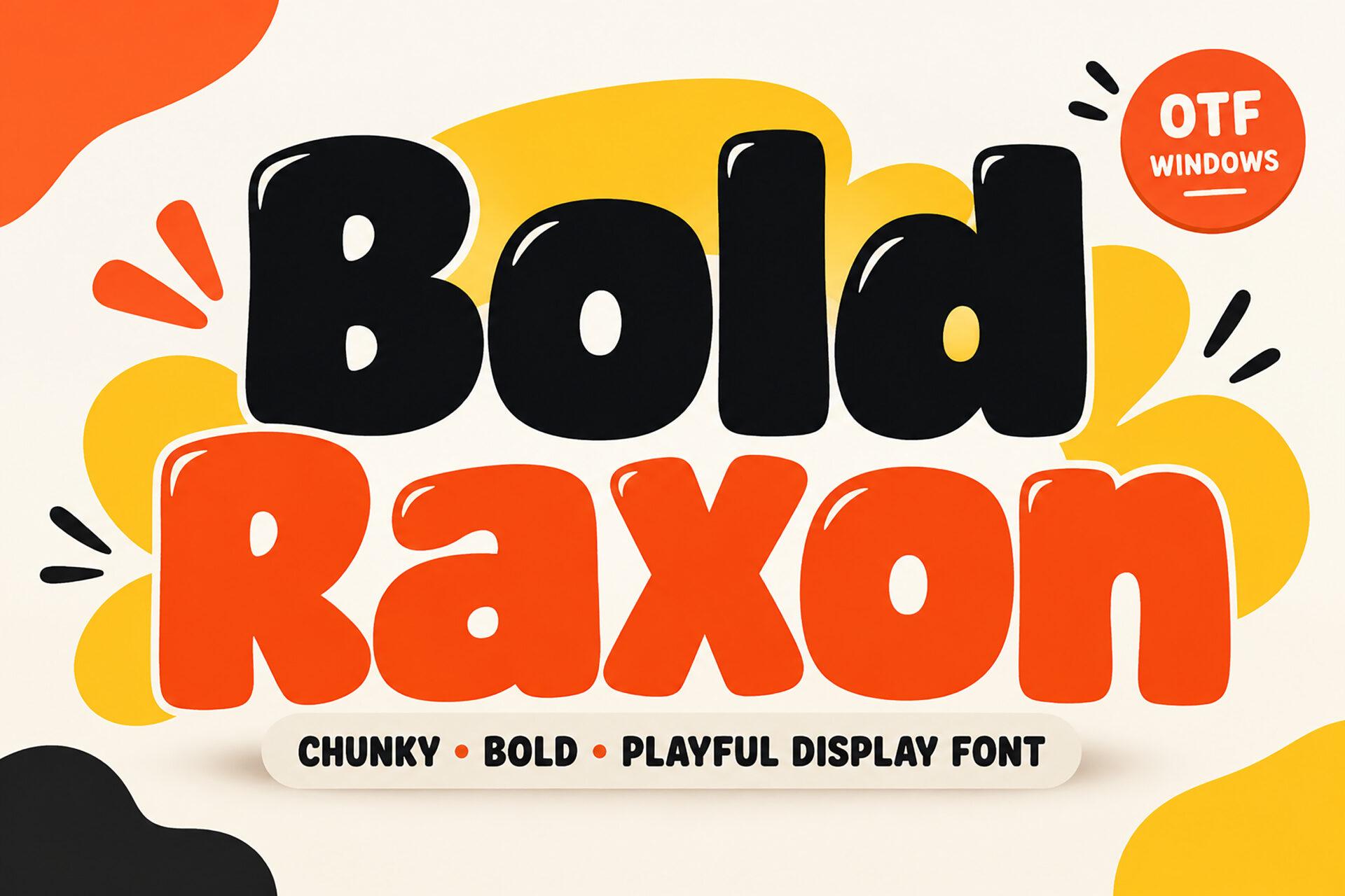
A rounded, heavy mixed-case display with a slight bounce: the letters sit at small, uneven angles, and the lowercase a, x and o are wide and round. The glossy highlights in the preview are an added effect, but the bare letterforms alone are already loud and cartoon-like.
Bold Raxon is built to be read at a glance, which makes it a natural choice for thumbnails and party graphics where the text competes with photos. Use two strong colors, as the preview does with black and orange, and add a thick outline or shadow if the background is busy.
5. Omletta Font by invasistudio
Best For: Diner and food truck logos, retro shirts
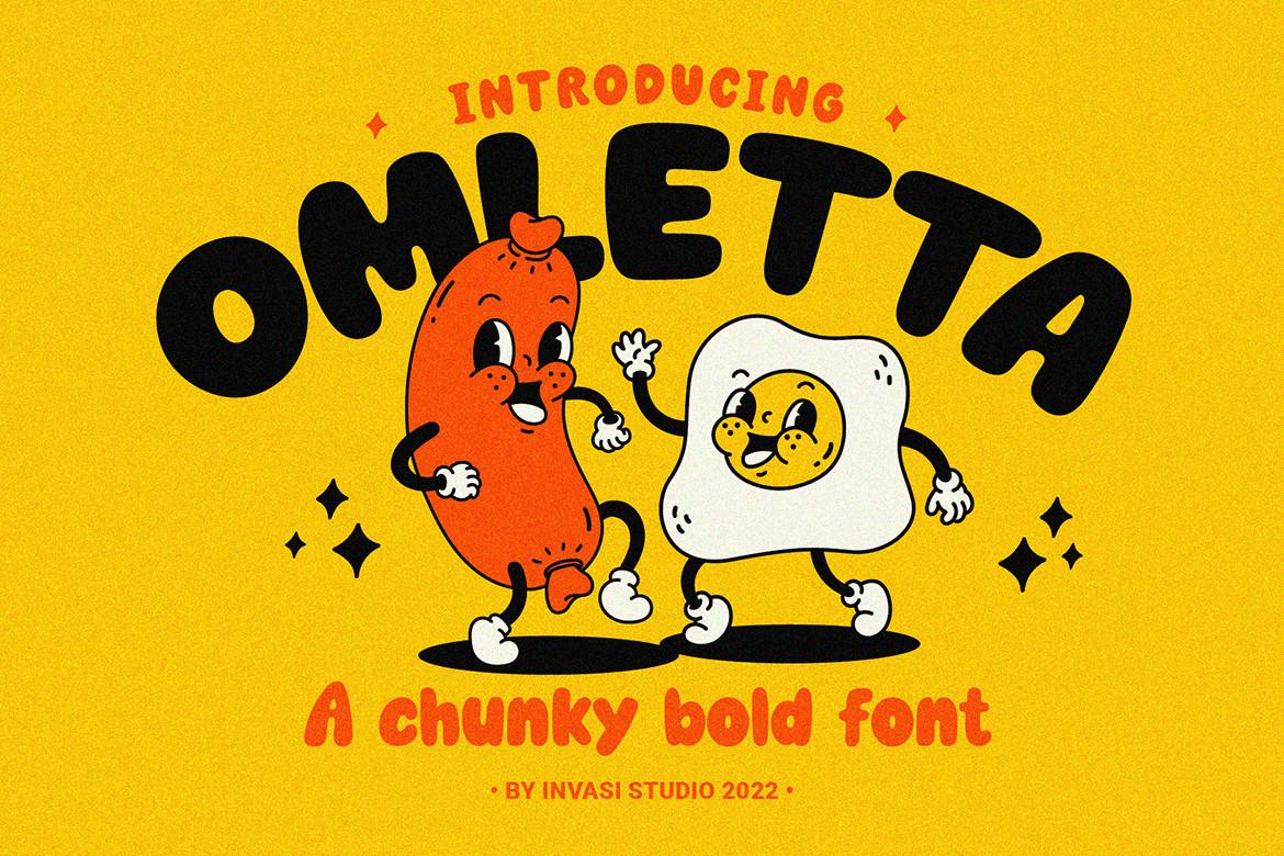
Soft, heavy capitals with slightly flared ends and a retro cartoon feel. In the preview the word is set on an arch above two vintage-style mascots, a sausage and a fried egg, which is exactly the kind of layout this font is made for.
Omletta looks at home on anything with a 1930s-to-1950s cartoon mood: a food truck logo, a breakfast menu, a shirt with a mascot. Curved or arched settings suit it well, and it stays readable when the letters are bent into a badge shape.
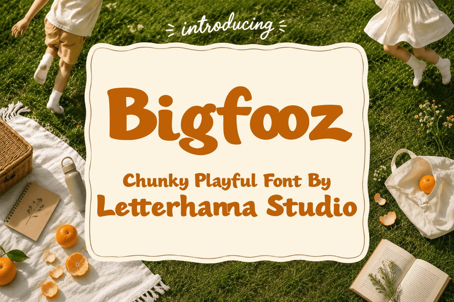
6. Bigfooz Font by letterhanna
Best For: Café menus, picnic labels, children’s book titles
A chunky mixed-case font with soft, slightly uneven edges, as if each letter was cut from thick paper. The lowercase is short and round, the B and g have generous bowls, and the overall color on the page is warm and calm rather than shouting.
Bigfooz is a good pick when you want weight without aggression. It suits a handwritten-looking café board, homemade jam labels or the cover of a picture book, and it pairs comfortably with a simple serif or a light script for a second line.
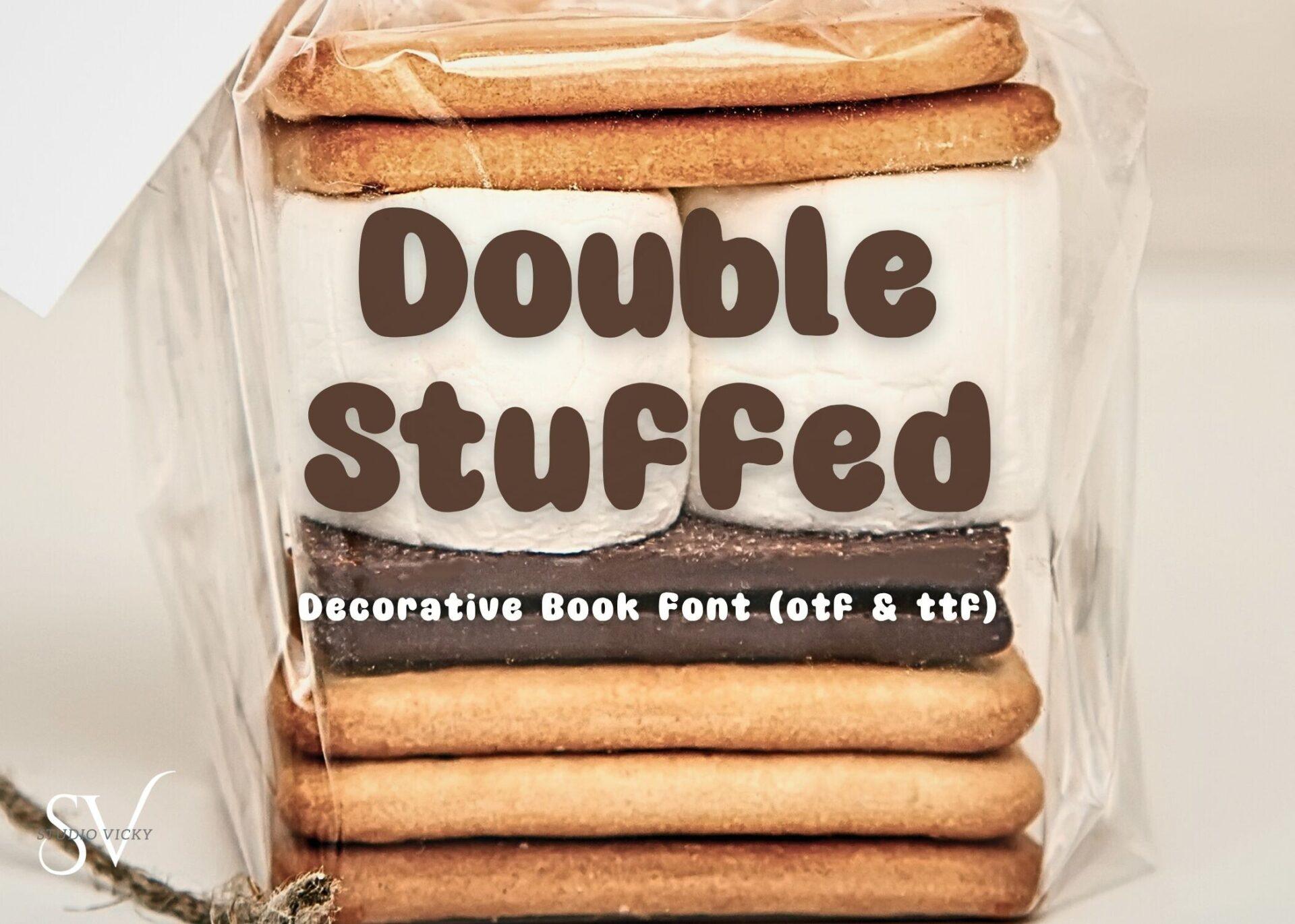
7. Double Stuffed Font by Victoria Gates
Best For: Cookie labels, bakery stickers, recipe cards
Rounded, plump mixed-case letters with soft corners and a slightly bouncy baseline. In the preview the brown title sits on a stack of cookies, and the shapes really do echo something baked: thick, even and a little lumpy in a pleasant way.
Use Double Stuffed for the name of a treat and keep the ingredient list or price in a quiet sans. It reads well in brown, cream and pastel tones, and the even stroke weight makes it straightforward to cut in vinyl or print as a sticker.
Bold Sans Serif Fonts for Logos
A bold sans serif is the workhorse of logo design: clean, readable and strong at every size. This group covers condensed, wide, geometric and vintage sans styles, each with its own detail that keeps a wordmark from looking generic.
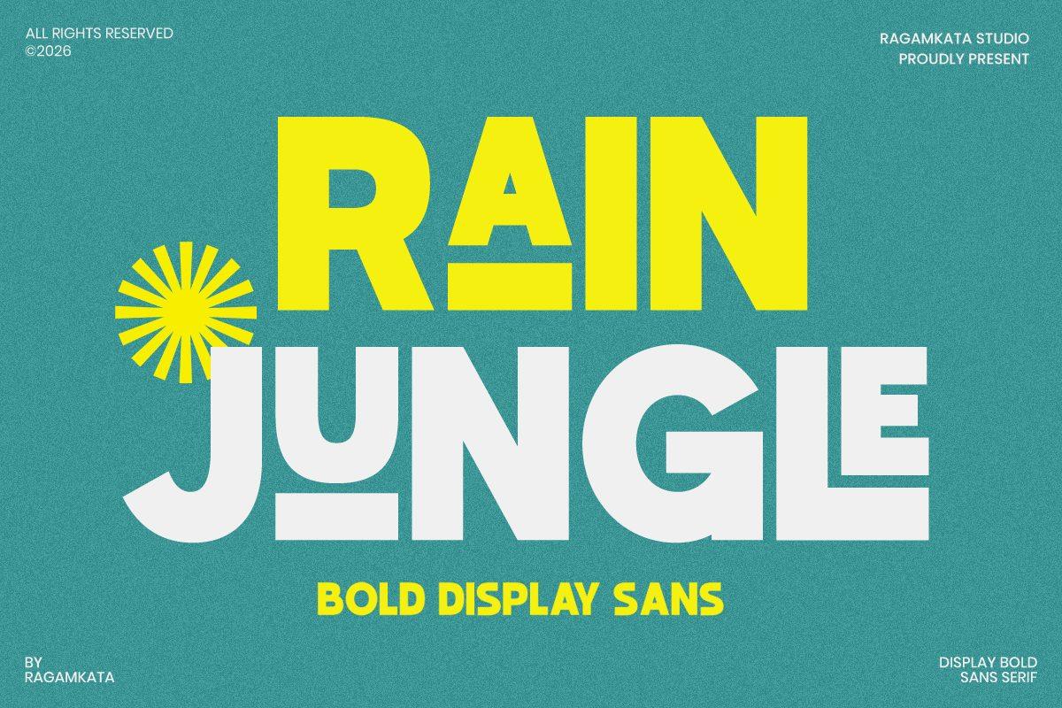
8. Rain Jungle Font by RagamKata Studio
Best For: Festival posters, travel and surf branding, bold headlines
A geometric bold display sans with playful cuts and floating parts: the crossbar of the A drifts below the letter, the J and U are built from separate strokes, and the round letters are wide and even. In the preview it is called a bold display sans.
Rain Jungle is strongest as a large headline in one or two words, where the broken details are visible. For a logo, try the name in capitals with a simple sun or wave mark, as the preview does. Avoid long texts, where the unusual shapes slow reading down.
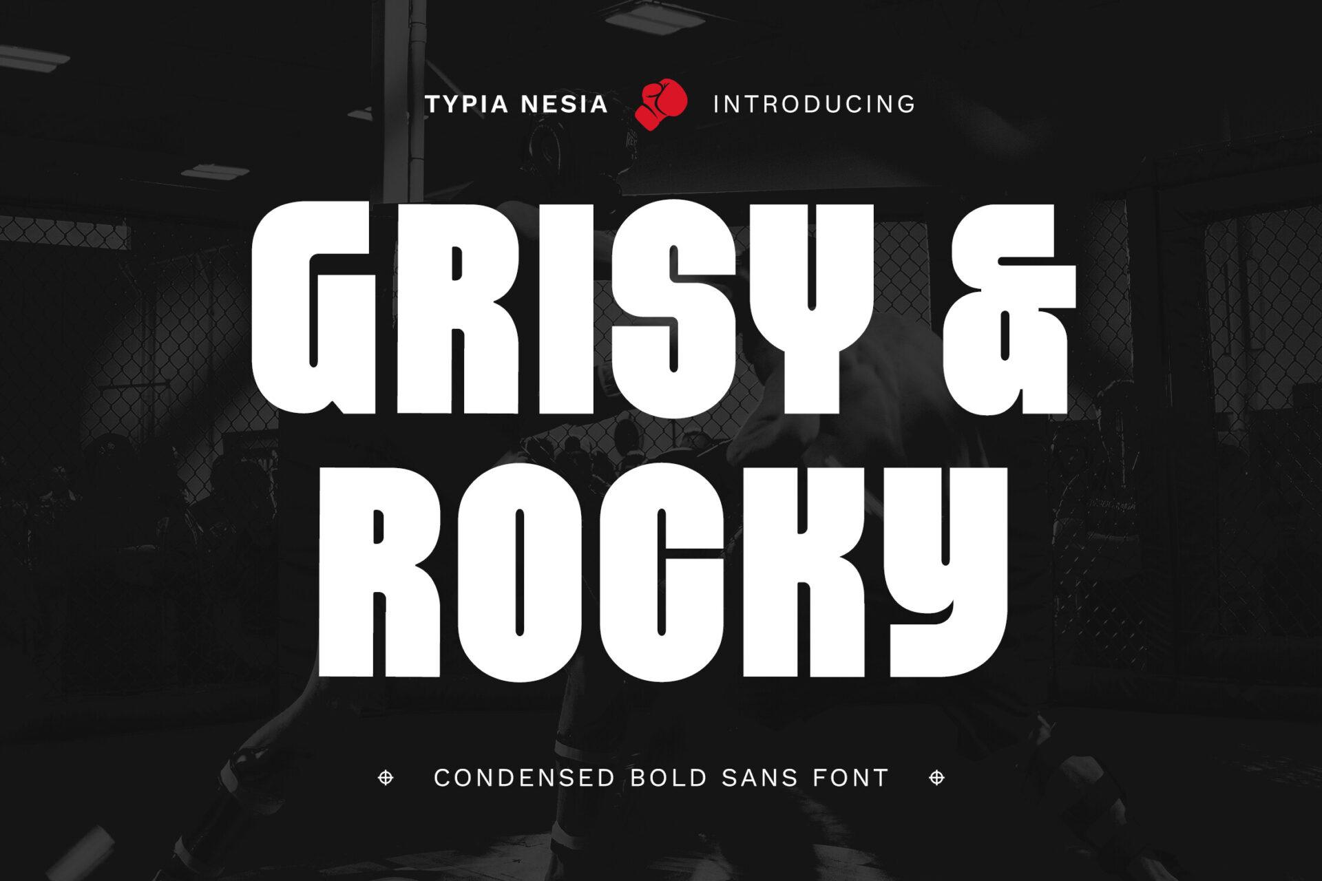
9. Grisy & Rocky Font by Typia Nesia
Best For: Gym and sports logos, event posters, headlines
A condensed bold sans in tall, narrow capitals with slightly rounded corners and tight counters. The preview calls it a condensed bold sans font, and the letters stack neatly into two lines with very little space between them.
Condensed bold fonts let you set long words large in a narrow space, so Grisy & Rocky works for poster headlines, team names and fitness brands. Keep the tracking tight for impact, or open it a little for small text on merch tags.
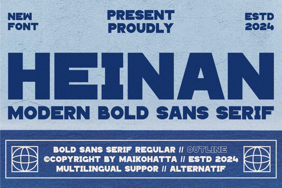
10. Heinan Font by maikofarazhatta
Best For: Streetwear wordmarks, event posters, brand headlines
A wide, heavy modern sans in capitals, with flat sides and squared-off curves. The preview lists a regular and an outline style, which lets you combine a solid word with an outlined one in the same design.
Heinan is a natural fit for clothing brands and event graphics where a wide, confident wordmark is the focus. The outline style is useful for a second line or a layered shadow effect, and both look strong in a single flat color on a shirt or hoodie.
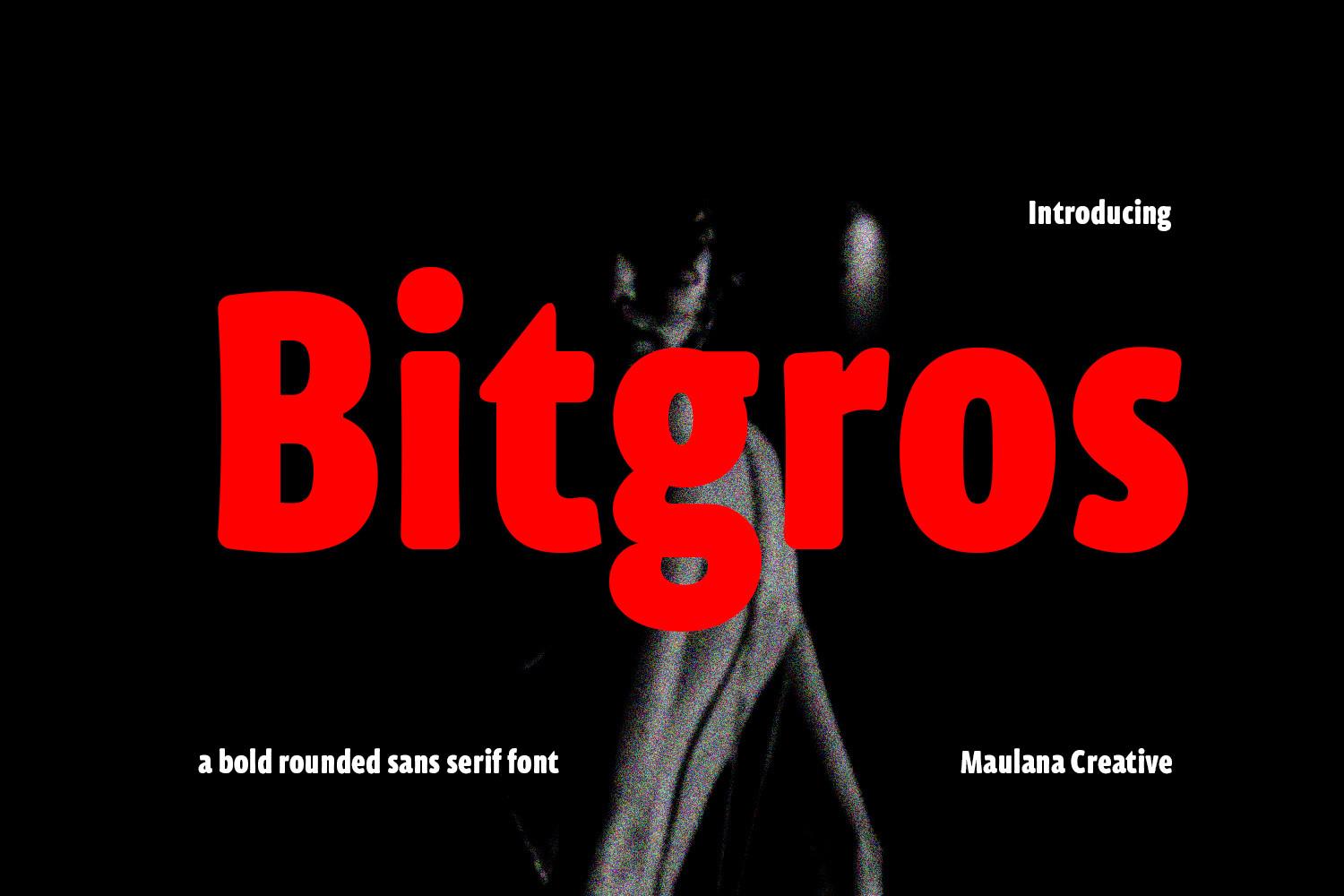
11. Bitgros Font by Maulana Creative
Best For: Magazine headlines, packaging, music posters
A bold rounded sans serif, as the preview describes it, with slightly condensed letters and soft ends. The lowercase is compact and dense, so a word set in Bitgros forms a solid, even block of color.
Bitgros sits between a logo font and a headline font: it is clean enough for a brand name and heavy enough for a poster. It looks especially good in strong red or black on light or photographic backgrounds, as in the preview.
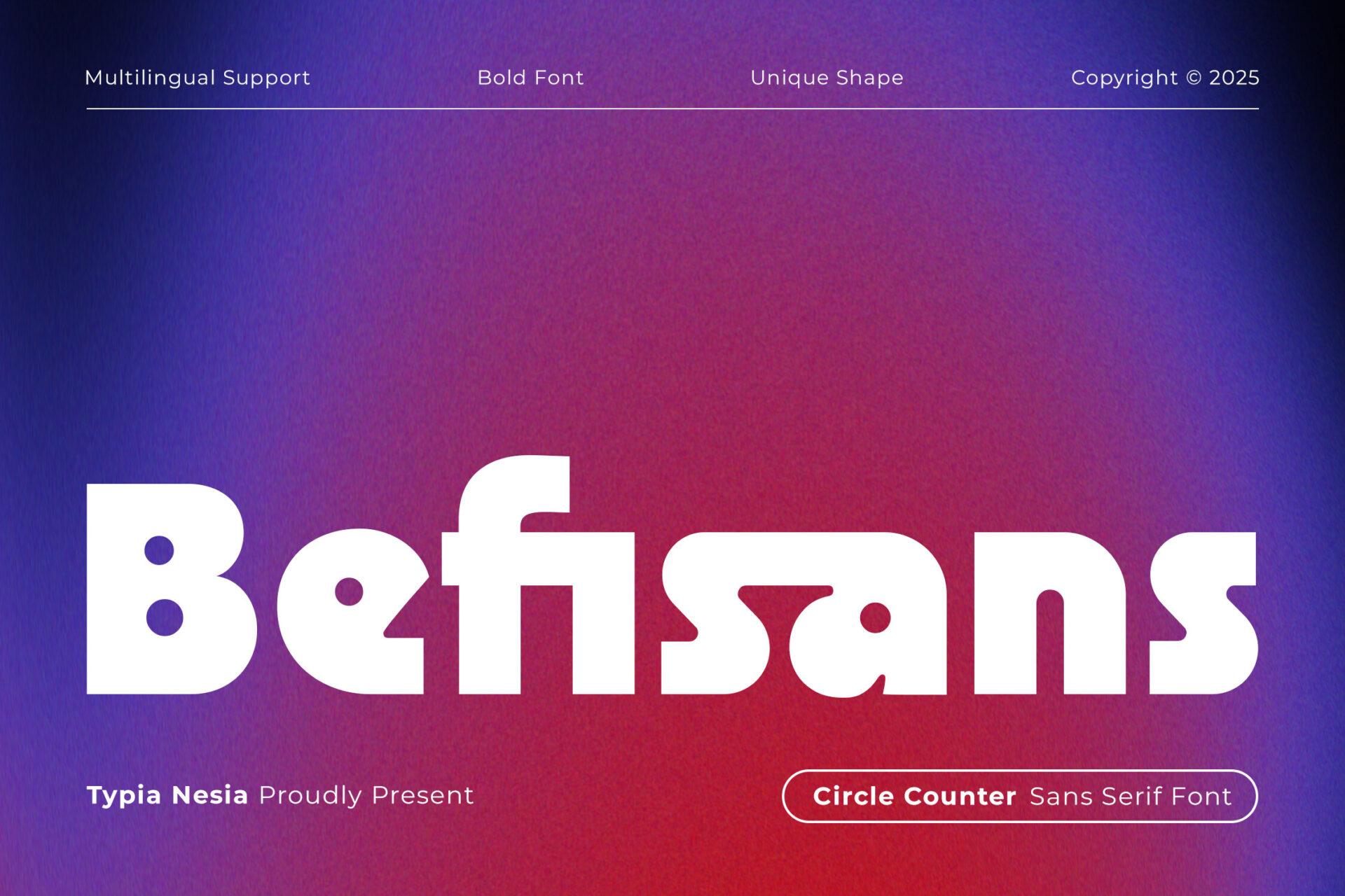
12. Befisans Font by Typia Nesia
Best For: App and tech logos, modern brand names, product labels
A heavy geometric sans where the counters are perfect circles: the B, e and a have small round holes punched into thick, flat strokes. The preview calls it a circle counter sans serif font, and the effect is clean, modern and very recognizable.
Befisans works best in lowercase or mixed case, where the round counters repeat across the word and become part of the brand look. Use it for a short name and leave plenty of white space around it so the circles stay visible.
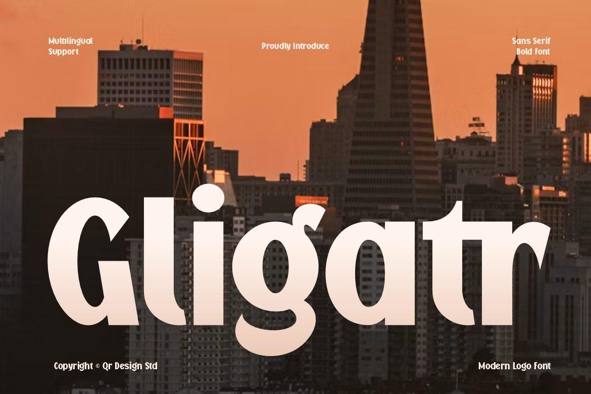
13. Gligatr Font by qrdesignstd
Best For: Shop signs, beauty and lifestyle brands, editorial covers
A bold display font with subtle flared strokes: the stems widen slightly toward their ends and the curves of the g and a have a soft, calligraphic swell. The preview labels it a modern logo font, and it feels warmer than a geometric sans while still clean.
Gligatr gives a brand name personality without needing a script. It suits boutiques, cosmetics and café signs, and it can carry a magazine-style title on its own. Pair it with a light sans for taglines and contact details.
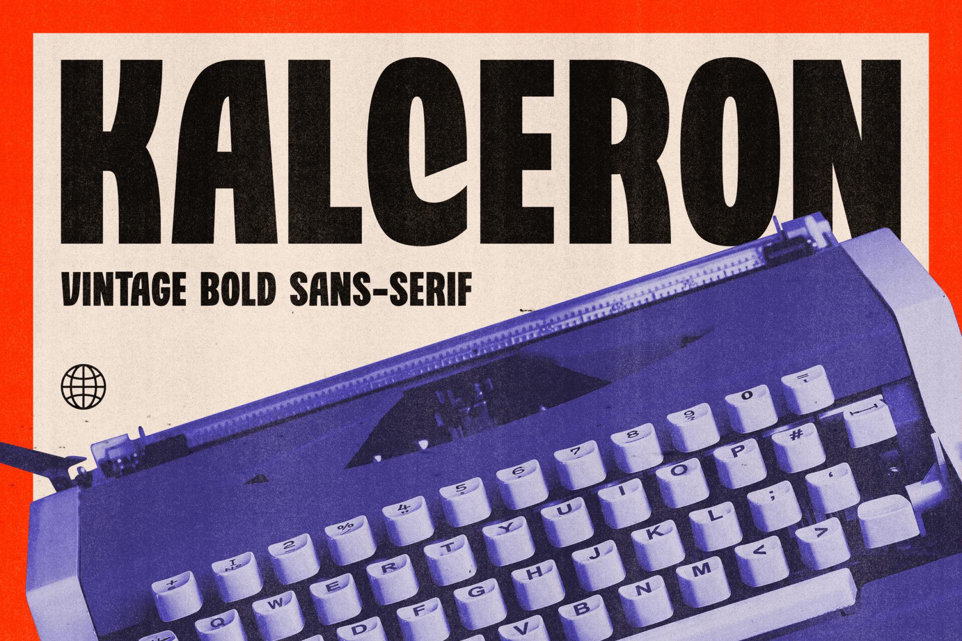
14. Kalceron Font by konstantinestudio
Best For: Vintage posters, record covers, retro labels
A vintage bold sans-serif, as the preview puts it: condensed heavy capitals with slightly quirky shapes, like the C and O squeezed into narrow ovals. Next to a typewriter in the preview, it looks like old print advertising.
Kalceron is the retro choice in this section. Set it in black on a warm off-white or a red background for a printed-poster feel, and it will look right on gig posters, record covers and craft beer labels.
Bold Script Fonts
Bold scripts combine the movement of handwriting with enough weight to read from a distance. These seven range from sporty jersey scripts and sign-painter styles to a dry brush and an elegant script for boutique labels.
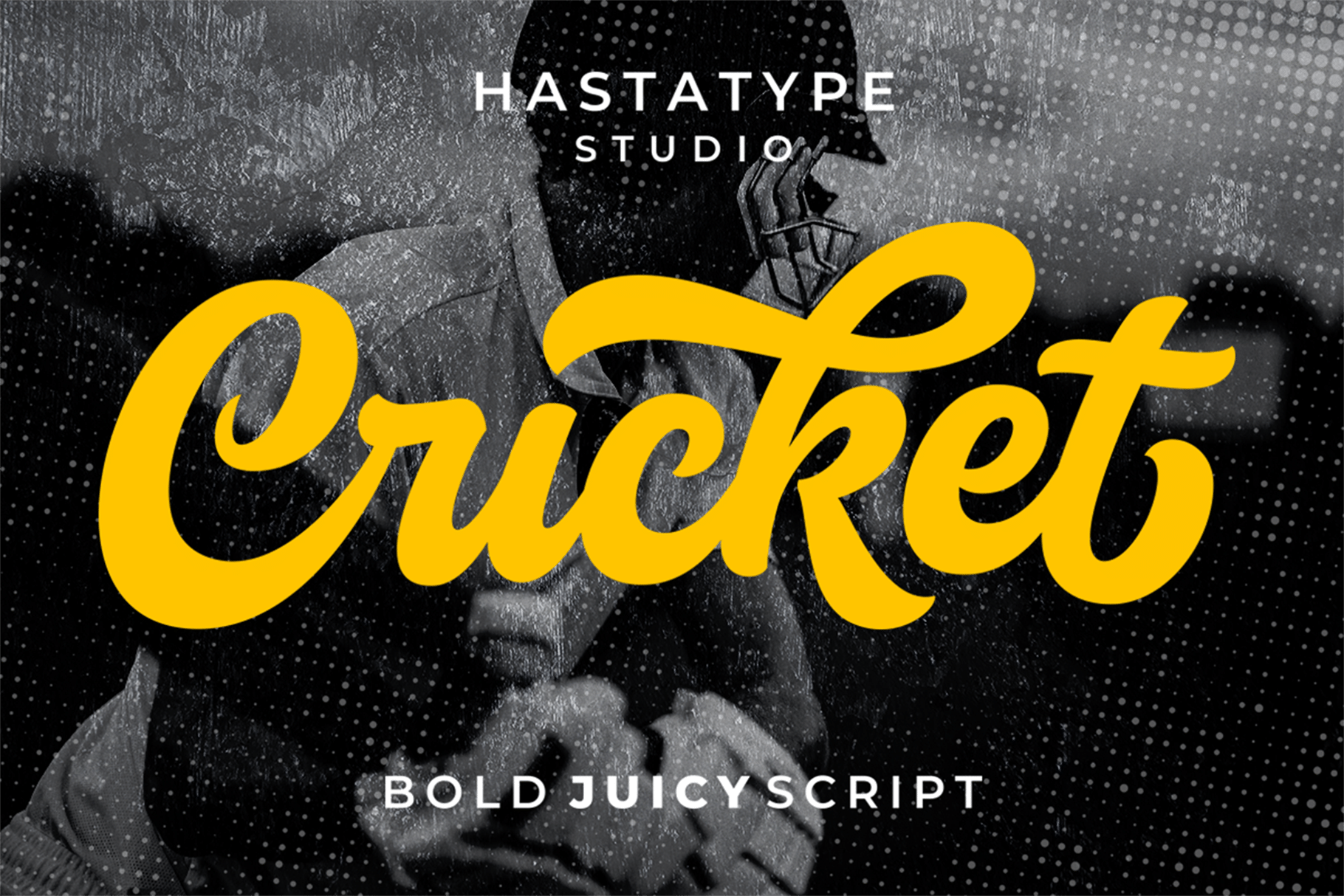
15. Cricket Font by IklazStudio
Best For: Sports team shirts, apparel wordmarks, retro badges
A heavy, juicy script with thick connected strokes, a confident slant and a long tail that sweeps under the word. The preview calls it a bold juicy script, and it has the classic baseball-jersey energy of a sports wordmark.
Cricket is made for team names and apparel: a script word across the chest of a shirt, underlined by its own tail. It holds up in vinyl and screen print thanks to the thick strokes. Keep it to one or two words and add a block font underneath for numbers or a city name.
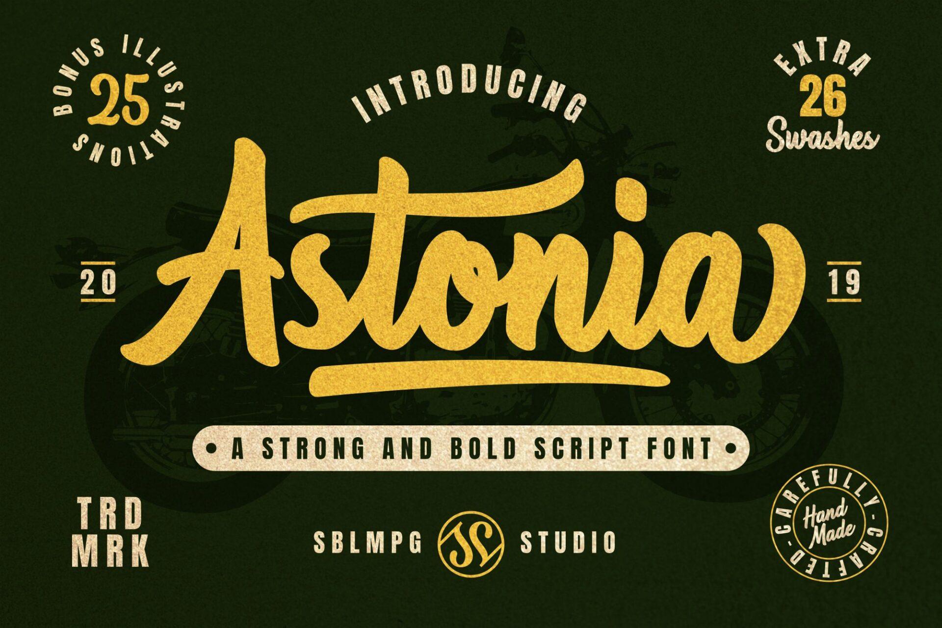
16. Astonia Font by Sibelumpagi Studio
Best For: Barbershop and motorcycle logos, vintage apparel
A strong, bold script with brushy texture and a long swash that underlines the word. The preview describes it as a strong and bold script font and lists 26 extra swashes, shown in a vintage badge layout.
Astonia belongs on badges, patches and shop signs with a garage or barbershop mood. The swash under the word gives you a ready-made line for a tagline or an established date, as in the preview. Combine it with a condensed sans for the small text.
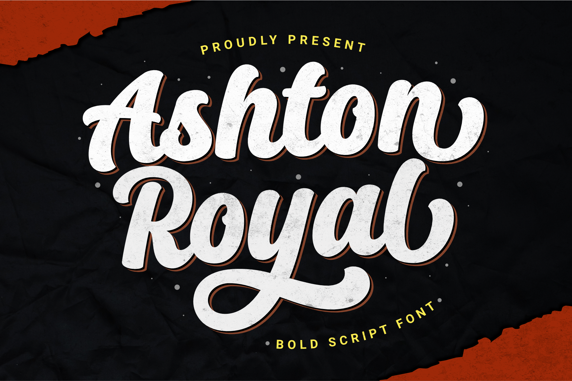
17. Ashton Royal Font by Holydie Studio
Best For: Retro shirts, signage, labels with a vintage feel
A bold script with big looping capitals and a slight bounce from letter to letter. In the preview the white letters carry a thin offset shadow, which gives them a classic sign-painted look.
Ashton Royal reads easily even in two lines, so it can carry a short phrase on a shirt or a shop window. Try it with a drop shadow or a second color behind the letters for a retro sign, and leave a little extra line spacing for the loops.
18. Oh Chewy Font by motokiwo
Best For: Candy and dessert shops, stickers, fun packaging
A thick, bouncy script with soft, rubbery strokes and a swash that runs out of the y. The preview calls it sweet and bold, and the letters really do look stretchy, like taffy or bubble gum.
Oh Chewy is for sweet and playful brands: a candy shop, an ice cream truck, a sticker that says yum. It works in bright colors on dark or light backgrounds, and the extended swash makes a good base for a small subtitle.
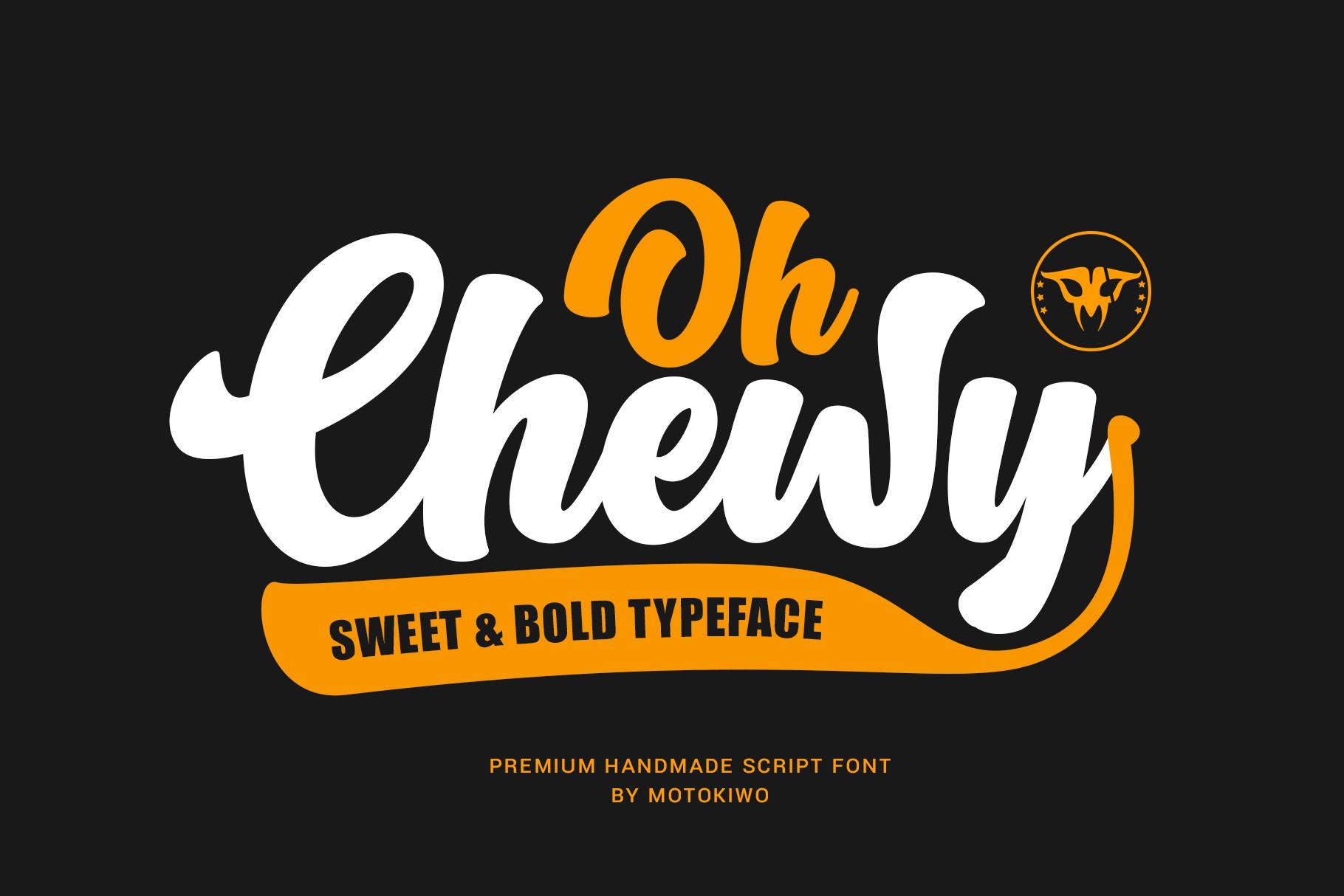
19. Rachy Font by Twistystd
Best For: Fashion and lifestyle labels, social media titles
A heavy, rounded script with almost no contrast between thick and thin strokes. The preview describes it as a bold script rounded font, and the letters are soft at every end, with full, round loops.
Rachy looks modern rather than vintage, so it suits fashion tags, Instagram highlights and cozy lifestyle brands. Set it large in white on a deep color, as in the preview, and use a clean sans for anything smaller.
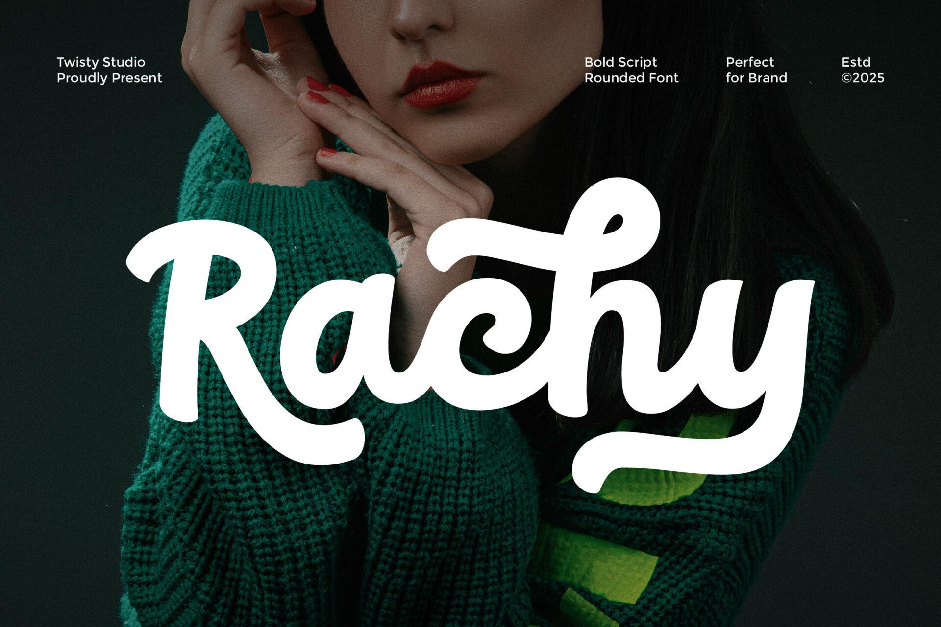
20. Secret Director Font by Fikryal Studio
Best For: Movie-style titles, streetwear, fitness graphics
A fast, dry-brush bold script with rough edges and visible bristle texture. The letters slant forward and vary in height, which gives each word the look of quick, energetic handwriting. The preview calls it a hand brush bold script font.
Secret Director brings motion to film-poster titles, gym graphics and streetwear prints. The rough edges are the point, so avoid tiny sizes where the texture turns into noise, and keep the background simple so the brush strokes stand out.
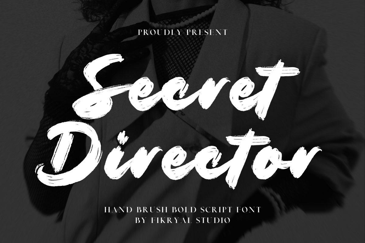
21. Monvera Font by basyar
Best For: Boutique logos, beauty and candle labels
The most refined script in this list: bold, but with smooth curves, modest contrast and neat loops. The preview presents it as an elegant bold script and a luxury branding typeface, shown with silk ribbons and flowers.
Monvera is the answer when a brand wants weight and elegance at once. It holds its shape on small product labels better than thin scripts do, and it pairs well with a spaced-out serif or sans in capitals for the tagline.
Funky and Groovy Bold Fonts
Funky fonts take bold letters and bend them: melting, wavy, flared and bouncy shapes with a strong 1960s and 1970s mood. They are made for shirts, stickers and posters, where personality matters more than neutrality.
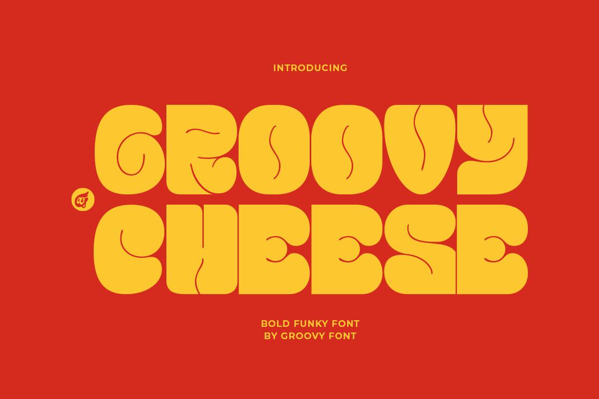
22. Groovy Cheese Font by Groovy Font
Best For: 70s-style shirts, record covers, retro stickers
Heavy capitals that look half melted: the strokes swell and pinch, the counters are warped, and the letters press tightly against each other. The preview calls it a bold funky font, and it has a strong late-1960s and 1970s poster mood.
Groovy Cheese is best for one or two short words set very large. It looks great in yellow, orange and red combinations on shirts and stickers. Because the letters are so tight, add a little tracking if you need the word to read from far away.
23. Sangua Font by IqsiartStudio
Best For: Snack and drink packaging, 70s shirts, retro poster titles
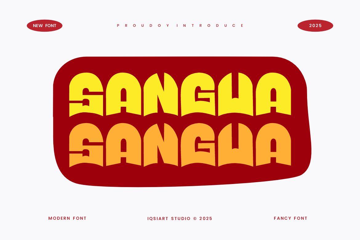
Heavy capitals with flat tops and wavy, scalloped bottoms, so every word ends in a rippling edge like melted wax or a drip of syrup. The letters stand shoulder to shoulder with almost no gaps, the counters shrink to narrow slits, and the S has a stepped cut through its middle. The preview stacks the name twice in yellow and orange inside a dark red shape.
Sangua works best as one short, wide word: a product name on a chip bag, a soda label or a retro shirt. Because the letters touch, it needs a large size and strong contrast to stay readable. Repeating the word in two colors, as the preview does, is an easy way to build a ready-made 70s graphic.
24. Moonwish Font by Rasiorise Studio
Best For: Gig posters, psychedelic prints, album art
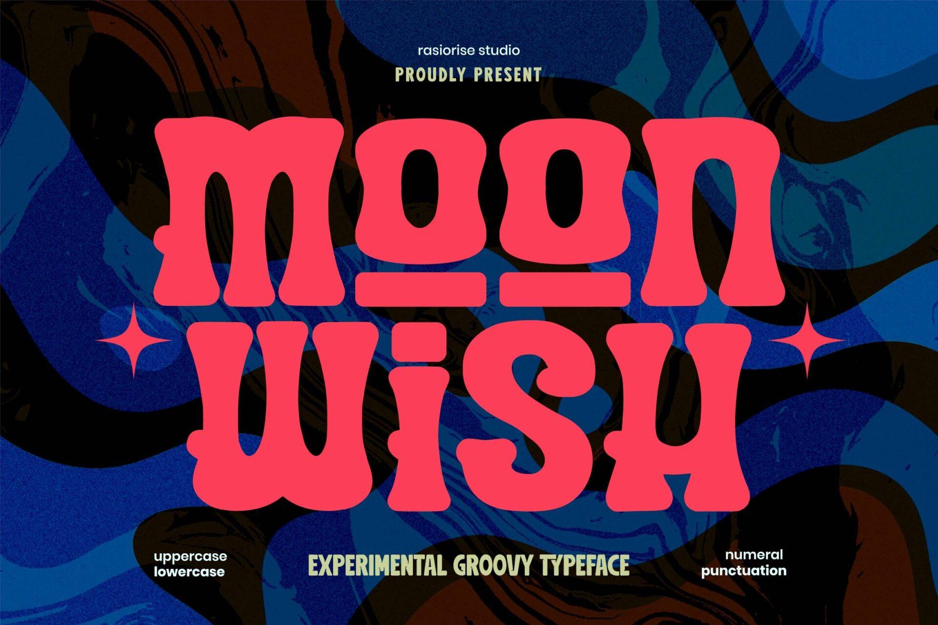
Tall, wavy capitals with flared tops and bottoms, as if the letters are stretching. The preview calls it an experimental groovy typeface and lists uppercase, lowercase, numerals and punctuation.
Moonwish shines on posters and album art with a psychedelic background, where its wavy forms join the overall pattern. Keep the text short and give it strong color contrast, as in the pink-on-swirl preview, so the shapes stay readable.
25. Wocke Funky Font by creakokunstudio
Best For: Festival posters, kids’ party signs, retro stickers
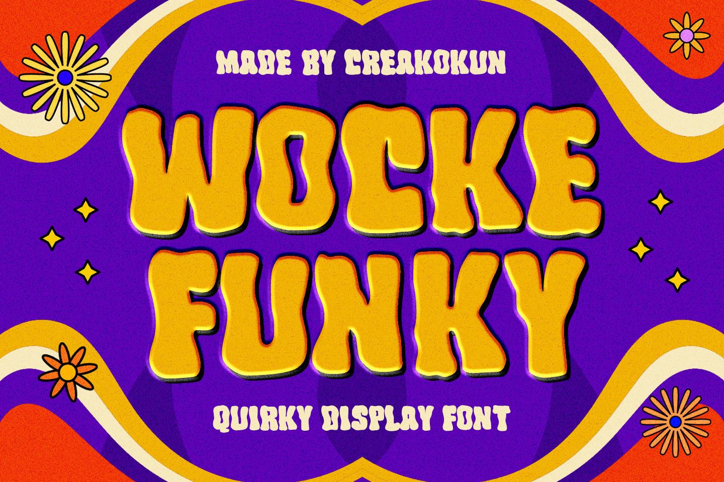
Wobbly bold capitals with wavy outlines and a playful, uneven rhythm. In the preview the yellow letters have a dark shadow behind them and sit on a swirling 70s background with flowers. The preview calls it a quirky display font.
Wocke Funky is fun rather than serious, so it suits a summer festival, a party invitation or a flower-power sticker. A drop shadow in a darker color, like the one in the preview, makes it pop on busy backgrounds.
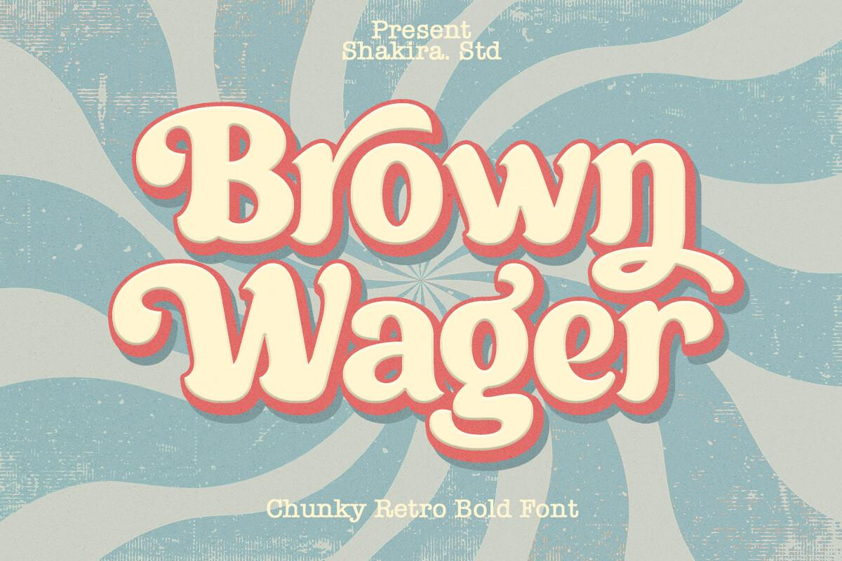
26. Brown Wager Font by Shakira Studio
Best For: Retro labels, shirts, café and bakery branding
A chunky retro display with soft, bulb-like serifs and a sweeping swash on the r. The preview calls it a chunky retro bold font and shows it with a layered pink shadow on a sunburst background.
Brown Wager is the warmest font in the funky group, with a classic 70s magazine feel. It looks lovely on bakery boxes, coffee labels and retro shirts, especially with one or two outline layers behind the letters.
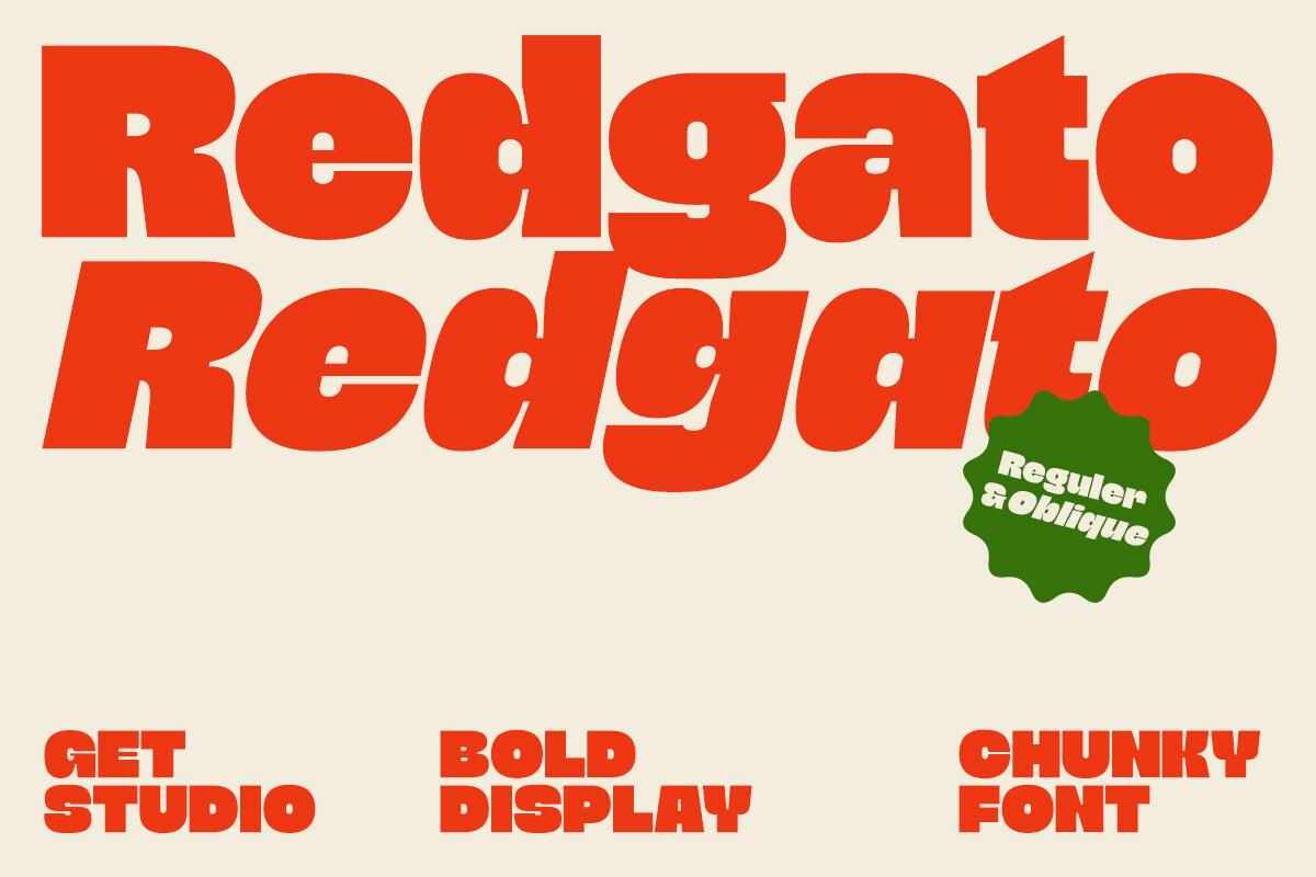
27. Redgato Font by getstudio
Best For: Packaging, bold posters, streetwear headers
A very heavy display font with tight spacing and slightly flared, sculpted letterforms. The preview shows a regular and an oblique style, set one above the other, and describes it as a bold display chunky font.
Redgato is the most graphic font in this group, closer to modern packaging than to hippie posters. The oblique style adds movement for sports or sale banners. Use it in one strong color, like the red in the preview, and let it fill the space.
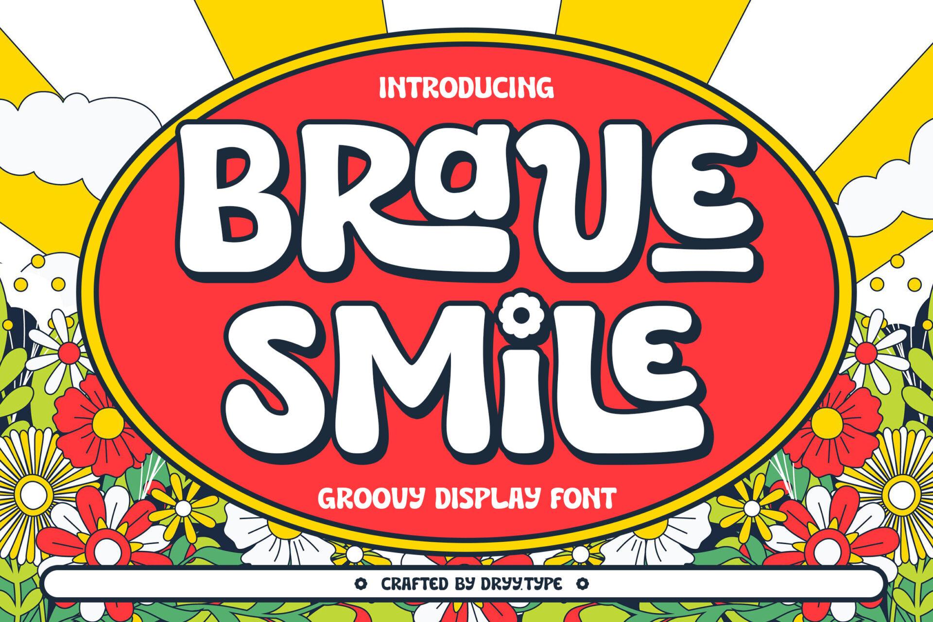
28. Brave Smile Font by Dryy.type
Best For: Retro kids’ shirts, flower-power stickers, party signs
A rounded groovy display with mixed upper and lowercase forms inside one word, which gives it a cheerful, bouncy rhythm. The preview calls it a groovy display font and frames the white letters in a red oval surrounded by flowers.
Brave Smile is ready for anything retro and happy: a kids’ shirt, a sticker sheet, a summer party sign. It reads well inside badges and ovals, so try the same framed layout as the preview for a quick, finished design.
How to Choose a Bold Font
Start with the length of the text. Chunky and funky fonts look best with one to three words. If the name is long or needs two lines, a condensed sans like Grisy & Rocky or Kalceron fits more letters into the same width.
Match the mood, not just the weight. All 28 fonts here are heavy, but they say different things. Rounded chunky fonts feel friendly and edible, condensed sans fonts feel sporty and urgent, bold scripts feel personal and retro, and groovy fonts feel nostalgic and playful.
Check the counters at your real size. Bold letters have small inner spaces. On a business card, a small label or a vinyl cut, counters that are too tight fill in and the word turns into a blob. Print or cut a test at the actual size before you commit.
Give a bold font a quiet partner. One bold font per design is usually enough. Use it for the name or the headline and set everything else, like taglines, prices and addresses, in a light sans or serif so the bold word stays the focus.
Think about color and background. Heavy letters carry color well, so a single strong color often looks better than gradients. On photos or busy patterns, add an outline or an offset shadow, as many of the previews above do.
FAQ
What is a bold font?
A bold font is a typeface with thick strokes, made to stand out. It can be a bold weight of a regular family or a display font designed to be heavy from the start, like most fonts in this list.
Which bold fonts are best for logos?
For most logos a bold sans serif is the safest choice, because it stays readable from a large sign down to a small icon. Heinan, Bitgros, Befisans and Gligatr all work as wordmarks. For a retro or handmade brand, a bold script like Astonia or Monvera can carry the logo instead.
What is the difference between chunky and bold fonts?
Chunky fonts are a type of bold font: very heavy, with small counters and usually rounded or soft corners. Every chunky font is bold, but a bold font can also be narrow, sharp or scripted.
Are bold fonts good for Cricut and vinyl?
Yes, often better than thin fonts, because thick strokes are easier to cut and weed. Avoid very small sizes with tight counters, and test fonts with rough edges, like brush scripts, before a large project.
Can I use a bold script for a whole sentence?
It is better to keep bold scripts to a name or a short phrase. In long text the heavy connected letters become hard to read. Set the rest in a simple sans or serif.
Where to Start
If you need a bold font for a brand name, start with the sans serif group: Heinan for a wide streetwear look, Befisans for a modern tech feel or Gligatr for a softer boutique style. For shirts and stickers, go to the chunky and funky fonts, where Chubby Gum, Omletta and Groovy Cheese do most of the work on their own. And if the design needs movement, pick a bold script: Cricket for team apparel, Astonia for vintage badges or Monvera for elegant labels.
Try two or three candidates with your real text before deciding. Bold fonts change a lot depending on the word, and the one that looks best in a preview is not always the one that looks best with your name on it.