Cool Fonts Alphabet: 30 Graffiti, Groovy, Comic, Art Deco and Retro Script Styles for Shirt Makers, Poster Designers and Letterers
Cool fonts are the ones that make people stop scrolling: graffiti tags, groovy 70s letters, loud comic lettering, glamorous Art Deco capitals and thick retro scripts. The 30 cool fonts below are grouped by those five styles, and each one shows its full alphabet, so you can see every letter before you choose.
This post contains affiliate links. If you buy through them, I may earn a small commission at no extra cost to you.
Each entry describes how the letters look, what is included on the alphabet sheet and where the font works best, from T-shirts and posters to stickers, labels and hand lettering practice.
All fonts in this list are on Creative Fabrica, and a single All Access subscription unlocks every one of them, so you can try several styles before committing to one.
More font collections in a similar style:
28 Graffiti Fonts
24 Graffiti Lettering Fonts
34 Bubble Fonts
20 Vintage Fonts
50 Lettering Fonts
30 Aesthetic Fonts
Table of Contents
- Cool Graffiti Fonts
- Cool Groovy Fonts
- Cool Comic and Pop Art Fonts
- Cool Art Deco Fonts
- Cool Retro Script Fonts
- How to Choose a Cool Font
- Cool Fonts FAQ
Cool Graffiti Fonts
Graffiti is the style most people picture when they search for cool letters: puffy throw-ups, sharp marker tags and blocky 3D pieces. These six cover all three, from loose handstyles to heavy outlined letters that hold up on a hoodie or a skateboard deck.
1. Back Wild Font by Cikareotype
Best For: Streetwear prints, skateboard graphics, sticker sheets, event flyers
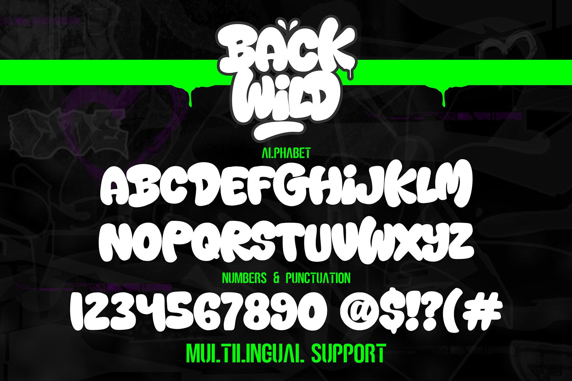
Back Wild Font is a puffy throw-up style: thick, rounded capitals that lean into each other, with a heavy dark outline around a light fill. The letters bulge at the ends of each stroke, so short words look packed and energetic rather than neat.
The alphabet sheet shows the full set of capitals, numbers and punctuation, plus multilingual support. Keep it to one to three words, since the shapes are wide, and give it a contrasting background or a bright stroke color so the outline stays visible on a print.
2. Wofline Graffiti Font by Tebaltipis.std
Best For: Hip-hop flyers, album covers, shirt back prints, tag-style signatures
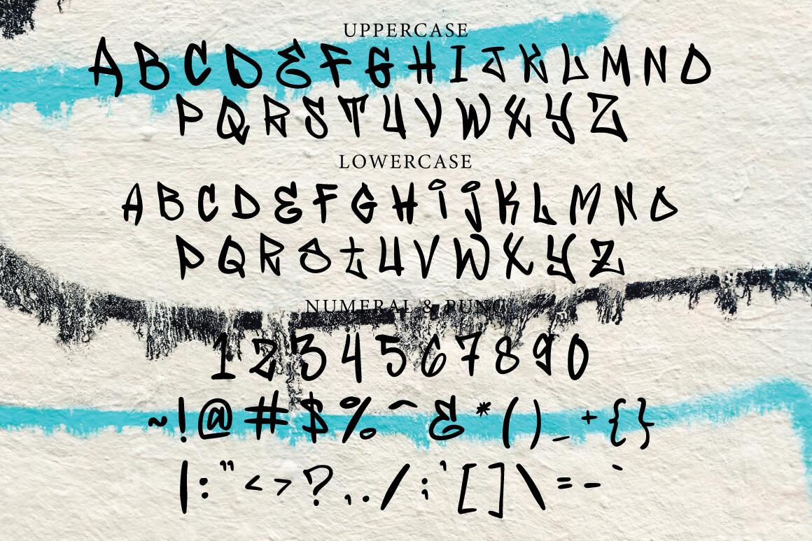
Wofline Graffiti Font looks like a fast marker tag: thin, spiky strokes, uneven heights and sharp angles where the pen changes direction. It feels drawn by hand on a wall, not built from shapes.
The sheet includes uppercase, lowercase and numerals, so you can set whole phrases instead of capitals only. Because the strokes are light, it needs size to read well: use it big on a poster or across the back of a shirt, and pair it with a plain sans for any small text.
3. Rughola Graffiti Font by madeDeduk
Best For: Streetwear logos, posters with long words, merch tags, city name prints
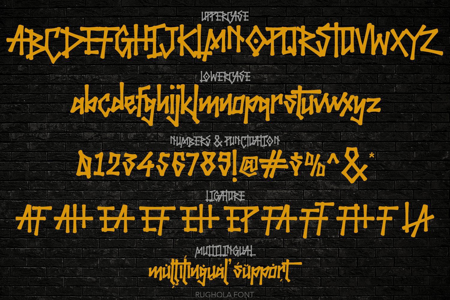
Rughola Graffiti Font is a tall, condensed marker hand with dry, slightly rough edges. The narrow letters sit close together, which keeps longer words compact, and the strokes have a quick, confident rhythm.
The alphabet sheet lists uppercase, lowercase, numbers and punctuation, a row of ligatures and multilingual support. Its narrow width makes it one of the few graffiti fonts here that can handle a city name or a full slogan on one line.
4. Street Fruit Font by Dansdesign
Best For: Bold posters, gaming and video thumbnails, kids’ streetwear, stickers
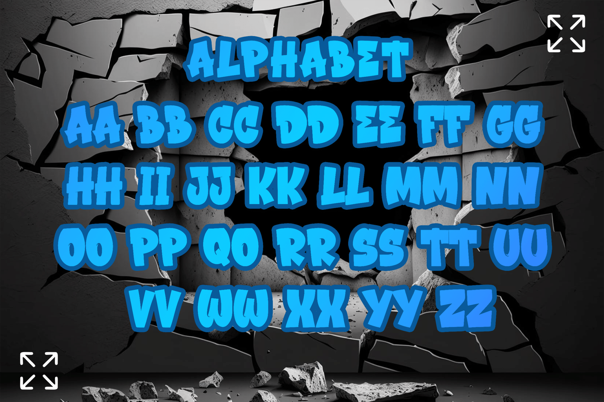
Street Fruit Font builds chunky 3D block letters with a thick outline and a deep extruded shadow, the classic look of a colorful graffiti piece. Each letter has a slight tilt, so words feel lively even when set in a straight line.
The alphabet sheet shows every letter in two versions side by side, which helps avoid repeated shapes in words with double letters. Fill it with two or three bright colors and keep the background simple; the letters already carry a lot of detail.
5. Graffiti Bubbly Font by Brown Cupple Fonts
Best For: Party posters, sticker designs, phone cases, playful merch
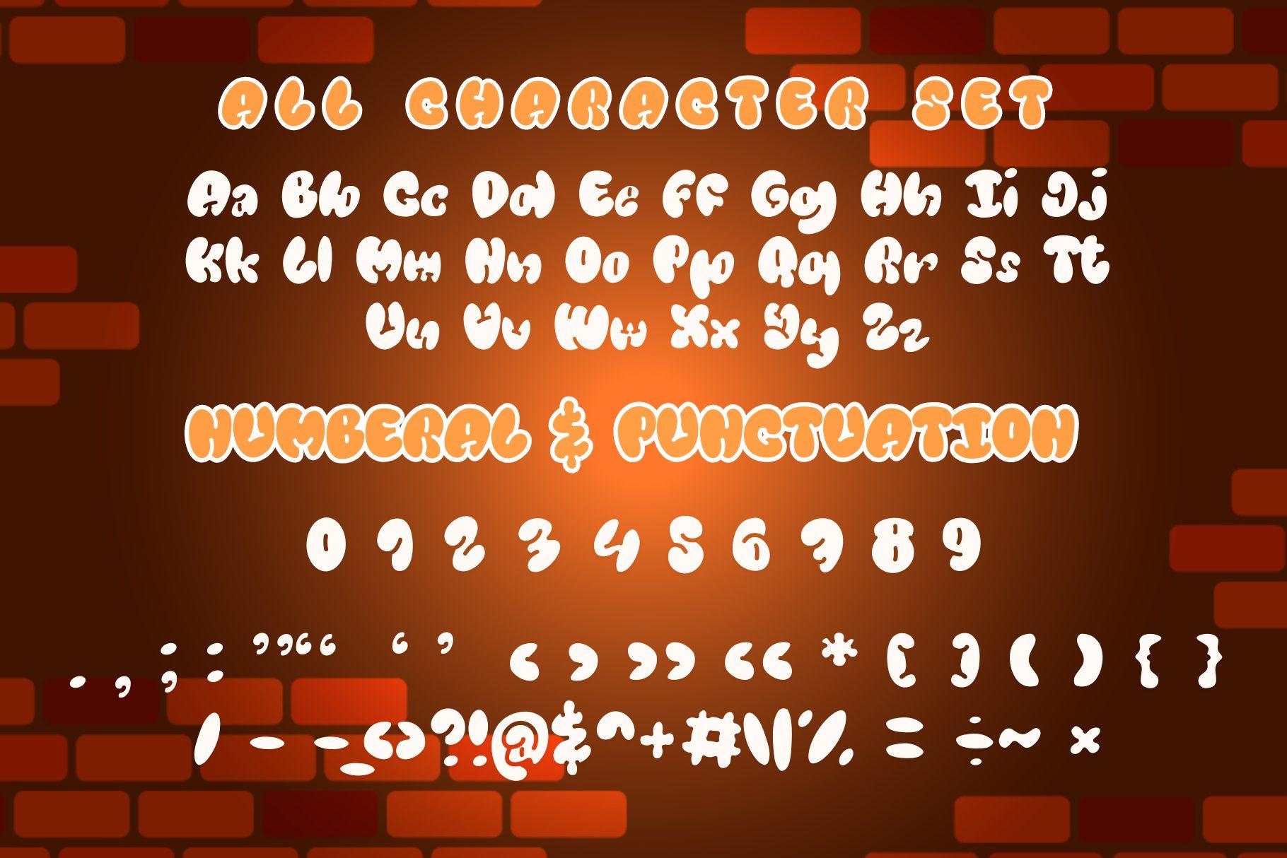
Graffiti Bubbly Font is the softer side of street lettering: round, inflated letters with smooth curves and no sharp corners. It reads as fun and friendly rather than tough.
The character set covers uppercase, lowercase, numerals and punctuation. It works well with a spray-paint splash or a drop shadow behind it, and it stays readable at medium sizes, which makes it useful for stickers and small product mockups.
6. Metro Graffi Font by Cikareotype
Best For: Layered two-color prints, wall-art posters, sneaker and cap mockups
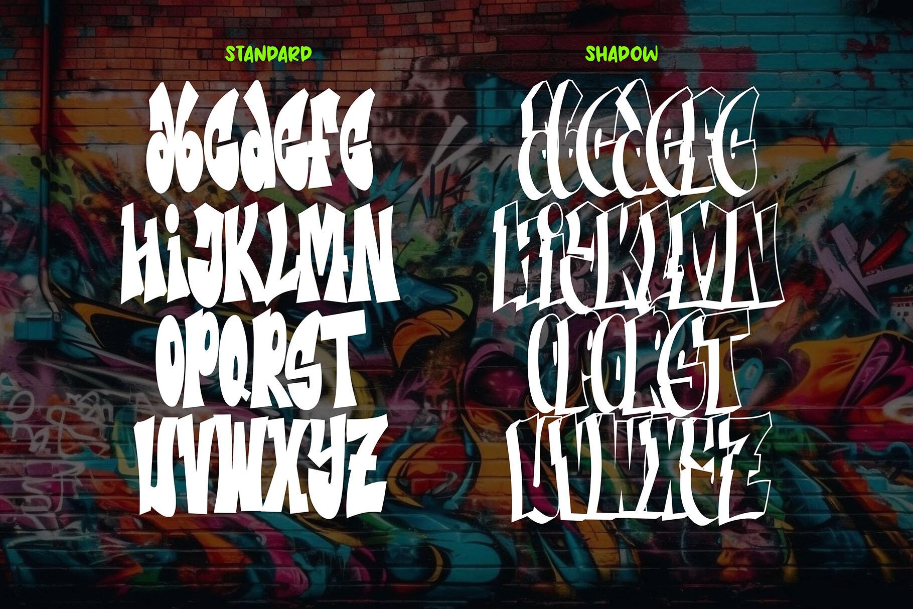
Metro Graffi Font has tall, twisted letters with pointed tips and kinks in the strokes, close to a simplified wildstyle. The forms are complex, so it reads best as a single word or a short name.
The alphabet sheet shows two styles, Standard and Shadow. Stack them in two colors to get a layered piece without drawing the shadow yourself, which is handy for screen-print designs where each color is a separate layer.
Cool Groovy Fonts
Groovy fonts bring back the 70s: swollen letters, soft curves and wavy outlines. They are some of the most-used cool fonts on shirts and stickers, because a short phrase in a groovy face already looks finished.
7. Groovy Beach Font by Blankids Studio
Best For: Retro shirts, beach signs, stickers, 70s party invitations
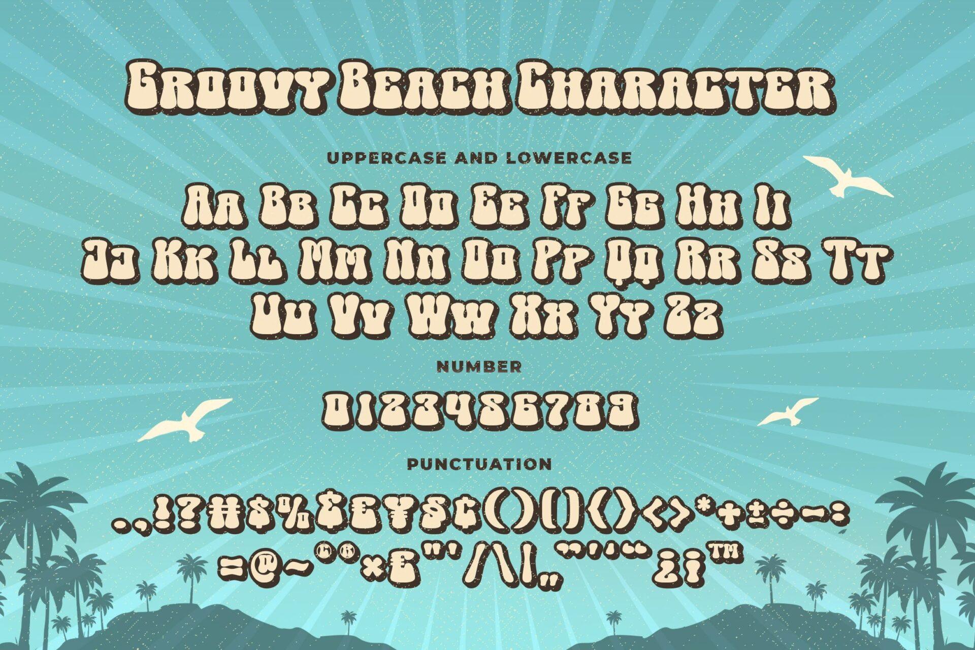
Groovy Beach Font has fat, wavy letters with an inline that follows each shape, so the letters look outlined twice. The forms swell and pinch like a vintage surf poster.
The character sheet includes uppercase and lowercase, numbers and punctuation. It looks best with two or three warm colors and a rainbow stripe or sun graphic behind it; on a plain white background it can feel a little empty.
8. Fungky Retro Font by Infinity art Studio
Best For: Posters, headlines, café and bakery labels, retro book covers
Fungky Retro Font is a heavy rounded display face with soft, flared ends on the strokes. It is less wavy than most groovy fonts, so it feels retro without becoming cartoonish.
The alphabet sheet shows capitals only, with punctuation and symbols; numbers are on a separate slide in the gallery. Use it for headlines and short labels, and give it generous letter spacing so the heavy shapes do not crowd each other.
9. Stay Chunky Font by Meow Creation
Best For: Sweatshirts, mugs, Cricut shirts with short phrases, gift tags
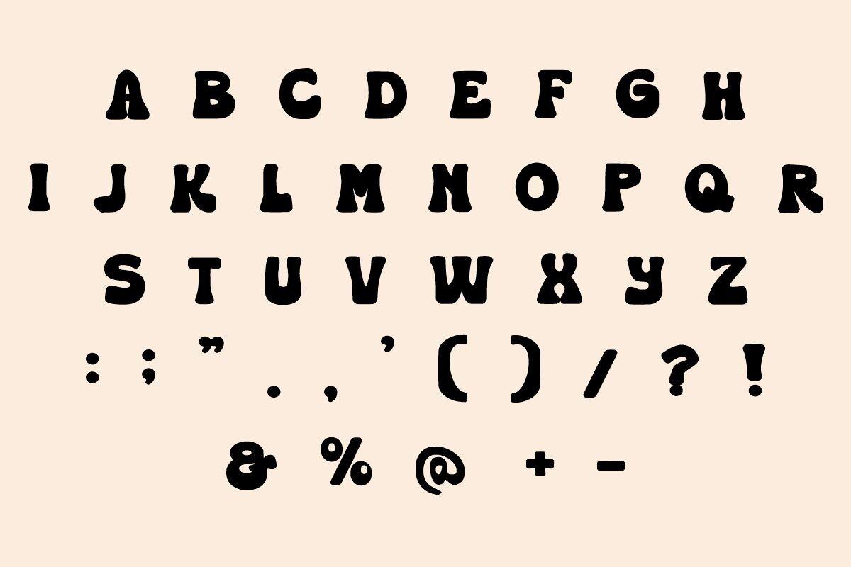
Stay Chunky Font is a thick soft serif with bulging curves and tight inner spaces. It reads clearly and still looks playful, which is why it suits phrases like “Be Kind” or a name on a mug.
The sheet shows uppercase, lowercase, numbers and symbols, and a bottom row of alternate letters with curly tails. Use one alternate at the start or end of a word for a little flourish; using them on every letter makes the line hard to read.
10. Sunny Chunk Font by cocodesign
Best For: Kids’ shirts, rainbow-themed signs, tote bags, classroom decor
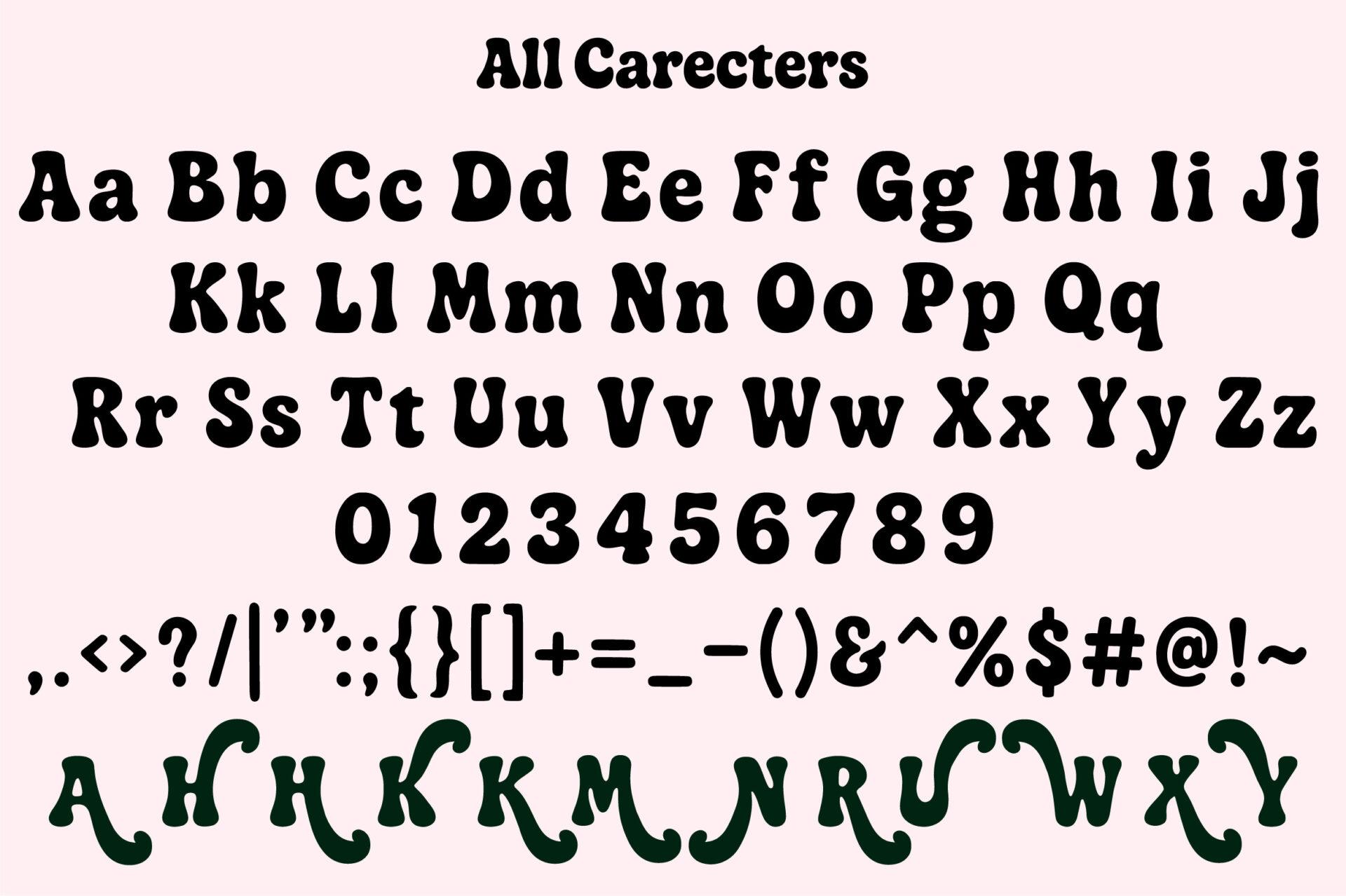
Sunny Chunk Font has bold, bouncy letters with rounded serifs and a slightly uneven baseline. It has the cheerful, sunny feel the name suggests.
The alphabet sheet covers uppercase, lowercase, numbers and punctuation, plus a row of alternate capitals. It is clean enough to cut on a Cricut at medium sizes, and it pairs well with simple rainbow, sun and flower graphics.
11. Balmy Groove Font by Sakti Avellin
Best For: Summer shirts, doormats, mugs, beach and pool signs
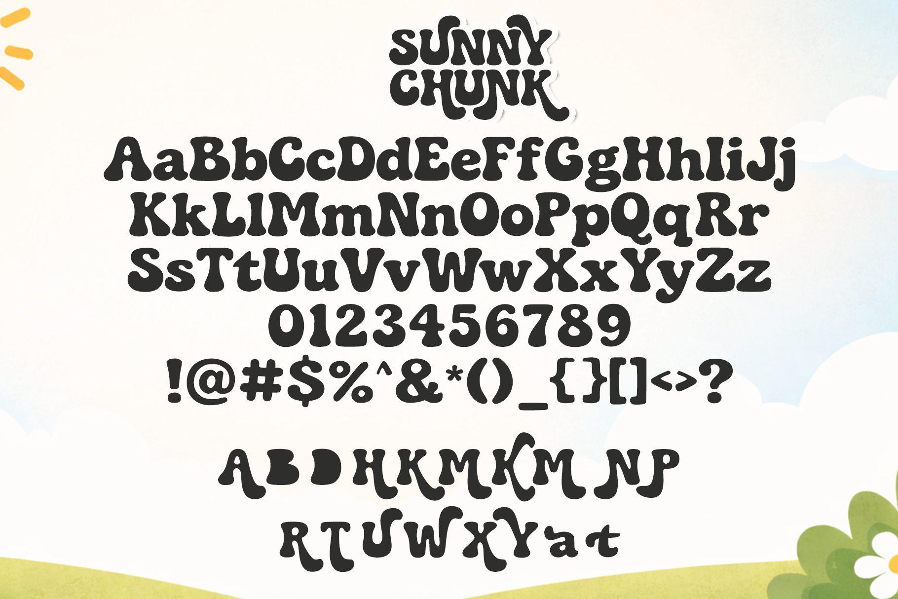
Balmy Groove Font has tall letters that look slightly melted, with wavy sides and swollen tops. It is narrower than most groovy fonts, so it fits longer words on one line.
The character set includes uppercase, lowercase, numbers and symbols. The wavy shapes look best in a single solid color; outlines and textures tend to fight with the curves.
12. Longies Font by Figstype
Best For: Apparel brands, posters, product labels, retro packaging
Longies Font is a tall, condensed retro display with rounded strokes and a 70s ad feel. The height of the letters makes it look confident even in one color.
The sheet shows uppercase, lowercase, numbers, punctuation, a row of ligatures and multilingual characters. It is a good choice for a small brand name or a product label where a groovy look is wanted but space is limited.
Cool Comic and Pop Art Fonts
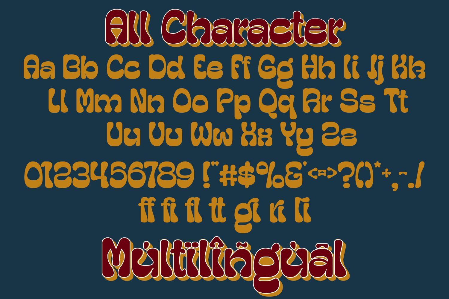
Comic and pop art fonts are loud on purpose: fat letters, bright fills, halftone dots and speech bubbles. They are a natural fit for kids’ merch, birthday decor and any design that needs to feel fun at a glance.
13. Superiot Font by memetxsaputra
Best For: Comic panels, café chalkboards, kids’ event posters, stickers
Superiot Font is a hand-drawn comic lettering style: slightly irregular strokes, open shapes and a relaxed slant. It looks like the text in a cartoon speech bubble.
The alphabet sheet includes uppercase, lowercase, numbers and symbols, so it can set full sentences, not only titles. Put it inside a speech bubble or next to a simple cartoon illustration, which is exactly how the gallery shows it.
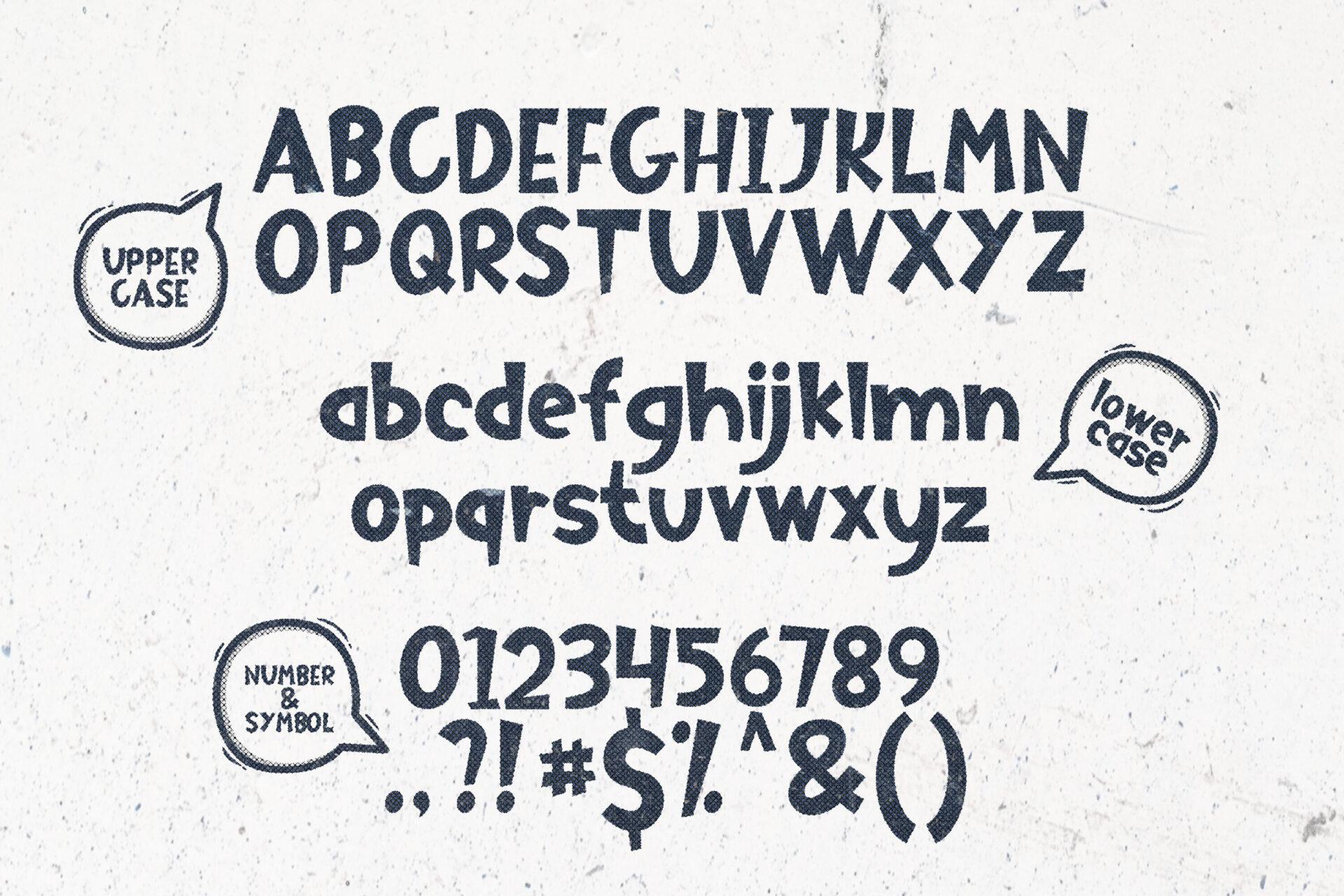
14. Comic Heroes Font by riki.studio
Best For: Kids’ tees, birthday cards, pastel merch, nursery signs
Comic Heroes Font has bold, rounded capitals with a light bounce. On pink and pastel backgrounds it looks sweet rather than loud, which sets it apart from the brighter comic fonts here.
The alphabet sheet shows capitals, numbers and punctuation. Since there is no separate lowercase on the sheet, plan your design around short all-caps phrases such as a name or “Happy Birthday”.
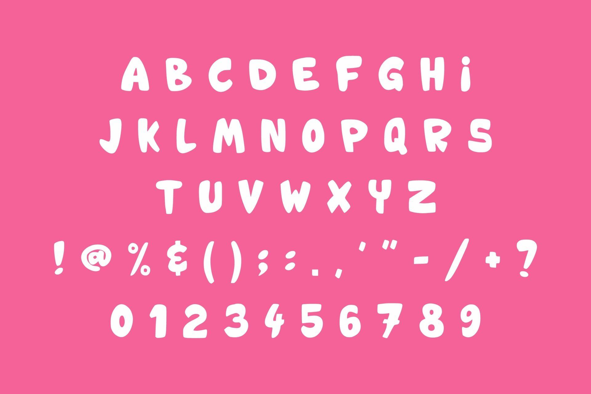
15. Boom Pop Font by Dreamspace.studio
Best For: Kids’ shirts, school and sports merch, headline stickers
Boom Pop Font is a heavy, rounded display face with letters of slightly different widths, which gives words a playful, bouncy rhythm. The covers show it in several bright colors on a comic burst background.
The alphabet sheet shows capitals, numbers and punctuation. Try a different color for each letter, as in the gallery, or add a thick outline and a drop shadow for a sticker look.
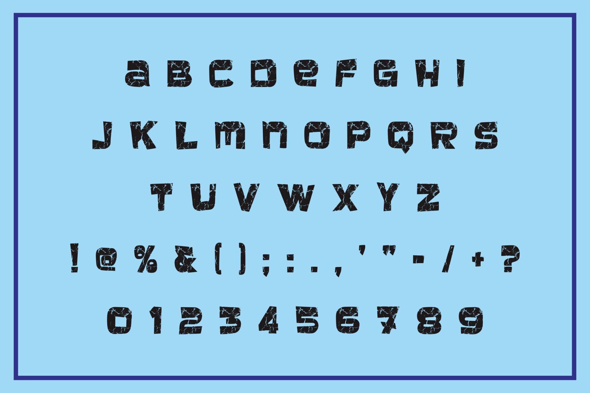
16. Ngomic Font by Rashdrawn
Best For: Comic posters, sale banners, pop art prints, sound-effect graphics
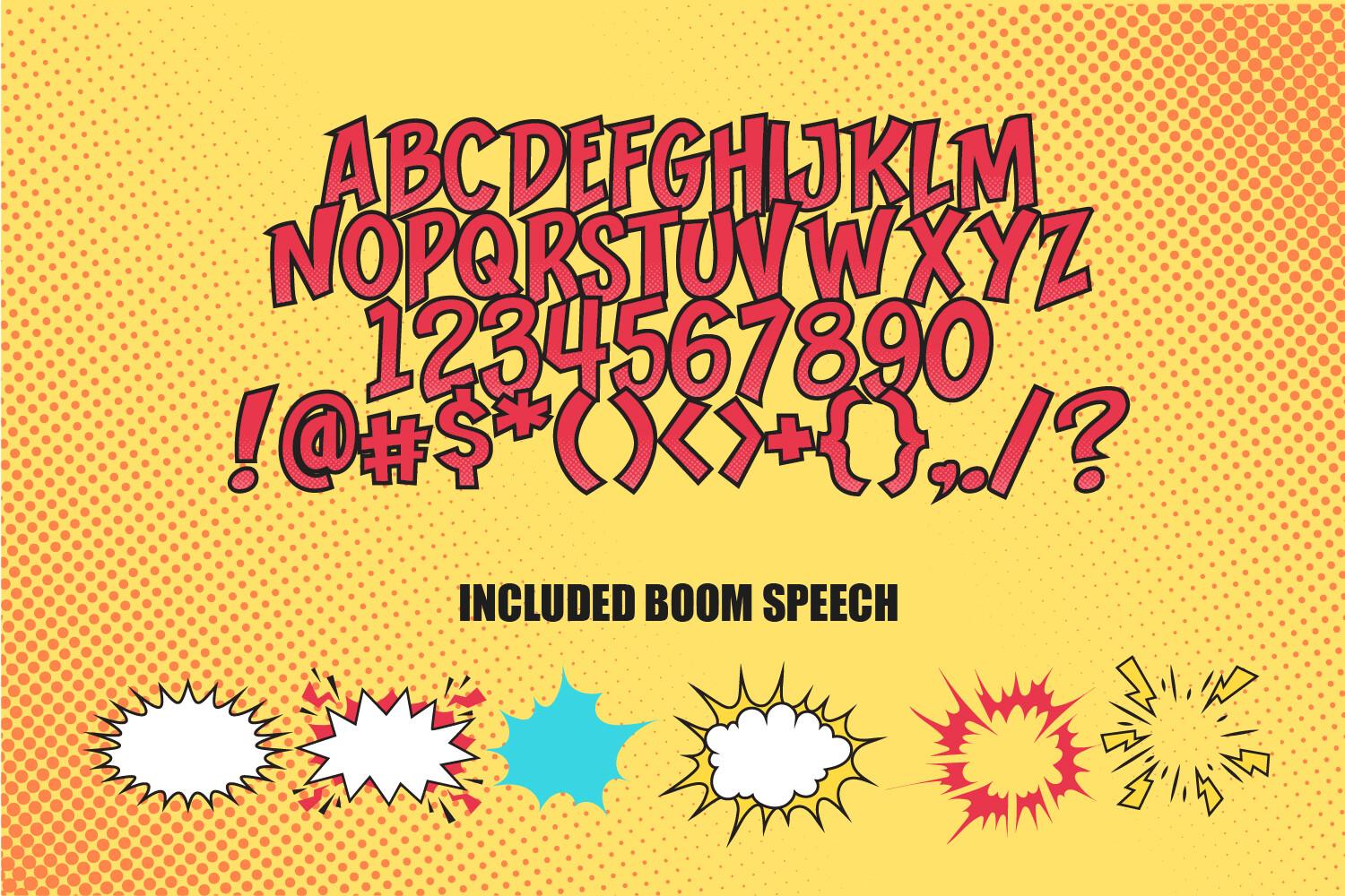
Ngomic Font is classic comic book lettering: tall, bold capitals with a slight lean and a dimensional shadow. On the alphabet sheet the letters are red with a yellow halftone background, the look of a printed comic page.
The sheet shows capitals, numbers and symbols, and it also includes boom speech bubble shapes. The gallery mentions three color styles and an EPS file, so check the product page for what each file contains before you plan a layout.
17. Pop Art Retro Font by Infinity art Studio
Best For: Kids’ clothing, retro posters, birthday decor, party signs
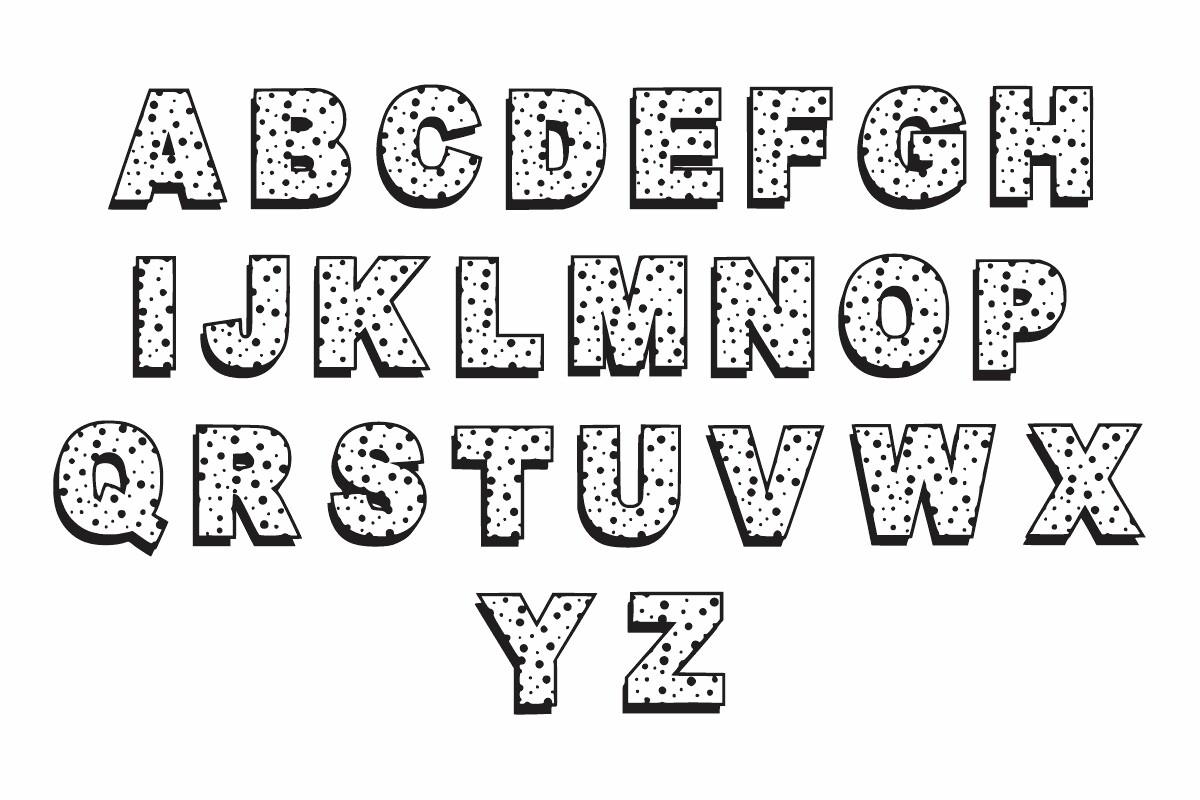
Pop Art Retro Font draws outlined capitals filled with a dotted, speckled pattern. It looks like a print from an old comic or a vintage toy box.
The alphabet sheet shows capitals only; numbers are on a separate slide in the gallery. The pattern is the main feature, so keep the letters large; at small sizes the dots blur into gray.
18. Grooven Pop Font by Dreamspace.studio
Best For: Kids’ parties, mugs, tote bags, playful shop signs
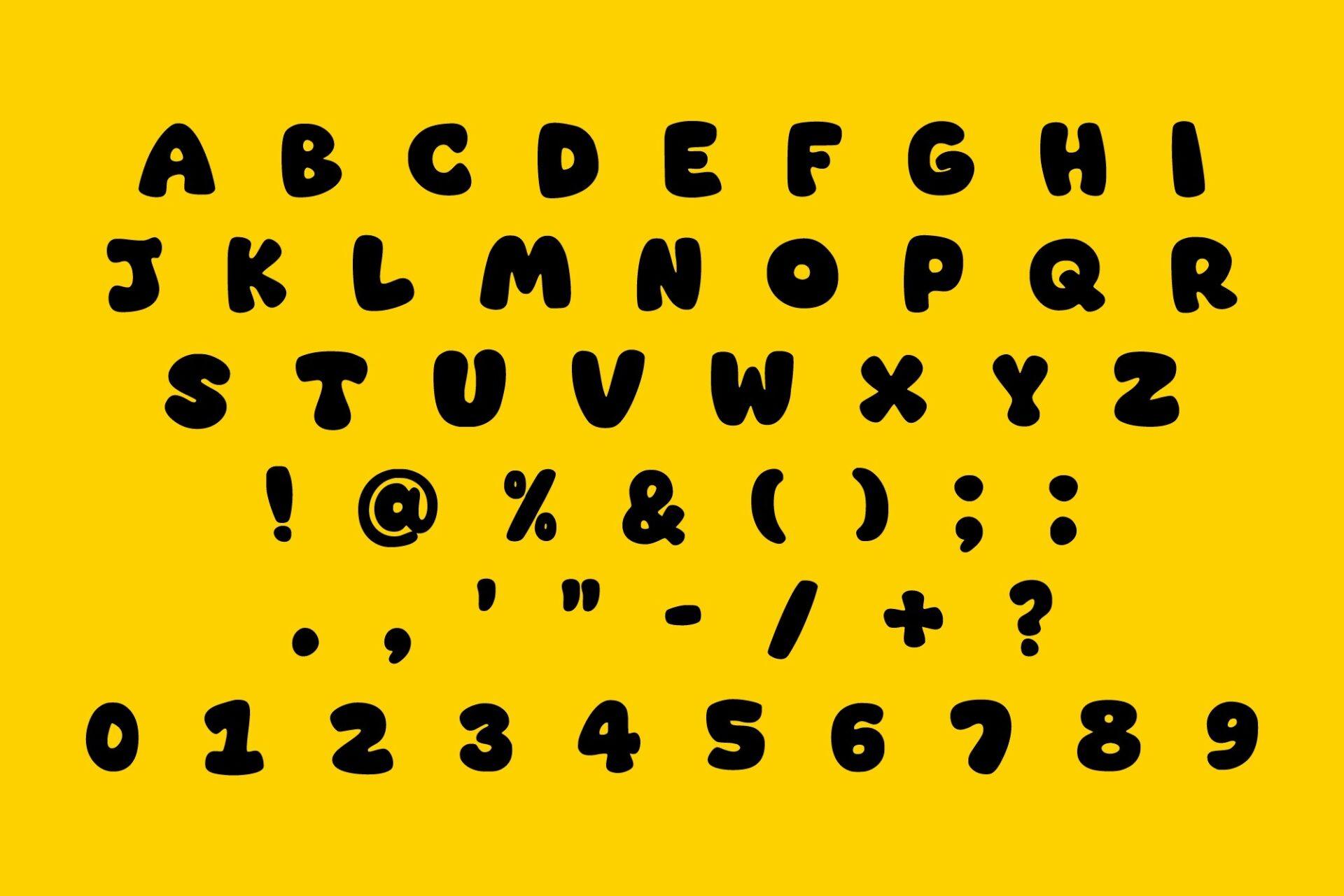
Grooven Pop Font has fat, soft capitals with rounded corners, close to a bubble font but more upright and even. It reads well from a distance.
The alphabet sheet shows capitals, numbers and punctuation. It is a simple, sturdy choice for vinyl cutting, since the shapes have no thin parts or tiny gaps to weed.
Cool Art Deco Fonts
Art Deco fonts are the cool of the 1920s: tall geometric letters, thin lines and gold on dark backgrounds. They suit anything that should feel glamorous, from a party invitation to a bar sign.
19. Silvadeco Font by Typia Nesia
Best For: Gatsby party invitations, event posters, lounge signage, gala menus
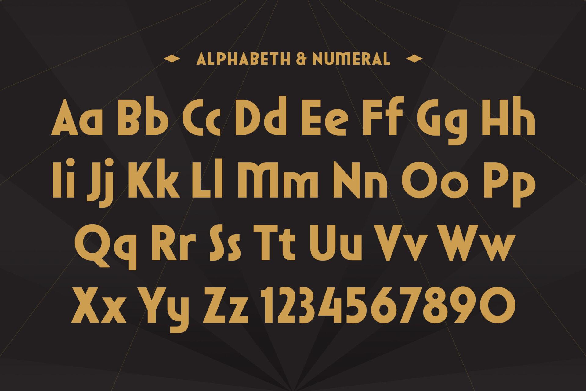
Silvadeco Font is an elegant, tall Art Deco face with high waists on letters like E and F and slim, upright proportions. Set in gold on black, it looks like a 1920s theatre sign.
The alphabet sheet shows uppercase, lowercase and numbers, and the gallery includes alternates and multilingual support. It handles longer text than most deco fonts, so it can carry a date and venue on an invitation, not only the headline.
20. Decort Font by pekotype
Best For: Jazz night posters, bar signs, vintage labels, music event flyers
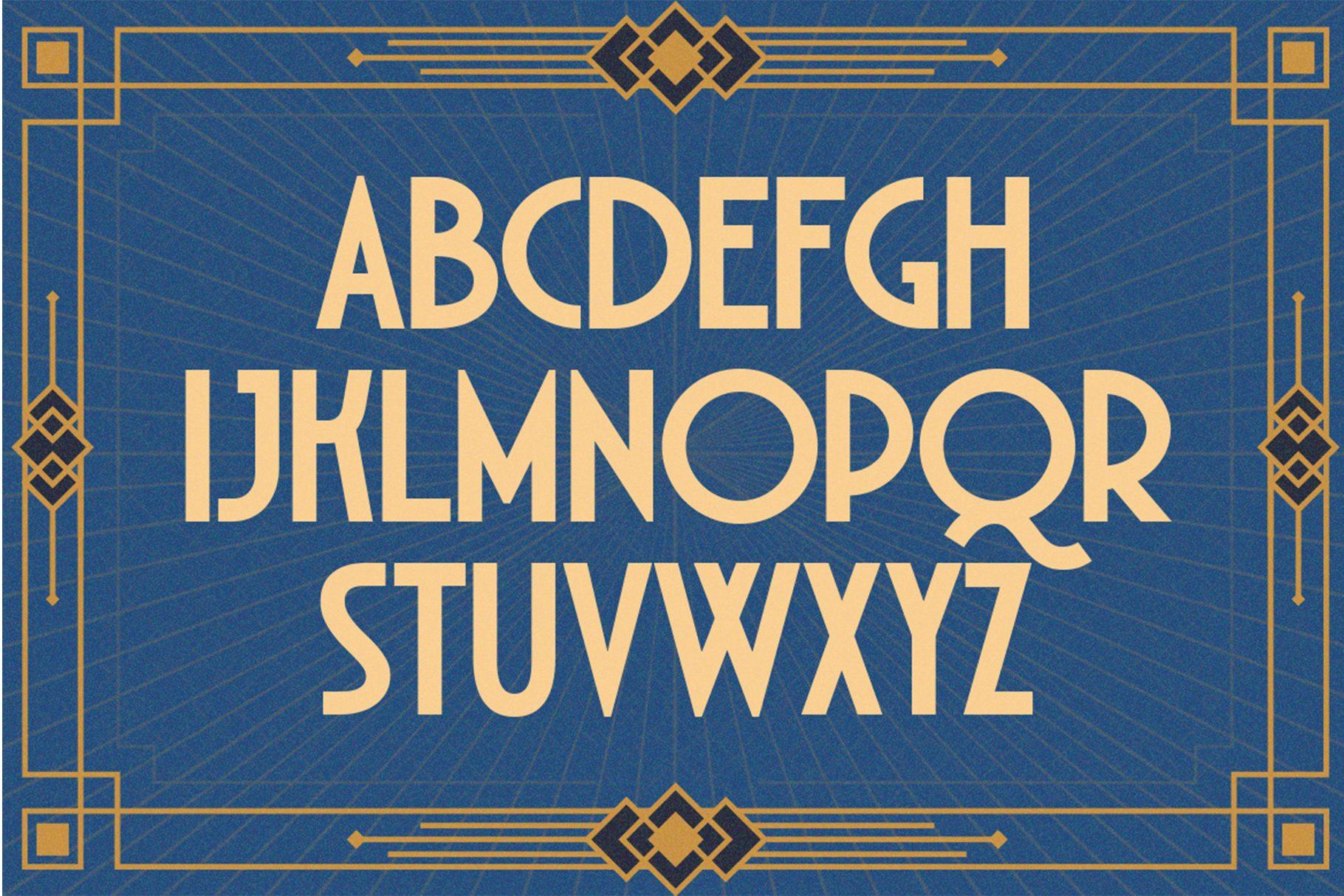
Decort Font has geometric Art Deco capitals with perfectly round O and Q shapes and sharp, straight sides on the rest. It looks clean and architectural.
The alphabet sheet shows capitals only, set in gold on a navy framed background; numbers and punctuation are on a separate slide. A thin geometric border, like the one on the sheet, is all it needs.
21. Art Nouveco Font by typealiens
Best For: Apothecary labels, badges, vintage logos, candle and soap packaging
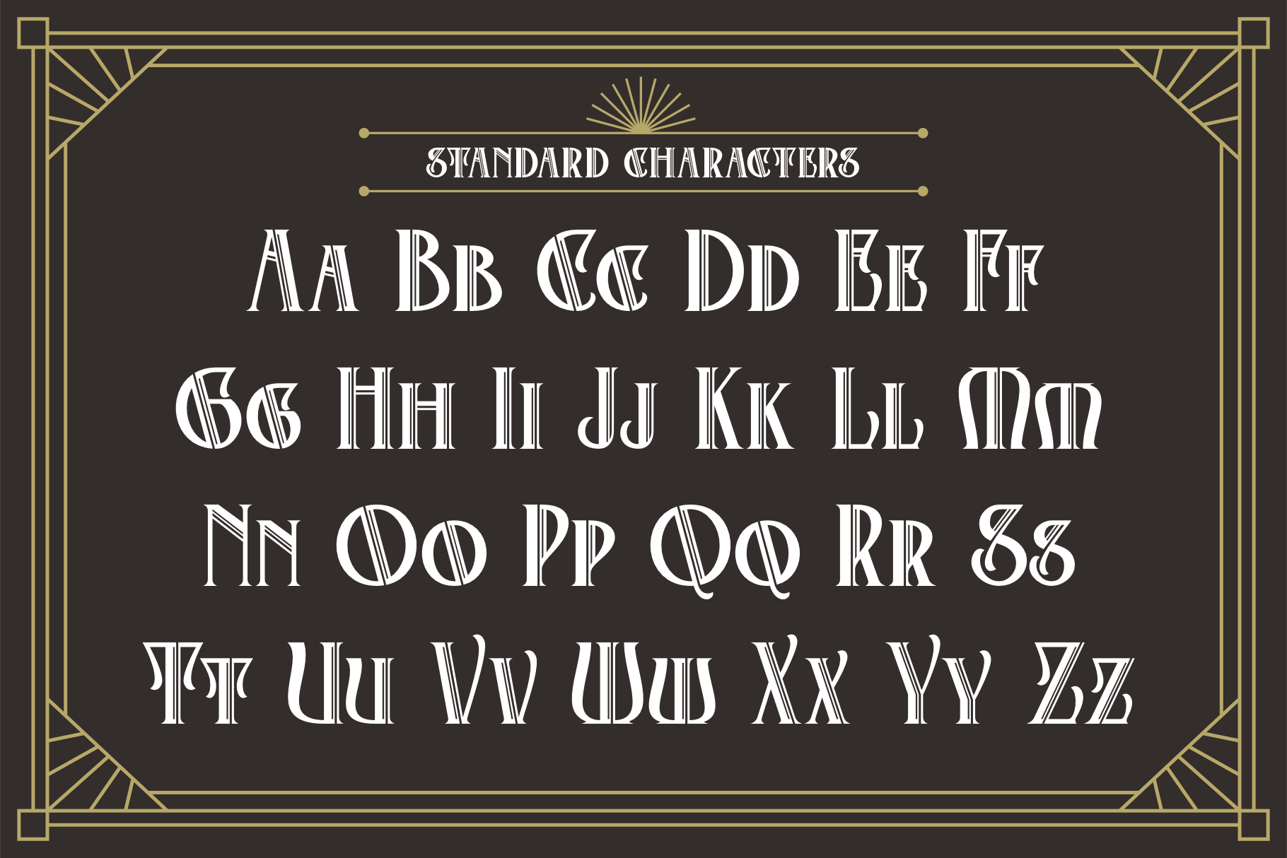
Art Nouveco Font mixes Art Deco structure with curled, decorative details from Art Nouveau. Letters like M and W have extra loops, which gives it an ornate, antique feel.
The standard characters sheet shows uppercase and lowercase, and the gallery has separate slides for numbers and alternates. It shines on badge and label layouts, as the gallery’s apothecary and “Avenue No. 13” examples show.
22. Decovaire Font by Kernova Fonts
Best For: Hotel and boutique logos, signage, gala invitations, menu headers
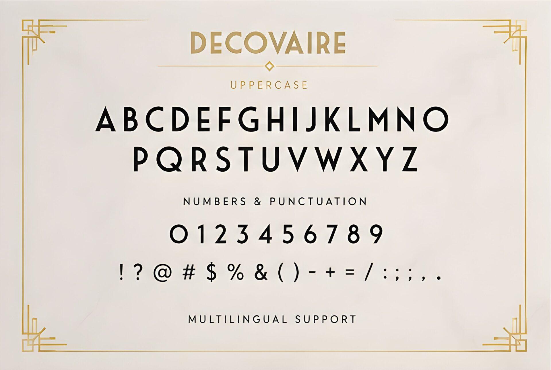
Decovaire Font is a light, refined deco face with thin strokes and slim geometric capitals. It is the quietest font in this group, more luxury hotel than jazz club.
The sheet shows uppercase, numbers, punctuation and multilingual support. Use it with wide letter spacing and plenty of empty space around it; it loses its elegance when crowded.
23. Postgate Font by Typia Nesia
Best For: Museum and exhibition posters, book covers, travel prints
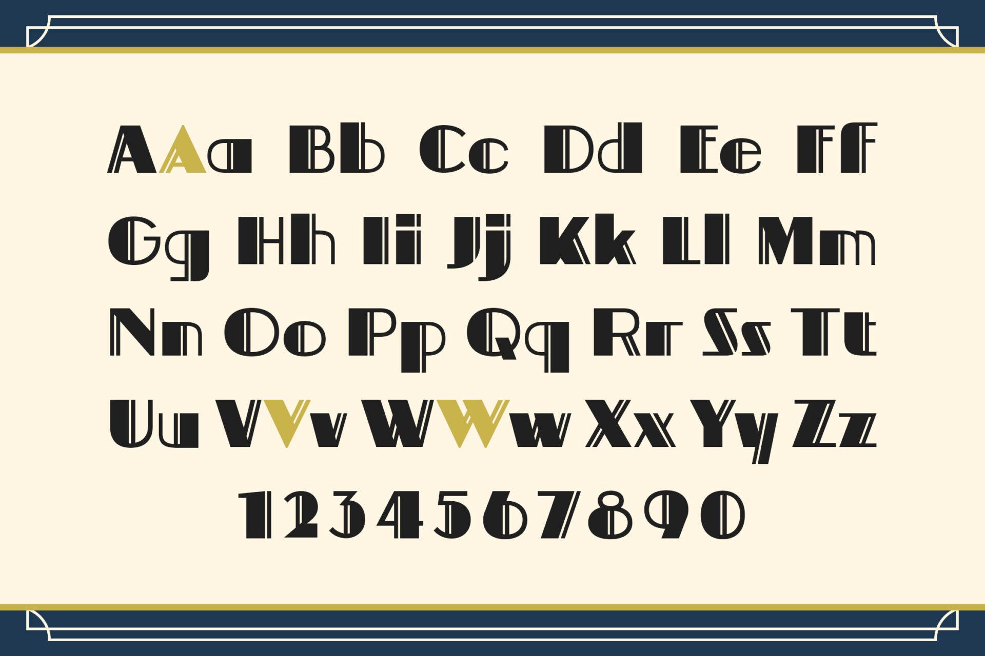
Postgate Font is a bold deco face with solid strokes and a classic, poster-like presence. The alphabet sheet highlights alternate A, V and W shapes in gold.
The sheet shows uppercase, lowercase and numbers, and the gallery includes multilingual support. Swap in one of the alternate letters in a headline to give a plain word a more decorative look.
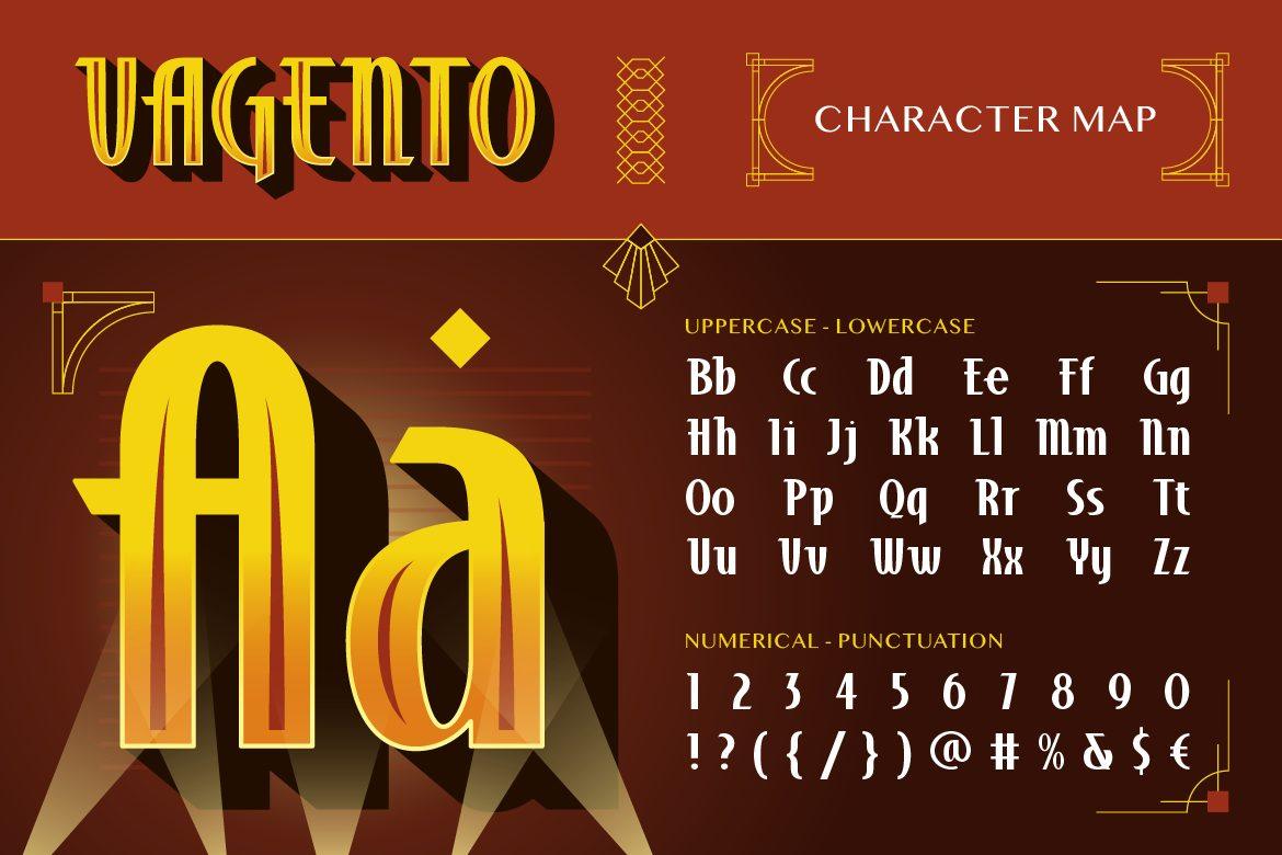
24. Vagento Font by Burntilldead
Best For: Vintage cinema posters, whisky and spirits labels, theatre flyers
Vagento Font is a dramatic Art Deco display with very tall letters and strong contrast between thick and thin parts. The gallery shows it in gold gradients on dark red, like an old film poster.
The character map covers uppercase, lowercase, numbers and punctuation, and the gallery has slides for ligatures and alternates. It is meant for big headlines, so pair it with a simple serif or sans for any body text.
Cool Retro Script Fonts
Thick retro scripts are the cool fonts of baseball tees, diners and barbershops. They have heavy strokes, connected letters and swash tails that underline a word on their own.
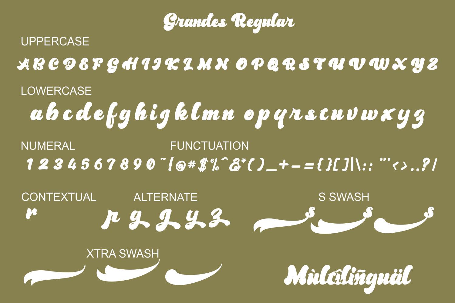
25. Grandes Font by BK Thompson Designs
Best For: Food packaging, sports-style logos, shirts, diner signs
Grandes Font is a heavy retro script with a strong slant and smooth, connected letters. The gallery shows it on snack packaging and logos, often with a contrasting shadow.
The sheet lists uppercase, lowercase, numerals and punctuation, contextual alternates, swash tails and multilingual support. Add one swash under the word for a classic baseball-logo look.
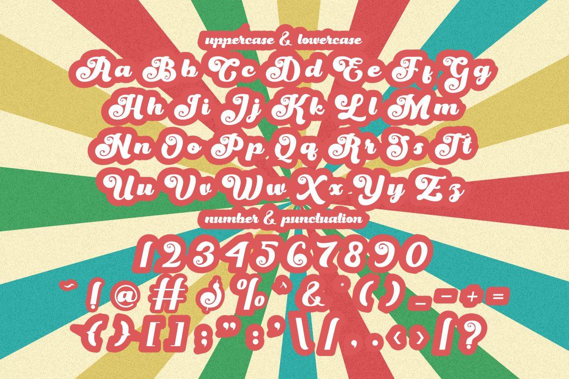
26. Magic Whip Font by putracetol
Best For: 70s retro shirts, florist and barbershop logos, posters
Magic Whip Font is a bold groovy script with round, swirling capitals and soft bubbly strokes. It sits between a retro script and a groovy display font.
The alphabet sheet shows uppercase, lowercase, numbers and punctuation, and the gallery has a slide of alternate styles. It looks great with an offset shadow in a second color, as on the sheet itself.
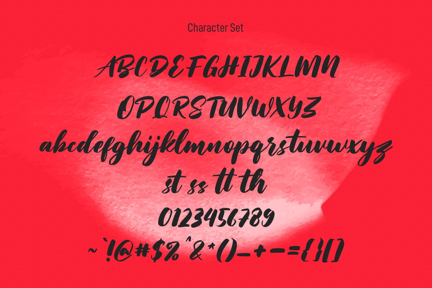
27. Sunday Serve Font by Maulana Creative
Best For: Barbershop signs, quote posters, apparel, café menus
Sunday Serve Font is a slanted brush script with dry, slightly textured strokes. It looks painted quickly with a flat brush, which gives it energy.
The character set includes uppercase, lowercase, numbers, punctuation and ligatures such as st, ss, tt and th. It works for both short logos and two-line quotes, and the texture keeps it from looking too polished.
28. Breaking Bread Font by GeekMissy
Best For: Bakery labels, cake toppers, recipe cards, kitchen signs
Breaking Bread Font is a casual, bouncy script with rounded strokes and a friendly, handwritten feel. It is lighter than the other scripts here.
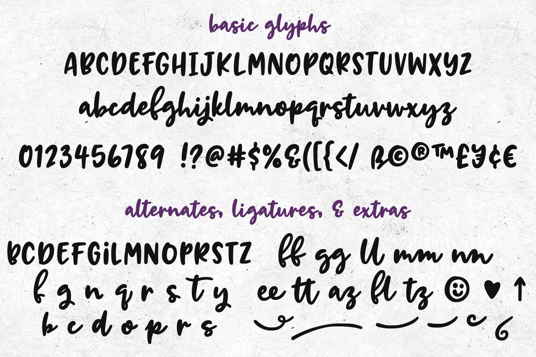
The sheet shows basic glyphs plus alternates, ligatures and extras, including small doodles like a heart and an arrow. Use the extras sparingly to decorate a label or a card without adding separate graphics.
29. Brighton Avenue Font by Whymore
Best For: Baseball tees, sports logos, varsity-style merch, team shirts
Brighton Avenue Font is a bold, sporty script in the style of classic baseball jerseys, with heavy strokes and a confident slant. The gallery shows it with long tails that sweep under the word.
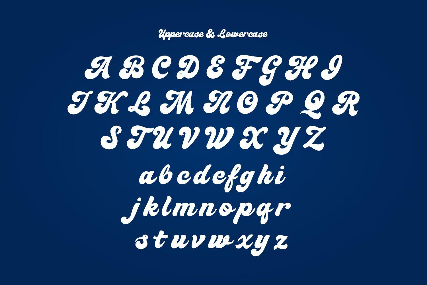
The alphabet sheet shows uppercase and lowercase, and the gallery has separate slides for swashes, alternates and multilingual characters. Set a team or town name with a tail swash and add a number in a block font below it.
30. Angkara Font by ElegantFont
Best For: Barbershop and restaurant branding, wine labels, vintage logos
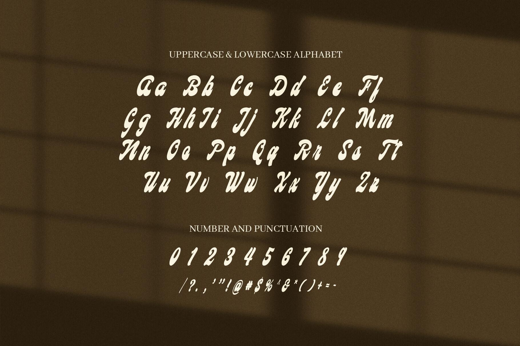
Angkara Font is a bold vintage script with flowing capitals and smooth joins. It feels classic and a little masculine, which fits the barbershop and restaurant examples in the gallery.
The alphabet sheet shows uppercase, lowercase, numbers and punctuation in light letters on a dark background. It needs contrast, so use it light on dark or dark on cream, and keep it at headline size.
How to Choose a Cool Font
Start with the surface. On a T-shirt or hoodie, heavy fonts like Back Wild, Street Fruit or Grandes hold up after printing, while thin tags like Wofline Graffiti need a large print area. For vinyl cutting, simple solid shapes such as Grooven Pop, Fungky Retro or Stay Chunky are easier to weed than textured or patterned letters.
Then check the alphabet sheet. Several fonts in this list show capitals only, among them Comic Heroes, Boom Pop, Grooven Pop, Pop Art Retro, Fungky Retro, Decort and Decovaire. They are great for names and short phrases, but if you need a full sentence, pick one with lowercase, like Superiot, Silvadeco or Sunday Serve.
Match the style to the mood. Graffiti and comic fonts feel young and loud, groovy fonts feel warm and nostalgic, Art Deco feels glamorous and retro scripts feel classic and sporty. Use one cool font per design and pair it with a plain sans serif for dates, prices or small details, so the display font stays the focus.
Cool Fonts FAQ
What makes a font cool?
There is no fixed definition. On Pinterest the word usually covers display styles with a strong personality: graffiti, bubble and groovy letters, comic lettering, Art Deco capitals and thick retro scripts. What they share is that the letters themselves are the design, not just a way to deliver text.
Which cool fonts work best for T-shirts?
Bold fonts with solid strokes print most reliably. In this list that includes Back Wild, Street Fruit, Groovy Beach, Stay Chunky, Boom Pop, Grandes and Brighton Avenue. Very thin or textured styles, like Wofline Graffiti or Sunday Serve, look best printed large.
Which fonts in this list have a full alphabet with lowercase?
Most of them. Fonts whose alphabet sheet shows capitals only are Fungky Retro, Comic Heroes, Boom Pop, Pop Art Retro, Grooven Pop, Decort and Decovaire. Every other font here shows both uppercase and lowercase.
Can I use these alphabets to practice drawing letters?
Yes. Each entry shows the full alphabet sheet, so you can study how the letters are built, for example the outlines and shadows of Street Fruit or the swash tails of Brighton Avenue, and copy the shapes in your own hand lettering.
Can I use these fonts on products I sell?
License terms are listed on each font’s Creative Fabrica page. Check them for the specific use you have in mind, such as print on demand or Cricut products, before you start selling.